Slidegenius, Inc.

How To Use Your Brand’s Custom Fonts in PowerPoint Design

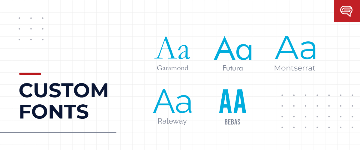
Custom fonts evoke emotions, making them an essential tool for defining your brand. Some fonts may portray traditional aesthetics, others a modern taste and can even give communicate grace and elegance. Brands strategically utilize fonts to help visually define their overall identity. Considering fonts can express a distinct “personality” it’s important to choose one that fits well with the brand and message you want to convey.

Often you are conveying your brand message through presentations internally, to customers, or even to potential investors so it is important to consistently use your brand’s font across all platforms. Employing your custom font in your presentations can help revitalize your design and define your brand’s aesthetics through your PowerPoint presentation. 

Using Custom Fonts in PowerPoint 

In order to use your brand’s custom font in your presentation, you’ll need to install it on your computer. Go to Control Panel > Fonts, then drag-and-drop or copy-and-paste the fonts into the Fonts Manager. Make sure the files are unzipped before you do. 

Avoiding Your Custom Font Being Replaced When Shared

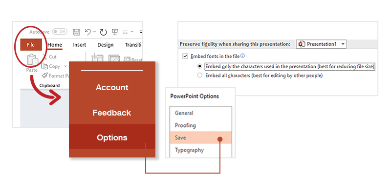
When you use custom fonts, there’s a possibility that PowerPoint will replace them if you share the deck with others. To avoid this try embedding the font in the presentation. PowerPoint allows this as long as the font file type is TTF or OTF. All you have to do is to click File > Option > Save, and then check the box that says, “Embed fonts in this file.” 

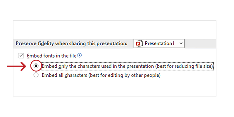
Keep in mind that this will likely increase your file size, so choose “Embed only the character used in the presentation” if you need to be wary of your file size. 

You can also share the font file itself when you’re sending the deck to others that need to edit your deck. PowerPoint will replace custom fonts with standards ones if you don’t embed the custom font, so this can be a great way to ensure your coworkers are also using the custom font and keeping your brand consistent. Keep your custom font file in an easy-to-find location for when you need to send it out.

Present Online 

This is especially helpful when you want to share your PowerPoint via online hosting without having to embed the custom font (or increase your file size). Your audience may or may not have your custom font installed in their version of PowerPoint. But by taking this route, you can ensure whatever custom font you have used will appear on the audience’s end without worrying if the custom font has been installed. 

Companies with digital asset management platforms (DAMs) or learning management systems (LMS) often allow readers to view their content online. Broadcast Slide Show is a feature that lets you livestream your presentation to an online audience. 

Consistency is Key

Much like all the other aspects of your company’s identity, consistency is key to how you present yourself, your brand, and your products or services. Using your brand’s custom font in your PowerPoint templates and presentations is a simple, yet effective way to authentically represent your company no matter who you are presenting to.

Leave Design to the Professionals: Hiring Trained PowerPoint Designers

Graphic design is an often-misunderstood aspect when running a business. The uninitiated assume that designs, be it logos or marketing content, can be created easily and quickly. These are deadly assumptions to make considering the significant role graphic design plays in branding. Companies with rock solid offerings can risk floundering in competitive markets if their designs look cheap or unappealing. Graphic designers are highly skilled professionals capable of strengthening a brand’s image.   

In this article, we will focus on an overlooked aspect of branding: PowerPoint presentation design. Discover how the work of a professional PowerPoint designer can help reshape the way your business is perceived in the boardroom.

Designers Deliver Messages Visually 

PowerPoint design is more than simply creating aesthetically pleasing slides. Professional designers are experts of visual communication. They can take heaps of bland looking data, like monthly sales reports, financial projections, or survey results, and transform them into more visually engaging pieces of content. Their discerning eye for information helps them filter out anything that serves no value to the design and message of the presentation.  

Ever felt like your presentation has too much text? Often, it probably does. Text heavy slides are still one of the most common problem most people make when creating their own pitch presentation. Professional designers are keener on showing over telling. They effectively utilize visual design elements to convey messages with only a fraction of text. This decreases clutter on the slides, making it easier for audience to interpret what being presented.  

Controlling the Flow of Information 

When in the hands of someone with little to no design skills, it’s very common to see the slides looking haphazardly put together with no sense of flow. Overwhelming information muddies your intended message. What good would all that information be if your audience can’t even make sense of it? 

Presentation designers deliberately take control of the flow of information. From the colors, text composition, and pictures/graphics, every element serves the purpose of being more visually intuitive. It’s a matter of using these visual cues to draw the attention of someone’s eyes. They effectively put all these elements together to ensure that your audience keys into every piece of relevant information without feeling overwhelmed by it all.

Save Yourself the Headaches  

There’s plenty at play when creating an effective PowerPoint. Which template should you use? Should the presentation have animations? Which visuals, tables, and graphs best illustrate your points? Professional designers can answer all these questions for you with ease. Their experience allows them to know what styles and visual flair work for every kind of presentation. Their knowledge of the ins and outs of PowerPoint enable them to fully maximize the capabilities of the program.  

In times when you simply have too much work on your plate to handle creating another presentation, professional PowerPoint designers can bear that load. More so, their highly developed skills in the matter ensures a greater final product than what you could have accomplished on your own. Having designers handle creating your presentation gives you the extra time and energy to focus on areas that better fit your own expertise.  

We Are SlideGenius, Your Valuable Partner  

As a start-up presentation design company since 2012, we’ve experienced our fair share of work and productivity struggles. In fact, our full team is split between four different offices around the world. Meaning, we all work “remotely” from one another daily. These barriers have become normal for us, but we continuously adapt and overcome. What pulls us together is our shared passion for helping our clients succeed. From our artists, writers, web developers, animators, and project managers, we utilize our expertise in presentation design to spark invaluable growth.  

At SlideGenius, we are eager to be a valuable partner to all who needs our services during this challenging time. Contact us today for all your presentation needs! 

Five Scenarios that Call for Outsourced Graphic Design

Outsourcing is a polarizing topic.

Some companies are staunchly against it, while others readily delegate work to partners and independent contractors alike.

For skilled tasks like graphic design, outsourcing is almost inevitable.

In these cases, it’s best to embrace the benefits of outsourcing, no matter your stance.

Outsourcing Is Trending

It might surprise you to learn that more companies are outsourcing graphic design work than ever before—and not necessarily under the duress of a heavy workload.

Choosing to outsource graphic design has some great benefits. Plus, it’s easier than ever thanks to the gig economy.

In the age of remote work and side hustles, finding a qualified graphic designer (or team of designers) for an affordable price takes minutes.

You might hop on a freelancer bidding website, contact a friend of a friend, or search the web for a trustworthy partner. Thankfully, there are few-to-no barriers to outsourcing, which has made it a viable solution for many companies in managing their workflow.

The Top Reasons Companies Outsource

Why outsource?

Every company has its own reasons, and different situations call for different solutions. To understand why outsourced graphic design is such a booming trend, take a look at some of the top survey answers from major companies:

  • 59% – Reduce/control costs
  • 57% – Focus on core functions
  • 47% – Solve capacity issues
  • 31% – Improve services
  • 28% – Gain access to expert talent and knowledge
  • 17% – Manage the business environment
  • 17% – Accelerate organizational transformation

From the numbers, outsourcing is often the function of cost control and task delegation.

Companies need a way to get quality collateral fast, without hampering their already-busy production teams. These are all valid reasons for seeking outsourced graphic design help, but it’s important to recognize the many other situations that might call for a helping hand.

Recognize Outsourcing Opportunities

It’s not always easy to recognize outsourcing as a solution. Here are some of the most common scenarios companies run up against and why outsourcing graphic design is the most viable solution.

Scenario 1: You need to cut costs

There’s a misconception that outsourcing is more expensive than in-house graphic design.

This simply isn’t true in most situations.

Consider the cost of a full-time salary and benefits packages, versus the cost of delegating a set number of hours out to someone. On average, a graphic designer pulls in around $45,000 per year.

That’s a major expense and you have every right to balk at the cost.

An outsourced specialist ultimately costs less than an in-house employee and will likely accomplish more in less time, instilling more total value in your cost per project.

Scenario 2: You’re growing and your internal design team is overwhelmed

Working at-scale is hard when you’re growing.

You might have more work than four graphic designers can handle, but not enough to justify bringing on a fifth person—it’s workflow purgatory!

Outsourcing graphic design as an intermediary measure allows you to function at-scale, without straining your operations to prematurely accommodate more staff.

With outsourcing, designers are there when you need it and gone when you don’t:

Download the full diagram here.

As the diagram above shows, if you ever experience #1 or #3, you should consider outsourcing graphic design to a trusted partner.

It’s the ultimate in flexibility.

Scenario 3: You’ve hired your first dedicated marketing person

A dedicated marketing manager is the first step to a robust marketing team—but they’re still only one person.

No matter how talented they are, they don’t have time to create and coordinate collateral. Let them focus on the administrative tasks crucial to campaign execution. Being able to focus on tact and strategy is what ultimately lifts your campaigns to success.

Leave content and collateral creation to a specialist.

Scenario 4: Your internal design team is getting burned out

Repetition is a precursor to burnout. If your in-house team works on the same projects over and over again with little deviation, they will stagnate and fizzle.

Outsourcing these repetitive and monotonous graphic design tasks is a win-win for everyone.

Your in-house team gets diversity and exposure to new projects. An outsourced specialist, on the other hand, gets consistent work they understand and can plan for.

Scenario 5: Your internal marketing team needs specialized support

Once in awhile, there’s a project above the pay grade of your in-house team (we see this a lot when it comes to incorporating presentation animation).

Instead of turning the project away, consider outsourcing.

It’s easy to meet the demands of the project when you have an entire world of skilled professionals to pick from. They’re able to help you deliver a quality result, without serving in a full-time capacity.

Like this post? Check out our “How to Effectively Support Busy Graphic Design Teams” guide:

Download eBook

Conclusion

No matter your feelings about outsourcing work, it’s important to recognize the benefits associated with it.

Every business is likely to encounter a situation in which outsourcing is the answer. When they do, having the wherewithal to turn to a outsourced designer can be the difference between success and hardship.

Keep an eye out for opportunities to improve capacity, cut costs, and control workflow by outsourcing graphic designers.

Capitalizing on these opportunities and utilizing an outsourced graphic design solution will put your business in a position to keep moving forward, full steam ahead with marketing and branding goals.

Ready to start your journey to presentation perfection? Schedule a free presentation consultation now.

The Overwhelmed Creative Team: A Cautionary “Design Ops” Tale

Back in 2011, fresh out of college, I worked for an advertising agency in New York City as an account manager.

It was one of the most stressful jobs I’ve ever had.

One of my responsibilities was overseeing the creation of my clients’ pitch decks, which — unsurprisingly — weren’t considered “mission critical” deliverables for the creative team.

There was never time to be idle; we were always on the go, brainstorming, producing content, and running to client meetings. The job was stressful but we were fortunate to have the right people that were easy to work with, passionate, and fun.

Over the next year though, the team began to thin. Some members left for bigger opportunities, others were poached by competing agencies, and some even started their own businesses.

Eventually, most of our veterans in the creative department were gone and the empty seats were filled with junior art directors and copywriters. 

I remember being worried about how things would unfold without some of the key employees I had come to rely on. Everyone had to step up. 

And for a while, everything ran smoothly. But as the agency grew and workloads increased, our internal design processes began to break down.

The creative team — consisting mostly of junior employees — were overwhelmed with pitch deck projects. At one point, they were unable to handle one of the decks assigned to them.

I remember it like it was yesterday…

As the account manager, I had to keep things moving and decided to just make the deck myself. 

Never did I think creating the PowerPoint deck would stress me out. After all, I’d used the tool for years to present my school reports and projects. The pre-loaded animations were there for the choosing and I knew I could find some cool-looking pre-designed templates somewhere online and simply visit YouTube for “design hack” tutorials.

Boy was I wrong.

See, the problem is that we’ve all worked with PowerPoint for years (even decades) and we trick ourselves into thinking we know enough.

Think about that for a moment.

That’s basically saying because we’ve driven cars since we were 16 years old, we feel comfortable with how the machine works.

In reality, most of us only know how to get from Point A to Point B (in most cases), and keep ourselves comfortable along the way.

We don’t know how to make the car more fuel efficient, or give it more horsepower to make it faster, or how to adjust the shocks for more on-road comfort or off-road capability—things that would undoubtedly benefit us in our week-to-week (depending on one’s lifestyle of course).

Instead, we use the same vehicle in its original configuration until it’s time to move on—because that’s what we’re used to.

If you think about it, that’s basically the same as downloading a pre-designed template that appears suitable, uploading content, and then hitting the proverbial gas pedal.

I felt I knew enough about PowerPoint to make the pitch deck acceptable.

Let’s be clear: when the goal for any project is “acceptable,” it’s safe to assume—in this day and age—it probably won’t move any needles in the right direction.

To no-one’s surprise, I came up with an almost plain deck with cheesy animations. You know, your typical box-in, appear, dissolve-type effects—stuff that causes Death by PowerPoint and makes you look old.

Fortunately, my presentation skills were good enough to outshine my unoriginal slides and the materials my creative team came up with were downright beautiful. 

But just seeing how the deck came out was a humbling experience. It was definitely something I was not proud of. I used to be so giddy presenting with the spectacular decks that our creative team came up with, but for this presentation, my deck was as good as just writing on the board with a marker

Heck, a whiteboard session might have even been more engaging than what I came up with. What’s worse is I could’ve had more hours to sleep and focus on what I was going to say rather than spend so much time on the deck.

The lesson here is pretty clear: we aren’t necessarily experts when we’ve done something many times, and just knowing “enough” is never good enough in high stakes environments like sales presentations, boardroom meetings, and keynote speeches (among others).

Whether you’re guiding a prospect through a product demo, trying to garner buy-in in the boardroom, or announcing upcoming products at your company’s annual internal conference, your ability to achieve the goals you set out to accomplish with your presentation rests on four key factors: 

1) Your presentation skills (obviously)

2) The narrative of your presentation

3) The design quality of your visual aid (typically a PowerPoint deck), and

4) MOST IMPORTANTLY: your audience’s level of engagement

Thankfully, I had the first one—but imagine what my team could have accomplished if we had all four!

Are Visuals in Business Presentations Actually Helpful?

Visual aids upgrade your speech, as the combination of content and design add flare to your presentation. These make your pitch more understandable and allow your audience to follow the discussion with their eyes.

SlideGenius Blog Module One

Get hundreds of PowerPoint slides for free.

Sign up for your free account today.

Sign Up now

Before making a customized PowerPoint presentation, your goals must be clear—you should be sure of the message you want to convey. When you have a plan, you’ll know what you have to work on to achieve your objectives.

So what exactly is so important about visual aids that it’s imperative that you prepare one for your business presentation?

It conveys the message loud and clear.

Visuals help you catch your audience’s attention and engage them throughout your presentation. With these, you can communicate complex ideas in an understandable way. Rather than “telling,” you’re “showing” the audience exactly what you want to say, allowing them to make connections on their own—given that the graphics you use are relevant to your discussion.

Approximately three-quarters of adults in America own a smartphone, making it one of the most quickly adopted consumer technologies to date. Apart from this, they spend almost five hours on their phones. Why is this number important?

As a presenter, you’d want to keep your audience’s eyes on you. So, to keep their attention off their phones, you have to make your visual aids appealing. Add graphics, images, and animations relevant to the topic at hand and you’re good to go.

It elicits emotions.

Images are highly subjective. That said, there are certain categories that are more likely to elicit strong emotional responses compared to others. Images can help establish a long-term connection with the hearts and minds of your audience.

Rather than using bullet points, images that resonate with the audience inspire them to act. Plus, this makes it easier for them to retain information for a longer period.

It saves processing time.

A picture paints a thousand words and it holds true to this day. Using visuals relevant to your presentation is less time-consuming compared to writing a few hundred words. Apart from that, you’d only need to make sure that what you say revolves around that.

In addition, because your audience’s brain works overtime to process all the information fed to them, visuals prove to be the most efficient way to make your discussion easier to understand.

Your visual aids shouldn’t distract your audience, but rather help them reach the core of your presentation. These can either make or break their first impression of what you are pitching and you as a presenter. Simplicity is key when it comes to customized PowerPoint presentations—the best way to keep your audience’s attention is by removing clutter.

Nothing else maximizes efficiency and effectiveness quite like professionally designed visual aids, but take note: you may have the best PowerPoint design, but its purpose is only to add interest and enhance the way you convey your message. You’re still the star of the show, which is why you still have to do well with your speech.

SlideGenius Blog Module One

Download free PowerPoint templates now.

Get professionally designed PowerPoint slides weekly.

Sign Up Now

References:

Miltner, Olivia. “You’re Not Addicted to Your Smartphone – You Just Really Like People.” OZY. April 1, 2018. www.ozy.com/acumen/youre-not-addicted-to-your-smartphone-you-just-really-like-people/85737

Tierney, Leah. “6 Types of Images That Elicit an Emotional Response.” Shutterstock. May 5, 2017. www.shutterstock.com/blog/6-types-of-images-that-elicit-an-emotional-response

“Using Visual Aids.” University of Pittsburgh. www.speaking.pitt.edu/student/public-speaking/visualaids.html

Why White Space Looks Good in Presentation Design

Amateur designers tend to overdo their work. They cram every good idea they have into one design, leaving no area untouched. In their determination to not waste any space, they end up creating a noisy composition that buries the most important graphic elements. The result? Clutter, confusion, and chaos.

Fixing a sloppy work is simple in principle, although it’s not exactly easy to execute. As a graphic designer, all you need to do is maximize the use of an element called “white space,” which is a misnomer because it doesn’t necessarily refer to a white space. In fact, it can be any color, texture, or pattern, as long as it’s an unmarked area that makes the crucial points of a composition stand out.

White space is also known as “negative space” because it makes the “positive space” pop by shrinking in the background and remaining there unnoticed. Its general purpose is to provide a breather for the eyes so that viewers can easily scan a page and find what they need. Still, despite the crucial role that this element plays, it’s still overlooked and underrated at times.

Let’s give white space its own deserved spotlight. Let’s look at it not only from an aesthetic angle but also from a practical perspective. What do you say?

The Two Levels of White Space

There are two levels of white space according to density, ratio, proportion, and general purpose: macro and micro.

  • Macro White Space. Obviously, macro white space is larger in volume compared to its counterpart. Plus, it’s easier to notice because it occupies the bigger portion of a given space. Its main purpose is to emphasize the focal points in a composition and give them structure, and its asymmetrical nature allows it to lend any work a more dynamic and candid look.
  • Micro White Space. This refers to the white space that exists naturally between letters, words, lines, grid images, and other smaller graphic elements. Its main purpose is to direct the flow and order of the content to make for a legible and neat composition.

The Advantages of Using White Space

You’d think the advantages of using white space are obvious, but some presentation designers still overlook them. For good measure, go over them here again to fully internalize the importance of this presentation design element.

1. Improves readability and comprehension

The average attention span of a human being is not as long as it used to be, so if you want to attract and keep your viewers’ attention, you need to give them a good reason to stay. One way to do this is by making it easy for them to navigate through your content. Reduce clutter and design a slide in such a way that the viewers can easily find what they’re looking for. Aim for better comprehension and readability. When people have a full grasp of what you’re trying to communicate, they’re more likely to stay and find out what else you have in store for them.

2. Draws the eyes to the most important points

When used properly, white space can minimize distractions and draw the eyes to the presentation’s central points. The human brain tends to put emphasis on design elements surrounded by white space since they essentially cue the audience as to where they should be looking. When you use white space to lead users from one design element to another, you can sell your main points faster and more effectively.

3. Adds a sense of superiority to the design

In the age of digital media, first impressions matter so much more than ever before. To imprint a good brand image on the mind of your audience, you should master the art of simplicity and minimalism. By using white space liberally and masterfully, you can lend finesse and elegance to your PowerPoint deck. Just take Apple and Starbucks for example. These brands glorify the “less is more” principle, and as a result, their products are considered as the paragon of luxury and sophistication.

On the other hand, less effective presentations tend to cram a hodgepodge of things into one tight space. Too many elements clashing with one another tends to cheapen a slide deck’s overall look. Remember, a tidy and uncluttered space looks more impressive than a heavily packed one. Give your content some breathing space and let it speak for itself.

4. Strikes a balance between texts and images

While the lack of white space results to confusion, an excess of it gives off the impression of incompleteness. Be mindful of how you apply white space lest you look incompetent by under- or overusing it. Aim to strike a balance between the different elements in your presentation design. Keep in mind what Mads Soegaard, the editor-in-chief in The Interaction Design Foundation, said, “White space is a great tool to balance design elements and better organize content to improve the visual communication experience…. For that, the white space is the real star of the show, working between the words and the pictures. It keeps each page from looking busy.”

So, there you have it—everything you need to know to care about white space. Now equipped with such knowledge, you shouldn’t look at this design element as “empty space” anymore. Your improved understanding of the role of white space in presentation design should allow you to put it into better use. Remember, the things you leave out are just as important as those you use.

Resources:

Cao, Jerry, et al. “Why White Space is Crucial to UX Design.” Fast Company Design. May 28, 2015. www.fastcodesign.com/3046656/why-white-space-is-crucial-to-ux-design

Lana, Michelle. “Why Whitespace Is So Important in Web Design.” Segue Technologies. September 10, 2015. www.seguetech.com/whitespace-web-design

Soegaard, Mads. “The Power of White Space.” Interaction Design Foundation. n.d. www.interaction-design.org/literature/article/the-power-of-white-space

Turnbull, Connor. “Using White Space (or Negative Space) in Your Designs.” Envato Tuts Plus. July 19, 2011. webdesign.tutsplus.com/articles/using-white-space-or-negative-space-in-your-designs–webdesign-3401

“White Space in Graphic Design, and Why It’s Important.” Printwand. n.d. www.printwand.com/blog/white-space-in-graphic-design-and-why-its-important

Videos: How Can They Improve Your Presentation?

We can no longer ignore the growing hype around videos. These electronic media are gaining traction, and it wouldn’t be surprising if they soon become the most popular type of content, since more social media channels are popping up to underline their importance. Today, the effectiveness of videos in capturing people’s attention is apparent. In YouTube, for example, 400 hours of videos are uploaded every minute and almost 5 billion are viewed every day. These staggering statistics show that we create and consume video content in a rapidly increasing rate.

Still, while all this hype around videos is nice, we can’t really claim that it’s something new. Steve Jobs, the co-founder of Apple Inc., included this medium in his presentations as early as 1984. The potential of videos as the trendiest type of content will continue to grow, so if you haven’t explored the possibilities of video marketing, now is the time.

The Purposes of Using Videos in Presentations


Isn’t it ironic that although most marketers recognize video content as a powerful tool, only four percent use it religiously in presentations? That leaves a glaring 96 percent in the dark, stuck in traditional methods that are only half as effective as video marketing. This isn’t to say that you should add a video in every presentation—of course, if it isn’t appropriate, do away with it. But if you find an opportunity to use this type of content to support or highlight your message, why not grab it?

Here are the four main purposes of adding videos in your presentation:

  • To explain a complex idea. It’s hard to explain a technical idea to a group of people who know nothing about it. Sure, you can put that idea into words, but you can’t guarantee that your equally perplexing explanation will translate into something cohesive in the audience’s mind. If it’s too complicated to grasp, why not find another means of expressing it? Perhaps a video could render it more comprehensible?
  • To engage the audience in discussion. Videos have a certain pull that makes them effective in grabbing people’s attention. A relevant video presented at the right moment can keep the audience bolted to the screen. Make sure that the video you use can establish an emotional connection with your audience and can generate a meaningful discussion that will fire up their energy.
  • To break the monotony. You can’t expect the audience to listen to you for hours on end. Their attention is bound to wane at some point, and one way to recapture their interest is by giving them a break in the form of a video to watch. If possible, inject humor in your presentation to lighten up the mood and make room for a seamless transition.
  • To help in memory retention. An experiment conducted by Dr. Richard Mayer from the University of California, Santa Barbara revealed that people immersed in “multi-sensory environments” had better recall even years after a presentation. This is because when the human brain builds two mental representations of something (i.e. a verbal and a visual model), it typically results to better memory retention.

Things to Remember When Adding Videos to Your Slides

You’d think that adding a video to a presentation is a piece of cake, but some people still seem to miss the basics. To make sure that you do things right, take these pointers:

1. Embed the video in the presentation itself

Think of how unprofessional it would look to show the audience a video separate from the original presentation. You’d look like an amateur who didn’t bother to assemble your knowledgebase in one place. Plus, it would be inconvenient on your part when switching from one to the other, so it’s only practical and professional to insert the video in the presentation itself. In PowerPoint, you can embed a video directly in the slides to make for a smoother transition.

2. Keep it short and simple

Videos are meant to enhance your presentation, not replace it. That’s why you should only designate a short chunk of time for this type of content. Otherwise, you’ll lose your connection with the audience and destroy your momentum. An effective video presentation shouldn’t make the audience forget that you’re the main source and “relayer” of information.

Things to Remember When Adding a Video in Your Presentation: Keep it Short and Simple

3. Lean towards the authentic

People are more interested in realistic videos that reflect genuine experiences than in corporate ones that are too alien to relate with. To add a dab of authenticity in your videos, you can use testimonials that feature real customers who truly value and uphold your brand. Testimonials, especially when unsolicited, are a persuasive tool for inviting more people to consider your message.

4. Check its relevance to the topic

Relevance is the number one criteria when adding video clips in a presentation. You can’t just throw in anything that doesn’t relate to the points you’re trying to make. Every video clip must have a purpose—and that purpose should have something to do with underlining your core message.

5. Use narratives to draw emotional responses

Everyone responds to narratives. Stories have a certain quality that evokes emotional responses from people. A video content structure that follows a narrative can make for a more compelling presentation that will allow the audience to make sense of abstract ideas that would otherwise be lost in translation.

Now you know the secret to making your next pitch stand out. Use videos more wisely in your next presentation, and see the difference in your audience’s level of energy and engagement.

Resources:

Bell, Steven J. “Using Video in Your Next Presentation: A Baker’s Dozen of Ideas and Tips.” Info Today. n.d. www.infotoday.com/cilmag/jul10/Bell.shtml

Blodget, Henry. “The Lost 1984 Video: Steve Jobs Introduces the Mac.” Business Insider. August 25, 2011. www.businessinsider.com/video-steve-jobs-introduces-mac-2011-8

Boone, Rob. “How and Why You Should Use Video in Your Next Presentation.” Live Slides. January 22, 2016. www.liveslides.com/blog/how-to-use-video-in-presentations

Gallo, Carmine. “Four Easy Tips on Using Video to Make Your Presentation Stand Out.” Forbes. January 31, 2017. www.forbes.com/sites/carminegallo/2017/01/31/four-easy-tips-on-using-video-to-make-your-presentation-stand-out/#2ed99f26e3a0

Marshall, Lisa B. “How to Use Video in a Presentation.” Quick and Dirty Tips. August 9, 2012. www.quickanddirtytips.com/business-career/public-speaking/how-to-use-video-in-a-presentation

“3 Reasons to Add Video to Your Presentation.” Meetings Imagined. n.d. www.meetingsimagined.com/tips-trends/3-reasons-add-video-your-presentation

“36 Mind-blowing YouTube Facts, Figures, and Statistics 2017.” Fortunelords. March 23, 2017.

Choosing the Right Fonts for Your Presentation

Back in the day, when a global connectivity system, computers, and all these technological advancements were decades, even centuries, away from being invented, no one had the trouble of choosing what font to use for their works. Everything that people had—some without much choice—were their hands and what amounted to pens. Getting something on paper was all manual labor, and how readable manuscripts were depended not only on the conventions and foundations of the language but also on how legible their penmanship was.
Now, though, almost everything has become digital: messages, word-processing programs, presentations, and the like. Fitting, then, that with technology came another host of problems. Technology isn’t perfect; it gave people the power of choice from an infinite number of many things: colors, fonts, layouts, images, etc.
Since the birth of PowerPoint, presenting has never been the same. Now, there are more stuff to consider when making your deck. From background to theme and, yes, fonts. How do presentation designers decide what to use? More importantly, how do you choose the perfect typeface for your slides? By answering three main questions:

1. What is my message?

Choosing the Right Fonts for Your Presentation: What is my message?
Along with that is a follow-up question: “How do I say my message?” Your topic and how you present your data are factors that affect your decision with which font to use.
If your topic is serious, then it begets an authoritative font, like the thick Rockwell or the aptly named Impact. But, if you like a quirky and light-hearted font for your topic, then something along the lines of Tahoma, Segoe, and Verdana can do the trick. When you know how font personalities affect readers’ perception, then you can easily narrow down your choices and find the one that’s apt with the gravity of your message.
The worst you could do is mismatch your fonts with your theme. Have you even seen a public service announcement that used Symbol (which, for those who are unfamiliar, are letters from the Greek alphabet)? And please, no matter what, don’t use Wingdings. Your font must be appropriate. You don’t want another case of Comic Sans, do you?

2. Is it readable?

Choosing the Right Fonts for Your Presentation: Is it readable?
You could answer that question in two approaches: font type and font size.
In general, there are four font classifications: serif, sans serif, script, and decorative. Of the four, the first two are most widely used. Fonts belonging to the serif family are great for print since, even with small sizes, their serifs provide space and fluidity for continuous reading. Sans serif are best used when large and projected onscreen because they are clear in the sense that when serif fonts are projected, the thinner strokes of the letters tend to be muddled or appear broken-up.
As for a specific font size, a good rule to live by is Guy Kawasaki’s 10/20/30 rule: 10 slides in 20 minutes with 30 font size. Maximum readability even for the people at the back is guaranteed. If anything, you could even go bigger, especially when you have a single word on your slide. It’s easily read, impactful, and memorable.

3. How many should I choose?

Choosing the Right Fonts for Your Presentation: How many should I choose?
This goes over into consistency territory.
You’re already having trouble deciding one font; what more two or three? Generally, the usual advice is to have two complimenting fonts, a pair that doesn’t take away or fight for attention with each other. Typically, the best pair is a serif-sans serif combination, like the classic Times New Roman and Arial. But if you know font personalities, for the right topic and with the right approach, even a sans serif-sans serif combo will work in unexpected ways, like Cubano and Nunito.
Of course, you don’t need to use different fonts. A major point of using combos is to highlight certain parts of your content, and stylizing a keyword or an important point differently draws attention to it.
Choosing the perfect font to use on your slides is seldom easy. You could fall back to the old mindset of “As long as it’s readable,” but almost everyone does that; thus, you get the ubiquity of certain “standard” fonts that are now recommended to be avoided.
Experiment with your presentation. Answer the three questions above, and you’ve got a narrow pool to choose from. When you get the harmony you’re looking for, you can then wow your audience with your talk.
If you want to know more, watch this short video from our PowerPoint design agency, SlideGenius.

Resources:

Agarwal, Amit. “What Are the Best Fonts for Presentation Slides?” Digital Inspiration. July 17, 2012. www.labnol.org/software/tutorials/advice-select-best-fonts-for-powerpoint-presentation-slides/3355
Cass, Jacob. “15 Stunning Font Combinations for Your Inspiration.” JUST™ Creative. May 5, 2015. www.justcreative.com/2015/05/05/15-stunning-font-combinations-for-your-inspiration
Cournoyer, Brendan. “What Are the Best Fonts for Killer Presentations?” Brainshark. March 29, 2012. www.brainshark.com/ideas-blog/2012/March/best-powerpoint-fonts-for-killer-presentations
Erickson, Christine. “Not My Type: Why the Web Hates Comic Sans.” Mashable. October 3, 2012. www.mashable.com/2012/10/03/comic-sans-history/#6J_bWV037Eqw
Gabrielle, Bruce. “The #1 Best Advice for Choosing PowerPoint Fonts.” Speaking PowerPoint. December 5, 2011. www.speakingppt.com/2011/12/05/best-font
Haley, Allan. “Type Classifications.” Fonts.com. n.d. www.fonts.com/content/learning/fontology/level-1/type-anatomy/type-classifications
Kawasaki, Guy. “The 10/20/30 Rule of PowerPoint.” GuyKawasaki.com. December 30, 2005. www.guykawasaki.com/the_102030_rule

Fundamental Elements of a Strong PowerPoint Slide

Have you ever wondered about the makings of a perfect slide? Or if not perfect, at least a strong and impressionable one? Many answers are found online, and for just as many reasons, that you just can’t be sure which is correct. You could say, of course, that there are niche functions for what objects or elements you put on your deck, but does that make your slides strong individually and/or as a whole?
Blank slides often bear no weight, so you fill them up with visual elements. But being willy-nilly with what you put in there will make the effort counterproductive: the more objects in your slide, the more cluttered and distracting it becomes. It’s best to strike the balance between too much and too few.
Now, what are your options? The following elements are the necessities of a powerful slide. What’s more powerful is how you use them, vis-à-vis standalones or any number of combinations thereof.
Fundamental Elements of a Strong PowerPoint Slide: Theme, Title, Background

Theme

You can’t start creating a presentation without a central message and a theme. While everything around your presentation revolves around the former, your slides are designed per the latter. This can be a broad term, extending from color scheme to branding to even subtle details like typography and illustration style.
Choose an appropriate theme for your topic. It’s not a good idea to have a presentation about the wonders of nature but accent your slides with a black color scheme.

Title

While it doesn’t need to appear in every slide, it does mark where you are in terms of your whole presentation. It can also denote that a specific slide is noteworthy. Subtitles, to a degree, extend a title and branch out to other points, but it also doesn’t have to be ubiquitous.
Knowing when or when not to put a title maximizes the impact of the slide on the audience. Be clever with it. Wit is always appreciated.

Background

Imagine a theater stage with no backdrop—nothing to tell the setting or set the mood. The same goes for slides, even if it works on a case-by-case basis. Slide backgrounds reinforce the theme or branding of the presenter and set the mood for the audience.
Your background doesn’t need to be flashy. Even plain white can be appealing, especially when given the proper treatment. As long as it’s appropriate, as with theme, then you can make it work.
Fundamental Elements of a Strong PowerPoint Slide: Text, Images, Effects

Text

Getting to the meat of your message can be done in two ways: with your content or through pictures. With the former, less is more. A few select words can deliver bigger impact—and be remembered more easily—than a paragraph or two that dances around your point.
This is one of the things abused by those who have little experience with slide design. Think “death by PowerPoint.” Walls of text are to be avoided, of course, but having little to none on your slides can and does pay off.

Images

Pictures solicit or trigger strong emotional responses from anyone in a heartbeat. If your “less is more” with text can’t be achieved, try using an image that encapsulates and describes what words can’t do efficiently. You will see the results immediately.
Since humans are visual creatures, they process and react much faster to an image compared to words that are then read and understood. It’s, literally, seeing a bigger picture. All it takes is one look to make a point.

Effects

There are two kinds of effects that you can set in a slide: the shifting Transition and the object-focused Animation. You can highlight and emphasize points or objects and switch from one slide to another in style. Movements catch attention—a result of survival instinct and evolution to notice objects in motion—so take advantage of that fact with PowerPoint’s animation settings.
A word of caution though: use only when necessary. Don’t risk distracting your audience by overusing effects. A gimmick for gimmick’s sake will only be detrimental for your presentation.
Fundamental Elements of a Strong PowerPoint Slide: Visualized Data

Visualized Data

Cold, hard figures are exactly that. Cold. And boring. Instead of plainly showing numbers and percentages, use charts or graphs, even the occasional diagrams, to show your data in a more entertaining—and by extension more educational—manner.
The more creative your chart or graph is, the more lasting the impression that the data makes. Think of how infographics use design to show statistics: with creativity, wit, and humor. Employ the same to your slides.
Now you could be thinking, “I need all seven in just one slide? This is madness!” No, you just need a couple, like a combination of Background, Text, and Effect. Some can stand on its own, for example, Title or Image. It will only be a distraction to put all seven, so only put what you need.
Lastly, as already said above, the most important element of any slide is the overall message of your presentation. Each part of your visual aid should point toward, support, and strengthen the crux of the whole exercise. You wouldn’t be onstage talking about your advocacy then jumping to a different matter altogether just because.
Everything about your PowerPoint presentation should revolve around your message. Any combination of the elements above serve as parts of a whole, all working in harmony to inform and educate your audience. And that is the key factor to wowing your audience.

Resources:

Finkelstein, Ellen. “3 Components of an Effective Presentation.” EllenFinkelstein.com. December 6, 2000. www.ellenfinkelstein.com/pptblog/3-components-of-an-effective-presentation
Kawasaki, Guy. “The Only 10 Slides You Need in Your Pitch.” GuyKawasaki.com. March 5, 2015. www.guykawasaki.com/the-only-10-slides-you-need-in-your-pitch
Mineo, Ginny. “Your Graphs Look Like Crap: 9 Ways to Simplify and Sexify Data.” HubSpot. October 7, 2013. blog.hubspot.com/marketing/data-graph-design-powerpoint-tips-ht#sm.0001frknxr3k3dlkqq22lsqtd9h7a
Tate, Andrew. “10 Scientific Reasons People Are Wired to Respond to Your Visual Marketing.” Canva. May 19, 2015. designschool.canva.com/blog/visual-marketing
“The Elements of a Slide.” Boundless. n.d. www.boundless.com/communications/textbooks/boundless-communications-textbook/preparing-and-using-visual-aids-16/using-powerpoint-and-alternatives-successfully-85/the-elements-of-a-slide-325-5653

6 Things to Watch Out for During Presentation Q&As

“By doubting we are led to question, by questioning we arrive at the truth,” said Peter Abelard. The French philosopher and theologian certainly knew what he was talking about.

At the end of any presentation comes the ever-present Q&A session. It’s never not present. You don’t just present and walk away. There will always be members of the audience who will ask for clarifications and/or just want to understand more.

And it’s your job to answer them. You’re already there onstage, presumably with a great visual aid you or an awesome PowerPoint design agency created, and you’re the one they’re addressing their questions to. Not to mention that your presentation made them think of these queries. If you don’t respond, apart from not getting the answers the audience wanted, it also makes you look unprofessional. Let’s set the difference though: purposefully not answering is not the same as not knowing the answer.

So what mistakes should you avoid during Q&As? Or at least keep in check? Here are some of them:

Presentation Matters: Question and answer

Silence

This can come from both sides: presenter and audience. It’s either they have no or no more questions or the presenter takes a long time to answer. Either way, silence can make the whole mood awkward.

If you’re having a mental block after the question is given, take a moment and pause. If you still don’t have an answer after a few seconds, you can always say, “Excuse me, but let me gather my thoughts for a few more seconds.” This honest move shows that you took the time to really think about your answer—which, in all fairness, you really did.

Tone of Voice

Be conscious of how you talk—not just how you pronounce your words but also how you say, in general, your speech. It’s not just about your intonation or where you place stresses and pauses (you know, for dramatic effect). It’s also how you make your message heard and felt.

The same goes for answering questions. If you come off too strong, the gesture may be seen as defensive; come off too weak and risk being thought of as a weak answerer. A friendly tone is the best tone to use and is also the most welcoming.

Presentation Matters: Long Answer

Long Answers

When faced with a long question, it doesn’t mean you need to respond with an answer of the same length; besides, long questions don’t warrant that. Instead, give your answer as straight and concise as you can.

You risk losing the attention of your audience the more you dwell on an answer—worse, you may even repeat points over and over again, putting into question your expertise on the subject. You’ve already got limited time as it is.

Fillers

Speaking of diminishing subject-matter expertise, “Um,” “Well,” “You know,” and “Uh” will not help establish that. Repeating these filler words over and over will only serve to annoy your audience and damage your credibility, not to mention that they will also eat time.

Granted, no one can speak fluently without practice, especially with impromptu answers, but the best you could do is lessen these fillers. It’s always a good idea to take a pause and gather your thoughts, then speak.

Presentation Matters: Composure

Composure

Keeping your cool is already a given, especially if you’re onstage. If you’re thrown off by awkward questions, dissenting opinions, or even hecklers, that’s going to reflect on your general demeanor. Don’t let these situations—and many more—faze you.

Keep calm, and stay polite throughout the entire session. Once you lose your composure and try to pick a fight with a member of your audience, especially with hecklers, your night will just be ruined… and that’s the best you end up with. Don’t bring more harm to your credibility.

Arguments

Closely linked to the last point, arguments, especially heated ones, will only end up wasting everybody’s time. It will also show that you’re defensive, combative, and hostile, three things (among others) you don’t want your audience thinking of you.

Instead, lead questions to the right track. If someone offers an opposing opinion, acknowledge the difference (because there’s really not much you can do after), and, if possible, offer a middle ground. Or just end with the acknowledgment and move on to the next question.

It’s not easy having a question and answer portion to end your presentation. Being a moderator comes with its own duties, responsibilities, and rules completely different from being a speaker. But once you get the hang of it, you’ll be acing both in no time.

Of course, preparation is a must. You’ve already prepared for the presentation; what’s stopping you from doing the same for the Q&A? You’re already the subject-matter expert, so it makes sense that you’re the one they’ll be asking questions from. Allay their fears and satisfy their curiosity. Answer them in the best way possible: your own.


Resources:

Decker, Ben. “Avoid These Don’ts During Presentation Q&A Sessions.” PresentationXpert. n.d. www.presentationxpert.com/avoid-these-donts-during-qa-sessions

Greene, Charles III. “Presentation Skills: 5 Tips to Improve Your Q&A.” CharlesGreene.com. August 27, 2012. www.charlesgreene.com/2012/08/5-tips-to-improve-your-qa-sessions

Holtzclaw, Eric. “9 Tips for Handling a Q&A Session.” Inc. February 5, 2013. www.inc.com/eric-v-holtzclaw/9-tips-for-handling-a-qa-session.html

Posey, Cheryl. “The Importance of Using the Correct Tone of Voice.” SpeakingYouBestOnline.com. April 18, 2012. www.speakingyourbestonline.com/blog/the-importance-of-using-the-correct-tone-of-voice

Watts, Rich. “The Complete Guide to Handling Q&A Sessions.” LinkedIn Pulse. June 13, 2014. www.linkedin.com/pulse/20140613151624-131038283-the-complete-guide-to-handling-q-a-sessions

Windingland, Diane. “13 Tips for Handling a Question and Answer Session.” VirtualSpeechCoach.com. May 2, 2012. www.virtualspeechcoach.com/2012/05/02/12-tips-for-handling-a-question-and-answer-session

“Top Tips on Handling a Question and Answer Session.” University of Bedfordshire. December 2009. www.beds.ac.uk/knowledgehub/events/toptips/questionandanswer

Looking for creative presentations that can leverage your business? Enjoy free PowerPoint templates from SlideStore! Sign up today.

-->