Slidegenius, Inc.

Presentation Design No-No’s That You Can Fix

The way presenters design their pitches has evolved. As Microsoft PowerPoint launches new features that boast of contemporary design and high-end technology, users become more aggressive and innovative in creating their slides. Pitches have become more promising, ultimately helping businesses attain their goals.
Despite the progression, some presenters still fail to provide a visually-appealing pitch that can entice their audiences. Ugly typefaces, tacky transitions, and pixelated images continue to surface, making a presentation look horrible, or worse, unprofessional.
Fortunately, with a little imagination and research, bad presentation design choices can be improved. One can still live up to the standards of modern design through good old PowerPoint elements that have seemed to fade away over time. Challenge the world of presentation design and project an appealing PowerPoint by trying out the following design tips.
Improving Three of the Most Common Presentation Design Mistakes

Clip Art: Tweak It

Clip art is dead. In December 2014, Microsoft retired its clip art gallery and gradually added several PowerPoint features such as Shapes, Icons, and Online Pictures. Gone are the days of cartoons in presentations as designers and presenters now prefer custom images when visualizing a point. Apart from communicating a message more clearly, the dawn of vectors and photographs allowed PowerPoint users to create a more personable and contemporary-looking deck.
Many websites offer free and editable stock images, which you can download without signing up. Modify them according to your need and make sure that they suit your presentation’s message. Wrong use of stock photography can show your lack of authenticity and creativity, and that can ruin the overall look of your presentation design.
If you are, however, keener on using objects and illustrations, PowerPoint’s Shapes and Icons are a great way to add more life to your presentation. Choose from a broad range of predesigned elements by clicking “Insert” in PowerPoint’s Home tab, which now has the “Screenshot” option as well.
Improving Three of the Most Common Presentation Design Mistakes

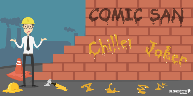
Comic Sans: Imitate It

People dislike Comic Sans so much that a petition was put up to ban it. The website Comic Sans Criminal, however, explained that all fonts have a personality and a purpose and that using Comic Sans is only appropriate when:

  • your audience is under 11 years old;
  • you’re designing a comic; or
  • your audience is dyslexic and has stated that they prefer the typeface.

Considering its purpose, Comic Sans isn’t that bad at all. In fact, a number of educators and designers prefer its “true a” form—or an “a” with a circle and a stick—since it is known as the basic model of the letter.
If you’re looking for a “true a” as well, use Comic Sans alternatives instead. HVD Comic Serif is a close substitute if you’re in need of an easygoing, comical typeface. For corporate presentations, Hattori Hanzo Light Italic is a good pick.
Play around with fonts and typefaces to find one that suits your brand and personal style. Keep in mind that two or three choices are enough. Overdoing it may risk the aesthetic of your slides, making your content hard to read and understand.
Improving Three of the Most Common Presentation Design Mistakes

Bullet Points: Limit Your Use

Bullet points are essential in keeping PowerPoint presentations organized. However, when used inappropriately, they can be detrimental to presentation design and its effectiveness. According to Brainshark, bullet points are ideal when updating a previous discussion or explaining simple points. Apart from allowing your audience to scan your content more easily,  these symbols allow them to concentrate on other parts of your speech.
However, to quote Ray Bradbury, “Too much of anything isn’t good for anyone.” Having too many bullets in your presentation doesn’t only make your content look disorganized but also leads your audience away from your point. To deliver an impactful speech, develop a great script that you can match with bullets and attention-grabbing visuals. Maintain a balance between the two to avoid a cluttered presentation.
You can also use headlines to construct your ideas. Headlines provide a snappy feel that engages and informs your audience. Simplify your points to guarantee the attention of your audience and the success of your pitch.
Good ol’ PowerPoint design elements may not be the rave today, but they can make a comeback in your presentation through creativity and resourcefulness. Go back to the basics of presentation design and allow yourself to innovate. Use alternatives while keeping your message and audience in mind. With this, you’ll be on your way to delivering a one-of-a-kind speech that your audience will remember.
 

Resources:

Belknap, Leslie. “Why Bullet Points Kill Presentations.” Ethos3. April 7, 2015. www.ethos3.com/2015/04/why-bullet-points-kill-presentations
Crerar, Paula. “PowerPoint Bullet Points: Do We Need Them?” Brainshark. January 24, 2012. www.brainshark.com/ideas-blog/2012/January/powerpoint-bullet-points-do-we-need-them
Gabrielle, Bruce. “PowerPoint Clip Art Is Dead. Now What?” Speaking PPT. February 16, 2015. speakingppt.com/2015/02/16/clip-art-dead
“6 Alternatives to Comic Sans (With a True ‘A’). Keri-lee Beasley. March 14, 2015. kerileebeasley.com/2015/03/14/6-alternatives-to-comic-sans-with-a-true-a

25 Important Design Elements for Designers

Every industry has its own set of jargons—even design. While having a so-called “eye for design” can help you go a long way, it’s not enough to cut the mustard. There are still some basic principles to follow and adhere to in order to achieve a certain credibility in the field. Before you can become a master of design, there are fundamental principles that you need to learn first. Design is as much a skill as a raw talent, after all.
You may be a natural artist who simply has a knack for creativity, but sometimes, that’s not enough, especially if the industry you’re trying to permeate is graphic design. There are conventions in this industry that you need to study in order to create useful and valuable artworks. Don’t get this wrong—you can certainly start random projects and find an audience for it afterwards. But if you want to become a prominent figure in the competitive design market, you need to study the game first to be one of the best.

The Importance of Design Elements

Art cannot exist without the pieces that comprise it, whether they be simple or otherwise. What lend a work of art an identity are the different elements that bring it to life. Those same elements set a convention through which a design enthusiast can appreciate or judge the beauty of an art form.
Another reason why the different elements of design are important is that they form a system around which the language of design revolve. Without these, art appreciation cannot be possible. To illustrate, imagine being asked to assess a work of art. If you don’t understand how design elements work, you’d be limited to making vague observations. However, if you’re well-spoken in this department, you’ll be able to express exactly which aspects of the design works or not.
The elements of design are important in so many levels. That’s why every designer and design enthusiast should strive to master them.
25 Important Design Elements for Designers

Resources:

Copperman, Amy. “8 Basic Principles of Design to Help You Create Awesome Graphics.” Adobe Spark. July 27, 2016. spark.adobe.com/blog/2016/07/27/8-basic-design-principles-to-help-you-create-better-graphics
Hortin, Anthony. “The 5 Basic Principles of Design.” Maddison Designs. March 27, 2009. maddisondesigns.com/2009/03/the-5-basic-principles-of-design
Taheri, Maryam. “10 Basic Elements of Design.” Creative Market. May 27, 2016. creativemarket.com/blog/10-basic-elements-of-design
Wong, Yoon Sann. “Graphic Designers: Cheat Sheets That Simplify Design Elements, Print Terms, More.” Design Taxi. September 2, 2016. designtaxi.com/news/388239/Graphic-Designers-Cheat-Sheets-That-Simplify-Design-Elements-Print-Terms-More

Why White Space Looks Good in Presentation Design

Amateur designers tend to overdo their work. They cram every good idea they have into one design, leaving no area untouched. In their determination to not waste any space, they end up creating a noisy composition that buries the most important graphic elements. The result? Clutter, confusion, and chaos.

Fixing a sloppy work is simple in principle, although it’s not exactly easy to execute. As a graphic designer, all you need to do is maximize the use of an element called “white space,” which is a misnomer because it doesn’t necessarily refer to a white space. In fact, it can be any color, texture, or pattern, as long as it’s an unmarked area that makes the crucial points of a composition stand out.

White space is also known as “negative space” because it makes the “positive space” pop by shrinking in the background and remaining there unnoticed. Its general purpose is to provide a breather for the eyes so that viewers can easily scan a page and find what they need. Still, despite the crucial role that this element plays, it’s still overlooked and underrated at times.

Let’s give white space its own deserved spotlight. Let’s look at it not only from an aesthetic angle but also from a practical perspective. What do you say?

The Two Levels of White Space

There are two levels of white space according to density, ratio, proportion, and general purpose: macro and micro.

  • Macro White Space. Obviously, macro white space is larger in volume compared to its counterpart. Plus, it’s easier to notice because it occupies the bigger portion of a given space. Its main purpose is to emphasize the focal points in a composition and give them structure, and its asymmetrical nature allows it to lend any work a more dynamic and candid look.
  • Micro White Space. This refers to the white space that exists naturally between letters, words, lines, grid images, and other smaller graphic elements. Its main purpose is to direct the flow and order of the content to make for a legible and neat composition.

The Advantages of Using White Space

You’d think the advantages of using white space are obvious, but some presentation designers still overlook them. For good measure, go over them here again to fully internalize the importance of this presentation design element.

1. Improves readability and comprehension

The average attention span of a human being is not as long as it used to be, so if you want to attract and keep your viewers’ attention, you need to give them a good reason to stay. One way to do this is by making it easy for them to navigate through your content. Reduce clutter and design a slide in such a way that the viewers can easily find what they’re looking for. Aim for better comprehension and readability. When people have a full grasp of what you’re trying to communicate, they’re more likely to stay and find out what else you have in store for them.

2. Draws the eyes to the most important points

When used properly, white space can minimize distractions and draw the eyes to the presentation’s central points. The human brain tends to put emphasis on design elements surrounded by white space since they essentially cue the audience as to where they should be looking. When you use white space to lead users from one design element to another, you can sell your main points faster and more effectively.

3. Adds a sense of superiority to the design

In the age of digital media, first impressions matter so much more than ever before. To imprint a good brand image on the mind of your audience, you should master the art of simplicity and minimalism. By using white space liberally and masterfully, you can lend finesse and elegance to your PowerPoint deck. Just take Apple and Starbucks for example. These brands glorify the “less is more” principle, and as a result, their products are considered as the paragon of luxury and sophistication.

On the other hand, less effective presentations tend to cram a hodgepodge of things into one tight space. Too many elements clashing with one another tends to cheapen a slide deck’s overall look. Remember, a tidy and uncluttered space looks more impressive than a heavily packed one. Give your content some breathing space and let it speak for itself.

4. Strikes a balance between texts and images

While the lack of white space results to confusion, an excess of it gives off the impression of incompleteness. Be mindful of how you apply white space lest you look incompetent by under- or overusing it. Aim to strike a balance between the different elements in your presentation design. Keep in mind what Mads Soegaard, the editor-in-chief in The Interaction Design Foundation, said, “White space is a great tool to balance design elements and better organize content to improve the visual communication experience…. For that, the white space is the real star of the show, working between the words and the pictures. It keeps each page from looking busy.”

So, there you have it—everything you need to know to care about white space. Now equipped with such knowledge, you shouldn’t look at this design element as “empty space” anymore. Your improved understanding of the role of white space in presentation design should allow you to put it into better use. Remember, the things you leave out are just as important as those you use.

Resources:

Cao, Jerry, et al. “Why White Space is Crucial to UX Design.” Fast Company Design. May 28, 2015. www.fastcodesign.com/3046656/why-white-space-is-crucial-to-ux-design

Lana, Michelle. “Why Whitespace Is So Important in Web Design.” Segue Technologies. September 10, 2015. www.seguetech.com/whitespace-web-design

Soegaard, Mads. “The Power of White Space.” Interaction Design Foundation. n.d. www.interaction-design.org/literature/article/the-power-of-white-space

Turnbull, Connor. “Using White Space (or Negative Space) in Your Designs.” Envato Tuts Plus. July 19, 2011. webdesign.tutsplus.com/articles/using-white-space-or-negative-space-in-your-designs–webdesign-3401

“White Space in Graphic Design, and Why It’s Important.” Printwand. n.d. www.printwand.com/blog/white-space-in-graphic-design-and-why-its-important

Infographic Dissection: Parts that Make Up a Good Infographic

A quick look at multiple blogs will reveal an amazing truth: infographics are all the rage for the past few years. Why wouldn’t they? They make complex concepts easily understandable and, generally speaking, make life simpler. On a lighter side, they’re quirky and fun—almost entertaining—to read.
Infographics, a portmanteau of the term “information graphics,” is not a new concept. From the late 18th century onward, information graphics have made data more visual and more appealing for study. As such, the tedious task of studying countless tables to compare numbers and figures became as simple as looking at graphs and/or charts (which, by all rights, are methods of data visualization). Today, most infographics are intended mainly for information dissemination, shareability, and traffic management.
This is not bad though; in fact, the statistics back it up. Infographics are liked and shared thrice more than any other visual material online. The very nature of the medium and the fact that they make tons of information easily understood (without wasting a good chunk of your time) make them likable, which adds to their popularity. Added to that is that humans are visual creatures, and you’re looking at one of the two most effective and most efficient methods edutaining; the other is video (think documentaries and the like).
In that surge of popularity, many people tried their hand at making infographics. Some came out great, while others aren’t. It’s unavoidable: Mass production usually results in poorer quality. While there are still some that stand out among the sea of mediocrity, it’s better to be reminded every now and then of what makes for a good infographic.
Although it’s not that difficult in theory, in practice, it can be very different. You need skills and excellent planning to pull it off. But if you’re confident that you can create an amazing infographic, remind yourself of what you need to put in your piece. Let the infographic below be your checklist on the what and the why.

Resources:

Taylor, Marcus. “The Anatomy of Creating a Great Infographic.” Venture Harbour. n.d. www.ventureharbour.com/the-anatomy-of-creating-a-great-infographic
“10 Types of Visual Content to Use in Your Content Marketing.” Mass Planner. October 21, 2015. www.massplanner.com/10-types-of-visual-content-to-use-in-your-content-marketing

Why Design Matters In Making a PowerPoint Deck

Design can be intimidating to incorporate in a deck. What if you have to prioritize content over it? Does aesthetics even matter in a presentation?

Actually, yes, design matters. And content. But it’s not a choice of one over the other. It’s best to have both. It’s great to meld the two concepts into one seamless idea. Having a design that compliments a presentation’s intended purpose complements your content and, ultimately, your message.

Purpose

What do you want your deck to be about? What is it for? These are the questions of purpose and meaning you need to have an answer for. Proper planning and thorough research are the backbone of any presentation. Once you’ve laid your foundations, it’s time to organize the information.

In comes design. Combine creativity and strategy to make data visualization engaging. As Scott Dadich, editor-in-chief of Wired, said: “Design and technology just aren’t that far apart.”

Make the data on your deck more appealing through visual representations. These includes charts, infographics, and powerful and appropriate images. It’s not limited to those either. Interpret information so that it makes sense and relates to your main objective. If you want to sell your idea, it needs to be clear and easy to understand.

Appeal

We can make sense of the technology around us using design. PowerPoint itself was designed so that anyone can make their own presentations. In effect, you now have the freedom to design your slides and the ability to control every aspect of it. Make it stand out by presenting your data beautifully and meaningfully.

Design matters because it makes your slides appealing. Make your ideas accessible and enticing on top of being immediately understandable. The effort to make sure your deck looks fantastic won’t go unnoticed. Not to mention that design can also help emphasize points.

Identity

Consistency and theme unify your deck. You can be consistent if you know your content by heart. It’s your task to tell the audience what your idea is. A sense of uniformity is key to making your slides memorable. Additionally, a theme gives your audience a general idea of your content.

Establish an unforgettable look in your audience’s minds. It’s easier to remember slides that have personality and character. When you make it stand out, your viewers can identify with your vision.

Make your ideas recognizable early on. You’re closer to perfecting your pitch once you’ve made a good impression on your audience. Having a design in mind lets you visualize your final product from the beginning of your preparation.

Excellence in Design

There’s a sense of aesthetics everywhere. Letting your visuals work together with your content benefits your presentation. Research and develop your deck’s content carefully.

Preparation is important to achieve absolute clarity in your deck. A clear purpose helps visualize your intention. Integrate your ideas in a design to make it more communicable and solve the problem of making your subject engaging. With fine-tuned content and unified design, your deck will be more unique and have the attention it deserves.

References:

Dadich, Scott. “Letter From the Editor: Why Design Matters More Now Than Ever Before.” Wired.com. September 30, 2014. www.wired.com/2014/09/editors-note-design-issue

Joseph, Therese. “VISUAL BEST PRACTICES FOR PRESENTATIONS.” Shift Collaborative. June 8, 2014. www.shiftcollaborative.com/visual-best-practices-for-presentations

Marie, Irev. “5 Reasons Why Good Design Matters To Your Business.” Simplio Web Studio. August 19, 2015. www.simpliowebstudio.com/5-reasons-why-good-design-matters-to-your-business

Noar, Adam. “5 Tips and Tools for Designing a Stand-Out Presentation.” Design Shack. February 20, 2013. www.designshack.net/articles/graphics/5-tips-and-tools-for-designing-a-stand-out-presentation

Stribley, Mary. “30 Advertisement Design Tips That Turn Heads: Brilliant Case Studies.” Canva. July 1, 2015. designschool.canva.com/blog/advertisement-design-tips


Featured Image: “wings” by Asparukh Akanayev on flickr.com

5 Design Tips to Avoid Becoming a Presentation Killer

Let the verdict decide whether a presenter is guilty of Death by PowerPoint, otherwise known as the presentation killer, or the never-ending boring bullet point marathon.

We’ll be here to help and guide you to make the right design choices so that your deck won’t be next in trial.

It all begins with the first impression. Take a look at the first slide on your deck right now and evaluate whether the design looks consistent with your brand.

If it fails to meet the criteria, it might be time to take some design pointers to keep your deck moving on the right track.

Between 65-85% of people describe themselves as visual learners. You could be tuning out a lot of people during your presentation if your slides don’t have images that support your message.

We’ll briefly touch on Guy Kawasaki’s 10-20-30 rule and how they can keep you from becoming a presentation killer.

1. Consistent Design

Consistency helps build your brand’s identity.

What’s your brand known for, and how can you translate this concept through design? Being consistent means building your reputation over time by staying true to the company’s values.

But a company changing hands or shifting in direction happens and can be a challenge to handle.

For example, Logitech’s rebranding came about from CEO Bracken Darrell changing their offerings beyond selling computer mice. So they changed the logo to reflect their change in direction.

Update your company’s image to stay consistent with your brand’s values and identity.

2. High-Quality Images

In your first slide, feature your brand front and center.

Have a clear, high-quality image of your logo so that your audience can immediately identify your brand.

Don’t use low-quality images that look pixelated on screen. Not only does it look distracting and unprofessional, but it puts your brand’s image in a negative light as a result.

Avoid filling your deck with too many images, as it can inflate your PowerPoint file’s size. Resize images that don’t need to be emphasized to avoid this problem.

3. Strategic Color Choice

Colors have a strong psychological impact that can influence the way we feel and think, so craft a strong image for your brand’s identity.

Image plays a major part in social media, and image-building should take priority especially when you want your brand to stand out.

This infographic from DesignMantic is a handy guide to profile your business and match it with a suitable color combination.

For example, businesses in the healthcare industry commonly use the colors red and green because of the psychological effect of these colors. The color red denotes attentiveness and determination while green represents hope, endurance, and safety. You can use these colors and other combinations to create a color profile that inspires trust in your brand.

4. Complementary Images

Take caution when you choose an inspirational image for your slide. It can detract from your message if it’s too striking. This means choosing a beautiful yet abstract image fails to support your message because it becomes a source of distraction.

The audience could become too absorbed with your image that they fail to see your point.

The images you pick should support your message and help the audience make a meaningful decision about your presentation.

Choose your supporting images carefully and make sure that it’s connected to the product or service that you’re offering.

5. The 10-20-30 Rule

Be careful how much content you pump into your slides.

Guy Kawasaki, former chief evangelist of Apple, is a proponent of the 10-20-30 rule. His guidelines will give your pitch precision and maximize engagement with your audience. Deliver your presentation in ten slides, for twenty minutes, in a font no smaller than thirty points: that’s the 10-20-30 rule.

It compels the presenter to reduce slide clutter in favor of a concise pitch.

The time constraints are in place because when you’re pitching to a VC, you can’t afford to waste anybody’s time. And the large font size is there so that the presenter won’t read off the slides and focus on their delivery instead.

Imagine pitching to Guy Kawasaki himself and the 10-20-30 rules starts to make sense. Create an impressive pitch by taking heed of his rules.

Make Killer Presentations

You should always make a good first impression, so build a good image by following design choices that will support your brand and your message.

Build trust by selecting colors that communicate your brand’s values. Your pitch should include images that support your message, but be aware that having too much in your deck can increase your file size dramatically.

The use of overly inspirational images can backfire on you if it fails to support your message, so exercise some restraint when you think about placing one in your deck.

Guy Kawasaki is a VC himself, so he understands and knows the pitch that gets attention. His popular 10-20-30 rule should key you in on the template that can win an investor.

Get a free quote from our SlideGenius experts to effectively get your message across in your deck and pitch.

References

“[INFOGRAPHIC]: Color Your Brand Industry-wisely!” DesignMantic. March 18, 2014. Accessed December 21, 2015. www.designmantic.com/blog/color-your-brand-industry-wisely

“Guy Kawasaki – The 10/20/30 Rule of PowerPoint.” Guy Kawasaki. December 30, 2005. Accessed December 21, 2015. http://guykawasaki.com/the_102030_rule

“How to Evaluate PowerPoint Presentation Slides?” Presentation Process. N.d. Accessed December 21, 2015. www.presentation-process.com/evaluate-powerpoint-presentation.html

“New Logo and Identity for Logitech by DesignStudio.” Brand New. July 8, 2015. Accessed December 21, 2015. www.underconsideration.com/brandnew/archives/new_logo_and_identity_for_logitech_by_designstudio.php#.VneM-_krKUk

Vong, Katherine. “Image Is Everything: Why People Are Hooked on Image-Based Social Media.” TrendReports. August 13, 2012. Accessed December 21, 2015. www.trendreports.com/article/imagebased-social-media

Featured Image: “Just the tip of the iceberg” by Myxion flickr.com

Advertising PowerPoint Design Tips: Make Your Visuals Talk

In simple PowerPoint design, images visually support your words, creating a memorable image in your audience’s minds. However, you can play with this basic structure and create something more engaging. In Cutting Edge Advertising, Jim Aitchison suggests the use of metaphors, adjusting your text and images’ placement, or making a bent headline or visual.

Center your messages on a clear, specific idea by making an interesting image and supporting it with a straightforward tagline (and vice versa). Once your listeners can picture your message for themselves, your product or service will stick in their minds long after you finish the sales presentation.

Sell more effectively by combining this factor with clear-cut messages.

Bent Images with Straight Headlines

Apply the twist here to represent your idea in the image. Show a metaphor, a comparison or a dominant image.

The Business Times and The Economist print ads both talk about giving you the whole picture when you read their news. The images—the text cut in half, the binocular-shaped magazines and the Rubix cube— are all twisted to prove their points.

Keep your message, font, and text size simple so your clients focus on the image without distractions.

Bent Headlines with Straight Images

You can also show your idea in the headline and support it with a normal image. Clever word puns and verbal metaphors all come in handy as seen in the Cigarillos and Timberland print ads.

The text needs to be interesting or provocative enough to get your audience thinking. Otherwise, you’ll get a bland and uninteresting overall visual.

The Secret: Be Consistent

Choosing between the two approaches depends on how you want to emphasize your idea. Once you decide to either bend your text or image, be consistent with your messages.

The Business Times and The Economist had one main idea, similar to how Timberland emphasized their durability.

Emphasize one main idea, stick to it and support it with relevant facts. Making a striking visual impact ensures that audiences remember you long enough to contact you for a business deal.

References

Aitchison, J. Cutting Edge Advertising: How to Create the World’s Best Print for Brands in the 21st Century. Singapore; New York: Prentice Hall, 2004.
Diaz, Ann-Christine. “The Economist’s New Campaign Dishes Out Real — and Metaphorical — Hot Potatoes.” Advertising Age News. November 11, 2013. Accessed August 3, 2015.
Fine-tuning Your Presentation’s Core Message.” SlideGenius, Inc. November 11, 2014. Accessed August 3, 2015.
PowerPoint Visual Design Tips From Ads: Text & Image Balance.” SlideGenius, Inc. July 22, 2015. Accessed August 3, 2015.

-->