Slidegenius, Inc.

Apply the 10/20/30 Rule to Your PowerPoint Presentations Now

Guy Kawasaki is a successful venture capitalist who has been writing books about the trade since 1987.

A few years back, he wrote a short blog advocating a simple rule for PowerPoint & pitch deck presentations. He called it the 10/20/30 Rule of PowerPoint.

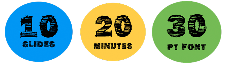
According to the 10/20/30 rule:

…a PowerPoint presentation should have ten slides, last no more than twenty minutes, and contain no font smaller than thirty points.

Kawasaki came up with this quick presentation style due to his line of business, citing how he’d often listen to dozens of pitches in a short period of time.

However, even if you’re not in the venture capital business, the 10/20/30 rule can still be applicable to your goals.

Given people’s increasingly shortening attention spans, keeping your presentation compact can save all of you time while still getting the meat of your message across.

Here we expound on each of Kawasaki’s points. But first, the 10/20/30 Rule in his own words:

Rule #1: 10 Slides

Kawasaki pointed out that it’s challenging to comprehend more than ten concepts in a meeting.

Most people assume that you need to be highly detailed in order to be impressive, but this isn’t always the case.

The 10/20/30 rule also suggests that you use the ten slides to tackle all the topics important to your audience. For a venture capitalist, these topics are the following:

  1. Problem
  2. Your solution
  3. Business model
  4. Underlying magic/technology
  5. Marketing and sales
  6. Competition
  7. Team
  8. Projections and milestones
  9. Status and timeline
  10. Summary and call to action

Use this list as a guide when you’re trying to condense your presentations into neat, salient points.

Depending on the type of presentation you’re giving, you can tweak these to fit your purpose, but try to keep your slides to a minimum, with a visible flow like the one above.

Rule #2: 20 Minutes

You should be done with your ten-slide presentation in twenty minutes.

Kawasaki would often allot an hour to hear an entrepreneurial pitch, but most of the time gets lost in other things. (For instance, your laptop might take a while to sync with the projector.)

Emergencies might also pull your audience away from the meeting. It’s best to keep your presentation short so that you’ll also have time to address questions and other concerns.

Rule #3: 30-pt Font Size

Kawasaki observed that the only reason people used smaller font sizes is to be able to cram huge chunks of text into a slide.

In doing so, your audience may perceive that you’re not familiar with the material and that you’re using the PowerPoint as a teleprompter.

The 10/20/30 rule forces you to use a larger font, so you can cut back on unnecessary details. Remember: you’re the one who has to do the talking, not your PowerPoint presentation.

10 slides in 20 minutes using a font no smaller than 30 points. Easy enough, right?

Are You Looking for a custom-designed PowerPoint Pitch Deck? Schedule a FREE presentation consultation now!

Featured Image: Lostium Project via Flickr

Tech Presentations: Generating Leads for Writing Projects

Creating a tech presentation for your start-up isn’t easy.

What’s too much information? Is it easily understood? More importantly, will it make anyone want to invest in your efforts?

At SlideGenius, we’ve been helping technology and software companies create successful presentations for years. We know how hard it can be to get it right and how badly things go wrong if you don’t.

That’s why we’re here to help.

Before you ever get to the visuals, you need to find the right things to say. If writing isn’t your strong suit, here are a few tips that will help you create a communicative presentation that will turn your question marks into dollar signs.

Don’t Put All Your Knowledge on the Slides

One of the biggest mistakes people make is overexplaining.

People often forget that the visual aid is being shown behind the speaker. The speaker is the only one who needs to explain everything at length. The presentation is there to make it easy for the audience to follow the flow of the discussion.

Good presentations only have the nuggets of gold that comprise the value of the overall message. They present things in a manner that creates interest. They neither compete with the speaker nor do they divert your audience’s attention from the presenter.

Often a person will worry that their PowerPoint has not had every facet written into the slide, especially when introducing new technology or software.

“People won’t understand…!” they fret. Perhaps not. But if everything the speaker knows is in the presentation, the speaker is superfluous. If everything you know about how platform works is up there, it robs you of any perceived genius.

And a presentation alone will not hold the same attention that a human being will.

The speaker is the most important part. They should be authentic and credible, not someone who knows only as much as the PowerPoint presentation.

PowerPoint Slides Are Small, So Keep Word Counts Low

An effective presentation is composed of equal parts copy and visuals. You have to remember that this isn’t some pamphlet or manifesto handed out desperately on some street corner. Without the right visuals, your audience will spend their time wondering when it will end.

Even a skilled writer who fills their slides with text will find themselves overlooked. A less-than-skilled writer will only amplify their shortcoming.

There isn’t a hard and fast rule as to how many words there should be on a slide, but we try to stick to 75 words and below. Remember, less is more.

Leave Room for Visuals

Many people struggle with abstract concepts. It’s less a product of intelligence and more simply that most people who have the resources to invest in your project likely already have a lot of moving pieces in their lives.

The advantage of this is it alleviates some of the burden on you as a writer. After all, what can demonstrate how your technology works better than a well-created chart or a high res mock-up? The secret of images is that they help people turn concepts into reality.

Where do you place the images? Images, especially in a pitch deck designed to raise funds, belong in “Act 2” of the presentation.

They should appear after the problem has been established and the solution has been presented. These should make your products and services stand out, explain how they works.

These should make what you’re offering as tangible as possible.

When you’re outlining your script, make sure you’re leaving room dedicated to that.

Get Help from People Who Understand Tech Presentations

At SlideGenius, we have been helping people like you looking to outsource tech presentation designs since 2012. We’ve helped people raise hundreds of millions of dollars in that time. If there’s a lot riding on your presentation, you should reach out and talk to one of reps about what your needs are.

Our team of writers will help you create the structure and copy you need. Their work allows your genius to come to the forefront and enables our design team to create the visuals you’re looking for.

Don’t struggle alone. Pick up the phone today.

The Power of Language in Your Presentations

Imagine life without language. Hard, isn’t it?

When you’re giving a presentation, whether it’s to raise money, making a sales pitch or just helping people to learn more about your business, the words you choose are everything.

Language is deeply ingrained in us, intertwined with our beliefs, culture, identity, and our experience as humans. It is the representation of the reality that we live in and it is the tool we use to make sense of the world.

It is a social construct and humans are inherently social creatures. It reflects our reality and holds significant power over us. The question is how?

The Science of Language

Linguists and philosophers believe that language shapes how we perceive the world through our understanding of its structure and how the meaning is conveyed to us. Aristotle started the conversation with his concept of rhetoric, which is the art of persuasive speaking or writing. This art form touched lightly on compositional techniques, and later became part of the umbrella that is linguistics, the study of language.

Since our perception of the world is limited by the language that we use, language is a powerful tool that can be used to set limits.

People in power have used speeches to move their audience and gather supporters, their ideologies delivered in a way that evokes their intended social effects. Their beliefs and ideas are often delivered by organizing specific words in patterns, coupled with grammar style that is razor sharp in its precision.

“You need to do it” versus “just do it.”

“You need to do it” implies a directive. An average person will tend to bristle at it. Remember during your teenage years, when your parents tell you to do something and you do the complete opposite? The use of the word “need” tells the listener that something must be done or else. The former takes away the agency of the person and the first instinct is usually to defy it.

“Just do it,” on the other hand, is not only short and concise (perfect for recall) but also gives leeway for the listener to decide whether to do it or not. It gives them a choice. Using “just” at the beginning of the sentence suggests that the speaker is daring the listener to do something. It motivates the listener to respond to the challenge… no more excuses.

Just do it.

You can influence people with the right language in the right order. It’s all about how you say it.

Language as a Symbol

Before you go and call the best PowerPoint design company that you could find, consider the content first.

Through linguistics came semantics, which is the study of meaning and offers an in depth look at signifiers. Ferdinand de Saussure states that language is a self-contained system composed of signs that function based on their relationship with one another. Each sign has a unique meaning shaped by culture and experience within that system.

For example, the color “red” has different meanings around the world. Love in the West, good luck in Asia, and death in Africa. The same principle is applicable to language as words are symbols, that carry their own meaning.

Remember that words signify different meanings. Are you “mad” or “furious?” Mad implies anger that will pass, while being “furious” denotes that a mere apology will not be acceptable.

Consider the words and phrases that you will use in your presentation, as the words you choose to use can evoke reactions such as worry, joy, happiness, and anger.

Remember that language is more than words. It signifies the meaning behind the words. Once you have grasped the nuances of the language that you intend to use in your presentation, you may call a PowerPoint expert to handle the design for you. Paired with the optimal body language, your presentation is sure to be an unforgettable experience.

Choose the Best Word for Your Message

Not sure you’re communicating your story as best you can? At SlideGenius, we help people just like you tell their stories better. No matter the industry, no matter the time frame, we can help you to take your project and make sure you’re getting the most out of it. We’ve done it for thousands of clients already. Just reach out for a free quote.

-->