Aristotle and the Art of Persuasion: Delivering a Persuasive Sales Pitch

business presentation

communication

design

public speaking

Aristotle, the ancient Greek philosopher, is credited with developing one of the most enduring frameworks for persuasion. His work on rhetoric, particularly the principles of ethos, pathos, and logos, remains relevant todayโ€”especially for anyone looking to deliver a persuasive sales pitch. By integrating these principles, sales professionals can engage their audience, build trust, and convince them to take action.In this article, weโ€™ll explore how Aristotleโ€™s Art of Persuasion can be applied to modern sales pitches, providing you with a blueprint for crafting compelling, persuasive presentations.

Ethos: Establishing Credibility and Trust

What is Ethos?

Ethos refers to the speaker’s credibility, authority, and character. In a sales context, ethos is about building trust with your audience, demonstrating that youโ€™re knowledgeable, reliable, and aligned with their values.

How to Apply Ethos in Your Sales Pitch

  1. Highlight Your Expertise: Begin your sales pitch by demonstrating your experience and knowledge in the field. Share your professional background, success stories, and any relevant industry credentials to reassure your audience that youโ€™re a credible source of information.
    • Example: โ€œWith over 10 years of experience helping companies in your industry streamline their supply chains, weโ€™ve developed strategies that lead to measurable results.โ€
  2. Leverage Testimonials and Case Studies: Including testimonials or case studies from previous clients builds trust. Prospective customers are more likely to believe in your product or service if others have had success with it.
    • Example: โ€œLast year, our solutions helped Company X reduce costs by 25% and improve operational efficiency by 30%โ€”and weโ€™re confident we can do the same for you.โ€
  3. Show Integrity: Be transparent about your offeringโ€™s strengths and weaknesses. Acknowledging potential challenges shows honesty and builds long-term trust with your audience.
    • Example: โ€œWhile our platform requires an initial setup period, our clients have found that it offers long-term benefits in terms of scalability and cost savings.โ€

Pathos: Engaging Emotions

What is Pathos?

Pathos appeals to the audience’s emotions. In sales, pathos is about making a personal connection with your prospects and understanding their needs, frustrations, or desires. A strong emotional appeal can drive decisions and motivate action.

How to Apply Pathos in Your Sales Pitch

  1. Tell a Story: Humans are naturally drawn to stories, and stories evoke emotions that facts and figures alone cannot. Use storytelling to connect with your audience on a deeper, more emotional level.
    • Example: โ€œImagine a future where your team spends less time troubleshooting inefficiencies and more time focusing on innovation and growth. Thatโ€™s what we aim to help you achieve.โ€
  2. Address Pain Points: Understand the problems your prospects face and empathize with their frustrations. Use these pain points to create urgency and frame your product as a solution.
    • Example: โ€œWe know that managing multiple suppliers can be a logistical nightmare, leading to missed deadlines and increased costs. Our solution simplifies the process, giving you more control over your operations.โ€
  3. Create a Vision of Success: Help your audience visualize the benefits of your product or service by painting a picture of what their future could look like if they adopt your solution.
    • Example: โ€œImagine how much time and money youโ€™ll save with automated processes, leaving your team free to focus on strategic growth.โ€

Logos: Presenting Logical, Fact-Based Arguments

What is Logos?

Logos refers to logical appealโ€”using data, statistics, facts, and clear reasoning to persuade the audience. In sales, logos helps establish that your offering is not only beneficial but also practical and valuable.

How to Apply Logos in Your Sales Pitch

  1. Use Data and Statistics: Include hard numbers and evidence that show how your product or service delivers results. Data adds weight to your claims and helps support your key points.
    • Example: โ€œOur software has been shown to reduce inventory management costs by 15% in just the first quarter, according to recent client data.โ€
  2. Provide a Clear and Structured Argument: A persuasive pitch should follow a logical progression. Present your productโ€™s features and benefits in a clear, step-by-step manner that makes it easy for the audience to follow your argument.
    • Example: โ€œFirst, weโ€™ll implement our system to integrate your current infrastructure. Then, our data analytics will give you real-time insights to optimize supply chain operations, resulting in immediate cost savings.โ€
  3. Break Down the ROI: Explain the return on investment (ROI) clearly and concisely, demonstrating how the cost of your product or service will be outweighed by its long-term benefits.
    • Example: โ€œWhile the initial investment is $50,000, our clients typically see savings of $100,000 within the first yearโ€”doubling their return.โ€

Combining Ethos, Pathos, and Logos in Your Sales Pitch

The key to Aristotleโ€™s art of persuasion is balance. To deliver a persuasive sales pitch, you must effectively combine ethos, pathos, and logos in a way that resonates with your audience. Hereโ€™s how to weave these elements together for maximum impact:

1. Start with Ethos: Establish your credibility right from the start. Build trust by showing your knowledge and understanding of the clientโ€™s needs. Share success stories and professional expertise.

2. Engage with Pathos: Once youโ€™ve established your credibility, tap into the emotional side of your audience. Empathize with their challenges and paint a picture of success that appeals to their desires. Make the problemโ€”and the solutionโ€”personal.

3. Back It Up with Logos: Support your emotional appeal with logic and evidence. Present data, statistics, and clear reasoning to demonstrate the effectiveness and value of your product. Ensure your pitch has a logical structure thatโ€™s easy to follow.

Practical Example: A Sales Pitch Using Aristotleโ€™s Framework

Letโ€™s put it all together with a sample sales pitch for a fictional software company:

Introduction (Ethos):

โ€œAs the leading provider of supply chain management software with over a decade of experience in this industry, weโ€™ve helped companies like yours streamline their operations, reduce costs, and improve efficiency.โ€

Identify the Problem (Pathos):

โ€œWe understand how overwhelming it can be to manage multiple suppliers, track inventory, and meet deadlines. These daily challenges can create stress for your team and negatively impact your bottom line.โ€

Present the Solution (Logos):

โ€œOur cloud-based platform offers real-time data analytics, automated reporting, and seamless integration with your existing systems. On average, our clients see a 20% reduction in supply chain costs within six months of implementation. With a projected ROI of 150%, the investment quickly pays for itself.โ€

Close with a Call to Action (Ethos + Pathos):

โ€œWe believe in long-term partnerships with our clients, ensuring that you have the tools and support to achieve your goals. Letโ€™s work together to bring your operations to the next levelโ€”creating more efficiency, better results, and less stress for your team.โ€

Conclusion

Aristotleโ€™s principles of persuasionโ€”ethos, pathos, and logosโ€”remain powerful tools for anyone delivering a sales pitch today. By establishing credibility, connecting emotionally with your audience, and backing your claims with logic and evidence, you can create a pitch that not only informs but also inspires action. When these elements are woven together seamlessly, your sales pitch becomes a compelling story that resonates with your audience and drives results.

The Art of Persuasion: Delivering a Persuasive Sales Pitch

business presentation

communication

design

public speaking

Influence should be your main concern when it comes to speaking before an audienceโ€“may it be consumers, employees, teammates, or potential investors. Your goal is to make an impact big enough to either change your audienceโ€™s opinion or strengthen an already existing point of view.The point of an effective sales pitch is to persuade your audience into buying or to think about your presentation, may it be a product, service, or concept. To do so, you must appeal to the listeners and convince then that what youโ€™re offering is the most favorable choice.The content and design of your custom PowerPoint should work together to convince your audience.The Greek philosopher Aristotle (384-322 B.C.) was incredibly influential, especially that he made significant and lasting contributions to various aspects of human knowledge. One of his concepts included the modes of persuasion, which, according to him, can be furnished by the spoken word. These are as follows:

Ethos (Credibility)

When delivering a presentation, you must assert your credibility and intelligence as a speaker. Your tone, pitch, and diction help establish thisโ€“you have to look and feel confident. Stage presence is also necessary in gaining the audienceโ€™s trust.How do these factors translate to your PowerPoint presentation?Include your credentials in a self-introduction slide.Let your audience know who you are and what you specialize in, as these give your listeners a sneak peek into your expertise. If you have achievements that would help build your credibility as a speaker in the field, the better.Leverage your credibility by quoting other industry experts.Quoting industry experts add value to your presentation. It shows how familiar you are with the topic, boosting your credibility.

Pathos (Emotion)

The emotional content of your presentation makes it more memorable. That said, you become a better speaker when you have the ability to work with your audienceโ€™s emotions just as you handle your own.How will you add an emotional factor to your slides?Tell a story.Stories can get in touch with your audience on a personal level, hence making it an effective presentation technique. The more people can relate to it, the better they understand what the pitch is all about.Rehearse your pitch in front of other people and have them give you feedback. Remember that storytelling can either make or break your presentation so you have to make sure that the story youโ€™re sharing is appropriate for your audience.Evoke emotions through visuals.Colors have the power to change or reinforce your audienceโ€™s mood in a matter of seconds. Apart from the design itself, companies that build presentation decks put the palette they use into careful consideration.

Logos (Logic)

Aristotle emphasized the appeal to logic and reasoning the most. Once youโ€™ve captured your audienceโ€™s attention, the next step is to take action. Convince them that the change or action is within reason and in their best interest.Survey results, market data, trendsโ€“the last mode of persuasion is the most common and the easiest to incorporate into a presentation.How can you incorporate logic and reasoning into your custom PowerPoint presentation design?

Use backup in the form of case studies and testimonials.

When you include these into your presentation, it shows the effects of the practices, ideas, products, or services, in action.

Use common concepts as analogies and make comparisons.

Explaining complex concepts may not be an easy feat, but if you make the right analogies and comparison, those who may not know much about the subject can easily understand the topic.While these strategies may seem obvious to many people, there are still those who are miss out on the advantages that these pointers give to the presentation itself, making them bland and unconvincing.Hopefully, you apply these to your next sales pitch. Not only will you improve your credibility, but these will increase your confidence, too.

Presentation Design No-Noโ€™s That You Can Fix

design tips

presentation design

presentation design tips

The way presenters design their pitches has evolved. As Microsoft PowerPoint launches new features that boast of contemporary design and high-end technology, users become more aggressive and innovative in creating their slides. Pitches have become more promising, ultimately helping businesses attain their goals.Despite the progression, some presenters still fail to provide a visually-appealing pitch that can entice their audiences. Ugly typefaces, tacky transitions, and pixelated images continue to surface, making a presentation look horrible, or worse, unprofessional.Fortunately, with a little imagination and research, bad presentation design choices can be improved. One can still live up to the standards of modern design through good old PowerPoint elements that have seemed to fade away over time. Challenge the world of presentation design and project an appealing PowerPoint by trying out the following design tips.Improving Three of the Most Common Presentation Design Mistakes

Clip Art: Tweak It

Clip art is dead. In December 2014, Microsoft retired its clip art gallery and gradually added several PowerPoint features such as Shapes, Icons, and Online Pictures. Gone are the days of cartoons in presentations as designers and presenters now prefer custom images when visualizing a point. Apart from communicating a message more clearly, the dawn of vectors and photographs allowed PowerPoint users to create a more personable and contemporary-looking deck.Many websites offer free and editable stock images, which you can download without signing up. Modify them according to your need and make sure that they suit your presentationโ€™s message. Wrong use of stock photography can show your lack of authenticity and creativity, and that can ruin the overall look of your presentation design.If you are, however, keener on using objects and illustrations, PowerPointโ€™s Shapes and Icons are a great way to add more life to your presentation. Choose from a broad range of predesigned elements by clicking โ€œInsertโ€ in PowerPointโ€™s Home tab, which now has the โ€œScreenshotโ€ option as well.Improving Three of the Most Common Presentation Design Mistakes

Comic Sans: Imitate It

People dislike Comic Sans so much that a petition was put up to ban it. The website Comic Sans Criminal, however, explained that all fonts have a personality and a purpose and that using Comic Sans is only appropriate when:

  • your audience is under 11 years old;
  • youโ€™re designing a comic; or
  • your audience is dyslexic and has stated that they prefer the typeface.

Considering its purpose, Comic Sans isnโ€™t that bad at all. In fact, a number of educators and designers prefer its โ€œtrue aโ€ formโ€”or an โ€œaโ€ with a circle and a stickโ€”since it is known as the basic model of the letter.If youโ€™re looking for a โ€œtrue aโ€ as well, use Comic Sans alternatives instead. HVD Comic Serif is a close substitute if youโ€™re in need of an easygoing, comical typeface. For corporate presentations, Hattori Hanzo Light Italic is a good pick.Play around with fonts and typefaces to find one that suits your brand and personal style. Keep in mind that two or three choices are enough. Overdoing it may risk the aesthetic of your slides, making your content hard to read and understand.Improving Three of the Most Common Presentation Design Mistakes

Bullet Points: Limit Your Use

Bullet points are essential in keeping PowerPoint presentations organized. However, when used inappropriately, they can be detrimental to presentation design and its effectiveness. According to Brainshark, bullet points are ideal when updating a previous discussion or explaining simple points. Apart from allowing your audience to scan your content more easily, these symbols allow them to concentrate on other parts of your speech.However, to quote Ray Bradbury, โ€œToo much of anything isnโ€™t good for anyone.โ€ Having too many bullets in your presentation doesnโ€™t only make your content look disorganized but also leads your audience away from your point. To deliver an impactful speech, develop a great script that you can match with bullets and attention-grabbing visuals. Maintain a balance between the two to avoid a cluttered presentation.You can also use headlines to construct your ideas. Headlines provide a snappy feel that engages and informs your audience. Simplify your points to guarantee the attention of your audience and the success of your pitch.Good olโ€™ PowerPoint design elements may not be the rave today, but they can make a comeback in your presentation through creativity and resourcefulness. Go back to the basics of presentation design and allow yourself to innovate. Use alternatives while keeping your message and audience in mind. With this, youโ€™ll be on your way to delivering a one-of-a-kind speech that your audience will remember.

Resources:

Belknap, Leslie. โ€œWhy Bullet Points Kill Presentations.โ€ Ethos3. April 7, 2015. www.ethos3.com/2015/04/why-bullet-points-kill-presentationsCrerar, Paula. โ€œPowerPoint Bullet Points: Do We Need Them?โ€ Brainshark. January 24, 2012. www.brainshark.com/ideas-blog/2012/January/powerpoint-bullet-points-do-we-need-themGabrielle, Bruce. โ€œPowerPoint Clip Art Is Dead. Now What?โ€ Speaking PPT. February 16, 2015. speakingppt.com/2015/02/16/clip-art-deadโ€œ6 Alternatives to Comic Sans (With a True โ€˜Aโ€™). Keri-lee Beasley. March 14, 2015. kerileebeasley.com/2015/03/14/6-alternatives-to-comic-sans-with-a-true-a

Stock Photography and How It Can Ruin Presentation Design

Photography

presentation design

presentation tips

Look around you. Youโ€™re bound to see a picture or ten. Itโ€™s amazing how images have permeated the collective mind. But in hindsight, they have always had the power to do so. Historically, cave paintings served as the first method of documentation. Ancient Egyptian hieroglyphics were mostly drawn or carved. One could even say that everything you see is an image, scientifically speaking.With that much influence, itโ€™s no wonder that pictures have spread far and deep into the collective subconscious. So much that it became the driving force for the invention of the camera, making portraits easier to create and, after many technological advances over the decades, instant.In that same vein, photographs became available online, including stock images. But the term has been met with both positive and negative reactions. There are arguments from both sides saying that stock photography is cheapโ€”if not downright freeโ€”but that, legally, youโ€™re better off using originals.Where do you side in the argument? Presentation design-wise, youโ€™re better off not using stock photography for your deck and instead creating your own that fit your or a presentation agencyโ€™s designโ€”a.k.a. the perfect images for your slides. Here are reasons why.Stock Photography and How It Can Ruin Presentation Design

Lack of Authenticity and Creativity

Thereโ€™s no greater show of designer laziness than using stock images. Why? Because itโ€™s already available online. You can get one with just a few clicks. Never mind using your own resources for that photoshoot (which doesnโ€™t have to be grand to begin with).Using stock images is the easy way out. Thereโ€™s a certain lack of creativity that stock images display because all it takes is a โ€œyes or noโ€ choice: does it portray what I want? Instead of getting specifically what youโ€™re looking for, you settle for another since itโ€™s ripe for the taking. While there are alternatives, like your own shoot, it wonโ€™t be as easy as just downloading one.It doesnโ€™t help, too, that stock images are easily obtainable from the Internet. What are the chances that youโ€™re the only one using a particular photo? Zero. Itโ€™s bound to show up in places you wouldnโ€™t expect, which leads to โ€ฆStock Photography and How It Can Ruin Presentation Design | Designer laziness

Overfamiliarity

You know how the first time you hear a funny joke, you canโ€™t stop laughing? Then it gets repeated over and over, and it isnโ€™t humorous to you anymore? Itโ€™s the same with stock images. The more your audience has seen a photo you used on your presentation design, any hope of impact you intended is gone.Itโ€™s because theyโ€™re already familiar withโ€”if not outright expectingโ€”it. That they have seen the exact photo, if not the same actions, connotations, and justifications elsewhere, should always be a consideration. This is especially true when even in your search, there were dozens of images like the one you chose. โ€œFamiliarity breeds contempt,โ€ goes the adage.Whatโ€™s an alternative then? If you must use stock images, then be unpredictable. If youโ€™re looking for a picture of a business meeting, then donโ€™t choose common ones, like room full of executives. Try a coffee shop meeting or a team building to show something new and fresh. If you canโ€™t find one, then why not shoot your own or even choose one from your albums? How about that for a new take on the term โ€œstock photographyโ€?Stock Photography and How It Can Ruin Presentation Design | OverFamiliarity

Inconsistent Feel

Presentation design revolves around a theme, often the brand or topic. When youโ€™re designing images, you keep said motif in mind, wanting to adhere to it and keep the whole deck consistent.There isnโ€™t much wiggle room for this, however, when your pool is piled with stock images. You have no control over the art direction of the image you have chosen since itโ€™s just there, and how you use it becomes the question. This may present problems, but of course, if youโ€™re really persistent, you can find one you can settle on. But even then, it still feels out of place.Thereโ€™s also what may be construed as โ€œforced imagery,โ€ wherein a picture barely symbolizes or depicts the topic at hand but is instead accompanied by lengthy justifications at how itโ€™s really illustrating the point. Not only does this need a contrived explanation, but it also denotes poor planning on your part.Stock Photography and How It Can Ruin Presentation Design | Inconsistent feel

Post-Development

Stock images are readily available, but just because you can download them doesnโ€™t mean you should. Itโ€™s not like there arenโ€™t better alternatives out there; itโ€™s merely the easiest way out. And if you think that wonโ€™t cost you anything, think again.As a legal matter, there are many loopholes and gray areas on creative commons and copyrights. When itโ€™s that open-ended and indefinite, you can bet that there are people who can and will make some money out of it by suing you or others for using their photos for unintended reasons, like commercial purposes.Would you rather risk that possibility or take delight in the pleasure and satisfaction that your image is your own? You help not only yourself by minimizing complications from external parties but also your presentation design by being specific with your choice. That can make the biggest impact of all. 

Resources:

Boag, Paul. โ€œStop Using Stock Photography Clichรฉs.โ€ Boag World. January 4, 2010. www.boagworld.com/design/stock-photographyField, Dennis. โ€œ8 Tips on Choosing the Right Photos for Your Design.โ€ InvisionApp.com. March 11, 2015. www.invisionapp.com/blog/8-tips-on-choosing-the-right-photos-for-your-designReynolds, Garr. โ€œWhat Makes an Image Good for Presentations โ€“ Part I.โ€ PowerPoint Ninja. n.d. www.powerpointninja.com/graphics/what-makes-an-image-good-for-presentations-part-iReynolds, Garr. โ€œWhat Makes an Image Good for Presentations โ€“ Part II.โ€ PowerPoint Ninja. n.d. www.powerpointninja.com/graphics/what-makes-an-image-good-for-presentations-part-iiStruck, Amos. โ€œWhat Are Stock Images? One of the Best Image Resources Explained.โ€ Stock Photo Secrets. n.d. www.stockphotosecrets.com/questions-answers/what-are-stock-images.htmlSuggett, Paul. โ€œThe Case for and Against Stock Photography.โ€ The Balance. October 12, 2016. www.thebalance.com/the-case-for-and-against-stock-photography-38444Walker, Tommy. โ€œStock Photography vs. Real Photos: Canโ€™t We Use Both?โ€ ConversionXL. n.d. www.conversionxl.com/stock-photography-vs-real-photos-cant-use

25 Important Design Elements for Designers

Design Elements

design tips

presentation design

Every industry has its own set of jargonsโ€”even design. While having a so-called โ€œeye for designโ€ can help you go a long way, itโ€™s not enough to cut the mustard. There are still some basic principles to follow and adhere to in order to achieve a certain credibility in the field. Before you can become a master of design, there are fundamental principles that you need to learn first. Design is as much a skill as a raw talent, after all.You may be a natural artist who simply has a knack for creativity, but sometimes, thatโ€™s not enough, especially if the industry youโ€™re trying to permeate is graphic design. There are conventions in this industry that you need to study in order to create useful and valuable artworks. Donโ€™t get this wrongโ€”you can certainly start random projects and find an audience for it afterwards. But if you want to become a prominent figure in the competitive design market, you need to study the game first to be one of the best.

The Importance of Design Elements

Art cannot exist without the pieces that comprise it, whether they be simple or otherwise. What lend a work of art an identity are the different elements that bring it to life. Those same elements set a convention through which a design enthusiast can appreciate or judge the beauty of an art form.Another reason why the different elements of design are important is that they form a system around which the language of design revolve. Without these, art appreciation cannot be possible. To illustrate, imagine being asked to assess a work of art. If you donโ€™t understand how design elements work, youโ€™d be limited to making vague observations. However, if youโ€™re well-spoken in this department, youโ€™ll be able to express exactly which aspects of the design works or not.The elements of design are important in so many levels. Thatโ€™s why every designer and design enthusiast should strive to master them.25 Important Design Elements for Designers

Resources:

Copperman, Amy. โ€œ8 Basic Principles of Design to Help You Create Awesome Graphics.โ€ Adobe Spark. July 27, 2016. spark.adobe.com/blog/2016/07/27/8-basic-design-principles-to-help-you-create-better-graphicsHortin, Anthony. โ€œThe 5 Basic Principles of Design.โ€ Maddison Designs. March 27, 2009. maddisondesigns.com/2009/03/the-5-basic-principles-of-designTaheri, Maryam. โ€œ10 Basic Elements of Design.โ€ Creative Market. May 27, 2016. creativemarket.com/blog/10-basic-elements-of-designWong, Yoon Sann. โ€œGraphic Designers: Cheat Sheets That Simplify Design Elements, Print Terms, More.โ€ Design Taxi. September 2, 2016. designtaxi.com/news/388239/Graphic-Designers-Cheat-Sheets-That-Simplify-Design-Elements-Print-Terms-More

Why White Space Looks Good in Presentation Design

design tips

PowerPoint Design

presentation design

white space

Amateur designers tend to overdo their work. They cram every good idea they have into one design, leaving no area untouched. In their determination to not waste any space, they end up creating a noisy composition that buries the most important graphic elements. The result? Clutter, confusion, and chaos.

Fixing a sloppy work is simple in principle, although itโ€™s not exactly easy to execute. As a graphic designer, all you need to do is maximize the use of an element called โ€œwhite space,โ€ which is a misnomer because it doesnโ€™t necessarily refer to a white space. In fact, it can be any color, texture, or pattern, as long as itโ€™s an unmarked area that makes the crucial points of a composition stand out.

White space is also known as โ€œnegative spaceโ€ because it makes the โ€œpositive spaceโ€ pop by shrinking in the background and remaining there unnoticed. Its general purpose is to provide a breather for the eyes so that viewers can easily scan a page and find what they need. Still, despite the crucial role that this element plays, itโ€™s still overlooked and underrated at times.

Letโ€™s give white space its own deserved spotlight. Letโ€™s look at it not only from an aesthetic angle but also from a practical perspective. What do you say?

The Two Levels of White Space

The word "Macro" is displayed in large, playful, bubble-style pink lettering against a blue background. The logo for SlideStore by Slidegenius is visible in the bottom right corner, offering a perfect element for your next pitch deck.

There are two levels of white space according to density, ratio, proportion, and general purpose: macro and micro.

  • Macro White Space. Obviously, macro white space is larger in volume compared to its counterpart. Plus, itโ€™s easier to notice because it occupies the bigger portion of a given space. Its main purpose is to emphasize the focal points in a composition and give them structure, and its asymmetrical nature allows it to lend any work a more dynamic and candid look.
  • Micro White Space. This refers to the white space that exists naturally between letters, words, lines, grid images, and other smaller graphic elements. Its main purpose is to direct the flow and order of the content to make for a legible and neat composition.

The Advantages of Using White Space

Readability" is written in pink block letters on a blue background, with the letters "E" and "D" graphically represented as an open book. In the bottom right corner, there is a logo with the text "SLIDEstore by aspose.slides," perfect for enhancing your next PowerPoint presentation.

Youโ€™d think the advantages of using white space are obvious, but some presentation designers still overlook them. For good measure, go over them here again to fully internalize the importance of this presentation design element.

1. Improves readability and comprehension

The average attention span of a human being is not as long as it used to be, so if you want to attract and keep your viewersโ€™ attention, you need to give them a good reason to stay. One way to do this is by making it easy for them to navigate through your content. Reduce clutter and design a slide in such a way that the viewers can easily find what theyโ€™re looking for. Aim for better comprehension and readability. When people have a full grasp of what youโ€™re trying to communicate, theyโ€™re more likely to stay and find out what else you have in store for them.

2. Draws the eyes to the most important points

When used properly, white space can minimize distractions and draw the eyes to the presentationโ€™s central points. The human brain tends to put emphasis on design elements surrounded by white space since they essentially cue the audience as to where they should be looking. When you use white space to lead users from one design element to another, you can sell your main points faster and more effectively.

3. Adds a sense of superiority to the design

The slide has a blue background with the text "LESS IS MORE." written in large, neon pink letters. In the bottom right corner, the logo "SLIDESTORE" appears with a shopping cart icon.

In the age of digital media, first impressions matter so much more than ever before. To imprint a good brand image on the mind of your audience, you should master the art of simplicity and minimalism. By using white space liberally and masterfully, you can lend finesse and elegance to your PowerPoint deck. Just take Apple and Starbucks for example. These brands glorify the โ€œless is moreโ€ principle, and as a result, their products are considered as the paragon of luxury and sophistication.

On the other hand, less effective presentations tend to cram a hodgepodge of things into one tight space. Too many elements clashing with one another tends to cheapen a slide deckโ€™s overall look. Remember, a tidy and uncluttered space looks more impressive than a heavily packed one. Give your content some breathing space and let it speak for itself.

4. Strikes a balance between texts and images

While the lack of white space results to confusion, an excess of it gives off the impression of incompleteness. Be mindful of how you apply white space lest you look incompetent by under- or overusing it. Aim to strike a balance between the different elements in your presentation design. Keep in mind what Mads Soegaard, the editor-in-chief in The Interaction Design Foundation, said, โ€œWhite space is a great tool to balance design elements and better organize content to improve the visual communication experienceโ€ฆ. For that, the white space is the real star of the show, working between the words and the pictures. It keeps each page from looking busy.โ€

So, there you have itโ€”everything you need to know to care about white space. Now equipped with such knowledge, you shouldnโ€™t look at this design element as โ€œempty spaceโ€ anymore. Your improved understanding of the role of white space in presentation design should allow you to put it into better use. Remember, the things you leave out are just as important as those you use.

Resources:

Cao, Jerry, et al. โ€œWhy White Space is Crucial to UX Design.โ€ Fast Company Design. May 28, 2015. www.fastcodesign.com/3046656/why-white-space-is-crucial-to-ux-design

Lana, Michelle. โ€œWhy Whitespace Is So Important in Web Design.โ€ Segue Technologies. September 10, 2015. www.seguetech.com/whitespace-web-design

Soegaard, Mads. โ€œThe Power of White Space.โ€ Interaction Design Foundation. n.d. www.interaction-design.org/literature/article/the-power-of-white-space

Turnbull, Connor. โ€œUsing White Space (or Negative Space) in Your Designs.โ€ Envato Tuts Plus. July 19, 2011. webdesign.tutsplus.com/articles/using-white-space-or-negative-space-in-your-designs–webdesign-3401

โ€œWhite Space in Graphic Design, and Why Itโ€™s Important.โ€ Printwand. n.d. www.printwand.com/blog/white-space-in-graphic-design-and-why-its-important

Videos: How Can They Improve Your Presentation?

audience engagement

PowerPoint Design

presentation tips

video

We can no longer ignore the growing hype around videos. These electronic media are gaining traction, and it wouldnโ€™t be surprising if they soon become the most popular type of content, since more social media channels are popping up to underline their importance. Today, the effectiveness of videos in capturing peopleโ€™s attention is apparent. In YouTube, for example, 400 hours of videos are uploaded every minute and almost 5 billion are viewed every day. These staggering statistics show that we create and consume video content in a rapidly increasing rate.

Still, while all this hype around videos is nice, we canโ€™t really claim that itโ€™s something new. Steve Jobs, the co-founder of Apple Inc., included this medium in his presentations as early as 1984. The potential of videos as the trendiest type of content will continue to grow, so if you havenโ€™t explored the possibilities of video marketing, now is the time.

Incorporating videos into your presentation can take it to the next level by adding dynamic, engaging, and informative content that enhances the audience’s experience. Videos help break up long stretches of text or talking, provide visual demonstrations, and keep your audience engaged. Whether itโ€™s a product demo, customer testimonial, or instructional video, videos are a powerful tool in any presentation.

Hereโ€™s how videos can improve your presentation:


1. Engage and Maintain Audience Attention

Videos are inherently more engaging than static slides or walls of text. They grab attention and hold it, helping prevent audience fatigue during long presentations.

How It Helps:

  • Breaks Monotony: By incorporating video, you give your audience a break from listening to just your voice or looking at text-heavy slides.
  • Stimulates Multiple Senses: Videos stimulate both visual and auditory senses, which keeps the audience more alert and engaged.

Example: A corporate presentation can include a short, visually appealing video that demonstrates the company’s new product features rather than explaining them in words.


2. Simplify Complex Information

Some ideas or concepts are better explained visually, and videos are perfect for simplifying complex or technical content. A video can show step-by-step processes, offer visual demonstrations, or present complicated data in an easily digestible format.

How It Helps:

  • Visual Representation of Data: Instead of using complicated charts or graphs, a video can animate data in a way that makes it easy to understand.
  • Demonstrates Processes: Videos can show processes in action, such as how a product works or how a service is performed, helping your audience understand more quickly.

Example: Instead of presenting detailed technical specifications of a product, you could include a short video showing the product in action, highlighting its key features.


3. Elicit Emotional Responses

Videos are effective at generating emotional responses from the audience, which can strengthen the connection to your message. Whether itโ€™s a testimonial, an inspirational story, or an emotional appeal, videos can evoke feelings that resonate with viewers on a deeper level.

How It Helps:

  • Create an Emotional Connection: Videos can use music, visuals, and storytelling to elicit emotions that text alone cannot.
  • Enhance Persuasiveness: An emotional connection can make your message more persuasive, especially in presentations aimed at selling a product, service, or idea.

Example: A nonprofit organization might include a video with testimonials from individuals who have benefited from its services, making a stronger emotional appeal for donations.


4. Provide Credibility and Authority

Videos from experts, customer testimonials, or case studies lend credibility to your presentation. A well-crafted video can serve as authoritative evidence that reinforces your key points and builds trust with the audience.

How It Helps:

  • Builds Trust: Customer testimonials or expert endorsements shown through videos can be more impactful than written testimonials.
  • Shows Real-World Application: Case studies and demo videos show real-world applications of your product or service, adding legitimacy to your claims.

Example: Including a customer testimonial video in a sales presentation can show potential clients how your product or service has helped others in similar situations, making your pitch more convincing.


5. Add Variety and Break Up Lengthy Content

Long presentations can quickly become overwhelming if every slide follows the same format. Videos add variety and break up long blocks of talking or static slides, giving your audience a refreshing change of pace.

How It Helps:

  • Improves Retention: Breaking up long sections of your presentation with videos keeps your audience from zoning out.
  • Enhances Engagement: By varying the format, you keep your audience more engaged and interested in the content.

Example: In a long training session, you could include short video clips that demonstrate key concepts, ensuring that your trainees stay engaged throughout the presentation.


Final Thoughts

Using videos in your presentation is a powerful way to increase engagement, clarify complex information, and make a lasting impact. Whether through demonstrations, testimonials, or emotional stories, videos enhance the overall quality and effectiveness of your presentation. Just be sure to choose videos that align with your message and complement your content, not detract from it.


Isnโ€™t it ironic that although most marketers recognize video content as a powerful tool, only four percent use it religiously in presentations? That leaves a glaring 96 percent in the dark, stuck in traditional methods that are only half as effective as video marketing. This isnโ€™t to say that you should add a video in every presentationโ€”of course, if it isnโ€™t appropriate, do away with it. But if you find an opportunity to use this type of content to support or highlight your message, why not grab it?

Here are the four main purposes of adding videos in your presentation:

  • To explain a complex idea. Itโ€™s hard to explain a technical idea to a group of people who know nothing about it. Sure, you can put that idea into words, but you canโ€™t guarantee that your equally perplexing explanation will translate into something cohesive in the audienceโ€™s mind. If itโ€™s too complicated to grasp, why not find another means of expressing it? Perhaps a video could render it more comprehensible?
  • To engage the audience in discussion. Videos have a certain pull that makes them effective in grabbing peopleโ€™s attention. A relevant video presented at the right moment can keep the audience bolted to the screen. Make sure that the video you use can establish an emotional connection with your audience and can generate a meaningful discussion that will fire up their energy.
  • To break the monotony. You canโ€™t expect the audience to listen to you for hours on end. Their attention is bound to wane at some point, and one way to recapture their interest is by giving them a break in the form of a video to watch. If possible, inject humor in your presentation to lighten up the mood and make room for a seamless transition.
  • To help in memory retention. An experiment conducted by Dr. Richard Mayer from the University of California, Santa Barbara revealed that people immersed in โ€œmulti-sensory environmentsโ€ had better recall even years after a presentation. This is because when the human brain builds two mental representations of something (i.e. a verbal and a visual model), it typically results to better memory retention.

Things to Remember When Adding Videos to Your Slides

Youโ€™d think that adding a video to a presentation is a piece of cake, but some people still seem to miss the basics. To make sure that you do things right, take these pointers:

1. Embed the video in the presentation itself

Think of how unprofessional it would look to show the audience a video separate from the original presentation. Youโ€™d look like an amateur who didnโ€™t bother to assemble your knowledgebase in one place. Plus, it would be inconvenient on your part when switching from one to the other, so itโ€™s only practical and professional to insert the video in the presentation itself. In PowerPoint, you can embed a video directly in the slides to make for a smoother transition.

2. Keep it short and simple

Videos are meant to enhance your presentation, not replace it. Thatโ€™s why you should only designate a short chunk of time for this type of content. Otherwise, youโ€™ll lose your connection with the audience and destroy your momentum. An effective video presentation shouldnโ€™t make the audience forget that youโ€™re the main source and โ€œrelayerโ€ of information.

3. Lean towards the authentic

People are more interested in realistic videos that reflect genuine experiences than in corporate ones that are too alien to relate with. To add a dab of authenticity in your videos, you can use testimonials that feature real customers who truly value and uphold your brand. Testimonials, especially when unsolicited, are a persuasive tool for inviting more people to consider your message.

4. Check its relevance to the topic

Relevance is the number one criteria when adding video clips in a presentation. You canโ€™t just throw in anything that doesnโ€™t relate to the points youโ€™re trying to make. Every video clip must have a purposeโ€”and that purpose should have something to do with underlining your core message.

5. Use narratives to draw emotional responses

Everyone responds to narratives. Stories have a certain quality that evokes emotional responses from people. A video content structure that follows a narrative can make for a more compelling presentation that will allow the audience to make sense of abstract ideas that would otherwise be lost in translation.

Now you know the secret to making your next pitch stand out. Use videos more wisely in your next presentation, and see the difference in your audienceโ€™s level of energy and engagement.

Resources:

Bell, Steven J. โ€œUsing Video in Your Next Presentation: A Bakerโ€™s Dozen of Ideas and Tips.โ€ Info Today. n.d. www.infotoday.com/cilmag/jul10/Bell.shtml

Blodget, Henry. โ€œThe Lost 1984 Video: Steve Jobs Introduces the Mac.โ€ Business Insider. August 25, 2011. www.businessinsider.com/video-steve-jobs-introduces-mac-2011-8

Boone, Rob. โ€œHow and Why You Should Use Video in Your Next Presentation.โ€ Live Slides. January 22, 2016. www.liveslides.com/blog/how-to-use-video-in-presentations

Gallo, Carmine. โ€œFour Easy Tips on Using Video to Make Your Presentation Stand Out.โ€ Forbes. January 31, 2017. www.forbes.com/sites/carminegallo/2017/01/31/four-easy-tips-on-using-video-to-make-your-presentation-stand-out/#2ed99f26e3a0

Marshall, Lisa B. โ€œHow to Use Video in a Presentation.โ€ Quick and Dirty Tips. August 9, 2012. www.quickanddirtytips.com/business-career/public-speaking/how-to-use-video-in-a-presentation

โ€œ3 Reasons to Add Video to Your Presentation.โ€ Meetings Imagined. n.d. www.meetingsimagined.com/tips-trends/3-reasons-add-video-your-presentation

โ€œ36 Mind-blowing YouTube Facts, Figures, and Statistics 2017.โ€ Fortunelords. March 23, 2017.

5 Rules When Presenting Hard Data

Hard Data

presentation tips

public speaking tips

Business communication is a skill that, simple though it may appear, takes a lot of effort to master. Every professional, regardless of rank or specialization, ought to learn the basics of delivering presentations, as this skill can come in handy when relaying a new business opportunity or spreading news about the success of a new initiative.If your career leans more towards the technical side, itโ€™s all the more important for you to grasp data storytelling at its fullest. Itโ€™s true that numbers and graphs can lend a credible air to your presentation, but wouldnโ€™t it be a whole lot better if your audience can understand the information you feed them? The goal of business presentations after all is to inform, not to impress.

Pointers on Data Storytelling

Presenting Hard Data: Know the Story Behind the DataData storytelling takes a lot of practice to master. The following list can be a good starting point towards understanding the full power of this skill.

1. Know the story behind the data

Itโ€™s unfair to expect your audience to make sense of hard data when you yourself canโ€™t comprehend it. As a presenter, itโ€™s your job to dissect a piece of information before presenting it to your listeners. Most importantly, as a data storyteller, you must learn how to extract convincing and relatable stories from hard numbers. Donโ€™t limit yourself within technical boundsโ€”instead, try to capture a creative idea or insight that will best communicate your message. By harnessing the power of storytelling, you can encourage your audience to be more engaged and cooperative.

2. Provide context when going technical

One of the common mistakes that presenters make is plunging right in on the actual data. Amateurs often donโ€™t bother constructing a logical structure that allows for the smooth transition of ideas. If youโ€™re serious about being an effective data storyteller, keep in mind that your main goal is to make sure that the audience finds meaning in your presentationโ€”they must be able to translate the data you give them into their everyday lives. To make that happen, you simply need to provide context when treading on technical subjects. If you try hard enough, it shouldnโ€™t be too difficult to make a connection between numbers and reality.The last thing you want to see is a roomful of people wearing befuddledโ€”or worse, indifferentโ€”looks. Your data-heavy presentation might make sense to you, but you have to assume that the audience are utterly unfamiliar with the concepts youโ€™re sharing. As much as possible, veer away from technical language and use laymanโ€™s words instead. Try to strike an emotional chord with your audience. Yes, itโ€™s a business presentation, but a little touch of personality wonโ€™t do any harm. In fact, if you employ the right strategies, pulling at your audienceโ€™s heartstrings can be more beneficial than you think.

3. Let your message sink in before advancing

Presenting Hard Data: Let Your Message Sink in Before AdvancingRacing against time is not a viable excuse for rushing a presentation. Most time constraints are declared beforehand to allow presenters to work within those limits. By being mindful of your boundaries, you can control the flow of the presentation while still letting stories unfold from the numbers and figures. Remember, haste makes waste. For your message to sink in, you need to give the audience ample time to digest it. Rushing through it will only do harm and no good. Speak slower and pause for good measure. Let the audience meet you halfway at their own pace.

4. Make an important detail prominent

The audience wonโ€™t remember everything you share them, so itโ€™s important to underline the key points you want to impress on their minds. For maximum impact, capture, package, and present the core message in a moving and unforgettable way. You can do this visually by giving a core idea a slide of its own or by iterating it throughout your speech. To better highlight your message, eliminate everything that distracts from it. Clutter will only confuse your audience, so make a final run-through before presenting to ensure that only the most important elements will reach the audience.

5. Use imagery to paint vivid pictures

Presenting Hard Data: Use Imagery to Paint Vivid PicturesOne of the factors that can redeem a data-heavy presentation is aesthetics. While thereโ€™s some truth to the general notion that no one listens to a business presentation unless necessary, the experience needs not be unpleasant. You can mute the dullness and bring a little color to your presentation by, well, literally bringing color to it. Use visuals where appropriate to make the data more appealing. Also, be mindful of the font sizes and styles you use. By being conscious of your slidesโ€™ design, you can guarantee that the visual elements of your presentation clarify your message and not hamper it.Thereโ€™s nothing inherently wrong with using charts to communicate a message, but youโ€™d be wise to remember that thereโ€™s always a better way when presenting things. Donโ€™t settle for cold and intimidating numbers; instead, delve deeper and find the story beneath them. Use data to weave a story that paints the bigger picture. When allโ€™s said and done, thereโ€™s no reason why math and storytelling should be two different things.

Resources:

Crooks, Ross. โ€œ7 Ways Data Can Tell Your Story.โ€ Visage. October 7, 2014. visage.co/7-ways-data-can-tell-storyFrench, Katy. โ€œ11 Design Tips for Beautiful Presentations.โ€ Visage. November 24, 2016. visage.co/11-design-tips-beautiful-presentationsRavilochan, Teju. โ€œ6 Principles for Making Your Pitch Unforgettable.โ€ Unreasonable. July 31, 2013. unreasonable.is/6-principles-for-making-your-pitch-unforgettableSamuel, Alexandra. โ€œHow to Give a Data-Heavy Presentation.โ€ Harvard Business Review. October 16, 2015. hbr.org/2015/10/how-to-give-a-data-heavy-presentationโ€œPresentation Ideas: When Presenting Data, Get to the Point Fast.โ€ Duarte. n.d. www.duarte.com/presentation-ideas-when-presenting-data-get-to-the-point-fast

Choosing the Right Fonts for Your Presentation

design 101

fonts

PowerPoint Design

presentation design

video

Back in the day, when a global connectivity system, computers, and all these technological advancements were decades, even centuries, away from being invented, no one had the trouble of choosing what font to use for their works. Everything that people hadโ€”some without much choiceโ€”were their hands and what amounted to pens. Getting something on paper was all manual labor, and how readable manuscripts were depended not only on the conventions and foundations of the language but also on how legible their penmanship was.Now, though, almost everything has become digital: messages, word-processing programs, presentations, and the like. Fitting, then, that with technology came another host of problems. Technology isnโ€™t perfect; it gave people the power of choice from an infinite number of many things: colors, fonts, layouts, images, etc.Since the birth of PowerPoint, presenting has never been the same. Now, there are more stuff to consider when making your deck. From background to theme and, yes, fonts. How do presentation designers decide what to use? More importantly, how do you choose the perfect typeface for your slides? By answering three main questions:

1. What is my message?

Choosing the Right Fonts for Your Presentation: What is my message?
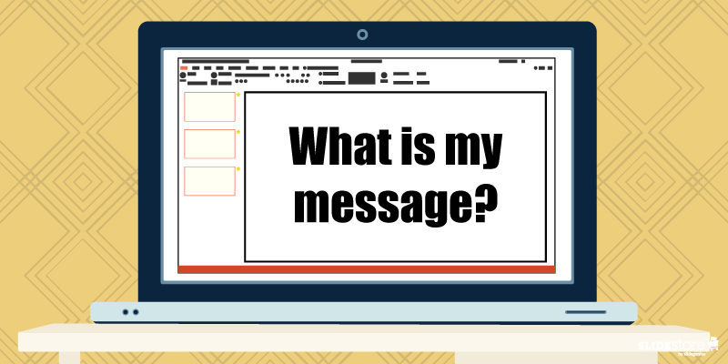
Along with that is a follow-up question: โ€œHow do I say my message?โ€ Your topic and how you present your data are factors that affect your decision with which font to use.If your topic is serious, then it begets an authoritative font, like the thick Rockwell or the aptly named Impact. But, if you like a quirky and light-hearted font for your topic, then something along the lines of Tahoma, Segoe, and Verdana can do the trick. When you know how font personalities affect readersโ€™ perception, then you can easily narrow down your choices and find the one thatโ€™s apt with the gravity of your message.The worst you could do is mismatch your fonts with your theme. Have you even seen a public service announcement that used Symbol (which, for those who are unfamiliar, are letters from the Greek alphabet)? And please, no matter what, donโ€™t use Wingdings. Your font must be appropriate. You donโ€™t want another case of Comic Sans, do you?

2. Is it readable?

Choosing the Right Fonts for Your Presentation: Is it readable?
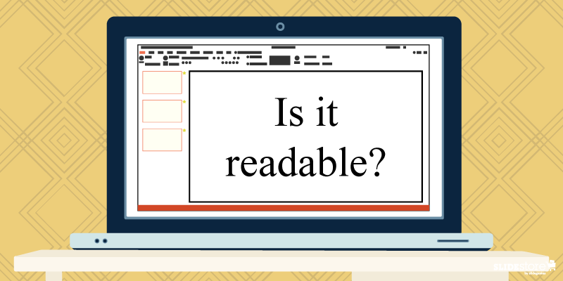
You could answer that question in two approaches: font type and font size.In general, there are four font classifications: serif, sans serif, script, and decorative. Of the four, the first two are most widely used. Fonts belonging to the serif family are great for print since, even with small sizes, their serifs provide space and fluidity for continuous reading. Sans serif are best used when large and projected onscreen because they are clear in the sense that when serif fonts are projected, the thinner strokes of the letters tend to be muddled or appear broken-up.As for a specific font size, a good rule to live by is Guy Kawasakiโ€™s 10/20/30 rule: 10 slides in 20 minutes with 30 font size. Maximum readability even for the people at the back is guaranteed. If anything, you could even go bigger, especially when you have a single word on your slide. Itโ€™s easily read, impactful, and memorable.

3. How many should I choose?

Choosing the Right Fonts for Your Presentation: How many should I choose?
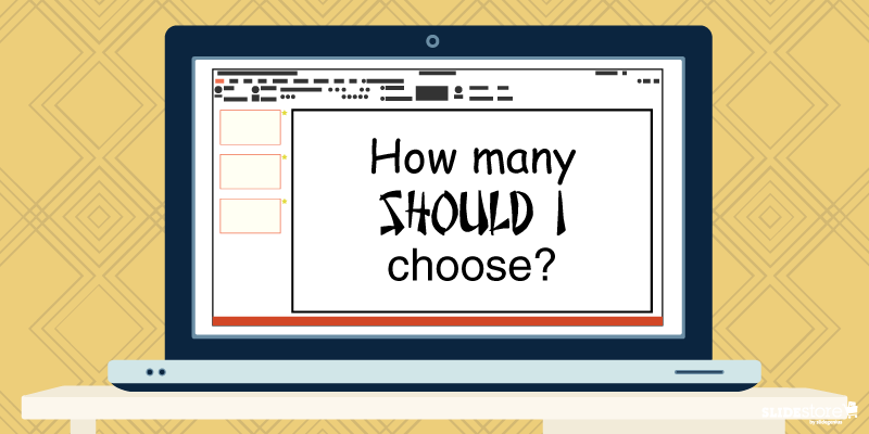
This goes over into consistency territory.Youโ€™re already having trouble deciding one font; what more two or three? Generally, the usual advice is to have two complimenting fonts, a pair that doesnโ€™t take away or fight for attention with each other. Typically, the best pair is a serif-sans serif combination, like the classic Times New Roman and Arial. But if you know font personalities, for the right topic and with the right approach, even a sans serif-sans serif combo will work in unexpected ways, like Cubano and Nunito.Of course, you donโ€™t need to use different fonts. A major point of using combos is to highlight certain parts of your content, and stylizing a keyword or an important point differently draws attention to it.Choosing the perfect font to use on your slides is seldom easy. You could fall back to the old mindset of โ€œAs long as itโ€™s readable,โ€ but almost everyone does that; thus, you get the ubiquity of certain โ€œstandardโ€ fonts that are now recommended to be avoided.Experiment with your presentation. Answer the three questions above, and youโ€™ve got a narrow pool to choose from. When you get the harmony youโ€™re looking for, you can then wow your audience with your talk.If you want to know more, watch this short video from our PowerPoint design agency, SlideGenius.https://www.youtube.com/watch?v=uFCEb8fU8RY

Resources:

Agarwal, Amit. โ€œWhat Are the Best Fonts for Presentation Slides?โ€ Digital Inspiration. July 17, 2012. www.labnol.org/software/tutorials/advice-select-best-fonts-for-powerpoint-presentation-slides/3355Cass, Jacob. โ€œ15 Stunning Font Combinations for Your Inspiration.โ€ JUSTโ„ข Creative. May 5, 2015. www.justcreative.com/2015/05/05/15-stunning-font-combinations-for-your-inspirationCournoyer, Brendan. โ€œWhat Are the Best Fonts for Killer Presentations?โ€ Brainshark. March 29, 2012. www.brainshark.com/ideas-blog/2012/March/best-powerpoint-fonts-for-killer-presentationsErickson, Christine. โ€œNot My Type: Why the Web Hates Comic Sans.โ€ Mashable. October 3, 2012. www.mashable.com/2012/10/03/comic-sans-history/#6J_bWV037EqwGabrielle, Bruce. โ€œThe #1 Best Advice for Choosing PowerPoint Fonts.โ€ Speaking PowerPoint. December 5, 2011. www.speakingppt.com/2011/12/05/best-fontHaley, Allan. โ€œType Classifications.โ€ Fonts.com. n.d. www.fonts.com/content/learning/fontology/level-1/type-anatomy/type-classificationsKawasaki, Guy. โ€œThe 10/20/30 Rule of PowerPoint.โ€ GuyKawasaki.com. December 30, 2005. www.guykawasaki.com/the_102030_rule

Understanding Color Contrast in Graphic Design

Color Contrast

designs tips

presentation design

Whether youโ€™re proficient in design or not, you ought to possess at least a single grain of knowledge about color contrast. Itโ€™s a principle that can be seen everywhere, although itโ€™s mostly prominent in graphic design and other art-related fields. Color contrast refers to the stark visual differences that make an object distinct from others. The polarity of black and white, two colors known to be the ultimate opposites, is a classic example that illustrates this design principle. As a designer, however, you need to learn to work on a more diverse palette that transcends these two so that you can explore other ways of achieving color contrast.

The Importance of Contrast in Design

A circle of twelve colorful crayons radiates outward from the center like spokes on a wheel. The gradient shifts from red to yellow, green, blue, and purple, on a wooden surface. "SLIDESTORE by Designs" branding text is visible in the bottom right corner, perfect for adding charm to your next presentation or slide template.

A simple way to weed out amateur designers from the cream of the crop is by judging the way they apply contrast in their work. Contrastโ€”whether it be of shapes, typography, or colorโ€”is the foundation of every artistic masterpiece. You have to be conscious of how you use it since it can be the single most important element that can make or break your design. Color is one of the first things that register in our subconscious when we look at a work of art. A design piece that fails to employ color contrast effectively can result to a jarring spectacle that can strain the audienceโ€™s eyes and cause them to withdraw their gaze. As all designers can agree on, thereโ€™s no thought worse than knowing that nobody wants to see the fruits of their labor.

Color contrast is important for three reasons:
  • It attracts the eye. People are subconsciously drawn to artworks that use contrast seamlessly. This principle is attractive to the eye because it creates visual interest. When done correctly, color contrast shouldnโ€™t be noticed. When done the wrong way, however, it glares like a flagrant sin.
  • It reinforces an idea. Colors carry a certain weight, so when theyโ€™re used effectively, they can impact viewers manifold. Use color contrast to strengthen your message.
  • It shows hierarchy. Color contrast can create a focal point and establish a hierarchy of importance in your design. With this design principle, you can draw people to a certain area of a page without telling them outright that itโ€™s what they should focus on.

Make sure to strike a balance when applying color contrast. Using this design principle excessively is just as bad as not applying it at all.

Johannes Ittenโ€™s Seven Kinds of Color Contrast

A pair of hands is seen painting a landscape on a spiral-bound notebook. The landscape features mountains and greenery, depicted in a low-poly art style. The table holds watercolor paints, brushes, a palette, and paint tubes, evoking the creative energy of an art session in progress for a presentation.

Mastering color contrast is just like mastering any other skillโ€”it takes practice. There are no hard and fast rules, no shortcuts, and no magic formulas that you can count on. Cultivate your eye for design and work hard on finetuning it. To better understand color contrast, you need to learn its different aspects and forms. Johannes Itten, a Swiss expressionist painter, was among the first to make a theory about the possible types of color contrast. Here are seven of them:

1. Contrast of hue

Hue refers to the name of a specific color that is typically found on the color wheel. You donโ€™t have to apply hues in their purest forms since they might clash. You can lighten or darken them to resemble real-life contexts. When used right, the contrast of hue can create a vivid effect on your design.

2. Contrast of saturation

Saturation refers to the purity of a color; thatโ€™s why this type of contrast is also known as the contrast of pure colors. A color in its brightest form is 100% saturated, but by diluting its intensity, you can abate its impact to create a better effect. You can desaturate a color by mixing it with white (tints), black (shades), or gray (tones). When used well, the contrast of saturation can be a unifying factor that leads to a harmonious composition in your design.

3. Contrast of temperature
A top-down view of a wooden table with art supplies scattered around, including paintbrushes, paint tubes, a watercolor palette, and a paint palette. In the center, a person is preparing a presentation slide showcasing their painting of a mountain landscape in a notebook.

Mixing warm (red, orange, yellow) and cold (blue, violet, green) colors in a design is also another form of color contrast. This type of contrast can create a dramatic effect, especially when one side is dominant and the other is subservient.

4. Contrast of simultaneity

This refers to the effect colors have on each other. It is derived from the law of complementary colors, in which colors cancel each other out to produce an achromatic light mixture (white, gray, or black). This means that if a certain color is absent, the eye will produce its complement.

5. Contrast of extension

Also known as the contrast of proportion, the contrast of extension refers to the effect of amplifying the impact of a certain color by placing it in a dominant spot. This type of contrast underlines the fact that colors can appear weaker or more dominant depending on their arrangement or placement in a design. When using this, keep in mind that the dominant color shouldnโ€™t overpower the surrounding hues but rather unify them.

6. Contrast of dark and light colors

This type of contrast refers to the brightness of colorsโ€”how light or dark they are. Playing light and dark hues off of each other will make your design more powerful and dramatic. Using a high light/dark contrast will allow you to determine which parts of your design are the most important.

7. Contrast of complements

This refers to color pairings that tend to intensify both colors. As you know, complementary colors occupy opposite positions in the color wheel. When adjacent, they intensify each otherโ€™s power, but when mixed, they nullify each other by producing a grayish black hue. Exploring color contrast can take your design to the next level. Use it to its optimum and watch your masterpieces soar into new heights, making you worthy of the title, โ€œdesigner.โ€

Resources:

Aaberg, Kasper. โ€œColor Contrast: All About the Difference.โ€ Love of Graphics. n.d. www.loveofgraphics.com/graphicdesign/color/colorcontrast Farley, Jennifer. โ€œPrinciples of Design: Contrast.โ€ SitePoint. December 3, 2009. www.sitepoint.com/principles-of-design-contrast

Jones, Henry. โ€œThe Principle of Contrast in Web Design.โ€ Web Design Ledger. February 3, 2010. webdesignledger.com/the-principle-of-contrast-in-web-design

Kliever, Jane. โ€œDesigning with Contrast: 20 Tips from a Designer (with Case Studies).โ€ Canva. September 22, 2015. designschool.canva.com/blog/contrasting-colors

Oโ€™Nolan, John. โ€œFully Understanding Contrast in Design.โ€ Web Designer Depot. September 17, 2010. www.webdesignerdepot.com/2010/09/fully-understanding-contrast-in-design

Roach, Nick. โ€œFour Quick Tips for Improving Color Harmony in Your Theme Customizations.โ€ Elegant Themes. August 26, 2013. www.elegantthemes.com/blog/resources/four-quick-tips-for-improving-color-harmony-in-your-theme-customizations

โ€œItโ€™s Not Just Black and White: Understanding the Importance of Contrast in Graphic Design.โ€ Pluralsight. March 9, 2014. www.pluralsight.com/blog/creative-professional/just-black-white-using-contrast-get-attention-graphic-designs

Corrigan, Dennis & Hoffer, Peter. โ€œThe Seven Color Contrasts: Based on the Work of Johannes Itten.โ€ Marywood. n.d. www.marywood.edu/dotAsset/45ee9b19-5c3a-47bc-974b-47436488e792.pdf