Slidegenius, Inc.

Leave Design to the Professionals: Hiring Trained PowerPoint Designers

Graphic design is an often-misunderstood aspect when running a business. The uninitiated assume that designs, be it logos or marketing content, can be created easily and quickly. These are deadly assumptions to make considering the significant role graphic design plays in branding. Companies with rock solid offerings can risk floundering in competitive markets if their designs look cheap or unappealing. Graphic designers are highly skilled professionals capable of strengthening a brand’s image.   

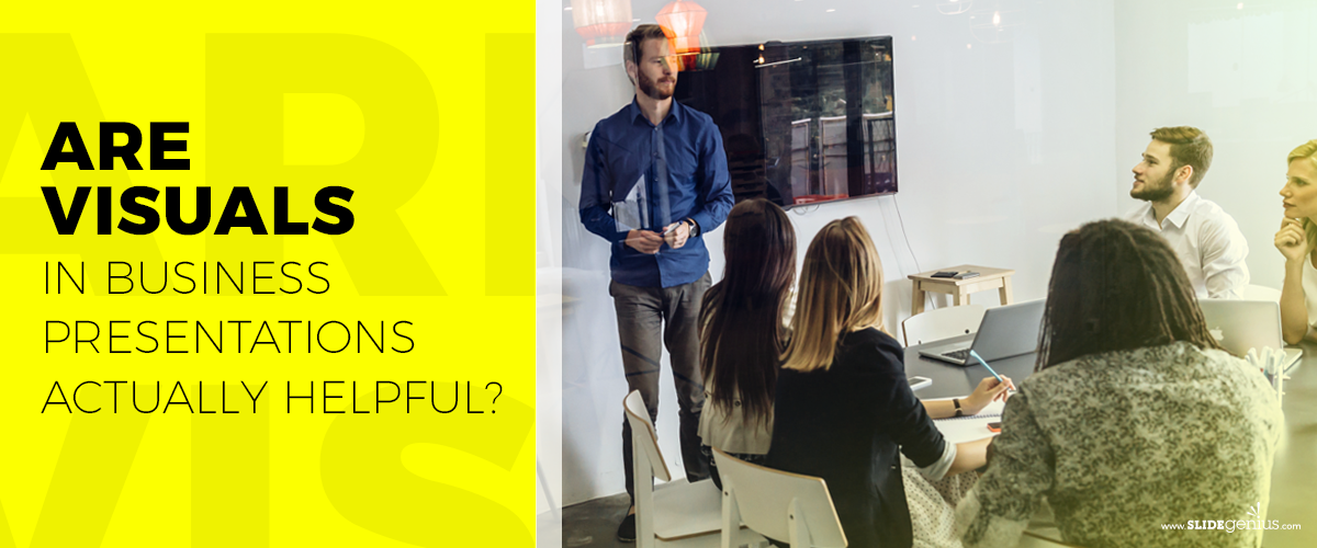
In this article, we will focus on an overlooked aspect of branding: PowerPoint presentation design. Discover how the work of a professional PowerPoint designer can help reshape the way your business is perceived in the boardroom.

Designers Deliver Messages Visually 

PowerPoint design is more than simply creating aesthetically pleasing slides. Professional designers are experts of visual communication. They can take heaps of bland looking data, like monthly sales reports, financial projections, or survey results, and transform them into more visually engaging pieces of content. Their discerning eye for information helps them filter out anything that serves no value to the design and message of the presentation.  

Ever felt like your presentation has too much text? Often, it probably does. Text heavy slides are still one of the most common problem most people make when creating their own pitch presentation. Professional designers are keener on showing over telling. They effectively utilize visual design elements to convey messages with only a fraction of text. This decreases clutter on the slides, making it easier for audience to interpret what being presented.  

Controlling the Flow of Information 

When in the hands of someone with little to no design skills, it’s very common to see the slides looking haphazardly put together with no sense of flow. Overwhelming information muddies your intended message. What good would all that information be if your audience can’t even make sense of it? 

Presentation designers deliberately take control of the flow of information. From the colors, text composition, and pictures/graphics, every element serves the purpose of being more visually intuitive. It’s a matter of using these visual cues to draw the attention of someone’s eyes. They effectively put all these elements together to ensure that your audience keys into every piece of relevant information without feeling overwhelmed by it all.

Save Yourself the Headaches  

There’s plenty at play when creating an effective PowerPoint. Which template should you use? Should the presentation have animations? Which visuals, tables, and graphs best illustrate your points? Professional designers can answer all these questions for you with ease. Their experience allows them to know what styles and visual flair work for every kind of presentation. Their knowledge of the ins and outs of PowerPoint enable them to fully maximize the capabilities of the program.  

In times when you simply have too much work on your plate to handle creating another presentation, professional PowerPoint designers can bear that load. More so, their highly developed skills in the matter ensures a greater final product than what you could have accomplished on your own. Having designers handle creating your presentation gives you the extra time and energy to focus on areas that better fit your own expertise.  

We Are SlideGenius, Your Valuable Partner  

As a start-up presentation design company since 2012, we’ve experienced our fair share of work and productivity struggles. In fact, our full team is split between four different offices around the world. Meaning, we all work “remotely” from one another daily. These barriers have become normal for us, but we continuously adapt and overcome. What pulls us together is our shared passion for helping our clients succeed. From our artists, writers, web developers, animators, and project managers, we utilize our expertise in presentation design to spark invaluable growth.  

At SlideGenius, we are eager to be a valuable partner to all who needs our services during this challenging time. Contact us today for all your presentation needs! 

Are Visuals in Business Presentations Actually Helpful?

Visual aids upgrade your speech, as the combination of content and design add flare to your presentation. These make your pitch more understandable and allow your audience to follow the discussion with their eyes.

SlideGenius Blog Module One

Get hundreds of PowerPoint slides for free.

Sign up for your free account today.

Sign Up now

Before making a customized PowerPoint presentation, your goals must be clear—you should be sure of the message you want to convey. When you have a plan, you’ll know what you have to work on to achieve your objectives.

So what exactly is so important about visual aids that it’s imperative that you prepare one for your business presentation?

It conveys the message loud and clear.

Visuals help you catch your audience’s attention and engage them throughout your presentation. With these, you can communicate complex ideas in an understandable way. Rather than “telling,” you’re “showing” the audience exactly what you want to say, allowing them to make connections on their own—given that the graphics you use are relevant to your discussion.

Approximately three-quarters of adults in America own a smartphone, making it one of the most quickly adopted consumer technologies to date. Apart from this, they spend almost five hours on their phones. Why is this number important?

As a presenter, you’d want to keep your audience’s eyes on you. So, to keep their attention off their phones, you have to make your visual aids appealing. Add graphics, images, and animations relevant to the topic at hand and you’re good to go.

It elicits emotions.

Images are highly subjective. That said, there are certain categories that are more likely to elicit strong emotional responses compared to others. Images can help establish a long-term connection with the hearts and minds of your audience.

Rather than using bullet points, images that resonate with the audience inspire them to act. Plus, this makes it easier for them to retain information for a longer period.

It saves processing time.

A picture paints a thousand words and it holds true to this day. Using visuals relevant to your presentation is less time-consuming compared to writing a few hundred words. Apart from that, you’d only need to make sure that what you say revolves around that.

In addition, because your audience’s brain works overtime to process all the information fed to them, visuals prove to be the most efficient way to make your discussion easier to understand.

Your visual aids shouldn’t distract your audience, but rather help them reach the core of your presentation. These can either make or break their first impression of what you are pitching and you as a presenter. Simplicity is key when it comes to customized PowerPoint presentations—the best way to keep your audience’s attention is by removing clutter.

Nothing else maximizes efficiency and effectiveness quite like professionally designed visual aids, but take note: you may have the best PowerPoint design, but its purpose is only to add interest and enhance the way you convey your message. You’re still the star of the show, which is why you still have to do well with your speech.

SlideGenius Blog Module One

Download free PowerPoint templates now.

Get professionally designed PowerPoint slides weekly.

Sign Up Now

References:

Miltner, Olivia. “You’re Not Addicted to Your Smartphone – You Just Really Like People.” OZY. April 1, 2018. www.ozy.com/acumen/youre-not-addicted-to-your-smartphone-you-just-really-like-people/85737

Tierney, Leah. “6 Types of Images That Elicit an Emotional Response.” Shutterstock. May 5, 2017. www.shutterstock.com/blog/6-types-of-images-that-elicit-an-emotional-response

“Using Visual Aids.” University of Pittsburgh. www.speaking.pitt.edu/student/public-speaking/visualaids.html

What Makes an Effective Healthcare Presentation?

Sharing your work and achievements through a presentation is an essential part of gaining the favor of your colleagues in the medical and scientific communities. The ability to do it flawlessly is not an easy feat but doing so effectively greatly contributes to your success.

Engaging your audience and conveying your enthusiasm for the topic at hand, however, may be difficult, especially if you are not presenting it to the medical and scientific communities. This is where many presentations fall flat. Some of the pitfalls include overly complicated content—this is where professional PowerPoint presentations come in.

So, how can you engage your audience and maximize detail retention at the same time?

Illustrate Your Ideas

In the scientific community, proof is vital and for it to be taken seriously, it has to be backed up with enough credible sources. Your presentation doesn’t have to drown in citations, but only use enough backing data to make your point powerful.

Simply telling your audience or providing a wall of text isn’t going to help health information stick. So instead of giving a presentation with text-filled slides, create a custom PowerPoint by using diagrams, graphs, and other types of graphics. These will guide your audience while you explain complex ideas.

You may also use stock photography. These images have improved—no longer appearing staged, but rather more realistic.

Visuals play a huge role as these are handled by a different process in working memory as compared to auditory information—the visuospatial sketchpad.

Use Animation

Animation adds a new level of engagement, as it works as a great storytelling tool. It gives your presentation a bigger impact because it allows you to pace the flow of information, keep your audience engaged, and sync what you’re saying with what they’re seeing.

It can do wonders for your presentation when used properly—conveys your message more powerfully. Using too much, however, may end up distracting your audience. In which case, you’ll be doing the opposite of what you intend to do. Remember: less is more—so don’t overcomplicate your slides and just animate what needs to be emphasized.

Familiarize Yourself with PowerPoint Formatting Tools

You can come up with the best PowerPoint designs by familiarizing yourself with the formatting tools included in the software. When you can manipulate these properly, you can create virtually anything from scratch. It gives you the power to communicate the way you want to, ensuring the audience remembers key information.

In essence, these are various ways to emphasize certain parts of your medical presentation. Not only will these methods make your deck more interesting, but it will help organize your thoughts as well. With these, you can point your audience toward relevant details instead of just showing a wall of text or the whole figure, distracting them from your current point.

Try applying these to your future presentations and see how much of the information was remembered by the audience.

Why Design Matters In Making a PowerPoint Deck

Design can be intimidating to incorporate in a deck. What if you have to prioritize content over it? Does aesthetics even matter in a presentation?

Actually, yes, design matters. And content. But it’s not a choice of one over the other. It’s best to have both. It’s great to meld the two concepts into one seamless idea. Having a design that compliments a presentation’s intended purpose complements your content and, ultimately, your message.

Purpose

What do you want your deck to be about? What is it for? These are the questions of purpose and meaning you need to have an answer for. Proper planning and thorough research are the backbone of any presentation. Once you’ve laid your foundations, it’s time to organize the information.

In comes design. Combine creativity and strategy to make data visualization engaging. As Scott Dadich, editor-in-chief of Wired, said: “Design and technology just aren’t that far apart.”

Make the data on your deck more appealing through visual representations. These includes charts, infographics, and powerful and appropriate images. It’s not limited to those either. Interpret information so that it makes sense and relates to your main objective. If you want to sell your idea, it needs to be clear and easy to understand.

Appeal

We can make sense of the technology around us using design. PowerPoint itself was designed so that anyone can make their own presentations. In effect, you now have the freedom to design your slides and the ability to control every aspect of it. Make it stand out by presenting your data beautifully and meaningfully.

Design matters because it makes your slides appealing. Make your ideas accessible and enticing on top of being immediately understandable. The effort to make sure your deck looks fantastic won’t go unnoticed. Not to mention that design can also help emphasize points.

Identity

Consistency and theme unify your deck. You can be consistent if you know your content by heart. It’s your task to tell the audience what your idea is. A sense of uniformity is key to making your slides memorable. Additionally, a theme gives your audience a general idea of your content.

Establish an unforgettable look in your audience’s minds. It’s easier to remember slides that have personality and character. When you make it stand out, your viewers can identify with your vision.

Make your ideas recognizable early on. You’re closer to perfecting your pitch once you’ve made a good impression on your audience. Having a design in mind lets you visualize your final product from the beginning of your preparation.

Excellence in Design

There’s a sense of aesthetics everywhere. Letting your visuals work together with your content benefits your presentation. Research and develop your deck’s content carefully.

Preparation is important to achieve absolute clarity in your deck. A clear purpose helps visualize your intention. Integrate your ideas in a design to make it more communicable and solve the problem of making your subject engaging. With fine-tuned content and unified design, your deck will be more unique and have the attention it deserves.

References:

Dadich, Scott. “Letter From the Editor: Why Design Matters More Now Than Ever Before.” Wired.com. September 30, 2014. www.wired.com/2014/09/editors-note-design-issue

Joseph, Therese. “VISUAL BEST PRACTICES FOR PRESENTATIONS.” Shift Collaborative. June 8, 2014. www.shiftcollaborative.com/visual-best-practices-for-presentations

Marie, Irev. “5 Reasons Why Good Design Matters To Your Business.” Simplio Web Studio. August 19, 2015. www.simpliowebstudio.com/5-reasons-why-good-design-matters-to-your-business

Noar, Adam. “5 Tips and Tools for Designing a Stand-Out Presentation.” Design Shack. February 20, 2013. www.designshack.net/articles/graphics/5-tips-and-tools-for-designing-a-stand-out-presentation

Stribley, Mary. “30 Advertisement Design Tips That Turn Heads: Brilliant Case Studies.” Canva. July 1, 2015. designschool.canva.com/blog/advertisement-design-tips


Featured Image: “wings” by Asparukh Akanayev on flickr.com

Informing through Graphics: Visualizing Data in Infographics

65% of people identify as visual learners. That explains a demand to revolutionize traditional presentation methods to be more creative and visually stimulating. Among visual aids, infographics are beginning to gain momentum. Quickly, it’s becoming one of the most popular means of visualizing data in recent years.

Its clean and straightforward delivery of otherwise complex data adds to the infographic’s appeal. But just like any data presentation, infographics take time and effort to make. Knowing how to strategically clean and place material is important in pulling off a good infographic. Randomly throwing things together would confuse potential viewers and deter them from looking further at your material.

Here are three ways to making an effective infographic:

Info + Graphics

As its name suggests, infographics are a mixture of your actual information and a bit of graphics. The word “infographics” is, after all, a portmanteau of the words information and graphics. The key to a good one is a balance between data and visual impact. You have to translate your raw information to graphics without compromising one for the other.

Otherwise, you either fail to deliver your main point to your infographic viewer, or they get bored with what they see. To marry your info and graphics seamlessly, highlight key information and keep any supporting or minor details in smaller text. Maintaining a consistent theme is also helpful in providing structure to your graphics.

Don’t Oversimplify

Although an infographic aims to steer clear of being too complicated to digest, oversimplifying your data is just as bad. Avoid seeming one-sided in an attempt to cut the figures you have in your infographic. But don’t bombard people with statistics.

Leaving gaps between your facts defeats the purpose of presenting information. Organize your data efficiently for a better end product. In her article on data visualization, The Guardian’s Rachel Banning-Lover, suggests that one way to reconcile this dilemma is to narrow down your focus to a specific issue. This segregates your data into main points and sub-points in relation to your chosen topic.

Once you have that in mind, you’ll know how to go about your visual arrangement better.

Lay out the Layout

Once you have your data ready, the next step is to decide how you’re going to incorporate your graphics. In an infographic, everything is meant to affect visual impact. Graphics aren’t the only part of your visual presentation.

It’s a matter of making text, image, and even space work together to attract viewers and relay information. You’re free to design and layout your elements however you like. But as a general guide, always consider whether people can easily read through your visuals. A pretty and comprehensive infographic will be wasted if it can’t be read.

Make use of whitespace to give your reader’s eyes a break. Whitespace, or the absence of text or objects in a layout, helps ease the eyes into reading. Encourage the viewer to read on, don’t intimidate them by saturating your infographic with text and images.

Conclusion

An infographic is a handy communication device. But don’t be fooled into making it an excuse for lazy data presentation. Making hard facts visually palatable is by no means an easy task. Pay equal attention to your data and your graphics.

Don’t let one overshadow the other in your overall layout. At the same time, make sure your infographic is not only aesthetically pleasing, but also readable. You’ll be able to get an audience’s attention and create a lasting impression.

Need help with your presentation needs? Contact our SlideGenius experts today and request a free quote!


References

Banning-Lover, Rachel. “How to make infographics: a beginner’s guide to data visualisation”. The Guardian. August 28, 2014. Accessed October 12, 2015. www.theguardian.com/global-development-professionals-network/2014/aug/28/interactive-infographics-development-data
“Go Visual: Use Infographics to Give Your Business Pitch Maximum Impact – Piktochart Infographics.” Piktochart Infographics. October 1, 2015. Accessed October 12, 2015. www.piktochart.com/blog/go-visual-use-infographics-to-give-your-business-pitch-maximum-impact


Featured Image: “2.26.09: color wheel” by Team Dalog on flickr.com

Count from 6 to 10: A Quick Guide to Great Presentations

We’ve previously discussed how the numbers one to five can make your business presentations count. This was based off keynote speaker Stephen Boyd’s tips to create a presentation countdown. With our own take on it, let’s continue counting from number six to number ten.

6. Presenting after SIX o’clock P.M.

Business professionals work eight hours on a regular basis. After a long day, only a few stay later than six o’clock p.m. to polish their paperwork, web designs, PowerPoint slides, and the like. After all, we want to get back to our families and our lives, right?

Deliver your presentations as if you’re doing them after six in the evening. Embody the elements of fun, involvement, and learning to keep your audience awake. Treat your audience like close friends and family you’ve been longing to see. Sustain their interest from the beginning to end, no matter how late it is.

7. Seven Means Complete

According to the Bible, the number seven has three Hebrew roots: saba, shaba and sheba. These three biblical ideas are associated with oaths, perfection, and completeness. Whether you’re delivering a pitch to a potential client or discoursing a monthly report with co-workers, your PowerPoint presentation should contain complete data.

Providing evidence supports your argument or main idea. Maximize the use of graphs and charts, statistics, and other visuals for a more comprehensive discussion. Inevitably, your audience will have questions or clarifications which you can tackle in a Q&A session. However, it pays to address all of these possible questions from the beginning to make things easier for everyone.

8. Eight for Affinity

The number eight is drawn with two interconnecting circles. Lacking one circle, either at the top or at the bottom, means you have zero. Presentations are about making connections. Your business speech is useless without an audience.

Command interest by connecting with them on a personal level. You can best engage an audience by exuding a credible aura, by appealing to their emotions, or by challenging their intellect. Building networks after your business pitch is another way to solidify your core message, and get viable results as well.

9. Nine for Anticipation

Where there’s nine, an end is anticipated — nine is followed by ten, ninety-nine makes way for one hundred, and so on. Anticipating unforeseeable circumstances in your talk is a good presentation skill. Don’t make your audience tune out because you panicked or lost your train of thought. Always be prepared for whatever can go wrong in a speaking engagement.

Planning ahead increases your chances of foreseeing or dealing with such problems.

10. Perfect Ten

There’s no denying that the number ten connotes perfection. Ten is a rounded number, which is why our counting system is based on the power of ten. We rate things with one being the lowest and ten being the highest. Striving for perfection is the best mindset for succeeding in your business presentation.

Make sure that your PowerPoint design has the perfect font combo and title slide. Reinforce it with confident delivery and compelling content. Always aim for a deck that will get a perfect ten rating.

To Sum It Up

Use numbers six to ten as your guide for delivering fun, complete, engaging, planned, and perfect business presentations. Remember the importance of connecting to your audience, sharing complete and pertinent data, appealing to emotions, anticipating crises, and striving for perfection.

Need a PowerPoint deck to give you an edge? Check out our portfolio for inspiration, or contact our slide design experts for a free quote.


References

Boyd, Stephen. “Public Speaking By Numbers.” Speaking-Tips, August 17, 2011. Accessed June 10, 2015.
Count from 1 to 5: A Quick Guide to Great Presentations.” SlideGenius, Inc. July 14, 2015. Accessed August 27, 2015.

Professional PowerPoint Designers and Cost-Effective Results

PowerPoint has become a standard in today’s business communications. It’s used in any type of industry, from startups to big-scale. Although it helps convey messages, professionals tend to use this tool by following a standardized format: stagnation.

A stagnant medium means everything looks the same. Everyone starts to rely on templates, and no one stands out. While PowerPoint’s user-friendliness makes it easy to create slides for any type of presentation, that also makes it more susceptible to uninspired decks.

However, there are some experts in the field who are equipped with the proper skills and knowledge to pull off a stunning deck for their clients. Availing the services of these professional PowerPoint designers can help you rise above the rest. Here’s why:

Professional Slides Make You Look Good

A team of dedicated and experienced designers, copywriters, and marketing consultants give you the best presentation deck possible, ensuring you always look your best. Designs are custom-made to suit your company’s needs, while still being in line with your image and branding.

With this important responsibility off your shoulders, you can breathe easily and concentrate on your responsibilities as the presenter.

Save Time and Money

Having a professional team means you can get your slides whenever you need them.

If you’re usually in charge of making your own slides, you can instead put your efforts into something more productive. If you’re in charge of a team, you won’t have to disrupt the process or wait for a member to be free to start your deck.

Having to occasionally design presentations in-house disrupts an employee’s regular workflow. According to Demand Media’s George Root III well-planned task delegation is necessary for more efficient work output. This means that you need experts in the specific fields for faster, optimized work.

Outsourcing a team of professionals on standby means your people can concentrate on what they do best: working to further improve your product or service. With disturbances gone, office efficiency is boosted, saving both time and money.

Increase Returns

Nothing beats output done by experts. When you hire professional PowerPoint designers, your presentation’s quality will always match that of your company’s, allowing you to convert more opportunities into revenue and making your business grow.

Amazingly well-made decks ensure consistent positive feedback, maximizing returns for you and your company.

Conclusion

No matter how good of a presenter you are, you’ll always need a presentation deck that reflects your skill and talent, as well as those of your team and your company’s brand message.

Though they have become too standard for their own good, PowerPoint presentations are still your gateway to effective business communication. Hire a professional PowerPoint designer now and make your business stand out.

Still unconvinced? Contact us now, and let our team of professional PowerPoint designers change your mind.

References

Root, George. “Importance of Teamwork at Work.” Chron. Accessed July 24, 2015.
Your Brand Should Be In Your PowerPoint Designs.SlideGenius, Inc. July 8, 2014.

PowerPoint Visual Design Tips From Ads: Text & Image Balance

Text-heavy slides are a common PowerPoint deck problem. That’s why you should rely primarily on visuals for your business presentations, keeping text to a bare minimum with simple labels and lists. This gives you more room to talk about your pitch.

SlideGenius Blog Module One

Get hundreds of PowerPoint slides for free.

Sign up for your free account today.

Sign Up now

Should text dominate your slide or will an image do on its own?

Deciding the text’s length, the image’s position, and the kind of image to use are also problems shared by presenters and advertising agencies alike. According to renowned author, Jim Aitchison, it’s best to use a single-minded approach: either the visual or the text must dominate the image.

The Postcard-or-Letter Method

The postcard-or-letter method is a choice between using a visually-led execution with a short piece of text, or a mostly text-based advertisement that still uses a visual. Consider the image and text sizes, as well as the elements’ location in your PowerPoint visual design to pull off a similar effect.

1. Image Size vs. Text Size

Simple and minimalist executions like Burger King’s Fiery Fries print ad use a dominant visual with a small piece of text. This works best for postcard-style announcements or for making a point for your business presentations.

For the opposite method, let the text occupy a dominant portion of the frame, as with the XO Beer print ads. When using the letter style, you need an interesting story to tell about your product, or an engaging activity that lets them imagine something interesting.

2. Location, Location, Location

Positioning is a crucial visual factor. To make your point clear, place your images in the middle to make them more prominent.

For comparisons, place two images side-by-side, similar to how Aitchison cites the Kaminomoto hair grower print ads. In other cases, let people see the image in the middle and your text below it, just like the early Volkswagen ads. Make either the text or image more dominant than the other or your slide will distract your audience.

The Point: Show Less to Talk More

Be as minimalistic as possible. Your PowerPoint slides only have room for a dominant visual or piece of text, not all the images or words in the world. Decide whether you need to make a point or compare yourself with the competition. Then, choose which element will get your audience’s interest, and decide where to put it to best get their attention. It’s not about how much content you can cram into your slides, but how you can use what little you have to convince your clients to do business with you.

To help you maximize your visuals and text for your business presentations, try to get in touch with a professional PowerPoint presentation designer today!


SlideGenius Blog Module One

Download free PowerPoint templates now.

Get professionally designed PowerPoint slides weekly.

Sign Up Now

References

5 TED Talk Secrets for Persuasive PowerPoint Presentations.” SlideGenius, Inc. 2015. Accessed July 22, 2015.
Aitchison, J. Cutting Edge Advertising: How to Create the World’s Best Print for Brands in the 21st Century. Singapore; New York: Prentice Hall, 2004.
XO Beer. Neil French. Accessed July 22, 2015.

3 Reasons You Should Hire a PowerPoint Specialist

The internet has greatly boosted the speed and quality of how people share and develop knowledge. Web culture has spawned a new generation of people with an independent can-do mindset, and presentation design isn’t an exception.

This is exactly why you’ll need experts in the field to give you advice. You can go places with your presentation pitch deck if you have someone that understands your brand’s value, and the best marketing tools that your message needs.

SlideGenius Blog Module One

We redesign PowerPoint presentations.

Get your free quote now.

get a free quote

As an excellent presenter, don’t show up with an amateur presentation that distracts and disengages your audience.

Here are three important reasons to hire a PowerPoint specialist:

They Can Tell Your Story

A lot of companies give their sales associates freedom with their presentation designs, causing them to stray from the story you want your brand to tell. Audiences appreciate presentations that speak in a language consistent with the same story as your brand.

Professional presentation designers provide decks that stay true to your core identity, ensuring that your audience gets the right message, as inconsistency between your visual design and your speech confuse and tune your audience out. If you’re a high-class brand, no one will invest in you if your slides are cluttered and use eye-searing colors. Unity between your brand story and presentation deck effectively complements and conveys your message.

Having trouble narrowing down your company’s narrative? A team of experienced marketing specialists can streamline your brand story to better reflect your core values and your company identity.

They Can Wow Your Audience

A PowerPoint presentation specialist can provide exemplary, eye-catching, and engaging decks. Expect no less from people who do this for a living.

PowerPoint specialists can fulfill all your presentation needs and more. Do you need striking visual design? You deserve it. Do you want your logo animated? They can do that for you. How about a video in your presentation? They can make one from scratch.

A design that complements your purpose gets your message across. Audiences appreciate uniform content, visual elements, and purpose, making them feel like you know exactly what you’re talking about. This increases the chance of converting budding interest into positive action.

They Can Boost Your Confidence

A PowerPoint presentation is merely a visual aid, but don’t underestimate the importance of coming up to bat with a well-designed pitch deck. Stepping into the spotlight is much easier when you can focus on presenting. You free up resources to concentrate on improving your service’s other aspects or preparing as a presenter, instead of worrying about how your template should look or what image will exemplify the concept you’re talking about in one glance.

A professionally designed pitch deck can increase customer trust and engagement, making your job simpler and your goals easier to achieve. With fewer things to worry about, you’ll also have more time and money to improve your actual product or service, creating a positive feedback loop that begins and ends with excellent service.

Effective presentation design involves a lot of preparation. The process involves unifying your brand, your core message, and your specific purpose. If you think your brand warrants only the best, then you need the assistance of true presentation professionals.

Call up one of our PowerPoint specialists, and let’s get you started on that pitch deck that your brand deserves!

SlideGenius Blog Module One

Download free PowerPoint templates now.

Get professionally designed PowerPoint slides weekly.

Sign Up Now

References

3 Reasons Why You Need a PowerPoint Presentation Specialist.SlideGenius, Inc. August 1, 2013. Accessed May 19, 2015.
3 Additional Perks of Getting a PowerPoint Presentation Specialist.” SlideGenius, Inc. Accessed May 19, 2015.

Consider the Eyes: White Space in Great Presentation Design

Ever stopped to take a longer look at an advertisement and recalled information even hours after seeing it?

If your answer is yes, then you just experienced effective graphic design.

SlideGenius Blog Module One

Get hundreds of PowerPoint slides for free.

Sign up for your free account today.

Sign Up now

Graphic design uses time-tested rules based on how human eyes perceive and interpret information.

According to University of Toronto’s Roger Martin, employing design thinking can also help businesses plan for effective and efficient communication by deciding what visual elements are necessary, what they look like, and where they should be placed.

However, there’s one visual element that continues to confuse a lot of beginning presenters: space.

What is White Space?

White space (also known as negative space) is the absence of any distinct object or shape in a layout. When printed materials still dominated information sharing, publishers made the most out of the available layout space because of high publishing costs. This is why newspapers, paperbacks, and most textbooks still look the way they do today—crammed with as much text and image that can fit.

As most information is now transmitted and consumed digitally, designers no longer worry about wasting paper, allowing designers to use more white space. This shift in the use of space benefits your layout in many ways.

How White Space Affects the Viewer

White spaces impart a sense of cleanliness to a page. Restraining yourself from adding visible elements avoids cluttering your slides, confusing viewers, and burying important messages.

The absence of discernible objects also conveys openness. White space invites your audience to participate in the discussion and be more engaged as listeners.

How White Space Aids Your Design

  • Relaxes your audience’s eyes

The eyes’ muscles relax when there’s nothing to focus on. This regulates your audience’s mental stamina and safeguards their capacity to be attentive for longer.

  • Groups similar or related elements together

When there is a uniform amount of space among them, shapes are perceived as similar. This is a great way to organize multiple elements without adding objects such as bounding boxes to the slide.

whitespace1

  • highlights important elements

Shapes that are clearly separated by space are highlighted and further emphasized. You can use this for recapping, summarizing, or focusing.

whitespace2

  • Makes your design classier

This effect is tied to how white space was treated in print media’s heyday when publications tried to fit as much content as possible in available pages. Consequently, publications that wanted to exude a more exclusive feel were more charitable with space.

whitespace3 whitespace4

How Apple Mastered White Space

Flooding your space with content causes discomfort in viewers, as this actual website example demonstrates:
whitespace7

Conversely, Apple’s website uses white space to elevate their products’ perceived quality. Their website is a perfect example of simple design for both products and collateral:

whitespace5


Practice restraint. Don’t saturate your slides with images and text in the hopes that it’ll improve information sharing and memory retention. It won’t fill in the gaps between supporting data and great presentation design techniques.

Adding too many elements in one space makes text less legible and important images less visible. Effective designs leave viewers with enough space to breathe and translate your visuals into lasting and actionable knowledge.

Resist the temptation to fill your slides with frills. Fewer elements make more of a lasting impact.

SlideGenius Blog Module One

Download free PowerPoint templates now.

Get professionally designed PowerPoint slides weekly.

Sign Up Now

References:

Martin, Roger. “What Is Design Thinking Anyway?Design Observer. September 28, 2009. Accessed May 14, 2015.
Using White Space in PowerPoint Design-a Closer Look.” SlideGenius, Inc. December 4, 2014. Accessed May 14, 2015.

-->