Are Visuals in Business Presentations Actually Helpful?

animation

become a better presenter

business presentations

Graphic Design

PowerPoint Design

PowerPoint Experts

slide design

visual aids

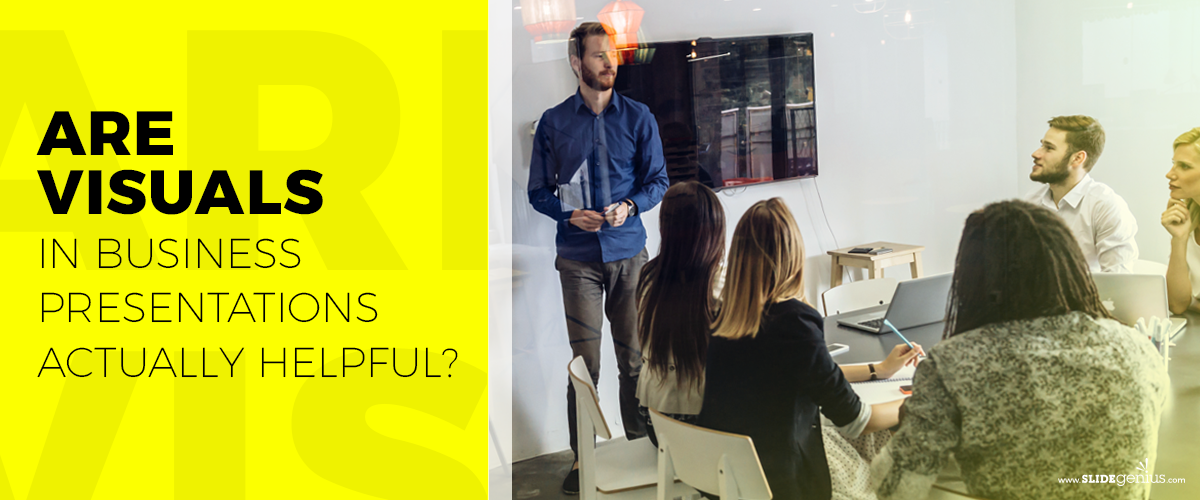
Visual aids upgrade your speech, as the combination of content and design add flare to your presentation. These make your pitch more understandable and allow your audience to follow the discussion with their eyes.
[sg-blog-modules module=three]
Before making a customized PowerPoint presentation, your goals must be clear—you should be sure of the message you want to convey. When you have a plan, you’ll know what you have to work on to achieve your objectives.

So what exactly is so important about visual aids that it’s imperative that you prepare one for your business presentation?

It conveys the message loud and clear.

Visuals help you catch your audience’s attention and engage them throughout your presentation. With these, you can communicate complex ideas in an understandable way. Rather than “telling,” you’re “showing” the audience exactly what you want to say, allowing them to make connections on their own—given that the graphics you use are relevant to your discussion.

Approximately three-quarters of adults in America own a smartphone, making it one of the most quickly adopted consumer technologies to date. Apart from this, they spend almost five hours on their phones. Why is this number important?

As a presenter, you’d want to keep your audience’s eyes on you. So, to keep their attention off their phones, you have to make your visual aids appealing. Add graphics, images, and animations relevant to the topic at hand and you’re good to go.

It elicits emotions.

Images are highly subjective. That said, there are certain categories that are more likely to elicit strong emotional responses compared to others. Images can help establish a long-term connection with the hearts and minds of your audience.

Rather than using bullet points, images that resonate with the audience inspire them to act. Plus, this makes it easier for them to retain information for a longer period.

It saves processing time.

A picture paints a thousand words and it holds true to this day. Using visuals relevant to your presentation is less time-consuming compared to writing a few hundred words. Apart from that, you’d only need to make sure that what you say revolves around that.

In addition, because your audience’s brain works overtime to process all the information fed to them, visuals prove to be the most efficient way to make your discussion easier to understand.

Your visual aids shouldn’t distract your audience, but rather help them reach the core of your presentation. These can either make or break their first impression of what you are pitching and you as a presenter. Simplicity is key when it comes to customized PowerPoint presentations—the best way to keep your audience’s attention is by removing clutter.

Nothing else maximizes efficiency and effectiveness quite like professionally designed visual aids, but take note: you may have the best PowerPoint design, but its purpose is only to add interest and enhance the way you convey your message. You’re still the star of the show, which is why you still have to do well with your speech.
[sg-blog-modules module=two]
References:

Miltner, Olivia. “You’re Not Addicted to Your Smartphone – You Just Really Like People.” OZY. April 1, 2018.

Tierney, Leah. “6 Types of Images That Elicit an Emotional Response.” Shutterstock. May 5, 2017. www.shutterstock.com/blog/6-types-of-images-that-elicit-an-emotional-response

“Using Visual Aids.” University of Pittsburgh. www.speaking.pitt.edu/student/public-speaking/visualaids.html

Back to the Future (of Marketing): Interactive Brochures

audience engagement

Brochures

digital media

engaging audiences

interactive

Interactive Brochures

presentation tips

Rick Enrico

SlideGenius

visual aids

Your presentation is just the beginning, so don’t let your pitch end in the boardroom. In fact, take it further: have your audience take your company’s brand with them, wherever they go.

There are many types of collaterals that people can take home, but why stop there? Don’t just think in terms of physical items that they can carry around with them.

Here’s an idea: translate your usual print materials to digital media. That way, you don’t just reach out to your target market but you’ll also expand your network to other potential leads.

The Future Is Digital

Technology undeniably plays a big role today in people’s lives. For businesses, digital marketing proves to be an important tool in attracting prospects and increasing sales. Digital media helps marketers monitor what type of content people are more responsive to, allowing them to adapt accordingly. At a time when print is going digital, brochures and pamphlets can be converted into interactive sources.

Including interactive brochures in your digital marketing strategy benefits you in many ways. Paperless collaterals don’t only help the environment but also offer more accessibility than a traditional handout. People can view your company’s story anytime, anywhere, and you’ll even be able to track their interest in your business.Things like page analytics and data can help determine whether your content is drawing people in or not.

Take It Outside

Old-fashioned brochures stay with potential partners and clients. While these are good giveaways after a presentation, they reach a limited audience Take your content outside the boardroom and present your product and your story to other people.

There’s an available market online that you can’t tap into with word of mouth and networking alone. You can reach out to a wider audience faster by using people’s interconnectedness through digital media. At the same time, your existing customers are free to review your services from an easily downloadable interactive brochure. Expanding your partnerships and taking care of your current clients will be easier once you go digital.

Engaging the Audience

Interactivity is what makes the e-brochure so appealing. Unlike its paper counterpart, an interactive brochure can let you execute creative ideas that can only be possible with a digital medium. Although it’s basically a PDF version of your handout, you can put additional features, like an animation, that your viewers can interact with.

Aside from its availability in any electronic device, a digital brochure makes your content more engaging. If there’s one thing that should remain constant from your pitch to your marketing strategies, it’s audience engagement. You’re more likely to get investors by steering their attention towards you. Achieving the right combination of fun and professionalism in your e-brochure helps you get noticed.

Don’t give your prospects flat information. Make their experience interactive.

The Bottom Line: Go Big, Go Digital

Technology is a major game changer in the field of marketing. Don’t become outdated. Enter the new playing field and bring your product to a bigger market.

Making use of interactive brochures effectively attract and keep people’s attention. Its accessibility makes it easily available to anyone interested in your services. Prospects’ increased awareness of your brand boosts your sales leads and volume significantly.

Not sure where to start your digital marketing strategy? Consult with our SlideGenius designers today.


Adding Visuals to Your Technology PowerPoint

diagrams

technology powerpoint

visual aids

Incorporating visuals into your PowerPoint presentations is essential, especially when dealing with technical subjects. Technology presentations can easily overwhelm audiences with data, jargon, and complex ideas. The right visuals can help break down complicated information and make your message more engaging and digestible. Here’s how to enhance your technology PowerPoint with powerful visuals.


1. Use Diagrams to Simplify Complex Processes

Technology presentations often involve explaining complex systems or processes. Using diagrams can help simplify these concepts and make them easier for your audience to follow.

Why It’s Important:

  • Clarifies Information: Diagrams help break down complex processes into manageable, understandable parts.
  • Engages Visual Learners: Visual learners can grasp the information more easily when it’s presented in a clear, diagrammatic form.

How to Do It:

  • Create flowcharts, network diagrams, or process maps to explain systems like IT infrastructure or software development workflows.
  • Use arrows and shapes to visually guide your audience through the steps or components of a system.

2. Incorporate Infographics to Visualize Data

Technology presentations often include data-heavy content, such as usage statistics, performance metrics, or market trends. Infographics can help you present data in a more engaging and accessible format.

Why It’s Important:

  • Makes Data Easier to Understand: Infographics condense data into a visual format that’s easier for your audience to absorb at a glance.
  • Enhances Engagement: Visual data is more engaging than spreadsheets or bullet points, keeping your audience focused and interested.

How to Do It:

  • Use tools like Canva or PowerPoint’s built-in features to create custom infographics that visualize key data points.
  • Incorporate charts, icons, and color coding to make the data easy to interpret.

3. Use High-Quality Images to Reinforce Key Points

Including relevant, high-quality images can reinforce your message and help illustrate key points. For example, images of hardware, software interfaces, or screenshots of code can provide visual context in technology presentations.

Why It’s Important:

  • Provides Context: Images help contextualize abstract concepts, making them more relatable to your audience.
  • Improves Retention: Audiences are more likely to remember information when it’s paired with a relevant visual.

How to Do It:

  • Add images of technology products, prototypes, or real-life use cases to visually support your explanations.
  • Ensure all images are high resolution and professional to maintain credibility.

4. Use Icons and Symbols for Better Visual Flow

Icons and symbols can help guide your audience’s attention and visually organize information. These simple, yet effective visuals can highlight key points, break up text, and direct the audience’s focus.

Why It’s Important:

  • Enhances Readability: Icons break up dense text and make slides more visually appealing.
  • Adds Visual Hierarchy: Use symbols to create visual distinctions between main points and supporting details.

How to Do It:

  • Use technology-related icons (e.g., computers, gears, cloud symbols) to represent different sections of your presentation or key concepts.
  • Place icons next to bullet points or titles to make the slides more scannable.

5. Animate Visuals for More Dynamic Presentations

Adding animations to your visuals can make your presentation more dynamic and engaging. Animations can also help emphasize important points or guide your audience through a complex diagram step by step.

Why It’s Important:

  • Keeps the Audience Engaged: Movement grabs attention and keeps your audience focused on the presentation.
  • Emphasizes Key Information: Animating visuals draws attention to specific points and helps pace your delivery.

How to Do It:

  • Use PowerPoint’s animation features to reveal diagrams or charts in stages as you explain each part.
  • Apply subtle animations like Fade In or Wipe to introduce new visuals smoothly without overwhelming your audience.

6. Use Consistent Visual Themes

A consistent visual theme throughout your presentation helps create a cohesive and professional look. Whether you’re using diagrams, infographics, or images, ensure that the style, color scheme, and fonts remain consistent across all your slides.

Why It’s Important:

  • Creates Visual Harmony: Consistency in visuals prevents your presentation from looking disjointed and maintains a polished appearance.
  • Strengthens Branding: Using consistent visuals that align with your company’s brand colors and fonts reinforces your identity.

How to Do It:

  • Choose a visual theme and color scheme before you start designing your slides.
  • Stick to the same style of icons, fonts, and colors to maintain uniformity throughout the presentation.

Final Thoughts

Adding visuals to your technology PowerPoint presentations can enhance clarity, improve engagement, and make complex information more accessible. Whether you’re using diagrams, infographics, or animations, the key is to ensure that your visuals support your message and help your audience understand the technical content more effectively. Keep visuals consistent, relevant, and high-quality to create a polished, professional presentation.