Slidegenius, Inc.

Webinar PowerPoint Tips: Creating a Presentation that Speaks through the Screen

In today’s world, distance is no longer an issue when it comes to effective communication. With web conferences or webinars, you no longer have to hop on a plane to sit in meetings with those in another time zone.

But there’s more to webinars than just talking in front of a webcam, especially if you want to share crucial information or leave a lasting impression. It’s important that you enhance your audience’s experience with a webinar PowerPoint deck.

When you’re presenting in front a live audience, you’re physically available to command their attention. Your PowerPoint slides serve a secondary purpose. However, when you’re presenting online, your webinar PowerPoint deck is the main attraction.

With that in mind, consider these specific tips to make sure that your webinar PowerPoint speaks through the computer screen.

Sequence: What your webinar PowerPoint should contain

It’s important that your webinar PowerPoint follows a structure with a logical flow. Begin with a quick introduction, delve in the main body of your topic, and end with a concise conclusion.

  • Introduction – Include slides introducing yourself and other presenters in the webinar. Include a picture and relevant credentials so your audience can feel like they’re not just talking to a computer screen. It’s also useful if you can include a slide that explains the logistics of your webinar.
  • Body – The body of your webinar PowerPoint deck will depend on the topic you’re discussing. Whatever it is, keep your discussion clear but brief. Stick to discussing only one point at a time. There are plenty of ways to arrange the body of your webinar PowerPoint, just make sure that each point is structured into main segments.
  • Conclusion – The conclusion of your webinar PowerPoint should be short and sweet. Don’t drag it out by repeating everything you said before. Instead, create a slide that summarizes your main points. To encourage your audience to participate in a discussion, include an action plan or a call-to-action question.

Design: What your webinar PowerPoint should look like

Your webinar PowerPoint should be efficiently designed for online sharing. Lags on your presentation look unprofessional and can be frustrating for your audience.

Opt for a simpler, sleeker design. As always, avoid using too much text and bullet points. Most importantly, avoid using huge picture files, videos, and animations which might cause problems for connectivity. This doesn’t mean you should go completely without graphics. Just make sure the file sizes aren’t too large or are compressed before sharing. 

Consider the following when designing your webinar PowerPoint deck:

  • When explaining something that requires several steps, consider making use of “build” slides. This is a type of animation that allows you to reveal a slide bit by bit as you talk.
  • Make use of PowerPoint’s SmartArt graphics to illustrate key points without having to use complicated images.
  • For your the background of your slides, opt for a solid color or gradient effect. Lower quality images might not be big enough to fill the entire background. And if you resize them, your background will look distorted and pixelated.


Reference

Reduce the File Size of a Picture.” Office Support. Accessed June 30, 2014.


Featured Image: Ministerio TIC Colombia via Flickr

No Photoshop? Edit Pictures in PowerPoint

There are so many ways to create unique PowerPoint presentations. The software has many tools and functions that allow you to be as creative as possible. The many possibilities include customizing templates, creating exciting shapes to enhance presentation design, and adding animations to your slides. Another thing you can do is edit pictures in PowerPoint.

PowerPoint is an excellent alternative if you don’t have Photoshop (or are overwhelmed by its complexity). You can do a lot of basic photo editing to enhance the images you’ve added to your presentation.

Need a Presentation Designed?
Click Here To View Our Amazing Portfolio!

Edit Pictures in PowerPoint: The Basics

To get started, familiarize yourself with the Pictures Tool Format tab.

The Pictures Tool Format tab

This only appears if you have a picture selected, so go ahead and Insert the image you want to edit into a Blank Slide.

Edit pictures in PowerPoint by starting with a blank slide and the raw image
Original image by Dave L.

The tools you’ll probably use the most to edit pictures in PowerPoint are the following:

  1. Corrections – This will allow you to edit your picture’s brightness and contrast and choose to either sharpen or soften it.
  2. Color – With this option, you can change the saturation and tone of your image. You can also choose to overlay several color filters.
  3. Crop – Aside from letting you do the obvious, PowerPoint’s crop tool allows you to crop your image into many different shapes.
  4. The options under Picture Styles – This group allows you to customize and design your picture with a few clicks effortlessly. You can add effects or borders. Choosing Picture Layout automatically will enable you to convert your image into a SmartArt graphic.

Using these tools to edit my chosen picture, I was able to come up with this:

Edited using the basic PowerPoint photo tools

Adding Text to Images

Another thing you’ll probably want to do is to add text to your pictures. You can’t do this in the Format tab. You have to go back to the Insert tab and select Text Box.

Insert > Text Box

Just create a TextBox anywhere you want on the picture, and then start typing like you would if you were editing slides.

Edit pictures in PowerPoint by adding text boxes

To add a background color to the TextBox, just go to the Home tab and select Shape Fill. A drop-down box will appear where you can choose whatever color you want.

Saving Pictures

You can save your edited pictures separately from your slides, and you don’t need to go through the tedious process of using Print Screen, either. All you have to do is Right-Click the image and then choose Save Picture As.

To save several objects as one picture (which is what you’ll have to do if you added a text box): Select all elements you want to include, right-clic-, and then choose Group. After that, you can right-click again and save as usual.

If you’re editing the photos for your PowerPoint slides, don’t forget to keep all manipulated images manageable. Select your edited picture, go back to the Format tab, then select Compress Pictures.

Bonus: Creating Polaroids with PowerPoint

Now that you’re familiar with the Pictures Tool, here’s a quick tutorial: edit pictures in PowerPoint and turn them into “Polaroids.”

You can edit pictures in PowerPoint and turn them into Polaroids!

  1. Crop your image into a 1:1 ratio. Set it aside for a while.
  2. Draw a rectangle using the Shape tool. Make sure it’s big enough for your image to fit inside. It’ll be in the default color. Don’t change it to white yet!
  3. Select the rectangle and go to the Drawing Tools Format tab. Under Shape Effects, select Shadow (Outer). When the rectangle has the drop-shadow effect, change its color to White.
  4. Drag the image on top of the rectangle. If it disappears under the shape, just select the shape, hover over Send to Back, and choose Send Backward.
  5. Adjust the image to create the overall look of a Polaroid picture.
  6. Group the image and the rectangle and Save.

There you have it!

We hope that learning how to edit pictures in PowerPoint can help you come up with great presentation design ideas. Don’t be afraid to explore and utilize all the tools that PowerPoint has to offer.

4 TED Talks to Inspire Innovative Thinking in Your Company

Forbes contributor Cheryl Conner recently shared five TED Talks for entrepreneurs in search of creativity and inspiration. While the presentations she chose offered practical tips for those looking for continued success in business ventures, all of them offer great advice for anyone who  wants to enhance their careers.

Living up to its motto, “ideas worth sharing,” TED is never short on great presentations. We’re expecting even more when TED Global 2014 rolls around this October. While we wait for a fresh set of ideas, here are four TED Talks that can help inspire innovative thinking in your company—regardless of where you are on the corporate ladder.

Shawn Achor: ‘The happy secret to better work’

We’re often taught that happiness follows success, but psychologist Shawn Achor believes otherwise. In his TED Talk, Shawn offers that we reverse this formula. Actually, it’s happiness that inspires productivity.

90 percent of your long-term happiness is predicted not by the external world, but by the way your brain processes the world. And if we change it, if we change our formula for happiness and success, what we can do is change the way that we can then affect reality. What we found is that only 25 percent of job successes are predicted by I.Q. 75 percent of job successes are predicted by your optimism levels, your social support and your ability to see stress as a challenge instead of as a threat.

Kathryn Schulz: ‘Don’t regret regret’

Kathryn Schulz is a writer that specializes on ‘Wrongology’. In this TED Talk, she discusses the all-too-familiar feeling of regret, and how we should use it as a positive source of motivation.

You’re going to experience more regret in that situation if you missed your flight by three minutes than if you missed it by 20. Why? Well because, if you miss your flight by three minutes, it is painfully easy to imagine that you could have made different decisions that would have led to a better outcome. “I should have taken the bridge and not the tunnel. I should have gone through that yellow light.” These are the classic conditions that create regret. We feel regret when we think we are responsible for a decision that came out badly, but almost came out well.

Stanley McChrystal: ‘Listen, learn… then lead’

Four-star general Stanley McChrystal used to be the commander of the U.S. and International forces in Afghanistan. For his TED Talk, he shares how he managed to lead people of different backgrounds, skills, and ages into working toward a common goal.

And as soon as I hit, the first thing I did is I’d see if I’d broken anything that I needed. I’d shake my head, and I’d ask myself the eternal question: “Why didn’t I go into banking?” (Laughter) And I’d look around, and then I’d see another paratrooper, a young guy or girl, and they’d have pulled out their M4 carbine and they’d be picking up their equipment. They’d be doing everything that we had taught them. And I realized that, if they had to go into combat, they would do what we had taught them and they would follow leaders. And I realized that, if they came out of combat, it would be because we led them well. And I was hooked again on the importance of what I did.

Nilofer Merchant: ‘Got a meeting? Take a walk’

It might seem like an odd idea to have a business meeting while taking a walk, but as corporate director Nilofer Merchant suggests, fresh air and exercise can have a huge impact on how you think.

And if we’re going to solve problems and look at the world really differently, whether it’s in governance or business or environmental issues, job creation, maybe we can think about how to reframe those problems as having both things be true. Because it was when that happened with this walk-and-talk idea that things became doable and sustainable and viable.

Find more inspiring presentations at the TED Talks library.


Featured Image: Gisela Giardino via Flickr

How to Work with a Professional PowerPoint Designer

Even with a working knowledge of PowerPoint, there will be times when you’d rather hire a presentation designer than work on it on your own. Either you’re too busy and don’t have the time or the event is too important for a DIY presentation. In any case, having a professionally designed PowerPoint gives you a number of advantages.

For one, you can be sure that your slides are given a lot of tender, loving care. You know can’t go wrong once you step in front of your potential audience with your PowerPoint. Professional PowerPoint designers can certainly come up with attractive and mind-blowing designs. They don’t even need your help or input at all, right? Wrong.

There’s more to working with presentation designers than telling them your preferred design and paying for their expertise. There are still some things expected of you to ensure that your presentation would look unique and not as though it was made using a cookie cutter template. To make the most of your collaboration (and your budget), here are some tips that you may want to follow when working with a designer:

Prepare your content

Unless you want your presentation to contain generic stock photos, you’ll need to provide your designer with appropriate materials to use. You also have to make sure that the text data is complete and ready.

This way, the designer can work on your PowerPoint immediately and get it done according to your time frame.

Communicate properly

Your designer needs to understand your objectives for your presentation. If for some reason you’re going to be busy for the next couple of days, be sure to provide him or her with a description of what you want your slides to convey. This includes the general style, feel, and tone.

If there are any specific colors and typeface that you want, then say so. Avoid giving general instructions such as “make it look awesome” or telling the designer to “surprise me.” Vague instructions can be interpreted in many different ways and really “surprise” you in the end.

Trust your designer’s instinct

When in doubt, put your trust on your designer. For sure, he or she has an extensive experience and the right skills to deliver great results.

If you have some ideas that wouldn’t jive with the overall presentation design, let your designer work on a solution. After all, you’re working with an expert.

Conclusion

Working with a professional PowerPoint designer is not a one-way street. Both of you want the same thing: A well-designed PowerPoint presentation that will leave a great impression. So, as much as possible, be open to suggestions and if you’re presented with a concept, respond constructively.

Keep in mind that successful projects are generally the result of a great collaboration between two people who respect each other’s skills and capabilities.


Reference

Colors and Typography.” Virginia Tech. Accessed June 27, 2014.

PowerPoint Templates: 4 Tips for Creating Your Own Design

Great content can easily be buried under mediocre PowerPoint designs. It’s likely that majority of your audience are visual learners, and the standard bullet point presentation will easily pass over their heads. Using PowerPoint templates that are tailored to support your content is a much better option.

You can choose to download PowerPoint templates online. You’ll find plenty of unique designs if you know where to look. However, if you want to make sure that your design perfectly complements your presentation, try these tips for customizing PowerPoint templates.

You don’t have to start from scratch.

Unless you’ve conceptualized how you want your presentation to look, starting out with a blank slide can be quite daunting. As is messing around with PowerPoint’s Slide Master function is time-consuming. Luckily, you don’t have to start from scratch with your PowerPoint templates. You can always start with any of the default PowerPoint themes or download from Microsoft.com and simply customize its color scheme and background.

Here are just some of the things you can do:

  • Instead of using solid colors for backgrounds, you can give your slides an interesting gradient effect. (Right Click on the slide and choose Format Background. In the dialog box, choose the Gradient Fill option.)
  • Use high-quality images as background for a few select slides. Choose images that are simple, with colors that match the rest of your slides. It should also go without saying that they have to be related to the theme of your presentation.
  • Use design programs like Pixie and Adobe Kuler to be able to choose colors schemes that are coherent with the rest of your PowerPoint template.

Give images a unified look with photo-editing tools.

The Internet has a wealth of images you can use for your PowerPoint templates. But choosing images from several sources can give your PowerPoint design a disjointed look. Some images might seem too saturated, while others might look too dark.

Give your pictures a unified look by making necessary adjustments and corrections with photo-editing tools. You can use Photoshop or web-based applications like PicMonkey. However, the best option, if you’re pressed for time is to just use PowerPoint. Simply click on the image you want to edit and go to the Picture Tools Format tab.

Be mindful of white space.

Whenever you want to design your PowerPoint templates, just keep in mind the importance of white space. Leave enough blank spaces to allow your content to stand out. Too much clutter isn’t only difficult on the eyes, it’s also distracting the audience from your message.

Find inspiration from other sources.

If you’re still feeling overwhelmed, you can source for inspiration from PowerPoint design experts.

View samples of our work here, and you’re sure to find something that will help your presentation.

There’s inspiration to be found everywhere. The best thing to remember when creating your own design—regardless if it’s for PowerPoint templates or something else—is to keep an open mind.


Reference

“The Visual (spatial) Learning Style.” Learning Styles. Accessed June 26, 2014. www.learning-styles-online.com/style/visual-spatial


Featured Image: “Yellow Green Orange fluorescent marker on white background” by photosteve101 on flickr.com

Empowering Collaboration: Unleashing the Potential of Comments with PowerPoint

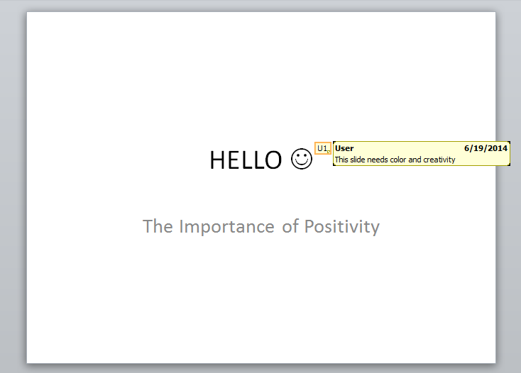
In this PowerPoint tutorial, we’re exploring a PowerPoint tool that allows you to add comments to slides. This is different from your own slides’ notes section, which are your comments on your presentations. However, if you want others to put their comments on your deck, make use of this feature.

This is useful if you’re collaborating with several people in preparing for a presentation. Available for PowerPoint 2010 onwards, with the Comments PowerPoint tool, you can annotate slides in a few simple steps:

Step 1

Start by clicking the Review tab. Choose the New Comment icon, which is grouped under Comments.

Comment PowerPoint Tool Step 1: Select NEW COMMENT

Doing so will prompt this box to appear:

Yellow pop-up box where you can type text

Step 2

Type down your comments. When you’re done, just click anywhere on the slide to collapse the yellow comment box.

Step 3 

Place your annotation anywhere on the slide by dragging this icon to your desired location:

comment tutorial 07

comment tutorial 06

You can create as many comments as you’d like. Review all your comments or make changes to any of them with these icons:

Edit Comment, Delete, Previous, Next

You can hide all your notes by clicking the Show Markup icon (which is automatically highlighted when you begin adding comments). You can click it to make all your annotations appear again.

There you have it! The Comments function is simple. It’s a helpful PowerPoint tool to have in your arsenal. You can now easily pass pointers and notes with your team, making collaborations efficient and hassle-free.

Breathing Room: Unleashing the Power of White Space in PowerPoint Presentations

In visual arts, white space refers to the unmarked portion of a page or the empty space in-between content. This graphic design element, however, is more than just a passive by-product of a layout design. White space helps create balance and harmony, allowing a canvas or page to look more appealing.

White space is also great for one important purpose. According to designer Corina Ciripitca, graphic artists use it to guide the viewers’ eye and lead them from one element on the page to another. You can also apply this principle to your PowerPoint designs.

Greater impact

Also known as negative or blank space, white space (though, it doesn’t always have to be white) is added to a layout in order to create better structure. As a result, the text or image that the space surrounds generates greater impact. Just look at the sample below: white space  

The image, one of Volkswagen‘s famous ads, utilizes white space to effectively convey its message. Compared to a cluttered design, the advertisement retains only the most essential parts of its message, leaving room for the viewer’s gaze to rest.

This avoids sensory overload, which, similar to information overload, defeats the point of communicating to the audience. Too many things going on can overwhelm your audience and bury all the information under superficial details.

Less clutter

With your slide design, leaving plenty of white space can make a lot of difference. In fact, white space has made such an impact on the design industry that Smashing Magazine‘s Vitaly Friedman and a few other writers wrote extensively on the topic.

It makes the text as legible as possible while allowing images to capture attention. This means that there’s no need to fill your slide’s empty areas with logos or other pointless graphics or text that do not add to your key points. The less cluttered your slides look, the more powerful your message will become.

Better appreciation

Putting too much text and images can drown out the key points on your slides. When used strategically, the white space on your slides will inform your audience instantly where to look. Apart from making your layout easier to follow, it also offers the eye a visual rest. Using white space in PowerPoint designs is probably one of the easiest ways to add impact to your slides. As you put enough blank space

As you put enough blank space around an image or text, you emphasize their importance. In turn, they capture your audience’s attention. Ultimately, even if you don’t know anything about layout design, mastering the use of white space in PowerPoint designs can significantly improve the way you create your slides.

Craft a winning PowerPoint with a simple deck that doesn’t flood the audience’s eyes. Once you’re through with this, you can focus on your pitch and polish your overall presentation.

References

Ciripitca, Corina. “Why Is White Space Good For Graphic Design.” Designmodo. October 13, 2011. Accessed June 25, 2014.
Friedman, Vitaly. “White Space and Simplicity: An Overview.” Smashing Magazine. January 12, 2007. Accessed June 25, 2014.

What Marketing PowerPoint Presentations Can Do For Your Business

Marketing is the bridge that connects producers with consumers. It involves the development, promotion, and distribution of products with the aim of satisfying the needs and demands of consumers. It’s a process that’s fundamental to your business, forming the lifeblood of what you do. Every step demands clear and effective communication between different parties. This is where

Every step demands clear and effective communication between different parties. This is where marketing PowerPoint presentations can come in handy.

Marketing PowerPoint presentations can help facilitate communication in the following areas:

Product Management

By definition, product management involves all decisions made in the production and sale of goods or services. It serves to determine details like improvements that can be made on the product, whom it should be marketed to, and how it should be promoted. Information that can answer these queries is gathered through research. This is best shared through marketing PowerPoint presentations.

The visual component of a PowerPoint makes information engaging and easy to follow. Translate data about customers, trends and competitors through concise slides. Focus on the most important details and offer brief explanations on how it could affect the development of your new product. Adding relevant images will also make your presentation memorable.

Marketing PowerPoint slide by SlideGenius

Pricing

Presenting financial data through a marketing PowerPoint will help your company make sound decisions about pricing. Since plenty of people are inclined towards visual learning, it might be beneficial for both presenter and audience to break down statistics and numbers in engaging visuals.

Using charts and graphs, translate all the dizzying numbers and statistics into digestible illustrations. This also leaves room for your verbal elaboration, which will let you establish a personal connection with the audience.

Promotion and Advertising

A marketing PowerPoint can also work as a great promotional tool for your product. If you find yourself presenting at industry or press events, make use of PowerPoint slides that visually translates the message of your brand.

Let your marketing PowerPoint illustrate the best thing about your product. Answer the questions your consumers will likely ask:

  • What is it?
  • Why is it important?
  • How does it work?

Marketing PowerPoint slide by SlideGenius

Conclusion

All types of presentations should be given plenty of thought. Specific presentations especially require specific types of elements on the deck. As an expert in your own field, you know the content best. However, not everyone has time to design a perfect deck, especially just days before the deadline.

If you need more insight about marketing PowerPoint presentations, don’t hesitate to contact us for a quick consultation. Our expert PowerPoint designers are ready to help you take your products to the next level.


Reference

What Is Product Management? Definition and Meaning.” BusinessDictionary.com. Accessed June 25, 2014.


Featured Image via Flickr

Charting the Course: A Comprehensive Guide to Unleashing the Power of PowerPoint Charts

Many presenters are often guilty of what young people nowadays call “TMI,” or Too Much Information. They tend to include too many details in their presentations, making the slides look cluttered and incomprehensible. Fortunately, there are several ways to present your data in a more organized manner. You can use images or other visual aids such as charts.

Below are the different types of PowerPoint charts that you can use along with some tips on how to maximize them for your presentations:

Pie Charts

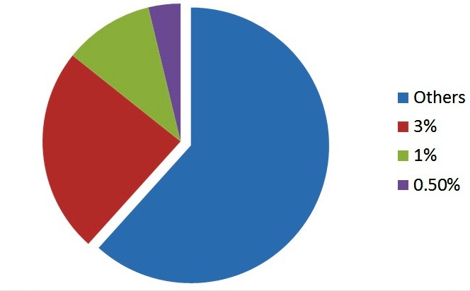
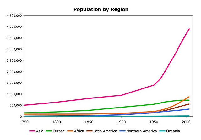
These charts are commonly used to show percentages. For better visual impact, limit the pie slices to 3-5. Limiting the number of slices can keep the pie from looking really messy when you need to show a lot of different data points. Instead of showing every little detail, you can turn your pie chart into something like this:

powerpoint charts

Apart from making it larger than the others, contrast the most significant slice with the use of color.

Vertical Bar Charts

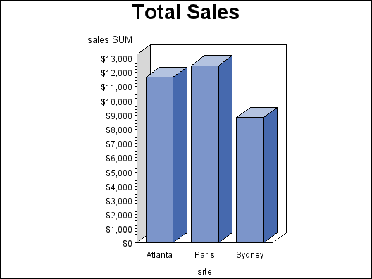
Vertical bar charts are useful for showing changes in quantity over periods of time. Limiting the bars to around 4-8 can make your vertical bar chart easy on the eyes. Vertical bar charts show how variables are affected as each of them rises or falls.

bar-chart

Horizontal Bar Charts

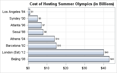
This type of chart is used for comparing quantities. One example is when you compare sales figures of your products on a given period. Horizontal bar charts can be used in the same manner as  vertical bar charts, although it uses the y-axis for labeling. It is usually preferred when the labels (the names of the cities, in the example below) are too long for the x-axis.

bar chart


Line Charts

Line charts are great for displaying trends. For example, you can use this to show how your company’s sales have gone up each year. You may also use an upward arrow to emphasize the positive trend.

3202553051_1196f2d84e_z

Most people would rather use tables instead of charts. After all, it’s easy to prepare them when all you need is a side by side assessment of numerical data. Tables, however, do not have the same visual impact as charts. You can even make your chart 3-D to increase its appeal. Regardless of how you present your data, though, make sure that they are accurate and relevant to your presentation.


Featured Image: by Chris Potter via flickr.com

About Face: Choosing PowerPoint Fonts

You have plenty to consider when it comes to choosing PowerPoint fonts. You can choose from the ones available on your computer by default.

Or you can search the Internet for downloadable fonts. With such a wide selection, how do you choose the right PowerPoint fonts? We have a few tips and reminders on that front.

Serif versus Sans Serif

When choosing PowerPoint fonts, consider the difference between Serif and Sans Serif

Notice how stems are sticking out of the letter “A” on the left? Those are called serifs. Serif font types like Times New Roman, Georgia, and Book Antiqua have a classic and formal feel to them. These associations come to us because we see these fonts used in more traditional media like books and newspapers.

Meanwhile, the letter “A” on the right is a sans serif font. Sans serif fonts like Arial, Helvetica and Calibri have cleaner lines. They evoke a more modern feel because they dominate websites and advertising.

When choosing PowerPoint fonts, consider the differences between Serif and Sans Serif.

Take note of how our cultural associations have assigned meaning to different font types. For example, it might be better to use serif fonts for PowerPoint presentations of a more formal nature. (Let’s say you’re presenting an investment pitch book.)

It’s also important to consider the aesthetics of both. Because of its clean lines, sans serif fonts are easier to read. They’re perfect for the body of your slides. Likewise, you can increase the readability of serif fonts by increasing font size. You can make use of them in title slides or headlines.

One Happy Font Family

Choose PowerPoint fonts within the same font family/typeface

Variety is an interesting element in design, and it’s better if you use more than one font for your PowerPoint presentation. However, in one of his famous slide presentations, keynote author Jesse Desjardins suggests that you limit PowerPoint fonts to only 2-3 styles. Keep your PowerPoint fonts unified by choosing ones from the same font family or typeface.

When Arial Becomes Boring

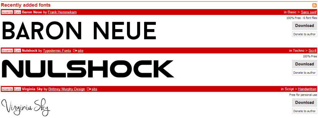
You can search the Internet for PowerPoint fonts that you can download for free

The Internet provides a wealth of font choices when you start feeling bored with the defaults on your computer. You can download great PowerPoint fonts for free at dafont.com. Dafont and several other websites like it allow users to upload and share fonts of their own creation.

Using these custom-made fonts allow for more creativity in your PowerPoint design. And with so many choices, you’re bound to find a font that perfectly matches the theme of your presentation.

However, keep in mind that the font you downloaded might not be installed on other computers. If that happens, PowerPoint will substitute it for another font that might skew the complete look of your slides.

To prevent this, follow these steps from Palomar College’s Terry Gray to embed fonts in your PowerPoint file. A word of caution, though: this technique will bloat your file size, so weigh your pros and cons!

Still in need of inspiration? Browse through our works to see how good font choices can make a difference in PowerPoint design.


Reference

Desjardins, Jesse. “STEAL THIS PRESENTATION!” LinkedIn. August 23, 2010. Accessed June 23, 2014.


Featured Image: Wikimedia Commons 

-->