Slidegenius, Inc.

5 Quick Pointers for Productive Business Meetings

Not a lot of us look forward to business meetings. In fact, as gathered by Prezi in a recent survey, a majority of people admit to drifting off while listening to a colleague’s presentation. Instead of paying attention, more than half of the respondents said they’re often tempted to text, check their emails, go on social media, or even take a quick nap. How can you turn this situation around to ensure that your business meetings are always effective and productive?

As you might have guessed, the secret lies in how you work the room. Keep in mind these pointers to conduct your business meetings well:

1. Figure out your goals and objectives

Before calling for a meeting, identify your main objective and figure out the goals you want to accomplish. If these goals seem simple enough, ask yourself whether it warrants an hour of face-to-face group interaction. As business etiquette expert Jacqueline Whitmore mentions, meetings can be quite expensive. Is a meeting actually necessary to meet your objective? Or will be you be able to gather answers by simply communicating through email or a quick phone call?

2. Don’t go over the time limit

The business world is fast-paced and schedules are usually packed with dozens of activities throughout the day. Make sure you use everyone’s time wisely. Set a time limit and follow through. Don’t let your meetings drag on beyond the schedule. If you do, everyone will soon lose their attention. A few might even have to sneak out of the conference room because of something else to attend to.

3. Have an agenda and stick to it

The best way to keep your meetings on track is by sticking to an agenda. List down all the topics you want covered, discussed, and resolved. Start with the most pressing matter and move down to issues that are less important. This will help everyone maintain their focus throughout your meeting, and avoid discussing points that are off-tangent. Be sure to distribute the agenda beforehand to give attendees some prior notice.

4. Encourage feedback and discussion

Business meetings are an avenue for open communication. Don’t monopolize the discussion just because you’re the one taking the lead. Give attendees the opportunity to provide feedback. If you’re making use of a slide deck to present some ideas, you might be tempted to rush in order to have time for a discussion. You can encourage free-flowing conversations by making use of a non-linear presentation instead.

5. Follow up with the attendees

If your meeting is successful, everyone will leave the conference room with their own action items. These are things that need to be accomplished based on the discussion you had. Designate someone in the group to list down all the action items and post it to a shared document. This will help everyone keep track of what needs to be done after the meeting. And to keep everyone productive, don’t forget to remind others of their tasks through follow-ups.

Keep your business meetings productive by setting clear goals. Most importantly, make sure everyone attending has the opportunity to share their own ideas and give feedback.


References

Presentation Habits Presenters Don’t Like to Admit.” Prezi Blog. September 23, 2014. Accessed September 30, 2014.
Whitmore, Jacqueline. “The Best Way to Run a Business Meeting.” Entrepreneur. January 03, 2014. Accessed September 30, 2014.


Featured Image: Sebastiaan ter Burg via Flickr

Click to Add Title: Using PowerPoint Templates

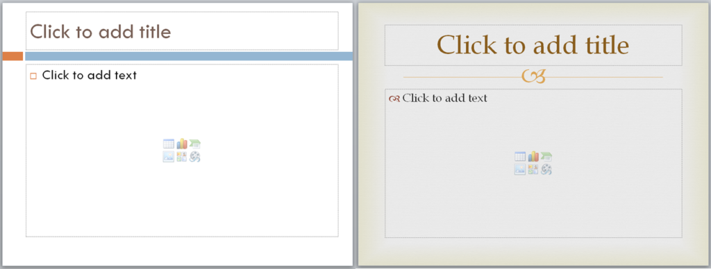
A PowerPoint template is a great place to start when you’re feeling clueless about how to design your slides. Once you’ve taken your pick, all you have to do is fill in the blanks and add your content. It’s quite a convenient method for those of us who weren’t given enough time to prepare for a presentation.

Despite this, we’ve all heard that PowerPoint templates aren’t always the best solution. Because of its preset format, working with a template can really stifle your creativity.

The placeholders automatically tell you where to text and images should go. Even if you decide to customize the template you chose from PowerPoint’s built-in gallery, you’ll only be able to change so much. After all your effort, your slides will look like other presentation decks, a standard headline on top with a bullet point list below it, or a picture on the right with some text beside it.

So how do you make your PowerPoint templates stand out when you’ve got very little time to think of a unique design? 

1. Look for unique templates at Microsoft.com

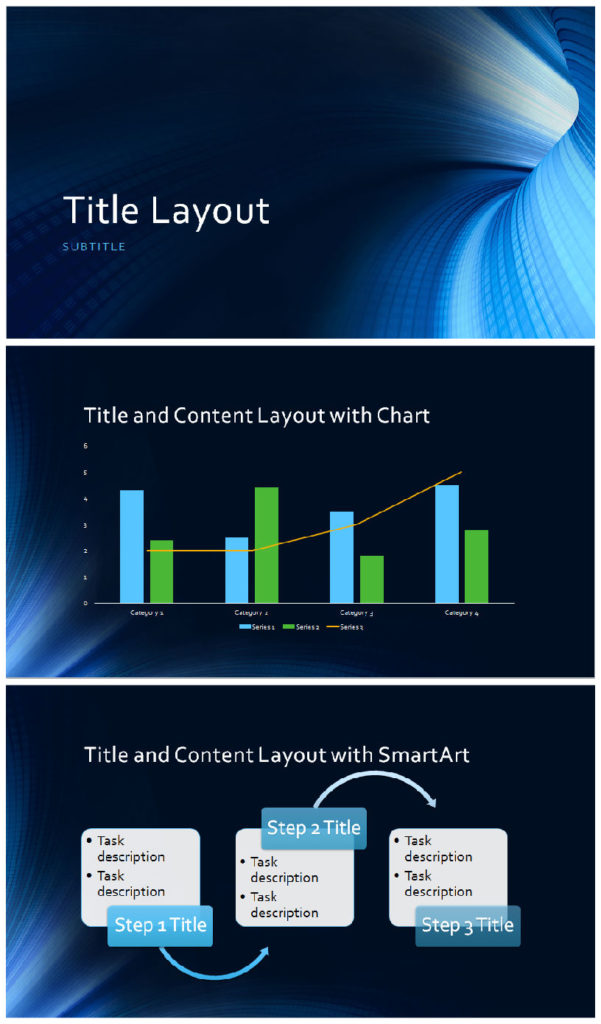
PowerPoint Template: Business Digital Blue (Download HERE)

The default templates in PowerPoint have been used to death in the business world. If you want to stand out without customizing each aspect of your slides, you can head on over to Microsoft.com and choose from a wide array of less common PowerPoint templates available there.

2. Change the layout

PowerPoint Template: Angles (Quote from Trade Show Institute | CC BY 3.0)

To avoid repetitive-looking slides, try to move around your placeholders and change up the layout. Try placing headlines at the bottom of your slides. Change up the position of your text. Better yet, minimize your use of bullet points and use images to illustrate your points instead. Be creative and experiment with the template at hand.

3. Integrate your brand colors

PowerPoint Template: Grid

One more thing you can do is change your template’s color scheme to something that mirrors your brand. This way, you don’t have to worry about integrating your company logo to your slides. Your brand will be well-represented throughout the presentation just by having the right colors.

The Final Word

Templates don’t have to be boring. You can change it up and apply your own style to it. Seek less used options online, either on the Microsoft site itself, or on other websites that provide quality templates you can use to your advantage. Tweak your layout by changing the placeholders and applying different color schemes on your slides. While you’re at it, why not integrate your brand colors to help impress your company identity on your audience throughout the presentation?

You can do all this yourself with a few clicks and the willingness to explore PowerPoint’s vast potential. Or, you could contact a presentation designer to help you get right off the bat. SlideGenius customizes templates to your liking. Contact us today for a free quote!

The Science of Effective Storytelling in Presentations

We often talk about the advantages of storytelling as a presentation technique.

SlideGenius Blog Module One

We redesign PowerPoint presentations.

Get your free quote now.

get a free quote

A presentation that’s filled with facts and figures can easily stray into a monotonous lecture that slowly lulls the audience to sleep. But if you choose to tell a story, you can give your audience something personal, concrete, and relatable to listen to. You can elicit very strong emotions that allow them to participate and engage with what you’re sharing.

As Dr. Paul Zak of the Center for Neuroeconomic Studies found, narratives can trigger powerful responses when told the right way.

The science of effective storytelling

In this short film made for the Future of Storytelling Summit, Dr. Zak carefully explains how the human brain responds to effective storytelling:

After observing the neural activity of respondents who viewed the story of a terminally-ill two-year-old boy, Dr. Zak found that effective storytelling can evoke powerful feelings of empathy that come from the release of particular neurochemicals, including oxytocin and cortisol. Furthermore, these powerful responses often turn into concrete and positive action.

This, however, doesn’t happen by telling just any other story. In order to be effective, the narrative has to follow the dramatic arc outlined by German playwright Gustav Freytag: exposition, rising action, climax, falling action, and resolution. Otherwise, as Dr. Zak concluded, listeners will have “little if any emotional or chemical response.”

What does this mean for presentations?

To elicit the same powerful emotions from your audience, craft a story that follows the solid structure Gustav Freytag first envisioned 150 years ago:

Exposition

In a literary story, this is where the author lays out some “ground work” by presenting the characters, setting, and basic conflict.

For your presentations, this is where you establish some context. Introduce the point of view you’re presenting, and share some background information. If the story  focuses on an experience you had with a client, set the scene and introduce important details.

Rising Action

After presenting the context of your story, it’s time to build tension and increase conflict. This is where you identify obstacles that prevent your character from feeling fully satisfied or happy. If your story is from a target customer’s POV, tell your audience about the challenges they face.

Climax

As the turning point of your story, the climax is the part where your character comes face-to-face with their problem. This is where the conflict becomes fully-realized and a solution is seen on the horizon. For your presentation, the climax marks where you start driving home your core message.

Falling Action

Slowly, as a solution becomes clearer and clearer, your character takes a course of action towards the identified goal. In the traditional sense, this is where the protagonist battles the antagonist. For your presentation, this is where you continue explaining your core message, focusing on how it helps resolve the problems you introduced early on.

Conclusion/Resolution

Finally, describe how your character meets their goals. This is where you explain how you and a difficult client came to an agreement. In another example, the conclusion is the part that details how your target customer finally achieves full satisfaction.

Powerful storytelling can change the outcome of your presentations. Share stories that engage your audience by following an age-old technique that has always been universally effective.

SlideGenius Blog Module One

Download free PowerPoint templates now.

Get professionally designed PowerPoint slides weekly.

Sign Up Now

Featured Image: Screen shot from Future of StoryTelling: Paul Zak 

How to Make a Simple Infographic Using PowerPoint SmartArt

Visual content is currently ruling social media. If you want to capture the attention of your audience, an infographic is a wise way to do it. As we’ve mentioned in the past, Internet users prefer how infographics can effectively break down the information they need through easy-to-comprehend illustrations. Here’s a quick tutorial on how you can make a simple infographic using PowerPoint SmartArt:

Step One: Resize slide

With a blank slide, go to the Design tab and click on Slide Size. Set the size for Custom and define the dimensions you want to work with. For PowerPoint 2010, you can do this by clicking on Page Setup in the Design tab.

If you want a general idea of what’s usually acceptable for slide sizes, decks that will be exported or shared across other platforms and projected on a traditional screen usually use the Standard size 10″ x 7.5″. On the other hand, widescreen (13.3″ x 7.5″) is preferable for a deck meant for TV or a monitor. Knowing your venue and the equipment that will be used beforehand will come in handy in determining what size your slides should be.

Step Two: Choose the perfect SmartArt shapes

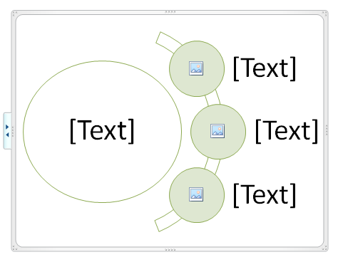
Once you’ve successfully resized your slide, go to the Insert tab and click on SmartArt. Choose the template that will work best with the infographic you’re planning to make. It will be better if you choose a template that allows you to automatically add pictures.

infographics smartart

In the image above, the template already provides a guideline of where you can put in images and text. This saves you time from deciding how to layout your SmartArt design.

Step Three: Customize

Insert text and data you’ve gathered through research. And most importantly, add some images to make your infographic pop. You can make use of the icons from The Noun Project or make your own by customizing PowerPoint shapes. You can also find some stylized font types from DaFont. Be creative and think outside the box. Experiment by playing with colors and white space.

Step Four: Save your work

Once you’re pleased with your handy work, you can save the infographic by going to the File tab and clicking Save As. Remember to save your infographic as a JPG or PNG file. When a dialogue box appears, choose Current Slide Only.

Your infographic won’t look as complex as what you’d normally see online. But if you use your imagination and take some inspiration from some of our previous PowerPoint tutorials, you can come up with something that is just as unique and exciting.

Infographics and PowePoint designs have plenty in common. Let your infographic reach its full potential with the help of a design expert. Contact our SlideGenius professionals today for a free quote!


Featured Image: Paul Hudson via Flickr

How to Create a STAR Moment for Your Presentations

Are your presentations falling flat? In her book Resonate, Nancy Duarte shares a few methods for a dramatic and memorable presentation delivery.

SlideGenius Blog Module One

Get hundreds of PowerPoint slides for free.

Sign up for your free account today.

Sign Up now

A successful presentation creates a connection with the audience. In other words, it has to have “Something They’ll Always Remember.” The STAR moment doesn’t have to be particularly big or flashy, but it needs to be awe-inspiring. According to Duarte, it’s all about creating a “significant, sincere, and enlightening moment…that helps magnify your big idea.”

A huge spectacle doesn’t automatically equal to a STAR moment, particularly if it distracts the audience from your core message.

So how does it work? Duarte named five different types of STAR Moments in her book. Here’s a short review and some tips on how you can use them to make your presentations stand out:

1.) Memorable Dramatization

You can create a memorable impression with small dramatizations throughout your presentation. These dramatizations don’t have to be complicated. You can simply make use of props to help illustrate your points, or perform a demonstration of your product. What’s important is that you take your key points and turn them into something that your audience can watch play, which will help them understand the information you’re sharing with them.

As an example, Duarte cites how Richard Feynman explained the likely cause of the Space Shuttle Challenger disaster. As one of the investigators on the case, Feynman demonstrated what went wrong using a few props during a televised hearing. According to the physicist, the O-rings in the shuttle became less resilient due to the cold weather. To explain his point, he compressed a similar O-ring using a clamp and immersed it in ice-cold water.

2.) Repeatable Sound Bites

You can also repeat short and memorable phrases throughout your presentation—”sound bites,” as Duarte calls these. To be effective, they should be easily recalled and communicated to others. Take note of all the critical messages in your presentation and constantly repeat them verbatim throughout your presentation. This will help your audience remember your main arguments, and echo your points to their colleagues and social media followers.

3.) Evocative Visuals

Visuals wields a different power over words. It’s one thing to read or hear something. It’s a completely different experience to see it represented by a picture or video. They are even more powerful if you want to portray abstract concepts. You can use images to add impact to the data you’re presenting. Instead of using a graph or a chart, add some illustrations that will properly present the point you’re making.

STAR moment - Conservation International

Another thing that Duarte suggests is the use of contrasting images. She provides a few slides from Conservation International as an example. In their campaign, scenic pictures of the ocean are juxtaposed with images of polluted beaches.

4.) Emotive Storytelling

Of course, the best way to connect with your audience is by showing them something they can relate to. Another way to create a STAR moment in your presentation is through storytelling. As we’ve mentioned in the past, sharing stories is part of our nature as social beings. Don’t be afraid to tell a story that reveals the emotions driving your presentation. If you’re pitching to investors, go ahead and share your business story. Show them how passionate you are about your venture.

5.) Shocking Statistics

The last way to create a STAR moment is by integrating statistics and data to your presentation. Things become more concrete if there’s a specific number attached to it. But don’t just hand out a large figure. Contextualize your statistics in a way that your audience can easily relate to.

In Resonate, Duarte cites how Steve Jobs framed the 5 million songs sold every day in the iTunes store: “We are selling over five million songs a day now. Isn’t that unbelievable? Five million songs a day! That’s 58 songs every second of every minute of every hour of every day.”

Try adding a STAR moment to your next presentation. Create an experience that will allow your audience to take your message to heart.

SlideGenius Blog Module One

Download free PowerPoint templates now.

Get professionally designed PowerPoint slides weekly.

Sign Up Now

Reference

Duarte, Nancy. “Resonate.” Duarte. Accessed September 26, 2014.


Featured Image: Screen shot of the Resonate Multimedia Version 

PowerPoint Inspiration: Sample Slides That Will Blow You Away 

You have a big presentation coming up and, as it always is, the stakes are unbelievably high. You’ve prepared your content and talking points. It’s time to build an amazing and memorable PowerPoint deck. You’ve read all the tips and tricks you can find. You know that you want your deck to be a far cry from the usual ones you see in business meetings. You open PowerPoint and a blank slide stares back at you. After a few minutes, you realize you’re stuck. All the ideas you formed earlier seems cliche and boring now.

So how do you solve this PowerPoint design block? Kendra Haines of Web Designer Depot compiled a bunch of PowerPoint slides that could be useful for inspiration. We narrowed down her list to 5 PowerPoint inspiration sources for your big business presentation:

1.) Designing the Business Experience – Matthew Smith 
(Click image to view PowerPoint presentation)

This PowerPoint makes use of bold images and minimal text to get the point across. It strategically makes use of color. Some slides pop out with a bright dominant green, while others are more subdued with a simple black and white palette.

2.) For a Future-Friendly Web – Brad Frost 

This PowerPoint deck is the best example for how you can turn any discussion into a visual experience. It makes use of original illustrations, high-quality images, and screencaps for a more engaging presentation.

3.) Data, Design, Meaning – Idan Gazit 

Speaking of visuals, the designer of this PowerPoint deck offers up some advice on how you can visualize data. It’s easier to digest information if it comes in charts that people can easily decipher.

4.) It’s Worth the Effort – Ian Collins 

This is a visually-stunning presentation that can inspire anyone suffering from creative block. Take note of how it allows the pictures to tell  a story. The filtered look to the photos also add to the emotions the presentation is trying to convey.

5.) Customer Satisfaction by the Numbers – Zendesk

PowerPoint Inspiration 5 - Zendesk Customer Satisfaction

This PowerPoint report outlines Zendesk’s global customer satisfaction scores, as well as some ideas on how to improve the customer service experience. It’s data-heavy but visually engaging slides can be a great source of inspiration for a high-stake business presentation.


You can also try to look for PowerPoint inspiration by checking out our portfolio. Better yet, how about stepping away from your computer for a while. Take a walk around your neighborhood and you might come across something that interests you. Take a camera with you and take pictures. You might be able to use some of them in your PowerPoint deck when you return.


Featured Image: Tsahi Levent-Levi via Flickr

Prezi Feature of the Week: Getting Started

PowerPoint remains the default choice for most business settings. But if you want something new for your next big presentation, Prezi is a great place to start.

Prezi gives you the freedom to structure your presentation as you see fit. Instead of asking you to work on a progression of slides, Prezi gives you a canvas where you can lay out your content. This spaces allows you to organize your ideas in any way you want. You don’t have to think of your presentation in terms of moving from point  A to Z. Your presentation can go from A to B, return to A, and then skip to F.

With Prezi, you get to visualize the big picture and then zoom into the specifics as you deliver your presentation. Because of this flexibility, Prezi can be intimidating for beginners. If you feel like the blank canvas is going to swallow you whole, try starting from the basics:

1.) Templates

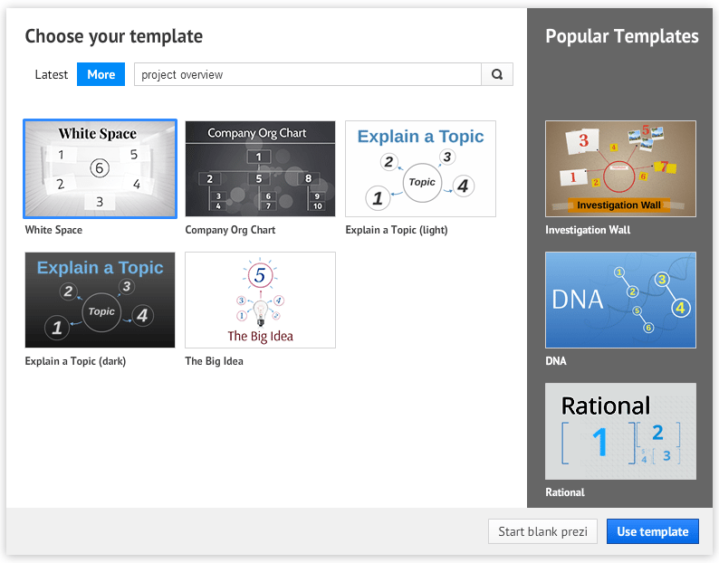
When you first make a new Prezi, you can choose to start from a blank canvas or work with a template. By using a template, Prezi automatically constructs how the different objects will look on the canvas. All you have to do is add your own content.

prezi template 02

Prezi has plenty of unique designs that can work as a visual metaphor for your presentation. If you’re having trouble imagining how yours should look, use the search box to find suggestions that are perfect for the topic you’re covering.

prezi template 03

2.) Frames and Layouts

If you’d rather build your Prezi from scratch, you’ll need to learn how to use frames. Basically, frames work in the same way as slides. They’re placeholders for your content, allowing you to organize your ideas. You can think of them as Lego pieces you have to arrange and put together to build a whole structure.

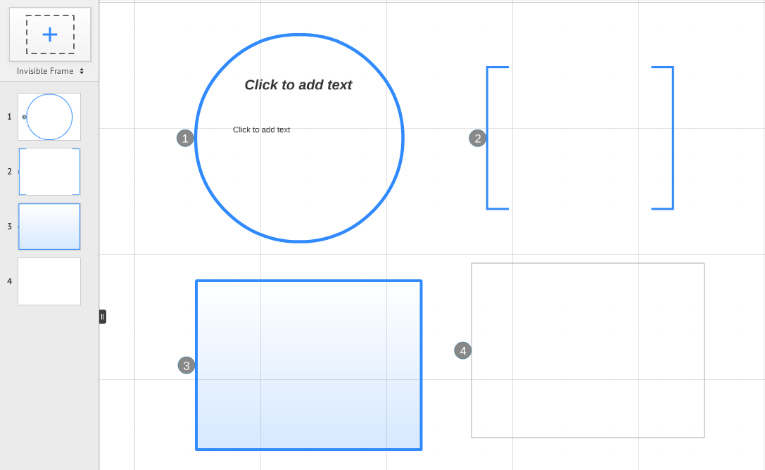
There are four different frame types—circle, bracket, rectangle or invisible. Just click on the + icon above the left sidebar and drag the frame into your canvas.

prezi frames

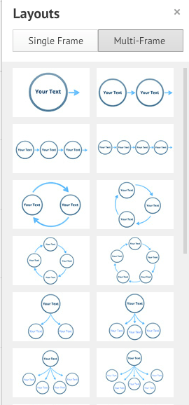
Rotate, scale, and move the frames to build the structure you have in mind. You can also make use of layouts to add frames with placeholders you can edit. If you don’t want to bother with arranging frames in a specific way, you can choose from the Multi-Frame Layouts available.

prezi layouts

3.) Path

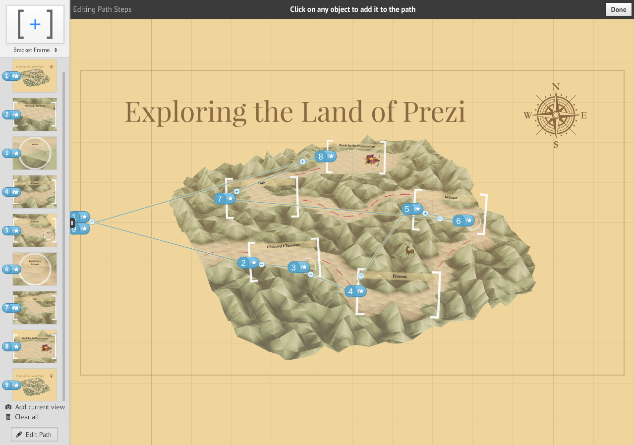
Whether you’re using a template or starting from scratch, the path tool is a crucial part of the Prezi-making process. A path will define how your presentation will transition from one frame to the next. You have the freedom to move across the canvas however you like.

Once all your frames are set, click on the Edit Path button at the bottom of the left sidebar. On your canvas, select objects in the order you want them to appear. Add Current View can also help you transition to the view that’s currently filling your screen.

prezi path
It’s never easy to try something new for the first time. With some patience and creativity, you will easily find your footing. Prezi can be a little confusing for beginners, so familiarize yourself with these three basic features. Next week, we’ll take a closer look at other Prezi features to help you become a pro.


Featured Image: Death to the Stock Photo / Prezi logo via Wikimedia Commons

3 Quick Ways to Turn Information into Visuals

As we know, it’s easier for our brains to process visual information. As Dr. John Medina writes on his website, “vision trumps all other senses.”

Within seconds of exposure, pictures beat sentences and words for recall. And in memory tests where people are shown hundreds of photos, they can remember 90% three days later – and 63% after a year.

So if you want to make your presentations memorable, you need to learn how to turn all your data and information into visuals that your audience can easily digest and understand. We’re living in the multimedia age. Today, there’s much more emphasis on images and graphics than there is on the written word. According to MarketingProfs, these are 3 quick methods that you can try to make your information more memorable:

Videos

What can be more engaging than watching something play out before your very eyes? Showcase product demos or customer testimonials through short video clips. You can even try your own hand with a short informative skit through animation. Get started by making use of free tools like Masher, Animoto, and Adobe Voice. If you’d rather just share a video you found through YouTube, you can check this tutorial to learn how you can add one directly to your PowerPoint slides.

Infographics

Another great way to visualize information is through the use of infographics. As we mentioned in the past, they’re an effective way to condense data in a way that’s easy to understand. Infographics are a fun combination of quirky illustrations and hard-hitting facts. To make one yourself, keep these pointers in mind and explore online tools like Visme and Piktochart. With a bit of creativity and customization, you can also make use of PowerPoint SmartArt.

Heat Maps

You’ve probably seen heat maps used in the weather report, where color intensity is used to pinpoint the temperature all over the country. For a presentation, you can also make use of a heat map to visualize data about your website. If, for example, you’re presenting about your online marketing methods, you can make use of Crazy Egg and Clicktale to make your own heat map. These sites will pull information from your websites and pages to show which areas have the most activity.

What other methods do you use to turn the information you have into eye-catching and interesting visuals? Share your thoughts through our social media channels linked below.


READ MORE: Three Ways to Visually Present Information (Without Spending a Fortune) – MarketingProfs

Featured Image: Armando Maynez via Flickr

3 Steps to Simplify Your Complex Technology PowerPoint

Delivering a presentation about technology-related topics can be quite challenging. For one, you will have to simplify various concepts for the benefit of your audience and to maximize your allotted presentation time. You’ll also need to organize your ideas into concise and easy-to-understand PowerPoint slides.

You need to keep your technology PowerPoint deck from being looking too complex. On top of it all, you have to make a connection with the audience. It becomes even more challenging when you’re presenting to people who are not familiar with the topic or technology you’re discussing.

If you’re in a similar situation, here are three key pointers to keep in mind when working on a technology PowerPoint presentation:

1. Focus on the core message

Avoid over-explaining the concepts in your slides by zeroing in on the key points you want to share. Before you open PowerPoint, start by creating an outline. What is the main takeaway of your presentation? Is it really necessary to explain particular concepts? If it is, which part of your explanation is the most crucial? Keep editing and trimming down your points until you arrive at the main ideas you want to share.

2. Explain with images and illustrations

As we know, research has shown that visual elements can better engage the attention of an audience. Instead of piling paragraphs of text onto your technology PowerPoint, you can make use of images to expound on key points. You can also make use of flowcharts or SmartArt graphics to illustrate concepts that might be harder to understand.

3. Don’t forget the story

Knowing that you’ll be presenting about technology, you might want to simply focus on answering the “how-to’s”. But other than that, you should also remember to tell your story. At the heart of all the tech-speak, what is the narrative behind the topic you’re presenting? A story is a great way to make an emotional connection with your audience. As an example, consider this ad run by Apple for the iPhone 5s.

Conclusion

Creating an engaging technology PowerPoint is challenging, but it isn’t impossible. All you need to do is create a solid plan and focus on making a valuable connection with your audience.

While interesting stories may temporarily engage, don’t forget to link it all back to your core message. Text can be effective in getting straight to the point, but illustrating your point may be even better in catching people’s attention. Make use of diagrams and other images to relate to your pitch.

Giving people hard facts can tire people out. Structure your presentation like a story with a convincing hook, line, and sinker. Don’t forget to tie it all in with a powerful conclusion and call to action.

Need a nudge in the right direction? Here at SlideGenius, we create different types of presentations and technology PowerPoint is one of our specialties. Contact us for a free consultation today.

Featured Image: crabchick via Flickr

Designing PowerPoint Decks for the Smartphone

Millions of Americans are glued to their smartphones. According to data gathered by Statista Dossier, there are currently around 163 million smartphone users in the US. The numbers are also expected to rise to 220 million by 2018. This comes as no surprise, considering that industry giants like Apple and Samsung release innovative new designs almost every year. In fact, Apple just released the iPhone 6 and iPhone 6 Plus.

Luckily, it doesn’t take a lot of work to make sure that your PowerPoint decks are compatible for viewing on smartphones. All you have to do is follow these four basic rules:

1. Big and bold text

sample slide for smartphones 01
Matthew Smith / Note&Point

Even if the iPhone 6 Plus has a screen size of 5.5 inches, that’s still a lot less room than where you’d commonly show a PowerPoint deck.  Make sure that the font type and size that you use is extremely readable. Go for 30 points or higher. Stylized fonts should always be larger than your usual sans serif text. You don’t want the audience to squint just to read what you’re trying to say.

2. High-contrast colors

sample slide for smartphones 02
Idan Gazit / Note&Point

Another way to increase the readability of your PowerPoint designs is through high-contrast colors. Use either a dark background with light-colored text or vice versa. Similarly, avoid using colors that are too bright. Try for a more muted palette with only a few vibrant pops of color every so often.

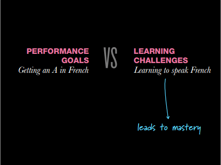
3. Powerful images over bullet points and paragraphs

sample slide for smartphones 03
Stephen P. Anderson / Note&Point

Don’t overwhelm your target audience with too much text. Visualize your key points with powerful images instead. This will help keep your PowerPoint deck simple and straightforward. Don’t try to discuss too much concepts at one go. Explaining complicated concepts will require more sentences and paragraphs. If you feel like there’s something in your content that needs further explanation, simply link to other resources instead. You can also try to make a flowchart or an infographic using free online tools like Piktochart.

4. Simplicity

sample slide for smartphones 04
Stephen P. Anderson / Note&Point

Despite the need for visuals, it’s also important that you don’t complicate your PowerPoint designs. Remember, you don’t have much space to work with. Always be mindful of white space and maintain balance in your design. You can still add some animations and transitions, but keep them to a minimum. Aim for a seamless viewing experience. Having too many elements will cause your presentation to lag.

The Takeaway

Smartphone users love the flexibility and convenience it offers. From your phone, you have access to a host of information. If you want to settle a silly argument, you can simply ask Siri for the answer. If you want to keep your work on track, there are plenty of apps that help you organize your ideas and to-do-list.

Among the other things you can do on a smartphone is deliver and view a presentation. You can share your PowerPoint deck through SlideShare or Brainshark.

In the boardroom, you won’t have to set-up a laptop and projector. With interactive apps like SlideShark and SlideKlowd, you can share your presentation directly to your audience’s devices.


Reference

Smartphone Users in the US 2010-2019.” Statista. Accessed September 24, 2014.

-->