Slidegenius, Inc.

Should You Memorize Your Presentation?

If there’s one thing people fear worse than death itself, it’s public speaking.

Professional speakers and experienced executives will often hire PowerPoint design services to focus on the visual aspect of their presentation. This way, they can maximize their time for speech preparation.

Sure, it can be nerve-wracking, but if done right, it will always feel fulfilling in the end.

Once you address your anxiety, it might make you a bit paranoid, but don’t worry about it—many people deal with this, too, and everyone has their own way of dealing with it.

While there are those who consider memorization as a means to reduce anxiety, others may find it difficult, consequently adding to their stress.

Dr. Genard, author of Fearless Speaking, thinks memorizing speeches is a terrible idea. To him, reciting from memory detaches the speaker from the audience. In addition, it makes them sound stiff and mechanical.

When stress and anxiety kick in, all the information you’ve memorized will disappear. These hijack the brain and reduce fluid intelligence—or the ability to solve problems. This was observed by Sian Beilock, an Associate Professor of Psychology at the University of Chicago.

Instead of memorizing your presentation, rehearse as much as you can. Ask your peers to critique and give their feedback so you can apply these to the way you present.

Knowing the pitch like the back of your hand results in you delivering your pitch conversationally. This makes it easier for your audience to pick up on the emotions and reactions you’re trying to coax from them.

Break your ideas into bite-sized chunks and get to know the gist of each one, so you can describe them on your own later on. By then, it will become easy for you to play around with concepts to compare and contrast them with. This allows for a more authentic, on-the-spot performance, as you’re telling it with your own voice—making your expertise on the subject shine.

Darlene Price, a communications coach and the president of Well Said, Inc., stated in an article with Business Insider, that memorizing your opening is fine and recommended since the beginning of the pitch often carries a rush of adrenaline, empowering you to start strong and make a confident first impression.

The way you deliver your speech matters more than the content. No matter how interesting the information is, if you’re lacking confidence, it’s not going to come out right. Why sell your presentation short when you could be convincing people to trust you.

Above all, reciting a memorized pitch takes the authenticity and fun out of presenting. Custom PowerPoint presentations can provide the key points of your discussion, but it’s still up to you to carry the flow of conversation with confidence.

Presentation anxiety is normal and you shouldn’t make a big deal out of it. The only way to lessen it is to make sure that you’re prepared for it. Accept their feedback gracefully, so you can improve and deliver your next presentation with more confidence and conviction.

What Are Designers’ Go-To Fonts for PowerPoint Presentations?

Your performance as a speaker, with the effective integration of powerful visuals, makes a good presentation. If you want to get the branding right, you should balance these two in every pitch.

If you’re going to use a PowerPoint presentation for your pitch, the content of your deck should reflect your overall message.

One way to emphasize the content is through using the right fonts. This aspect of visual design is one of the most important choices you have to make. Arranging the text strategically can help you send a powerful message.

Getting a customized PowerPoint presentation? Here are a few things you should know about font styles:

Serif vs Sans Serif

These are font styles that you should familiarize yourself with. You can use these for various parts of the presentation, differentiating one part from another, or putting emphasis to retain information.

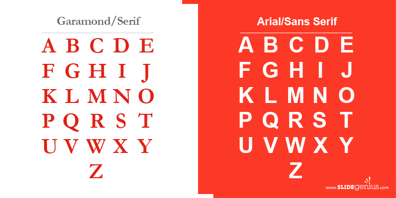
If you see small elements extending from the letters, these are called “serifs” and fonts with these are commonly used in magazines, books, or anything related to print. Sans serif lacks the projecting elements jutting from the edges. You can see this style dominating most web-based experiences.

To give you a visual representation of the two styles, take Garamond and Arial for example. Garamond is characterized by the small lines at the ends of its characters while Arial has none of these.

While on the topic of various font styles, fonts are categorized in five different ways: Geometric, Humanist, Old Style, Transitional, Modern, and Slab Serif.

Font Alternatives

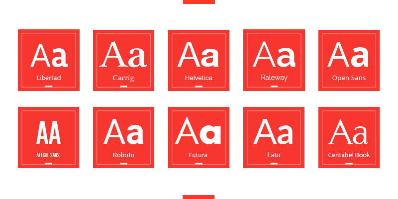
Times New Roman had been the default font for Word Documents for decades, only to be replaced by Calibri in Office 2007. If you would like to veer from the norm, here are some fonts you can use as alternatives:

  • Libertad
  • Carrig
  • Helvetica
  • Raleway
  • Open Sans
  • Alégre Sans
  • Roboto
  • Futura
  • Lato
  • Centabel Book

Before you choose your font, however, here are factors you need to consider:

Theme

The font you choose should go well with the theme of your presentation. It should match the message you’re trying to convey because if it doesn’t complement the look and feel of your deck, it will be noticeable.

Demographics

Know your audience—their age range, their interests. It’s important that you engage them through things they understand and like. For example, if you’re presenting to a group of young people, make sure that you’re using a typeface that can be easily understood.

Legibility

To make sure you hold the readers’ attention, make sure the text is readable. Save the fancy-looking fonts for headlines and more prominent usages.

Mood

This is what you get when you combine the aesthetics of the typeface to the readability of the text. The font you choose evokes emotion, but its readability can take communication to a whole new level.

There are plenty of fonts to choose from, which is why you should stick to just one. Two to three types should suffice—no point in combining two fonts that look the same. Improve your design by combining the ones that complement each other and let your presentation stand out.

-->