Slidegenius, Inc.

All Ears: How Listening Helps Assess Audience Response

As a presenter, your main goal is to engage your audience.

Just because the audience is looking at you, it doesn’t necessarily mean they’re listening. They might just be hearing what you’re saying, but not digesting any of the information.

Everybody hears, but not all of them may listen. You may be asking yourself, “What’s the difference? Both actions refer to the brain registering sound anyway.”

These two have different meanings. Hearing is an effortless, passive occurrence while listening is a conscious choice, which demands your concentration and attention.

Before you hire a PowerPoint design agency to make your presentation, outline it according to the various listening styles and strategies.

Relationship Listening

Empathy, presence, and support are essential when it comes to this form of listening. The ultimate goal here is to develop a strong connection with your audience.

During presentations, this comes in the form of asking and taking questions— this type of engagement builds rapport. Eventually, this leads to a conversation with the audience where insights are shared.

Appreciative Listening

Sales pitches sell a product or service aimed to solve a problem. What better way to introduce or talk about these through telling a story about a similar experience?

When you incorporate storytelling into your presentation methods, you don’t necessarily ask for constructive criticism or feedback, but you are enforcing an area of appreciative listening as you engage your audience.

Critical Listening

Have you ever watched a debate? If you have, then you’d notice that the two opposing panels have an artillery of information backed by research, ready to rebut every point that the other brings to the table.

While you aren’t part of the debate itself, you are engaging in critical listening, which involves analyzing content and identifying the debaters’ objectives.

During your presentation, your audience will seek to weigh the pros and cons of your argument, especially when you’re trying to persuade them or change their beliefs.

Discriminative Listening

The objective of this listening technique is to focus on the sounds, which makes it the foundation of the other four. Here, the listener is encouraged to be more sensitive to the speaker’s tone, pitch, paralanguage, and speech rate.

This goes hand-in-hand with Comprehensive Listening, which is one of the primary methods of learning. It demands you to concentrate on the source and the information it gives.

The indicator of discriminative listening goes beyond words. At the beginning of your presentation, your audience will assess your body language, facial expressions, and even the outfit you chose to wear that day.

Apart from the topic itself, the way you deliver it is everything in the presentation space.

Just because you’re the speaker, that doesn’t mean you shouldn’t do your part as a listener. You still have to, as this helps you determine which information should be included in your commercial pitch deck.

Everyone wants to be heard and understood. This is especially true for presenters who rigorously prepare for their sales pitches and business presentations. Acknowledgement from the audience during presentations means that you have successfully built rapport and established a relationship with them.

Should You Distribute Handouts on Your Next Presentation?

After each sales pitch, speakers can only hope their audience had taken something from their presentation—to have engaged the audience enough for the speaker to be remembered.

SlideGenius Blog Module One

We redesign PowerPoint presentations.

Get your free quote now.

get a free quote

Distributing handouts is a great way to remind your audience of your topic’s key points. This is especially helpful if you have more information that you would like to relay, but can’t include in the presentation because of time constraint or layout/design reasons

These are especially useful for presentations with tons of details because it is impossible for your audience to take in that much information.

What does it contain?

While your PowerPoint is customized to contain the key points of your presentation, your handout provides an extensive explanation of the details bulleted in your deck and your contact information.

Handouts

Usually just a page or two—enough to thumb through, the handout’s content shouldn’t only cover the topics discussed in your presentation. You can also include related information, such as case studies and other print collateral, that supports and further explains your pitch.

Should you distribute them?

Presentations shouldn’t exhaust the audience, instead, this is where you deliver your core message in an engaging way.

Handouts

Adding the element of handouts strengthens your call-to-action, as these provide the resources they need to get in touch when they need to discuss purchasing decisions.

The advantages of handouts, however, come with downsides, including the possibility of creating a disconnect between you and the audience—serving as a distraction because the audience will be reading rather than listening.

In the end, it is up to you to whether to use print collateral during your presentation or not. After all, handouts only reinforce what you’ve already mentioned in your presentation. If you’re confident in your PowerPoint and you think it’s effective on its own, then there’s no need for them.

People can only take in so much before they experience information overload and by the time they do, they will be unable to retain half of what you’ve said.

Handing out print collateral for the first time? No need to worry. Apart from being PowerPoint experts, we also provide print services that attend to these specific needs.

SlideGenius Blog Module One

Download free PowerPoint templates now.

Get professionally designed PowerPoint slides weekly.

Sign Up Now

References:

“Understanding Information Overload.” infoengineering. n.d. www.infogineering.net/understanding-information-overload.htm

Lampton, Bill. “Using Handouts to Reinforce Your Training Presentations.” Business Know-How. March 26, 2015. www.businessknowhow.com/growth/handouts.htm

The Good & the Bad: Presenting to a Generation X Audience

The Pew Research Center released a study saying that millennials are dominating the U.S. labor force. That’s more than one in three people or 56 million millennials working or looking for work.

However, it’s those who were born between 1965 and 1981 (Generation X) that are changing the nature of work. Gen Xers are dominating the playing field, having founded more than half of all new businesses.

SlideGenius Blog Module One

We redesign PowerPoint presentations.

Get your free quote now.

get a free quote

These are the people you should be presenting and marketing to.

America’s Neglected Middle Child

Despite the nickname, the appeal of Generation X has significantly risen due to their growing influence. People don’t hear much about them because all eyes are on the continuous rise of millennials and the slow retirement of baby boomers.

In a recent report provided by CNBC, however, it revealed that this generation is thriving, playing a critical—somewhat underappreciated—role in leadership while markets continue to grapple with digital transformation.

The Global Leadership Forecast 2018 showed that out of 25,000 leaders across 54 countries and 26 major industry sectors, Gen Xers account for 51% of leadership roles. And because they have an average of 20 years in the workforce, they are primed to quickly assume most executive roles.

The Advantages

Gen Xers have more money to spend than any other age group. Why? Because they are at the peak of their careers and income, which is why it’s no surprise that they have more cash to burn compared to the generations that preceded and succeeded them.

Apart from this, those who belong to this age group make up the majority of startup founders. This characterizes them as big thinkers who are unafraid to explore uncharted territory—always ready to absorb and try new ideas.

Lastly, they value authenticity. Be transparent with your presentation—be forward with your intentions. This age group holds strong family values, fueling their desire for safety and security. If your message reflects those values, then you’ll surely engage them.

The Drawbacks

Deemed as the “latch-key” generation, this age group doesn’t like being told what to do. They grew up in a time where they were left to their own devices while their parents were struggling to get new jobs because of a surge in nationwide layoffs.

Also, they’re not known to be the most tech-savvy, which is why you may want to keep it clean and simple on your customized PowerPoint presentation and focus on the execution of your delivery.

When marketing to a multigenerational crowd, not only will you have to tailor your topic to the appropriate audience, but your PowerPoint presentation has to be customized to suit their tastes, too.

Consider catering to Gen Xers. They may not be millennials, which make up the majority of the labor force, but they are at the peak of their careers and income. If you want to deliver an effective presentation to this age group, then make sure to look over this list of pros and cons to sell, compel, and inspire.

SlideGenius Blog Module One

Download free PowerPoint templates now.

Get professionally designed PowerPoint slides weekly.

Sign Up Now

References:

“Survey Report: 2015 State of the Startup.” Sage. 2015. www.sage.com/na/~/media/site/sagena/responsive/docs/startup/report

Anovick, Paul and Merrill, Theresa. “Eight Effective Elements for Engaging a Multigenerational Audience.” American Management Association. October 18, 2011. www.amanet.org/training/articles/eight-effective-elements-for-engaging-a-multi-generational-audience.aspx

Neal, Stephanie and Wellins, Richard. “Generation X—Not Millennials—Is Changing the Nature of Work.” CNBC. April 11, 2018. www.cnbc.com/2018/04/11/generation-x–not-millennials–is-changing-the-nature-of-work.html

Fry, Richard. “Millennials Are the Largest Generation in the U.S. Labor Force.” Pew Research Center. April 11, 2018. www.pewresearch.org/fact-tank/2018/04/11/millennials-largest-generation-us-labor-force/

Presentation Don’ts: Bad Presentation Habits

Most blogs would provide tips on how to successfully engage your audience through public speaking and visual aids, effectively garnering more investors and potential customers.

Surely, you’ve seen and conducted numerous presentations, but as stated on a previous blog post, spectators will always remember the bad ones. Oftentimes, even more so than the core of the discussion itself.

SlideGenius Blog Module One

Get hundreds of PowerPoint slides for free.

Sign up for your free account today.

Sign Up now

Do you think there’s room for improvement in the way you conduct a presentation? Then, here are things you shouldn’t do during a sales pitch:

Starting with an apology

You’re late, missing a few of your discussion materials, your equipment malfunctions—these are just some of the things that can go wrong before you start your presentation. The usual reaction of speakers is to apologize in advance for how these mishaps may affect the presentation.

An apology sets a negative tone, which distracts your audience from what really matters—your presentation. Skip the minute-long explanation as to what the cause of the delay is and instead, handle it discreetly, take a deep breath, and start on a good note—begin how you usually would. This shows how you handle yourself under pressure.

Reading your slides/handouts

Eye contact and actively engaging with the audience is vital in making presentations effective. If your eyes are glued to either your slides or handouts, you won’t have a chance to interact with your listeners.

Glancing at your PowerPoint or notes is acceptable, but you must remember that knowing your material like the back of your hand is more favorable than relying on handouts because then, you’d be able to answer questions on top of your head.

Winging it

Stream of consciousness sometimes works on paper, but when you’re presenting in front of an audience, it isn’t recommended. If anything, this only makes you appear disorganized to your audience.

The more you stay off-topic, the less time you’ll have to focus on your presentation.

While winging it works for some, it’s better not to risk it and stick to what actually works: practicing. Instead of rambling on and on, which has the tendency to steer you away from your main point, practicing and internalizing your presentation helps you deliver information in a more concise and accurate manner.

Cluttering slides

Your slides should only contain the key points of your topic. When you present a wall of text, you’re wasting the usefulness of the tool. Remember: your slides are supposed to provide visual support to your claims.

If you don’t know which parts to retain, consulting with PowerPoint experts is the best way to go.

Forgetting to proofread the content of the presentation

Another problem is realizing that you have typos in your presentation when you’re already in front of your audience.

Once they notice these mistakes, you’re going to come across as unprepared or you’ve done your PowerPoint in a rush—both situations will not help you gain the customers you need.

Mistakes, when done repeatedly, become habits, and these are difficult to break when you’ve become accustomed to it. It’s better to take note of these tips before conducting another presentation so you can improve and be more effective.

SlideGenius Blog Module One

Download free PowerPoint templates now.

Get professionally designed PowerPoint slides weekly.

Sign Up Now

References:

Morgan, Nick. “Should You Prepare Your Speech or Should You Wing It?” Forbes. October 25, 2016. www.forbes.com/sites/nickmorgan/2016/10/25/should-you-prepare-or-should-you-wing-it-the-perennial-public-speaking-question/#538f61b5c4fe

Spacey, Andrew. “How James Joyce Developed His Stream of Consciousness Novels. Owlcation. June 14, 2017. owlcation.com/humanities/Edouard-Dujardin-James-Joyce-and-Stream-of-Consciousness-Writing

Stachowiak, Dave. “Don’t Start Your Presentation Like This.” Coaching for Leaders. n.d. coachingforleaders.com/dont-start-like-this/

Bullet Points and Why They Matter to Your Presentation

Many articles online provide profound insights on how to charm your audience, retain attention when speaking in public, or create the best presentation for the right purpose. And for the most part, there have been similarities that can be seen in almost every piece. One of the many from presentation experts is: “Don’t ever use bullet points. You don’t need them.”

What warranted the general avoidance? Is it because it’s primarily considered the reason for death by PowerPoint (DbP)? If you consider bullet upon bullet in different slides, then sure, you can call the whole thing as walls of text. Given that humans favor the visual over the textual, audiences will be bored by all the reading.

But did you know “death by bullet points” exists? Symptomatic, not synonymous, to DbP, overuse and misuse of bullet points have always been every audience member’s nightmare. And it has happened more than once, much to the annoyance of the crowd. Does that mean that bullet points should be avoided?

Not necessarily. Bullet points are useful in specific situations, and in the proper context, they’re your best tool. Here are a few reasons why they matter.

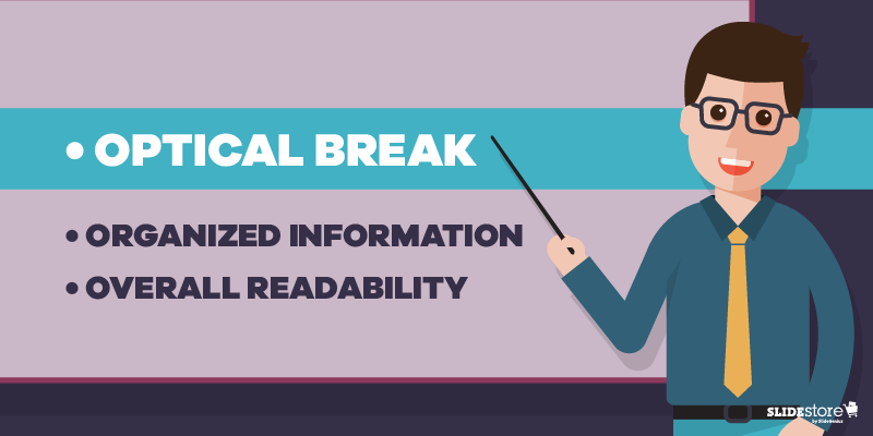
Optical Break Bullet Points

Optical Break

Reading can be strenuous for the eyes, especially when you have a big block of text in one slide. While seeing this word wall can be intimidating for some, others would just outright not read it. Those who attempt will find themselves blinking more since their eyes dry out from, unsurprisingly, not blinking (because they’re reading).

Bullet points put line breaks on long passages, not just with the negative space from the background but also with clear markers on where a specific item begins and ends. Shorter bits of text are more welcome since they’re easier to understand, digest, and remember. Any form of relaxation is pleasant for your eyes.

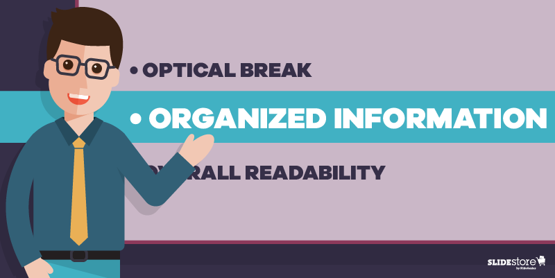
Organizing information | Bullet Points

Organized Information

In the same way that your eyes need a break, your brain also needs a breather when trying to comprehend a long paragraph—much less a lengthy sentence. This is where bullet points shine.

Dissect the text, then separate and summarize the main points. Those summations can then be what you can put on your bullets. That brevity is already a big plus; how much more if they’re fascinating?

Think of bullet points as the “too long; didn’t read” (TL;DR) version, the abridged edition, of your long paragraph. By bulleting the main points, you can shorten a sixty-word section to merely a fraction of that, saving your audience’s time. Plus, they get to listen to you more.

Overall readability | Bullet Points

Overall Readability

Which would you rather see: a big block of words or a bulleted list? Which of the two is cleaner and easier on the eyes and is therefore more readable? Most, if not all, would say the latter, especially when the layout is planned properly. With the former, you risk instances of misreading since there are too many words and lines all bunched up in one place.

Keep your slides neat and tidy by having few words—and relatively fewer bullet points—in them. Prevalent enough is the 6×6 rule, stating that you should have no more than six bullets with six or fewer words each in a slide. There’s also the “three words and four bullets per slide” rule.

The Last Bullet Point

There’s a reason why bullet points are overused, and consequently are now being mistreated for it. Just like the Comic Sans fiasco, most people are tired of seeing bullets in almost every presentation they attend. However, that’s not a reason to ignore and neglect the importance and benefits of using this tool.

Of course, you should always exercise moderation; there is such a thing as death by bullet points. A good way to avoid that is by not overloading your slides with bullets, which can be just as bad as a wall of text. In short, know when and when not to use them.

Your slides are your visual aid, so making them clean is on you—and for your audience.

Resources:

Bruce, Robert. “8 Quick Tips for Writing Bullet Points People Actually Want to Read.” Copyblogger. February 7, 2012. www.copyblogger.com/writing-bullet-points

Clark, Brian. “Little Known Ways to Write Fascinating Bullet Points.” Copyblogger. October 23, 2006. www.copyblogger.com/little-known-ways-to-write-fascinating-bullet-points

Crerar, Paula. “PowerPoint Bullet Points: Do We Need Them?” Brainshark. January 24, 2012. www.brainshark.com/ideas-blog/2012/January/powerpoint-bullet-points-do-we-need-them

Paradi, Dave. “How to Write Powerful Bullet Points.” Think Outside the Slide. n.d. www.thinkoutsidetheslide.com/how-to-write-powerful-bullet-points

“10 Ways to Avoid Death by Bullet Points.” Presentitude. March 4, 2015. www.presentitude.com/10-ways-avoid-death-bullet-points

“Comic Sans: Why All the Hate?” Snapily. January 8, 2013. www.snapily.com/blog/comic-sans-why-all-the-hate

3 Ways to Play and Present Your Own PowerPoint on TV

There are multiple mediums to show your PowerPoint presentation in. The program’s accessibility allows you to display your deck from your laptop to the Web, on mobile, on a traditional projector and screen, and even on a TV.

The latter is especially recommended for informal settings where you want to present a slideshow of your photo album. It can also work for more formal occasions like classroom or boardroom presentations.

High Quality, Fast, Columbus PowerPoint Design
Get a FREE Design Quote Now!

Here’s how you can play your PowerPoint on TV:

1. Connect from Your PC

PowerPoint on TV: Connect from Your PC

Need a Presentation Designed?
Click Here To View Our Amazing Portfolio!

This is one of the most common methods of showing your deck on a screen. Most television sets these days come with an HDMI port to connect your laptop via cable. Simply locate your TV and PC’s HDMI ports and plug in the two ends of the cable. Make sure you’ve pressed the AV button on your television remote control to select the correct HDMI output.

Once you’ve connected the two devices, your laptop screen should automatically show on your TV.

Control the flow of your presentation from your PC like a standard PowerPoint but project it on a bigger screen. This lets you engage your audience by putting your visuals on a widescreen while having complete control of your deck

2. Save It as a Video

PowerPoint on TV: Save as a Video

Need a Pitch Deck Designed?
Click Here To View Our Amazing Portfolio!

If you want to free your hands entirely as you present, save your PowerPoint as a video instead, as suggested in Microsoft Office’s guides.

This is an option available on PowerPoint 2010 onward. On the File menu, click Save & Send, then select Create a Video.

You can still play your deck on a TV in this format by saving your video to a USB flash drive or burning it on a DVD. Most flat-screen televisions have USB ports to attach your flash drive and open video files.

On the other hand, those without a flash drive can burn their video presentation into a CD or DVD. A self-presenting deck in this form aids your presentation while letting you focus on content and delivery.

3. View It on Apple TV

PowerPoint on TV: View on Apple TV

Enterprise Presentation Design at Scale…
Click Here To View Our Amazing Portfolio!

Apple TV is a micro-console that uses a Wi-Fi connection or local network to stream media to your television screen. Apple developed it to bring the innovation of apps to TV. To use Apple TV for your PowerPoint, you’ll still need to save it as a video file.

Make sure that the file format is compatible with Apple TV. If you’re not sure what to save your presentation as the usual file format is .MP4. You can also upload your video presentation on iTunes and sync it with Apple TV.

From there, you can watch and present your video hands-free as well. However, since this option needs the macro-console around the television, you may need to reserve it for intimate family gatherings or occasions where there’s no pressure to set up quickly.

Bonus Tip: Two Different Screens

PowerPoint on TV: Different Screens

Have an Upcoming Conference?
Click Here To View Our Amazing Portfolio!

Although PowerPoint was initially meant to be projected from a computer screen to a bigger one, the two screens don’t have to show the same thing.

For example, if you have helpful comments attached to your slides, you’ll be able to view them using the Presenter View feature without projecting your notes to the audience. Seeing your original screen can give you more than just a guide to follow during your pitch.

Your notes act as prompts when you encounter mental blocks. You don’t have to read directly from them, but specific keywords may help trigger a thought you plan to expound on. However, remember to move away behind your laptop and engage the audience with your body language.

If there aren’t any helpful notes on your slides, you can either have someone click on the next slide for you or use a remote control to move across slides according to your pace. Either way, the purpose of having two screens is to interact with the audience without being glued to your PowerPoint.

Remember that your deck is only there to support your presence, not replace you completely. No matter where you decide to project your slides, you’re still obliged to connect with the audience emotionally and physically. This ensures you leave a memorable impression on your listeners during and after your speech.

The Wider, the Better
PowerPoint on TV: Present on TV

We Service the Globe…
Click Here To View Our Amazing Portfolio!

You can play your PowerPoint anywhere—from the small screen of a mobile device to the wide screen of a TV. If you’re aiming for the latter, connect directly from your TV to your PC through an HDMI cable. Go through your presentation slide by slide by controlling your TV deck as you would on your computer.

You can also save your presentation as a video and copy it in a USB, burn it to a DVD, or stream it through Apple TV. This leaves your hands free enough to engage your audience with hand gestures and appropriate body language. The last option can take some time setting up, so you might not be able to use it all the time.

Television has evolved to far more uses than viewing shows. Use it to showcase your deck to family and friends in the confines of your living room, or use it in a corporate setting.

If you’re having trouble with your presentation needs, our SlideGenius experts are here to lend an ear. Contact us today for a free quote!

High Quality, Fast, Columbus PowerPoint Design
Get a FREE Design Quote Now!

References

“Apple – Apple TV.” Apple. www.apple.com/tv/
“Turn Your Presentation into a Video.” Office Blogs. www.support.office.com/en-us/article/Turn-your-presentation-into-a-video-c140551f-cb37-4818-b5d4-3e30815c3e83

The Real Cost of a Poor Presentation

The truth may be more prevalent than you would like to admit, but it’s unhealthy to ignore the fact that there are good presentations, and there are also bad ones. If you could give an estimate, how many from the total number of existing presentations are poorly made? Around 50 percent? That’s a big number. Assume for a second that, around the world, there are over a billion PowerPoint files today. That’s 500 million at the very least.

With all the design and content tips littered all over the Internet about making the best pitch deck, you’d think that by now, everyone can create decent slides. But let’s not get too idealistic. PowerPoint is tricky to master, especially when you consider how people have different reactions to presentations in general.

Should you cater to their wants then? “Yes” would be a short answer, but it has serious implications for your succeeding attempts at presentation. For example, when you’re creating a pitch deck. You can’t make a one-fits-all since it’s practically impossible to create slides according to the preferences of every executive you’re looking to impress. It’ll be a mishmash of different styles, and that can be distracting.

Does it mean that this is a hopeless case? Of course not. The best you could do is minimize the negative effects of a bad pitch deck presentation, like death by PowerPoint. Other suggestions are doing your best to create the most visually appealing deck people will ever see or hiring a good team of presentation specialists to make awesome slides—as long as you avoid using poorly designed presentations. Why? Because you stand to lose more than just cash by crafting pitch decks or sales presentations sloppily. The infographic below will help you see that you shouldn’t be worried with just your profit margins because you put at risk something bigger than money.

Resources:

Griffith, Eric. “17 Tricks to Master Microsoft PowerPoint.” PC Mag. October 14, 2014. www.pcmag.com/feature/328357/17-tricks-to-master-microsoft-powerpoint

Looking for creative presentations that can leverage your business? Enjoy free PowerPoint templates from SlideStore! Sign up today.

Working with an Awful-Looking PowerPoint Template

Corporate PowerPoint templates are notorious for their impracticality and ineffectiveness. This is because they’re usually created by people with limited knowledge or experience in design. If you are guilty of this sin, then you should hire a slide design professional who can amp up your template’s look and feel. The aesthetics of your presentation can reflect the amount of dedication you put in it, so make sure you create a template that is engaging and attractive.
The general goals of a presentation are to communicate a message, make a point, and sell an idea. A bad template can undermine these goals and inhibit you from delivering an effective presentation. Here are some of the most common components of an awful-looking presentation template, alongside some tips on how to rectify them.

6 Elements of a Bad PowerPoint Template and How to Fix Them

What do bad presentation templates have in common? They all lack a unifying idea that marries content and design. Awful-looking presentations are ambiguous, and from this major flaw springs others. Although the following elements seem inconsequential, they can still leave a great impact on your template’s final look, usability, and effectiveness.
PowerPoint Template Mistakes: Inadequate Features

1. Inadequate features

A good presentation template should be flexible enough to meet the company’s needs. Otherwise, it will be of no use. Include the fundamental features in your template, but don’t stop there. Make sure you include not only an opening and ending slide but also transition slides, master slides, and other standard slides that can enhance your message. Apart from this, you should also provide a guidebook that will instruct and direct the presenters as to the proper uses of the template. Provide demonstration videos and actual presentation samples if necessary.

2. Lack of visual elements

One of the worst things you can do to a presentation template is to deprive it of an emotional element. Templates that are riddled with unnecessary bullets and large walls of text do nothing but insult the audience’s time and attention. Don’t encourage presenters to bombard their presentations with lengthy passages. Set presentation guidelines that limit ideas to one per slide. To add an emotional trigger, encourage the use of visual tools like graphics and videos. Let the presenters bring their ideas to life through emotive and photographic elements.
PowerPoint Template Mistakes: Poor Color Contrast

3. Weak color palette with poor contrast

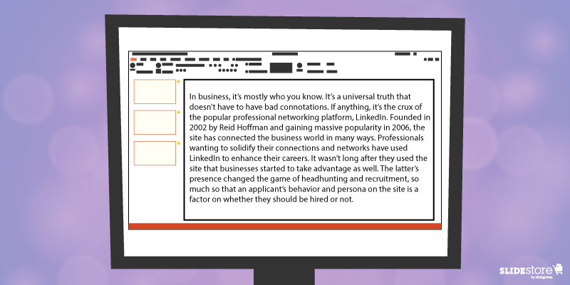
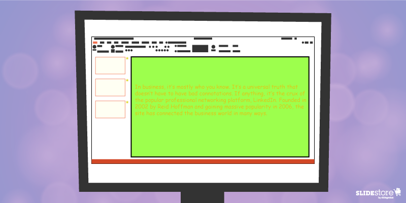
Many things can go wrong with your chosen palette. For instance, you might choose a color theme that may not reflect your brand. The colors may not be appropriate to the image you want to project and the message you want to communicate. Another thing that may go awry is the color contrasting of the fonts and backgrounds. As you know, weak contrast results to poor readability, which will render your text invisible, and thus, worthless. To avoid this problem, always calculate the effect of a certain font color on the background. Finally, be careful about the inclusion of weak and/or daring colors in your theme. Weak colors can weaken your design, and daring colors can disorient your audience.

4. Unreadable typography

Typography is one of the most important elements of a presentation since it can set the stage for the content. There are two important aspects of typography: size and style. You need to get these two right to achieve an effective presentation. Make sure the standard font size you set is not lower than 44 points. This size is large enough to command attention but not too large that it looks ludicrous. You also need to consider the font style. Traditional serif fonts look formal and professional while sans serif fonts are more modern and clean-looking. Use what’s appropriate for your presentation.
When you use custom fonts, make sure they’re installed in external computers. The thing about custom fonts is that they can mess up the layout of your slides if the computer you’re using doesn’t support them. Embed the true type fonts into the presentation to avoid this fiasco.
PowerPoint Template Mistakes: Use of Clip Art

5. Cheesy effects

Perhaps the biggest PowerPoint nightmares are the cheesy effects, which include transitions, sound effects, and animations. It’s understandable if you want to spice up your template, but find better ways to do that other than adding inappropriate effects to your presentation. However, if you feel like you need to use the said effects because they offer a functional purpose, make sure to use them sparingly. Instead of the default sound effects from the PowerPoint library, embed background music from external resources. As for animations and transitions, make sure they add value to your content. Use only what’s absolutely crucial for the presentation.

6. Use of clipart and stock photos

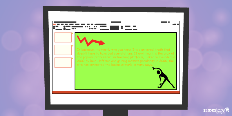
Visual elements are generally good, but there are certain design taboos that you should avoid. We’re talking about clipart and clichéd stock photos. No matter how hard you try, you won’t find a reason compelling enough to justify the use of clipart in your deck. Nothing screams “lame” louder than mediocre symbols in a modern corporate presentation. The same thing goes for stock images. There are many staged and cringeworthy photos that will only lessen the value of your template if you’re careless enough to use them. If you’re going to use photos, go for genuine-looking ones that can trigger emotional reactions from the audience.
If you address these bad design habits that plague many PowerPoint presentations today, you will save your company major headaches. Fix these problems and watch as your presentation templates reach a different level of beauty, usability, and effectiveness.

Resources:

Chibana, Nayomi. “Color Theory for Presentations: How to Choose the Perfect Colors for Your Designs.” Visme. December 28, 2015. blog.visme.co/how-to-choose-a-color-scheme
Godin, Seth. “Really Bad PowerPoint.” Type Pad. January 29, 2007. sethgodin.typepad.com/seths_blog/2007/01/really_bad_powe.html
Hristov, Boris. “Reality Check: Is Your Company’s PowerPoint Template Bad?” Medium. January 19, 2016. medium.com/@borishristov/reality-check-is-your-company-powerpoint-template-bad-bf6ff82780ef#.4kkk8wijb
Mancini, Sunday. “4 Common PowerPoint Template Mistakes.” Ethos 3. May 26, 2016. www.ethos3.com/2016/05/4-common-powerpoint-template-mistakes
Panzironi, Michelle. “7 PowerPoint Mistakes That Make You Look Old.” Forbes. January 16, 2016. www.forbes.com/sites/propointgraphics/2016/01/16/7-powerpoint-mistakes-that-make-you-look-hella-old/#41da1a5234e7
“10 Tips for Designing Presentations That Don’t Suck: Part 1.” Work Front. February 2, 2017. resources.workfront.com/project-management-blog/10-tips-for-designing-presentations-that-dont-suck-part-1
“10 Ways to Spot a Lame Corporate PowerPoint Template.” PowerPoint Ninja. n.d. www.powerpointninja.com/templates/10-ways-to-spot-a-lame-corporate-powerpoint-template
“Choosing the Right Fonts for Your PowerPoint Presentation.” Documents with Precision. March 10, 2016. www.documentswithprecision.com/choosing-right-fonts-powerpoint-presentation

Fundamental Elements of a Strong PowerPoint Slide

Have you ever wondered about the makings of a perfect slide? Or if not perfect, at least a strong and impressionable one? Many answers are found online, and for just as many reasons, that you just can’t be sure which is correct. You could say, of course, that there are niche functions for what objects or elements you put on your deck, but does that make your slides strong individually and/or as a whole?
Blank slides often bear no weight, so you fill them up with visual elements. But being willy-nilly with what you put in there will make the effort counterproductive: the more objects in your slide, the more cluttered and distracting it becomes. It’s best to strike the balance between too much and too few.
Now, what are your options? The following elements are the necessities of a powerful slide. What’s more powerful is how you use them, vis-à-vis standalones or any number of combinations thereof.
Fundamental Elements of a Strong PowerPoint Slide: Theme, Title, Background

Theme

You can’t start creating a presentation without a central message and a theme. While everything around your presentation revolves around the former, your slides are designed per the latter. This can be a broad term, extending from color scheme to branding to even subtle details like typography and illustration style.
Choose an appropriate theme for your topic. It’s not a good idea to have a presentation about the wonders of nature but accent your slides with a black color scheme.

Title

While it doesn’t need to appear in every slide, it does mark where you are in terms of your whole presentation. It can also denote that a specific slide is noteworthy. Subtitles, to a degree, extend a title and branch out to other points, but it also doesn’t have to be ubiquitous.
Knowing when or when not to put a title maximizes the impact of the slide on the audience. Be clever with it. Wit is always appreciated.

Background

Imagine a theater stage with no backdrop—nothing to tell the setting or set the mood. The same goes for slides, even if it works on a case-by-case basis. Slide backgrounds reinforce the theme or branding of the presenter and set the mood for the audience.
Your background doesn’t need to be flashy. Even plain white can be appealing, especially when given the proper treatment. As long as it’s appropriate, as with theme, then you can make it work.
Fundamental Elements of a Strong PowerPoint Slide: Text, Images, Effects

Text

Getting to the meat of your message can be done in two ways: with your content or through pictures. With the former, less is more. A few select words can deliver bigger impact—and be remembered more easily—than a paragraph or two that dances around your point.
This is one of the things abused by those who have little experience with slide design. Think “death by PowerPoint.” Walls of text are to be avoided, of course, but having little to none on your slides can and does pay off.

Images

Pictures solicit or trigger strong emotional responses from anyone in a heartbeat. If your “less is more” with text can’t be achieved, try using an image that encapsulates and describes what words can’t do efficiently. You will see the results immediately.
Since humans are visual creatures, they process and react much faster to an image compared to words that are then read and understood. It’s, literally, seeing a bigger picture. All it takes is one look to make a point.

Effects

There are two kinds of effects that you can set in a slide: the shifting Transition and the object-focused Animation. You can highlight and emphasize points or objects and switch from one slide to another in style. Movements catch attention—a result of survival instinct and evolution to notice objects in motion—so take advantage of that fact with PowerPoint’s animation settings.
A word of caution though: use only when necessary. Don’t risk distracting your audience by overusing effects. A gimmick for gimmick’s sake will only be detrimental for your presentation.
Fundamental Elements of a Strong PowerPoint Slide: Visualized Data

Visualized Data

Cold, hard figures are exactly that. Cold. And boring. Instead of plainly showing numbers and percentages, use charts or graphs, even the occasional diagrams, to show your data in a more entertaining—and by extension more educational—manner.
The more creative your chart or graph is, the more lasting the impression that the data makes. Think of how infographics use design to show statistics: with creativity, wit, and humor. Employ the same to your slides.
Now you could be thinking, “I need all seven in just one slide? This is madness!” No, you just need a couple, like a combination of Background, Text, and Effect. Some can stand on its own, for example, Title or Image. It will only be a distraction to put all seven, so only put what you need.
Lastly, as already said above, the most important element of any slide is the overall message of your presentation. Each part of your visual aid should point toward, support, and strengthen the crux of the whole exercise. You wouldn’t be onstage talking about your advocacy then jumping to a different matter altogether just because.
Everything about your PowerPoint presentation should revolve around your message. Any combination of the elements above serve as parts of a whole, all working in harmony to inform and educate your audience. And that is the key factor to wowing your audience.

Resources:

Finkelstein, Ellen. “3 Components of an Effective Presentation.” EllenFinkelstein.com. December 6, 2000. www.ellenfinkelstein.com/pptblog/3-components-of-an-effective-presentation
Kawasaki, Guy. “The Only 10 Slides You Need in Your Pitch.” GuyKawasaki.com. March 5, 2015. www.guykawasaki.com/the-only-10-slides-you-need-in-your-pitch
Mineo, Ginny. “Your Graphs Look Like Crap: 9 Ways to Simplify and Sexify Data.” HubSpot. October 7, 2013. blog.hubspot.com/marketing/data-graph-design-powerpoint-tips-ht#sm.0001frknxr3k3dlkqq22lsqtd9h7a
Tate, Andrew. “10 Scientific Reasons People Are Wired to Respond to Your Visual Marketing.” Canva. May 19, 2015. designschool.canva.com/blog/visual-marketing
“The Elements of a Slide.” Boundless. n.d. www.boundless.com/communications/textbooks/boundless-communications-textbook/preparing-and-using-visual-aids-16/using-powerpoint-and-alternatives-successfully-85/the-elements-of-a-slide-325-5653

Looking Back on the Birth of PowerPoint

It’s hard to imagine life without the comforts of modern technology that people know today: smartphones, 24/7 Internet access, computers that basically provide anything and everything with the push of a few buttons, and the like. Now, you’d think that innovation is an everyday occurrence, but that wasn’t the case in the mid-1900s, especially for businesses.

Back in the early 60s, Roger Appeldorn invented the first overhead projector. It had a simple principle of using light reflected upon mirrors to display data printed on transparencies (a.k.a. foil or viewgraph), paper-sized sheets of cellophane. The bulky instrument became a mainstay in meeting rooms, but the processes to create one sheet of transparency were tedious and time-consuming (inkjet printing was still a new thing). If not printed, then presenters would handwrite data to be projected on the transparencies. That is, until the 90s. What happened?

Microsoft PowerPoint happened.

Its revolutionary and innovative approach to creating presentations gave it an edge over its more than thirty competitors. Its timing with the booms of both the Apple and Windows operating systems—primitive as they were—cemented its growth. And its fundamental function hosted other uses it wasn’t intended for, like classroom operations and simple public speaking exercises (and not-so-simple ones like the TED Talks). Yes, it’s that flexible.

Today, PowerPoint is at its latest version: PowerPoint 2016, as part of the Microsoft bundle Office 2016. More than two decades since the first version was published, PowerPoint is at its prime—with no signs of slowing down anytime soon. Although it has seen its share of competitors, the presentation designer software remains as strong as ever, if not stronger.

So how did this juggernaut of a program come to fruition? How about a teaser? For starters, did you know that PowerPoint didn’t start as an internal project of Microsoft? The following infographic will take you through decades across the technological history to the go-to presentation software that is—and will always be—Microsoft PowerPoint.

Resources:

Akanegbu, Anuli. “Vision of Learning: A History of Classroom Projectors.” EdTech Magazine. February 28, 2013. www.edtechmagazine.com/k12/article/2013/02/vision-learning-history-classroom-projectors

“Life Before the Web – Running a Startup in the 1980’s.” The Zamzar Blog. July 13, 2016. blog.zamzar.com/2016/07/13/life-before-the-web-running-a-startup-in-the-1980s

-->