Sharing your work and achievements through a presentation is an essential part of gaining the favor of your colleagues in the medical and scientific communities. The ability to do it flawlessly is not an easy feat but doing so effectively greatly contributes to your success.Engaging your audience and conveying your enthusiasm for the topic at hand, however, may be difficult, especially if you are not presenting it to the medical and scientific communities. This is where many presentations fall flat. Some of the pitfalls include overly complicated content—this is where professional PowerPoint presentations come in.So, how can you engage your audience and maximize detail retention at the same time?
Illustrate Your Ideas
In the scientific community, proof is vital and for it to be taken seriously, it has to be backed up with enough credible sources. Your presentation doesn’t have to drown in citations, but only use enough backing data to make your point powerful.Simply telling your audience or providing a wall of text isn’t going to help health information stick. So instead of giving a presentation with text-filled slides, create a custom PowerPoint by using diagrams, graphs, and other types of graphics. These will guide your audience while you explain complex ideas.You may also use stock photography. These images have improved—no longer appearing staged, but rather more realistic.Visuals play a huge role as these are handled by a different process in working memory as compared to auditory information—the visuospatial sketchpad.
Use Animation
Animation adds a new level of engagement, as it works as a great storytelling tool. It gives your presentation a bigger impact because it allows you to pace the flow of information, keep your audience engaged, and sync what you’re saying with what they’re seeing.It can do wonders for your presentation when used properly—conveys your message more powerfully. Using too much, however, may end up distracting your audience. In which case, you’ll be doing the opposite of what you intend to do. Remember: less is more—so don’t overcomplicate your slides and just animate what needs to be emphasized.
Familiarize Yourself with PowerPoint Formatting Tools
You can come up with the best PowerPoint designs by familiarizing yourself with the formatting tools included in the software. When you can manipulate these properly, you can create virtually anything from scratch. It gives you the power to communicate the way you want to, ensuring the audience remembers key information.In essence, these are various ways to emphasize certain parts of your medical presentation. Not only will these methods make your deck more interesting, but it will help organize your thoughts as well. With these, you can point your audience toward relevant details instead of just showing a wall of text or the whole figure, distracting them from your current point.Try applying these to your future presentations and see how much of the information was remembered by the audience.
Communication in today’s landscape is one big irony. While the different forms of digital media are thriving, face-to-face conversations are braving what could be called “dark times.” People today are more preoccupied than before—they tend to listen less and talk more. Unsatisfying communication is rampant in both the small setting and the big picture. We see relationships crumble and fights ensue because of the poor way spouses, parents, children, neighbors, friends, and colleagues communicate. We all suffer and endure the negative consequences of this notorious problem, which exists even among political parties, ethnicities, nations, and religions.And the most disturbing part is that poor communication seems to be more than just a trend but a facet that is deeply ingrained in our present culture. If we look closely at it, communication seems to be both the problem and the solution. The complication can be traced back to people not showing enough interest or having enough forbearance to purse their lips, open their minds, and simply listen. Poor listening is the problem, and deep listening is the answer. Only by acknowledging this fact and working towards achieving it can we bring about a shift in the way communication works in the digital age.
What Deep Listening Truly Means
We all know and practice active listening, which entails repeating what the speaker says and seeking clarification for ambiguous ideas. While active listening is highly encouraged, to truly solve the problem of poor communication, we need to master deep listening, a more contemplative form of communication that involves listening to oneself before others.Deep listening occurs when your mind is quiet and you’re able to suspend your reactive thinking and just open your thoughts to every possibility. It entails what John Keats called negative capability, which refers to when you’re “capable of being in uncertainties, mysteries, doubts, without any irritable reaching after fact and reason.” The nature of deep listening may appear paradoxical—after all, it claims that to better communicate with others, you must first pay attention to yourself. But by applying the principles of deep listening, you can become a more receptive, emphatic, trusting, and trustworthy listener, which can ultimately lead you to becoming a good communicator.
Three Steps to Connecting with Your Body, Speech, and Mind
According to David Rome and Hope Martin, two trainers who have been studying and teaching deep listening for more than a decade, there are three techniques for tuning in to your mind, body, and speech: awareness meditation, the Alexander technique, and focusing on felt senses. By practicing these techniques, you can keep in touch with all aspects of your being—which is, ultimately, the foundation of deep listening.
1. Awareness Meditation
This type of meditation is known to some as mindfulness and to others, peaceful abiding. Whatever you call it, this principle lies only on two simple ideas: to watch your thoughts come and go without acting on them, and to always return to the present moment no matter what. Usually done in the form of a sitting meditation, it puts emphasis on body presence. One of the main inspirations for this technique is “The Four Foundations of Mindfulness,” an article by Buddhist meditation master Chogyam Trungpa Rinpoche. It explains the following:
Mindfulness of body. “The basic starting point is solidness, groundedness. When you sit, you actually sit. Even your floating thoughts begin to sit on their own bottoms. You have a sense of solidness and, at the same time, a sense of being.”
Mindfulness of life. “The instinct to live can be seen as containing awareness, meditation, mindfulness. It constantly tunes us into what is happening. So, the life force that keeps us alive itself becomes the practice of mindfulness.”
Mindfulness of effort. “The sudden flash is a key to all Buddhist meditation, from the level of basic mindfulness to the highest levels of tantra. But it is not enough just to hope that a flash will come to us; there must be a background of discipline.”
Mindfulness of mind. “Mind functions singly. Once. And once. One thing at a time. Things always happen one at a time, in a direct, simple movement of mind. Mindfulness of mind is to be there with that one-shot perception, constantly.”
2. The Alexander Technique
This principle is what molds you into developing equanimity so that you can avoid becoming a victim of your life circumstances. It enables you to look after yourself while facing the rigorous demands of life. By assuming an objective point of view, you not only open your mind to see how you interfere with your natural and intrinsic inclinations but also discern which habits and qualities you should let go of.
3. Focusing on Felt Senses
Originating from Western philosophy, this technique involves cultivating three inner skills: self-knowledge, a caring presence, and an intuitive insight. As its name suggests, this principle involves noticing your senses as you feel them. Usually, you don’t pick up these senses in your attention radar, but if you try to be more attentive to your emotions, you will be able to notice them easily. By noticing these sensations before acting on them, you’ll be able to choose your words and actions better in future arguments, helping you improve the way you communicate.The sum of these three contemplative practices is powerful enough to effect a dramatic change that can impact everyone. If only more people learn and apply these valuable skills, we could all see a significant shift in the quality of communication in the twenty-first century.
References:
Bailey, Joe. “What Is Deep Listening?” Goodlife Zen. n.d. goodlifezen.com/what-is-deep-listeningPopova, Maria. “The Art of ‘Negative Capability’: Keats on Embracing Uncertainty and Celebrating the Mysterious.” Brain Pickings. n.d. www.brainpickings.org/2012/11/01/john-keats-on-negative-capabilityRinpoche, Chogyam Trungpa. “The Four Foundations of Mindfulness.” Lion’s Roar. November 30, 2016. www.lionsroar.com/the-four-foundations-of-mindfulness“Deep Listening.” Mindful. n.d. www.contemplativemind.org/practices/tree/deep-listening“Deep Listening.” Mindful. August 26, 2010. www.mindful.org/deep-listening
A successful investor pitch deck is much more than a collection of slides—it’s a carefully crafted presentation that tells your company’s story, showcases your vision, and convinces investors that your business is worth their investment. To achieve this, a winning pitch deck needs to balance storytelling, data, and design, all while remaining clear and concise.Here are the key elements that make up a winning investor pitch deck:
1. Start with a Strong Executive Summary
Your pitch deck should open with a brief, compelling executive summary. This sets the stage for the rest of your presentation and provides investors with a high-level overview of your company’s mission, goals, and potential.What to Include:
Problem and Solution: Start by highlighting the problem your company solves and how your solution addresses it uniquely.
Value Proposition: Explain why your product or service is essential and how it stands out in the market.
Business Model: Briefly describe how you make money and what your key revenue streams are.
Example: If you’re developing a healthcare app, the executive summary should quickly explain the issue your app addresses (e.g., the difficulty of accessing affordable healthcare) and how your solution simplifies this process.
2. Clearly Define the Problem
Investors need to understand the problem you’re solving before they buy into your solution. Be specific and make sure the problem is significant enough to justify the need for your product or service.What to Include:
Identify the Pain Point: Focus on a real, tangible issue that affects a large market or a niche audience.
Provide Data: Use statistics or research to quantify the problem, demonstrating its scope and the demand for a solution.
Example: A pitch deck for an environmental startup might outline the increasing need for sustainable packaging, supported by data showing the growth in consumer demand for eco-friendly products.
3. Present Your Unique Solution
Once you’ve outlined the problem, introduce your solution. This is the heart of your pitch—investors want to know what makes your product or service better than existing alternatives.What to Include:
Explain How It Works: Provide a clear, concise description of your solution and how it solves the problem.
Highlight Differentiation: Emphasize what makes your product or service unique, such as proprietary technology, innovative features, or market position.
Example: For a tech company, this slide could feature a brief demo of the software, along with a few bullet points highlighting its unique features compared to competitors.
4. Demonstrate Market Opportunity
Investors want to see that your business operates in a growing, scalable market with plenty of room for expansion. Demonstrating the market size and growth potential is key to convincing investors that your company has significant upside.What to Include:
Market Size: Show the total addressable market (TAM), the serviceable available market (SAM), and your target market (SOM).
Growth Potential: Include data or trends that indicate market growth over the next 3-5 years.
Example: A food delivery startup might highlight the rapid growth of the gig economy and the increasing consumer demand for convenience in food services.
5. Showcase Your Business Model
A strong business model is essential to a winning investor pitch deck. Investors need to know how you plan to generate revenue and sustain growth.What to Include:
Revenue Streams: Explain how your company makes money, including your pricing strategy, subscription models, or other revenue streams.
Profitability Path: Show how your business can scale profitably and when you expect to reach profitability.
Example: A SaaS company might explain its subscription-based model, detailing different pricing tiers and how upselling premium features will increase customer lifetime value (CLTV).
6. Introduce the Team
Investors invest in people as much as they invest in ideas. Highlight your team’s expertise and ability to execute the business plan.What to Include:
Key Team Members: Showcase the qualifications and relevant experience of your leadership team.
Advisors and Board Members: Include any high-profile advisors or board members who add credibility and guidance to your company.
Example: A biotech startup could feature its scientific team, emphasizing their previous experience working on successful drug development projects.
7. Present Financials and Projections
Your financials are one of the most critical elements of your pitch. They provide investors with insight into your company’s performance and future potential.What to Include:
Revenue and Expenses: Include your current financials, covering revenue, operating costs, and net income.
Projections: Provide a forecast of future growth over the next 3-5 years, including revenue, expenses, and profitability.
Funding Requirements: Clearly state how much funding you are seeking and how you plan to use it (e.g., for product development, marketing, hiring).
Example: Include a chart that outlines your financial projections, showing how your company will grow from its current stage to becoming a profitable business.
8. Highlight the Competition
Investors want to know where you stand in the market and how you plan to outperform your competition. A competitive analysis helps demonstrate your company’s positioning and unique advantages.What to Include:
Competitor Comparison: Include a competitor matrix or chart that shows where your product excels compared to others.
Barriers to Entry: Highlight any barriers that make it difficult for competitors to replicate your business model.
Example: A fintech startup might present a comparison chart showing its lower fees, faster transaction times, and higher user satisfaction rates compared to established competitors.
9. Show Traction and Milestones
If your company has already achieved key milestones, showcasing these accomplishments is critical for building investor confidence.What to Include:
Key Metrics: Include any relevant metrics such as customer acquisition, revenue growth, partnerships, or product launches.
Major Milestones: Highlight major achievements, such as reaching a certain number of users, securing partnerships, or launching a new product.
Example: A health-tech company might showcase its recent partnership with a major hospital network or the number of patients using its app.
Final Thoughts
A winning investor pitch deck is concise, visually engaging, and tells a compelling story. By focusing on the problem, presenting a unique solution, and demonstrating financial growth potential, you can create a pitch that resonates with investors. Remember, the goal is not just to present data but to convince investors that your business has the potential to scale and succeed.
Has it ever happened to you that, when crafting slides for a great presentation, you’ve got multiple objects to select, copy, paste, move, etc. And working with your mouse is slowly but surely becoming tedious, exhausting, and time-consuming? To be fair, it’s not limited to just PowerPoint.In almost every program on desktop, and even the operating systems (Windows and Mac) themselves, there are specific sequences and/or combinations of keyboard presses that correspond to functions and commands, called keyboard shortcuts.Ever wondered what the keys on the bottom row are for, specifically the Ctrl (Control) and Alt (Alternate) keys? They’re integral to keyboard shortcuts. If it’s not Ctrl plus a key, then it’s Alt plus another key—or both Ctrl and Alt. To give you an example, if you’re a Windows user, then you’re familiar with the desktop shortcut “Alt + Tab” for cascading through different active windows/open programs. There’s “Ctrl + Alt + Del” as well, opening a Securities Options menu where you can choose Task Manager, among other things.In short, keyboard shortcuts give you access to functions that are usually hard to access by mouse. But they don’t stop there. If efficiency didn’t cross your mind the first time you read the phrase “keyboard shortcuts,” since they make a certain number of functions faster to do, then how about health?Repetitive strain injury (RSI) has been linked with too much computer mouse use. Although extended keyboard use has also been linked to RSI, an average person uses the mouse more than a keyboard. At least with keyboard shortcuts, you’re balancing your use of both computer accessories with less risks involved.Now, when creating those enticing slides, what shortcuts are available to you? Check this gifographic to learn what you can train yourself to use and share with your presentation friends. You can bet that experienced presentation designers and public speakers use the hotkeys below to help them go through their PowerPoint files quicker and better.
Resources:
Jones, Steven C. “Computer Work Postures and Injury: The Stress of Reaching for the Mouse, a Doctor’s Perspective.” Business Know-How. n.d. www.businessknowhow.com/manage/computer-mouse-injuries.htmKlosowski, Thorin. “Back to Basics: Learn to Use Keyboard Shortcuts Like a Ninja.” Lifehacker. December 20, 2012. www.lifehacker.com/5970089/back-to-the-basics-learn-to-use-keyboard-shortcuts-like-a-ninja“5 Reasons Why You Should Be Using Keyboard Shortcuts.” Shortcut Keys. n.d. www.shortcutkeys.net/why-use-shortcuts
When reading, isn’t it bothersome to see a typographical error that distracts you from peacefully enjoying the piece? There’s the nagging feeling that “teh” should be “the,” that “your” should be “you’re,” or that “should of” is completely wrong. If tenses are all over the place or the subject-verb agreement isn’t correct, then that impression of the mistake gives way to disappointment and silent rage. Typos are distracting, to say the least.
To curb typographical errors, the responsibility of proofreading content falls squarely upon your shoulders. Be it a blog post, a book waiting to be published, or even a social media update, any piece of content should be proofread before publishing and publicizing, lest you be subject to the anger-inciting asterisk.
“But wait,” you may probably say. “What’s the difference between proofreading and editing? And there’s revision, too.” It’s time to contrast.
Revising vs. Editing vs. Proofreading
Revising entails the “re-visioning” of the whole piece; you gauge and, if ever, change how you approach your topic. Some of the main questions you need to consider when revising are, “Did the last draft fail to answer important questions, and does the recent one succeed?” and “Is the argument clear and understandable?”
Editing is done so that the whole piece is coherent and unified. You check the flow from one sentence to another and the logic from one paragraph to the next to discern whether the transitions are clear and smooth. If not, then rearrange paragraphs, rewrite sentences, and make the according edits.
Proofreading, the lightest of the three, is where you look for misspelled words, misused punctuation marks, and improper verb tenses and subject-verb agreements to fix them. This is the last step you should do before posting your content.
You must also check your PowerPoint presentation to ensure it doesn’t have any errors (and if it does, edit). Other than showing that you took the time to perfect your slide, it also implies the following notions:
Clarity
Apart from the fact that typographical errors and grammatical mistakes are distracting (diverting your reader’s attention to the typo itself), they take focus away from the message of your presentation in PowerPoint. There are more possible misinterpretations of a line missing a word, a missing letter crucial to the intended definition of the word (think “pubic” instead of “public”), or inconsistent tenses.
While it may be said that the human mind internally corrects the mistake, it’s still an unnecessary mental activity for the reader. Instead of focusing on and absorbing your piece, they’re looking out for mistakes just to satisfy the feeling that what they’re reading is clean and error-free—if they even decide to keep reading your piece.
Instead of muddling and muffling your piece’s flow of information because of errors, make sure your copy is clean and polished. Take the time to think about how your audience reads your article. When you see a typo, correct it right away.
Professionalism
Often, if you read content rife with grammatical and typographical errors, your judgment on it is, “This must have been done by an amateur.” Contrast that with well-proofread copies, and the stigma of unprofessionalism is gone.
Careless mistakes are always a show of unprofessionalism. It can imply that you weren’t fully prepared with your slides or that you crammed your PowerPoint presentation. It can mean that you never bothered to check for mistakes after your first draft or that you didn’t organize everything effectively and efficiently.
This is why there is a practice in any printed publication to correct any factual or typographical errors that made it past layers of editing, albeit in the next edition. Unfortunately, this doesn’t hold as true for digital copies even though editing them is easier to do. Make sure you don’t fall into the same trap.
Consistency
Which do you go for: “toward” or “towards”? “Color” or “colour”? If you’re not careful, you might end up using two kinds of English in a single piece.
Having a consistent voice and tone is a must, if not for regional differences then for establishing yourself as a proficient English speaker and communicator. If you use American English, then keep it that way throughout your piece; if you’re going for British, then make your spelling and idiom use consistent. It may sound traditionalist, but there are critics of this kind of inconsistency. Plus, it helps define your target market without alienating the other party.
All in all, keep your content error-free. It’s a secret to crafting great copies. Even in school, you were trained to submit perfect essays and reports since having typos usually meant markdowns. It’s the same when it comes to business, only with far-reaching consequences. When you’re in front of a crowd whose decision could shape your life and/or career, you wouldn’t want to risk making the kind of mistake.
Writers live by a general rule, and it’s a good exercise of their English and organizational skills. “Write in white heat; revise/edit in cold blood.” Any word work you do falls under this rule. There are no exceptions. Not even your slides. The task of proofreading falls upon you, the content creator, and definitely not a PowerPoint presentation designer.
Resources:
Scocco, Daniel. “The Impotence of Proofreading.” Daily Writing Tips. n.d. www.dailywritingtips.com/the-impotence-of-proofreading
Wasielewski, Jarek. “The Importance of Proofreading Your Webinar.” Webinar Tips Blog. September 25, 2015. blog.clickmeeting.com/the-importance-of-proofreading-your-webinar
Wright, Catharine. “Revision, Editing and Proofreading: What’s the Difference?” Peer Writing Tutors & FYS Mentors. February 14, 2011. sites.middlebury.edu/peer_writing_tutors/2011/02/14/revision-editing-and-proofreading-what%E2%80%99s-the-difference
Wroblewski, M.T. “The Importance of Proofreading in the Workforce.” Chron. n.d. smallbusiness.chron.com/importance-proofreading-workforce-36110.html
Zimmer, John. “Five Typographical Errors to Avoid on Your Slides.” Manner of Speaking. November 6, 2010. www.mannerofspeaking.org/2010/11/06/five-typographical-errors-to-avoid-on-your-slides
“How Proofreading Services Can Make Your Next Presentation a Success.” Re:word. n.d. www.reword.ca/how-proofreading-services-can-make-your-next-presentation-a-success
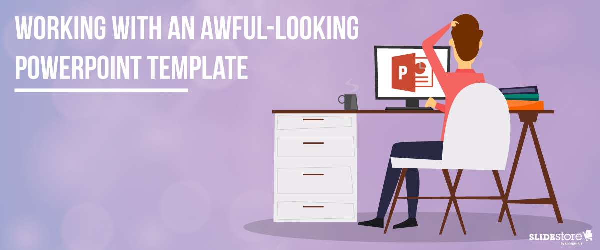
Corporate PowerPoint templates are notorious for their impracticality and ineffectiveness. This is because they’re usually created by people with limited knowledge or experience in design. If you are guilty of this sin, then you should hire a slide design professional who can amp up your template’s look and feel. The aesthetics of your presentation can reflect the amount of dedication you put in it, so make sure you create a template that is engaging and attractive.The general goals of a presentation are to communicate a message, make a point, and sell an idea. A bad template can undermine these goals and inhibit you from delivering an effective presentation. Here are some of the most common components of an awful-looking presentation template, alongside some tips on how to rectify them.
6 Elements of a Bad PowerPoint Template and How to Fix Them
What do bad presentation templates have in common? They all lack a unifying idea that marries content and design. Awful-looking presentations are ambiguous, and from this major flaw springs others. Although the following elements seem inconsequential, they can still leave a great impact on your template’s final look, usability, and effectiveness.
1. Inadequate features
A good presentation template should be flexible enough to meet the company’s needs. Otherwise, it will be of no use. Include the fundamental features in your template, but don’t stop there. Make sure you include not only an opening and ending slide but also transition slides, master slides, and other standard slides that can enhance your message. Apart from this, you should also provide a guidebook that will instruct and direct the presenters as to the proper uses of the template. Provide demonstration videos and actual presentation samples if necessary.
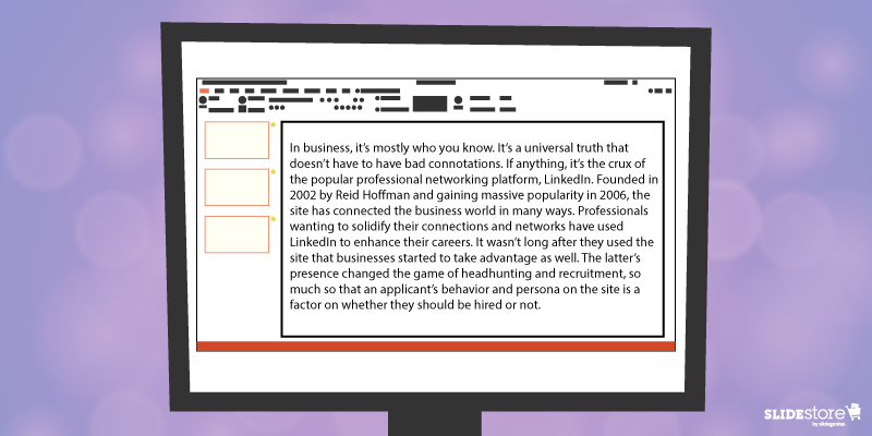
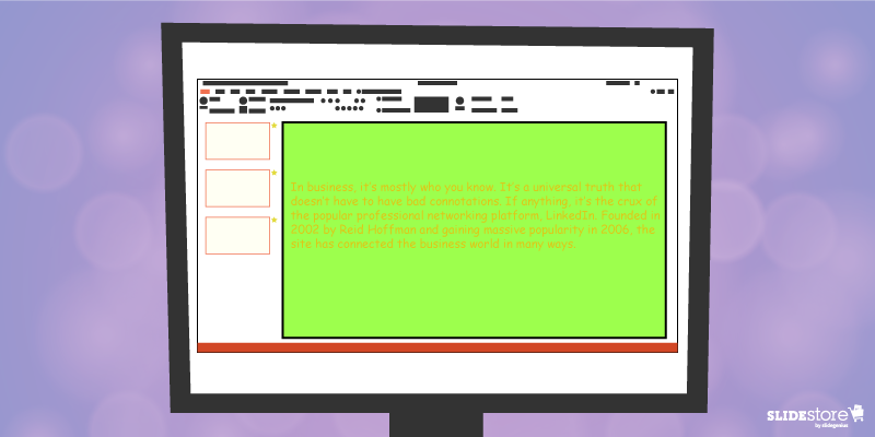
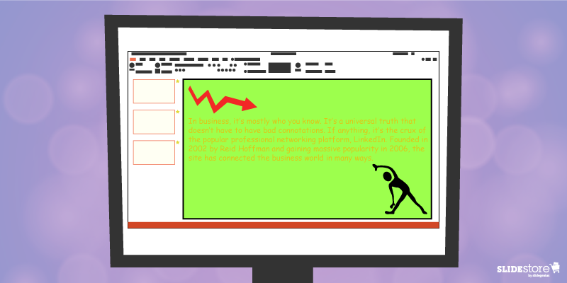
2. Lack of visual elements
One of the worst things you can do to a presentation template is to deprive it of an emotional element. Templates that are riddled with unnecessary bullets and large walls of text do nothing but insult the audience’s time and attention. Don’t encourage presenters to bombard their presentations with lengthy passages. Set presentation guidelines that limit ideas to one per slide. To add an emotional trigger, encourage the use of visual tools like graphics and videos. Let the presenters bring their ideas to life through emotive and photographic elements.
3. Weak color palette with poor contrast
Many things can go wrong with your chosen palette. For instance, you might choose a color theme that may not reflect your brand. The colors may not be appropriate to the image you want to project and the message you want to communicate. Another thing that may go awry is the color contrasting of the fonts and backgrounds. As you know, weak contrast results to poor readability, which will render your text invisible, and thus, worthless. To avoid this problem, always calculate the effect of a certain font color on the background. Finally, be careful about the inclusion of weak and/or daring colors in your theme. Weak colors can weaken your design, and daring colors can disorient your audience.
4. Unreadable typography
Typography is one of the most important elements of a presentation since it can set the stage for the content. There are two important aspects of typography: size and style. You need to get these two right to achieve an effective presentation. Make sure the standard font size you set is not lower than 44 points. This size is large enough to command attention but not too large that it looks ludicrous. You also need to consider the font style. Traditional serif fonts look formal and professional while sans serif fonts are more modern and clean-looking. Use what’s appropriate for your presentation.When you use custom fonts, make sure they’re installed in external computers. The thing about custom fonts is that they can mess up the layout of your slides if the computer you’re using doesn’t support them. Embed the true type fonts into the presentation to avoid this fiasco.
5. Cheesy effects
Perhaps the biggest PowerPoint nightmares are the cheesy effects, which include transitions, sound effects, and animations. It’s understandable if you want to spice up your template, but find better ways to do that other than adding inappropriate effects to your presentation. However, if you feel like you need to use the said effects because they offer a functional purpose, make sure to use them sparingly. Instead of the default sound effects from the PowerPoint library, embed background music from external resources. As for animations and transitions, make sure they add value to your content. Use only what’s absolutely crucial for the presentation.
6. Use of clipart and stock photos
Visual elements are generally good, but there are certain design taboos that you should avoid. We’re talking about clipart and clichéd stock photos. No matter how hard you try, you won’t find a reason compelling enough to justify the use of clipart in your deck. Nothing screams “lame” louder than mediocre symbols in a modern corporate presentation. The same thing goes for stock images. There are many staged and cringeworthy photos that will only lessen the value of your template if you’re careless enough to use them. If you’re going to use photos, go for genuine-looking ones that can trigger emotional reactions from the audience.If you address these bad design habits that plague many PowerPoint presentations today, you will save your company major headaches. Fix these problems and watch as your presentation templates reach a different level of beauty, usability, and effectiveness.
Resources:
Chibana, Nayomi. “Color Theory for Presentations: How to Choose the Perfect Colors for Your Designs.” Visme. December 28, 2015. blog.visme.co/how-to-choose-a-color-schemeGodin, Seth. “Really Bad PowerPoint.” Type Pad. January 29, 2007. sethgodin.typepad.com/seths_blog/2007/01/really_bad_powe.htmlHristov, Boris. “Reality Check: Is Your Company’s PowerPoint Template Bad?” Medium. January 19, 2016. medium.com/@borishristov/reality-check-is-your-company-powerpoint-template-bad-bf6ff82780ef#.4kkk8wijbMancini, Sunday. “4 Common PowerPoint Template Mistakes.” Ethos 3. May 26, 2016. www.ethos3.com/2016/05/4-common-powerpoint-template-mistakesPanzironi, Michelle. “7 PowerPoint Mistakes That Make You Look Old.” Forbes. January 16, 2016. www.forbes.com/sites/propointgraphics/2016/01/16/7-powerpoint-mistakes-that-make-you-look-hella-old/#41da1a5234e7“10 Tips for Designing Presentations That Don’t Suck: Part 1.” Work Front. February 2, 2017. resources.workfront.com/project-management-blog/10-tips-for-designing-presentations-that-dont-suck-part-1“10 Ways to Spot a Lame Corporate PowerPoint Template.” PowerPoint Ninja. n.d. www.powerpointninja.com/templates/10-ways-to-spot-a-lame-corporate-powerpoint-template“Choosing the Right Fonts for Your PowerPoint Presentation.” Documents with Precision. March 10, 2016. www.documentswithprecision.com/choosing-right-fonts-powerpoint-presentation
Creating strong PowerPoint slides requires attention to clarity, design, and engagement. Here are the fundamental elements of a well-designed PowerPoint slide:
1. Concise and Focused Content
Why it matters: A strong slide should deliver one key message or idea. Overloading slides with too much information distracts the audience and makes it harder for them to retain important points.
How to apply: Limit your slide to 3-5 bullet points or key ideas. Use short, direct sentences or phrases, and avoid long paragraphs. Each slide should support a single concept, allowing the audience to focus on the message without becoming overwhelmed.
2. Clear and Readable Text
Why it matters: If your audience cannot easily read the content on your slides, they’ll lose interest quickly. Legibility is essential for effective communication.
How to apply: Use large, sans-serif fonts like Arial or Calibri, with a minimum font size of 24 points for body text and 36 points for headings. Stick to consistent fonts and colors across all slides. Ensure there is sufficient contrast between the text and background, making it easy to read even from the back of the room.
3. Visual Balance and Design
Why it matters: An aesthetically pleasing slide keeps the audience’s attention and ensures your content is well-organized. Too much clutter can distract from the message.
How to apply: Utilize white space to give your slides a clean, organized look. Limit images and design elements to only those that enhance your message. Align your text, images, and visuals neatly to create visual balance on each slide. A consistent layout across all slides contributes to a professional appearance.
4. Engaging Visuals
Why it matters: Images, icons, and charts can convey ideas more powerfully than text alone, helping to increase understanding and retention.
How to apply: Incorporate relevant visuals like photos, icons, or infographics that support your message. Use charts and graphs to present data visually, but make sure they are simple and easy to understand. Avoid generic or irrelevant images that don’t add value to the presentation.
5. Consistent Branding
Why it matters: Consistent branding helps reinforce your message and creates a professional, cohesive presentation. It ensures that your slides reflect your company or personal brand.
How to apply: Use your brand’s colors, fonts, and logo consistently throughout the presentation. Stick to a color palette that complements your brand and is easy on the eyes. Make sure your slides align with your brand’s style guidelines for consistency.
6. Minimal Transitions and Animations
Why it matters: While transitions and animations can add engagement, overusing them can be distracting and make your presentation feel unprofessional.
How to apply: Use simple transitions and animations, like fade-ins or appear, sparingly and only to highlight key points. Avoid flashy effects like bouncing text or excessive movement, which can distract from your core message.
7. Actionable Call to Action (CTA)
Why it matters: A clear call to action helps direct the audience to the next steps, especially in business or sales presentations. It turns passive listeners into engaged participants.
How to apply: Place the CTA in a prominent spot on the final slide, using bold text or a contrasting color. Use specific, actionable language like “Sign up today” or “Contact us for more information” to drive engagement.
By focusing on these core elements, you can create effective, engaging, and professional PowerPoint slides that communicate your message clearly and resonate with your audience.
Presenting can be a nerve-wracking experience, especially when faced with common challenges that can disrupt the flow of your presentation. From technical difficulties to audience engagement issues, these problems can derail even the most well-prepared presenter. Fortunately, with a little preparation and foresight, many of these issues can be avoided.Here are the top problems presenters face and how to avoid them:
1. Technical Difficulties
One of the most common problems presenters face is technical issues, such as malfunctioning equipment, incompatible file formats, or connection problems. These can cause delays, stress, and a loss of audience attention.How to Avoid It:
Test Equipment Ahead of Time: Arrive early to test the projector, microphone, and any other equipment. Ensure your laptop connects properly to external displays and that sound and video work as expected.
Have Backups: Always have a backup of your presentation on a USB drive and email a copy to yourself. This ensures that you have access to your presentation even if your primary device fails.
Bring Necessary Cables/Adapters: If you’re presenting in a location with different equipment, bring any necessary adapters (HDMI, VGA, etc.) to ensure compatibility.
Example: Before presenting at a conference, test your laptop’s connection to the projector and sound system, and have a backup copy of your slides saved in multiple locations.
2. Losing Audience Attention
Another common challenge is losing the attention of your audience, especially during longer presentations. People tend to zone out if a presentation becomes monotonous or lacks engagement.How to Avoid It:
Engage with the Audience: Ask questions, invite participation, or incorporate live polls to keep the audience engaged and make them feel involved in the presentation.
Use Visuals: Incorporate images, videos, and infographics to break up long stretches of text and keep the presentation visually stimulating.
Keep It Dynamic: Change your tone, pace, and energy levels throughout the presentation to maintain interest.
Example: During a 30-minute sales pitch, ask the audience for their thoughts on a key point, or incorporate an engaging video that illustrates your message.
3. Running Over or Under Time
Presenters often struggle with managing their time, either running over and having to rush through the final points, or finishing too quickly, leaving awkward gaps.How to Avoid It:
Time Your Rehearsals: Practice your presentation multiple times and time yourself to ensure you stay within the allotted time. Adjust your content accordingly if necessary.
Use a Timer: Use a timer or a clock (such as the one available in Presenter View in PowerPoint) to keep track of time as you present. This helps you stay on pace.
Prioritize Key Points: If time starts to run out, make sure you know which points are the most important and focus on them, skipping or shortening less crucial sections.
Example: If you’re scheduled for a 15-minute presentation, time yourself during rehearsal and trim content to ensure you can comfortably cover everything within that time frame.
4. Nervousness and Stage Fright
Many presenters experience anxiety, stage fright, or nervousness, which can negatively impact their performance. Nervousness may lead to filler words, shaky hands, or a quavering voice.How to Avoid It:
Practice Relaxation Techniques: Practice deep breathing exercises before your presentation to calm your nerves. Visualization and positive affirmations can also help reduce anxiety.
Practice Your Presentation: The more familiar you are with your material, the less nervous you’ll feel. Practice in front of friends, family, or a mirror until you feel confident.
Start with a Smile: Smiling at the beginning of your presentation can help you feel more relaxed and confident, and it sets a positive tone with your audience.
Example: Before stepping on stage, take a few deep breaths and visualize yourself successfully delivering the presentation. Smile as you begin to set a confident tone.
5. Overloading Slides with Information
Some presenters try to cram too much information into their slides, resulting in cluttered, text-heavy slides that are difficult to follow. This can overwhelm the audience and make it hard for them to focus on key points.How to Avoid It:
Stick to Key Points: Use bullet points or short phrases to highlight the key takeaways on each slide. Avoid adding large paragraphs of text.
Use White Space: Ensure your slides have enough white space to avoid looking cluttered. This makes your presentation look cleaner and more professional.
Explain, Don’t Read: Your slides should act as visual aids, not scripts. Avoid reading directly from your slides, and instead use them to supplement your spoken words.
Example: Instead of a slide with a long paragraph of text, break it into three concise bullet points and explain the details verbally while using the slide as a visual cue.
6. Handling Difficult Questions
Presenters may face difficult or unexpected questions from the audience, which can throw them off if they aren’t prepared. Mishandling questions can diminish your credibility.How to Avoid It:
Prepare for Common Questions: Anticipate possible questions the audience might have and prepare answers for them in advance. This will make you feel more confident during the Q&A session.
Take Your Time: If you’re unsure of how to answer a question, it’s okay to take a moment to think. If you don’t know the answer, offer to follow up after the presentation.
Stay Calm and Polite: Even if faced with tough or critical questions, maintain a calm and polite demeanor. This helps you maintain control of the room and preserves your professionalism.
Example: After presenting a new product, you might be asked about a feature that hasn’t been fully developed yet. Acknowledge the question, and offer a general timeline for when more information will be available.
Final Thoughts
Presenters face a range of challenges, from technical difficulties to managing time and nerves. However, with proper preparation, practice, and foresight, you can avoid these common pitfalls and deliver a smooth, confident presentation. By focusing on audience engagement, using technology effectively, and preparing for potential obstacles, you’ll set yourself up for success.
Here are seven of PowerPoint 2016’s best new features that significantly enhanced user experience and presentation design:
1. PowerPoint Designer (Design Ideas)
What it is: This feature uses AI to automatically suggest layout ideas based on the content in your slide. It instantly offers professional-looking designs that save time and enhance slide aesthetics.
Why it’s great: It allows users with limited design skills to create visually appealing presentations with ease. You simply insert your content, and the tool suggests layout options.
2. Morph Transition
What it is: The Morph transition enables smooth animation between slides. It lets you create fluid transitions by automatically moving objects from one slide to the next.
Why it’s great: It’s ideal for storytelling or when you want to create continuous flow animations. This can be used for objects, text, and images, creating dynamic presentations without needing complex animation skills.
3. Real-Time Collaboration
What it is: PowerPoint 2016 introduced real-time co-authoring, allowing multiple users to work on the same presentation simultaneously.
Why it’s great: Teams can collaborate more efficiently, whether they’re in the same office or working remotely. This feature ensures everyone is working on the most up-to-date version.
4. Tell Me Feature
What it is: “Tell Me” is a smart search bar located at the top of the PowerPoint ribbon. It allows you to type in tasks or commands you’re looking for, and PowerPoint helps you find them quickly.
Why it’s great: This feature is especially useful for users who are unfamiliar with where certain tools or features are located within the software.
5. Ink Equations
What it is: PowerPoint 2016 lets you insert complex math equations by handwriting them directly into a slide using a stylus or your mouse.
Why it’s great: This is a great feature for educators, students, or professionals who need to quickly insert mathematical expressions without typing them out.
6. Enhanced Presenter View
What it is: Presenter View now shows the next slide, speaker notes, and a timer on your monitor while the audience only sees the current slide.
Why it’s great: This allows for better pacing and control during presentations, giving you confidence in what’s coming next without revealing too much to the audience.
7. Screen Recording
What it is: PowerPoint 2016 has a built-in screen recording tool that allows you to record your screen directly into a slide. It captures screen actions, along with audio and video, if necessary.
Why it’s great: It’s ideal for creating tutorial videos or demonstrations without needing to switch to third-party screen recording software.
These features made PowerPoint 2016 a versatile tool for creating visually appealing, collaborative, and interactive presentations, empowering both novice and advanced users to elevate their presentation game.
DOWNLOAD HUNDREDS OF FREE POWERPOINT PRESENTATIONS
Click Here to Sign Up for FREENote: This tutorial is also applicable to Microsoft PowerPoint 2013.Videos are effective at both informing and entertaining audiences and are useful for minimizing text. As visual aids, they’re great for explaining complicated subjects or demonstrating a product or process, making your presentation more dynamic and engaging.That’s why you should embed videos in PowerPoint 2016 for an audience that has trouble paying attention to long strings of text. Videos can also be useful for minimizing the slides you need so your pitch can be more succinct.
You’d be impressed to find out that you can put videos into your deck without even leaving PowerPoint. Let’s run through two ways you can place videos into your slides for a more dynamic and engaging presentation.Before you start embedding videos into your slide, check if the videos you want to use are free for personal or commercial use. If not, ask for permission from the video owner first.
DOWNLOAD HUNDREDS OF FREE POWERPOINT PRESENTATIONS
When you link a video to your PowerPoint, it can only be played if you have an online connection. If you’ll use videos from the Web, make sure you have a reliable Internet network during your pitch.There’s plenty of video-sharing Web sites out there, but for this tutorial, let’s use YouTube as an example.1. Go to the ribbon and click on the Insert tab.2. Under the Media group, click on Video and select “Online Video…” from the dropdown options.3. A window named Insert Video will appear. This will look different from the option to insert a video directly from your PC. If you’re signed in with your Windows ID, you’ll see an additional option aside from YouTube and From Video Embed Code: OneDrive – Personal, which lets you embed videos directly from your OneDrive account.
4. If you’re not signed in, or if you don’t have a Windows ID, only YouTube and From Video Embed Code will appear as your options.This is a helpful feature to have when you’re editing a presentation on the go. However, you need to make sure you’re logged in with your Windows ID to access this feature.
These options each have a box beside it, which you’ll fill out with relevant information. We’ll walk you through each one below.YouTubeSimply paste your video’s URL into this field. Additionally, PowerPoint can do more than just that.*SlideGenius tip:This field also serves as a search box. You can type a few keywords, and all videos related to your search query will show up.Wait for the video’s thumbnail to load. Once it’s loaded, click on it. Then, click Insert to place the video into your slide. You can drag the video around and resize it whichever way you want.From Video Embed CodeYou can grab a video’s embed code from its YouTube page and paste it into this field. Be sure to check the video’s pixel width and height in the embed code (written as ‘width=”___” height=”___”’). Plugging in this code will resize the video to those dimensions and may result in different resolutions across screens.You can also manually edit the numbers in the “width” and “height” sections to make the video fit your slides. This helps if you want all of your videos to follow a specific size throughout your presentation.
B. Embedding Videos from Your PC
You can’t always rely on reliable Internet access when embedding online videos. The good thing is that you can embed videos you’ve saved on your computer. Whether your venue has good reception or not, deliver your presentation as you intended—with visually impressive results.1. Go to the ribbon and click on the Insert tab.2. Under the Media group, click on Video and select Video on My PC… from the dropdown options. A window named Insert Video will appear, which will allow you to choose among your personal or downloaded files.3. Once you’ve clicked on the video you want to embed, go to the lower right corner of the Insert Video window and click on the Insert button.That’s it! You’ve embedded an offline video into your PowerPoint.
Bonus Info: Where to Find Video Embed Codes in YouTube
1. Open your Web browser of choice. Then, go to the YouTube page of the video you want to embed.2. Look for the Share button below the Subscribe button. Click on it to reveal three tabs: Share, Embed and Email.3. Click on the Embed tab. A box with the highlighted embed code will appear.4. Once you’ve found the embed code, right click on the highlighted text and copy. You can also use the keyboard shortcut Ctrl + C. To do this, hold down Ctrl, then press the C key on your keyboard.
Watch this video tutorial and learn how to embed videos in PowerPoint 2016
Now you know how to embed offline and online videos!
Thanks to continuous software updates, images and videos are now easier to embed, giving you more possibilities to visually enhance your presentation. Make sure that you carefully apply each step for a more effective and attention-grabbing PowerPoint deck.To deliver a more dynamic and engaging animated PowerPoint presentation, get in touch with a SlideGenius expert. We can even offer you a free quote.
DOWNLOAD HUNDREDS OF FREE POWERPOINT PRESENTATIONS
 In the scientific community, proof is vital and for it to be taken seriously, it has to be backed up with enough credible sources. Your presentation doesn’t have to drown in citations, but only use enough backing data to make your point powerful.Simply telling your audience or providing a wall of text isn’t going to help health information stick. So instead of giving a presentation with text-filled slides, create a custom PowerPoint by using diagrams, graphs, and other types of graphics. These will guide your audience while you explain complex ideas.You may also use stock photography. These images have improved—no longer appearing staged, but rather more realistic.Visuals play a huge role as these are handled by a different process in working memory as compared to auditory information—the visuospatial sketchpad.
 Animation adds a new level of engagement, as it works as a great storytelling tool. It gives your presentation a bigger impact because it allows you to pace the flow of information, keep your audience engaged, and sync what you’re saying with what they’re seeing.It can do wonders for your presentation when used properly—conveys your message more powerfully. Using too much, however, may end up distracting your audience. In which case, you’ll be doing the opposite of what you intend to do. Remember: less is more—so don’t overcomplicate your slides and just animate what needs to be emphasized.
 You can come up with the best PowerPoint designs by familiarizing yourself with the formatting tools included in the software. When you can manipulate these properly, you can create virtually anything from scratch. It gives you the power to communicate the way you want to, ensuring the audience remembers key information.In essence, these are various ways to emphasize certain parts of your medical presentation. Not only will these methods make your deck more interesting, but it will help organize your thoughts as well. With these, you can point your audience toward relevant details instead of just showing a wall of text or the whole figure, distracting them from your current point.Try applying these to your future presentations and see how much of the information was remembered by the audience.
 We all know and practice active listening, which entails repeating what the speaker says and seeking clarification for ambiguous ideas. While active listening is highly encouraged, to truly solve the problem of poor communication, we need to master deep listening, a more contemplative form of communication that involves listening to oneself before others.Deep listening occurs when your mind is quiet and you’re able to suspend your reactive thinking and just open your thoughts to every possibility. It entails what John Keats called
  According to David Rome and Hope Martin, two trainers who have been studying and teaching deep listening for more than a decade, there are three techniques for tuning in to your mind, body, and speech: awareness meditation, the Alexander technique, and focusing on felt senses. By practicing these techniques, you can keep in touch with all aspects of your being—which is, ultimately, the foundation of deep listening.


 2. Under the Media group, click on Video and select “Online Video…” from the dropdown options.
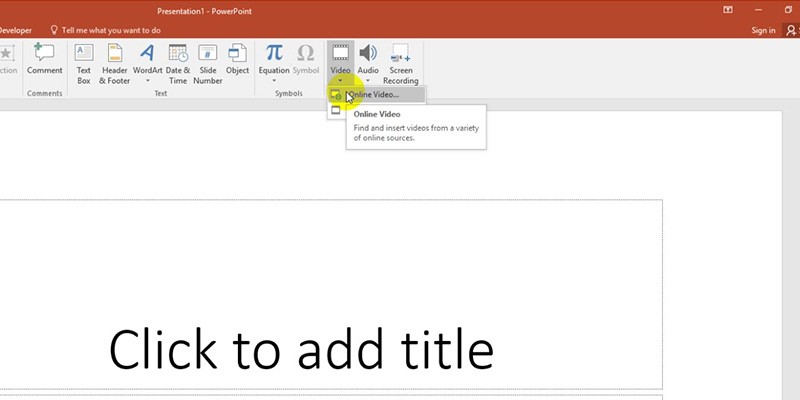 3. A window named Insert Video will appear. This will look different from the option to insert a video directly from your PC. If you’re signed in with your Windows ID, you’ll see an additional option aside from YouTube and From Video Embed Code: OneDrive – Personal, which lets you embed videos directly from your OneDrive account.
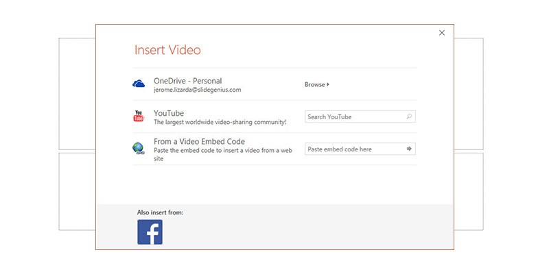 4. If you’re not signed in, or if you don’t have a Windows ID, only YouTube and From Video Embed Code will appear as your options.
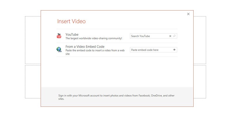 This is a helpful feature to have when you’re editing a presentation on the go. However, you need to make sure you’re logged in with your Windows ID to access this feature.
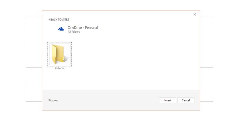 These options each have a box beside it, which you’ll fill out with relevant information. We’ll walk you through each one below.YouTubeSimply paste your video’s URL into this field. Additionally, PowerPoint can do more than just that.
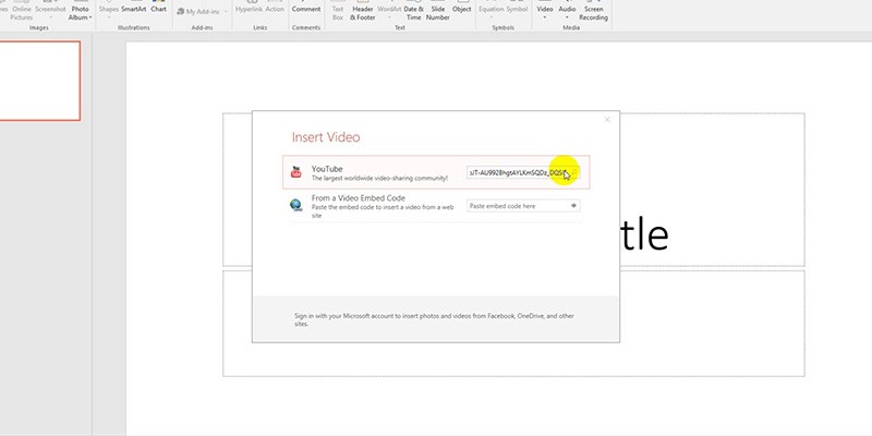 *SlideGenius tip:This field also serves as a search box. You can type a few keywords, and all videos related to your search query will show up.
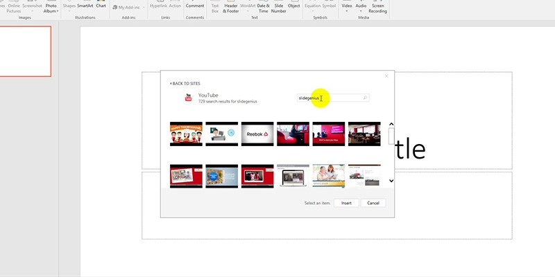 Wait for the video’s thumbnail to load. Once it’s loaded, click on it. Then, click Insert to place the video into your slide. You can drag the video around and resize it whichever way you want.
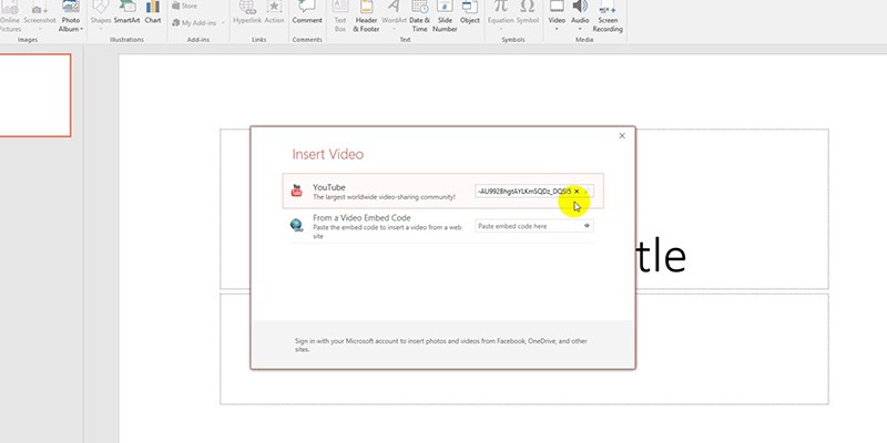 From Video Embed CodeYou can grab a video’s embed code from its YouTube page and paste it into this field. Be sure to check the video’s pixel width and height in the embed code (written as ‘width=”___” height=”___”’). Plugging in this code will resize the video to those dimensions and may result in different resolutions across screens.You can also manually edit the numbers in the “width” and “height” sections to make the video fit your slides. This helps if you want all of your videos to follow a specific size throughout your presentation.
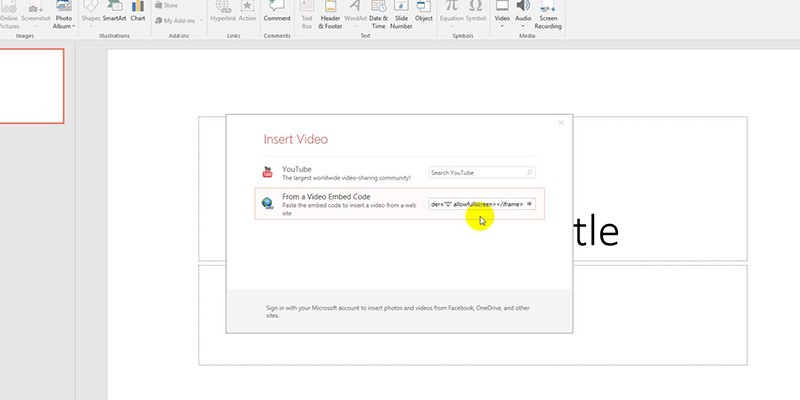 B. Embedding Videos from Your PC
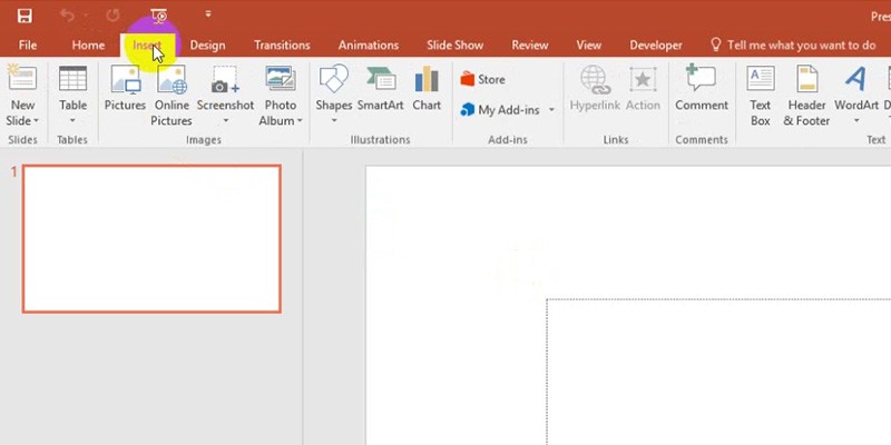 2. Under the Media group, click on Video and select Video on My PC… from the dropdown options. A window named Insert Video will appear, which will allow you to choose among your personal or downloaded files.
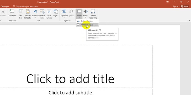 3. Once you’ve clicked on the video you want to embed, go to the lower right corner of the Insert Video window and click on the Insert button.
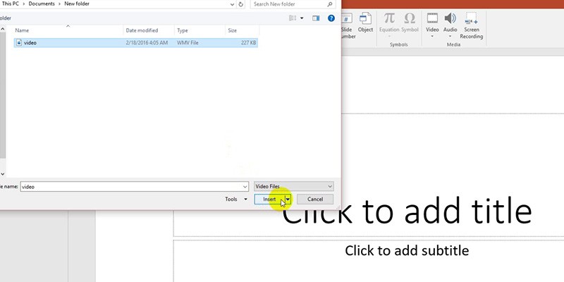 That’s it! You’ve embedded an offline video into your PowerPoint.
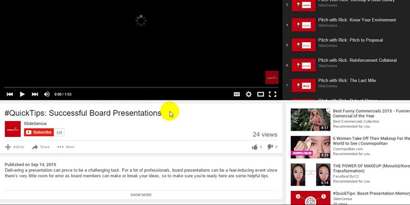 2. Look for the Share button below the Subscribe button. Click on it to reveal three tabs: Share, Embed and Email.
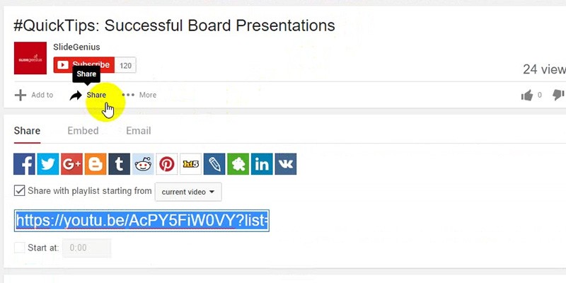 3. Click on the Embed tab. A box with the highlighted embed code will appear.
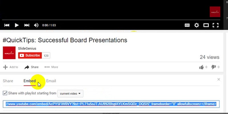 4. Once you’ve found the embed code, right click on the highlighted text and copy. You can also use the keyboard shortcut Ctrl + C. To do this, hold down Ctrl, then press the C key on your keyboard.