Slidegenius, Inc.

How Repurposing Presentations Can Boost Content Marketing Efforts

A lot of time and resources can be spent crafting beautiful and effective presentations.

After all, they’re the cornerstone of sales and marketing efforts—and made right, are highly effective in driving success.

But we don’t just mean in slide deck format. Because whether it’s a presentation that gets used frequently or not, hidden inside it is a treasure trove of additional content possibilities. 

They just need to be teased out.

Repurposing presentations is a great strategy any business can take advantage of.

Don’t worry, it’s not lazy or unoriginal to reuse good content. On the contrary. It actually offers your business tremendous benefits! 

You’ll get consistency across collateral and conserve your marketing budget for other important projects. Plus, you’ll have assets at-the-ready, enabling you to roll out marketing efforts quicker and with better consistency. 

The key is in repurposing presentations properly, which this posts addresses.

Use Individual Slides as Images

If your presentation was designed with best practices in mind, it’s sure to have more than a few visually appealing slides.

Don’t be afraid to take these individual slides out of the deck and use them as images alongside other marketing collateral.

Images for Blog Posts

Blog posts are a great example. 

If your deck has a slide about product benefits, use it as a visual aid for a blog post about that product.

Adding visual elements like images and videos (more on videos later) to blog posts enhances reader experience.

Just like for presentations, visual aids increase engagement, reinforce concepts (when done correctly), and ultimately keep readers reading — remember, the length of time readers spend on your posts is one of the most important SEO signals search engines pay attention to.

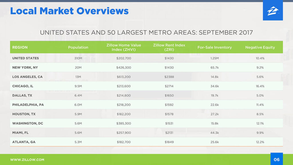
For example, you can see how the second slide in the following Zillow presentation could be re-purposed as a supporting image for a blog post covering the top real estate markets:

Images for Product & Service Pages

The purpose of a marketing presentation is to sell and the same goes for the product/service pages or landing pages on your website. 

Taking a few benefits-driven slides from the deck and using them as visuals on these types of web pages is the perfect way to capture visitor intrigue and answer basic questions.

One way to do this is to transform individual slides into a beautiful downloadable sell sheet and offer it on pertinent product or services pages to measure user intent.

The best part about this is that your slide deck is already branded, making them a seamless fit for your website.

Images for Social Media Posts & Promotional Ad Campaigns

Another great place to use slides as images is on social media. 

Facebook, Twitter, Instagram, and LinkedIn are all visually-driven platforms (and we all know that posts with images and videos see much higher engagement rates than text-based posts). 

The right presentation slides can be a quick and easy way to populate your feed with social-ready graphics. They convey meaningful messaging in a branded way—all you need to do is come up with snappy post copy and crop the images appropriately.

For example, with a bit of editing, any one of the following slides could be used as Caterpillar’s LinkedIn “pinned” post, which the company isn’t taking advantage of (at least at the time this article was published):

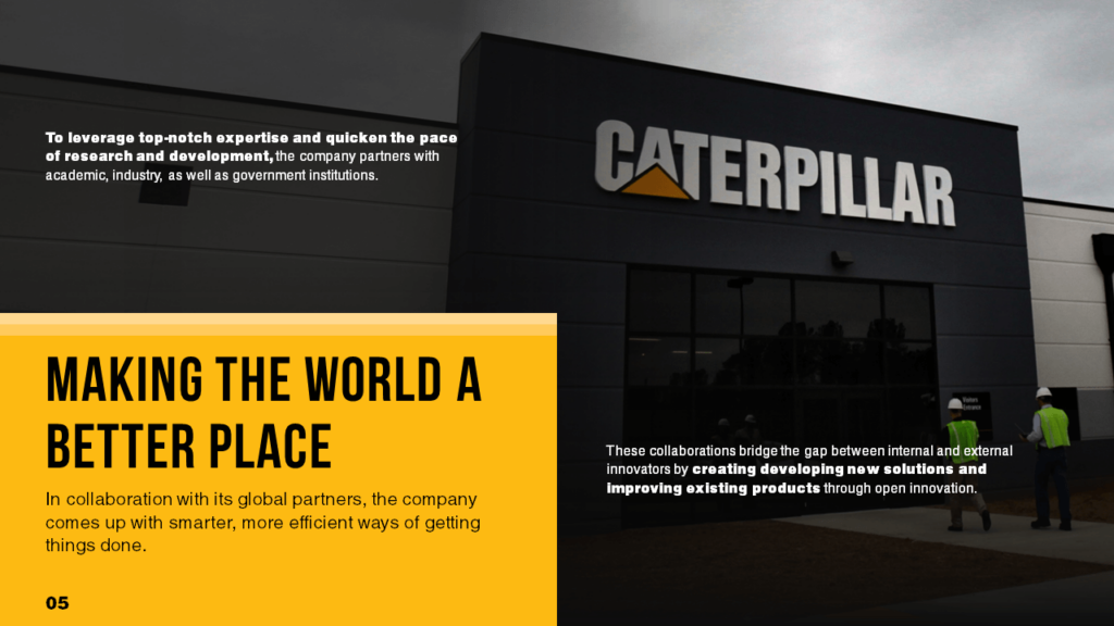
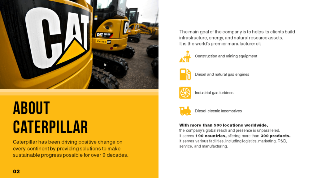
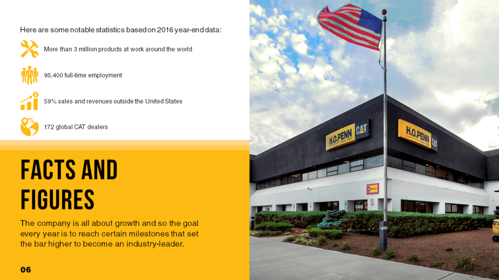
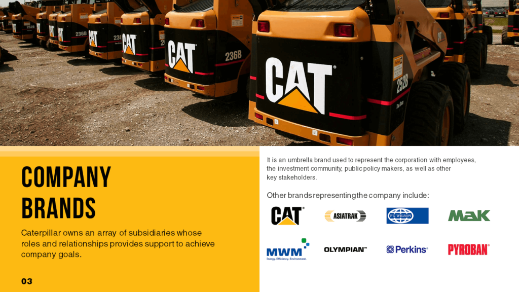
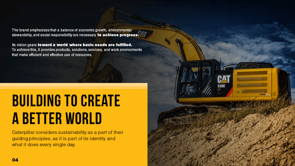
The pinned post can link to a case study, a blog post on Caterpillar’s recent social responsibility efforts, an industry guide…you get the idea.

Heck, even Caterpillar’s LinkedIn cover photo can be revamped using the first slide in the group above.

Don’t forget about PPC and social ads, too. 

Whether you’re running a brand awareness campaign or retargeting to existing customers, branded and benefits-driven visuals will boost the success of your ad campaign. Just keep in mind that some social media platforms (Facebook especially) don’t like text-heavy ad images, so you’ll probably need to make some edits to the slides first.

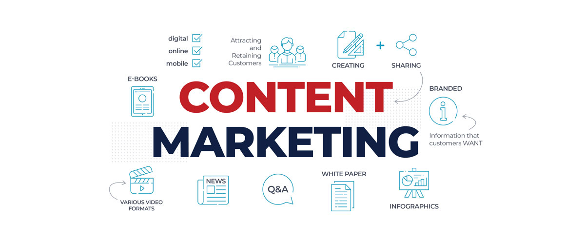
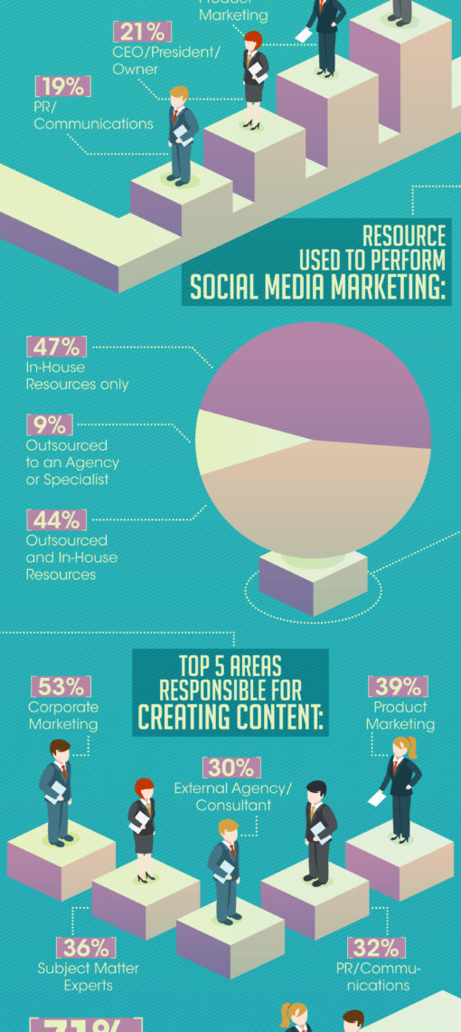
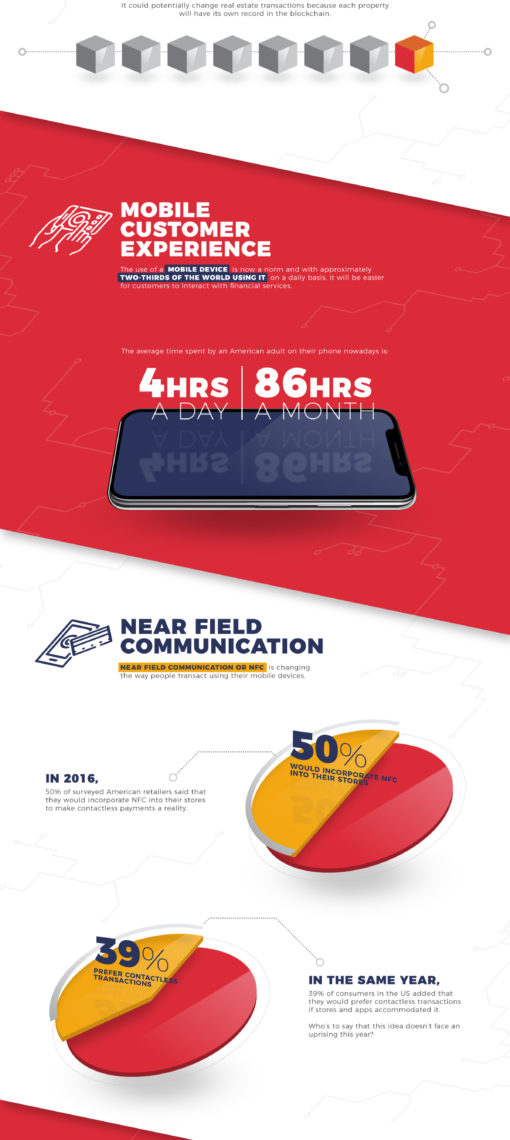
Convert Your Presentation into a Beautiful Infographic (or collection of infographics)

A good slide deck conveys everything a person needs to know about a topic.

If you’re pitching a product or service, the deck will have robust data and analysis to project these benefits to people. 

This type of data is also ideal for infographics.

You may not realize it, but your presentation likely already includes the building blocks for an infographic (or two). 

Go through a deck and start pulling out slides, data and graphics that tell a story—then, consolidate them into a beautiful and informative infographic.

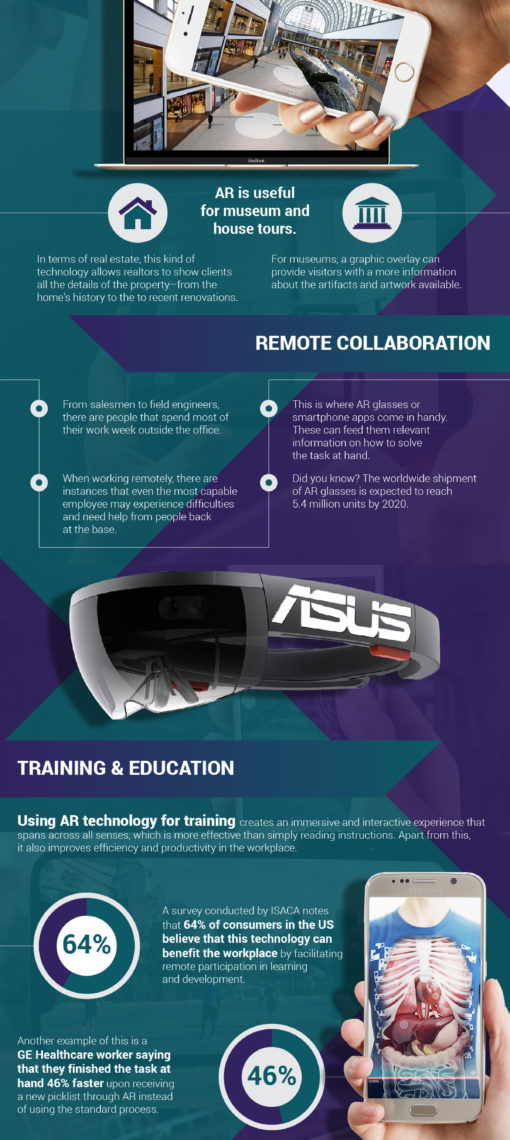
Start with one big infographic. This one might take a little scrolling on the part of a customer, but it’ll be worth it! A comprehensive infographic will tell them everything they need to know about your industry, product, service, or brand story in one condensed image. 

There’s no need for a 30-slide deck—a 30-second infographic can sum it all up.

Bite-sized infographics are also valuable. Pick a point and create a smaller infographic that harps on this one facet of the presentation. These mini infographics are great for social sharing, email blasts, and ad buys. They’re digestible in seconds and make a bold statement in just as little time.

Whether you create a big, engaging infographic or parcel presentation data out into smaller concepts, the goal is the same: Lead generation. Infographics are great lead-gen tools, and they’re readily borne from a well-made sales and marketing presentation.

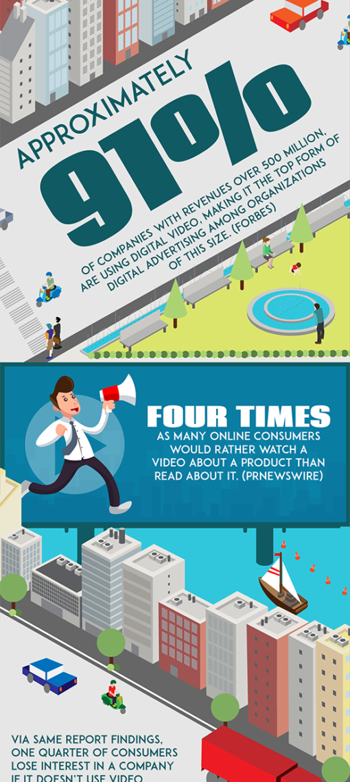
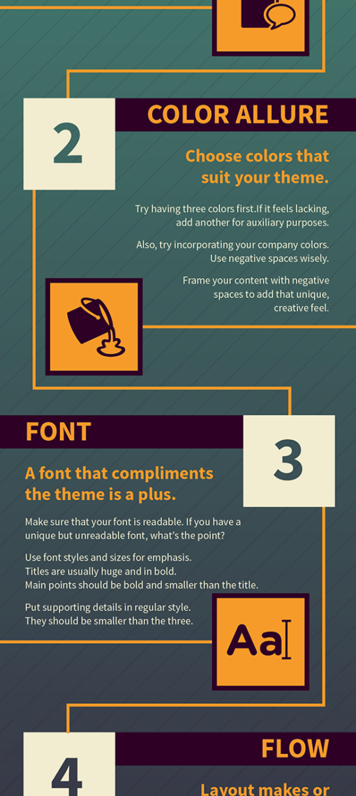
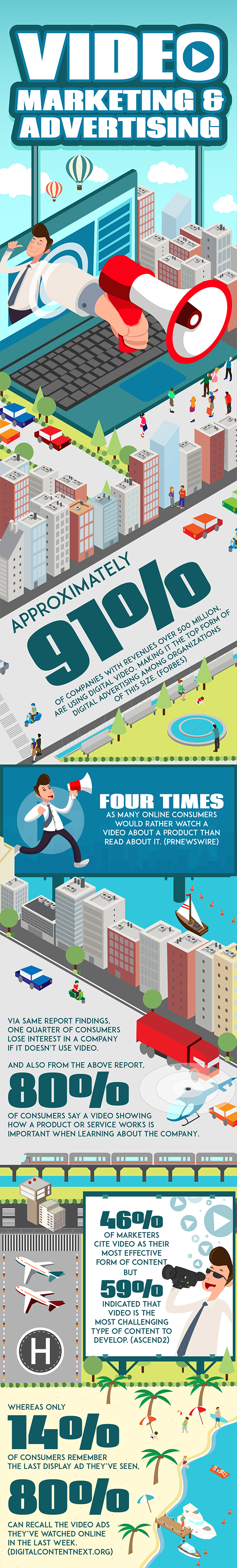
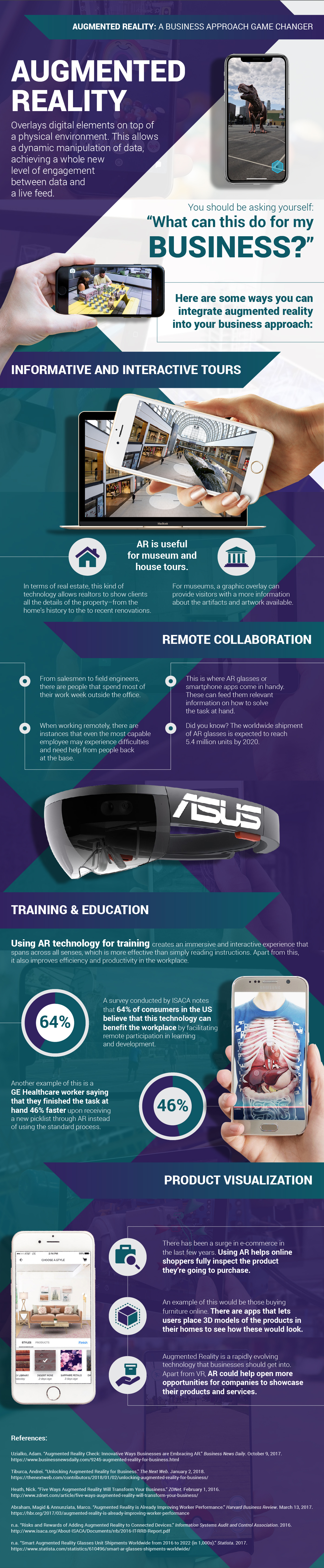
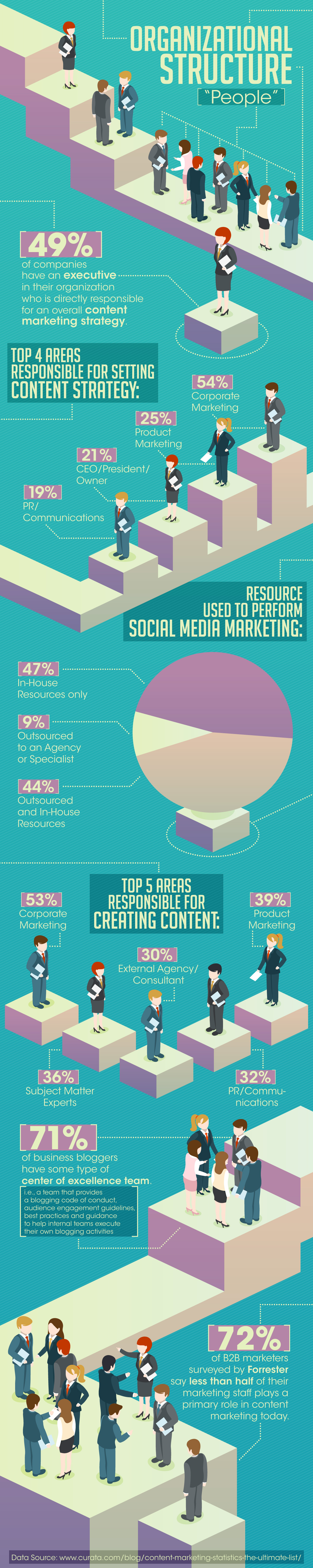
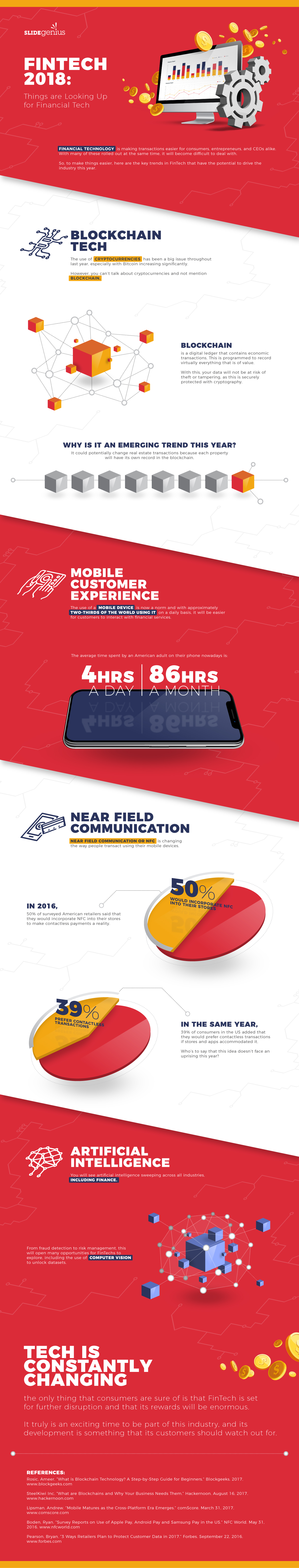
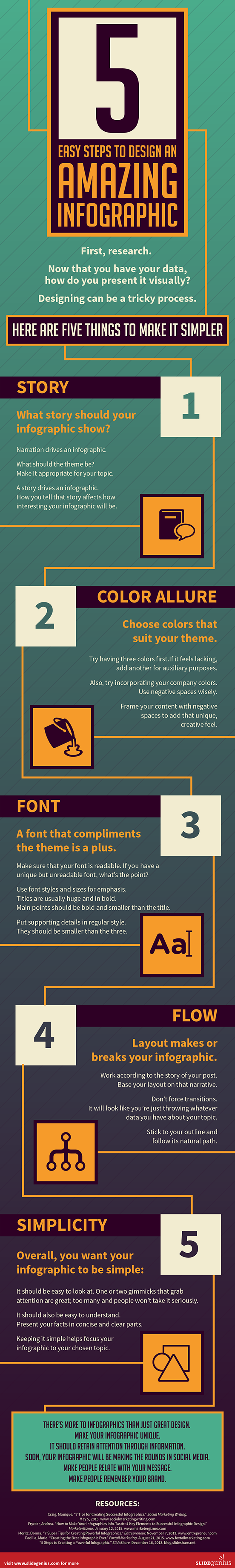
Here are some great examples of infographics crafted from information in presentations:

Convert Your Presentation into an Engaging Video

Slide decks are almost videos as-is. 

Think about the difference between manually clicking through slides and having them play automatically every 8-10 seconds, with a transition in-between. That’s a video! 

It sounds cheesy, but actually has a ton of practical applications.

Company Lobby Videos

Do the TV screens in your lobby need a content refresh?

If any of your presentations illustrate your company’s origin story, purpose or values, convert it into a video and add it to the content carousel that’s running in your company lobby.

Here’s an example of a a video created from re-purposed slides. You can see how it could be used as an “About Us” video in a company communal or waiting area:

Convert a Webinar Deck into a Video

Remember that slideshow you used for that educational webinar?

Record the voiceover, sync it up to the slideshow in a video, and:

  • disseminate it in a customer newsletter
  • upload it to a video-sharing site (like YouTube and Wistia), or
  • “gate” it behind a lead-generation offer (if it’s valuable enough) and advertise it on social media

The possibilities are truly endless.

Share on Video-sharing Sites

As stated above, whatever you decide to do with your video, make sure to upload it to sites like YouTube (you’ll reap the SEO benefits from the world’s second-largest search engine), Vimeo, Wistia, and other video-sharing sites for easy and extra exposure.

Internal Training Videos

The same goes for a training video for internal teams. 

With videos, people can pause, rewind and play at half or double speed in video format, making it easier to follow along and retain information.

Product/Service Videos

Another great slideshow-to-video idea is to extract individual slides and combine them into a targeted short video for a product or service page. 

These videos don’t have to be more than 30 seconds and can play automatically alongside product listings, in social feeds, or in standalone video ads.

Social Media “Stories

Finally, there’s social media to consider. 

Video is huge on social platforms! Facebook and Instagram in particular reward video content with more exposure, which can bring much-needed attention to your product. 

Adding these short product videos to the “stories” feature of these platforms only serves to increase exposure to them.

Convert Your Presentation into a Free (or Lead-Generating) eBook

On-the-go readers appreciate having access to downloadable content they can take with them and read on their own time.

That’s why eBooks and guides are still popular content assets.

So, take the slides you’ve already designed, combine them with existing blog posts on the same topic, and bring them together in an informative eBook!

Naturally, the most useful eBooks or guides will come from presentations that are more “educational” in nature. For example, if your CEO recently gave a keynote presentation on the trends of the industry your company operates in, this is perfect content to be re-purposed into a beautiful downloadable industry report.

eBooks don’t have to be long—under 10 pages is common, and they’re great for showcasing your expertise, improving brand exposure, and establishing you as a credible resource.

Offer an eBook for free on your website as supporting content or charge a small fee on Amazon Kindle (only if the content is valuable enough!) for people to tap into that knowledge. 

Finally, consider offering it as a free download after someone provides their email address. It’s a tried and true lead-gen solution that’ll help you capitalize on your marketing collateral.

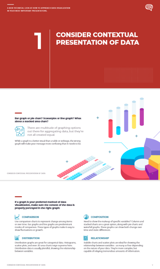
Here’s an excerpt from an eBook we created from a slide deck on data visualization:

You can download the full eBook here.

Integrate the Presentation into Print Materials

The options for repurposing a presentation are endless when it comes to print materials. 

Slides can easily become part of brochures, flipbooks, direct mail pieces, postcards, handouts, rack cards and just about anything else. 

Depending on your audience and the message you’re trying to send, a single deck could yield several rounds of print collateral!

Make the Most of Your Presentations!

If you’ve designed your presentations effectively, the content from them can (and should) live on long after the presentation has ended.

Smart marketers will realize the potential of the material and adapt it to other efforts, creating consistent, coherent messaging.

Use the ‘rule of three’ as an example. A piece of content should have a minimum three uses before it’s retired:

  • Presentation → infographic → social post, or
  • Presentation → blog post → eBook

No matter the collateral you create or how you use it, make sure it originates from your well-designed presentations. 

5 Reasons Your Company Conferences Aren’t Engaging

Company conferences are a great opportunity for your company to affirm itself. They’re ideal for celebrating successes, addressing headwinds, and generally setting the tone for your company’s direction. 

It’s a premier opportunity to reach a broad internal audience and convey a meaningful message.

Capitalizing on the prospect of a company conference takes diligent planning. Specifically, with regard to presenting information. 

Failing to present yourself in a meaningful way can undermine your message, putting you at risk of losing authority. You need your conference to leave your employees feeling good about the direction of the business.

If you haven’t had much success with company conferences in the past, it’s time to reassess the message you’re putting out there. Here are five things that could be holding your conferences back.

1. They’re Not Striking

If you’re bringing your people together for a specific reason, make sure there’s a sense of ceremony. 

Pomp and circumstance go a long way in setting the tone for importance. Start with décor and imagery that’s visually striking.

Above all else, accent the brand. Balloons, table runners, name tags, programs, or any other physical event materials need branding. 

Use your company colors. Slap the logo on things. Reinforce the idea that, no matter the message, the company is the central concept—an annual gala to celebrate the company, a summit conference to discuss the future of the company, a thank-you event for employees of the company.

Create a visually striking atmosphere that emphasizes the brand. 

Even beyond the materials, hold it at a venue that’ll excite guests. Or, enforce a dress code that sets a chic professional standard. 

A striking event is one people want to be at.

2. They’re Not Stimulating

There’s a big difference between striking and stimulating

Striking piques attention. Stimulating holds it. For as much as your conference should be attention-grabbing, make sure it’s attention-holding.

The best way to get people stimulated by your conference is to provide information in conjunction with visual appeal. 

A beautiful program that contains great information about event speakers, for example. The design gets people to pick up the program. The information keeps them reading it. 

The same goes for any speaker presentations or participation activities. 

Give people a reason to pay attention. Draw them in with flash and keep them captivated with substance.

3. Your Presentations Lack a Theme or Motif

Presentations are a cornerstone of any company conference. They reinforce a specific motif or idea, and help instill concepts in attendees. 

Unfortunately, they’re also one of the biggest opportunities for making mistakes.

Your presentation could be ineffective for a variety of reasons. Cluttered slides, too much or not enough information, confusing data visualization, and lack of preparation are all barriers to communication. 

Moreover, a poorly designed presentation simply won’t command attention—especially if their virtual events. But the biggest issue with most presentations is a lack of narrative.

Good presentations take time to put together. 

The slideshow needs to set a tone, introduce a narrative, and read like a story. And, once you have a well-crafted deck, you need to rehearse until you know your topic and the flow of your presentation like the back of your hand. 

Being able to deliver a well-designed, engaging presentation with the right cadence is the hallmark of a successful company conference.

4. You Don’t Have a Bold Takeaway

What’s the point of your conference? 

If there’s a reason you’re bringing everyone together in such a grandiose manner, you need to make sure the takeaway is deserving of the buildup. Putting on a spectacular conference only to end it with a clear lack of direction all but invalidates the entire event.

It doesn’t matter what the takeaway is, it needs to be bold. 

  • Make sure it’s emphatic and true. 
  • Make it confident and clear. 
  • Keep the tone calm and honest.

Above all else, make sure your company conference builds to a final idea. 

The bold takeaway of your event will validate everything you worked so hard to put together. And, it’ll affirm the narrative of everything you presented—whether it’s awards or informative slideshows.

5. You Don’t Address the Right Topics

Take the pulse of your company before you start planning an event. 

Failing to do so could mean putting on a conference that’s overshadowed by the elephant in the room.

  • Business facing hard times? Talk about the headwinds and the plan to address them. 
  • The past year been a booming success? Talk about what went right and who made it happen. 
  • A shift in the industry? Show how you’re adapting and what the path to success is.

Address the topics that your company needs to be talking about. Otherwise, your conference could come off as disingenuous.

Bonus: Find Ways to Engage!

If your company conferences haven’t traditionally been engaging, ask yourself if you’ve been giving people the opportunity to be active participants in them. 

There’s a big difference between sitting everyone in a big room for a slew of presentations and actively involving attendees.

Consider giving people the ability to register for presentations they want to see or participate in.

Host games, raffles, activities, and other fun asides that offset the more professional aspects of the event. Solicit audience participation. 

Whatever it is, make sure it draws people in instead of keeping them at a distance. 

And, of course, get feedback wherever possible to help decide what works and what doesn’t for future events.

Company conferences are an opportunity for both the business and its employees to have a level-set. Don’t squander the occasion! Spend the time to create a conference that’s engaging for everyone in attendance, while ultimately fulfilling the purpose of the event.

Ready to take your presentation to the next level? Schedule a free presentation consultation now.

How Harnessing Basic Marketing Principles Can Help Sales Presentations

Sales and marketing have a unique relationship.

It’s marketing’s job to create opportunities for sales. In turn, the sales team works with the marketing team to continually hone and refine the messaging. 

When this partnership is firing on all cylinders, the company grows, but alas, there’s a gap in the process.

If Sales Guy Steve doesn’t tell Marketing Maggie what he needs to sell better, how could she provide him with the right sales presentation? 

Likewise, if Maggie doesn’t know Steve’s prospect audience, the presentation he’s getting won’t help him illustrate value. 

Marketing and sales need to be on the same page. 

Channeling core marketing principles into sales presentations is the best way to bridge any gaps.

Define Strategy Before Deploying Tactics

What do you want the results of the sales presentation to be? 

Having a goal is an important first step in creating effective sales presentations. 

This is where sales needs to collaborate with marketing and say, with certainty, what the final objective is. 

Is it to:

  • Capture prospect interest?
  • Introduce or emphasize benefits?
  • Create an immediate sale?
  • Take market share from a competitor?

The biggest misconception is that sales is always about making an immediate sale. 

It’s not. It’s about building customer confidence. 

Sometimes the sale might come right away; other times, the presentation is just a stepping stone on the way to a future sale.

No matter the audience, have a goal. Know the goal. Design with the goal in mind.

Strengthen Your Message by Knowing Your Audience

Before a sales presentation is given, you need to know who you’re talking to. 

As simple of a concept as it is, however, it’s often overlooked in the rush to illustrate benefits.

Benefits are universal; how they’re presented depends on the audience. Presenting benefits without the right spin tends to come off as generic or vague.

Consider these two examples for the same product:

Generic: Product X lasts 2x longer than the competition and costs half the price!

Targeted: Single moms on a budget trust Product X because it lasts 2x longer than the competition. At half the price, it’s easier than clipping coupons.

The benefits are the same in both examples, but the latter is more powerful. The targeted example speaks to someone, not at them. It shows the concerns of single moms—shopping on a budget and saving time. It shows this core consumer group that you see them and understand what’s important to them.

Once you have their attention, make sure you hold on to it. 

Make a Connection (and Move the Needle) with a Story

Once you know who you’re talking to and have their attention, give prospects a reason to act. 

Inspire them. Evoke emotion. Get them fired up! 

The simplest way to tap into feelings and action is to craft a narrative. Simply put: Tell them a story.

Let’s face it: People don’t like being sold to. They prefer to make decisions on their terms, which means relying on your sales presentation to do the selling for you. 

Presentations that tell a story are more likely to get a favorable response than a classic sales pitch. 

Consider the following example:

You worked 60 hours this week. You’ll work 60 hours next week. But today’s Saturday and you’re not working today. Today is all about sweatpants and slippers, comfort food and naps. Today is your day. What better way to make the most of it than with Product X?

Even that small snippet is a story. 

A story is something people can relate to, that evokes emotion and creates understanding. 

It’s the modern way of selling, and it’s only possible when sales and marketing work together. 

Use storyboarding to identify the right narrative for your target customer. Then, support your presentation with powerful copywriting and design to drive home the sale.

Increase Interest by Keeping Engagement High

Engagement. 

One of the most important objectives for any marketing campaign is just as important when it comes to sales presentations.

This is where beautiful and thoughtful design comes in and can really take sales presentations up a notch.

All of the following are powerful stimuli that keep prospects attentive and engaged in your messaging:

Giving prospects something to look at beyond text is important. 

Remember, sales presentations have to be stimulating to generate interest in the sale itself. 

If the message (and how it’s delivered) is uninspiring, prospects won’t pay attention.

Keep It Simple, Especially with Data Visualization

A marketing presentation needs to be as simple as possible. It should stay focused on a specific topic and remain straightforward from start to finish. 

Just like brand experiences need to be cohesive and consistent, slides in a deck should be as well. 

It all comes back to the KISS philosophy.

As a good rule of thumb, every slide of a sales presentation should present a singular idea. That idea should be succinctly summarized and supported with engaging text and images. 

This is especially important when it comes to data visualization.

Someone should be able to process what’s in front of them in about a minute or two. The simpler things are, the more likely the idea will land.

It’s the job of sales to tell marketing what these most important features are. Then, it’s the job of marketing to convey them concisely.

Differentiate Your Message

Too often, sales will hand over competitor marketing materials to the marketing department and say “I want it to look like that.” 

As a result, your sales pitch and presentation won’t look any different to your customer. 

Worse still, it might look like a rip-off if they’ve already been pitched by a rival.

Don’t focus on designing a presentation that disputes your competition. Instead, focus on designing one that distinctly differentiates your brand and its products or services. 

This is the foundation of a successful sales presentation. 

A novel idea is going to get much more traction than a rehash of something your prospect has seen and heard before.

Fall back on your branding. Make sure the benefits speak clearly to the audience. Keep prospects engaged. The success of your presentation hinges on how appealing you make your message—and there’s nothing more appealing than something new.

Deliver a Compelling Call-to-Action

When the presentation wraps up, what do you want people to do? 

What’s the most important takeaway for them? 

Ending on a blank slide with the company logo immediately invalidates your efforts. Instead, end with a call-to-action:

  • Contact a sales rep
  • Visit this website
  • Place your order
  • Call this number

Giving explicit instructions leaves no room for error in helping prospects act. 

It’s the final step in an effective sales presentation—arguably the most important step.

A well-crafted sales presentation helps Sales Guy Steve sell better. But to get one into his hands and in front of prospects, Marketing Maggie needs to understand his needs. 

When sales and marketing collaborate, it’s evident. Sales presentations not only look great, they speak volumes to the people they’re made for. 

Ready to take your presentation to the next level? Schedule a free presentation consultation now.

6 Design Team Issues that Negatively Affect Marketing Departments

Even some of the world’s biggest brands have trouble marketing. 

Not every idea is a home run and often, internal struggles are a primary cause of marketing failures. Sometimes, bringing concepts to fruition just isn’t a smooth process—especially when the struggles involve design.

Self-inflicted wounds are avoidable, but only if your team is able to recognize how it’s holding itself back.

If the problem involves the design team specifically, it’s important to look at where failures occur and how to avoid and overcome them. Here are seven of the most common for enterprise-level design teams.

1. Isolation

In today’s turbulent, customer-driven marketplace, Agile has become king, and although its practices allow companies to flourish in the volatile and complex environment we now live in, the same practices can cause unintended inefficiencies beneath the surface.

For example, designers are now finding themselves embedded in cross-functional teams with engineers and product owners. Although this has its advantages, it isolates designers from each other, bringing problems of its own.

In isolation, designers can no longer receive the career-progressing design feedback they received when working closer to other designers. In time, this isolation can cause feelings of career stagnation and ultimately drive them to search for greener pastures.

For obvious reasons, this reality can lower the caliber of a company’s marketing efforts.

Yes, designers need to work with the people in charge of producing the concepts they’ll create, but they also need to collaborate with other creatives who have a hand in marketing, like copywriters and web designers.

Isolating the design department means losing the cohesion between these groups and the capabilities they have when working as a team.

2. Loss of Vision

With successful products come product expansions, related offerings, supporting services, and the like.

As teams divide to specialize in each corner of the product segment, the shared vision of the original product can get diluted (or worse, completely lost) in the shuffle.

As a marketing professional, you understand a lack of cohesion and identity can negatively impact the customer experience.

And internally, designers feel the loss of product vision most acutely.

Marketing can help designers working across product divisions by providing a North Star to guide design systems.

3. Confusion Over Branding Guidelines

This is related to Point #2, but pertains to when the company or brand itself evolves rather than an individual product or service. 

As a brand grows and evolves, so does its core elements: fonts, colors and proportions change, logos, verbiage as well as imagery. 

Even companies with well-established brand guidelines need to keep their branding updated and consistent. Confusion over even small nuances can stall a project. If it’s not on-brand, it’s not approved.

A freelancer unfamiliar with the branding rules. A tenured designer who’s seen several iterations. Anyone on the design team can get confused if the brand guidelines aren’t clear and accessible. 

Make sure everyone involved in the design process—from graphic artists to copywriters, web developers to consultants—has access to the most up-to-date version of the style guide at all times.

Like this post? Check out our “How to Effectively Support Busy Graphic Design Teams” guide:

Download eBook

4. Handcuffing Design by Stakeholders

One of the quickest ways to crush the design team and stagnate marketing is to handcuff creators. 

Put them in a box. 

Put a cap on their imagination. 

Whatever you call it, it’s death for any prospect of marketing success.

This is a top-down problem. An executive doesn’t like the bold new idea, so they tear it down and go with the same old concept. A marketing manager doesn’t listen to the idea of a talented designer because they “haven’t put in their time.”

Handcuffing can happen any time you invalidate an idea before actually considering it. 

For design concepts especially, something new or bold is always worth considering—even if you don’t ultimately use it.

Designers who feel heard and valued are more likely to keep coming up with concepts. 

Eventually, one of them will be a winner.

5. Circular Feedback & Revisions

Any creative is used to getting feedback. 

But no matter how much feedback you provide or in what capacity you deliver it, there’s nothing more infuriating than circular revisions. 

It typically goes like this:

  1. Jane marks up a design and changes elements A, B and C. 
  2. The designer makes revisions. 
  3. Then Mark changes element A back to the original and tweaks element C again. 
  4. The designer makes revisions. 
  5. Then Leslie changes elements A, B and C a little bit. 
  6. The designer makes revisions… again.

Look familiar?

This vicious cycle can go on forever, and it will if people continue to make changes to changes that have already been changed.

It’s frustrating for a designer who sees every iteration. They’re often changing things several times, only to revert to an earlier design.

The simplest way to nip this problem in the bud is to encourage holistic feedback. Have everyone provide feedback or revisions on a design before sending it back to the artist.

Holistic revisions result in more cohesive final designs and a sane design team.

6. Project Hierarchy & Delegation

If everything is urgent, nothing is urgent. 

It’s the motto of someone who has been at the receiving end of a project barrage—often, a designer.

Good design work takes time and there’s a clear difference between work that’s rushed and work properly managed.

The solution to getting high-caliber design work and top-tier marketing graphics is to manage projects and delegate work with a mind for turnaround and capacity

Designers have varying capacities and work at different speeds, and each project comes with its own demands. 

Instead of throwing the next available designer at a project or heaping more into the fire, pay attention to logistics.

Conclusion

These seven problems nag at even the biggest brands. Sometimes, working with creatives requires a break from the business mindset. It takes emphasis on the human element and an understanding of team collaboration to tear down these roadblocks and kick marketing design efforts back into high gear.

Design issues hindering you from making successful marketing campaigns? Contact SlideGenius today and we’ll help you get back on track. 

-->