Slidegenius, Inc.

Guy Kawasaki’s 10-20-30 Rule of Presentation: Is It Still Relevant?

PowerPoint is a superb presentation tool that can be an effective visual aid for professional speakers when appropriately used. However, at the hands of inexperienced presenters who have no eye for design, it can pave the way for jarring and unattractive slides. Sad to say, the business world is teeming with mediocre pitch decks that just don’t do justice to the ability of PowerPoint as an excellent design tool. Luckily, there are people like Canva Chief Evangelist Guy Kawasaki, who can show the noobs how it should be done.

Kawasaki advocated the 10-20-30 Rule of PowerPoint, which banks on the idea that a presentation “should have ten slides, last no more than twenty minutes, and contain no font smaller than thirty points.” Although Kawasaki originally meant it for entrepreneurs and startup business owners, this principle applies to all presentations. Following this guide can avoid basic design mistakes and ultimately stand out from the vast sea of lackluster presentations.

Why the 10-20-30 Rule Is Still Relevant Today

Kawasaki’s 10-20-30 Rule is now more than a decade old—which, we can all agree, is a long time for any virtual rule to last, with the constant and almost abrupt changes that technology makes. Although PowerPoint is still the most recognizable presentation design software in recent history, it’s no longer the only one in the book. Several competitors have emerged, and they all have something relevant to offer. Apart from that, how people use PowerPoint has changed over time. What was invaluable ten years ago may not be as significant today.

This begs the question, “Does the 10-20-30 Rule still apply?” The answer to this is short and clear: YES. Here’s why.

1. Presenters still cram several ideas into one pitch deck

You’d think a lot would have changed in a decade. Well, in the case of slide design, nothing much has improved. Don’t get this wrong—agencies specializing in presentation design have emerged over the years and elevated the landscape. The individual presenters who have not fully maximized the use of PowerPoint still make the same mistakes. Despite professionals strongly advising against it, some presenters still cram multiple ideas into one pitch deck. They don’t even bother to filter out the unnecessary stuff and keep only the crucial points.

When Kawasaki first proposed the 10-20-30 Rule, he also suggested ten topics for the ten slides: the problem, the solution, the business model, the underlying technology, sales and marketing, the competition, the team, projections and milestones, status and timeline, and summary and call to action.

So, instead of filling each slide with unnecessary text, why not try to identify your salient points first and then make an outline based on them? Use as little text as possible to avoid overwhelming your audience with a barrage of ideas. If a slide isn’t necessary, do away with it. Remember, you are the star of your presentation, not the pitch deck or anything else. Make sure that all focus remains on you.

Are You Looking for a Pitch Deck?
View Our Amazing Pitch Deck Examples!

2. People’s attention span is getting shorter

We’re in the age of social media, where the best content is short and fast, and people appreciate things that don’t take much time. Attention spans have become relatively more straightforward, so people are growing more impatient and expectant—a combination that is hard to satisfy. This is why when delivering a presentation, you should always be considerate of your audience’s time and level of interest. Even if you’re given an hour to present, prepare for a speech that doesn’t last longer than twenty minutes. You can use the extra time to set up your equipment or hold a Q&A session.

“But I have something significant to say!” you may argue. That doesn’t give you any reason to go beyond the suggested time frame. Look at the universally-renowned TED talks, for example. Speakers are expected to deliver their speeches in eighteen minutes or less, which doesn’t stop them from communicating brilliant ideas worth sharing. If you have an imposed time constraint, you’ll be forced to edit your speech meticulously until it’s down to the bare necessities. Trim down all the unnecessary stuff to put the essentials in the spotlight.

3. Readability is a crucial factor that’s still being sidelined

The number one rule of presentations is simple: The audience is the boss. Wherever you are in the presentation, you should always put the audience at the forefront of your mind. For instance, what the people in the front row see should also be seen clearly by those in the back row. Optimize the font size of your text to accommodate all of your viewers. When you see people squinting at your slide, take the hint that something’s not right.

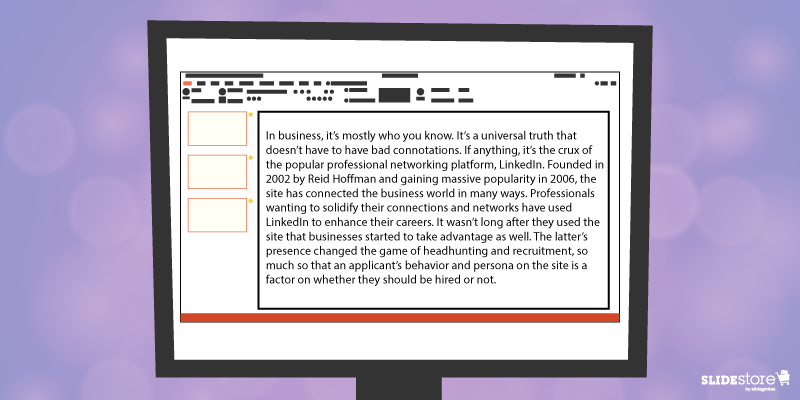
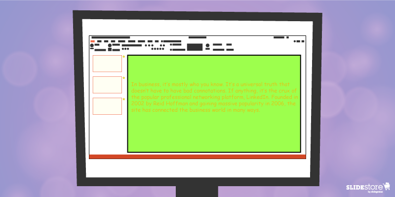
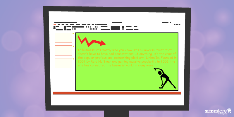
Another reason why the thirty-point font rule should still be reinforced today is that it encourages you to limit the number of words you can put in each slide. As much as possible, don’t overload your slides with information. Remember that your goal is not to bombard your audience with ideas but to present them with a few that can improve their lives.

Is the 10-20-30 Rule Absolute?

Kawasaki didn’t mean for the 10-20-30 Rule to be followed religiously by all business presenters. Instead, he set it as a guideline for people who want to improve their pitch decks and, consequently, their presentations. The fact remains that each situation is unique, so there’s no hard-and-fast rule that applies to all.

Instead of asking how many slides you should have, ask how many you need. Also, instead of going with the twenty-minute rule, why not apply the one-third rule, which suggests that the length of your speech should be one-third of the time you’re given? That is, after all, the original idea that Kawasaki proposed. Lastly, you can bend the thirty-point-font rule without breaking it. It’s only the minimum font size recommended, so you can go higher as the number of words you use per slide decreases. Ultimately, you should consider the needs of your audience instead of mindlessly jumping on the bandwagon. What works for one may not always work for you.

Twelve years later, Kawasaki’s 10-20-30 rule is still as effective as ever. If every presenter applies these three timeless guidelines, the landscape of presentation design will be infinitely better.

Resources:

Dlugan, Andrew. “The 10-20-30 Rule: Guy Kawasaki on PowerPoint.” Six Minutes. June 10, 2010. sixminutes.dlugan.com/10-20-30-rule-guy-kawasaki-powerpoint

Jonson, Laura. “The 10/20/30 Rule of PowerPoint: Does It Still Work?” SlideShare. January 13, 2016. blog.slideshare.net/2016/01/13/the-102030-rule-of-powerpoint-does-it-still-work

Kawasaki, Guy. “The 10/20/30 Rule of PowerPoint.” Guy Kawasaki. December 30, 2005. guykawasaki.com/the_102030_rule

“Follow the 10-20-30 Rule for a Perfect PowerPoint Presentation.” Presentation Load. October 17, 2013. blog.presentationload.com/follow-10-20-30-rule-perfect-powerpoint-presentation

Bullet Points and Why They Matter to Your Presentation

Many articles online provide profound insights on how to charm your audience, retain attention when speaking in public, or create the best presentation for the right purpose. And for the most part, there have been similarities that can be seen in almost every piece. One of the many from presentation experts is: “Don’t ever use bullet points. You don’t need them.”

What warranted the general avoidance? Is it because it’s primarily considered the reason for death by PowerPoint (DbP)? If you consider bullet upon bullet in different slides, then sure, you can call the whole thing as walls of text. Given that humans favor the visual over the textual, audiences will be bored by all the reading.

But did you know “death by bullet points” exists? Symptomatic, not synonymous, to DbP, overuse and misuse of bullet points have always been every audience member’s nightmare. And it has happened more than once, much to the annoyance of the crowd. Does that mean that bullet points should be avoided?

Not necessarily. Bullet points are useful in specific situations, and in the proper context, they’re your best tool. Here are a few reasons why they matter.

Optical Break Bullet Points

Optical Break

Reading can be strenuous for the eyes, especially when you have a big block of text in one slide. While seeing this word wall can be intimidating for some, others would just outright not read it. Those who attempt will find themselves blinking more since their eyes dry out from, unsurprisingly, not blinking (because they’re reading).

Bullet points put line breaks on long passages, not just with the negative space from the background but also with clear markers on where a specific item begins and ends. Shorter bits of text are more welcome since they’re easier to understand, digest, and remember. Any form of relaxation is pleasant for your eyes.

Organizing information | Bullet Points

Organized Information

In the same way that your eyes need a break, your brain also needs a breather when trying to comprehend a long paragraph—much less a lengthy sentence. This is where bullet points shine.

Dissect the text, then separate and summarize the main points. Those summations can then be what you can put on your bullets. That brevity is already a big plus; how much more if they’re fascinating?

Think of bullet points as the “too long; didn’t read” (TL;DR) version, the abridged edition, of your long paragraph. By bulleting the main points, you can shorten a sixty-word section to merely a fraction of that, saving your audience’s time. Plus, they get to listen to you more.

Overall readability | Bullet Points

Overall Readability

Which would you rather see: a big block of words or a bulleted list? Which of the two is cleaner and easier on the eyes and is therefore more readable? Most, if not all, would say the latter, especially when the layout is planned properly. With the former, you risk instances of misreading since there are too many words and lines all bunched up in one place.

Keep your slides neat and tidy by having few words—and relatively fewer bullet points—in them. Prevalent enough is the 6×6 rule, stating that you should have no more than six bullets with six or fewer words each in a slide. There’s also the “three words and four bullets per slide” rule.

The Last Bullet Point

There’s a reason why bullet points are overused, and consequently are now being mistreated for it. Just like the Comic Sans fiasco, most people are tired of seeing bullets in almost every presentation they attend. However, that’s not a reason to ignore and neglect the importance and benefits of using this tool.

Of course, you should always exercise moderation; there is such a thing as death by bullet points. A good way to avoid that is by not overloading your slides with bullets, which can be just as bad as a wall of text. In short, know when and when not to use them.

Your slides are your visual aid, so making them clean is on you—and for your audience.

Resources:

Bruce, Robert. “8 Quick Tips for Writing Bullet Points People Actually Want to Read.” Copyblogger. February 7, 2012. www.copyblogger.com/writing-bullet-points

Clark, Brian. “Little Known Ways to Write Fascinating Bullet Points.” Copyblogger. October 23, 2006. www.copyblogger.com/little-known-ways-to-write-fascinating-bullet-points

Crerar, Paula. “PowerPoint Bullet Points: Do We Need Them?” Brainshark. January 24, 2012. www.brainshark.com/ideas-blog/2012/January/powerpoint-bullet-points-do-we-need-them

Paradi, Dave. “How to Write Powerful Bullet Points.” Think Outside the Slide. n.d. www.thinkoutsidetheslide.com/how-to-write-powerful-bullet-points

“10 Ways to Avoid Death by Bullet Points.” Presentitude. March 4, 2015. www.presentitude.com/10-ways-avoid-death-bullet-points

“Comic Sans: Why All the Hate?” Snapily. January 8, 2013. www.snapily.com/blog/comic-sans-why-all-the-hate

The Don’ts to Hosting an Excellent Webinar

Isn’t it great to venture back to the time when seminars were held in a large place, audience members lined up to enter and get a good seat, with the speaker in the same building, talking straight to them? Given today’s hustle-and-bustle way of life, it’s already difficult to host a seminar, much less get people to attend. Technology, though, has a solution: a web seminar or webinar.

Since its start in May 1996 with NetMeeting, the webinar has evolved. It’s no surprise that it’s now considered as one of the best marketing tactics around. You reach and engage your audience even in remote areas. More options are now available to the host that make it easy to pull off.

However, if you think it’s that simple to host a webinar, then you’re mistaken. There are a lot of bad things you can do to fail, like the following. These shortcomings will guarantee you a bad and poorly presented webinar, so it would be prudent to avoid these.

Avoiding Three Basic Flops to Host a Great Webinar | No Internet Connection

Not Checking Connection

It’s a commonly known fact that webinars are done online—the Internet connecting hundreds to thousands of people from different corners of the globe to a single spot. While the number of attendees doesn’t do much to hamper the flow of the web presentation, your connection to the world wide web may and will be compromised quickly since you’re consuming a great chunk of bandwidth with video and audio streaming.

Therefore, it’s a good idea to secure a strong and stable Internet connection, or at least be aware of what can happen when your connectivity is weak and cannot handle something as demanding as a webinar. You know how YouTube videos suddenly stop playing to buffer and load? Don’t let your audiences experience that.

But what if there was an unforeseen emergency? A backup ISP is usually the best answer. The times when technology will fail you may be hard to predict, but that doesn’t mean you can’t prepare contingency plans.

Avoiding Three Basic Flops to Host a Great Webinar | Outdated Equipment

Skimping on the Hardware

Don’t underestimate a webinar’s demand for hardware. If YouTubers and streamers need hundreds of dollars for specialized equipment, expect to shell out the same amount just to get the gears rolling.

First off, you’re going to need a webinar platform. There are good subscription services for this. Next, you need a computer capable of multitasking, since you’d be running a lot of programs (platform and presentation, among others) simultaneously. Then, as above, a good ISP and a heavy-duty modem/router with matching bandwidth. Lastly, the bunch purchase of high-quality webcam, speakers, and microphone. Those preinstalled on laptops are often not good enough; rather, you want those specialized ones that may be a bit costly but are worth it.

Once more with the backup plans, you’d want extras as well. If that means another platform, computer, and extra accessories, then so be it. At least you’re prepared when any one of those fails at the last minute.

Avoiding Three Basic Flops to Host a Great Webinar | PowerPoint Animations

Being Reckless with PowerPoint Animations

Of course, you’re expected to have a beautifully designed presentation deck. You, a presentation designer, or a presentation design agency should take care of that. However, don’t get overzealous with how you craft your presentation pitch deck.

The basics, such as using less text to make way for powerful images and making font sizes larger, among others, should still be followed. There is no excuse for shirking away from the essentials. But present in PowerPoint, and absent in normal images or infographics, are animations that display specific elements with a nifty twist. Even a normal presentation shies away from too much object movement.

But should a webinar avoid it too? Not really, but there are more considerations. For one, animations seldom go smoothly online since there are circumstances out of your control. Your animations may show up nicely on your end, but your audiences may experience “jumpiness” on theirs.

Instead, only use animation on objects that really need it: a point you need to emphasize instantly or to show progression or any sort of movement that will arrest attention. The lesser your PowerPoint animations are, the better. In the same way that too much effects can break your deck, webinars can also be more conducive to learning with minimal special effects.

Conclusion

Don’t even attempt these gross neglects of basic steps. Presentation technology may have made life easier to live in, but it will be useless without a decent amount of human effort to operate it.

Hosting a webinar with slides is simpler now, with the Internet carrying the burden of many menial tasks, but that doesn’t mean you can just be willy-nilly about it. Without a solid plan, you’re bound to fail. Take the time to prepare. Then wow your audience with an unforgettable web seminar. Leave them wanting for more.

Resources:

Agron, Mike. “Ultimate Planning Checklist for Successful Webinars.” Content Marketing Institute. May 13, 2016. www.contentmarketinginstitute.com/2016/05/planning-checklist-webinars

Courville, Roger. “3 Reasons PowerPoint Animations May Suck in Your Webinar (and What to Do About It).” EventBuilder. February 13, 2013. www.eventbuilder.rocks/3-reasons-powerpoint-animations-may-suck-in-your-webinar-and-what-to-do-about-it

Majumdar, Arunima. “14 Tips to Create and Present a Highly Effective Webinar.” eLearning Industry. February 20, 2014. www.elearningindustry.com/14-tips-to-create-and-present-a-highly-effective-webinar

Shelley, Brian. “11 Steps to Make Sure Your Next Webinar Is a Total Flop.” HubSpot. February 7, 2013. blog.hubspot.com/blog/tabid/6307/bid/34149/11-Steps-to-Make-Sure-Your-Next-Webinar-Is-a-Total-Flop.aspx

Shewan, Dan. “How to Do a Webinar Your Audience Will Love.” WordStream. March 16, 2016. www.wordstream.com/blog/ws/2014/08/26/how-to-do-a-webinar

Sibley, Amanda. “10 Things That Take a Webinar from Good to Great.” HubSpot. January 3, 2014. blog.hubspot.com/marketing/webinar-planning-list

Skrivanko, Mary Ann. “Webinars – History and Trends.” InsiderHub. June 30, 2015. www.insiderhub.com/webinars-history-and-trends

Wasielewski, Jarek. “Top 4 Do’s and Don’ts of Webinars.” ClickMeeting. October 1, 2014. blog.clickmeeting.com/topdos-donts-webinars

Proofreading: How Important Is It for PowerPoint Presentations?

When reading, isn’t it bothersome to see a typographical error that distracts you from peacefully enjoying the piece? There’s the nagging feeling that “teh” should be “the,” that “your” should be “you’re,” or that “should of” is completely wrong. If tenses are all over the place or the subject-verb agreement isn’t correct, then that impression of the mistake gives way to disappointment and silent rage. Typos are distracting, to say the least.

To curb typographical errors, the responsibility of proofreading content falls squarely upon your shoulders. Be it a blog post, a book waiting to be published, or even a social media update, any piece of content should be proofread before publishing and publicizing, lest you be subject to the anger-inciting asterisk.

“But wait,” you may probably say. “What’s the difference between proofreading and editing? And there’s revision, too.” It’s time to contrast.

Revising vs. Editing vs. Proofreading

Revising entails the “re-visioning” of the whole piece; you gauge and, if ever, change how you approach your topic. Some of the main questions you need to consider when revising are, “Did the last draft fail to answer important questions, and does the recent one succeed?” and “Is the argument clear and understandable?”

Editing is done so that the whole piece is coherent and unified. You check the flow from one sentence to another and the logic from one paragraph to the next to discern whether the transitions are clear and smooth. If not, then rearrange paragraphs, rewrite sentences, and make the according edits.

Proofreading, the lightest of the three, is where you look for misspelled words, misused punctuation marks, and improper verb tenses and subject-verb agreements to fix them. This is the last step you should do before posting your content.

You must also check your PowerPoint presentation to ensure it doesn’t have any errors (and if it does, edit). Other than showing that you took the time to perfect your slide, it also implies the following notions:

Clarity

Apart from the fact that typographical errors and grammatical mistakes are distracting (diverting your reader’s attention to the typo itself), they take focus away from the message of your presentation in PowerPoint. There are more possible misinterpretations of a line missing a word, a missing letter crucial to the intended definition of the word (think “pubic” instead of “public”), or inconsistent tenses.

While it may be said that the human mind internally corrects the mistake, it’s still an unnecessary mental activity for the reader. Instead of focusing on and absorbing your piece, they’re looking out for mistakes just to satisfy the feeling that what they’re reading is clean and error-free—if they even decide to keep reading your piece.

Instead of muddling and muffling your piece’s flow of information because of errors, make sure your copy is clean and polished. Take the time to think about how your audience reads your article. When you see a typo, correct it right away.

Professionalism

Often, if you read content rife with grammatical and typographical errors, your judgment on it is, “This must have been done by an amateur.” Contrast that with well-proofread copies, and the stigma of unprofessionalism is gone.

Careless mistakes are always a show of unprofessionalism. It can imply that you weren’t fully prepared with your slides or that you crammed your PowerPoint presentation. It can mean that you never bothered to check for mistakes after your first draft or that you didn’t organize everything effectively and efficiently.

This is why there is a practice in any printed publication to correct any factual or typographical errors that made it past layers of editing, albeit in the next edition. Unfortunately, this doesn’t hold as true for digital copies even though editing them is easier to do. Make sure you don’t fall into the same trap.

Consistency

Which do you go for: “toward” or “towards”? “Color” or “colour”? If you’re not careful, you might end up using two kinds of English in a single piece.

Having a consistent voice and tone is a must, if not for regional differences then for establishing yourself as a proficient English speaker and communicator. If you use American English, then keep it that way throughout your piece; if you’re going for British, then make your spelling and idiom use consistent. It may sound traditionalist, but there are critics of this kind of inconsistency. Plus, it helps define your target market without alienating the other party.

All in all, keep your content error-free. It’s a secret to crafting great copies. Even in school, you were trained to submit perfect essays and reports since having typos usually meant markdowns. It’s the same when it comes to business, only with far-reaching consequences. When you’re in front of a crowd whose decision could shape your life and/or career, you wouldn’t want to risk making the kind of mistake.

Writers live by a general rule, and it’s a good exercise of their English and organizational skills. “Write in white heat; revise/edit in cold blood.” Any word work you do falls under this rule. There are no exceptions. Not even your slides. The task of proofreading falls upon you, the content creator, and definitely not a PowerPoint presentation designer.

Resources:

Scocco, Daniel. “The Impotence of Proofreading.” Daily Writing Tips. n.d. www.dailywritingtips.com/the-impotence-of-proofreading

Wasielewski, Jarek. “The Importance of Proofreading Your Webinar.” Webinar Tips Blog. September 25, 2015. blog.clickmeeting.com/the-importance-of-proofreading-your-webinar

Wright, Catharine. “Revision, Editing and Proofreading: What’s the Difference?” Peer Writing Tutors & FYS Mentors. February 14, 2011. sites.middlebury.edu/peer_writing_tutors/2011/02/14/revision-editing-and-proofreading-what%E2%80%99s-the-difference

Wroblewski, M.T. “The Importance of Proofreading in the Workforce.” Chron. n.d. smallbusiness.chron.com/importance-proofreading-workforce-36110.html

Zimmer, John. “Five Typographical Errors to Avoid on Your Slides.” Manner of Speaking. November 6, 2010. www.mannerofspeaking.org/2010/11/06/five-typographical-errors-to-avoid-on-your-slides

“How Proofreading Services Can Make Your Next Presentation a Success.” Re:word. n.d. www.reword.ca/how-proofreading-services-can-make-your-next-presentation-a-success

Working with an Awful-Looking PowerPoint Template

Corporate PowerPoint templates are notorious for their impracticality and ineffectiveness. This is because they’re usually created by people with limited knowledge or experience in design. If you are guilty of this sin, then you should hire a slide design professional who can amp up your template’s look and feel. The aesthetics of your presentation can reflect the amount of dedication you put in it, so make sure you create a template that is engaging and attractive.
The general goals of a presentation are to communicate a message, make a point, and sell an idea. A bad template can undermine these goals and inhibit you from delivering an effective presentation. Here are some of the most common components of an awful-looking presentation template, alongside some tips on how to rectify them.

6 Elements of a Bad PowerPoint Template and How to Fix Them

What do bad presentation templates have in common? They all lack a unifying idea that marries content and design. Awful-looking presentations are ambiguous, and from this major flaw springs others. Although the following elements seem inconsequential, they can still leave a great impact on your template’s final look, usability, and effectiveness.
PowerPoint Template Mistakes: Inadequate Features

1. Inadequate features

A good presentation template should be flexible enough to meet the company’s needs. Otherwise, it will be of no use. Include the fundamental features in your template, but don’t stop there. Make sure you include not only an opening and ending slide but also transition slides, master slides, and other standard slides that can enhance your message. Apart from this, you should also provide a guidebook that will instruct and direct the presenters as to the proper uses of the template. Provide demonstration videos and actual presentation samples if necessary.

2. Lack of visual elements

One of the worst things you can do to a presentation template is to deprive it of an emotional element. Templates that are riddled with unnecessary bullets and large walls of text do nothing but insult the audience’s time and attention. Don’t encourage presenters to bombard their presentations with lengthy passages. Set presentation guidelines that limit ideas to one per slide. To add an emotional trigger, encourage the use of visual tools like graphics and videos. Let the presenters bring their ideas to life through emotive and photographic elements.
PowerPoint Template Mistakes: Poor Color Contrast

3. Weak color palette with poor contrast

Many things can go wrong with your chosen palette. For instance, you might choose a color theme that may not reflect your brand. The colors may not be appropriate to the image you want to project and the message you want to communicate. Another thing that may go awry is the color contrasting of the fonts and backgrounds. As you know, weak contrast results to poor readability, which will render your text invisible, and thus, worthless. To avoid this problem, always calculate the effect of a certain font color on the background. Finally, be careful about the inclusion of weak and/or daring colors in your theme. Weak colors can weaken your design, and daring colors can disorient your audience.

4. Unreadable typography

Typography is one of the most important elements of a presentation since it can set the stage for the content. There are two important aspects of typography: size and style. You need to get these two right to achieve an effective presentation. Make sure the standard font size you set is not lower than 44 points. This size is large enough to command attention but not too large that it looks ludicrous. You also need to consider the font style. Traditional serif fonts look formal and professional while sans serif fonts are more modern and clean-looking. Use what’s appropriate for your presentation.
When you use custom fonts, make sure they’re installed in external computers. The thing about custom fonts is that they can mess up the layout of your slides if the computer you’re using doesn’t support them. Embed the true type fonts into the presentation to avoid this fiasco.
PowerPoint Template Mistakes: Use of Clip Art

5. Cheesy effects

Perhaps the biggest PowerPoint nightmares are the cheesy effects, which include transitions, sound effects, and animations. It’s understandable if you want to spice up your template, but find better ways to do that other than adding inappropriate effects to your presentation. However, if you feel like you need to use the said effects because they offer a functional purpose, make sure to use them sparingly. Instead of the default sound effects from the PowerPoint library, embed background music from external resources. As for animations and transitions, make sure they add value to your content. Use only what’s absolutely crucial for the presentation.

6. Use of clipart and stock photos

Visual elements are generally good, but there are certain design taboos that you should avoid. We’re talking about clipart and clichéd stock photos. No matter how hard you try, you won’t find a reason compelling enough to justify the use of clipart in your deck. Nothing screams “lame” louder than mediocre symbols in a modern corporate presentation. The same thing goes for stock images. There are many staged and cringeworthy photos that will only lessen the value of your template if you’re careless enough to use them. If you’re going to use photos, go for genuine-looking ones that can trigger emotional reactions from the audience.
If you address these bad design habits that plague many PowerPoint presentations today, you will save your company major headaches. Fix these problems and watch as your presentation templates reach a different level of beauty, usability, and effectiveness.

Resources:

Chibana, Nayomi. “Color Theory for Presentations: How to Choose the Perfect Colors for Your Designs.” Visme. December 28, 2015. blog.visme.co/how-to-choose-a-color-scheme
Godin, Seth. “Really Bad PowerPoint.” Type Pad. January 29, 2007. sethgodin.typepad.com/seths_blog/2007/01/really_bad_powe.html
Hristov, Boris. “Reality Check: Is Your Company’s PowerPoint Template Bad?” Medium. January 19, 2016. medium.com/@borishristov/reality-check-is-your-company-powerpoint-template-bad-bf6ff82780ef#.4kkk8wijb
Mancini, Sunday. “4 Common PowerPoint Template Mistakes.” Ethos 3. May 26, 2016. www.ethos3.com/2016/05/4-common-powerpoint-template-mistakes
Panzironi, Michelle. “7 PowerPoint Mistakes That Make You Look Old.” Forbes. January 16, 2016. www.forbes.com/sites/propointgraphics/2016/01/16/7-powerpoint-mistakes-that-make-you-look-hella-old/#41da1a5234e7
“10 Tips for Designing Presentations That Don’t Suck: Part 1.” Work Front. February 2, 2017. resources.workfront.com/project-management-blog/10-tips-for-designing-presentations-that-dont-suck-part-1
“10 Ways to Spot a Lame Corporate PowerPoint Template.” PowerPoint Ninja. n.d. www.powerpointninja.com/templates/10-ways-to-spot-a-lame-corporate-powerpoint-template
“Choosing the Right Fonts for Your PowerPoint Presentation.” Documents with Precision. March 10, 2016. www.documentswithprecision.com/choosing-right-fonts-powerpoint-presentation

Fundamental Elements of a Strong PowerPoint Slide

Have you ever wondered about the makings of a perfect slide? Or if not perfect, at least a strong and impressionable one? Many answers are found online, and for just as many reasons, that you just can’t be sure which is correct. You could say, of course, that there are niche functions for what objects or elements you put on your deck, but does that make your slides strong individually and/or as a whole?
Blank slides often bear no weight, so you fill them up with visual elements. But being willy-nilly with what you put in there will make the effort counterproductive: the more objects in your slide, the more cluttered and distracting it becomes. It’s best to strike the balance between too much and too few.
Now, what are your options? The following elements are the necessities of a powerful slide. What’s more powerful is how you use them, vis-à-vis standalones or any number of combinations thereof.
Fundamental Elements of a Strong PowerPoint Slide: Theme, Title, Background

Theme

You can’t start creating a presentation without a central message and a theme. While everything around your presentation revolves around the former, your slides are designed per the latter. This can be a broad term, extending from color scheme to branding to even subtle details like typography and illustration style.
Choose an appropriate theme for your topic. It’s not a good idea to have a presentation about the wonders of nature but accent your slides with a black color scheme.

Title

While it doesn’t need to appear in every slide, it does mark where you are in terms of your whole presentation. It can also denote that a specific slide is noteworthy. Subtitles, to a degree, extend a title and branch out to other points, but it also doesn’t have to be ubiquitous.
Knowing when or when not to put a title maximizes the impact of the slide on the audience. Be clever with it. Wit is always appreciated.

Background

Imagine a theater stage with no backdrop—nothing to tell the setting or set the mood. The same goes for slides, even if it works on a case-by-case basis. Slide backgrounds reinforce the theme or branding of the presenter and set the mood for the audience.
Your background doesn’t need to be flashy. Even plain white can be appealing, especially when given the proper treatment. As long as it’s appropriate, as with theme, then you can make it work.
Fundamental Elements of a Strong PowerPoint Slide: Text, Images, Effects

Text

Getting to the meat of your message can be done in two ways: with your content or through pictures. With the former, less is more. A few select words can deliver bigger impact—and be remembered more easily—than a paragraph or two that dances around your point.
This is one of the things abused by those who have little experience with slide design. Think “death by PowerPoint.” Walls of text are to be avoided, of course, but having little to none on your slides can and does pay off.

Images

Pictures solicit or trigger strong emotional responses from anyone in a heartbeat. If your “less is more” with text can’t be achieved, try using an image that encapsulates and describes what words can’t do efficiently. You will see the results immediately.
Since humans are visual creatures, they process and react much faster to an image compared to words that are then read and understood. It’s, literally, seeing a bigger picture. All it takes is one look to make a point.

Effects

There are two kinds of effects that you can set in a slide: the shifting Transition and the object-focused Animation. You can highlight and emphasize points or objects and switch from one slide to another in style. Movements catch attention—a result of survival instinct and evolution to notice objects in motion—so take advantage of that fact with PowerPoint’s animation settings.
A word of caution though: use only when necessary. Don’t risk distracting your audience by overusing effects. A gimmick for gimmick’s sake will only be detrimental for your presentation.
Fundamental Elements of a Strong PowerPoint Slide: Visualized Data

Visualized Data

Cold, hard figures are exactly that. Cold. And boring. Instead of plainly showing numbers and percentages, use charts or graphs, even the occasional diagrams, to show your data in a more entertaining—and by extension more educational—manner.
The more creative your chart or graph is, the more lasting the impression that the data makes. Think of how infographics use design to show statistics: with creativity, wit, and humor. Employ the same to your slides.
Now you could be thinking, “I need all seven in just one slide? This is madness!” No, you just need a couple, like a combination of Background, Text, and Effect. Some can stand on its own, for example, Title or Image. It will only be a distraction to put all seven, so only put what you need.
Lastly, as already said above, the most important element of any slide is the overall message of your presentation. Each part of your visual aid should point toward, support, and strengthen the crux of the whole exercise. You wouldn’t be onstage talking about your advocacy then jumping to a different matter altogether just because.
Everything about your PowerPoint presentation should revolve around your message. Any combination of the elements above serve as parts of a whole, all working in harmony to inform and educate your audience. And that is the key factor to wowing your audience.

Resources:

Finkelstein, Ellen. “3 Components of an Effective Presentation.” EllenFinkelstein.com. December 6, 2000. www.ellenfinkelstein.com/pptblog/3-components-of-an-effective-presentation
Kawasaki, Guy. “The Only 10 Slides You Need in Your Pitch.” GuyKawasaki.com. March 5, 2015. www.guykawasaki.com/the-only-10-slides-you-need-in-your-pitch
Mineo, Ginny. “Your Graphs Look Like Crap: 9 Ways to Simplify and Sexify Data.” HubSpot. October 7, 2013. blog.hubspot.com/marketing/data-graph-design-powerpoint-tips-ht#sm.0001frknxr3k3dlkqq22lsqtd9h7a
Tate, Andrew. “10 Scientific Reasons People Are Wired to Respond to Your Visual Marketing.” Canva. May 19, 2015. designschool.canva.com/blog/visual-marketing
“The Elements of a Slide.” Boundless. n.d. www.boundless.com/communications/textbooks/boundless-communications-textbook/preparing-and-using-visual-aids-16/using-powerpoint-and-alternatives-successfully-85/the-elements-of-a-slide-325-5653

7 of PowerPoint 2016’s Best New Features

PowerPoint is one of the most important programs in Microsoft Office. It features a competitive range of graphical and presentation tools, making it useful for both personal and business applications. PowerPoint 2016, its most recent version, marks almost three years of productivity since the last update. This newest application doesn’t come with dramatic changes. In fact, most of its additional features are enhancements from the previous version.
What sets the real difference with PowerPoint 2016 (and with Office 2016 in general) is the fact that it focuses on enhancing user experience on the cloud. It encourages a collaborative workspace where documents can be shared and used online. It also aims to represent and ultimately fine-tune the synergetic culture that pervades the current work system.
Basically, what Microsoft wants is to get consumers into a new way of thinking about its products. The techno giant wants its brand to be associated with cloud availability, innovation, and timeliness. By offering new features and constant updates, Microsoft aims to pan out its new brand identity—but, of course, consumers need to be onboard for that to happen.

Is This Upgrade Worth Your Money?

Now, the question is, would upgrading to PowerPoint 2016 be in your best interest? Or can you work just as fine with the version you have, however old? The simple answer is this: you won’t miss out on anything big by choosing to not upgrade. Upgrading is not compulsory, after all. You’ll still have the basics that come with every version—all you’ll miss are the new features.
So, the real question now is whether you want the new features or not. Remember, a new version means a new software, and a new software means smarter and more updated features. Finally, you have to remember that PowerPoint is used by over 500 million users worldwide, with 120 million of them using it for business and educational purposes. Just imagine how many of that number have already chosen to upgrade their accounts. Worth a thought, isn’t it?
To help you decide whether or not PowerPoint 2016 is worth your money, here’s an infographic outlining some of its best and newest features.

Resources:

Bjork, Dawn. “What Are the Top 10 PowerPoint 2016 New Features?” The Software Pro. n.d. thesoftwarepro.com/powerpoint-2016-new-features
Sartain, JD. “Check Out PowerPoint 2016’s Best New Features: Charts, Effects, and More.” PC World. January 18, 2016. www.pcworld.com/article/3018735/software/check-out-powerpoint-2016s-best-new-features-charts-effects-and-more.html
“PowerPoint Usage and Market Share.” Infogram. n.d. infogr.am/PowerPoint-usage-and-Marketshare
“What’s New in PowerPoint 2016.” Microsoft Training. August 17, 2015. www.microsofttraining.net/b/whats-new-powerpoint-2016

Looking Back on the Birth of PowerPoint

It’s hard to imagine life without the comforts of modern technology that people know today: smartphones, 24/7 Internet access, computers that basically provide anything and everything with the push of a few buttons, and the like. Now, you’d think that innovation is an everyday occurrence, but that wasn’t the case in the mid-1900s, especially for businesses.

Back in the early 60s, Roger Appeldorn invented the first overhead projector. It had a simple principle of using light reflected upon mirrors to display data printed on transparencies (a.k.a. foil or viewgraph), paper-sized sheets of cellophane. The bulky instrument became a mainstay in meeting rooms, but the processes to create one sheet of transparency were tedious and time-consuming (inkjet printing was still a new thing). If not printed, then presenters would handwrite data to be projected on the transparencies. That is, until the 90s. What happened?

Microsoft PowerPoint happened.

Its revolutionary and innovative approach to creating presentations gave it an edge over its more than thirty competitors. Its timing with the booms of both the Apple and Windows operating systems—primitive as they were—cemented its growth. And its fundamental function hosted other uses it wasn’t intended for, like classroom operations and simple public speaking exercises (and not-so-simple ones like the TED Talks). Yes, it’s that flexible.

Today, PowerPoint is at its latest version: PowerPoint 2016, as part of the Microsoft bundle Office 2016. More than two decades since the first version was published, PowerPoint is at its prime—with no signs of slowing down anytime soon. Although it has seen its share of competitors, the presentation designer software remains as strong as ever, if not stronger.

So how did this juggernaut of a program come to fruition? How about a teaser? For starters, did you know that PowerPoint didn’t start as an internal project of Microsoft? The following infographic will take you through decades across the technological history to the go-to presentation software that is—and will always be—Microsoft PowerPoint.

Resources:

Akanegbu, Anuli. “Vision of Learning: A History of Classroom Projectors.” EdTech Magazine. February 28, 2013. www.edtechmagazine.com/k12/article/2013/02/vision-learning-history-classroom-projectors

“Life Before the Web – Running a Startup in the 1980’s.” The Zamzar Blog. July 13, 2016. blog.zamzar.com/2016/07/13/life-before-the-web-running-a-startup-in-the-1980s

Black Cats of PowerPoint Presentations

Sometimes, in the middle of reviewing a PowerPoint presentation, there comes the anxiety wherein people ask themselves if the slides are enough or overdone. Some even come to a point where they struggle critiquing their work because they spent too much time on it. After so much time and effort, you may wonder if you’ve been efficient or just wasteful.

If, at the end of the day, despite all efforts to make a great presentation, it still doesn’t feel right to say it’s a job well done, here are some signs to help you make that call.

Black Cats of PowerPoint Presentations: clown juggling

Unlucky 7

In rare cases, presentation taboos may be excused when necessary but international speaker and presentation skills expert, John Zimmer, says having too many bullets and texts make no sense when crafting a pitch.

According to him, PowerPoint presentations that follow the 1-7-7 rule, or slides that consist one heading, seven bullets, and seven words, promise boredom and apathy on the part of the audience. Same point goes for the 1-6-6 rule.

Avoid this by using fewer bullet points. When used sparingly, bullets can be effective to communicate ideas and points because they offer convenience to the audience. Bullets help save more time and space to allocate new information. Too many of them, however, does the opposite of that value.

Minimize your use of words. Use communicative graphics and pictures that can replace texts. It’s best to do this in slides that contain messages that you would like your audience to remember.

In this case, the 4-by-5 rule might just be right for your presentation. Unless you’re enumerating from a list, then four bullets and five words are ideal to keep your presentation informative and snappy.

Black Cats of PowerPoint Presentations: reaper

The Scripture

One way to know if something isn’t easy to understand is when you read it repeatedly. There are several reasons why this happens. Usually, it means you’re having an idle moment or your phrases or sentences need to be simplified.

When reading, experts say an average person renders 50 – 300 WPM (words per minute). However, when reading technical content, the statistics go down to 50 – 75 WPM.

Sometimes, slides look like pages of ancient text, which contain too much information and take more time to read compared to the normal ones. When comprehending a script, use simpler but appropriate words and sentences to lessen the reader’s strain and lag. If you can’t process your messages easily, then how can you expect your readers to do so? Only use words with deeper meaning when necessary.

Pause after a certain amount of words to give time for them to absorb everything.

Also, speaking from an active voice welcomes a continuous reading process. Use present or passive tenses instead of progressive tenses. They’re easier to read and make ideas seem more simple.

Lastly, though it’s advised to keep one thought in one slide, you can opt to break your sentences in the middle and proceed to the next. Maintain the dominance of the white background. It also pays to maintain a breathing room for your eyes.

Black Cats of PowerPoint Presentations: fortune teller

Magic Decks

When you present a deck with numerous slides in a considerably long time, do you wonder if your audience recall everything?

A research conducted in 2012 by cognitive neuroscientist, Dr. Carmen Simon, examined how many slides people can remember from a text-only, standalone PowerPoint presentation. After 48 hours, results showed that 1,500 participants remembered an average of four slides out of the presented 20.

The study revealed that visuals played a significant role in keeping the slides memorable. It was also found that similar-looking slides are easier to remember. The distinctiveness of every other fifth slide in Simon’s presentation were significant help as well.

Marks help remember. Use pictures or designs not only to illustrate, but also to keep slides more interesting and easier to recall. It’s best to use them strategically. Use markings on slides that need more emphasis.

Conclusion

Your deck doesn’t have to be all-telling. You can just make books if that’s the case. A good deck must contain all significant points and ideas for the presenter to collaboratively explain with. In a PowerPoint presentation full of information, points become harder to highlight. Use words sparingly so that your audience would actually pay attention to your content.

Be strategic when creating your slides to make them more engaging. When making presentations, discover ways to be more conscious on your creative and communicative processes. It pays to understand your audience’s interests with regards to these aspects.

Lastly, know that sometimes, complex solutions only solve basic problems. Before you start with another PowerPoint presentation, invest your time in getting to know more about creating effective presentations. This way, you end up creating your presentation in a lesser hassle pace and with more peace of mind.

Resources:

Zimmer, John. “PowerPoint Math: The 1-6-6 Rule. Manner of Speaking.” Manner of Speaking. www.mannerofspeaking.org/2010/03/04/powerpoint-math-the-1-6-6-rule

Simon, Carmen. “The Results Are In: How Much Do People Really Remember from PowerPoint Presentations?” Brainshark. February 12, 2013. www.brainshark.com/ideas-blog/2013/February/results-what-people-remember-powerpoint-presentations

Nelson, Brett. “Do You Read Fast Enough To Be Successful?” Forbes. June 4, 2012 www.forbes.com/sites/brettnelson/2012/06/04/do-you-read-fast-enough-to-be-successful/#5d9d3eca58f7

Thomas, Mark. “What Is the Average Reading Speed and the Best Rate of Reading?” Health Guidance. www.healthguidance.org/entry/13263/1/What-Is-the-Average-Reading-Speed-and-the-Best-Rate-of-Reading.html

5 Effective PowerPoint Delivery Methods for Presentations

Most presenters barely notice what particular presentation technique they’re using whenever they take the stage. This is because they’re not fully aware of how it could influence both their performance and their audience. When you prepare your pitch, decide whether you want to use a fast-paced approach or spend more time discussing your main points.

This provides a guide for organizing your ideas and translating them to your slides. While there are many presentation styles which work best for different speakers, there are also PowerPoint delivery methods that they can use to optimize their slides. Here, we’ll define some techniques introduced and practiced by popular presenters:

The Takahashi Method

Named after Masoyoshi Takahashi, this approach relies heavily on keywords with one main point placed per slide. Instead of using images, bullet points, or other visual elements, words are used as visuals.

This method requires many slides (depending on your content) since each one only has a few words displayed. Applying this method encourages your audience to pay more attention to you as the speaker, since you are the one explaining what’s projected on-screen.

The Kawasaki Method

Named after Guy Kawasaki, and also known as the “10-20-30” method (10 slides, 20 minutes, 30 font size). This approach is commonly used for investor presentations where a short yet impactful approach is needed to stand out among the competition.

This allows you to give brief but understandable messages within a limited time.

The Lessig Method

Used by Lawrence Lessig, this style has a limited use of images, relying more on words, similar to Takahashi’s style. Concise words or statements are used and slides are changed around, depending on the words the presenter delivers.

This focuses more on telling a story and injects a more synchronized approach, generating interest and allowing audiences to be more attentive.

The Godin Method

Seth Godin’s technique is a combination of texts and images, where the speaker uses striking photos to let the pictures speak for themselves. This lets him explain what he’s trying to point out and reiterate his main ideas through images.

This approach differs from Takahashi and Lessig’s, since they’re more focused on conveying their message primarily with text. The advantage? Using this appeals to the audience’s passions and establishes an emotional connection with them.

The Steve Jobs Method

Steve Jobs’ style concentrates on large images and texts, focusing on one statement per slide and combining it with visual elements. This gives the presenter the chance to offer demonstrations and allow a more interactive way of communicating his ideas.

This method enables your performance to be more interesting and powerful, allowing the audience to get the message easily for maximum impact.

In Conclusion

Let your objectives dictate your manner of presenting. Situations requiring brevity and conciseness might require the Kawasaki Method. The Takahashi and Lessig methods favor a confident presenting style to better focus attention on the speaker. The Godin and Jobs methods use strong images that create strong emotional connections.

The key is to understand and identify your objective as a presenter. Once you know this, you can then decide on what presentation style to use. Choose which one of the delivery methods suits you the most. Let SlideGenius experts help you out!

-->