Slidegenius, Inc.

Common Challenges in Tailoring Presentations—and Solutions

While inevitable, challenges in tailoring presentations are also great opportunities for growth and improvement. Whether you’re addressing a room full of experts or introducing complex topics to novices, the key lies in understanding and meeting the unique needs of your audience.

Need a Presentation Designed?
Click Here To View Our Amazing Portfolio

Let’s delve into the challenges presenters face and explore solutions to enhance your presentation skills.

Understanding Your Audience

One of the primary challenges in tailoring presentations is the daunting task of understanding your audience. Each group possesses different expectations, interests, and knowledge levels.

Solution

Employ audience analysis techniques such as surveys, feedback forms, and pre-event communication. These tools enable you to gather valuable insights, allowing you to customize your presentation to meet the specific needs of your audience.

By taking the time to comprehend their expectations, you set the stage for a more impactful and tailored presentation.

Crafting Relevant Content

The heart of any presentation lies in its content—and the challenge is creating material that resonates with a diverse audience. Meeting this challenge involves customizing examples, incorporating relevant data, and employing storytelling techniques.

Solution

Tailor your content to align with the interests and backgrounds of your audience and create a connection that fosters engagement.

Simplicity and clarity should be your guiding principles, ensuring that even complex topics are accessible to all.

Addressing Technical Challenges

Technical challenges can pose significant hurdles in tailoring presentations. From unexpected glitches to compatibility issues, presenters must be prepared for anything.

Solution

Develop backup plans, conduct tech rehearsals, and familiarize yourself with presentation tools. Being adaptable in the face of unexpected technical difficulties is crucial.

Moreover, a calm and collected response can instill confidence in your audience, assuring them that you control the situation.

Maintaining Engagement

Maintaining audience engagement is an ongoing challenge in tailoring presentations. Audiences have varying attention spans, and monotony can quickly lead to disinterest.

Solution

Incorporate interactive elements, visuals, and varied presentation styles into your presentation. Keep your audience actively involved through questions, discussions, or multimedia content.

Adapt your approach to suit different learning preferences to create an environment that fosters engagement throughout the presentation.

Adapting to Different Learning Styles

Tailoring presentations becomes even more complex when considering the diverse learning styles of your audience. Challenges arise in catering to visual, auditory, and kinesthetic learners simultaneously.

Solution

Incorporate a mix of elements that appeal to various learning preferences. Flexibility is key; be responsive to cues from your audience and adjust your delivery to ensure that everyone can grasp the information presented.

Handling Questions and Feedback

During a presentation, challenges in tailoring presentation often manifest in the form of unexpected questions and feedback.

Solution

Prepare for common questions, actively listen to your audience, and employ gracious response techniques. Embrace feedback as an opportunity for improvement, demonstrating a willingness to engage with your audience and address their concerns.

Integrating their input into future presentations enhances the tailored approach.

Time Management

Balancing content delivery within a limited time frame is a perpetual challenge in tailoring presentations.

Solution

Prioritizing key points, effective time allocation, and rigorous practice are essential strategies. Acknowledge potential time constraints and plan accordingly.

A well-managed presentation stays within the allotted time and leaves a lasting impact on the audience.

Need a Presentation Designed?
Click Here To View Our Amazing Portfolio

Challenges in tailoring presentations are inevitable, but they are surmountable. Embrace these challenges as opportunities to refine your skills, and with each tailored presentation, you’ll become a more adept and impactful communicator.

Dos and Don’ts of Pre-Seed Pitch Deck Creation

As entrepreneurs navigate the challenging path of wooing potential investors, understanding the dos and don’ts of pre-seed pitch deck creation becomes paramount.

Need a Presentation Designed?
Click Here To View Our Amazing Portfolio

Dos of Pre-Seed Pitch Deck Creation

Clarity and Conciseness

Crafting a pre-seed pitch deck demands a delicate balance between providing comprehensive information and maintaining clarity.

Investors often have limited time, and a convoluted message may result in lost opportunities. Entrepreneurs should focus on delivering a succinct narrative that communicates the problem, the solution, and the market opportunity.

Compelling Storytelling

Investors are not just interested in the features of your product or service; they want to understand the journey and the impact your solution can make.

Develop a narrative that resonates emotionally, emphasizing the problem your startup solves and the transformative potential of your solution.

Visual Appeal

Investors are inundated with pitch decks, and yours needs to stand out visually.

Utilize visuals such as charts, graphs, and images to make complex information digestible. Consistent branding and design not only make your pitch deck visually appealing but also convey a sense of professionalism.

Market Validation

Concrete evidence of market demand is a powerful persuader.

Include data points, user testimonials, and case studies to demonstrate that your product or service addresses a real need. Investors are more likely to commit if they see that others in the market are interested and satisfied.

Team Introduction

Investors invest in people as much as they invest in ideas.

Showcase your team’s strengths, expertise, and relevant experiences. Highlighting key achievements and demonstrating the cohesiveness of your team can instill confidence in potential investors.

Don’ts of Pre-Seed Pitch Deck Creation

Overwhelming Amount of Information

While it may be tempting to include every detail about your startup, resist the urge to overload your pitch deck with information.

Keep it focused and only present the most critical aspects. Investors should be able to grasp the essence of your business quickly.

Lack of Focus

A pitch deck should tell a coherent and concise story. Avoid going off on tangents or including information that doesn’t contribute to the main message.

Each slide should build upon the previous one, guiding the investor through a logical and compelling journey.

Unrealistic Financial Projections

Optimism is essential, but unrealistic financial projections can lead to skepticism. 

Ensure that your financial projections are grounded in market research and realistic assumptions. Transparency about your financial expectations builds trust with potential investors.

Ignoring the Competition

Acknowledging and addressing your competition head-on demonstrates a deep understanding of your market. Ignoring competitors can signal naivety or a lack of awareness.

Clearly define what sets your startup apart and why investors should choose your solution over others.

Neglecting the Ask

Clearly state your funding requirements and how the investment will be utilized. 

Failing to specify the ask can create confusion and result in missed opportunities. Be transparent about your financial needs and the milestones you plan to achieve with the funding.

Need a Presentation Designed?
Click Here To View Our Amazing Portfolio

In the competitive startup fundraising landscape, a well-crafted pre-seed pitch deck is your ticket to capturing investor attention. By adhering to the dos and don’ts of pre-seed pitch deck creation, entrepreneurs can significantly enhance their chances of securing the funding needed to propel their ventures forward.

How to Write a Teaser Pitch Deck that Captivates

To write a teaser pitch deck, entrepreneurs must carefully balance brevity and impact, creating a narrative that captures attention and leaves a lasting impression.

Need a Presentation Designed?
Click Here To View Our Amazing Portfolio

Know Your Audience

To write a teaser pitch deck that resonates with your audience, you must understand your audience.

Tailor your message to resonate with the specific interests, preferences, and expectations of potential investors. Research their investment portfolio, previous investments, and areas of expertise to align your pitch with their interests.

A targeted approach increases the chances of grabbing their attention from the start.

Emphasize Clarity in the Executive Summary

The executive summary is the teaser’s focal point, and clarity is paramount.

In a few concise sentences, clearly articulate your company’s mission, unique value proposition, and the problem it solves. Investors should grasp the essence of your venture effortlessly.

Avoid industry jargon or overly technical language—simplicity and clarity are your allies.

Showcase a Compelling Market Opportunity

Paint a vivid picture of the market opportunity your venture addresses.

Clearly define the target market, emphasize its growth potential, and highlight relevant trends. Investors want to see that you have a deep understanding of the market dynamics and can capitalize on emerging opportunities.

Moreover, use compelling data points and insights to support your claims.

Define the Problem and Present the Solution

Craft a succinct narrative around the problem your product or service solves.

Articulate the pain points your target audience faces, setting the stage for introducing your innovative solution. Focus on the uniqueness and effectiveness of your product, highlighting its potential to address the identified problem in a way that competitors don’t.

Showcase Traction and Milestones

Investors are drawn to ventures with a proven track record. Thus, showcase key milestones and achievements.

Highlight user growth, customer acquisitions, partnerships, or any other notable accomplishments that validate your venture’s potential. Tangible evidence of traction builds credibility and instills confidence in investors.

Introduce Your Stellar Team

Investors invest in people as much as they invest in ideas.

Introduce your team with concise and relevant bios, emphasizing their expertise and experience. Showcase how the team’s skills align with the challenges your venture faces. A strong, capable team is a reassuring factor for potential investors, demonstrating that your venture is well-positioned for success.

Craft an Engaging Narrative

Storytelling is a powerful tool for capturing and retaining attention. Use it to write a pitch deck that captures your audience’s attention.

Develop a narrative that communicates facts and creates an emotional connection. Share the journey of your venture, emphasizing key turning points, challenges, and triumphs.

A compelling story adds a memorable and relatable dimension to your pitch.

Pay Attention to Design and Visual Elements

The visual appeal of your teaser pitch deck is a silent influencer.

Choose a clean, professional layout, incorporating engaging visuals and graphics. Consistent branding, with colors and fonts aligned with your company’s image, adds a polished touch.

A well-designed deck enhances readability and leaves a positive impression.

Need a Presentation Designed?
Click Here To View Our Amazing Portfolio

Follow these guidelines to write a teaser pitch deck that captivates investors, creating opportunities for your venture to thrive.

Tips for a Persuasive How It Works Slide

A persuasive How It Works Slide acts as a tool for demystifying complex concepts and engaging the audience.

Need a Presentation Designed?
Click Here To View Our Amazing Portfolio

Here are some tips for crafting a power-packed How it Works Slide that leaves a lasting impact on your audience.

Understanding Your Audience

Before delving into the design and content creation process, take a moment to understand your audience.

Identify your audience’s needs, preferences, and pain points, aligning your How It Works Slide with their mindset.

Simplifying Complex Concepts

Effective communication hinges on breaking down complex ideas into easily digestible chunks.

As you build a persuasive How It Works Slide, consider your audience’s familiarity with the subject matter. Adjust the level of detail accordingly, utilizing visual aids such as charts or diagrams to enhance understanding.

Learn how to strike the perfect balance between simplicity and accuracy to create a persuasive How It Works Slide that speaks to your audience.

Storytelling Techniques

Humans are naturally drawn to stories, making storytelling a powerful technique in building a persuasive How It Works Slide.

Craft a narrative structure that guides your audience through the process, engaging them with relatable scenarios. Incorporate real-world examples to illustrate key points, transforming your presentation into a compelling story.

Use storytelling to make your How It Works Slide informative and captivating.

Visual Design and Layout

Captivate your audience at first glance with a visually appealing How It Works Slide. 

Choose a design that aligns with your brand identity, and thoughtfully use colors, fonts, and imagery to enhance the overall aesthetic. Establish a clear visual hierarchy, ensuring your How It Works Slide conveys information effectively.

Furthermore, elevate your design skills to create a presentation that informs and makes a lasting impression.

Clear and Concise Messaging

Conciseness improves persuasion when it comes to a How It Works Slide.

Craft compelling headlines and subheadings to guide your audience through the content. Use concise and impactful language, avoiding unnecessary jargon that might confuse your audience.

Ensure comprehensible messaging with every word serving a purpose to make your How It Works Slide effective.

Incorporating Social Proof

Build credibility and trust by seamlessly incorporating social proof into your How It Works Slide.

Showcase success stories, testimonials, or positive results associated with your product or service. Weave social proof into your narrative to enhance your presentation’s persuasiveness, reassuring your audience that your solution has proven benefits.

Explore strategies for incorporating social proof into your How It Works Slide to establish trust and credibility.

Need a Presentation Designed?
Click Here To View Our Amazing Portfolio

Craft a persuasive How It Works Slide to stand out and ensure you influence your audience’s decision.

What Not to Do When Presenting Funding History

Presenting funding history can make or break potential partnerships. Let’s delve into the often-overlooked pitfalls entrepreneurs face when presenting their funding history and learn why steering clear of them contributes to successful investment presentations.

Need a Presentation Designed?
Click Here To View Our Amazing Portfolio

Here are the mistakes to avoid when presenting funding history.

Lack of Transparency

Some companies choose to hide unsuccessful funding rounds, presenting a skewed version of their financial journey.

Investors appreciate honesty and a clear depiction of the highs and lows. Thus, failing to disclose the terms and conditions of funding rounds can lead to misunderstandings and erode trust.

Inconsistent Data Presentation

Inconsistencies in financial figures and misalignments with previous public statements can cast doubt on a company’s integrity.

Investors rely on accurate and consistent information to make informed decisions. Any discrepancies may lead to questions about the reliability of the data presented, potentially jeopardizing the funding process.

Neglecting the Storytelling Element

Numbers alone don’t tell the complete story. Neglecting the storytelling element in your funding history presentation can leave investors uninspired.

Overemphasizing financial metrics while ignoring the broader narrative of how funding has fueled business growth can result in a lackluster presentation. 

Companies should aim to strike a balance, illustrating not just the financial aspects but also the journey, challenges, and triumphs.

Overpromising and Underdelivering

Setting unrealistic expectations can lead to disappointment and erode investor confidence.

Companies often fall into the trap of overpromising during funding presentations, painting an overly optimistic picture of future achievements. Failing to subsequently demonstrate milestone achievements can have lasting repercussions, affecting future funding opportunities and tarnishing the company’s reputation.

Lack of Contextualization

Presenting funding history without providing adequate context can leave investors confused.

Companies should take the time to explain the purpose of each funding round, detailing how the capital was utilized to drive specific aspects of business growth. Without this context, investors may struggle to grasp the strategic significance of past funding events.

Ignoring Investor Concerns

Failing to address potential red flags or dismissing investor inquiries during the presentation is a significant mistake.

Investors appreciate transparency and openness to discussions. Ignoring concerns may create a sense of distrust and make it challenging to establish a healthy investor-company relationship.

Poor Timing of Information Release

Delayed disclosures of funding rounds or untimely updates on business milestones can create uncertainty.

Investors want to stay informed in real-time; delays in sharing crucial information may lead to missed opportunities or a lack of investor confidence.

Overlooking Competitive Landscape

Neglecting to highlight competitive advantages or underestimating the market position concerning competitors is a strategic error.

Investors need to understand how a company differentiates itself in a competitive landscape. Failing to provide this information may result in investors questioning the sustainability and growth potential of the business.

Need a Presentation Designed?
Click Here To View Our Amazing Portfolio

By avoiding the mistakes outlined in this blog, companies can position themselves favorably in the eyes of investors, fostering trust and increasing the likelihood of securing future funding.

Why Raising Funds Without a Pitch Deck Can Backfire

Some startups think that raising funds without a pitch deck is acceptable. However, there are risks associated with the absence of a well-crafted investor presentation.

Need a Presentation Designed?
Click Here To View Our Amazing Portfolio

Here are some potential consequences of raising funds without a pitch deck.

Lack of Clarity and Structure

Startups are often fueled by innovative concepts that can leave investors perplexed when not presented coherently.

The absence of a structured narrative presented through a pitch deck may hinder the understanding of the company’s mission and goals. It can make or break a potential investment.

Consider a startup with groundbreaking technology but unable to articulate its applications or market potential. Investors who seek clarity may turn away from seemingly convoluted opportunities, resulting in missed funding prospects for the startup.

Missed Opportunities for Storytelling

Human connection and relatability are key elements in attracting investment. 

Without a pitch deck, startups miss valuable opportunities for storytelling, an essential component that goes beyond mere data and statistics.

A compelling narrative provides investors with a glimpse into the startup’s journey, challenges, and aspirations, fostering a deeper emotional connection.

A startup without a pitch deck fails to weave a story that resonates with investors. This lack of emotional engagement can be a critical setback, as investors may gravitate towards ventures that promise returns and align with their values and beliefs.

Difficulty in Conveying Complex Ideas

In the intricate world of startups, where innovative technologies and complex business models abound, conveying these ideas becomes paramount.

A pitch deck serves as the canvas for illustrating intricate details, ensuring that potential investors can grasp the nuances of the business.

Startups raising funds without a pitch deck may struggle to present their groundbreaking technologies or sophisticated business models in a digestible format. This difficulty in communication can alienate potential investors who can’t comprehend the intricacies, resulting in missed opportunities for funding.

Reduced Credibility with Investors

Credibility is a currency that holds immense value in the world of investments.

When a startup opts to forgo a pitch deck, it risks being perceived as unprepared and lacking in professionalism. Investors, who are often inundated with investment opportunities, seek ventures that showcase dedication, thorough planning, and a serious commitment to success.

An unprepared presentation or the absence of a pitch deck can cast doubt on the startup’s credibility. This lack of confidence can dissuade investors from taking the leap, even if the underlying business concept holds promise.

Limited Ability to Differentiate from Competitors

In a saturated market, standing out is a competitive advantage.

A pitch deck showcases a startup’s strengths, advantages, and differentiators. Without it, a startup may struggle to distinguish itself from competitors vying for the same pool of investors.

Investors who seek innovation and potential market leaders are more likely to be drawn to startups that effectively communicate their distinct offerings. Failure to do so, due to the absence of a pitch deck, can relegate a startup to just another player in the market, limiting its appeal to investors.

Need a Presentation Designed?
Click Here To View Our Amazing Portfolio

Startups aspiring to secure investments and propel their growth must recognize the indispensability of a well-structured pitch deck in navigating the competitive fundraising landscape. Embracing this document mitigates risks and enhances the likelihood of success in the challenging realm of startup finance.

The Consequences of an Inaccurate Funding Ask Slide

The Funding Ask Slide serves as a direct plea to investors, articulating the startup’s financial needs. However, the consequences of an inaccurate Funding Ask Slide can be profound, shaping the trajectory of the company’s growth and investor relations.

Need a Presentation Designed?
Click Here To View Our Amazing Portfolio

Consequences of Inaccurate Funding Asks

Underestimating Funding Needs

Underestimating the financial requirements of a startup can be a grave error with multifaceted repercussions.

The most immediate consequence is the scarcity of resources for essential growth and development. Stunted product innovation and the inability to hire key talent become glaring issues, hindering the company’s competitive edge.

Moreover, this miscalculation results in missed market opportunities, creating a ripple effect that compromises scalability and market penetration. Operational challenges, including the struggle to meet production demands, further exacerbate the situation.

Overestimating Funding Needs

Conversely, overestimating funding needs can be equally detrimental.

The foremost impact is the loss of investor confidence, as it tarnishes the startup’s credibility and trustworthiness, making subsequent funding rounds significantly more challenging.

The potential for dilution of equity and control looms large, causing internal strife among founders and early investors.

The startup also risks wasting valuable resources through funds misallocation on unnecessary expenses, leading to an inefficient use of financial resources.

Impact on Investor Relations

The consequences of an inaccurate funding ask extend beyond immediate financial implications, significantly affecting investor relations. Trust and credibility issues arise, causing damage to the startup’s reputation.

Rebuilding investor trust becomes a Herculean task with potential long-term consequences. The strain on long-term relationships becomes evident, creating difficulties in maintaining positive investor rapport and securing ongoing support and partnerships.

The startup also faces increased scrutiny from future investors, heightening skepticism and necessitating extensive due diligence in subsequent funding rounds.

Rebuilding After Inaccuracies

Despite the severe consequences, startups have avenues for recovery post an inaccurate funding ask.

Transparent communication is required to regain investor trust. Acknowledging mistakes and outlining corrective actions demonstrate a commitment to rectification. 

Navigating subsequent funding rounds requires a strategic approach involving developing a realistic and well-supported funding plan. Leveraging past experiences can turn challenges into opportunities, strengthening the pitch and instilling confidence in investors.

Need a Presentation Designed?
Click Here To View Our Amazing Portfolio

The consequences of an inaccurate Funding Ask Slide are far-reaching and impactful. Thus, as startups navigate the challenging funding landscape, they must ensure accuracy and transparency throughout their Funding Ask Slide.

Oscar Speech Sounds A Lot Like…..

Cue the famed actresses in overly expensive ball gowns. Cue the undeniably sarcastic and quirky host. Cue the applauses. It’s awards season in Hollywood.

The most prestigious, of the film awards, is of course the much anticipated Oscars. Every year The Academy nominates a few fortunate actors and actresses who are praised for their works in major motion pictures. It is a special award that every actor dreams of receiving. Only a few, however, are lucky enough to actually walk on stage and accept the gold statue themselves. After the nerve-wracking tearing of the envelope the winners are then presented on stage to deliver a speech. This speech defines their Oscar moments even as it is only done in less than two minutes.

So what can we compare an Oscar speech to?


2cec8fb4-b84f-4918-94d1-1c27bb3e9fd3_fields

An Elevator Pitch

Short. Simple. Sweet. And most of all, straight to the point. An elevator pitch presents a product or service in as less time as possible – usually under two minutes.

An Oscar speech follows the similar concept. It delivered quickly, with the winner wrapping up his speech of gratitude and thanks in a very small amount of time. There are a few similar adjectives that we can use to compare a successful elevator pitch (which is usually paired with a PowerPoint presentation and a well rounded Oscar speech:

1. Short

An elevator pitch, just like an Oscar speech, should be between 30 seconds to two minutes. You should impose a strict time limit to your pitches. Drawing out your pitch will make your audience become disinterested in your points and, worse, stop paying attention.

As much as possible, get your points across swiftly and avoid using fillers. Condense your content into the simplest form possible within your pitch. Your goal is to allow audience to understand and learn.

movies-cuba-gooding-jr-oscar


2. Memorable

Like many elevator pitches that investors and or potential clients hear daily, there are dozens of Oscar speeches going on throughout the night of the Academy Awards. A good pitch is one that is unique and becomes memorable over the other various pitches, one that stands out.

If your idea gets lost in a blur with the rest, it wasn’t a very successful one. You always remember the most unique speech of the night when you watch The Academy Awards. The same can be said for the most unique and successful pitch.

 85th Annual Academy Awards - Show

3. Passionate

An effective acceptance speech is one that is delivered with passion and pride. It simply draws you in. You can apply the same principles to an elevator pitch.

While a well-rounded Oscar speech ends with a riveting and memorable closing line, your pitch should end with a passionate power statement. When delivering a pitch, you want to present yourself to your audience as being as credible as possible. You can earn your credibility by pitching with plenty of passion.

4a5222e0-6246-4c98-ad55-35d5da48bb87_hanks

References

Argetsinger, Amy. “Nine Oscar Speeches That Changed the World.” Washington Post. February 22, 2013. Accessed January 20, 2014.
Ums, Likes and You Knows: Avoiding Fillers in Your Presentation.” SlideGenius, Inc. August 21, 2013. Accessed January 20, 2014.

Olympians Can Teach Presenters a Thing or Two

Olympians are no ordinary athletes. They embody the qualities of an essential role model; an individual who represents their country and values in a positive and inspirational light. Not only are these characters unbelievably talented, but they are also a true description of a genuine champion.

With Sochi 2014 quickly approaching, Olympians from all corners of the globe will join together in Russia competing in various winter sports such as skiing, figure skating, snowboarding, and hockey. These athletes have devoted their months, and even years, to rigorous training and practice. Their hard work and dedication will soon pay off as the XXII Olympic Winter Games becomes their time to present.
sochi-2014-logo
Embracing the qualities that are associated with hardworking, well-respected Olympians will allow you to become a more effective presenter in the long run. Whether you’re speaking in front of a board of investors or pitching a sale to potential clients, perseverance and dedication will set you apart from the rest and allow your presentation to become effective and memorable.

There are a few questions to ask yourself before you step out on the ice or snow and present. These are the vital traits and questions Olympians from all backgrounds share in order to become gold medalists. Prior to your next PowerPoint presentation give yourself a few minutes to ask yourself these winning questions.

Have you trained adequately?

Olympians dedicate their entire lives in preparation for the big games. Long hours of training, dieting and exercise become their daily routine. A question to always ask yourself prior to your presentation is: How well prepared are you? Here are a few other guiding questions:

  • Will my audience be able to understand my main points?
  • Is this presentation marketable?
  • Does my pitch flow accordingly with my slides?

Do you have a strong will to win?

Olympians must have a passionate desire to go for the gold and win; take this mentality and apply it to your presentations. Though you may not necessarily, “win”, a gold medal you should have an aspiration to be the best, and be

Though you may not necessarily, “win”, a gold medal you should have an aspiration to be the best, and be your best. Your competition may not be visible at the time, but the audience will surely be comparing your presentation to other’s they’ve witnessed in the past.

Are you willing to accept the challenge?

Just as Olympic medalists overcome challenges during training and during the actual games, be prepared to accept any faults that may arise during your presentation. You might have a difficult question from an audience member or just a hard subject to tackle, in general, but going into the presentation with the mindset that things could, and may, go wrong will allow you to be better prepared.

You might have a difficult question from an audience member or just a hard subject to tackle, in general. But going into the presentation with the mindset that things could, and may, go wrong will allow you to be better prepared.

Are you Inspirational?

We’ve all be inspired by Olympic medalists such as, Gabby Douglas or Apolo Ohno, who’ve fearlessly decorated themselves with gold medals over the past years.

Learn from athletes like these, how can you inspire your audience? What makes your message different? What can you teach your audience? These concepts can push you in the right direction to be memorable, a concept that is crucial in presentation giving.


References

Sochi 2014.” Olympic.org. Accessed January 15, 2014.
Why Your Presentation Needs to Be These 3 Words.SlideGenius, Inc. January 5, 2014. Accessed January 15, 2014.

The Similarities Between Presentations and Advertisments : Super Bowl Edition

With Super Bowl XLVIII in the near future, this brings the excitement millions of Americans will come to share on February 2, 2014, as two national football teams will go head to head in one of the most highly televised programs of the year.

Apart from the notoriety of the game itself, between the AFC and NFC champions battling it out for the esteemed title, the Super Bowl is also known for creative, humorous advertisements that air during game breaks. We can expect to see some of the most well-known brands putting their best foot forward in their most ingenious and creative commercial installments of the year.

These infamous advertisements share various similarities to what can be described as successful and effective PowerPoint presentations. Compiling a presentation that speaks to your audiences and engages them is a similar concept that should be applied to distinguishing an innovative commercial that markets and intrigues viewers. Below are a few shared examples that both successful Super Bowl commercials and presentations have in common.

super bowl 48

Emotion Plays a Part

A good presentation is one that is memorable, and a memorable presentation is one that evokes emotion. Audience members are always captivated by content that is presented with emotion, which can be done by sharing a story or moving visuals. The same concept is applicable to an effective commercial as the brand’s focus is to connect with the audience on an emotional level. After all, the purpose of an advertisement is to sell. Appealing to the consumer’s emotion can make them feel connected to your product or message and in turn, generate sales.

Convey a Message

Every presentation should have a definitive message and this should be clearly repeated throughout your PowerPoint presentation. Having too many themes or conflicting ideas will leave your audience confused: you should attempt to actually teach them something. It’s important to stay on the same page with your audience throughout the entire presentation. The same can be said for a successful commercial, a good Super Bowl advertisement conveys a great message that not only covers what product or service it’s selling but the story behind it.

Become Memorable

Everyone’s favorite Super Bowl commercials are the ones they remember. Your PowerPoint presentation is a compilation of several different components, including graphics, statistics, bullets and talking points. As the presenter, it’s your job to carefully select these in order to project the purposes and themes you want your audience to remember overall. The most memorable Super Bowl commercial of all time was the Apple 1984 Introduction of the Mac Computer. You can watch the commercial here

What’s your favorite Super Bowl commercial? Comment below and tell us why!


References

Apple 1984 Super Bowl Commercial Introducing Macintosh ComputerYouTube. Accessed January 10, 2014.
Met Life StadiumAccessed January 10, 2014.

Maintain Audience Attention With This One Technique

Catching someone’s attention is one thing. Keeping them interested is another.

So here’s your challenge: What can you do to maintain audience attention? It’s almost an unmanageable task due to different factors. For one, every audience member analyzes and processes information differently. This makes appealing to all types of thinkers quite a daunting task.

Another issue is that people have this aversion to sales talks, even if you are simply selling them a particular idea, not a product. So above everything, it’s imperative that your audience learns something interesting about your message instead. There is one rule of thumb that can help you make sure your presentation is above all, understandable….

Put Yourself in Their Shoes


put_yourself_in_someone_shoes

When drafting up a presentation ask yourself this very simple question throughout the preparation of your PowerPoint. Will my points and train of thought be able to hold audience attention and keep them interested? Is this information useful to them? Is there too much content on this slide? Will they comprehend my message?

But placing yourself in the role of your audience will help guide you to think outside the box. Putting everything in their perspective, when you are outlining and creating your presentation, will not only help you cut down excess (and useless) information but also allow you to design a better PowerPoint.

Selfishness Hinders Audience Connections

While most of us subconsciously create our work in the mindset of thinking about us – think about them instead. Take this theory and apply this to your next presentation, you can practice it by going over your finished presentation and jot down notes at places you may think could use some editing and re-designing.

See if you are wholly interested throughout your PowerPoint presentation, and if your mind seems to wander at moments where information isn’t digestible or understandable. Take that into account because it is likely that your audience’s mind would wander at those exact same moments.

Conclusion

To maintain audience attention for a designated period of time does seem almost impossible. With breakthrough statistics categorizing the average adult attention span at a mere 5-12 minutes long, it makes sense for any professional presenter to panic. Sure, there are a few steps that you can take to enhance  your professional PowerPoint presentations. However, they don’t offer a real guarantee that you will be able to capture audience attention or make them comprehend your ideas completely.

Being able to communicate effectively is the single most important factor in presentation science, regardless of your topic or message, your audience needs to be on the same page as you.

References:

4 Types of Audience Members You Need to Present For.SlideGenius, Inc. November 13, 2013.
Vidyarthi, Neil. “Attention Spans Have Dropped from 12 Minutes to 5 Minutes — How Social Media Is Ruining Our Minds [Infographic].SocialTimes. December 14, 2011.

Why Your Presentation Needs to be These 3 Words

Regardless the topic of your presentation, regardless the audience in front of you, regardless time allotted to you, and regardless the goal you have in mind; every single one of your presentations should be about these three words: Understandable, Memorable & Emotional.

Shape your presentation to concurrently fit these three categories, and you will be able to make millions! Not really, but you will definitely have a very effective presentation, which will lead to more sales.

Here is a Forbes’ breakdown of these three categories and the significance of each one:

Understandable.

Without clear and understandable slides, your professional PowerPoint presentation is practically useless. Simplicity is key when it comes to design. In aims to make your content and CTA’s clear to your audience, aim to keep your deck to ten slides and at a very maximum of 4 points per slide.

Bullet points are probably the most widely used form of delivery, but they aren’t necessarily the best. “In 2001 the iPod was “1,000 songs in your pocket.” In 2008, the MacBook Air was “The world’s thinnest notebook.” Steve Jobs always described his products in one sentence.” Bullet points can be effective because they are simple and quick, which makes them easy to understand, but nothing beats delivering your point in a conversational, one-sentence structure. Saying your point as if you were telling it to your mom, friend, or a random stranger is a great way to think of your delivery during your presentation.

Another useful way of thinking of understandability is the “Twitter Test.” If you can express your point in 140 characters or less, you’ll make your point in its simplest form, which is always the best form.

Memorable.

Memory’s magic number is 3! “Neuroscientists generally agree that the human mind can only consume anywhere from three to seven points in short-term, or “working memory” (This is why the phone number is only seven digits. Long ago scientists discovered if you ask people to remember eight digits, they forget just about the entire sequence of numbers). Incorporate this concept of 3 in your presentations. This can be done in a handful of creative ways: describe concepts in three words, divide your whole presentation into three parts (and say that you’re doing that), give the “three next steps,” or use the idea however you see fit. Rule-3 packaging makes things easier to understand, which in turn is more memorable.

Emotional.

Not all people are logical, but I can assure you that everyone is emotional. An emotional story will be more likely to reel in sales than a scientific finding. Ethical, unethical, right or wrong, it seems hearts and guts prove to be better salesmen than brains! Emotion can be presented in a multitude of useful venues. These include, but are not limited to photographs, videos, songs, colors schemes, the way you dress, the way you talk, and even the lighting in the room you present in. Everything around us can sway the way we feel in some way; large and small.  Knowing your audience well enough to the point that you can identify what will make them cry, laugh, scream, or sing can be the single most useful tool at your disposal. Be emotional in the way you talk; if you want your audience to be excited, talk as if you were excited!

To sum up, when you’re designing your next corporate presentation, or investor pitch, or just any PowerPoint presentation, make sure you can describe the deck as understandable, memorable, and emotional, and you will find yourself accomplishing whatever the deck was created to accomplish.


Reference:

Gallo, Carmine. “The Three Basic Secrets of All Successful Presentations.” Forbes. February 22, 2013.

A Lesson from A Christmas Story: How to Build Your Credibility

Effectively gaining your audience’s trust is imperative in any presentation setting.  Building that sense of reliability can be fairly tricky but there are a few lessons we can takeaway from one of the greatest holiday movies and a certain little boy named Ralphie.

images

If you aren’t familiar with Jean Shepard’s, A Christmas Story, it’s the classic story of a boy who will do anything to get what he wants for Christmas. In Ralphie’s case, he fantasizes about the, “official Red Ryder carbine-action 200-shot range model BB rifle with a compass in the stock “, the one and only thing he wants for Christmas. Throughout the entire film, Ralphie is set on a determined quest to convince his “Old Man”, mother, teacher and Santa himself that he absolutely needs this gift, even though he could potentially “shoot his eye out with that thing”.

So what can we learn about a hopeful little boy who desperately wants a gun for Christmas? It’s simple, Ralphie was able to build credibility with his parents because in the end he got what he wanted when they surprised him with his beloved BB gun. Though his parents were well aware of the possible danger of shooting his eye out, Ralphie constantly assured them that he “would be careful”-  enabling their trust.

Here are a few suggestions to help you establish that credibility and trust from your audience when giving a PowerPoint presentation:

Ensure Strong Verbal Delivery and Body Language

Speak loud and clear: the more understandable you are to your audience, the more they can trust what you’re saying. Use effective body language as well: stand tall and don’t fidget nervously to assure them that you’re cool, calm and confident.

Teach More, Sell Less

The purpose of your presentation is to teach your audience your content- selling them goes simultaneously with this. The more your audience learns, the more they remember.

Engage Constantly

Ask questions and listen to their ideas. Effective communication goes along way with trust building: your audience can believe your ideas when you believe in their concerns.

Share Beneficial Content

Skip the fluff, even if your content is simplified—another important PowerPoint tip. Only provide your audience with information that is useful and relatable. Don’t project a ton of text and statistics that they will soon forget, less is more!

Design, Write and Look Professional

This is a three step process. You want your PowerPoint to look neat, clean and presentable so skip the over abundance of animation and bordered backgrounds. Grammar and spell check multiple times before presenting, even ask for a second pair of eyes for extra edits. And most importantly, look presentable! It’s better to be overdressed than under dressed.

A-Christmas-Story-Red-Ryder

These four tips will help you build trustworthiness with any audience  base. Whether you are presenting to a conference room full of people, or even just one person, you are building a reputation for yourself within that time period. From start to finish your audience is meticulously judging your words, content and overall appearance of your professional presentation. Capture their attention in a good way and establish that trust from beginning to end.

Though Ralphie may not be a great example in this case, because in the end his parents ended up being right when he almost shot his eye out, he successfully built his own credibility by convincing his parents that they could trust him.  In your next professional presentation consider these tips in order to effectively gain your audience’s trust, I double dog dare you.

How to Be the Best : Lessons from Brands that Changed the World

Netflix. GoPro. The iPod.

What do all of them have in common? These are all original products and concepts that uniquely redefined their industries. They revolutionized the way we watch movies, listened to music and recorded the world around us.
mod-mini-usb-cable-add-external-power-enclosed-gopro-hero3-camera.w654

It was pure originality that allowed these ideas to become the most popular name brand names of the era. Simplistic and innovative ideas combining together to create a one of the kind solution to certain problems. 10,000 songs in your pocket, a portable video camera, and a virtual Blockbuster.

So what can we learn from these very different products? Their ingenuity enabled them to become the most successful products and concepts in their markets and it is originality that allows you to create the most impactful PowerPoint presentation. There are a few concepts to utilize in your next presentation to create an innovative and unique PowerPoint.
ipodnanos

Branded Templates: Market your way through every slide. Include customized branding and logos throughout your presentation, which gives each slide it’s own unique flair.

Simplicity: This concept goes hand in hand with originality. Minimalize your key points and make sure your content is easily understandable and memorable.

Creative Graphics, Visuals, and Animation: The most creatively designed PowerPoints are the most memorable presentations. Utilize impactful images, sensible animation, and visuals that will excite your audience.

In essence, creating an original PowerPoint doesn’t mean to go out of the standard boundaries of presentation etiquette. You should always have an organized outline with a beginning, middle and end that keeps your story flowing. Being unique is utilizing creativity as a supplementary component of something that is already structured.
An original presentation is not only an impressive one, but one that also shows your creative marketing strategy. Think of ways to use innovation and apply this to your content throughout your presentation. Tell a story, throw in some humor and ask questions throughout your presentations to engage your audience. Do what it takes to be different.

Reference:

Putting Your Presentation before Your PowerPoint.SlideGenius. December 9, 2013.

Lessons from Social Media: Instagram

Whether it be taking picture of plane wings, an appetizing dinner or an artsy photo of your latte, Instagram has become one of the most prominent forms of social media to date. The application became so popular that it  was acquired by Facebook this past year in a hefty billion dollar deal. It may be the pure simplicity of photo sharing that draws so many users to the app, but there are certain steps one must partake in to get the perfect “Insta”. We’ve created a comparison between the steps of taking the perfect picture and creating the perfect powerpoint presentation. 

Step 1 : Picking the Perfect Angle 

tumblr_mas47arQRL1qhrzxto1_500

The first step of taking any Instagram is getting a unique angle, just like picking a perfect (and direct) angle for your audience when creating a presentation idea. Your ideas and thoughts presented (simply) within your powerpoint should be original and one of a kind, the better the ideas the more these will resonate with your audience.


Step 2: Picking the Perfect Filter

instagram-filter-options

No Instagram is complete without a perfect filter to give it a spruce of color and the same is said for sparking up your presentation. You can add character to any powerpoint slides with eye-opening graphics, videos and images, the more colorful and put together- the better!

Step 3: Picking the Appropriate Hashtag

Hashtag-620x350

After you’ve snapped your picture and added the perfect filer, tagging hashtags is necessary to make the Instagram complete.  The same step should be used in your final completion of your PowerPoints you should always review your finished slides to make sure all your ideas connect with each other and most importantly- make sense!

Avoiding a PowerPoint Penalty Flag

You can really use PowerPoint for just about anything…..

This past week’s story in the world of sports came from a man who submitted a PowerPoint presentation as his resume for an open coaching position for the University of North Dakota’s football team. Turns out he doesn’t quite have the standard credentials we were expecting to see. Christopher McComas, who currently works as an technician at Marshall University, made headlines this week as his application for the position went viral on the Internet. He listed out many his esteemed qualifications which included his many years of experience playing Madden and NCAA Football on his beloved Playstation.

The story of Christopher’s application became an Internet sensation. Between the lack of actual qualifications that are appropriate for a collegiate athletic position and his horribly put together powerpoint design, there are a few take aways we can learn from his errors.

 13385

Here are a few mistakes we noticed in Christopher’s presentation:

  • Formatting : Avoid using Comic Sans and boring templates, this shows a lack of effort and preparation.

  • Grammar/Spelling:  With bullet points people tend to think run on sentences are acceptable, but try to avoid this and utilize appropriate and professional language

  • Lack of Content: There is no significant or persuasive content within his presentations that supports his claim.

  • Organization:  There is no real structure – a presentation should have all three components: a title, a body and a takeaway.

northdakota13s-1-web

Though we wish Christopher the best of luck in his attempts to coach football at the University of North Dakota, one thing we can guarantee is that this PowerPoint is less than impressive and maybe next time he should just stick to the normal resume format for his next  job application.

Full Story: http://www.sbnation.com/lookit/2013/12/11/5202166/sb-nation-endorses-chris-mccomas-for-north-dakota-head-coach

The Top 5 Major PowerPoint Mistakes

Save yourself from a PowerPoint disaster with SlideGenius’s top five list of major PowerPoint presentation no’s of the year. Avoiding these common mistakes will have you going from PowerPoint amateur to professional in a matter of minutes – creating your most impressive presentation yet.

5. Paragraphs on Slides

Having giant paragraphs on your slide will guarantee you two things: a disinterested audience that won’t remember your content. We tell stories with words and images, having a ton of paragraphs up on your slides will distract your audience from listening to your points. Too much text  also provides you with more of an opportunity to read directly off of your slides, which of course is another major presentation no. You can avoid this by using bullet points as your primary text formatting- this allows you to broadcast important information without causing your audience to fall asleep.

4. Sound Effects per Animation

Sound effects cause too much chaos during any presentation and will divert your audience’s attention,  prevent this mistake by eliminating sound with your transitions. You can easily do this by making sure you’ve clicked “none” in the sound options in the animation box.

3 Using Elementary Fonts

While we all we’ll admit to using our longtime favorites Comic Sans or Garamond Script (yes they are pretty and cute) avoid using these types of fonts within a professional presentation. Stick with the most basic and easily legible fonts available so your audience can actually read your text without wondering if that letter is a g…or maybe a y?

2. Unusual Color Choices and Palettes

Skip choosing awkward color schemes that don’t match well and could possibly distract your audience by let’s say, blinding them. Avoid unusual color combinations such as red and green that are bright and disruptive. Keep your color scheme consistent throughout your entire presentation utilizing the same two or three colors. Also, avoid using those tempting patterned or textured powerpoint themes that will cause your font to be lost in the midst of an chaotic background.

1. Avoiding T.M.I.

T.M.I or Too Much Information is the ultimate general mistake when drafting up any PowerPoint presentation. Too much text, too many slides, and too much content will backfire on transcribing your ideas to your audience. Remember that the average adult thinking span is only five to seven minutes long, so keep all information simple and short -less is more! Tips to avoid this are having time limits and slide maximums (this should be around 15 slides) so you aren’t going overboard with your presentation.
Works Cited:

Keeping Your Audience in Mind : The 4 Essential Questions to Ask Yourself

“A good teacher, like a good entertainer who first must hold his audience’s attention, then he can teach his lesson” – John Henrik Clarke

If you ask any author what questions they ask themselves before drafting up their next bestseller, chances are they’ll tell you the first and most foremost step is targeting a specific audience. Presentations are all universally based around an audience because they are the reason why presenters, present. Before you start gathering content or building an outline for your next PowerPoint presentation, you should ask yourself these essential questions first.

Who Are They?

Your first step is knowing the basic knowledge and understanding of who your audience is. These include aspects such as their size, prior knowledge, and expectations. Are you presenting to a small or large group? What kind of production are they expecting? What kind of company culture do they share? Reaching out and personally connecting with them will make all the difference.

What Do They Know?

You don’t want to be going over concepts that the audience is already aware of. Understand what they have prior knowledge of and exclude sounding redundant in your presentation by not utilizing this information. This may require a substantial amount of research, but knowing this background information will put you a step ahead in the game.

What Interests Them?

Losing your audience’s interest is the ultimate presentation backfire, keep them entertained with personalized facts and ideas that are tailored to them exclusively. Do a substantial amount of research on their current projects and incorporate this knowledge within your powerpoint slides.

What Do You Want Them To Learn?

Your takeaway is the most essential feature of your entire presentation. The most vital question (before starting any presentation) is what do you want your audience to remember most? You are the teacher giving your audience a lesson- they should learn from you and your ideas. When crafting your presentation make sure to emphasize these themes or points regularly so your audience can remember the key points first.


Reference:

Sieber, Tina. “10 PowerPoint Tips for Preparing a Professional Presentation.Makeuseof.com. May 23, 2009.

Our Best PowerPoint Recommendations of 2013

The developing art of PowerPoint changes year by year; bringing forth new ideas that create all around better presentations. We’ve compiled our list of the most effective and beneficial tips from 2013.

Stay Consistent.

Consistency is key when it comes to your companies branding – the basic marketing should be universal throughout your entire presentation. This uniformity should include your companies logos, color, background, theme and graphic styling. The consistency will help reflect your company’s mission and philosophy by remaining constant on all platforms and this will create a recognizable brand to customers and audience members alike- which builds trust and loyalty.

Back to Basics.

You tell a story with your presentation slides,  so think of your PowerPoint as a high school essay that starts with an outline; organizing your introduction, your main points, counterpoints and conclusion. Your presentation should include all of these concepts and flow through accordingly.

Outline Smart.

Every substantial project starts somewhere and your powerpoint presentation should always start with a storyboard. This tool keeps your slides on point and helps you follow your persuasive argument throughout the entire presentation. A storyboard efficiently allows you to write all your points and ideas down prior to starting your powerpoint, which organizes your ideas effectively.

Images Speak Louder than Words.

A picture is worth a thousand words. The images that you place within your slides should be carefully chosen to fit your presentation. Another tip to consider is  to chose high quality images, look for HD or downloadable high-res images when searched on the Internet for your content, these will look much more polished on a large projector.

Adrian Dennis

Applying the Right Tools.

Utilizing effective outside tools can be used to enhance many components of your presentation slides. Touching back on a few we’ve covered in the past include beneficial support sites including, The PowerPoint FAQ that answers all your common day PowerPoint questions.

Putting Your Presentation Before Your PowerPoint

When drafting up any big presentation it’s easy to get caught up and forget about the vital questions that you should be asking yourself. With everything that is contributed to a PowerPoint presentation remember the key points you really want your audience to focus on.

A common misconception when giving any PowerPoint presentation is making your slides the focus, rather than your message- or actual verbiage. This is done by reading directly off your slides and reciting the text word for word. What most people don’t understand is that your PowerPoint is there as a supplementary piece that is used to solely enhance and elaborate your message.

4-presentation-lessons-from-steve-jobs-iphone-4-press-conference


While most of us have the urge to initially focus on getting all of our main points physically written onto a presentation- keep in mind that the PowerPoint slides are suppose to highlight takeaways and provide the content which is used accompany your story. The worst mistake you can make as a presenter is reading your slides word by word, which results in your audience completely losing interest and attention. Remember that, “communication is a transfer of emotion” and this becomes vital in getting your audience to understand your points and ideas.

Before you become caught up in dedicating your time to sprucing up your PowerPoint with tons of facts and fancy themed templates, understand that your speech is equally as important. Your story and words are just as significant as any statistic or graphics you have on your slides, so don’t forget to adequately prepare for your verbal content.

Your presentation is your message. It is the sole reason you even stand up in front of an audience and give PowerPoint in the first place. Be careful not to lose sight of the most significant details in any presentation preparation and make sure your message is portrayed in the most clear and effective way possible.

Works Cited: http://sethgodin.typepad.com/seths_blog/2007/01/really_bad_powe.html

Remapping the Self: A TEDx Talk with Erika Casriel

How does one define themselves? Why is it that we tend to think our judgements and ideas surpass those around us; and why do our emotions play a part in this? Psychology journalist Erika Casriel discusses new developments within the neuroscience field in a describing a new concept titled, “conciocenterism”, an idea she presented with TED, an organization that broadcasts “ideas worth sharing”.

SlideGenius developed her TEDx Presentation which you can watch here.

Some of Erika’s presentation ideas about this revolutionary notion of “conciocenterism” included concepts such as, instead of thinking of ourselves as the center of the universe we must challenge ourselves and see the more rational sides of our emotions and actions. Her theory challenges us to step outside ourselves and silence the illusion of the “little man inside our mind”. She provides a great analogy stating that instead of seeing ourselves as the lead actor in our life we should place ourselves within the audience position as well; therefore not letting irrational emotions and single minded judgments get the best of ourselves but to look at the bigger picture.

This idea of drifting away from egocentrism can also be tied back into giving a presentation, as you as the presenter must see both sides of the picture in order to connect with your audience by allowing them to see your inner thoughts as well.

References:

Casriel, Erika. “Remapping the Self: Neuroscience Gets Personal.” Lecture, Navesink, January 1, 2013

Why Your Presentation Needs to Be These 3 Words.SlideGenius. January 5, 2014.

What Breaking Bad Can Teach Us about Closing a Presentation *No Spoilers!*

Breaking Bad, AMC’s hit crime drama we’ve all come to know, love, and mournfully wave goodbye too, ended two weeks ago in a (without giving too much away) justified, epic climax after five seasons of watching Walter White (A.K.A. Heisenberg) turn from sheepish high school chemistry teacher to roaring meth kingpin.

For those of you who haven’t seen BrBa to its bitter-sweet end, I won’t go into details. What I will say of it is that I was thoroughly pleased with its conclusion, but not altogether satisfied, which is exactly what a great ending should be.

Ending our presentations requires the same careful planning. The show’s infamously meticulous Executive Producer Vince Gilligan put a great amount of thought and effort into the show’s final chapter, and that’s because he knows what his audience is going to remember.

There’s a famous saying in the sports world: “You’re only as good as your last game.” From this, we can take away that we’ll be remembered for our most recent victory and defeat. Our significance is who we are today. For a TV show–and for a presentation–the finale, or the closing, will be what is most remembered.

Even if the first 90 percent of your presentation is brilliant, but the last 10 percent is a total wash, guess what they’ll remember from the presentation? The horrific ending. Fair? maybe not, but definitely the reality.

So how to make sure your audience is left with the perfect ending? Here’s a few things Breaking Bad executed flawlessly that we can work into our presentations.

Leave Your Audience Wanting More

I previously stated that Breaking Bad’s ending was fantastic, yet not entirely satisfying. This is because, to me, the show ended at its peak, which I believe is precisely what Gillian planned. The series had a great story arc that resolved all issues, but we all still wanted the show to go on.

You don’t want your audience counting the minutes until you stop talking by the time you’re on the later half of your presentation. In fact, you should end the presentation saying everything you need to say, but your audience wants to keep listening. This will not only have them leaving with a favorable impression of you, but it will keep you and your presentation on their minds, ultimately leading to your information being better retained.

Don’t leave loose ends

There’s a big difference between a show ending at its peak and one that ends open-ended and often confusingly (I’m looking at you, Lost).

Just like this confusing promotional poster, Lost's conclusion left watchers scratching their heads.
Just like this confusing promotional poster, Lost’s conclusion left watchers scratching their heads.

Make sure everything in your presentation is adequately addressed and all questions answered. Many presentations leave their audience almost more confused that when the presentation started. A great way of ensuring your audience understood what you had to say is to leave time at the end for a Q&A session. At SlideGenius, we recommend to allot an equal amount of time for your Q&A session as for your presentation.

Hammer home your message

Just like Bogdan's eyebrows, our endings
Just like Bogdan’s eyebrows, our presentation’s message in our conclusion should be apparent and unavoidable.

Breaking Bad brought it all back out of the wood works for the finale. Characters we hadn’t seen in a couple seasons come back to life to be part of this modern-day western, and the episode even opens with Walter White back in his early meth-cooking days, where he still lies to his wife about having to work late at the car wash for its egotistical owner Bogdan. Don’t just end, recap. Remind them of your key points and overall message. Ending on your last point will likely reinforce the idea that the last point is the oly thing to take away, when it’s usually just one of many that you made.

What Professional Athletes Can Teach Us about Preparing for a Winning Presentation

There’s a saying in the sports world that 90 percent of performance is mental.

This isn’t to say that all the intense physical preparation, practice, and training for the big game won’t have a huge effect on an athlete’s performance, but none of that hard work will matter without being mentally prepared for the pressures of high-level competition.

Similarly, while it’s obviously vital to practice, obtain the best professional PowerPoint possible and plan all aspects of your presentation carefully, to avoid stress and pressure affecting you at the moment of your presentation. If you’re not mentally prepared then that presentation you worked so hard to perfect might never come to fruition. Look at some of today’s top athletes, like Peyton Manning and Lebron James, prepare themselves physically and mentally before any big game and have this down to an exact science.

Visualize Success

There was a study conducted by Dr. Judd Blaslotto at the University of Chicago in which the subjects were divided into three groups. At the beginning of the study, he tested each group on how many free throws they could make.

After this, he had the first group practice free throws every day for an hour, the second group just visualized making free throws successfully for an hour, and the third group didn’t do diddly squat.

After 30 days, the groups were retested. The third group didn’t improve. The first group improved by 24 percent and the second—the ones who did nothing but sit around all day thinking about shooting free throws—they improved by 23 percent.

young boy thinking
Success can look as easy as this. Simply imagining the success of your presentation can help ensure it.

Visualizing success is imperative to that success manifesting itself. If you are continually thinking about all the terrible things that could go wrong during a speech, this negative reinforcement may result in a poor performance. However, if you make it a point in your preparation to picture yourself giving a winning presentation, studies show that this will have a discernible positive impact.

Golfing and Grace Under Pressure

When pro female golfer Inbee Park won the U.S. Female Open earlier this summer, she credited her success to two things: her experience and her mental health coach.

This reiterates the two-part recipe for success in both sports and presenting to an audience. Preparation, practice, and experience are the foundation for success, but mental toughness is the final ingredient to a winning presentation.

Champion golfer Inbee Park employs a mental health coach to help keep her cool on the course.

Many golfers now use a mental coach to learn how to embrace anxiety before a tournament in order to use it to their advantage. The right amount of anxiety can heighten our awareness and sharpen our senses. The trick is to stay on top of your anxieties, controlling them rather than letting them control you.

While obviously this post can’t do what a mental coach can, some important lessons a mental coach often provides are:

Don’t carry mistakes from the previous hole through the rest of the round. When giving a presentation, don’t let past flubs haunt you. View each presentation as a unique opportunity to prove yourself.

Deep breaths can go a long way. It will lower your heart rate and allow you to think clearly and rationally about the situation.

Enjoy yourself. When you’re having fun, you won’t be weighed down by the pressure of the situation. Realize that people just want to enjoy your speech and have fun with it.

Maintain a Positive Outlook

Psychology today analyzed endurance sports such as marathon running and found that a key part of enduring these grueling races is mental outlook. While there isn’t as much crossover between presentation and endurance sports, there is a good lesson to learn about maintaining a positive attitude in the face of unexpected challenges, which is important when things don’t go as planned during our presentations.

“The key is how people respond to the stressful conditions,” writes psychologist Jim Taylor, Ph.D. “If you have two athletes of equal ability and one sees, for example, rain and wind as a threat that scares and intimidates them and the other as a challenge that they know they can overcome, the latter athlete will be more successful.”

This guy might be enjoying the rain a little too much, but he's certainly a good example of not letting misfortunes bog you down.
This guy might be enjoying the rain a little too much, but he’s certainly a good example of not letting misfortunes bog you down.

So if there’s a technology malfunction, an unruly crowd , or any of the unforeseeable flubs that tend to arise, remember to view them not as a death sentence to your presentation, but as another challenge to overcome and prove yourself with.

Check out our Webinar for ON24 :Teaching the Importance of Simplicity


ricksd_smaller

SlideGenius Founder and CEO Rick Enrico spoke last Thursday on the importance of simplicity in presentation design as a part of ON24’s very first installment of its Webinar Academy.

To view the webinar, titled, “Avoiding Information Overload: The Importance of Simplicity in Presentation Design,” do the quick, 1-minute registration here and view the entire webinar series created by ON24, a leading virtual communications company. Along with Rick’s, you’ll find several other Webinars that have a lot to teach about presenting in the digital age.

on24_logo

While most presentations designed by SildeGenius are given in person, the attention ON24 is giving to Webinars is indicative of a growing trend toward Internet-based presenting and how this is expanding our scope of how we can reach an audience. By viewing our webinar, you’ll see that all the key elements of an effective PowerPoint presentation are still there, but coupled with it is the ability to reach millions of people at the click of a button by creating your presentation online.

How to Think Like $5.99 and Not Like $6.00

Imagine you own a clothing store. Now you decide to begin a sale for that store. Let’s say a particular type of shorts usually costs $20 per short, but for the purposes of the sale you’re going to mark them down to $15 a piece.

There are two ways you could present that discount. The first would be as a percentage. Going from $20 to $15 would be 25% off. The second would be as an absolute number with $5 off. Which way is better?

Both discounts amount to the same final price. 25% off $20 and $5 off $20 both result in the customer paying $15 for the shorts. So both representations of the discount should have the same effect, right?

Wrong. Jonah Berger, author of Contagion, explains to us that the consumers find the 25% discount more attractive than the 5$ off. While the two discounts are the same economically, they don’t trigger the same psychological effect. One feels like a larger discount than the other.

Accordingly, the next time you’re reporting numerical information, pay attention to how you are presenting it. The way changes are represented can have a big impact on how they’re perceived.

Focus on the final number.

Like the story above, most people seemed to be more enticed by the offer when the discount number was larger. Rule of thumb would be whenever you are offering a discount under $100 display it as a percentage, and when the offer is greater than $100 display it as an absolute number. This will make sure you are always maximizing your psychological impact. Simpler is better. No one cares about a page of numbers and figures that look like the green screen display from the matrix. You need to simplify your results, and then simplify them again. Think of your raw data as a pile of freshly picked vegetables. People don’t want to eat them when they still have dirt and leave stems on them. People want a quick and painless way to stay healthy, so what do you do? You take those vegetables, clean them, cut them, put them in a blender and make a smoothie. Then you take that smoothie and turn it into a wheatgrass shot. Quick and to the point. So yes, your data should be reduced to the size of a wheatgrass shot! After all, the simpler your can represent your findings, the easier it will be for your audience to understand you, which will in turn make your call-to-action more successful.

Tell a story.

Everyone knows the best stories are the ones told with pictures, so use them. Portraying data graphically reveals patterns in the data that are hard to notice otherwise Visual depictions of data are almost universally understood without requiring knowledge of a language. It is also useful to alter your tone and speed as you approach the finding of any given graph. Much like when telling a story, the storyteller tends to get really excited toward the climax or “best part” of the story; it is not only useful but critical to draw attention to the most important features of the data.

I’ll leave you with Hans Rosling’s fascinating TED talk revolved around displaying data effectively, which you can watch here.

References:

Berger, Jonah. “Fuzzy Math: What Makes Something Seem Like A Good Deal?linkedin. August 28, 2013.

Kakutani, Michiko. “Mapping Out the Path to Viral Fame.” The New York Times. February 25, 2013.

Rosling, Hans. “The Best Stats You’ve Ever Seen.ted.com. February 2006.

Creating a Consistent Visual Theme for Presentations

A well-crafted visual theme for presentations captures the audience’s attention and conveys messages more effectively. Regardless of the type of presentation you are doing, a consistent visual theme enhances professionalism and clarity.

Here are techniques for creating a consistent visual theme for presentations to leave a lasting impact.

Need a Presentation Designed?
Click Here To View Our Amazing Portfolio

The Importance of a Visual Theme for Presentations

A visual theme for presentations is more than just a collection of colors, fonts, and layouts. It is the visual identity of your presentation, guiding your audience through your content cohesively and engagingly.

A consistent visual theme helps to:

  • Enhance Understanding — Consistent design throughout your presentation helps your audience follow along more easily. Visual cues like recurring colors and fonts reinforce key messages and make complex information easier to digest.
  • Build Credibility — A polished, professional appearance reflects well on you as the presenter. Consistency in your visual theme gives your presentation a unified look, which can build trust and credibility with your audience.
  • Create Brand Recognition — For businesses, a consistent visual theme can align with brand guidelines, reinforcing brand identity. This is especially important when presenting to external stakeholders, clients, or partners.

Starting with the Basics: Colors and Fonts

The foundation of any visual theme for presentations starts with colors and fonts. These elements are crucial because they set the tone and mood of your presentation. Here’s how to choose them effectively:

Select a Color Scheme

  • Keep It Simple — Choose a primary color that reflects the tone of your presentation, whether it’s professional, creative, or educational. Then, select one or two secondary colors that complement the primary color. Use these colors consistently across all slides for backgrounds, text, and graphics.
  • Consider Color Psychology — Colors evoke emotions and can influence how your message is received. For instance, blue often conveys trust and professionalism, while green symbolizes growth and stability. Choose colors that align with the message you want to convey.
  • Ensure Contrast — High contrast between text and background colors is essential for readability. Dark text on a light background or light text on a dark background works best to ensure that your content is easy to read.

Choose Complementary Fonts

  • Limit Font Choices — Stick to one or two font families to maintain consistency. A sans-serif font like Arial or Helvetica is often preferred for its readability, especially in PowerPoint presentations. Use a bolder version of the same font for headings and a regular or lighter version for body text.
  • Maintain Legibility — The font size should be large enough to be read from a distance, especially in large venues. Avoid overly decorative fonts that can be difficult to read and detract from your message.
  • Align with Your Brand — If your presentation is for a business or organization, ensure the fonts align with your brand’s visual identity. This creates a seamless experience for your audience and reinforces brand recognition.

Structuring Your Slides for Consistency

Consistency in the structure of your slides is key to maintaining a cohesive visual theme for presentations. This involves the layout, spacing, and alignment of elements on each slide.

Use a Consistent Layout

  • Create Slide Masters — PowerPoint’s Slide Master feature allows you to set a consistent layout for all your slides. By defining the placement of titles, text, images, and other elements, you ensure that each slide follows the same structure, reinforcing the visual theme.
  • Align Elements Uniformly — Ensure that all text boxes, images, and other elements are aligned consistently throughout your presentation. Use PowerPoint’s alignment tools to achieve this, making your slides look neat and professional.
  • Balance Text and Visuals — A good visual theme balances text with images, charts, and other visuals. Avoid overcrowding your slides with too much text. Instead, use bullet points for key ideas and support them with relevant visuals.

Standardize Spacing

  • Consistent Margins — Maintain consistent margins on all slides to create a clean and organized look. This also helps ensure that no content appears too close to the edges of the slides, which can be visually jarring.
  • Even Spacing Between Elements — Ensure there is even spacing between different elements on your slides. Whether it’s text, images, or charts, consistent spacing contributes to the overall harmony of the design.

Enhancing Engagement with Visual Elements

While maintaining a consistent visual theme for presentations is important, you must keep your audience engaged. This can be achieved by carefully incorporating visual elements that complement your theme without overwhelming it.

Use High-Quality Images and Graphics

  • Relevant Visuals — Choose images and graphics that are relevant to your content and enhance your message. Avoid generic stock photos that can look out of place or detract from the professionalism of your presentation.
  • Consistent Style — Ensure that all images and graphics follow a consistent style. For example, if you start with flat icons, continue using similar icons throughout the presentation. This consistency in style contributes to a cohesive visual theme.

Implement Subtle Animations

  • Use Animations Sparingly — Animations can make your presentation more dynamic, but they should be used sparingly. Subtle transitions and animations can guide the audience’s attention to key points without distracting them from the content.
  • Consistent Transition Effects — Stick to one or two transition effects throughout your presentation. Consistency in transitions helps maintain the flow of the presentation and avoids unnecessary distractions.

Need a Presentation Designed?
Click Here To View Our Amazing Portfolio

A consistent visual theme for presentations is essential for delivering a clear, professional, and engaging message. With the right design choices, your presentation can leave a lasting impression, reinforcing key points and ensuring your audience 

Is Data Visualization in Life Science Presentations Important?

Life science presentations often involve complex data, intricate research findings, and detailed scientific concepts. Moreover, communicating information to an audience regardless of their role as stakeholders can pose a challenge.

Data visualization enables presenters to convey messages more effectively by transforming complex data into visual formats. It enhances comprehension, retention, and engagement, serving as an indispensable tool in life science presentations.

Let’s explore why data visualization is important and how to utilize it in life science presentations.

Need a Presentation Designed?
Click Here To View Our Amazing Portfolio

The Role of Data Visualization in Life Science Presentations

Data visualization involves representing data through graphical elements like charts, graphs, and maps, rather than relying solely on text and numbers.

In life science presentations, where data is often dense and multifaceted, visualization helps simplify and clarify information. It allows the audience to see patterns, trends, and outliers that might be missed when data is presented in a textual format.

This visual representation is not just about making data look attractive; it’s about making it more understandable and accessible.

Data visualization is critical in life sciences because it bridges the gap between complex scientific data and the audience’s understanding. For instance, a line graph showing the progression of a disease over time is far more impactful than a table of numbers.

Visualizations can convey relationships between variables, highlight significant findings, and provide a clear overview of the research. They help translate data into a digestible and memorable language.

Enhancing Audience Engagement

Using data visualization in life science presentations increases audience engagement. 

Scientific presentations can be overwhelming due to the complexity of the subject matter. When information is presented visually, it becomes more engaging, making it easier for the audience to follow along.
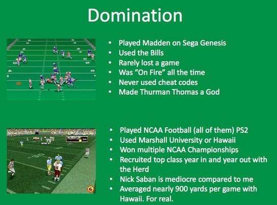
Visuals capture attention and can keep the audience focused on your key points.

Engagement is important in life science presentations, where the audience may range from highly knowledgeable peers to stakeholders with less scientific backgrounds. Visuals help bridge this gap by making the content more accessible to all audience members, regardless of their expertise level.

For example, a well-designed infographic can simplify the presentation of research findings, making them understandable even to those without a deep scientific background.

Improving Retention and Understanding

Studies have shown that people remember information presented visually more than text alone. This is because visuals are processed by the brain differently, creating stronger connections and memory cues.

In life science presentations, where conveying complex information effectively is crucial, data visualization can help ensure your audience retains the key messages long after the presentation.

Moreover, data visualization aids in understanding. Complex scientific data in its raw form can be difficult to interpret. Visualization tools such as charts, graphs, and diagrams can break down this complexity, presenting the data in a format that is easier to digest. This is particularly important in life science presentations, where understanding the nuances of the data is essential for making informed decisions or furthering research.

The Power of Visual Design in Scientific Communication

Good design is more than just making a presentation look nice; it’s enhancing communication.

In life science presentations, where precision and clarity are paramount, the design of your data visualizations plays a critical role.

PowerPoint, a widely used tool for presentations, offers various features that allow you to create effective visualizations that are informative and visually appealing.

Here are key design principles to follow:

Simplicity

Avoid clutter and focus on the most critical data points. Simplicity in design ensures that your visuals are clear and to the point.

Clarity

Use labels, legends, and annotations to make your data easy to understand. Clear visuals help your audience quickly grasp the information being presented.

Focus

Highlight key trends or insights by using contrasting colors or larger fonts. This helps direct your audience’s attention to the most important parts of the data.

Making Data Actionable

In life sciences, data is not just about presenting findings; it’s about driving action. Whether influencing policy decisions, guiding clinical practices, or shaping future research, the data presented in life science presentations often has significant implications.

Data visualization makes data actionable by clearly presenting the information in a way that supports decision-making.

For example, in a presentation about a new drug’s efficacy, a well-designed graph comparing the drug and a placebo can provide clear evidence of its effectiveness. This visual data can then be used to support arguments, justify conclusions, and persuade stakeholders. In this way, data visualization is not just a tool for communication, but a critical component of the decision-making process in life sciences.

Need a Presentation Designed?
Click Here To View Our Amazing Portfolio

Incorporating data visualization into your presentations can elevate your scientific communication, enabling you to convey complex data and ideas with clarity and impact.

Engage Your Stakeholders with Well-Designed Town Hall Presentations

Town hall presentations are critical for engaging stakeholders, conveying essential information, and fostering community within an organization. To ensure they are effective, their design and visual appeal must be top-notch.

Here are some strategies to make your town hall presentations more engaging and visually appealing.

Need a Presentation Designed?
Click Here To View Our Amazing Portfolio

Know Your Stakeholders

Knowing the needs and expectations of your stakeholders allows you to tailor your content accordingly.

Different segments of your audience may have varied interests; upper management might focus on strategic insights, while employees may need operational updates. Customizing your message to cater to these different groups ensures relevance and engagement.

Craft a Clear and Compelling Narrative

A town hall presentation should tell a story.

Define the core message you want to convey and build a narrative around it. A clear and compelling storyline helps maintain the audience’s attention and ensures that key points are communicated effectively.

Begin with an introduction that sets the stage, followed by the main content that elaborates on your key messages, and conclude with a strong closing that reinforces your points and calls for action or reflection.

Design for Visual Impact

A consistent visual theme throughout your presentation helps maintain a professional look.

Choose a cohesive color scheme, font style, and layout that align with your organization’s branding. High-quality visuals, such as relevant images, graphics, and icons, can illustrate key points more effectively than text alone, making the information more memorable.

Avoid overcrowding slides with text by using concise bullet points to highlight key ideas, ensuring your messaging is clear and direct.

Foster Interaction and Engagement

Town hall meetings should not be a one-way communication channel.

Engage your stakeholders by incorporating interactive elements into your presentation. This could include live polls, Q&A sessions, or even breakout discussions where smaller groups can delve into specific topics.

Encouraging audience participation makes the presentation more dynamic and provides valuable feedback and insights that can be addressed immediately.

Choose the Right Visual Hierarchy

Visual hierarchy is about guiding your audience’s eyes to the most important elements on the screen.

To achieve this, use larger fonts for headings and key points, and employ contrasting colors to draw attention to critical information. Organize content so that the most significant points stand out while supporting details are presented in a way that’s easy to follow. This ensures that your key messages are communicated effectively and remembered.

Integrate Multimedia Elements

Make your town hall presentation more engaging by integrating multimedia elements such as videos, audio clips, or interactive charts. Multimedia can break up the monotony of text-heavy slides and keep the audience engaged.

For instance, a short video can illustrate a new initiative or project more effectively than a static slide. Ensure that any multimedia content is high quality and relevant to the overall message.

Pay Attention to Color and Font Choices

The colors and fonts you choose can significantly impact your presentation’s readability and visual appeal.

Use colors that align with your brand and evoke the right emotions. For example, blue can convey trust and stability, while green may signify growth and renewal.

Fonts should be easy to read from a distance, with sans-serif options like Arial or Helvetica often being the most legible for presentations. Avoid using too many different fonts or colors, as this can make your slides look chaotic and unprofessional.

Make Your Presentation Accessible

Accessibility is an essential consideration in any presentation. Ensure your slides are accessible to all stakeholders, including those with disabilities.

Use high-contrast colors for text and background, and include alt text for all images and graphics. This makes your presentation more inclusive and ensures that your message reaches everyone in the audience, regardless of their abilities.

Follow Up with Stakeholders

After the town hall, it’s important to keep the lines of communication open.

Provide stakeholders with a summary of the key points discussed and any action items that were agreed upon. This follow-up reinforces the presented messages and ensures everyone is aligned on the next steps.

Additionally, gather feedback from stakeholders to understand what resonated well and what could be improved for future town halls.

Need a Presentation Designed?
Click Here To View Our Amazing Portfolio

Engage stakeholders and deliver your message through well-designed town hall presentations. Follow these strategies to ensure that your presentation stands as a valuable tool for organization alignment and engagement.

Increase the Visual Appeal of Conference Presentations

The visual appeal of conference presentations influences audience engagement and the overall effectiveness of the message being conveyed.  A well-designed presentation can captivate the audience, reinforce key points, and leave a lasting impression. Here are essential strategies to enhance the visual appeal of your conference presentations.

Need a Presentation Designed?
Click Here To View Our Amazing Portfolio

Prioritize Clean and Professional Design

Use Consistent Themes

Consistency in design elements such as fonts, colors, and layouts across all slides creates a professional look.

Choose a cohesive theme that aligns with your brand or the conference’s branding guidelines. This uniformity helps the audience focus on the content without being distracted by varying styles.

Limit Text and Bullet Points

Too much text can overwhelm your audience.

Aim for concise bullet points and short sentences. Highlight key ideas rather than providing detailed explanations on the slides. The presenter’s narration should complement the visual elements, not duplicate them.

Leverage High-Quality Visuals

Incorporate Relevant Images

High-quality images can greatly enhance the visual appeal of conference presentations.

Choose images that are relevant to your content and resonate with your audience. Avoid generic stock photos; instead, use images that illustrate your points effectively.

Utilize Infographics

Infographics are powerful tools for conveying complex information in a visually engaging manner. They can simplify data and make it more digestible.

Incorporate charts, graphs, and icons to break down statistics and trends, making the information more accessible.

Master PowerPoint Design

Optimize Slide Layouts

Effective use of space is crucial in PowerPoint presentations.

Ensure there is ample white space to prevent slides from looking cluttered. Use grid layouts to align text and images neatly, enhancing readability and visual appeal.

Use Animation Sparingly

Animations can add a dynamic element to your presentation but should be used sparingly to avoid distraction.

Simple transitions and subtle animations can guide the audience’s attention to key points without overwhelming them.

Emphasize Visual Hierarchy

Highlight Key Information

Visual hierarchy helps prioritize information and guides the audience’s eye to the most important elements first.

Use larger fonts for headings and key points, and employ contrasting colors to make important information stand out.

Apply Design Principles

Using fundamental design principles can significantly enhance the visual appeal of your presentation. Techniques such as alignment, proximity, and balance help create a coherent and visually pleasing layout. 

Encourage Interactions

Embed Videos

Videos can break the monotony of static slides and add a dynamic element to your presentation.

Ensure videos are high quality and relevant to the content. Embed short clips that illustrate key points or provide visual examples to enhance understanding.

Encourage Audience Participation

Engaging your audience can significantly enhance the visual appeal and effectiveness of your presentation.

Use interactive features like Q&A sessions or live feedback tools to involve your audience. This interaction can make your presentation more dynamic and memorable, encouraging active participation and interest.

Choose an Effective Color Scheme

Apply Color Psychology

Colors can evoke emotions and influence perceptions. Choose a color scheme that reflects the tone of your presentation.

For instance, blue often conveys trust and professionalism, while red can evoke excitement or urgency.

Use color psychology to enhance the emotional impact of your presentation.

Maintain Contrast

Ensure there is sufficient contrast between text and background colors. This enhances readability and ensures that your audience can easily follow along.

Dark text on a light background or light text on a dark background works best for clarity.

Keep Accessibility in Mind

Use Legible Fonts

Choose fonts that are easy to read from a distance.

Sans-serif fonts like Arial or Helvetica are often more legible for presentations. Avoid overly decorative fonts that can be difficult to read.

Provide Alternative Text

For images and graphics, include alternative text (alt text) descriptions. This ensures that your content is accessible to individuals using screen readers, enhancing the inclusivity of your presentation.

Practice Effective Data Visualization

Simplify Data Presentation

When presenting data, simplicity is key.

Use clear and straightforward charts and graphs to represent data points. Avoid overloading slides with too many data sets; focus on the most critical information.

Instead of presenting raw data, highlight trends, patterns, and key insights.

Use visual aids to draw attention to significant findings, making it easier for the audience to grasp the implications of the data.

Need a Presentation Designed?
Click Here To View Our Amazing Portfolio

Enhancing the visual appeal of conference presentations requires thoughtful design and a focus on clarity, consistency, and engagement. Elevate your presentation by following the strategies listed in this blog.

Tips to Make Your Sales Enablement Content Easy to Use

Sales enablement content is pivotal in empowering team sales with the tools and information they need to engage prospects and close deals. However, creating this content is only half the battle; ensuring it is easy to use is crucial for maximizing its effectiveness.

Need a Presentation Designed?
Click Here To View Our Amazing Portfolio

Here are some essential tips to design and present your sales enablement content.

Understand Your Audience

Before diving into the design, it’s crucial to understand who will be using your sales enablement content. Are they seasoned sales professionals, or are they new to the field? Knowing your audience helps tailor the content to their level of expertise and specific needs, ensuring its relevance and use.

Simplify the Content

Focus on Clarity

Simplicity is key when it comes to sales enablement content.

Avoid jargon and overly complex language. Your content should be easy to read and understand, ensuring your sales team can quickly grasp the information and apply it in their interactions with prospects.

Concise Messaging

Keep your messaging concise and to the point. Sales professionals are often pressed for time, so they should find the information they need quickly.

Use bullet points, short paragraphs, and clear headings to break down the content into digestible sections.

Optimize for PowerPoint

Design Best Practices

Since PowerPoint is a common tool for delivering sales enablement content, it’s important to follow design best practices.

Use a clean, professional template, and avoid cluttering slides with too much text. Instead, focus on key points and use visuals to support your message.

Interactive Elements

Incorporate interactive elements in your PowerPoint presentations to engage your audience.

Hyperlinks, embedded videos, and clickable elements can make your presentations more dynamic and engaging, helping your sales team better understand and retain the information.

Make It Easily Accessible

Centralized Repository

Store your sales enablement content in a centralized, easily accessible repository. A well-organized digital library ensures that your sales team can quickly find the resources they need, whether they are in the office or on the go.

Mobile-Friendly

Ensure your content is mobile-friendly. Sales professionals often need to access information on their phones or tablets while on the move. A mobile-friendly design ensures they can easily navigate and use the content from any device.

Regularly Update Content

Stay Current

The sales landscape is constantly changing, and your sales enablement content needs to reflect that. Regularly review and update your content to ensure it is up-to-date with the latest industry trends, product information, and sales techniques.

Feedback Loop

Create a feedback loop with your sales team to continually improve your sales enablement content. Regular feedback helps identify areas for improvement and ensures the content remains relevant and useful.

Training and Support

Provide Training

Even the best-designed sales enablement content can be ineffective if your team doesn’t know how to use it. Provide regular training sessions to ensure your sales team is comfortable with the content and knows how to apply it in their sales processes.

Ongoing Support

Offer ongoing support to address any questions or issues that may arise. A dedicated support system ensures that your sales team can make the most of the sales enablement content and continuously improve their sales performance.

Need a Presentation Designed?
Click Here To View Our Amazing Portfolio

A well-built sales enablement content empowers a sales team, driving their success. Implement these best practices to enhance your sales enablement strategy and work with your team to attain goals.

Leveraging Microapps to Show Innovations in Healthcare

Innovations in healthcare are crucial to improving patient outcomes, advancing medical research, and optimizing healthcare delivery. Staying ahead in the healthcare industry requires effectively communicating these advancements—microapps are transforming how these innovations are presented. These dynamic tools are revolutionizing healthcare presentations, offering fresh and engaging ways to display information.

Need a Presentation Designed?
Click Here To View Our Amazing Portfolio

Understanding Microapps

Microapps are specialized, interactive, and standalone web documents designed to perform specific tasks or deliver content. In healthcare presentations, they present complex information in an easily digestible format through interactivity and visual appeal.

The Role of Microapps in Healthcare Presentations

Enhancing Engagement

Traditional presentations can need help with engagement, especially with complex healthcare topics. Microapps transform static presentations into interactive experiences, incorporating charts, infographics, data visualizations, videos, and other visuals. This captures attention and makes information more accessible and intelligible.

Simplifying Complex Information

Healthcare innovations often involve intricate details and extensive data. Microapps simplify this complexity, breaking down large datasets into manageable chunks, using elements to explain processes, and providing a clear narrative through multimedia content. This ensures key messages are communicated effectively.

Real-Time Data Integration

Microapps in healthcare presentations offer real-time data integration from live websites, essential in an industry where data continually evolves. Presenters can provide up-to-date information, enhancing credibility and relevance.

Showcasing Innovations in Healthcare with Microapps

Highlighting Research and Development

Microapps effectively showcase the latest research and development in healthcare.

An interactive timeline of a drug development process, complete with videos, infographics, and 3D models, makes the information engaging and comprehensive.

Demonstrating New Technologies

Explaining new healthcare technologies through traditional presentations can be challenging.

Microapps offer interactive demonstrations, such as virtual tours of new medical devices, allowing users to interact, explore features, and understand functionality. This hands-on approach enhances comprehension and interest.

Patient Education and Awareness

Microapps are excellent tools for patient education and awareness campaigns. They create interactive guides on new treatment options, preventive measures, and health management strategies.

Providing easy-to-understand, interactive content improves patient engagement and adherence to treatment plans.

Designing Effective Healthcare Microapps

User-Centric Design

A user-centric approach is essential for the success of a healthcare microapp, focusing on creating an intuitive and seamless user experience. Understanding the target audience and designing accordingly ensures effectiveness.

Healthcare professionals, prioritize detailed data visualization and technical information, while patients focus on simplicity and clarity.

Integration with Existing Systems

Healthcare microapps should integrate seamlessly with existing healthcare systems and platforms, ensuring access to real-time data from live websites and enhancing functionality. This integration also provides a smoother user experience.

Continuous Improvement and Updates

The evolving healthcare industry requires microapps to undergo regular updates and improvements.

Incorporating user feedback, updating content, and continuously enhancing the user experience ensure the microapp remains relevant and effective.

Need a Presentation Designed?
Click Here To View Our Amazing Portfolio

Leveraging microapps ensures innovations in healthcare are communicated more effectively, driving engagement and aiding in understanding. As the healthcare industry evolves, microapps will play an increasingly important role in presenting innovations.

A Guide to Creating a Visual Annual Report Presentation

Annual reports communicate a company’s financial health, achievements, and plans to stakeholders. However, traditional text-heavy reports can be challenging to digest. Transforming your annual report into a visual presentation can enhance engagement and clarity, making it easier for stakeholders to understand and retain key information. Here’s a comprehensive guide to creating a compelling visual annual report.

Need a Presentation Designed?
Click Here To View Our Amazing Portfolio

Why a Visual Annual Report?

A visual annual report leverages the power of visuals to present data and insights. 

Visuals such as charts, graphs, and infographics simplify complex information, making it more understandable and memorable. Moreover, this approach captures stakeholders’ attention and conveys the message more effectively.

Planning Your Visual Annual Report

Effective planning is essential to create a successful visual annual report.

Define the key messages you want to convey. Identify the most important data points and achievements from the year. Decide on the structure of your presentation, ensuring it follows a logical flow from past performance to goals.

Choosing the Right Visuals

Selecting the appropriate visuals is critical in making your annual report engaging. Different types of visuals serve different purposes:

  • Charts and Graphs — Ideal for presenting financial data and performance metrics. Bar charts, line graphs, and pie charts can effectively illustrate trends and comparisons.
  • Infographics — Useful for summarizing complex information and processes. Infographics can combine text, images, and data to tell a cohesive story.
  • Images and Icons — Enhance the visual appeal and break up text-heavy slides. Use high-quality images and icons that align with your brand’s visual identity.

Designing Your Visual Annual Report

Here are some tips for designing your presentation:

Maintain Consistency

Consistency in design elements such as fonts, colors, and layouts creates a professional and cohesive look. Use your company’s branding guidelines to maintain a consistent visual identity throughout the presentation.

Simplify Your Slides

Keep slides clean and uncluttered. Use bullet points to highlight key information and avoid long paragraphs. Limit each slide to one main idea to ensure clarity and focus.

Use Data Visualization

Effective data visualization can make your report more impactful. Use charts and graphs to present financial data, market trends, and performance metrics. Ensure that your visuals are clear, accurate, and easy to interpret.

Incorporate Infographics

Infographics can transform complex information into visually engaging content. Use them to summarize key achievements, illustrate processes, and highlight important data points. Infographics make your presentation more dynamic and easier to understand.

Highlight Key Achievements

Dedicate slides to highlight major achievements and milestones. Use visuals to showcase significant projects, awards, and successes. Highlighting these achievements reinforces your company’s strengths and progress.

Include a Forward-Looking Section

End your presentation with a forward-looking section that outlines your company’s goals and strategies for the upcoming year. Use visuals to illustrate your strategic plan, growth opportunities, and future initiatives. This section helps stakeholders understand your vision and commitment to future success.

Engaging Your Audience

Engaging your audience is crucial for the success of your visual annual report presentation. Here are some strategies to keep stakeholders engaged:

Tell a Story

Narrative storytelling can make your presentation more compelling. Frame your data and insights within a cohesive story that highlights your company’s journey over the past year. A well-told story can resonate with stakeholders and make your message more memorable.

Use Multimedia

Incorporate multimedia elements such as videos and animations to enhance engagement. Videos can bring your report to life by showcasing testimonials, project highlights, and executive messages. Animations can add a dynamic element to your slides, making them more interesting.

Encourage Interaction

Encourage stakeholder interaction by incorporating Q&A sessions, polls, and discussions. Engaging stakeholders in the presentation process fosters a sense of involvement and allows for real-time feedback and insights.

Need a Presentation Designed?
Click Here To View Our Amazing Portfolio

Creating a visual annual report can transform how you present your company’s performance and plans to stakeholders. Incorporating these strategies into your annual report presentation will ensure your stakeholders are well-informed and aligned with your company’s vision.

The Critical Need for a ‘Use of Funds’ Slide in Biotech Presentations

In biotechnology, securing funding is a critical step toward advancing research and development. Investors need to be convinced not only of the potential of the biotech innovation but also of the company’s ability to manage their investment wisely—this is where the use of funds slide in biotech presentations becomes indispensable. 

The use of funds slide details how the requested capital will be allocated, providing transparency and confidence to potential investors. Let’s explore why it is essential in biotech presentations and how it can enhance a pitch deck.

Need a Presentation Designed?
Click Here To View Our Amazing Portfolio

Building Investor Confidence

One of the primary purposes of a use of funds slide in biotech presentations is to build investor confidence.

Investors often hesitate to commit large sums of money without knowing how it will be used. This slide acts as a financial roadmap, breaking down the allocation of funds into specific categories such as research and development, clinical trials, regulatory approvals, marketing, and operational expenses.

Through transparency, you demonstrate a clear and strategic plan for how the investment will drive progress and yield returns.

Enhancing Clarity and Transparency

Clarity and transparency are crucial in any pitch deck, but they are especially important in biotech presentations. Investors need assurance that their funds will be used effectively and efficiently.

A detailed breakdown of how the money will be spent helps investors understand the financial strategy behind the project. This level of detail makes them more likely to commit to funding.

Clear and transparent financial planning instills confidence in potential investors, showing them that you have a well-thought-out plan for their investment.

Strategic Allocation of Resources

Biotechnology projects are inherently risky due to the substantial costs and extended timelines required to develop new therapies and technologies.

The use of funds slide mitigates perceived risks by clearly outlining the distribution of funds across various phases of development. This slide should reflect a well-balanced approach to funding different aspects of the business.

For instance, significant portions may be allocated to R&D and clinical trials, but it’s also crucial to earmark funds for regulatory approvals, marketing, and operational costs. This balanced approach demonstrates that you have considered all necessary expenditures to bring your product to market successfully.

Visual Appeal and Effective Communication

In a pitch deck, visual appeal and clarity are paramount. The use of funds slide should be designed to convey information quickly and effectively.

Using PowerPoint, you can create visually appealing slides that use charts, graphs, and infographics to break down the allocation of funds. Visual elements help convey information quickly and effectively, ensuring investors can easily grasp the key points without wading through dense text. An engaging and well-designed slide can significantly enhance the overall impact of your pitch deck.

Aligning with Milestones

Investors in the biotech sector are particularly focused on milestones—significant achievements that indicate progress and reduce investment risk.

Aligning your use of funds slide with milestones can further enhance its effectiveness. Detailing how funds will be used to achieve specific milestones, such as completing a phase of clinical trials or securing regulatory approval, demonstrates a direct link between investment and value creation. This alignment shows investors that their money will directly contribute to achieving significant, value-driving milestones, making your presentation more persuasive and compelling.

Justifying Each Expense

It’s not enough to merely show how funds will be allocated; each expense must be justified. Investors need to understand the necessity of each expenditure and its contribution to the project’s success.

Brief explanations or annotations alongside each category can clarify the importance of the allocations. This justification builds a stronger case for the requested funding, showing that every dollar will be used strategically to achieve critical objectives.

Tailoring to Your Audience

Tailoring the use of funds slide to your specific audience can significantly enhance its impact. Different investors prioritize different aspects of a project. Some may focus on research and development, while others might be more interested in the path to regulatory approval or market entry.

Highlighting the areas most relevant to your audience can make your presentation more persuasive. Understand your investors’ priorities and emphasize the points that resonate most with them.

Best Practices for PowerPoint Design

When creating the use of funds slide in PowerPoint, adhere to best practices for design to ensure clarity and engagement:

  • Use clear headings and subheadings to organize information logically.
  • Color coding can differentiate between various expense categories.
  • Visual elements like pie charts or bar graphs can convey fund allocation at a glance.
  • Maintain a clean and professional look by ensuring text is legible and avoiding overcrowding.

Need a Presentation Designed?
Click Here To View Our Amazing Portfolio

The use of funds slide builds investor confidence, provides clarity and transparency, and demonstrates strategic allocation of resources. In biotechnology where every dollar counts, the use of funds slide is key to unlocking the investment necessary for success.

Using Graphics for an Engaging ‘Market Analysis’ Slide

A market analysis slide showcases market potential and provides critical insights that can persuade investors and stakeholders. Using graphics can transform a market analysis slide from a mundane data dump into a visually compelling and informative part of your presentation.

Need a Presentation Designed?
Click Here To View Our Amazing Portfolio

The Role of an Engaging Market Analysis Slide

A market analysis slide serves as the backbone of your pitch deck. It provides a snapshot of the market landscape, identifies opportunities, and highlights competitive advantages.

An engaging market analysis slide captures attention, clarifies complex data, and strengthens your argument with clear and compelling visuals.

Key Design Principles for Market Analysis Slides

Prioritize Clarity

Clarity is crucial when designing a market analysis slide. Graphics must be easy to read and understand.

Overcrowding the slide with too much information should be avoided to maintain clarity. Simplifying text using concise and direct language helps ensure the audience quickly grasps the key points. Highlighting important data points with larger fonts or contrasting colors can further enhance readability.

Utilize Various Types of Graphics

Incorporating different types of graphics can effectively present data.

Using a mix of charts, graphs, infographics, and maps keeps the audience engaged and helps convey information efficiently. Bar charts, line graphs, and pie charts are excellent for illustrating data trends and comparisons, while infographics can summarize information visually to enhance understanding. Maps are particularly useful for displaying geographical data clearly and effectively.

Choose an Effective Layout

An organized layout aids in conveying information logically and clearly.

Establishing a clear hierarchy guides the viewer’s eye through the slide, ensuring that the most critical information is noticed first. Dividing the slide into sections can help organize different types of information, making the slide more accessible and easier to navigate.

Use Color Strategically

Color plays a significant role in enhancing the readability and appeal of a market analysis slide.

Using a consistent color scheme that aligns with your brand can highlight key information and maintain visual harmony. Employing contrasting colors can draw attention to important data points or sections, ensuring that they stand out.

Maintain Consistency

Consistency in design elements such as fonts, colors, and graphic styles ensures a professional and cohesive look throughout your presentation.

Using the same font style and size for similar elements maintains uniformity, while ensuring all graphics follow the same design style contributes to a cohesive appearance.

Incorporate Animation Sparingly

Subtle animations can add a dynamic element to your market analysis slide, making it more engaging without being distracting.

Animations like revealing data points one by one can guide the audience through the information. Animating the path or flow between data points can illustrate connections or progression, adding to the visual appeal.

Focus on Design Simplicity

Simplicity in design ensures that your slide is not overwhelming and that key messages are easily discernible.

Reducing text to essential information only and avoiding excessive design elements that may clutter the slide can help maintain a clean and effective design.

Tailor to Your Audience

Tailoring your market analysis slide to your audience’s needs and preferences can enhance engagement and effectiveness. Highlighting market potential, growth opportunities, and competitive advantages can be particularly compelling for investors. Emphasizing operational insights, market positioning, and strategic initiatives may be more relevant for internal audiences.

Leverage PowerPoint Tools

PowerPoint offers a range of tools and features that can enhance your market analysis slide.

Utilizing graphics to create visually appealing charts and diagrams can simplify complex information. PowerPoint’s library of shapes and icons can be customized to fit your design needs, adding a professional touch to your slides.

Starting with a professional template and customizing it to align with your brand and message can save time and ensure consistency.

Optimize for Different Formats

Ensuring your market analysis slide looks great on various devices, whether projected on a large screen or viewed on a smaller device, is crucial for maintaining readability and design integrity.

Testing the slide on different screen sizes can help identify any issues and ensure a consistent experience for all viewers. Exporting the slide as a PDF or image can preserve design consistency when sharing.

Need a Presentation Designed?
Click Here To View Our Amazing Portfolio

An engaging market analysis slide is critical in building a successful pitch deck. Strategic design elements can make your data visually compelling and informative, ensuring that your market analysis slide informs and inspires your audience.

Design Tips to Make Your ‘Milestone’ Slide Engaging

A milestone slide highlights key achievements and outlines future goals, providing a clear roadmap of a company’s progress and strategic direction.

Need a Presentation Designed?
Click Here To View Our Amazing Portfolio

The Importance of an Engaging Milestone Slide

A milestone slide in a pitch deck is more than a timeline; it represents progress, achievements, and future objectives visually. It is crucial in persuading investors and stakeholders of your company’s potential.

An engaging milestone slide can:

  • Highlight Achievements — Showcasing significant accomplishments builds credibility.
  • Outline Future Goals — Clear depiction of upcoming milestones demonstrates strategic planning.
  • Enhance Understanding — Visual elements for presenting complex timelines and objectives.

Design Tips for an Effective Milestone Slide

Prioritize Clarity

Clarity is crucial when designing a milestone slide. Ensure your slide is easy to read and understand at a glance. Avoid clutter by focusing on key milestones and using concise text.

  • Use Simple Language — Keep descriptions brief and to the point.
  • Highlight Key Dates — Make important dates stand out with bold or larger fonts.

Utilize Visuals

Visuals are essential for making your milestone slide engaging. Use icons, images, and graphics to represent milestones, making them more memorable and visually appealing.

  • Incorporate Icons — Use relevant icons to represent different types of milestones.
  • Add Images — Where appropriate, include images to add context and visual interest.

Choose an Effective Layout

An organized layout helps convey information logically and clearly. Consider using a timeline or a roadmap format to illustrate the sequence of milestones.

  • Timeline Format — A horizontal or vertical timeline can effectively show the progression of events.
  • Roadmap Format — For a more dynamic look, a roadmap can depict milestones as checkpoints along a path.

Use Color Strategically

Color can enhance the readability and appeal of your milestone slide. Use a consistent color scheme that aligns with your brand and highlights key information.

  • Consistent Palette — Stick to a color palette that complements your overall pitch deck design.
  • Highlight with Color — Use contrasting colors to draw attention to important milestones or dates.

Emphasize Key Milestones

Not all milestones carry the same weight. Emphasize key milestones to ensure they stand out and receive the attention they deserve.

  • Size and Placement — Larger icons or text and prominent placement can highlight significant milestones.
  • Differentiation — Use different shapes or colors to distinguish major milestones from minor ones.

Maintain Consistency

Consistency in design elements such as fonts, colors, and iconography ensures a professional and cohesive look throughout your presentation.

  • Font Consistency — Use the same font style and size for similar elements to maintain uniformity.
  • Icon Style — Ensure all icons follow the same design style for a cohesive appearance.

Incorporate Animation

Subtle animations can add a dynamic element to your milestone slide, making it more engaging without being distracting.

  • Entrance Animations — Use animations to reveal milestones one by one, guiding the audience through the timeline.
  • Path Animations — Animate the path or connectors between milestones to illustrate progress.

Focus on Design Simplicity

Simplicity in design ensures your slide is not overwhelming and the key messages are easily discernible.

  • Minimal Text — Reduce text to essential information only.
  • Clean Design — Avoid excessive design elements that may clutter the slide.

Tailor to Your Audience

Consider your audience’s needs and preferences when designing your milestone slide. Tailoring your design to their expectations can enhance engagement and effectiveness.

  • Investor Focus — Highlight milestones that demonstrate financial growth and strategic achievements.
  • Team Focus — Emphasize collaborative achievements and upcoming goals.

Need a Presentation Designed?
Click Here To View Our Amazing Portfolio

An engaging milestone slide is a critical element of a successful pitch deck. With these design tips, your milestone slide can inform and inspire confidence in your audience.