Slidegenius, Inc.

Corporate Events and PowerPoint Presentations

Businesses organize corporate events for different reasons. Usually, it’s due to a special occasion, like a holiday, or a year-end celebration. But other times, the purpose is much more specific.

And in all those gatherings, it’s rare that you won’t find a PowerPoint being set up. An engaging visual presentation is necessary for engaging the audience’s gaze and drawing their attention to the event itself. Corporate events are also a way of drawing in more customers, while keeping in touch with loyal ones. Having an interesting and attractive deck to match the level of your event can greatly help with that.

Here are some of the most common corporate events that businesses usually organize and where slide presentations won’t look out of place:

Product Launches

As shown in AdAge’s EJ Schultz’s article on successful product launches, a well-organized launch can create a lot of buzz for a new product and give it a sales boost. To generate enough attention, you may set the occasion as either a trade event or media event.

Trade events would have well-known people in the industry as guests. These are market analysts, editors of trade publications and other prominent figures.

If you choose to make it a media event, then you may want to invite dozens of reporters. Regardless of how you plan the event, make sure that your PowerPoint presentation would leave a great impression.

Customer Appreciation Events

According to marketing strategist, Nancy Wagner, this type of event is aimed to reinforce customer trust and loyalty, leading to a long-term, sustained growth for your business.

As the host, this is your chance to communicate to your customers that they mean more to your company than simply sales numbers. A customer appreciation event is where you can express your gratitude to everyone at one time.

Apart from the usual team-building type of activities, showing a “thank you PowerPoint presentation” that serves as a tribute to your customer base is a good way to make the most of the event.

Conferences and Seminars

Joining conferences or seminars means you would be facing a larger crowd. To avoid that thing called death by PowerPoint, make sure to prepare your slides properly.

Make your presentation interesting for your audience. Basically, try to use less text and a bit more images. And most importantly, don’t drag the presentation too long. If you play your cards right, you might even get a referral or two to do business with.

Ultimately, organizing a corporate event and preparing a PowerPoint presentation have one thing in common. Both should be well-planned as they would reflect your business’ professional image.


References

Schultz, EJ. “14 Product Launches That Rocked And Why.” Advertising Age News. Accessed May 21, 2014.
Wagner, Nancy. “How to Plan a Customer Appreciation Day.” EHow. Accessed May 21, 2014.

Designing a ‘How It Works’ Slide That Works

Do you find it difficult to explain to someone how a product, service, or process works? If your business involves selling new products or you’re constantly introducing new service features, then you’ll need an easy way to explain things. This is where the “How It Works” slides come in.

Explaining how certain things work is one of the most common uses of presentation slides. Done right, a “how it works” PowerPoint can be effective for product demos, process flow illustrations, or pitching a business idea. To help you get started out, here are some ways you can make this type of slide work:

Lay it out

PowerPoint has several types of slide layouts. The default type comes with two boxes: The text box at the top, which is for the title of the slide, and the middle box, which is a multipurpose placeholder for text, graphics, or any content types.

For this purpose, however, you may choose the blank layout type and then simply insert the content that you need. Or better yet, as with the above slide, choose the Title Only template before putting all the other elements. To enhance the effect of your slide, feel free to choose from the Shapes and SmartArt Graphics.

Be consistent with colors

This one is pretty basic although there are still those who take it for granted. Buffer‘s Leonhard Widrich writes about how color schemes can affect our perception of a brand. The more recognizable colors have effectively been associated with specific brands, while those that were more difficult to point out didn’t have such a good color combination.

Similarly, presentation slides should have similar color schemes as they can affect the overall impact of your message.

Using varying combinations for different slides can confuse your audience. So for best results, make the color scheme of your How It Works slide consistent with the rest of your deck. This also applies to the slide itself. Looking at the above sample, you’ll notice that the color of the iVoteLIVE logo is consistent with that of the template. Apart from that, most of the imagery (i.e., photos and graphics) have similar shades of colors. This makes the slide pleasant to look at.

Take it easy with texts

This is another common concern and when it comes to How It Works slides, we can’t stress enough its importance. The purpose of slides is to describe visually something you can’t explain verbally. Why spend 15 minutes explaining a new feature, when a couple of images will take you just a few seconds, right?

If you’re going to include some texts, make sure not to mix up the fonts and font sizes just for the heck of it. Otherwise, your slide will appear visually confusing. Take a look at the sample again. While the format of the texts describing the consumers is different from the texts indicating the features (iVoteLive computer interface, Live Program Broadcasts), they still work because each group has specific purpose.

In short, they are not randomly mixed up.

The Takeaway: Engage with imagery

In general, images can make it easier for people to understand and remember ideas. So use relevant imagery instead of text in parts where you think a visual element would work better. When using images, though, be sure that they are of appropriate quality.

For scanned images, the ideal resolution is between 150 dpi (when precise color reproduction is not required) and 300 dpi (if you need higher quality images).

As much as possible, do not take images from the Internet as they usually of a very low quality and might pixelate when projected on a screen.


Reference

Widrich, Leonhard. “Why Is Facebook Blue? The Science of Colors in Marketing.” The Huffington Post. January 16, 2014. Accessed May 20, 2014.

Deliver a Winning Speech with an Engaging PowerPoint Presentation

A well-designed PowerPoint presentation can do wonders for your speech. Apart from being a great tool to help you recall your talking points, it can get your audience interested in your message. With an engaging presentation, you can show some things that otherwise you wouldn’t be able to without PowerPoint. Illustrations, animations, and other visual aids can make your speech clear and memorable.

Keep in mind, though, that you can’t just put together a PowerPoint presentation at the last minute and call it a day. A hastily produced presentation won’t help your speech, it could even make it worse. So in designing a presentation, make sure to remember the following:

Choose the Right Text Color and Font powerpoint presentation

As soon as the information appears on the slide, the audience is going to read it. This is good as it means they are paying attention. However, if the text isn’t easy to read, you’ll lose their attention fast.

According to graphic designer Dan Mayer, choosing an appropriate font requires several steps. Among these is to make sure to use a readable font. It should be big enough to be read by everyone in the audience – even those sitting at the back. Choose colors that won’t strain the eyes. Some of the ideal combinations of text and background colors are white on black, green on purple, and blue-green on red.

Avoid Putting Too Much Text on a Slide texts

One of the common mistakes that presenters make when creating PowerPoint designs is filling every slide with so much text. More often than not, text-heavy slides contain the exact same things that their presenters say. This should be avoided. As mentioned above, a PowerPoint presentation is an excellent tool for you and your audience.

It shouldn’t be misused, though. The best thing to do is to have no more than 35 words per slide. This will give your audience enough window to read and understand your written information and focus their attention back to you.

Use Plenty of Images

Imagery can supply the visual appeal that your speech needs. As the human brain processes images easier and faster than it does with text, graphics can help hold your audience’s interest effectively. They can also let you explain a subject more clearly. Naturally, you need to use relevant and not too flashy images to make your presentation look professional.

Line drawings, for example, are great for teaching concepts as they make potentially confusing, complicated information simple to explain and understand. If you’re planning to use humorous images, consider the sensibilities of the audience members first. Some things can be funny to some and yet offensive to others. So be careful not to cross the line. If you feel you need such images to liven up your speech, use only as few as possible.

Final Words

One last useful reminder:  Don’t use your PowerPoint presentation to provide your audience with cues on the structure of your speech. If they notice this, they would start to get bored and just count the remaining slides until the end of your presentation. Remember, slides should not be a word-for-word representation of your speech.

Use them to highlight or illustrate your points. This way, your speech will be able to engage your audience more effectively.

References

Mayer, Dan. ““What Font Should I Use?”: Five Principles for Choosing and Using Typefaces.” Smashing Magazine. December 14, 2010. Accessed May 19, 2014.
Lewis, By Tanya. “New Record for Human Brain: Fastest Time to See an Image.” LiveScience. January 17, 2014. Accessed May 19, 2014.

The Big Tease: Sparking Curiosity with Teaser Slide Decks

The teaser is most probably one the first documents that you’ll ever present to potential investors. Basically a quick glance or summary of your business, a teaser is what venture capitalists usually ask for before the actual meeting. Teaser slide decks, however, don’t need to create an impact right away.

What they should do is to spark curiosity, instead. In other words, your teaser must make the audience curious enough in order for you to be given the chance to make an impact.

Navicure Key
To make your teaser slide deck work, here are some things that you may want to keep in mind:

Know your audience and the setting

Teasers are usually shown in an office, in a quick private conversation with one or two potential investors. You’ll probably display your slides with a laptop, for better mobility.

Why do you need to know all these? Because these details can help you design your teaser slides more effectively. You wouldn’t want to bore your small audience members with a full and detailed presentation meant for a roomful of investors, would you?

Don’t make it text-heavy

As much as possible, do not put too many texts on your slides. If you need to include additional information, add an optional appendix after the primary content. Besides, there are certain details that potential investors won’t look into when doing an initial assessment of a venture.

So there’s no point in adding lengthy customer testimonials, extensive product descriptions, photos of your office, etc. These won’t make your audience excited — they might even find such things annoying.

You also have to remember that VCs are naturally up-to-date with what’s going on in their industry of interest. They have a good grasp of the basic business dynamics in every sector.  This means you don’t have to include all the gory details regarding the current market environment.

Make it flexible

While they are great visual aids, teaser presentations are not just meant for meetings. They may also be sent through emails. So try not to make your teaser too large that you’ll have trouble sending it as an attachment. Also, you need to consider the fact that VCs usually print the presentations they received for easy reading.

To make your teaser printer-friendly and consume less ink, choose a white or light-colored background.

To be on the safe side, a good deck structure to follow when creating a teaser is Guy Kawasaki’s 10/20/30 Rule. According to Kawasaki, a presentation should have 10 slides, last no more than 20 minutes, and contains no font smaller than 30 points. With that in mind, along with the above tips, you should be able to create a teaser slide deck that would lead to that very important meeting.

Conclusion

A teaser is made to do exactly what its name suggests – to tease. While it isn’t meant to immerse your target audience right away. It does help to be engaging and concise, especially in presenting what your main objectives are.

This is, after all, still a window into your actual presentation, so don’t take it for granted. Craft an interesting teaser that will leave your audience curious to know more about your offering.


Reference

The 10/20/30 Rule of PowerPoint.” Guy Kawasaki. December 30, 2005. Accessed May 19, 2014.

Adding PowerPoint Table to Your Slide

In our previous posts, we have tackled the subject of adding texts to an image. A table is simply another type of image in which you can add text. One significant difference is that a table is designed to arrange data into boxes or cells. As you may already know, a table has vertical arrangements (columns) and horizontal arrangements (rows).

The columns usually indicate categories while the rows are often meant to specify records. In PowerPoint, tables are effective tools for presenting data. They allow you to show so much information in a limited space. If you need to add a table on one of your slides, you may do any of the following:

Insert Table

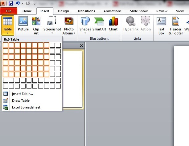
Select Insert in the main menu. Under this, the Tables option will appear. A small window will appear beside the option once you select it.

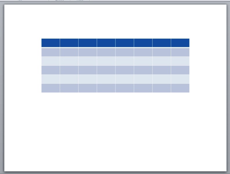
Next, drag the mouse to select the number of columns and rows your PowerPoint table needs. Shortly after this, your table will appear on the slide.


powerpoint table powerpoint table

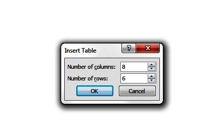
Another option is to click the option Insert Table at the bottom of the small window right after clicking the Tables group. A dialog box will appear wherein you’ll enter the number of columns and rows in the spaces provided. table 3

Draw Table

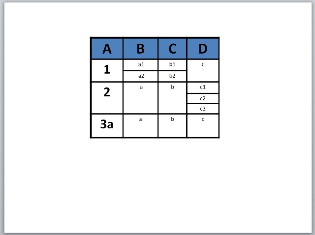
If you need to add a more complicated type of table you may select the option Draw Table in the Tables group. Using a set of drawing tools, you can create tables that aren’t just intersecting rows and columns. What you can create is a rather complex collection of cells that extend beyond one row or column. Probably something like this:

table 4

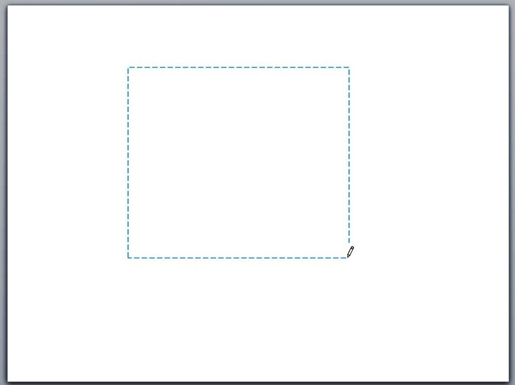
To start, click the Tables Group and select Draw Table from the menu. The cursor will then change to a pencil icon. Drag the mouse on the slide to create a rectangle frame.

pencil 2

Releasing the mouse button will reveal a single cell table.

draw-table

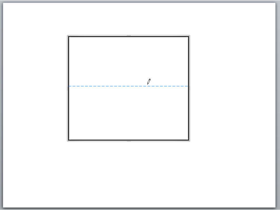
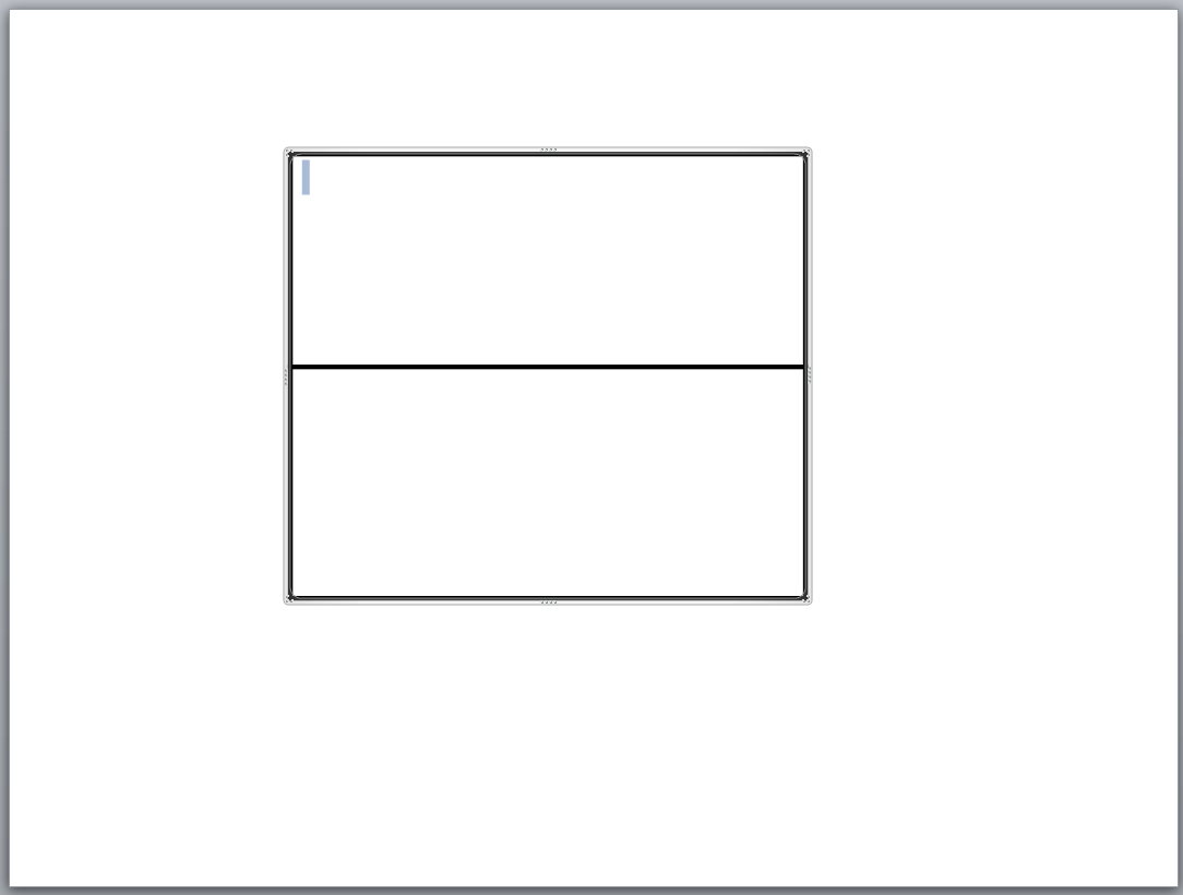
In the Design tab of the Table Tools, click the button Draw Table. The cursors will change back into a little pencil. It’s now time to create the cells. You will have to drag the pencil across the table to create lines. To split the table into two rows, for example, point the pencil near the left edge of the table. Click and then drag a line towards the right edge. Release the mouse button.

table 1pencil2

The Takeaway

Depending on your purpose, you may continue splitting the table into smaller cells. For each split, point the pencil at one edge and then click and drag to the other.

If you make mistakes, simply click the Eraser button (you can’t miss it as it looks like an eraser) in the Design tab and click on the line segment you want to erase. If you want to add life to your table, you may change the color or structure of your table using the options in the Design tab.

So What’s The Problem: Creating a Good Problem Presentation Slide

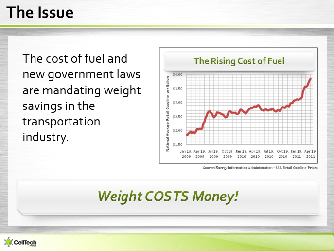
Real or perceived, a problem is what usually drives a customer to try a new product or service. Even if you offer your product for free, chances are that people won’t use it if it doesn’t help them solve their own concerns.

In creating your pitch presentation, you can’t just allot all of your time (and your slides) talking about your product’s effectiveness, value, ease of use, price, and various enticing feature. To get potential investors excited about your idea, they need to know about the issue that you want to solve.

According to career consultant, Shawn O’Connor, any business, whether you’re a budding startup or a big company, started out with a clear vision in mind, This vision isn’t only what you want to achieve or earn, but is often mostly also what your target market wants to earn from you.

You should show them that there is indeed a problem out there without an existing solution on the market. That is, other than the one you are offering. A good “problem presentation slide” is the best tool to use in this matter and help you build your case.


problem presentation slide


Before the Solution

The problem presentation slide is usually the second in a deck. You find it sandwiched between the elevator pitch, or overview, and the solution slides. This is, naturally, because the problem often comes before a solution. But also because this acknowledgement of the problem is what reels listeners in.

We’ve already established that people appreciate it when you know what they want. They’re willing to invest in a business that benefits them, rather than the other way around. Because of this, starting with the Problem slide before getting into the nitty-gritty of the solution you’ll be pitching is what actually interests them the most.

Make the presentation short and direct to the point, especially if you are presenting more than one problem. Use as few slides as possible in relating the problem to the audience. Preferably two to three will do. While you’ll want to elaborate your research on the market, lengthy presentations aren’t necessary. Just cut to the chase and pique their interests with key points.

Be the Solution

As it is, every problem presents an opportunity for a solution. Emphasize but do not exaggerate.

Your presentation should be enough to make your prospects believe that the market won’t be able to live without you. The description of your products should make the need for your product or service more pronounced and urgent. It should also set up the stage for your next slide: The Solution.

Conclusion

Every problem needs a solution — but often, this also goes the other way around. For a solution to come to mind, a well-defined problem is also necessary. Specifying a particular and plausible problem is the first step in creating your niche in the market.

Learn to leverage your brand with the right words and the right approach. Make sure to translate this on your deck for a convincing and effective presentation.


Reference

O’Connor, Shawn. “Step 1 for a Successful Startup: Identifying a Need in Your Community.” Forbes. April 9, 2013. Accessed May 16, 2014.

Office Timeline for PowerPoint

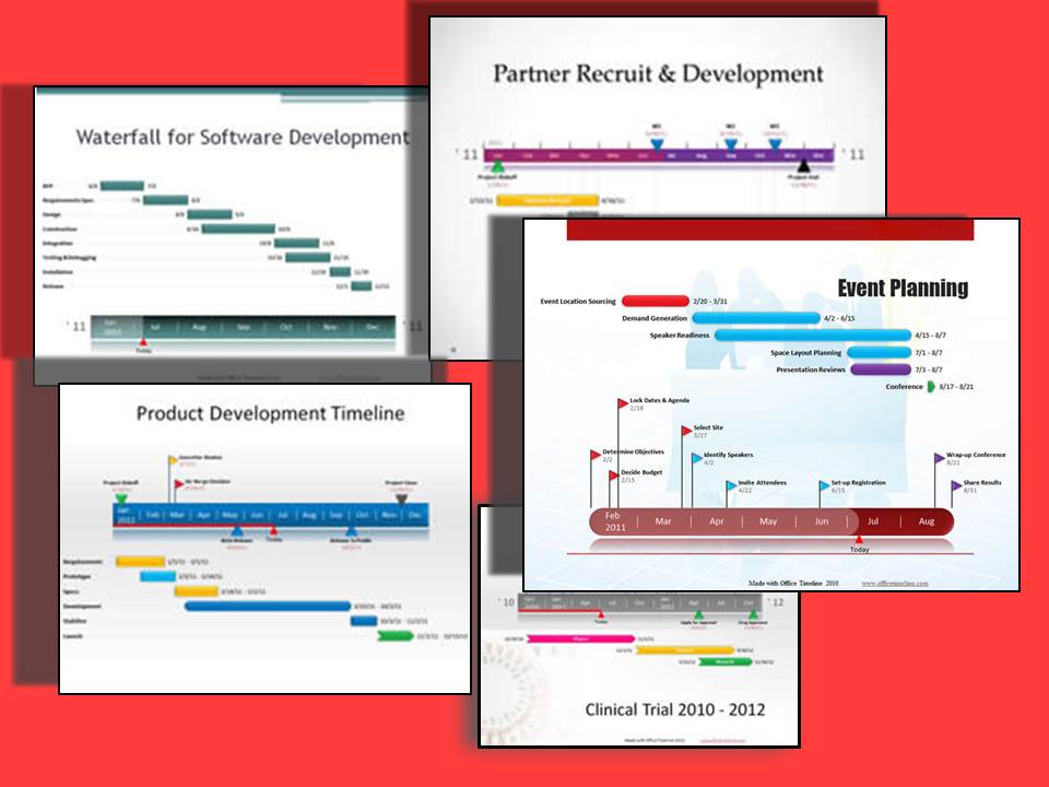
Previously we talked about creating tables and charts manually in PowerPoint. However, not everyone has the luxury to pore over a Gantt chart they need to present the following morning. In its efforts to be even more user-friendly and efficient, Microsoft’s released a program made to craft your timeline in just two minutes, or less.

Need to create a timeline in Microsoft PowerPoint but don’t have the time to input the necessary shapes and tools separately? Then you may want to check out Microsoft’s add-in for easily crafting professional looking timelines.

An Efficient Program

Office Timeline is designed for MS PowerPoint 2007, 2010, and 2013 and it works by enabling you to make your timeline and project slides quickly and easily. In fact, that’s its motto: Beautiful, Professional, Easy. 

In just a few minutes, you’ll be able to create a beautiful and organized timeline on the slide that you can proudly present to management, team member, or customers. This user-friendly wizard will simply ask for data such as start and end dates along with some descriptions. In an instant, it will create a timeline slide in your open presentation.

Presentation1

How to Use

It doesn’t take much effort to craft a Gantt chart with this program. You can download the plug-in for free on Office Timeline’s official site, or buy the Plus Edition. Once you’ve installed it in your program, an Office Timeline tab will appear beside the usual tabs in PowerPoint.

Select New. This will present you with various types of timelines that you can choose from. This includes pre-set templates that you can customize later on to your advantage. After choosing the type of timeline you want to present, you’ll be asked to input Milestones, which are the markers of your chart. These can be as many as you want, depending on the number of items on your timeline. You can further tweak this feature’s colordate, and name to fit your purpose.

The Gantt chart will appear on the slide after you’ve fulfilled all the requirements for your timeline. Here, you can select the separate components of the chart — including its scale and markers.

Conclusion

Organizing your data into understandable and brief diagrams is the key to a painless presentation. Most people — possibly including your own audience, whether these are customers, investors, or the big bosses — are visual learners who learn best by being shown data and progress information, rather than by being exposed to droves of text and winding verbal explanations.

While your PowerPoint isn’t meant to be a replacement for your actual presence, it will help to have a visual aid that supports your points and compresses the most important of these into neat visual charts. Office Timeline is one of these charts, developed by Microsoft to answer the information overload that plenty of presenters often fall into.

Are you going to stick to boring, text-heavy slides, or will you upgrade to this sleek, efficient tool?


References

Office Timeline SoftwareAccessed May 16, 2014.

Jazz Up Your Sales Presentation With a Label Tag Created in PowerPoint

Using images to represent ideas is one of the best ways to enhance PowerPoint presentations. A product label tag, for example, is great in designing your deck during a sales presentation. According to Entrepreneur, in such presentations, it’s essential to establish your identity and address your customers’ needs.

If ever you need a tag to back up your points and differentiate yourself from the competition, you can always search for custom images of these tags on the Internet and tweak them to your advantage.

Or better yet, create one that you can easily customize using the Shape functionality in PowerPoint. This tutorial will show you how to do it using the Shape and Text tools in PowerPoint 2010.

Drawing the Frame

First, assuming that your PowerPoint is already open, create a new, blank slide. Then, draw the label using the Rectangular shape with a rounded border. You can find this in the Insert tab under Shapes.

label tag

After this, select the Oval shape from the Shapes option to create a small circular shape. Put this near the top portion of the rectangle to serve as the label’s tag hole.

Filling with Color

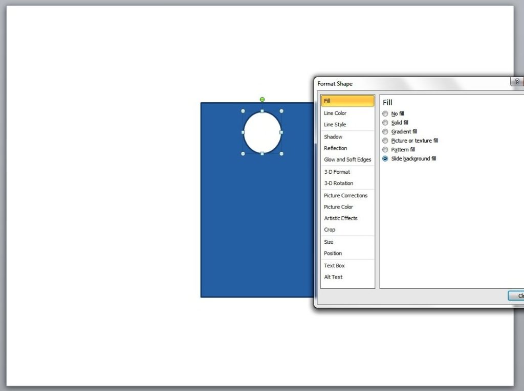
Fill the circle with the same color as that of the slide background. Do this by right-clicking on the shape and selecting the Format Shape option. Click Fill and then select Slide background fill.

label tag2

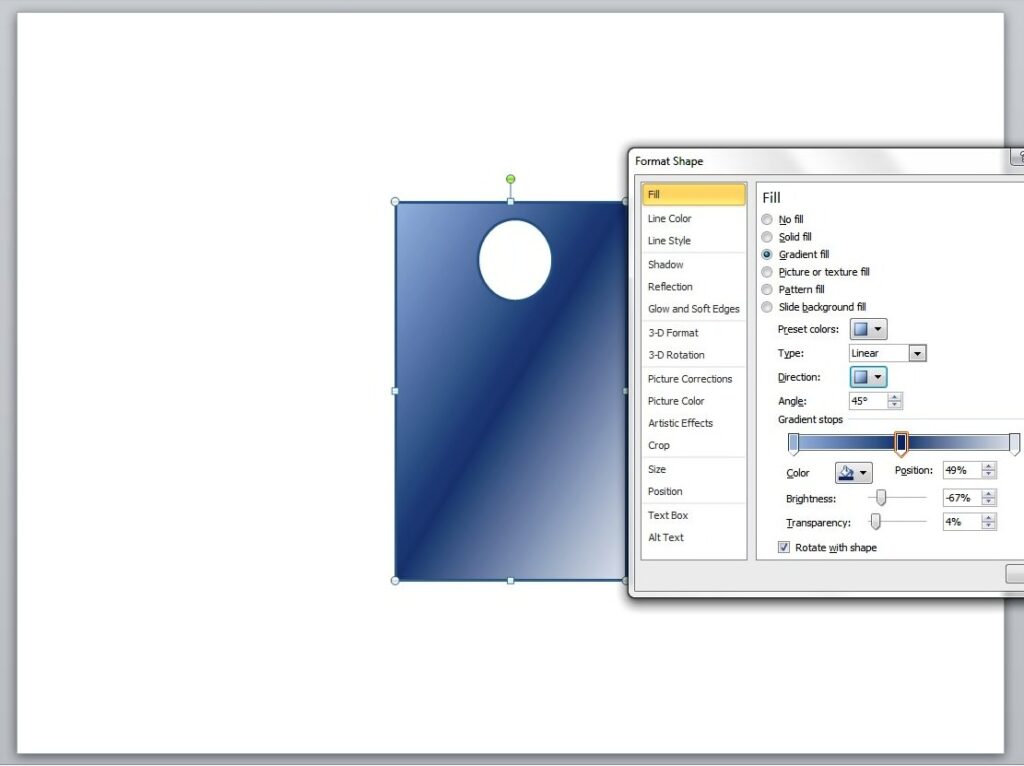
To give the label some depth, you may want to fill it with gradient color. To do this, click Fill from the Format Shape option and select Gradient fill. Depending on your preference, you may adjust the Gradient type, direction, color, brightness, and other qualities.

label tag3

Final Details

To create the label’s string, select the curve line from the Shapes option. Draw a line from the small circle and then click twice until you reach the label’s border. You may manipulate the string to give it a more natural look. Simply click on it and drag any of the visible points accordingly.

label tag6

Lastly, you’ll have to group all the shapes in a single label. Select all the elements and then right click on the label. Next, click on Group (and the other Group option that will appear) and

Next, click on Group (and the other Group option that will appear) and Voila! You now have your very own product label tag that you can use for your sales presentation. For added impact, think about adding some text inside the tags.

label tag7

Conclusion

An impressive deck is often eye-catching and unique, but more importantly, it should always be there to support you when you need to pitch to the crowd. Experiment with PowerPoint and add a tag to your slides. It’s simple and interesting. With just a few clicks using the Shapes tool, you’ll already have a tag-shaped image that you can spice up with text or gradients for depth.

Having trouble with your deck design? Our SlideGenius experts are always ready to help. Contact us today for a free quote!

Reference

Making Sales Presentations.” Entrepreneur. February 24, 2013. Accessed May 15, 2014.

About SlideGenius

SlideGenius.com is your business Power Point presentation expert. Based in San Diego, California, SlideGenius has helped more than 500 international clients enhance their presentations, including those of J.P. Morgan, Harley-Davidson, Pfizer, Verizon, and Reebok. Call us at 1.858.217.5144 and let SlideGenius help you with your presentation today!

Why We Are Different: Highlighting Your Competitive Edge

Today, most mainstream markets are becoming more saturated and difficult to penetrate, especially for budding entrepreneurs. This leads to companies and brands simply imitating each other in terms of features and benefits. But for those in these precarious market situations, customers have heard it all, and they’re not that impressed.

Defining your competitive edge can help establish your unique position in the market. With clearly defined benefits and features, your customers will know what really makes you a cut above the competitors and what steps you need to take to maintain that position.

SlideGenius Blog Module One

Get hundreds of PowerPoint slides for free.

Sign up for your free account today.

Sign Up now

Here’s how you can craft a slide stating your specific advantages:

Say it Fast

The “Why We Are Different” slide is a common fixture in corporate profile presentations.

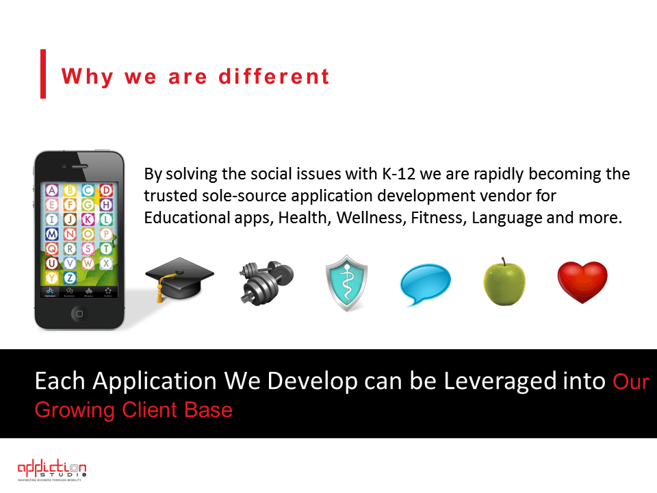
Ironically, many organizations use the same strategy in describing the things that differentiate them from the crowd: They use bullet points. Enumerating your best qualities isn’t exactly the best way to present your competitive edge. If you can say it one sentence, the stronger your impact will be.

This doesn’t mean that you’ll be leaving out important details from your slide. It only means compressing the important points in one non-highfalutin and simple-to-understand sentence. Since we’re talking about customers who are tired of hearing the same things over and over, a brief but enlightening slide is a breath of fresh air for their tired gaze. Try to be as concise as possible in your slide. Don’t go off on tangent unless necessary.

why we are different

Back it Up

Another effective way to describe your edge over the competition is this: Don’t make it about the competition.

Make it client-driven. You can do this by identifying your customer base and describing the solution to their problem.

For most of your customers, you are the ideal provider not because of flashy advertising or due to popular choice, but because you are able to address their needs and challenges. In an interview with LoyalBlocks’ Ido Gaver, Kevin Daum enumerates the ways you can back up your statements and show your sincerity.

Show people that their loyalty to you has perks—whether it’s in terms of addressing them personally, or giving them perks like promos and freebies. Build and maintain your competitive edge on that opportunity.

Say it Loud

Now that you have an idea of what your competitive edge really is, it’s time to declare it to the world using your slide. You don’t need to use big, highfalutin words.

Simple words would be enough, as long as they sound sincere, not condescending and inappropriate. Use images to support your text. Make sure they are relevant and do not detract from what you want to say. An effective slide that aims to set you apart from the competition will only succeed if you bring together strategic techniques to the table.

SlideGenius Blog Module One

Download free PowerPoint templates now.

Get professionally designed PowerPoint slides weekly.

Sign Up Now

Why We Are Different: Creating A Slide That Highlights Your Competitive Edge

Today, most mainstream markets are becoming more and more saturated and difficult to penetrate, especially for budding entrepreneurs. This leads to companies and brands simply imitating each other in terms of features and benefits. But for those in these precarious market situations, customers have heard it all, and they’re not that impressed.

Defining your competitive edge can help establish your unique position in the market. With clearly defined benefits and features, your customers will know what really makes you a cut above the competitors and what steps you need to take to maintain that position.

Here’s how you can craft a slide stating your specific advantages:

Say it Fast

The “Why We Are Different” slide is a common fixture in corporate profile presentations.

Ironically, many organizations use the same strategy in describing the things that differentiate them from the crowd: They use bullet points. Enumerating your best qualities isn’t exactly the best way to present your competitive edge. If you can say it one sentence, the stronger your impact will be.

This doesn’t mean that you’ll be leaving out important details from your slide. It only means compressing the important points in one non-highfaluting and simple-to-understand sentence. Since we’re talking about customers who are tired of hearing the same things over and over, a brief but enlightening slide is a breath of fresh air for their tired gaze. Try to be as concise as possible in your slide. Don’t go off on tangent unless necessary.

why we are different

Back it Up

Another effective way to describe your edge over the competition is this: Don’t make it about the competition.

Make it client-driven. You can do this by identifying your customer base and describing the solution to their problem.

For most of your customers, you are the ideal provider not because of flashy advertising or due to popular choice, but because you are able to address their needs and challenges. In an interview with LoyalBlocks’ Ido Gaver, Kevin Daum enumerates the ways you can back up your statements and show your sincerity.

Show people that their loyalty to you has perks — whether it’s in terms of addressing them personally, or giving them perks like promos and freebies. Build and maintain your competitive edge on that opportunity.

Say it Loud

Now that you have an idea of what your competitive edge really is, it’s time to declare it to the world using your slide. You don’t need to use big, highfalutin words.

Simple words would be enough, as long as they sound sincere, not condescending and inappropriate. Use images to support your text. Make sure they are relevant and do not detract from what you want to say. An effective slide that aims to set you apart from the competition will only succeed if you bring together strategic techniques to the table.


Reference

Daum, Kevin. “7 Great Ways to Build Customer Loyalty.” Inc.com. January 13, 2014. Accessed May 15, 2014.

-->