Slidegenius, Inc.

3 Ways to Livestream Your PowerPoint Presentation

Don’t let distance get in between you and your audience. Livesteaming your PowerPoint allows you to still be the face of your presentation. Several online platforms can bring your presentation out of the boardroom and into digital spaces. These enable you to reach a wider audience without having to sacrifice your personal presentation style.

While many people may have figured out workarounds to livestreaming, the truth is there are many options, which are not too difficult to navigate once pointed in the right direction. Here are three ways you can livestream your next PowerPoint presentation.   

Broadcast Online from PowerPoint 

Microsoft itself offers a safe, reliable means to broadcast your PowerPoint presentation online to remote audiences (for PowerPoint 2013 and newer versions).

First, find your presentation and open it up. In the File tab, you can start livestreaming your presentation through the Share button.  

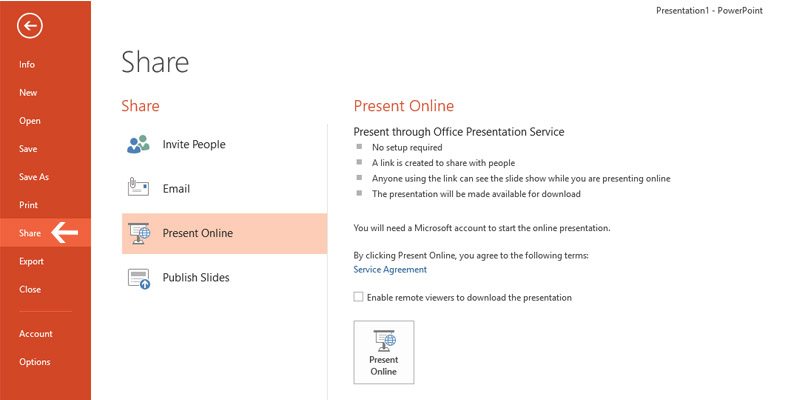
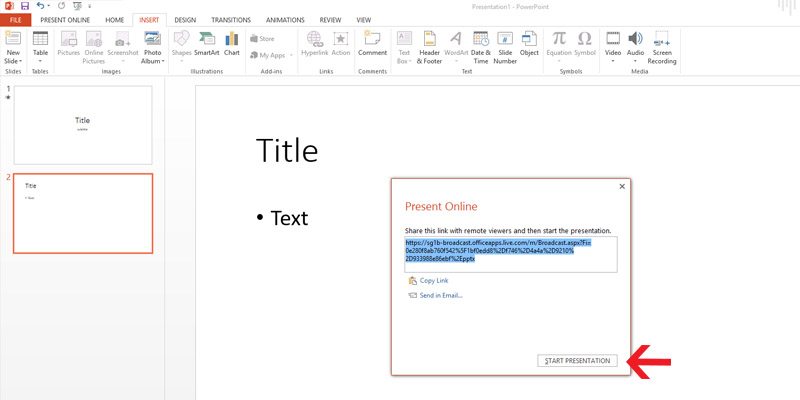
Next click the Present Online button. A dialog box will generate a custom URL for your presentation. You can then copy the link to send directly to your audience.

Once they’ve received the link, click Start Presentation. Viewers will then be able to see your presentation as you guide them through each slide in real time. 

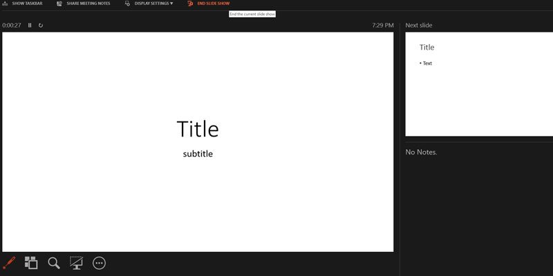
This highlights how Presenter View will appear only on your screen. Your audience will see your slide show as you present it. 

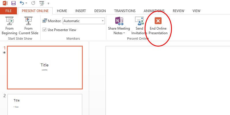
Once you’re done, simply hit the End Online Presentation in the Present Online tab. 

This option is convenient when meeting in person is not possible. However, the slight downside is that some of your original deck’s features may be compromised. All transitions will automatically be set to “fade” from the audience’s view and a file size limit may be imposed on your upload. 

In this situation, a concise deck is more advisable for livestreaming to minimize the lag in your loading times. 

Use Office Mix  

Office Mix is a free downloadable add-on for Office 365 subscribers. It makes livestreaming presentations much easier.  

Office Mix retains more content such as audio, video, polls, and quizzes than broadcasting through PowerPoint alone. These features are helpful for presenters seeking to maximize audience engagement. using their deck. Consider reviewing each feature to see which will work best in your presentation, especially as you are livestreaming.

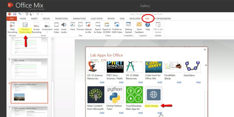
In the Mix tab, you can see Quizzes Video Apps

The platform also features “live digital inking.” This is a more hands-on approach that enables you to guide the audience using video, audio, and illustrations. Office Mix offers several helpful tutorials on their site for navigating these useful features.  

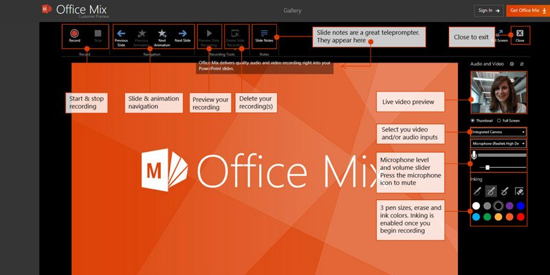
Office Mix requires an internet connection to share your presentation. However, your audience will be able to review your slides after you’ve concluded the presentation. And because Office Mix gathers audience data and feedback for in-depth analysis you can keep track of how your presentation went over with your audience and maximize on keeping track of after-presentation impact.

Upload to Online Platforms 

This third option offers the least audience interactivity in the moment but can maximize your audience reach. And it may be the easiest to execute. 

If the previous options are unavailable, you can upload and design your presentation on deck hosting platforms such as SlideShare. 

Publishing your slides online will allow you to reach out to a wider audience. While you can configure the presentation to be viewed by selected viewers only, default settings keep your deck open for public viewing. Adding tags to your presentation makes it easier to search online, further enabling mass sharing. 

These online platforms often require compressing your presentations to a size that websites can handle. While uploading to online platforms can be limited in file size, audiences will be able to view them at their own pace which can be a great benefit for a leave-behind aspect to your presentation.

Livestreaming Design Elements to Enhance Viewer Experience

Your deck plays a key role in the impact of your presentation and there are many ways to make your presentation accessible.

Because the presentation is being streamed from your source, you won’t need to worry about losing any of your custom fonts. That’s a common pain when people send their decks via email. Here are a few other assets that add value and enhance viewer experience: 

  • Interstitial Graphics: Controls broadcast flow and breaks it into segments 
  • Overlay Graphics: Media that plays over the main content  
  • Alert Overlays: Pulls live data from online sources and displays over the stream 

You may notice these things on streaming platforms like Twitch. Adding these elements to your presentation can give you a leg-up over other presenters and help you stand out with your audience.

Planning for the Future

Being able to present your deck effectively online will help amplify your message and showcase your skills as a presenter to your audience even while remote. And while working from home or hybrid interactions continue to be the norm, it’s essential to utilize all the tools you have at your disposal. Livestreaming solutions have made it so much easier to deliver a smooth online presentation experience. Take these tips as unique chances to improve your skills for your next big presentation.

Does Your Presentation Need Animation?

Once upon a time, animation was a taboo topic in the world of corporate PowerPoint presentations. 

Today, it is far from the gimmick people once thought it was. We now recognize it as a powerful tool in design and branding.

Why Animation Is Important: The Data Shows It

Before we get into it, we’ve packaged this post into a beautiful guide (with a little bonus content!) for those of you on the go:

Get the Guide Now!

The impact of animation comes down to how it affects audience engagement. 

Even against a backdrop of appealing text and engaging images, animation captures an audience’s attention. Where everything else is static, animation breaks the plane and stimulates the senses. 

Its eye-catching appeal makes it the best tool for improving engagement and comprehension.

In a study by the Harvard Department of Psychology Decision Science Laboratory, findings show people tend to characterize presentations with animation as quantifiably more “dynamic, visually compelling, and distinctive.”

These same respondents also rated presentations without animation poorly.

In the context of the study, it raised the standard for the entire presentation. Respondents felt more informed and had a higher opinion of the presenter, citing them as “more knowledgeable, professional, effective, and organized.”

As you can see, there’s a reason animation is now a standard in corporate presentations and no longer a taboo or tacky addition.

When used properly, it can help an audience better understand new concepts and fight “presentation fatigue” by actively directing audiences to focus on important points for better information retention.

Related: PowerPoint Animation Capabilities Most People Aren’t Aware Of

How to Approach Presentation Animation

But you need to be careful.

Integrating animation into presentations is not a golden ticket to more engaging presentations. The trick is to use it with purpose and discretion, otherwise it will only do more harm than good as it will confuse your audience instead of engaging them. 

To incorporate animation correctly, you need to follow a set of important guidelines:

1) Know Your Audience

The subject matter of the presentation has a lot to do with where animation fits in. Apart from this, the level of animation used will vary depending on the audience. 

Take a look at a heavily animated presentation for Spotify versus a simply-animated slideshow for USAA:


As you can see, two completely different industries and audiences demand different approaches to animation.

Think about how the animation affects the message. 

In the Spotify example, animation shows life and exuberance to illustrate the world-building concepts of the company. For USAA, animation acts as an exclamation point for every important fact presented. 

Both different, both effective.

2) Determine the Purpose

Animation should serve a purpose for the overall message. 

To understand its purpose, animations should come after you build your slides. 

The first four steps to creating an effective presentation are:

  1. Create a storyboard (yes, even presentations need storyboards!).
  2. Develop the content.
  3. Sequence the slides.
  4. Determine the key talking points.

Long story short: Content comes first.

After building the framework and creating the content, then consider animation.

Where do you want your audience to look? What slides or content need extra emphasis? 

Animation encourages focus, so use it within the greater context of the presentation to direct attention where it’s most-warranted.

Mastering animation means mastering “eye flow” and being able to control the engagement of your audience.

3) Use “Motion Paths” to Your Advantage

PowerPoint motion paths are great tools when telling a story or explaining a process.

Through motion paths, designers have the flexibility to walk an audience through different steps of a process. Here’s a great example of motion path use:

As you can see, motion paths are useful for text, objects or images. In addition, there’s plenty of room for creativity with the custom animation option.

Use motion paths to literally guide your audience from point to point. As a presenter, you’ll gain more control over the presentation’s pace and engagement. 

Motion paths instill much-needed cadence to topics for incremental education.

Related: Three Technology & Software Company Presentations We Love

4) Don’t Overdo It

Think about animation like an exclamation point on the statement you’re making. 

If you write a paragraph and every sentence ends with an exclamation point, the punctuation loses its power. 

(If everything is exciting, nothing is exciting!)

Animation emphasizes a great idea or caps off a bold statement.

Overusing it or getting too complex with how it’s featured is a recipe for chaos. People won’t know where to look, what to focus on, or what’s important. 

Keep it simple and organized.

5) Continuity is Key

The nature of animation should stay consistent throughout the entirety of the presentation. 

Consider it a part of your brand guidelines. Don’t deviate from the style you choose. Your audience will notice a “star wipe” in the middle of dissolving slides, just like they’ll notice if your simple animation suddenly becomes very complex.

Maintain animation consistency to avoid confusing people or detracting from the message. 

If at any time during the presentation the animation becomes more of a focal point than the content, it’s time to reassess.

6) Don’t Do “Defaults

Consistency in style and intensity are important. It’s also critical not to let animation become monotonous. 

Using default animations over and over again are just as bad as using poor photos or bad text. If anything, it detracts from the message you’re trying to deliver. 

Take the time to customize animations and keep them original every time. 

The style may be consistent, but the way they affect your messaging should always complement the point you’re trying to make.

Animation Keeps Your Audience Engaged

Used right, animation is perhaps the most powerful tool at your disposal for designing a robust PowerPoint presentation. 

It helps your messaging leap off the page, makes concepts more pronounced, and improves audience perception of the presentation as a whole.

Presentations become more like movies, adding more stimuli for viewers to engage with.

Similarly, it can complement the core concepts you’re presenting, but only when used correctly.

Ask yourself how engaging your presentation is from an audience standpoint. 

Is every slide a flat representation of information? Do the most important callouts of your deck get their due? 

If you find yourself struggling to stay focused or distinguish the key takeaways, your audience undoubtedly will, too. 

Sprinkle in some animation and watch its transformative effect. When done right, it’ll bring new appeal to your PowerPoint and get your message across in an undeniable way.

Ready to take your presentation to the next level? Schedule a free presentation consultation now.

Should You Distribute Handouts on Your Next Presentation?

After each sales pitch, speakers can only hope their audience had taken something from their presentation—to have engaged the audience enough for the speaker to be remembered.

SlideGenius Blog Module One

We redesign PowerPoint presentations.

Get your free quote now.

get a free quote

Distributing handouts is a great way to remind your audience of your topic’s key points. This is especially helpful if you have more information that you would like to relay, but can’t include in the presentation because of time constraint or layout/design reasons

These are especially useful for presentations with tons of details because it is impossible for your audience to take in that much information.

What does it contain?

While your PowerPoint is customized to contain the key points of your presentation, your handout provides an extensive explanation of the details bulleted in your deck and your contact information.

Handouts

Usually just a page or two—enough to thumb through, the handout’s content shouldn’t only cover the topics discussed in your presentation. You can also include related information, such as case studies and other print collateral, that supports and further explains your pitch.

Should you distribute them?

Presentations shouldn’t exhaust the audience, instead, this is where you deliver your core message in an engaging way.

Handouts

Adding the element of handouts strengthens your call-to-action, as these provide the resources they need to get in touch when they need to discuss purchasing decisions.

The advantages of handouts, however, come with downsides, including the possibility of creating a disconnect between you and the audience—serving as a distraction because the audience will be reading rather than listening.

In the end, it is up to you to whether to use print collateral during your presentation or not. After all, handouts only reinforce what you’ve already mentioned in your presentation. If you’re confident in your PowerPoint and you think it’s effective on its own, then there’s no need for them.

People can only take in so much before they experience information overload and by the time they do, they will be unable to retain half of what you’ve said.

Handing out print collateral for the first time? No need to worry. Apart from being PowerPoint experts, we also provide print services that attend to these specific needs.

SlideGenius Blog Module One

Download free PowerPoint templates now.

Get professionally designed PowerPoint slides weekly.

Sign Up Now

References:

“Understanding Information Overload.” infoengineering. n.d. www.infogineering.net/understanding-information-overload.htm

Lampton, Bill. “Using Handouts to Reinforce Your Training Presentations.” Business Know-How. March 26, 2015. www.businessknowhow.com/growth/handouts.htm

SlideStore: An Entrepreneur’s Portal to Presentations

PowerPoint has clearly established its reputation as the go-to medium for presentations. Boasting a billion installations worldwide in its three-decade existence, the slideshow software is undoubtedly a popular tool for business and educational communication.
Although many similar applications have emerged in the past, many still choose PowerPoint because of its familiarity and simplicity. With it, users can intuitively add multimedia to boost the visual impact of their decks. Aside from that, it’s easier to simplify complex ideas in a slideshow tool that encourages minimal use of text.
Knowing the broad reach of PowerPoint, you’d think that most people have already mastered it inside and out. However, it doesn’t come as a surprise that many still fail to tame this presentation giant. After all, mastering PowerPoint takes advanced design skills and not just a mere penchant toward decorating. It takes a true artist with a keen eye for design to craft a beautiful PowerPoint presentation.
That’s precisely why you need SlideStore to handle your design needs.

Introducing SlideStore

SlideStore is the brainchild of SlideGenius, a presentation design agency from San Diego, California. It’s ideal for people—entrepreneurs, particularly—with minimal design skills and little time to create a competent pitch deck. SlideStore provides free PowerPoint templates that you can customize to your liking. Whether you’re looking for a business presentation template or a PowerPoint that will engage new clients, SlideStore has the right deck for you.
Every PowerPoint template provided by SlideStore is crafted with passion and commitment, so you can expect top-notch slides that look, feel, and are pretty impressive. Still, if you want to take your presentation to the next level, you can opt for SlideGenius’ design services. That way, the company can create customized slides that match your needs and preferences.

What’s in Store for You

SlideStore’s premium services are anchored on the fact that everyone’s design requirements are unique. If you want your design ideas to come to life, let SlideStore do the work for you. Sit back and watch as your business sees an upsurge in conversion rates, sales volume, and brand credibility. Because believe it or not, a successfully laid out deck can have that effect on your business.
If you want to swing by just to scoop up some knowledge about design, that’s well and good, too. We’ll post design tips, PowerPoint hacks, and presentation techniques here on the SlideStore blog, so be sure to tune in regularly. After all, what harm is there in expanding your knowledge in PowerPoint design?
Welcome and have fun browsing SlideStore!

Resource:

Gaskins, Robert. “Sweating Bullets: Notes about Inventing PowerPoint.” Robert Gaskins. 2012. www.robertgaskins.com/powerpoint-history/sweating-bullets/gaskins-sweating-bullets-webpdf-isbn-9780985142414.pdf

Office Mix: Innovation in PowerPoint for Education

With all the arguments raised against it – the most notorious of which is Death by PowerPoint (or rather, by boredom through it) – PowerPoint has become notorious for boring and uninteresting presentations. In response to this, the presentation tool continues to innovate itself to improve both presenter and audience experience.

One of these innovations is MS PowerPoint’s Office Mix, a free add-in that lets people create interactive material they can share online. This feature especially caters to educators, who can now upload their lessons and teach their students anywhere, at any time.

But what exactly is Office Mix all about?

We break down each of its important aspects and give you their benefits.

1. Going Live Online

Office Mix is an easy-to-use tool for accessing and sharing content online. Anyone you choose to share your presentation with can view it from any device. You can share it with your peers in OneNote, or upload it on the web where students can access it.

It also lets you generate live web pages that your student can interact with on the spot.

Mix has revived the previously phased out web page option with the Quizzes Videos Apps button, which also lets you insert interactive quizzes.

Once you select the Web Page option in the Lab Apps, a dialog box requesting for the web page URL will appear. Once you’ve inserted the link, the web page will load and will be free for you to rearrange on your slide. To see how a live web page works on a deck, watch this tutorial on the Office Mix site.

Your PowerPoint definitely can’t replace your presence, but having this add-in helps students who need a quick review of your lessons. Walk them through every key point all over again at their own pace.

2. Digital Mix

Office Mix is literally a mix of mediums that make learning easier and more interactive.

It has improved PowerPoint for education by making use of digital media to connect with a tech-savvy generation. Take advantage of its audio and video narration to effectively guide students both visually and verbally.

Mix lets you take screen recordings of your actions when the need for a demo arises, and lets you digitally ink your slides in real time as you execute your lesson plan. Like broadcasting your PowerPoint, anyone who has a link to your presentation can view your slides as you go through this once you present your slide show online.

At the same time, Office Mix doesn’t take a PowerPoint pro to do the basics. It’s user-friendly enough to let you play around with the digital mediums without an in-depth knowledge of each.

3. PowerPoint Innovation

Office Mix has changed the concept of PowerPoint presentations in the classroom. It’s designed for interactivity, both on the part of the student, and the teacher.

The same Quizzes and Video Apps button in your Mix Add-in lets you insert quizzes and polls into your slides, and review your quiz questions before they go live. Students don’t just answer these quizzes. The results are returned to you so you’ll be able to gauge their comprehension of your lessons.

This data can be imported to Excel, where you can keep track of your students’ progress on a spreadsheet, making it easier for you to grade them.

Conclusion

The future of PowerPoint for education is here. Gone are the days when students would tune out in boring lectures.

Office Mix is inclusive for an optimal learning experience. Reach out to your students online, or discuss your lesson plan with colleagues. Mix makes use of different digital mediums to enhance interactivity.

It’s an innovation that keeps expanding the possibilities of PowerPoint beyond the slide and closer to the audience. Don’t miss out the opportunity to improve your educational presentations.

Let our SlideGenius experts help you with your presentation needs. Contact us today for a free quote!

Resources:

“Office Mix Tutorial: Web Pages, Simulations & More.” Office Mix. Accessed November 26, 2015. https://mix.office.com/watch/qn821zf10bni
“What Is Office Mix.” Office Mix for Teachers. n.d. Accessed November 26, 2015. www.mixforteachers.com/what-is-office-mix.html

Featured Image: “Teacher’s Desk – Linn School” by Todd Petrie on flickr.com

Looking for creative presentations that can leverage your business? Enjoy free PowerPoint templates from SlideStore! Sign up today.

How to Loop a GIF Background in PowerPoint 2013

Animation can easily capture audience interest, especially if they’re engaging and interactive. Backing up your pitch with well-designed motion graphics encourages the crowd to listen. Include motion graphics as backgrounds with PowerPoint to spice up your business presentation.

In this post, we’ll focus on using an animated GIF (Graphic Interchange Format) and how to use it as a background with the help of PowerPoint 2013’s customization options.

Loop a GIF in PowerPoint 2013

Before doing this, you’ll need to have an animated GIF image ready.

Once you have your file ready, here’s how you can place it on your slide:

1. Click the Design tab and then to the far right, select Format Background under the Customize group. You’ll notice the Format Background options appear at the right windowpane within the slide area.

Loop a gif background tips: New

2. In this window, choose the Picture or Texture Fill from the options.

Loop a gif background tips: picture or texture fill

3. Within the same window, click File to insert the GIF from your downloaded or saved files and then choose your desired GIF file.

Loop a gif background tips: choose file

4. Preview your current slide to see if the GIF plays. Under the Slide Show tab, click From Current Slide in the Start Slide Show group, or simply press Shift+F5 to preview the current slide you’re working on. The GIF will automatically loop at the start of the slide.

Loop a gif background tips: gif

Some Important Reminders

1. Click on Apply to All so that your GIF will play in the background of all your slides.

Loop a gif background tips: apply to all

2. You can see this button at the bottom of the Format Background window pane which can be accessed in the rightmost area of the Design tab.

Loop a gif background tips: format background

3. You can also choose other GIFs as backgrounds to invoke different reactions from your audience. This option stretches the image to fill the background, so choose a high-quality GIF so that it won’t look pixelated when expanded.

4. Last, but not the least, not all GIFs can loop properly when played in older versions of PowerPoint. Focus on your presentation’s content in case your animation fails to load.

5. The steps outlined in this article are distinctly different from just dragging a GIF into the slide area. You can’t resize or drag the GIF around once it’s applied as a background. This feature helps reduce the amount of slide elements in your deck and keeps the background firmly in place.

Background Animation

With PowerPoint’s capability to customize slides, you can add animation to pique the interest of your audience.

The ability to loop a GIF background can enhance your design and vary up your presentation’s look. A moving background can catch the attention of the audience, which can help them focus on the foreground elements afterwards. An animated design also helps differentiate your slide elements for visual contrast. This lets you deliver a memorable PowerPoint presentation.

Create a more dynamic and engaging deck with animation. SlideGenius experts can assist you and offer you a free quote!


Reference:

Menezes, Ryan. “How to Use Looping Backgrounds in PowerPoint.” Business & Entrepreneurship. n.d. yourbusiness.azcentral.com/use-looping-backgrounds-powerpoint-1766.html

Improve Your Deck with Interactive PowerPoint Presentations

The goal of any presentation is to engage its audience. There are a number of rhetoric techniques to achieve this, such as appeals to emotion and reason. However, you can also apply these techniques on your deck.

Aside from tapping into basic design principles that make your PowerPoint more eye-catching, current innovations in the presentation program have made it possible for an interactive presentation.

Find out how you can create a winning deck using three of PowerPoint’s interactive features:

1. Interactive Feed

One of the biggest breakthroughs of our time is the rise of social media. It has brought people closer and allowed new connections to form across geographical and cultural boundaries. Among the leading social platforms online, Twitter lets you interact directly with your audience and gain insight on their thoughts when you display a live feed on your slides.

Tap into the power of social media during your presentation, and encourage people to bring out their phones so they can tweet about your pitch.

Make use of a hashtag specific to your event, and look it up using a Twitter wall. Web sites like Tweet Beam let you view live tweets about specific events or hashtags and show them to your audience for added credibility, according to its founder, Pim Stuurman.

Import the live feed onto your deck by clicking Insert > Web Page. Copy the URL from the Twitter wall and paste it on the dialogue box that will open.

Unfortunately, LiveWeb is only available in PowerPoint 97 to 2010. You can download the LiveWeb add-in for PowerPoint to display your live feed for a more interesting and engaging deck. You can also add Web pages in PowerPoint 2013 onward through free add-ins like Office Mix.

2. Animation

If you prefer not to put up an interactive feed on your deck, attract and hold the viewer’s gaze with animation.

Just last year, Microsoft released an add-in that makes it possible to craft seamless basic animation that elevates the quality of your slides: PowerPoint Morph. This comes with an Office 365 subscription for PowerPoint 2016, but once installed, it creates unprompted effects that look like convincing basic animation.

Morph is found under the Transitions tab, and it gives you the option to animate objects, words, or characters. Just move your selected slide element in the path you want it to move after choosing the Morph option. Without needing any clicks, it will move in your desired path once you play the slide show.

This lets you discuss your pitch and interact with your audience further with your animation as a supplement.

3. Hyperlink

Take your pitch outside the slide with hyperlinks. This can be as simple as hyperlinking a specific word or phrase on your deck or to designing shapes or buttons that will help you navigate through your slides. For specific details on making the latter, check out our previous tutorial on hyperlinks.

Whichever object you choose, right click on your chosen slide element and select Hyperlink. A dialogue box will appear, where you can either insert a site URL or direct to another slide on your deck. Unlike the previous two options, this will require some work on your part as you go over your pitch.

You’ll need to click on the hyperlinks every time you want to move around your deck, but this is a relatively easier method than sifting through slides or opening a new window and loading a page.

Conclusion

An interactive PowerPoint can boost your audience engagement and successfully pique people’s interest faster.

Tap into social media and display a live feed on your wall. Find out what your listeners feel about your presentation and address their concerns in real time. Attract attention with effortless animation. Install the PowerPoint Morph add-in to achieve self-presenting animation on your deck. For easier navigation across and outside slides, add hyperlinks on selected slide objects. It’s designed to help your pitch move along smoothly by removing the hassle of manual backtracking, so strategically place them throughout your slides.

If you’re still having trouble with your presentation design needs, contact our SlideGenius experts today for a free quote!


References:

Pillai, Shyam. “LiveWeb – Insert and Update Web Pages Real-time in PowerPoint.” OfficeTips. n.d. www.skp.mvps.org/liveweb.htm
Stuurman, Pim. “How Do You Display a Live Twitter Feed in a PowerPoint Presentation?” TweetBeam. February 10, 2015. www.tweetbeam.com/blog/twitter-feed-powerpoint
“Using the Morph Transition in PowerPoint 2016.” Office Blogs. n.d. support.office.com/en-us/article/Using-the-Morph-transition-in-PowerPoint-2016-8dd1c7b2-b935-44f5-a74c-741d8d9244ea


Featured Image: “Interactive Interactive – Laura” by Dan Zen on flickr.com

Save Painful PowerPoint Presentations with Twitter

Millions of Twitter users collectively ruffled their feathers when rumors spread that Twitter lifted its 140 character limit. Those who weren’t quick to jump the bandwagon checked Twitter’s official announcement on the change. They were assured that the change only affected Direct Messages in Twitter.

And so, Twitter users were put at ease and continued to publicly broadcast their tweets. But what if something similar happened to PowerPoint? Let’s say that Microsoft announced that PowerPoint slides were now limited to a hundred per deck. And each slide will be limited to a hundred characters each.

Presentations will be forced to be more concise now that each pixel on a slide is prime real estate. But at least the files are going to be much smaller.

Rock the Nest

The above scenario is not as bad as it seems since this limitation shouldn’t obstruct a good pitch. Twitter and PowerPoint are at ends with each other on the surface. One could say that you chat in Twitter and then discuss on PowerPoint. But we learn more through our differences than our similarities.

A pitch is allotted a specific time and place to get all its ideas across, but a tweet will need to fight for attention and space on the web to get noticed. In the same way, not everyone gets the chance to have a time and place to be heard. Even with the prepared audience in presentations, you still need to fight to keep their attention focused on you and your topic.

Try to have a bigger stage in mind when delivering your pitch and aim to be understood on a greater level.

Speed Up

While Twitter rapidly sends out millions of tweets a day, PowerPoint presentations gradually spread out information per slide. This isn’t to say that presentations won’t be as effective when slides move fast. On the contrary, if you spend more than ten minutes to explain a slide, the audience will begin to expect the next slides to last just as long.

Avoid preemptively boring the audience by changing up your presentation’s pacing. Breeze through several slides, each containing only one main point. Make each slide memorable, or #tweetable.

Engage

A trending tweet is a force to be reckoned with. Getting a tweet to trend is the addicting and engaging aspect of Twitter. It’s like being placed in the spotlight over the Internet. And you can do this regardless of who you are, so the playing field is evened out. This is a large contrast to being a speaker.

Professionals, businessmen, and important personalities are expected to be knowledgeable in their fields. The experience they have makes them stand out from the average person. They already have the spotlight placed on them. It’s a matter of making themselves relatable to everyone.

Work with Your Strengths

The focus of the presentation is on you. Your deck is there to compliment you while you deliver your speech. There is enough time to get all your ideas across with this. If 140 characters are enough to spark discussions, a few slides surely can. Hasten the pace of your speech by making your slides keep up with everyone’s attention.

If possible, encourage the audience to take pictures of your slides, and let them tweet. Make others connect to your passion, help them understand what you can offer through your words and your experience. And most of all, value the spotlight placed on you.


References

Agarwal, Sachin. “Removing the 140-Character Limit from Direct Messages.” Twitter Blogs. August 12, 2015. Accessed October 8, 2015. www.blog.twitter.com/2015/removing-the-140-character-limit-from-direct-messages


Featured Image: Hainan Blue Flycatcher (Cyornis hainanus)by Sheau Torng Lim from flickr.com

Decide on Classic Presentation Fonts in 5 Minutes

Much of the fonts we use come from centuries-old developments in print technology. We’re even using the same fonts from when paper dominated how we read. Classic presentation fonts have long been used to deliver a certain atmosphere and look.

While custom fonts may evoke originality and exclusivity, compatibility issues are a great concern. PowerPoint can embed fonts into a presentation, but this feature doesn’t work in Mac OSX. Avoid having a custom font automatically replaced when it can’t be found on another computer.

So give your deck a timeless look by using these fonts.

The Modern Classic

We’ve previously talked about serif and sans serif fonts. The earliest experimentation with sans serif was in the 17th century. But its usage only became commonplace in the next century.

These typefaces are popular for looking modern, simple and clean. Sans serif fonts are easy to read on the web, and is perfect for use in big bodies of text.

Gill Sans

gill sans

This is available both in Mac and Windows systems. 

Where to find: Gill Sans in Mac and Gill Sans MT in Windows. Gill Sans, named after its creator, was based on the Johnston typeface by Edward Johnston.

It’s a versatile font that is effective on the title or the body of the text in a deck. Pair it up with a serif font in your slide. For example, use Gill Sans in the body of the text, then use a serif typeface in the title and vice versa.

The Old Classics

Serif fonts are as old as printing itself. This also means that they predate sans serif typefaces. These designs are large and formal compared to the newer typefaces. It’s the official style used in legal documents and books in print.

Give your deck a serious mood by using these readily available font styles.

Baskerville

baskerville

This is available both in Mac and Windows systems.

Where to find: Baskerville in Mac and Baskerville Old Face in Windows This was designed by John Baskerville in the late 18th century. He used his background in calligraphy and stonecutting to give this font its quality of strength.

A presentation in a formal setting will benefit from the use of Baskerville. Deliver a serious and strong first impression by using Baskerville in the title of your slide. Or give a respectable tone to the body of text in your pitch using this font.

Bodoni

bodoni

This is available both in Mac and Windows systems.

Where to find: Bodoni 72 Oldstyle, Bodoni 72 smallcaps in Mac, Bodoni MT in Windows This bold and beautiful font was purposefully created for large prints by Giambattista Bodoni in the late 18th century. Use Bodoni to bring elegance at the front and center of your slide.

A slide will look sophisticated with Bodoni as a main header, preferably with as little text to accompany it. The effect of this font minimizes as it shrinks down, so it’s best suited in the header.

Other considerations

When compatibility isn’t a great concern, there are many more typefaces to choose from. But do think twice about the compatibility of fonts across machines over customization. Despite the great freedom it brings, the choice to use any font can still feel overwhelming.

We suggest that you use these sans serif fonts. They’re considered cult classics and look excellent in presentations:

Helvetica

helvetica

Helvetica comes pre-installed in a Mac.

The font that even has its own movie.

Futura

futura

Futura comes pre-installed in a Mac.

It’s so popular it reached the moon.

In Conclusion

It’s true that more and more people are reading from screens rather than pages of paper. But the timeless fonts printed media left us will endure. There’s no need to look far to find them. Your computer already comes pre-installed with these font types.

These classics never go out of style. Use them for effective and engaging PowerPoint presentations!


References

Farley, Jennifer. “The Sans Serif Typeface.” SitePoint. October 16, 2009. Accessed October 6, 2015. www.sitepoint.com/the-sans-serif-typeface
McDermott, Megan. “Complete Guide to Pre-Installed Fonts in Linux, Mac, and Windows.” APaddedCell. March 19, 2012. Accessed October 6, 2015. www.apaddedcell.com/sites/www.apaddedcell.com/files/fonts-article/final/index.html
Soh, Tony. “Top 30 Best Serif Fonts.” Vector Diary. December 9, 2013. Accessed October 6, 2015. www.vectordiary.com/fonts/top-30-best-serif-fonts


Featured Image: “Typewriter” by ceasedesist from flickr.com

Advertising PowerPoint Design Tips: Make Your Visuals Talk

In simple PowerPoint design, images visually support your words, creating a memorable image in your audience’s minds. However, you can play with this basic structure and create something more engaging. In Cutting Edge Advertising, Jim Aitchison suggests the use of metaphors, adjusting your text and images’ placement, or making a bent headline or visual.

Center your messages on a clear, specific idea by making an interesting image and supporting it with a straightforward tagline (and vice versa). Once your listeners can picture your message for themselves, your product or service will stick in their minds long after you finish the sales presentation.

Sell more effectively by combining this factor with clear-cut messages.

Bent Images with Straight Headlines

Apply the twist here to represent your idea in the image. Show a metaphor, a comparison or a dominant image.

The Business Times and The Economist print ads both talk about giving you the whole picture when you read their news. The images—the text cut in half, the binocular-shaped magazines and the Rubix cube— are all twisted to prove their points.

Keep your message, font, and text size simple so your clients focus on the image without distractions.

Bent Headlines with Straight Images

You can also show your idea in the headline and support it with a normal image. Clever word puns and verbal metaphors all come in handy as seen in the Cigarillos and Timberland print ads.

The text needs to be interesting or provocative enough to get your audience thinking. Otherwise, you’ll get a bland and uninteresting overall visual.

The Secret: Be Consistent

Choosing between the two approaches depends on how you want to emphasize your idea. Once you decide to either bend your text or image, be consistent with your messages.

The Business Times and The Economist had one main idea, similar to how Timberland emphasized their durability.

Emphasize one main idea, stick to it and support it with relevant facts. Making a striking visual impact ensures that audiences remember you long enough to contact you for a business deal.

References

Aitchison, J. Cutting Edge Advertising: How to Create the World’s Best Print for Brands in the 21st Century. Singapore; New York: Prentice Hall, 2004.
Diaz, Ann-Christine. “The Economist’s New Campaign Dishes Out Real — and Metaphorical — Hot Potatoes.” Advertising Age News. November 11, 2013. Accessed August 3, 2015.
Fine-tuning Your Presentation’s Core Message.” SlideGenius, Inc. November 11, 2014. Accessed August 3, 2015.
PowerPoint Visual Design Tips From Ads: Text & Image Balance.” SlideGenius, Inc. July 22, 2015. Accessed August 3, 2015.

-->