Slidegenius, Inc.

Four Reasons You Need Presentation Designers (Not Just Graphic Designers)

Why do you need a presentation designer? Because every presentation has at least one goal in mind… to engage audiences.

Whether you’re guiding a prospect through a product demo, trying to garner buy-in in the boardroom, or announcing upcoming products at your company’s annual internal conference, your ability to achieve the goals you set out to accomplish with your presentation rests on a four key factors:

  • Your presentation skills (obviously)
  • The narrative of your presentation
  • Your audience’s level of engagement, and
  • The design quality of your visual aid (typically a PowerPoint deck)

If there’s one thing we’ve noticed in our seven-year history as an industry-leading presentation design agency, it’s that a lot of people consider themselves knowledgeable in presentation design because they’ve given—and received—so many of them over their educational and professional careers.

Unfortunately, only a few are truly knowledgeable.

Very few.

And when it comes to engaging audiences, the quality of your presentation’s narrative as well as your visual aid’s design matters, especially when the stakes are as high as they are in a sales presentation or the boardroom.

Let’s be honest, most people don’t even consider slide design until the last minute when it’s too late to integrate eye-catching and attention-keeping visual elements or craft a compelling narrative that helps your audience make the important associations you need them to.

By then, tunnel vision has settled in, causing you to overlook engagement-killing mistakes:

  • Settling for stock themes
  • Inconsistent fonts and design
  • Overabundance of useless information that’s considered “essential” by the presenter

—you know, mistakes that make you look old.

Time and again, we’ve seen hopeful presenters put maximum effort into designing their own presentations (or hire inexpensive design services), only to be met with sub par results.

Let us shed light on why professionally designed presentations are so important:

1) Presentation Design Teams Let You Scale

The bigger a company gets, the greater its demand for design services becomes—both in quality and quantity. For this reason, “Design Operations” (DesignOps or DesOps for short) has become a growing area of concern for design teams “seeking to help increase the value they produce for their host organizations and that organization’s customers.”

According to Pinterest, there are three advantages to having a Design Operations mentality:

  • Scalabiliy
  • Further specialization, and
  • Safe harbor designers

Take Airbnb, a company that skyrocketed to success in just a few years. Airbnb’s brand aesthetic remained consistent throughout its rapid growth across the world.

How was this possible?

In a nutshell, Design Operations pinpointed the most important design work and tasked them to Airbnb’s employed designers while outsourcing design processes that bogged down those important deliverables to agencies and individuals who could do them better, cheaper, quicker, and in many cases, all three.

Granted, not every company has (or will have) a dedicated DesignOps team, but management can still benefit from adopting a DesignOps mentality. Because the truth is, even presentations that look like they were just thrown together at the last minute are often the product of hours of someone’s work.

Having access to designers who specialize in PowerPoint—as our next point highlights—helps ensure that specific someone can focus on their actual job role.

2) The Right Designers Know PowerPoint Inside & Out

There are so many aspects and intricacies in PowerPoint that most people aren’t aware even exist.

For instance, the morph tool brings fresh, attention-grabbing animation to dull slides:

Most people have used PowerPoint at some point in their lives, however, we at SlideGenius rarely receive decks from potential customers that scratch beyond the tool’s surface (Plain text, pre-designed templates, and archaic animations, if any).

Presentation designers (and more specifically, designers working for agencies that specialize in PowerPoint) are among the few that truly know how to maximize PowerPoint’s capabilities. They blend their design skills (imagery, text and animation) with mastery of the wide breadth of tools available in the platform. 

For instance, are you familiar with “flair” animation? Flair adds infinite looping, free-flowing graphics to PowerPoint presentations, like in Windstar Cruises’ pitch deck (pay close attention to the water on every slide:

You can see how we used flair animation to add cohesion and consistency to Windstar’s deck.

Fully understanding the capabilities of PowerPoint allows presentation designers to integrate visually compelling features to each element of the presentation, including imagery, text, animation, and even animation timing and speed. 

Everything is crafted purposefully to elevate the narrative of each slide—and the presentation as whole.

Now, should complex animation be present on every slide? Not necessarily. Adding animation to presentations is an art and can easily be overdone by an untrained eye. The goal here is to engage audiences—the last thing you want is to overwhelm them with unnecessary distractions.

That said, it’s important to stand out, especially when giving sales presentations, and a skilled presentation designer can make your deck standout from a crowd of competitors (or acquire that “WOW!” factor in the boardroom) without overdoing it.

3) Good Designers Are Obsessed with Details 

The complexities of graphic design run deeper than simply having good looking imagery.

Professional designers understand the impact of consistency. Anyone can conduct a quick Google search and grab a few high-quality images, but do those images help tell your story?

Good presentation designers keep the big picture in mind when carefully selecting each element that goes into each slide. They meticulously choose and alter visuals to mesh with one another to deliver a cohesive narrative throughout the entire presentation.

Check out this example from our friends at Spotify:


Pretty cool, huh? (Learn more about PowerPoint animation capabilities here.)

See how cohesive the narrative and design elements are? The “Bubble” effect really ties in Spotify’s brand identity and keeps the presentation consistent and visually stimulating. The mark of an expert graphic designer is their impeccable attention to detail.

Apart from the images they choose or create, elements like color, alignment, and fonts deliberate pieces of the overall design.

While often overlooked, these subtle details lend to the message you’re pushing. When everything is put together consistently, it delivers a sense of polish that’s not normally accomplished in ordinary presentations.

4) Presentation Designers Provide Fresh Perspectives  

Has your company been using the same PowerPoint template since 2012?

Do the presentations employ the age-old “copy on the left, image on the right” format?

Is animation integrated anywhere?

We’ve all sat through presentations with slides that have too much copy, boring format, and disengaging visuals.

Skilled presentation designers know how important it is to break the mold. After all, it’s the only way to engage audiences.

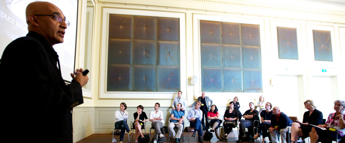
Let’s take the presentation’s copy, for example. It’s a common pitfall for people to fill their slides top-down with content without realizing most of it could be cut or moved to another slide entirely. Audiences are less likely to read what’s on screen when there’re walls of text staring right back at them:

example of a copy-heavy PowerPoint presentation

Concise copy is crucial because it has a direct effect on design. When there’s too much copy, it cripples the design into unappealing blocks of text. Too little copy, on the other hand, risks being too vague and will dilute the presentation’s message.

Ultimately, without the input of others, it’s easy to lose focus on what’s truly essential to the message of your presentation, missing the opportunity to engage audiences. A skilled presentation design team with copywriters can help provide an unbiased viewpoint on old content, identifying areas that you can reduce, remove, or rewrite.

If you’ve been using the same copy-heavy presentation for years, chances are your pitch isn’t as effective as it could be and it’s due for a deck refresh.

Ultimately, the balance between information and design is what separates compelling presentations from the ordinary, and a skilled presentation designer will help you find that coveted sweet spot.

Ready to take your presentation to the next level? Schedule a free presentation consultation now.

Converting Research Papers to Conference Presentations

Being invited to present research in a conference is a milestone in every academic’s life. You’re now ready to exhibit your work to an audience outside peer-reviewed journals. However, a paper and a presentation are two separate things, so you can’t directly translate one into the other.

For example, plenty of content is necessary for a scholarly paper, but you’ll have to filter out some of it in a conference. Although general rules apply in conference presentations, there are more nuances to consider. Some of these may come in the form of overly quoting your research or forgetting to clarify your points.

Basic Formula

If you’re a conference first-timer, it’s advisable to stick to a specific outline for your academic presentation.

Sociology professor Tanya Golash-Boza provides a basic formula on her personal site for fellow scholars. You still begin with an introduction before providing your framework, methodology, and related literature. You can then conclude your presentation with data or research analysis.

Essentially, its flow should remain similar to your paper’s. It depends on your field of study, but using this formula as a guide helps you structure your speech. The only difference is that you condense your information for your slides, making it more palatable for your crowd.This doesn’t necessarily mean you’ll be compromising a large chunk of your research.

This doesn’t necessarily mean you’ll be compromising a large chunk of your research. If anything, the discussion of your study should take up the bulk of your academic presentation. In this situation, you’re presenting to a crowd of like-minded individuals who are interested in your work. Chances are they’ve already looked it up enough to have a general idea of it, so don’t dwell on parts that your audience already knows.

SlideGenius Blog Module One

Get hundreds of PowerPoint slides for free.

Sign up for your free account today.

Sign Up now

Delivering the Research Paper

Conference presentations are often misinterpreted as word-for-word readings of the research paper. However, it’s highly encouraged to use a conversational tone to engage your audience. After all, they’re still people who’ll get bored with long lectures. Citing directly from your material isn’t necessarily a bad thing, either.

Since quoting previous studies and scholars is inevitable in an academic setup, it’s all right to occasionally refer to them. Just make sure you use to clue your audience in on an upcoming quote from your paper. A few examples of signal phrases are statements like “According to this theorist” or “This theorist argues that” to make the change in tone seem less random and stiff when you mention your sources.

As long as you keep track of the time, it’s also okay to read from your notes when you’re expounding on major ideas. Spend about one to two minutes on an important point in your study, then move on.

Visual Presentation

Its use of more research material distinguishes a conference PowerPoint from other presentations. Aside from the visual and textual prompts in your slides, you’ll need to include data and excerpts from your paper. Don’t overdo it, though. Present only the important parts of your research.

Overloading people with information will confuse them. They’re more likely to lose your thesis statement if you saturate the presentation with too many minor facts. Any supporting material can be mentioned briefly, outside the slide. At the same time, remember to address each bit of information you put on screen.

Your audience will appreciate an explanation of your main points. For other, less technical slides, you can mark your paper with prompts. This will help remind you which part of your presentation has a corresponding visual aid.

Conclusion

Keep a few extra things in mind when preparing for a conference presentation. Apply your research paper’s outline, but condense and edit its content to fit time constraints. Reading your paper verbatim makes you look too technical and stiff during your speech.

Listeners feel more at ease with speakers who are confident with their material. Don’t drag your audience through your slides. Limit your explanations to a few minutes before moving on to the next point. A compact and comprehensive presentation is more impressive than a rambling one.

Need help with your presentation? Contact our SlideGenius experts today and get a free quote!


References

Boza, Tanya-Golash. “How to Give a Fabulous Academic Presentation: Five Tips to Follow”. Get a Life, PhD. April 20, 2011. www.getalifephd.blogspot.com/2011/04/how-to-give-fabulous-academic.html

SlideGenius Blog Module One

Download free PowerPoint templates now.

Get professionally designed PowerPoint slides weekly.

Sign Up Now

Featured Image: “Creative Company Conference 2011” by Sebastiaan ter Burg on flickr.com

Quick Reminders for the PowerPoint Decks in Your Event

You were given the opportunity to organize and host an event that would gather the brightest minds in your industry. The speakers you invited will share innovative ideas with an audience eager to gain new insights. As always, they’ll be using presentation decks to illustrate their key points. To ensure that their presentations end successfully, it won’t be a bad idea to set up some reminders on how they should prepare their slides. Here are just a few tips you can share with them, via experts interviewed by Forbes:

From Jonathon Colman:

Use Big Text for a Big Impact

Guy Kawasaki’s famous 10/20/30 rule of presentation design tells us not to use any text that’s smaller than 30 points. That’s great advice, but when you need your text to pop, make it big—really big! Use type that’s over 100 points or even larger, depending on your typeface. See how I use different type sizes to make my messages stand out in this presentation.

Find a Theme, Carry it Through

A lot of speakers use photography to illustrate their ideas. So when everyone uses great photos, how can you make yours stand out and have an impact on your audience? I recommend choosing photos that all use a similar style, subject, or other theme in common. See how I made a presentation using only photos of apples—really!

From Rick Altman:

Avoid Death by PowerPoint by doing these three things

When you witness Death by PowerPoint, most of the time it is because a presenter makes these three things all the same. He wants to use his slides as handouts, he writes speeches on his slides, he reads them word for word…say+show+give = all the same.

But when presenter think about these three tenets separately, they begin to distinguish themselves from 99% of those giving presentations today. It becomes more work – you must speak without slide scripts, you must create slides and then separate handouts – but you will become so much better at each of the three tasks and your work will become more rewarding. And you give yourself an opportunity to create something extraordinary.

From Eddie Rice:

Your slides should be the supporting cast of your talk

Plan out what you will say before you create your slides and master that material before you start designing your slides. Your slides should be the “supporting cast” of your talk–not its main focus. The payoff comes in two ways: First, if something goes wrong with your presentation, you will still have a speech ready to give, and second, you be more confident as you give your talk because you will have already mastered its focus.

As we talked about in the past, a simple PowerPoint deck is the best way to give a memorable presentation. Encourage your speakers to move away from the text-heavy slides by telling them to keep their decks to roughly 10 slides. You can also suggest that they make use of different multimedia elements to emphasize key points. This will allow them to focus on their key points.


Reference

Fidelman, Mark. “20 World-Class Presentation Experts Share Their Top Tips.” Forbes. Accessed September 23, 2014.


Featured Image: Heinrich-Böll-Stiftung via Flickr

Corporate Events and PowerPoint Presentations

Businesses organize corporate events for different reasons. Usually, it’s due to a special occasion, like a holiday, or a year-end celebration. But other times, the purpose is much more specific.

And in all those gatherings, it’s rare that you won’t find a PowerPoint being set up. An engaging visual presentation is necessary for engaging the audience’s gaze and drawing their attention to the event itself. Corporate events are also a way of drawing in more customers, while keeping in touch with loyal ones. Having an interesting and attractive deck to match the level of your event can greatly help with that.

Here are some of the most common corporate events that businesses usually organize and where slide presentations won’t look out of place:

Product Launches

As shown in AdAge’s EJ Schultz’s article on successful product launches, a well-organized launch can create a lot of buzz for a new product and give it a sales boost. To generate enough attention, you may set the occasion as either a trade event or media event.

Trade events would have well-known people in the industry as guests. These are market analysts, editors of trade publications and other prominent figures.

If you choose to make it a media event, then you may want to invite dozens of reporters. Regardless of how you plan the event, make sure that your PowerPoint presentation would leave a great impression.

Customer Appreciation Events

According to marketing strategist, Nancy Wagner, this type of event is aimed to reinforce customer trust and loyalty, leading to a long-term, sustained growth for your business.

As the host, this is your chance to communicate to your customers that they mean more to your company than simply sales numbers. A customer appreciation event is where you can express your gratitude to everyone at one time.

Apart from the usual team-building type of activities, showing a “thank you PowerPoint presentation” that serves as a tribute to your customer base is a good way to make the most of the event.

Conferences and Seminars

Joining conferences or seminars means you would be facing a larger crowd. To avoid that thing called death by PowerPoint, make sure to prepare your slides properly.

Make your presentation interesting for your audience. Basically, try to use less text and a bit more images. And most importantly, don’t drag the presentation too long. If you play your cards right, you might even get a referral or two to do business with.

Ultimately, organizing a corporate event and preparing a PowerPoint presentation have one thing in common. Both should be well-planned as they would reflect your business’ professional image.


References

Schultz, EJ. “14 Product Launches That Rocked And Why.” Advertising Age News. Accessed May 21, 2014.
Wagner, Nancy. “How to Plan a Customer Appreciation Day.” EHow. Accessed May 21, 2014.

TED Talks You Should Be Watching Right Now

The TED (Technology, Education, Design) conferences have been around for about three decades. It was only in 2006, however, when the rest of the world became aware of it. Since going mainstream, the organizers have been streaming TED talks online for free.

A number of these streaming videos have earned over twenty million views – and continue to do so each day. That’s how popular these conferences have become. Apart from providing the audience with inspiration on various topics, the talks have also set the standard for public speaking and presentation.

Under the motto “ideas worth spreading,” each TED talk is meant to engage, inform, and educate. If you haven’t seen any of the talks, we suggest that you take some time to view them. After all, they generally run for only 18 minutes. As an introduction, here are three of the most popular TED talks that you should check out now:

How Schools Kill Creativity

by Sir Ken Robinson (author/educator)

Sir Ken Robinson makes a case for an education system that promotes creativity, pointing out that the current system does not recognize the talents that are innate to school children.

“The consequence is that many highly talented, brilliant, creative people think they’re not because the thing they were good at in school wasn’t valued, or was actually stigmatized.”

Your Body Language Shapes Who You Are

by Amy Cuddy (social psychologist)

Our non-verbal expressions, thoughts, and feelings affect us on a personal level. That’s according to TED speaker Amy Cuddy. And she may have a point. Peppered with personal anecdotes, Cuddy’s talk is very empowering especially to individuals who experience social anxiety and internal doubts.

“Before you go into the next stressful evaluative situation… configure your brain to cope the best in that situation. Get your testosterone up. Get your cortisol down. Don’t leave that situation feeling like, oh, I didn’t show them who I am. Leave that situation feeling like, oh, I really feel like I got to say who I am and show who I am.”

How Great Leaders Inspire Action

by Simon Sinek (leadership expert)

Simon Sinek believes that telling people our driving purpose, our values, and beliefs allow us to make a deeper connection with people. A connection that is more meaningful than functional benefits can contribute. Somehow, it makes sense as it inspires sincere loyalty.

“People don’t buy what you do; they buy why you do it. And if you talk about what you believe, you will attract those who believe what you believe.”

Knowledge is Power

Not everybody has an innate ability to inspire and move people. But it’s also a skill that can be learned. And learning from great speakers is one way to honing your own speech communication skills. TED offers a fountain of knowledge that’s readily available both for aspiring speakers and casual passersby who simply want to be inspired.

Improve your public speaking skills and become a better speaker by taking a tip from the most motivating talks and applying them to your own pitch.


Featured Image: TED via flickr.com

-->