Slidegenius, Inc.

Putting Together a Powerful Company Mission

A company’s mission statement defines your organization’s primary purpose. Basically, its purpose is to describe the reason of its existence. Mission statements are usually limited to one paragraph, but if you can explain it in only a few sentences, the better. All you have to mention are some key aspects such as your company’s objectives and what it hopes to accomplish.

If you are making a pitch to potential investors or introducing your company in a trade exhibit, your presentation slides should include your mission statement. Think of it as your chance to establish your organization’s identity and credibility, a chance to explain who you are.

HartPrecision-SG10


What’s it For?

Consider your mission statement as the driving force behind your company’s aspirations, shaping both your internal corporate culture and your target market’s perception of your brand or company name.

Before you start drafting a mission statement, you need to know yourself — and your intended customers. According to Success Design‘s Mandy Porta, determining your target market involves a thorough survey not only of the people you’re aiming to sell your product or service to, but also of the market situation as a whole. Is there a gap in the market that you can address? Who will be willing to buy your products? What is the competition doing, and how can you do it better?

Once you’ve gotten past this preliminary self-examination, you’ll have a better grasp of who you are as a company.

Writing the Mission Statement

Developing a strong mission statement would take some time. You can’t just string together some big words and call it your mission. You and your team should discuss it among yourselves to ensure that every word truly represents who you are as a company.

Before putting anything on your PowerPoint slide, here are a few questions that you should ask:

  • What do we do?
  • Why did we start this business?
  • What do we offer to the market?
  • Who are our clients?
  • How do we treat our clients?
  • What image does our business convey to the market?

Conclusion

One of the expected outcomes of answering those questions is that you would be able to identify your company’s winning solution. This refers to the concept that makes you stand out from the competition.

It is the thing that drives customers to your doorstep. Identifying that winning solution will also lead you to determine your standards of success. Combining your winning solution and your standards of success will enable you to reach to a measurable goal or a mission.

Choose your words carefully. Put everything into paper (or slide) once you have a clear and concise statement of that mission.


References

Porta, Mandy. “How to Define Your Target Market.” Inc.com. June 22, 2010. Accessed May 14, 2014.

Creating a PowerPoint Timeline Using SmartArt

Last time, we created a basic timeline using shapes and tables. Today, we’re going to create another one but only this time, we’ll take advantage of the SmartArt feature in Microsoft PowerPoint 2010.

SmartArt is useful for creating representations of a sequence of events in PowerPoint. This sequence of events can be a project milestone or an event timeline (which we’ll get back to in a bit).

The SmartArt Advantage

Basically, what SmartArt does is take the power and functionality of PowerPoint Shape on a different level.

It allows you to mix and match shapes and text in order to create diagrams and other custom graphics. Using it strategically lets you create slides that both communicate your message and capture your audience’s attention.

Getting Started

Now let’s create a basic timeline with the help of SmartArt. You can start by opening a blank PowerPoint slide. Point the cursor to the Insert tab and click on SmartArt. Then select Basic Timeline.

This is under the Process folder or the Circle Accent Timeline. As you hit OK, you will have to enter the necessary elements. (“Level 1 text appears next to larger circular shapes. Level 2 text appears next to smaller circular shapes.”)

PowerPoint timeline

Enhancing the Look

You may change the color of the graphic by clicking on the Design tag and picking the colors and effects that you want for your timeline.

timeline2

The different shape effects that you may choose include shadow, cartoon, 3D effect and more.

template2

Adding your content and doing a bit of tweaking completes the process. With some practice, you will soon be able to create a more complex PowerPoint timeline design.

SmartArt is an excellent functionality in PowerPoint that provides you with a wide range of visual options. Keep in mind, though, that it is still up to you to determine the appropriate graphic that matches your content. Because at the end of the day, SmartArt is simply a PowerPoint tool at your disposal that you can wield to your advantage.

References

Learn More about SmartArt Graphics.” Office Support. Accessed May 14, 2014.
“Basic PowerPoint Timeline Creation: Shapes and Tables.” SlideGenius, Inc. May 09, 2014. Accessed May 14, 2014.

About SlideGenius

SlideGenius.com is your PPT presentation design guru for your business. Based in San Diego, California, SlideGenius has helped more than 500 international clients enhance their presentations, including those of J.P. Morgan, Harley-Davidson, Pfizer, Verizon, and Reebok. Call us at 1.858.217.5144 and let SlideGenius help you with your presentation today!

Be Creative with Your Deck: Tips on Creating An Effective Team Slide

A pitch presentation is critical to clinching an important deal. Apart from polishing your pitch, though, it pays to prepare a slide deck about your team.

Potential partners are not only investing in your idea, they’re also putting their money on your team. They certainly would want to get to know the people who are going to make the endeavor a success.


GT Channel TeamA compelling story about your team can help establish your organization’s credibility and professionalism. So your team slide should leave a great impression.

To help you out, here are some tips on how to create a team slide that rocks.

Less is more

The primary purpose of creating the team slide is to highlight the group’s past accomplishments. This doesn’t mean, however, that you need to list every project everyone has ever worked on.

This will only overload the slide with too many details. As with any other type of slide, keep in mind that less is more.

One for all, all for one

The best way to present your team is to acknowledge their individual qualities before underscoring their overall aptitude as a group.

Start by highlighting each member’s qualifications for the project and showing how they are relevant. You may also give a short account of each one’s duties while emphasizing the expertise that they bring to the table individually.

After focusing on each of their strengths, emphasize their qualities as a team. Bring to the fore their capability to work together and how they complement each other as a productive group.

Short but sweet

Make your team introduction as short as possible. Ideally, the team slide should include three or four key players of your company. In about 30 seconds, you should be able to show everything about them that the investors would want to know.

Establishing the credibility and competence of your team is part of convincing potential investors with your pitch. With an impressive team slide, you have a better chance of making a compelling case for your team.

Using PowerPoint Shape Tool to Create Powerful Presentations

The Shapes tool in PowerPoint is very useful for creating diagrams, graphics and other visual elements for your presentations. Its large collection of shapes allows you to add balloons, borders, arrows, and other shape designs in your presentations. This functionality also helps create custom shapes depending on your design requirements.

Working with PowerPoint Shape tool is very easy. It’s as simple as locating the Insert tab and clicking on Shapes. Doing so will launch a popup window where you can choose any shape that you need. To give you an idea, here are a couple of ways you can manipulate shapes in PowerPoint Slides:

Adding Text to Shapes

Draw a shape and then start typing to add text. By default, the texts will be centered on the shape, but you can change alignment by selecting them and using the contextual mini-toolbar.

The text will not auto-re-size, however, to stay within the shape’s borders. It simply adjusts the shape as you continue typing.

To control this, right-click on the shape and select Format Shape. Then, click Text Options and after that, Text Box. Depending on your preference, change it to either “Shrink text on overflow” or “Resize shape to fit text,”

text
Naturally, putting so much text on a shape is not exactly a great idea but at least you know how to work around it. As you create them, both text and the shape become part of the same object.

Deleting the shape will also delete the text. If you want text to be separate from the shape, redraw the shape and use the Text Box tool when you type the text. If you need to move them together, you may choose to group them.

Changing a Shape into Another Shape

Let’s do this with the arrow shape. Choose the arrow from the Shapes menu and add it to your slide.

Untitled

Clicking on it will cause two yellow diamonds appear on its opposite sides. These diamonds indicate the areas of the arrow that you can edit.

arrw


Click and hold the diamond on the left portion of the arrow. Then, try dragging it for a bit in a downward direction. You will see that this lets you control the width of the arrow’s frame. Click and hold the other diamond at the top of the arrow. Drag it to the right. Doing so allows you to manipulate the size of the pointer.

arrw2

As you control the yellow diamonds, you can change the way the arrow is shown on the slide.

These are just some of the ways you can play with PowerPoint’s Shape functionality. We’ll be doing some more demonstration in the following days, so stay tuned.

PowerPoint Design Appreciation 101: Before and After Shots

In learning more about slide designs, comparing the before and after versions is very important. This is because it allows you to take note of the improvements in a deck’s quality as it goes through the design process. On the part of the PowerPoint designer, it gives them an idea on the best way to approach a project. This is especially true if they are handed with a previously conceptualized design.

Let’s take a look at the following examples of slide designs.

From Meh to Memorable

It doesn’t take a genius to understand that the “after” version looks more appealing than the “before” one. Taking the latter into consideration still matters because as a designer, it gives me a jumping-on-point for conceptualizing a new and, possibly, a better idea. I knew, from looking at the before slide, that white text on a plain blue background just doesn’t work. For the client, this can be a revelation! That PowerPoint presentations don’t have to be boring. In fact, when used creatively, a slide deck can be an effective tool for presenting a brand in a memorable and engaging manner.

Here is another before and after shot of a PowerPoint design. Try to critique the before version by asking yourself such question as “How can I make this slide look better?”  Then take a look at the after slide and see if the changes made meet your standard or if they are something that you would apply yourself.

Images Make a Difference

Adding too much text on a slide turns it into a piece of document. And instead of focusing on what the presenter is saying, the audience would rather read ahead. A better approach would be to organize the blocks of texts and add some relevant images. You may also want to apply entrance and exit animation effects to the texts to maintain your audience attention and keep them from reading ahead of you.

Here’s another excellent use of images and minimal texts. This time, one entire concept is divided into two separate slides for better impact.

From this:

Before: Gobie PowerPoint design


To these:

After: Gobie PowerPoint design


gobie solution


It’s alright to trim the text content as all the information could come directly from the presenter. To keep the slide from looking crowded, we only used the main points of the message and added a better visual backdrop.

Ultimately, it pays to be critical of the before slides. This gives you the chance to identify what’s wrong with the overall PowerPoint design and how to make the necessary improvements. If you’re working with a professional presentation designer, the most common changes that will pointed out to you would be the formatting, use of imagery, and the general look and feel of the deck. All of these factors contribute greatly to creating impressive after slides.

Creating a Jigsaw Puzzle Piece with PowerPoint Shapes

You can do a lot of things with geometrical shapes. Microsoft PowerPoint features a number of built-in shapes that are useful for creating diagrams in presentations. Most of the shapes, however, are pretty basic. Creating complex and interesting designs would require a bit of work.

Don’t worry. You don’t need to possess advanced knowledge in PowerPoint creation to create custom shapes. As a matter of fact, you can easily create a basic jigsaw puzzle piece just by using the PowerPoint Shape tool. Here are the steps to help you out:

Open PowerPoint and draw a rectangle.

powerpoint shapes

Then add a secondary shape, preferably oval, above your rectangle.

creating jigsaw puzzle piece

Right click on the oval and then choose Format Shape.


creating jigzaw puzzle piece | format shape

Select Fill and then on the Color menu, choose White (or background).


creating jigzaw puzzle piece | Select Fill and then on the Color menu, choose White (or background).
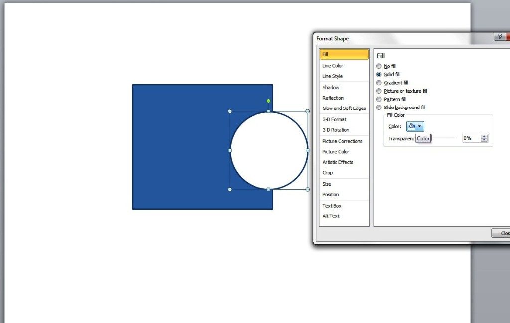
Then, select Line Color and tick No line to remove the oval’s line border.

creating jigzaw puzzle piece | select Line Color and tick No line to remove the oval’s line border.


Select both shapes ( you can do this by pressing the shift key while selecting the two) and click on Group. Then, select Group.

creating jigsaw puzzle piece
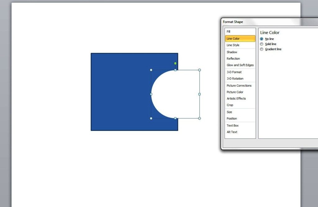
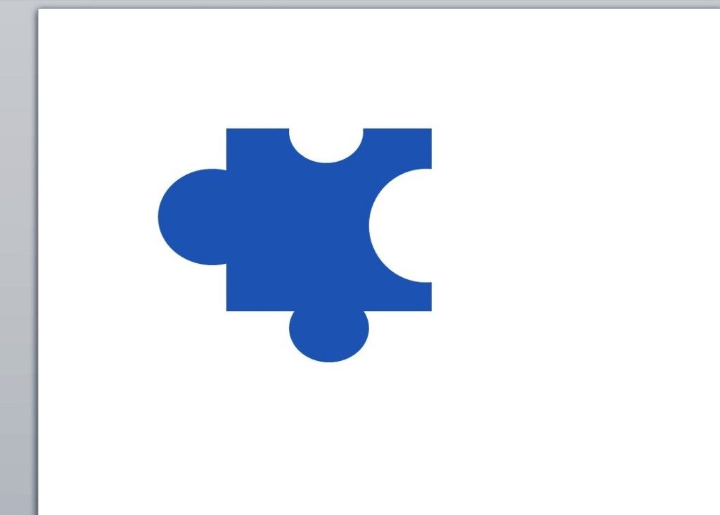
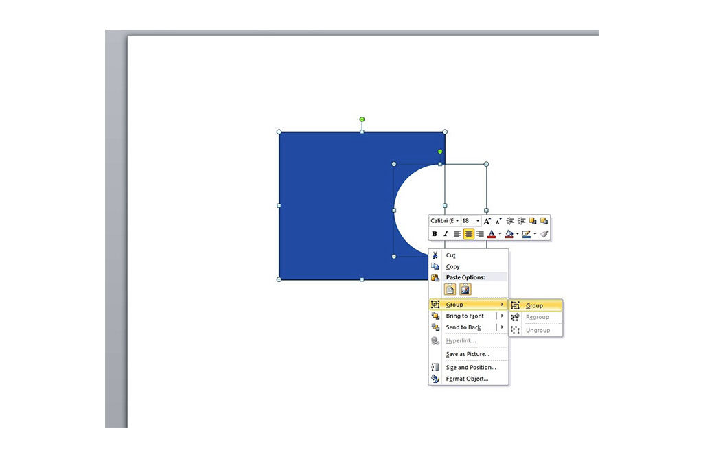
There you have it. You’re almost done. You just need to add a few more details by basically repeating the previous steps to make it look like an actual jigsaw puzzle piece


creating jigzaw puzzle piece… like this:

creating jigzaw puzzle pieceTo complete the design, simply create the next portion of the puzzle piece by adding a new oval shape but without shading it with a white fill.

Using jigsaw puzzle pieces as presentation tools is a creative way to get your message across. They can help you make your point as you piece together different parts of your project in your presentation. With this simple tutorial, you will be able to create your own jigsaw pieces to enhance the impact of your slides.


Beyond Basic: Unleashing Your Creativity with PowerPoint Timelines

One of the most commonly used diagrams in business presentations is the timeline. Many companies, for example, use it to illustrate the highlights of their organization’s growth. Timelines are also great for project management as they allow teams to know the milestones they need to achieve along with the targeted schedule.

A simple way to create a timeline is to use visual elements such as arrows, chevrons, or pentagons along with the table tools. Even if you don’t have an extensive background in creating PowerPoint, you can make your own timeline using those shapes and tools. With just a few tweaks, you can use them to enhance the impact of your timeline.

Here are a couple of steps to follow in creating a basic PowerPoint timeline using a table and some simple shapes.

Draw a Table

The first thing to do is to open a blank presentation in PowerPoint and then draw a table. It’s up to you to decide on the number of rows and columns. You may also apply some colors and styles to enhance the appearance of your table.

table

Create the Shapes

At this point, you will need two shape designs: the Chevron and Pentagon. Both of these shapes will help illustrate your activities or milestones. On the other hand, the Pentagon is a handy shape to show the initial activity as it has an arrow effect that appears only in the right side. The Chevron shape is suitable for the succeeding activities due to the arrow effect in both sides, providing an impression of movement or progress.


pentagon

Pentagon

chevron

Chevrons

Draw the Shapes on the Table

Lastly, draw the shape designs on the table accordingly. You will assign each shape an activity, which corresponds to certain tasks in your timeline. A Gantt diagram is a type of chart where you can adapt this basic design. You will just have to add some more activities or milestones. This timeline is also useful for other project planning presentations.

basic powerpoint timeline

The Takeaway

Whenever there’s a need for a graphical representation of a series of events, you can expect timelines to come in handy. You may even use one to represent your own personal milestones.

This basic design is a good start. With more practice and learning, you’ll be able to create more complicated timeline designs in no time.

Reference

Gantt. Accessed May 9, 2014.

TED Talks You Should Be Watching Right Now

The TED (Technology, Education, Design) conferences have been around for about three decades. It was only in 2006, however, when the rest of the world became aware of it. Since going mainstream, the organizers have been streaming TED talks online for free.

A number of these streaming videos have earned over twenty million views – and continue to do so each day. That’s how popular these conferences have become. Apart from providing the audience with inspiration on various topics, the talks have also set the standard for public speaking and presentation.

Under the motto “ideas worth spreading,” each TED talk is meant to engage, inform, and educate. If you haven’t seen any of the talks, we suggest that you take some time to view them. After all, they generally run for only 18 minutes. As an introduction, here are three of the most popular TED talks that you should check out now:

How Schools Kill Creativity

by Sir Ken Robinson (author/educator)

Sir Ken Robinson makes a case for an education system that promotes creativity, pointing out that the current system does not recognize the talents that are innate to school children.

“The consequence is that many highly talented, brilliant, creative people think they’re not because the thing they were good at in school wasn’t valued, or was actually stigmatized.”

Your Body Language Shapes Who You Are

by Amy Cuddy (social psychologist)

Our non-verbal expressions, thoughts, and feelings affect us on a personal level. That’s according to TED speaker Amy Cuddy. And she may have a point. Peppered with personal anecdotes, Cuddy’s talk is very empowering especially to individuals who experience social anxiety and internal doubts.

“Before you go into the next stressful evaluative situation… configure your brain to cope the best in that situation. Get your testosterone up. Get your cortisol down. Don’t leave that situation feeling like, oh, I didn’t show them who I am. Leave that situation feeling like, oh, I really feel like I got to say who I am and show who I am.”

How Great Leaders Inspire Action

by Simon Sinek (leadership expert)

Simon Sinek believes that telling people our driving purpose, our values, and beliefs allow us to make a deeper connection with people. A connection that is more meaningful than functional benefits can contribute. Somehow, it makes sense as it inspires sincere loyalty.

“People don’t buy what you do; they buy why you do it. And if you talk about what you believe, you will attract those who believe what you believe.”

Knowledge is Power

Not everybody has an innate ability to inspire and move people. But it’s also a skill that can be learned. And learning from great speakers is one way to honing your own speech communication skills. TED offers a fountain of knowledge that’s readily available both for aspiring speakers and casual passersby who simply want to be inspired.

Improve your public speaking skills and become a better speaker by taking a tip from the most motivating talks and applying them to your own pitch.


Featured Image: TED via flickr.com

Pitchbook Design: How to Make it Work

A pitch book is a valuable tool that investment bankers, asset managers, and financial advisors use to present an investment opportunity. Its main purpose is to focus the attention of prospective investors on a number of key points. After the meeting, the pitch book may also serve as a “leave behind” document that prospects will use for reference.

Although they’re usually printed out, pitch books work perfectly well as slide decks. Regardless of the platform, your pitchbook should be accurate and well-organized in presenting information.

There really isn’t one exact way to make a pitch book although there are some basic things that firms should keep in mind. For starters, you need to identify your key points and your audience. But aside from those, another important thing to consider is design.

Design’s Role

According to gyroVoice‘s Adam Swann, design is a key component simply because humans – no matter how high they are in the corporate ladder – are generally influenced by appearances. You’ll see this in trade shows. Booths with striking marketing collaterals and demo stations mostly outshine those with better yet poorly marketed products.

Pitch books should also be as attention-grabbing although a bit more professional. Below are key elements that will make your pitchbook – and your firm – look attractive to prospects:

Appropriate Colors

A well-designed pitchbook leaves a lasting impression. Using the right colors can help you achieve that. It also doesn’t hurt that colors stimulate the mind better than plain black-and-white. Just consider your choices carefully to keep your slides or pages from looking unprofessional. The best thing to do is use the ones that are consistent with your logo and other branding initiatives.

Just consider your choices carefully to keep your slides or pages from looking unprofessional. The best thing to do is use the ones that are consistent with your logo and other branding initiatives.

Eye-catching Graphics

Pitch books tend to get a bit text-heavy or too technical what with all the financial facts and figures. You can engage your audience better by including relevant graphics or imagery. Apart from helping your prospects identify with what you have to say, this strategy allows you to highlight your key points with ease. Avoid overdoing it, though, so you won’t distract your audience.

Apart from helping your prospects identify with what you have to say, this strategy allows you to highlight your key points with ease. Avoid overdoing it, though, so you won’t distract your audience.

Proper Length

Let’s be honest. It’s possible that prospective investors won’t read your pitch book word for word.  They’ll read even less during a live presentation. The ideal length would be between 10-20 slides, each with a word count of 125 or less. Make it as concise as possible.

Try not to include so much detail – that is what the appendix is for. And for better flow, introduce only one concept or topic per slide.

Conclusion

Your pitch book’s job is to show your firm’s philosophies, successes, and advantages over the competition. It is also important that you design it well.

You have to assume that your prospects see hundreds of pitchbooks every year. So if yours isn’t well-organized and fails to get to the point, they’ll lose interest quickly. But with a well-designed pitchbook, you’ll be able to stand out and leave a good impression.

References

Choosing the Right Colors for Your PowerPoint Design.” SlideGenius, Inc. June 3, 2014. Accessed
Swann, Adam. “Welcome to the Era of Design.” Forbes. May 3, 2012. Accessed May 8, 2014.

What Makes an Effective PowerPoint Presentation?

An effective PowerPoint presentation can make a lot of difference in facilitating a business meeting or making a sales pitch.

Can you imagine spending the entire time speaking in front of an audience without something to attract their attention? Nothing beats having a visual aid to back you up, not to mention keep your audience awake.

Of course, you need to work on making your PowerPoint powerful enough to communicate your message effectively. So what makes a presentation effective?

Design

In terms of PowerPoint presentation design, the main consideration should be legibility. One of the most common mistakes that many presenters make is stuffing their slides with entire blocks of texts. PowerPoint presentation specialists would advise you to avoid this.

Apart from making the slides look illegible and boring, it creates the impression that you are not prepared. This could put a dent on your professionalism and credibility.

In general, the layout isn’t meant to detract the viewer’s gaze. It should be able to highlight your points. Keep the text large enough for easy reading, with the color contrasting well with the background.

If you’re using images, make sure they don’t detract from the message. They should work to support the text, not overpower it. According to Inc.com‘s Eric Markowitz, consistency is essential in establishing a visually engaging deck. Make sure you know your brand, and you stick to it.

Content

Regardless of the message you want to communicate, you need to make sure that the content is presented clearly. The best way to do this is by organizing whatever you have to say into three main points.

Whatever details you want to include, they should all lead to those points.

Creating an outline of your main points can help you organize the flow of your PowerPoint presentation. It can also help you determine the parts of your talk where slides are necessary so you can avoid overusing them. Presentation slides are extremely useful.

Overusing them, however, might confuse your audience.

Delivery

Whatever you do, remember to talk to your audience and not to your slides. As a mark of a lazy presenter, reading the slides can tune your viewers out. The important thing is to engage your audience by maintaining eye contact as much as possible.

Use your slides only as supporting tools. Just take your main points to heart (without disregarding the amount of time you spend on each of them) and you’re good to go.

PowerPoint is an essential tool for business communicators. It can make your life so much simpler.

Conclusion

No matter how animated you can be or how skillful you insert humorous lines in your script, you need a visual tool to bring your ideas to life.

Hopefully, these three elements should be able to point you to the right direction in creating an effective PowerPoint presentation.

Reference

Markowitz, Eric. “5 Tips for a Great PowerPoint Presentation.” Inc.com. 2011. Accessed May 8, 2014.

-->