Slidegenius, Inc.

3 PowerPoint Techniques: Making Your Ideas PowerPoint-Friendly

PowerPoint slides can help make complex ideas easier to explain. They also allow your audience to grasp everything you say without much difficulty. Keep in mind, though, that you need to employ the right techniques to ensure the success of your presentation. To help you out, check out these common PowerPoint techniques that professional presenters use:

Bullets Instead of Paragraphs

Long paragraphs can make a slide look crowded and confusing. Often, the reason a presenter puts entire blocks of paragraphs on every slide is because he’s too lazy to sort out his main points. Or he intends to read the whole thing in front of his audience.

These shortcuts, however, will create the impression that you are not prepared and worse, unprofessional. As a result, no one will take your presentation seriously. To avoid this scenario, you may want to use bullet points instead of paragraphs.

Here are some important things to remember when using bullet points:

  • They’re short outlines of key points.
  • Leave room for you to expound.
  • Use as few words as possible.

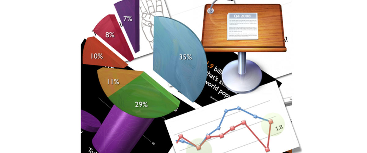
Turn Numerical Data into Graphs

Slides that contain a lot of numbers can be strenuous to look at. As a workaround, some presenters would use a laser pointer to draw attention to the important figures on the slide. However, some people can get easily distracted by it. This may cause you to lose not only your audience’s interest, but also their patience. Presenting numerical data using graphs or charts would be a better solution of compressing data while drawing attention.

To determine the type of graph to use, figure out what your data is all about. Is it showing a trend? Then you may use a horizontal, dotted line graph. This is great for illustrating trends and changes over a certain period of time. Are you making a comparison between two sets of data? Then a bar graph would be handy in this case.

Any data is best illustrated with graphs. Make sure to choose the right type of graph type to help make your message clearer to your audience.

Describe With Images

If you are going to describe things, places, or even people, think about using images instead of texts. With the right photo or graphics, you’ll be able to cut to your audience’s emotions. It will get them engaged in the presentation better than what texts can do.

There you have it. Making your next PowerPoint presentation interesting would be much easier with these three techniques. If you want to make your slides even more powerful but you don’t have the time or expertise, getting the services of PowerPoint specialists would be a great idea.


References

Nordquist, Richard. “How Long Should a Paragraph Be?About.com. Accessed May 7, 2014.
The Art of Graphs and Charts.SlideGenius. April 21, 2014. Accessed May 7, 2014.

The Power of Professionalism: Unleashing the Full Potential of Your Presentations with a PowerPoint Designer

There’s more to creating a PowerPoint presentation than merely choosing a template and inserting stock images. Sure, you can do all those and perhaps more (like adding some custom animations). But these might not be enough to get your message across.

Look, you may know how to drive a car, but it doesn’t automatically qualify you to be in NASCAR, right?

Admittedly, there’s nothing wrong about doing the heavy lifting yourself. When you’ve taken the time to maximize its features, you’d discover that PowerPoint is indeed a powerful tool that you can use to your advantage.

Certain situations, however, really do call for that professional touch. It isn’t a question of aesthetics, but more of a storytelling concern.

Storytelling Advantage

A professional PowerPoint designer understands that stories are what draw an audience to the idea he’s presenting. This means he has to rely on his storytelling skills to communicate effectively. And by storytelling, we don’t mean the way you’d read a tale to little kids before bedtime.

It’s more of how a director spins a yarn on the big screen. After all, the nitty-gritty of putting together a PowerPoint presentation is pretty much like what goes on behind the glitz and glamor of the movies.

You may have the benefit of a strong star power or striking cinematography, but if the storytelling fails to engage the audience, the movie falls flat. And when this happens, the audience can be very unforgiving.

Design Knowledge

As with producing a movie, making a presentation involves a number of elements. In both cases, making all the disparate elements go well together can help you tell a cohesive story.

For example, the use of colors to highlight some points will only work if you align the text in a way that’s comprehensible to your audience. These may be minor details but someone who isn’t familiar with design may miss out on their significance.

Professional PowerPoint designers know when to use (or not to use) the right design elements to support the story they want to tell. They have a great eye for detail that allows them to come up with successful slides. They understand that effective presentation design isn’t just about slapping images on every slide.

Conclusion

There are many different elements that go into making a PowerPoint presentation, and only a professional can bring them all together seamlessly. To pull through with a winning presentation, it’s important that your content, delivery, and design go hand-in-hand.

Without one, you definitely can’t succeed with the other. And that’s what professionals are there for. If you’re running short on time, or you simply want an expert’s opinion, contact a presentation partner you can trust. The returns on this investment will be worth it.


References

Top 10 Websites for Presentation Images.” Presentation Magazine. Accessed May 6, 2014.

Make The Most of Your Email Pitch

Social media interaction may be the “in” thing these days but email still remains a great way to reach prospective customers. Unfortunately, this isn’t exactly a secret to everyone. So expect tough competition for inbox space whenever you send an email pitch.

To keep your email from landing in the junk folder or being labeled spam, think about giving your email strategy a makeover. You can do this by following these tips:

Create a Good Impression

You can always send hundreds of emails to a prospective client at any given time. It is better, however, to think that you only have one chance to deliver your pitch. This way, you wouldn’t slack off but rather, work hard on making a good first impression on your prospect. Failing to make an impression puts you at risk of losing not only that sale, but also the chance to secure future deals with them.

Engage your prospects better by opening with a question or a scenario and ending with a strong call to action. Whatever it is that you want to say, remember to be clear and persuasive. And as with delivering business presentations in person, the pitch you send over the Web should be short, relevant, and direct to the point.

You may also want to highlight the benefits of using your products or services. Just remember to appeal to the emotion instead of simply spewing facts.

Don’t Pressure Your Audience

Your email pitch doesn’t have to pressure the reader into making a purchase right there and then. Instead, it should draw attention to some important points to promote future conversation. A good pitch compels prospects to say “tell me more,” not forces them to hand over their money.

The purpose of sending an email pitch is to generate some kind of response. So when you write your email, make sure that your goals are clear. Do you want your prospects to fill up a query form? Or you want them to visit your shop?

Regardless of your goals, do not pressure your prospects into buying immediately. Here’s a trick: Whenever a sentence you are writing starts to sound too “sales-like,” consider changing or removing it altogether.

Be Personal but Professional

Sending generic emails is a waste of time. People nowadays don’t take too kindly to receiving correspondences that are straight out of a sales template. Make sure to customize your emails according to a specific prospect. This may take more time but it can certainly help improve your response rate.

Potential clients deserve information that is relevant to them. Success Design‘s Mandy Porta suggests that you do your homework and know what exactly these prospects are looking for. Define your customer base, but also look at your competition.

Don’t rely on canned messages. Make your sales presentation fresh, relevant, and directed to the targeted audience specifically. This means everything – from handouts to copy – should be client specific.

Email is a useful tool for reaching your target audience. As long as you do it right, your email pitch can make a difference in establishing a strong relationship with your customers.


Reference

Porta, Mandy. “How to Define Your Target Market.” Inc.com. June 22, 2010. Accessed May 6, 2014.
Nations, Daniel. “Serious Question: What Exactly Is Social Media?About.com. Accessed May 6, 2014.

Applying the Rule of Three to Your Presentations

It is said that everything that comes in threes is perfect. The ability of the number three to be both brief but rhythmic in nature adds to its appeal to the general reader. It’s not too long, but at the same time, it still has substance.

This explains why many people are fascinated with The Rule of Three.

Grouping into Three

Stop, look, and listen; mind, body, and spirit; lights, camera, action; ready, set, go – these sets are just some samples of how we put this rule into use. Generally, you can find The Rule of Three in many stories, anecdotes, speeches, songs, and even jokes.

Basically, this so-called rule makes narratives more engaging and better presented. In telling a joke, for example, you can rely on a series of three points to help you create anticipation. The first two points are the parts that build up the joke while the third one releases the punchline. If you have heard about the one with three men (usually of different nationalities) entering a bar, you have been exposed to the Rule of Three.

The same principle applies to other aspects.

Thinking in Patterns

Have you noticed that when presented in patterns of threes, concepts and ideas somehow become more interesting and memorable? We may not always be aware of it but our mind prefers to view and process things in terms of patterns.

Whatever we do, we tend to look for patterns because, more often than not, they can help simplify things for us. And once we have simplified something, we become better at understanding or applying it into our everyday life.

Applying the Rule

You can apply the Rule of Three to your presentations. As the presenter, it can help you remember your key points as you speak.

Grouping your points into three’s will also let your audience understand and remember them better. Maximize the Rule of Three by dividing your topic into three parts. Naturally, your presentation will have a beginning, middle, and an end.

The beginning gives you the opportunity to break the ice. The middle part is where you expound on your topic. As for the end, wrap things up with an inspiring closing statement.

You can also apply the rule in a different way. If you are promoting a service, highlight its three benefits. If you are introducing a product, draw attention to its three features.

Regardless of your goal, the Rule of Three should be present in your presentation. It allows you to introduce your topic, emphasize it, and make it unforgettable. Furthermore, clustering a train of thought into threes is a great way to simplify things in a way that doesn’t just look good, but also highly effective in making an impact.


References

“Brain Seeks Patterns Where None Exist.” Scientific American Global. October 3, 2008. Accessed May 5, 2014.

Helpful Tools for Designing Presentations

Have you ever been impressed by an exceptional presentation that it made you wonder how the presenter had done it? We’re going to let you in on a secret.

Behind every successful presentation are a bunch of design and productivity tools. To give you some ideas, here are some of the tools for designing presentations that experts commonly use:

For organizing ideas

Taking down notes is an essential part of the brainstorming process to come up with presentation ideas. Many of us, however, are not used to putting thoughts on paper anymore. In this case, a mind mapping software will come in handy. Mind mapping involves drawing bits of information in diagram form instead of writing them in complete sentences. And in place of pen and paper, you can use a software application to create the diagrams.

Xmind is the one of the most popular mind mapping software out there. It’s packed with so many features yet easy to use. Best of all, it’s free.This program lets you create a concept map from scratch or with the help of its templates. Apart from the templates, it also comes with a number of charts that you can choose from for different purposes. This makes Xmind not only one of the best tools for designing presentations but it is also great for improving your productivity in general.

For creating attractive graphs and charts

Data-driven presentations can be hard to pull off. Failure would mean exposing your audience to torturous, boredom-inducing barrage of information. The best workaround would be to use charts and graphs. Creating such visuals can be tiresome, though. Especially for those of us who are not that good with Microsoft Excel. Thankfully, there’s a tool that can serve as a guide in the process of creating charts.

Oomfo is a plugin for Microsoft PowerPoint that helps users create engaging charts in presentations. With its user-friendly interface, you can create a wide range of charts that range – from the basic bar types to the more complicated ones such as the interactive waterfall chart.

For taking screenshots

Incorporating some screenshots in your presentation can help illustrate the points you are trying to make. However, you can’t simply rely on the Print Screen key on your keyboard. Sure, it’s handy but it offers a very limited capability. For one, you will have to paste the captured screenshot into an image editor such as Microsoft Paint or Adobe Photoshop before you can save or manipulate it. For a more efficient solution, you may want to check out Skitch.

Skitch is a screen capture tool that doesn’t just take a screenshot but also allows you to annotate it if you need to clarify your point further. You may choose to instantly save the screenshot as a JPG, BMP, PNG, or TIFF file. Skitch also lets you perform modifications to your screen shots. You can resize, flip, crop, and rotate the resulting images and archive them for use at a later date.

Creating a presentation involves more than just putting together a bunch of PowerPoint slides. With the right tools, a professional presenter can make his presentations remarkable and effective in getting his message across.
-->