Slidegenius, Inc.

Pantone’s Color of the Year and How You Can Use It for Business

Pantone calls itself “the world-renowned authority on color,” and perhaps rightfully so. The company has been in business since 1963, when its founder devised the Pantone Matching System, a standard scheme for identifying and communicating different shades and hues.

At the turn of the millennium, the company launched the project, “Color of the Year.” For seventeen years now, Pantone’s color forecasting has been a self-fulfilling prophecy. Different industries worldwide refer back to it when releasing new trends.

The Art of Color Forecasting

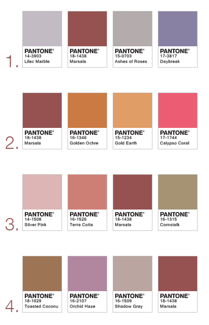
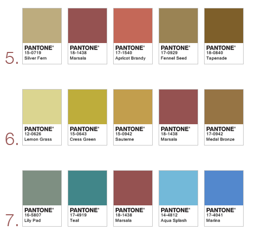
Although Pantone’s Color of the Year is widely anticipated and supported by a number of industries, the science behind it is still obscure. As Pantone senior vice president Ron Potesky said, “The complexity of the logic behind Color of the Year is greater than interior design or fashionit’s a forecast, a reflection of what’s happening in the world.”

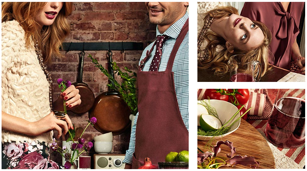
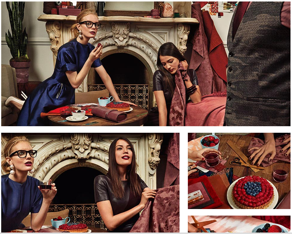
The process of color forecasting is not a simple one, although it’s highly subjective in nature. For months on end, the Pantone team gathers what they call “proof points” from all over the world. They go to car shows, runways, decorator showcases, and other important events that define culture and lifestyle. They try to make sense of meaningful overlaps so they can distill the mood and state of the times into a single color.

Pantone’s yearly selection serves no direct purpose to the consumer world, but its influence can be observed in many sectors. Owing to its longevity and the power of social media, the project has reinvented itself as an authority in color trend selection.

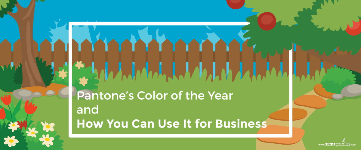
If you’re into the colors game, check out this infographic about Greenery, Pantone’s 2017 Color of the Year.

Colors and business always go hand in hand. The consumer world is about trust and persuasion, and it’s hard to accomplish either or both if your brand is portrayed in a dull and dismal way. Choose a vibrant and fresh palette this yearone that includes Greenery, perhapsand you might just see your customers showing more interest in your business.

Back up your skills with a well-designed PowerPoint presentation by letting our team to assist and offer you a free quote!

Resources:

Beals, Rachel Koning. “Nature and New Beginnings Inform Pantone’s 2017 Color of the Year: Greenery.” Market Watch. December 8, 2015. www.marketwatch.com

Budds, Diana. “Pantone’s New Color of the Year Is Weird and Perfect.” Facto Design. December 8, 2016. www.factodesign.com

Friedman, Vanessa. “Color of 2017? Pantone Picks a Spring Shade.” New York Times. December 8, 2016. www.nytimes.com

Hazzard, Tracy Leigh. “Why Pantone’s Color of 2017 Matters to Your Business.” Inc. December 9, 2016. www.inc.com

Hua, Karen. “Pantone’s Color of the Year 2017 Is Inspired by Nature and Influences Design.” Forbes. December 9, 2016. www.forbes.com

Pasquarelli, Adrianne. “How Pantone Picks Its Color of the Year.” Advertising Age. December 22, 2015. adage.com

Stewart, Jude. “Pantone’s 2017 Color of the Year: Greenery!” Print Mag. December 8, 2016. www.printmag.com

Stock, Kyle. “How Pantone Is Still Turning Color into Money.” Bloomberg. August 27, 2015. www.bloomberg.com

Weiss, Dyanne. “Does Pantone’s Color of the Year Influence Marketing?” Chron. n.d. smallbusiness.chron.com

“Color Can Influence Emotions in a Way that Few Other Mediums Can.” Digital Skratch. n.d. digitalscratch.com

“Color Psychology: How Does Color Affect Us?” Pantone. n.d. www.pantone.com

“Color Psychology: The Emotional Effects of Colors.” Art Therapy. n.d. www.arttherapyblog.com

“Introducing Greenery.” Pantone. n.d. www.pantone.com

“Shinrin Yoku.” Shinrin Yoku. n.d. www.shinrin-yoku.org

Looking for creative presentations that can leverage your business? Enjoy free PowerPoint templates from SlideStore! Sign up today.

PowerPoint Design Inspiration: What To Do With Marsala

Pantone Color Institute, the world’s leading color expert, recently announced their pick for 2015 Color of the Year. While their choice was initially met with some reservations, the warm and earthy Marsala remains an intriguing choice. Thanks to the rich narrative that goes behind the shade, Marsala is sure to inspire designers and creatives of every kind.

Seeing where the trends are heading, presenters should also consider incorporating the rich Marsala into their PowerPoint designs.

The narrative behind the color 

According to Pantone, Marsala represents the hearty and enriching qualities of “a fulfilling meal”. Thanks to its red-brown tones, the color also emanates a “sophisticated, natural earthiness.” The editorial pictures released by Pantone picture an elegant group of friends dining comfortably together.

As stated in the press release by executive director Lee Eiseman,

“Marsala enriches our mind, body and soul, exuding confidence and stability… Much like the fortified wine that gives Marsala its name, this tasteful hue embodies the satisfying richness of a fulfilling meal, while its grounding red-brown roots emanate a sophisticated, natural earthiness. This hearty, yet stylish tone is universally appealing and translates easily to fashion, beauty, industrial design, home furnishings and interiors.”

marsala 02 marsala 03

Following this narrative, Marsala is the perfect color for slides that want to depict a sense of luxury and a down-to-earth feel at the same time.

It’s the perfect choice for presentations and pitches around real estate, apparel, and retail. It will also help if you consider your organization’s own narrative. Think of the qualities that make your brand unique. If it matches with the qualities that are symbolized by Marsala, then Pantone’s choice is an obvious win.

Working Marsala into a color palette

There are plenty of ways to pair Marsala with other colors. Pantone came up with a total of 7 palettes that you can use for inspiration.

As listed on their website, Marsala’s warmth allows it to pop beside neutral colors like taupe and gray. Thanks to its rich undertones, it also works well with the colors amber, umber, as well as shades in golden yellow, green, and blue.

Color Palette: Pantone Color Palette: Pantone 2

To use similar looking palettes for your PowerPoint deck, make sure you temper these shades using a more neutral background. A PowerPoint color theme requires that you choose 2 light colors, 2 dark colors, and 6 accent colors.

Some factors to consider

Because Marsala is a rich and highly-nuanced shade, it’s important that you keep your slides balanced with a more minimalist design. You also need to make sure that the projector you’re using is working well. Busted bulbs might not pick up its wine-inspired tones. You’ll end up with a brownish shade instead. The same is true for printers.

If you plan to turn your presentation into a flipbook, make sure you use a high-quality printer to make sure the color’s integrity is maintained.

Marsala is a rich and vibrant color that tells a complex story.

While it’s primarily expected to appear in fashion, beauty, and interior design, there’s no reason you can’t incorporate it in PowerPoint design. Allow its rich and sensual shades inspire your presentation.

Reference

Basu, Tanya. “The Problem With Pantone’s Color of the Year.” The Atlantic. December 4, 2014. Accessed January 20, 2015.
INTRODUCING MARSALAPANTONE 18-1438.” PANTONE. Accessed January 20, 2015.
Turn Presentations into a Powerful Marketing Tool.” SlideGenius, Inc. July 23, 2014. Accessed January 20, 2015.

All images from Pantone.com

-->