Slidegenius, Inc.

A Shot in the Arm: How to Improve Your Healthcare PowerPoint


PowerPoint presentations are as useful in the medical and healthcare industry as much as in other fields. Whether in the academe or private practice, medical practitioners use healthcare PowerPoint for various presentation purposes. Physicians, for example, may be asked to present to interns as part of a lecture or to peers in seminars. They may even present to members of the community in a volunteer program. There’s only one problem, though. Most physicians and residents are not born presenters. Because of that, they tend to turn a presentation into a note-taking and outlining exercise. They simply pick from the default slide designs without adding an ounce of design creativity.

When tasked to give a talk in front of your colleagues or potential patients in a community, the success of your healthcare PowerPoint depends on two factors. These are: your ability to communicate your message clearly and the way you capture your audience’s attention. You can achieve them by keeping the following tips in mind:

Organize your presentation

Flesh out the specific topics that you need to discuss. Determine at least three important points and then use these points to fill up each of you slides. As much as possible, limit it to one point per slide. This will keep your slides from looking cluttered while improving readability.


Healthcare

Make it visual

Admittedly, healthcare PowerPoint presentations are not exactly the most exciting type of presentations out there. This doesn’t mean, however, that you can’t do something about it. To make your slides more appealing visually, try to use minimal text and more images. You can pick any images you like, as long as they are relevant to your topic and of high quality. This means that you should stay away from random, pixelated, and blurred clip art.

healthcare-powerpoint


Practice, practice, and more practice

The best public speakers are usually not born with all the necessary presentation skills. Many of them are able to engage audiences, maintain attention, and present valuable information because of hours and hours of practice. Apart from practicing your delivery, you should also practice the way you intend to use your healthcare PowerPoint slides. Take note of every timing and every pause. Remember, your PowerPoint is merely a tool. How you wield your tool can make a difference in achieving  presentation success as a medical lecturer/trainer.

Mastering the Art of Healthcare Presentations: 3 Practical Tips for Captivating Audiences

Effective and engaging presentations can be a challenging achievement to attain. But the challenge doubles with healthcare presentations, when details of the topic at hand sound alien to the general public.

Whether you’re about to give a lecture in a seminar, inform the market about a new medical breakthrough, or pitch to potential investors, you can prevent your audience from nodding off to sleep. Here are three practical tips to make your healthcare presentations engaging.

Here are three practical tips to make your healthcare presentations engaging.

Be accessible

It’s easy to lose your audience to technical terms and concepts, so it’s important to keep your healthcare presentations accessible. You can do this in three simple ways:

1.) Use PowerPoint slides

Well-designed PowerPoint slides can help your audience visualize the structure of your presentation, preventing them from feeling lost or confused. Use large font sizes (at least 30 points, according to keynote speaker and renowned venture capitalist, Guy Kawasaki) and keep the number of slides to a minimum. Create an attractive but simple PowerPoint design by using color schemes, backgrounds, and fonts consistently.

2.) Explain difficult concepts with illustrations, stories, and metaphors 

Healthcare presentations are informative in nature, so it’s impossible to completely eradicate the use of technical terms. Illustrate difficult concepts with flowcharts or graphs. You can also try to relate these concepts through stories from your own experience or clever metaphors.

3.) Explain jargon in layman’s terms

Similarly, try your to avoid using jargon. If you have to, explain them in a language that’s easy to understand.

Get straight to the point 

Condense your talk into concise points that are pertinent to your audience’s needs. Don’t waste your time explaining a complicated concept, because it can easily lead you off tangent.

Keep your talking points short but significant by answering What’s, Why’s, and How’s.

Prepare a complete handout

Presenters often make the crucial mistake of giving out printed copies of their slides as handouts. While this may work sometimes, remember that there is a difference between the two:

Your PowerPoint slides are visual aids that help enhance your presentation. Handouts are for your audience to refer back to after your presentation.

A complete handout has all the information you discussed organized into neat sections, plus the handy illustrations you used to explain complicated concepts.

You can also use it as a ‘footnote’ section by expounding on some details you edited out of your pitch.

Conclusion

Each presentation type is unique. Healthcare presentations may be more technical and specific than others, but that doesn’t mean it should be less engaging.

Make your pitch and your deck more accessible to your audience, be as straightforward as possible to keep your content compact, and don’t forget to prepare a handout that delineates each key point.

Deliver an effective healthcare presentation with these tips!

PowerPoint Best Practices for Keeping Audience Attention

There is no such thing as an attention span. There is only the quality of what you are viewing.  This whole idea of an attention span is, I think, a misnomer. People have an infinite attention span if you are entertaining them.” – Jerry Seinfeld

The primary goal in delivering a presentation is to get the core message across. Then, hopefully, your audience will respond accordingly (consider your pitch, make a purchase, apply what they’ve learn from you, etc.). Your call to action, however, is only as effective as your efforts to capture and maintain audience attention for the entire presentation.

We can’t say if we totally agree with Jerry Seinfeld’s view on the existence of attention span. On the average, Internet videos are viewed for only 2.7 minutes before the user moves on to another video or website. With that, it isn’t hard to imagine what the stats are in terms of live presentations that offer no “stop” or “next” button for you to click.

He has a point, however, when it comes to what holds the audience’s attention – the quality of what they are viewing. So, to ensure the quality of your presentation, below are some PowerPoint best practices that you may want to keep in mind:

One message, one slide

Accept the fact that not all people can retain chunks of new, unrelated information at a time. So avoid overstuffing your presentation. To let your audience see your key points at a glance, each slide should have one very short sentence that stands out.

If an audience member was only able to pay attention to those sentences, he or she will still go home with an understanding of your key points.

Writing one message per slide also allows you to keep track of your overall narrative easily. This is because every slide gives you a logical summary of each point you’re trying to make.

Show more, tell less

Studies have proven that many of us are visual learners. This means that there are people who retain information better when it is displayed in front of them, as opposed to simply hearing it.

One of the most important PowerPoint best practices to remember is to choose relevant images and insert them appropriately in your slides. With appropriately, we mean not adding photos or graphics just for the heck of it.

Make sure that the images are relevant, support your points, and do not clutter a slide’s layout.

Essentials in, surplus out

Most award-winning PowerPoint designs have one thing in common – simplicity. Their designers had the good sense to know which items to omit and which ones to include.

This is important because for one thing, it keeps your slides from being too cluttered. This practice also gives you the opportunity to display your expertise on your subject by talking about it in as spontaneous manner as possible – not by merely reading about it from the slides. Having your entire message displayed on the slides won’t exactly add to your credibility or to the success of your presentation.

Your PowerPoint should provide you with support. Remember, it’s a tool, and you are the messenger (not the other way around).


References

Visual Teaching Alliance. Accessed June 16, 2014.
Attention Span Statistics.” Statistic Brain. Accessed June 16, 2014.
Steinberg, Brian. “Questions For… Jerry Seinfeld.” WSJ. Accessed June 16, 2014.

Numbers Abound: Tips for Designing Financial PowerPoint Presentations

Designing financial PowerPoint presentations is a balancing act.

As the presenter, it’s easier to simply copy data from spreadsheets and paste them onto slides. But your audience might find the barrage of numbers overwhelming and hard to understand.

On the flip side, you can try to engage bored audience members with graphics and slide transitions. But use too much and your financial PowerPoint might end up looking ill-designed and uninspired.

How do you find the balance between ‘too much information’ and ‘too many distractions’?

Here are a few tips to keep in mind when you’re preparing a financial PowerPoint presentation.

Identify the financial data that moves your narrative forward

A financial PowerPoint presentation shouldn’t just be about showing off balance sheets, profit-and-loss statements, or market reports.

Consider these questions: What is the story that your audience came to hear? What is the narrative behind your presentation? Are you presenting the story of your company’s successful attempt to meet market challenges? Or are you talking about the promising growth of a start-up client company?

Think of the data you have as details in a story. Identify the scenario and decide which of your data is the most crucial to your story and the audience.

Illustrate numbers through diagrams, charts, and graphs

Once you’ve decided on the most important data, you can begin to translate numbers into illustrations. Doing so will help your audience follow patterns and trends that might otherwise seem confusing.

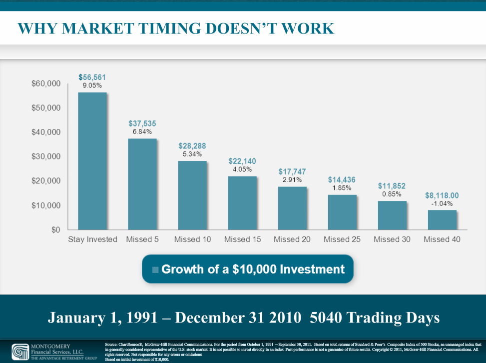
Visualize your data through diagrams, charts, and graphs. It’s also a great way to condense useful information into one slide. Data that spans several years can be summarized into a bar graph.

A financial PowerPoint slide designed by Slide Genius

Keep text to a minimum

Don’t be tempted to explain your illustrations with ten bullet points each. Instead, according to presentation trainer Dave Paradi, what you can do is to write sentences or ‘headlines’ that summarizes key points in the data.

It’s important to keep the text in your financial PowerPoint slides to a minimum. Long-winded paragraphs analyzing your pie charts can prove to be just as overwhelming as the numbers you’ve worked to condense.

Remember: it’s your job to expound on the data you’re presenting. You can’t just let your PowerPoint slides do the talking.

Opt for a design that matches content and context

With over 500 million users, most people are probably tired of seeing generic PowerPoint templates again and again. Instead of using default templates, get creative by customizing your financial PowerPoint slides.

Opt for a design that matches your content and the context of your presentation. For example, you can use color schemes that match your client’s logo if you’re presenting about their financial statements.

Here are a few other things to remember:

1. Font Type & Size

Choose font types that are easy to read. You don’t always have to go for the classic Arial or Times New Roman, but try to avoid blocky and ornate fonts unless they’re big enough to read. Venture capitalist Guy Kawasaki explains that the general rule for font size is 30 points or greater. This font size is readable for most audiences, which makes it safest to use.

2. Contrasting Backgrounds & Colors

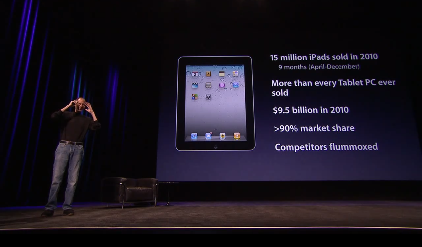
The color of your background should contrast with everything else on your slides—from font colors to the colors you use in your graphs. You can’t go wrong with using a dark blue background and white text (like Steve Jobs). You can also opt for a white background with black text. This option is easier to see in a bright room, so you won’t have to dim too many lights during your presentation.

For a time-saving, optimized financial presentation, consider working with professional PowerPoint designers. SlideGenius has an extensive portfolio of financial PowerPoint presentations.


References

“The 10/20/30 Rule of PowerPoint.” Guy Kawasaki. December 30, 2005. Accessed June 16, 2014.
Paradi, David. “Presenting Financial Data: Put Your Numbers on a Diet.” Presentation Xpert. Accessed June 16, 2014.

Pigment of the Imagination: How to Choose PowerPoint Color Schemes

A color scheme makes a huge difference in your PowerPoint design. You might not give it much thought, but colors evoke psychological responses in your audience, that may either make or break your presentation. Using the appropriate combinations can win people over and visually engage them.

But with such a wide selection to choose from, how can you know which colors work together?

A little research and experimentation can help you choose the perfect PowerPoint color schemes. Here’s a little nudge in the right direction:

You can find inspiration everywhere

Inspiration for color combinations can be found anywhere. Because color is so integral to our everyday lives, you’re bound to come across something that will work out for you.

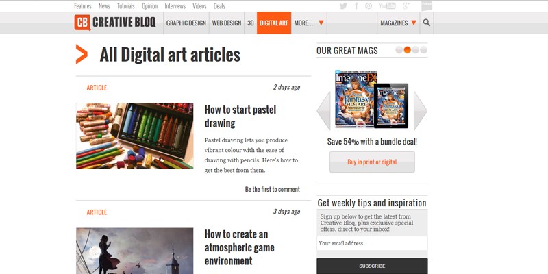
Observe the colors on your favorite website.

2016-02-10-Replace_Pigment_of_the_Imagination_2014

Copy the colors that decorate your favorite outfit.

ffce912852754f8946d9f415b0f0ed9b
Image: ModCloth

What colors are on the cover of the book you’re currently reading?

gabriel-garcia-marquez-one-hundred-years-of-solitude-04
Image: Goodreads

The best way to go about it is to consider the subject and core message of your presentation, and then find something related to what you want to say. If you’re not one for spontaneity when it comes to your deck, going with your company colors is a safe way of using color combinations on your deck will remind the audience of your brand.

Resources and tools

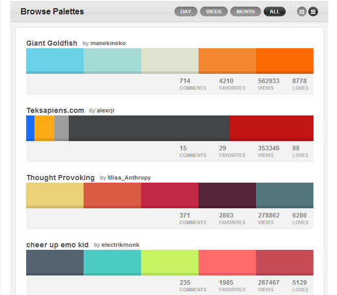
There’s also a rich trove of resources online that you can tap into for some professional, matching schemes. You can visit sites such as COLOURlovers to find the latest trends in colors, palettes, and patterns. Below are some of their expertly arranged palettes for your use:

Color palettes from COLOURlovers

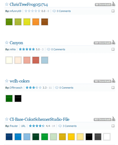
Another option is ColorSchemer.com. The website has an extensive ‘scheme gallery’ composed of color combos created by the website’s community through its free software.

Palettes from ColorSchemers

Inspiration comes in everywhere, but remember that having a tried and tested color scheme to apply on your deck can ease some of the trouble for you.

Other things to keep in mind

Once you’ve made the initial color choices, there are still other factors to keep in mind.

It’s important that your presentation is legible, so the colors you choose for font and background should contrast. Similarly, make sure that the pictures you use do not clash with the color scheme you’ve chosen.

iPad-2-Keynote-by-Steve-Jobs
Image: designsojourn.com

You may also have to cut a few of the colors from your final palette. It’s best to use a few different colors in your PowerPoint presentation in order to avoid overwhelming your audience. You don’t have to limit yourself to only two colors, but don’t go with 10!

If you don’t have time to pore over a deck right before an important presentation, you can always ask the help of professional PowerPoint designers to whip up an amazingly color-coordinated deck just for you.


Featured Image: Carmelo Speltino via flickr

Map Out Your Presentation With Mind Mapping

Designing an effective PowerPoint requires careful planning and preparation. You can start by writing an outline with a pen and paper.

If you’re more comfortable using a computer, then you may use a word processor such as Microsoft Word. If you want to take it up a notch, think about using a mind mapping tool instead.

Visual Representations

Mind mapping offers you a great way to brainstorm and give your ideas visual representations. It’s a process that combines imagery, color, and strategic arrangement of other visual elements.

Compared to manual note-taking, mind mapping has been proven to improve information recall mostly due to the use of images. With a large number of the population leaning towards visual learning, graphic representations of data is more easily processed than just walls of text.

In other words, it’s a perfect way not just to plan but also to deliver your PowerPoint presentation. It’s not just for your audience’s eyes, either. You yourself can benefit from this by looking at organized ideas that are easier to digest.

Powerful Program

Although you can create mind maps manually, there are different mind mapping tools available online that you can either purchase or download for free. Leverage your mind mapping skills with the use of powerful programs that help you organize your ideas more efficiently.

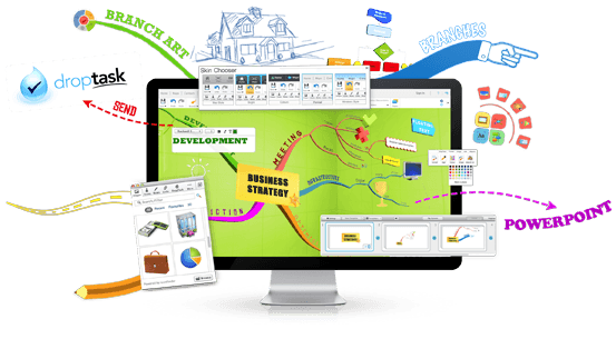
iMindMap, for example, is one of the most powerful mind mapping programs available today.

With this tool, you can create topic “branches” organically as if you are manually drawing a visual map. The program will draw and arrange the topics as you focus on typing the keywords of each topic.

mind mapping

One of the best features of iMindMap is its presentation mode. This feature animates your maps easily, allowing branches of topics to grow spontaneously. It also features a “presenter” view.

As you present, your own notes are made visible to you along with the menu bar that controls the presentation. What your audience can see, however, are just your mind maps.

iMindMap also offers the capability to make a recording of your voice, which you can then attach to a map branch.

Exportable Ideas

Another advantage of using mind mapping software is that your ideas become more exportable and accessible to collaborators.

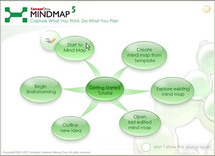
ConceptDraw is an example of an efficient mind mapping tool that works by connecting mind maps and business processes such as sending tweets and making a presentation.

Using ConceptDraw’s presentation mode, you may zoom or pan around your mind map and collapse or expand the nodes in ways that would make sense to your audience.

conceptdraw

If you prefer to deliver your presentation using PowerPoint, you can simply export your mind map, either as a text outline or as a series of slides.

There’s a good reason why mind mapping is suitable for creating presentation. It can engage the audience’s attention faster, thanks to its visual structure. The process also allows you, the presenter, to explore ideas in a larger space.


Reference

Mind Maps®: A Powerful Approach to Note-Taking.” MindTools.com. Accessed June 13, 2014.

Captivating Comeback: Reigniting Your Audience’s Interest

Presenters wouldn’t want to bore the audience with a winding speech with innumerable slides to match. There are times, however, when you just have to face an indifferent audience.

Teachers and lecturers especially encounter this type of problem most of the time. You may have prepared a 20-minute presentation, but if it feels like your target is indifferent to you from the start, then your preparation is all for naught.

If you’ve been in such situation, it might not be your fault after all. The next time you encounter that type of audience, here are some things you can do:

Be Aware of Warning Signs

When you get caught up in your presentation, you might end up rambling. This can cause you to be oblivious to the fact that your audience is tuning out.

In your next pitch, take note of the signs that people’s eyes are wandering off. They could be fidgeting or shifting in their seats. Some may even be squirming.

Those who are truly bored may be checking their watches and surreptitiously looking for the exit signs. To save your presentation, you need to be aware of such signals so you can react accordingly.

Connect Using the Right Body Language

According to body language expert Carol Kinsey Goman, when audience attention falters, non-verbal communication can play a significant part in keeping them engaged.

A strong eye contact, for example, can help jolt an audience member into paying attention. You may also use your voice to project and maintain control. In your spare time, try to learn how to vary the pitch and loudness of your voice.

Additionally, make sure to maintain the right stance. This will help you convey confidence and authority.

Break your Pattern

If you’ve been droning on for a few minutes, think about pausing for about 10 seconds. Doing so will surely get everyone to pay attention.

They’ll be surprised that you stopped. This will create anticipation on what you are going to say next.

Practice your Opener

Your slides won’t do everything for you. You can’t just show them to your audience while you go on reading from your notes.

You may not notice it but how well you prepare can affect how you hold your audience’s attention. Speech coach Sims Wyeth suggests that one of the most important parts you should master is delivering a great opener.

When you’re successful with your opener, you will be able to create a framework that prepares your audience for what they are about to hear.

Conclusion

Even the best presenters have difficulty commanding audience attention 100% of the time. It’s inevitable that people’s attention spans will stray from you.

However, there are ways to reel them back in. Surprise them by breaking your speech pattern, or starting off on the right foot. Impress them with a good pitch, and guarantee all eyes trained on you for the rest of your speech.


References

Goman, Carol Kinsey. “10 Simple and Powerful Body Language Tips for 2013.” Forbes. Accessed June 12, 2014.
Wyeth, Sims. “10 Ways Great Speakers Capture People’s Attention.” Inc.com. March 05, 2014. Accessed June 12, 2014.

Failure to Communicate: PowerPoint Verbal Crutches to Avoid

“What we’ve got here is a failure to communicate.”

While PowerPoint presentations are more visually oriented, your words can still prove to be powerful. Wield them properly and you’ll win your audience.

Give into these well-worn crutches and you’ll hardly make an impression.

Enter the Jargon

Jargon is a type of language composed of words and phrases that can be very informal and restricted to a particular group of people. Many people make the mistake of using industry jargon whenever they deliver a presentation, thinking they will sound smarter and more “businessy.”  The problem, however, is that you risk alienating, or even irritating, your audience if they didn’t understand what you are talking about.

Instead of saying, ““In the past fiscal year, we’ve leveraged strategic thinking to maximize our savings and capitalize on double-ply bathroom tissue as a substitute for the singly-ply variant.” You can just say, “We saved money last year by using double-ply bathroom tissues instead of single-ply ones.” That isn’t so hard, is it?

Cliché of the Titans

Clichés are nothing but tired metaphors. They aren’t just products of laziness, they also stem from the presenter’s lack of respect for the audience. If you value the audience’s attention, you’d do better than spit out uninspired phrases.

For what it’s worth, avoid clichés like the plague. If you can’t think outside the box, then go the extra mile by tweaking the phrasing to make them less cliché sounding.

In addition to verbal clichés, you may also want to avoid “visual clichés.” Visual clichés don’t do anything to let your presentation stand out.

Such images are now so common that it’s likely your audience expects to see them on your slides. Subvert their expectation by showing something new or different. So instead of showing a handshake stock photo, think about using a picture of Sherlock Holmes and John Watson instead.

Terminal Verbosity

Instead of saying “meeting,” you say, “organizational strategic planning and assessment.” Because you believe that big, intimidating words make you sound important. You may be overly compensating for something but this will simply leave your audience with the impression that you are arrogant and pretentious. Besides, adding more to your words only diminishes clarity.

Mark Twain had said it better, “The more you explain it, the more I don’t understand it.”

The point of your presentation is to share information and be understood. Alienating your audience with these verbal crutches would defeat your purpose. Leave a great impression by bringing original thoughts and  elegant simplicity into your presentation.

Conclusion

When it comes to the boardroom, say what you have to say. Avoid padding it with too much rhetoric. You may use jargon in conversations with colleagues or when writing business letters.

But your presentation is not the place for them. Pausing just to explain specific terms can take up much of your presentation time. So why not use plain, understandable English instead?


Reference

Financial Buzz Words Terms.” Investopedia. Accessed June 12, 2014.

How to Find Pictures for PowerPoint Presentations in the Vast Expanse of the Internet

As the age old adage goes, “a picture is worth a thousand words.”

We previously tackled the importance of reducing text in your PowerPoint slides. Your presentation needs to be visually engaging. A block of text that simply mimics your speech is an easy way to lose your audience. Instead, stimulate their brain’s ability to easily pick up visual cues by using carefully selected pictures.

The best image to use is the one that summarizes what you’d normally try to say in five bullet points.

The Internet is a great resource to find pictures for PowerPoint presentations, but practice caution.

Not everything that comes up in your Google image search is advisable to use. You might be in danger of infringing copyrighted materials without even knowing it!

So, how do you find perfectly legal pictures for PowerPoint presentations, then? Where should you go without having to worry about possible complications?

Sites to Get Your Pictures From

shutterstock screencap

1) Royalty Free Images

In exchange for a one-time fee, you can continuously use a copyrighted picture according to agreed upon terms without having to pay license fees in the future. A royalty-free license is common in stock photography.

512px-CC-logo.svg

2) Creative Commons-licensed content

You can use a photo with a creative commons (CC) license for free under specific conditions. There are different types of CC licenses, but the most important thing you’ll need to remember is Attribution. You’ll have to give credit to whoever owns the picture you decide to use.

Mona_Lisa,_by_Leonardo_da_Vinci,_from_C2RMF_retouched crop

3) Images in the public domain

An image in the public domain doesn’t hold any license, so it’s free to use. Works are considered to be part of the public domain if it meets the following:

      • the copyright has expired, or the work was never granted a valid copyright in the first place
      • the creator has relegated the work to the public domain
      • when they’re ineligible for copyright based on this criteria.

How do you find pictures like these? 

If you’d like pictures for PowerPoint presentations that are appropriate to use, don’t look for them using Google or Bing.

A huge selection of CC-licensed content can be found on Flickr. The search tool can be a little tricky, though, so you can use sites that find CC content like CC Search and Wikimedia Commons. Another option is to visit photo-hosting site 500px, which gathers all CC-licensed pictures in one place.

While there are no specialized searches to find photos in the public domain, Wikimedia Commons labels each picture with its license information. Public domain photos are tagged with this symbol:

PD-icon.svg

If, however, you’re willing to splurge a few couple of bucks, you can get royalty free images from websites like Getty ImagesiStock, and Shutterstock. While you might have to stretch your budget, the photos you get from these sites usually look more professional and polished.


References

Vision.” Brain Rules. Accessed June 12, 2014.
What Is in the Public Domain, Always, besides Ideas?PublicSherpa. Accessed June 12, 2014.


Featured Image by HikingArtist from Wikimedia.org 

Learning the Basics of Investment Banking Pitch Books

Investment banks and firms make use of ‘pitch books’ to secure potential clients. Technically, it’s defined as a marketing device that goes into detail about the attributes and services of a firm. Most investment analysts who are tasked to create pitch books make use of PowerPoint. For this reason, the term ‘pitch book’ can also refer to PowerPoint presentations created to attract new clients.

Making investment banking pitch books can be easily become daunting. It requires a lot of careful preparation and attention to detail. Delve into the basics of making these pitch books to get started.

Three Types:

There are several types of investment banking pitch books, differentiated depending on purpose and content. We can categorize them into three types:

1. Market Overviews/Bank Introductions

Purpose: This type of pitch book is used to introduce your bank/firm to potential clients, and to give them updates on recent market trends and deals.

Content: Information about that will help form a favorable impression to potential clients, such as:

  • Background and history
  • Vision and mission,
  • Organizational structure
  • Company size
  • Recent achievements and successful deals
  • Market overview/update
2. Deal Pitch Book

Purpose: The deal pitch book is made specifically for a particular deal, such as IPOs, debt issuance, and M&A (mergers and acquisitions).

Content: Details that will allow potential clients to see how well you operate. Include data that will support your claims. This might include the following:

  • Market growth rate
  • Relevant financial models
  • List of potential buyers, acquisition candidates, and financial sponsors with detailed descriptions (if applicable)
3. Management Presentations

Purpose: Management presentations are used to pitch newly-secured clients to investors.

Content: Important info about your client company that will allow investors to become familiar with them. Include their—

  • Background
  • Market overview
  • Products and services
  • Customers
  • Organizational chart
  • Financial performance
  • Expansion and growth opportunities

There are also sub-types that go into more specific purposes. Some of these types are the combo/scenario analysis pitch book, fairness opinions, and client update presentations.

Turning data into a PowerPoint

Keep in mind that regardless of the type of pitch book you’re making, your presentation must contain all of the following:

  • A title slide containing the date of the presentation, a general description of the content of your pitch, and your firm’s or client’s logo;
  • A table of contents completely listing all the different sections in your presentation; and
  • Slides that contain salient points and figures presented through graphs/diagrams.

PowerPoint presentations in the investment banking industry follow a different set of conventions and are more formal. There are certain things you can’t include that someone in the creative industry might tell you to add. You don’t have to include animations or transition effects.

Graphics should only be added to emphasize your key points. Color schemes should be kept simple and professional-looking.

The Final Word

While the length of a pitch book varies for each situation, it should typically be around 10-20 slides. This means you have to be critical of the information you’ll include. It’s important that you’re concise so you don’t end up with a pitch book that is tediously long and garbled.

Organize your content by allotting one slide per concept you have to discuss. You can use an appendix to expound on these concepts with additional tables, models, and the like.

There really isn’t one formulaic way to make an investment banking pitch book. Much of the work depends on various factors, like your company culture or who you’ll be pitching to.

What you should remember is that a pitch book is responsible for driving business into your firm.


Reference

Pitchbook Definition.” Investopedia. 2005. Accessed June 12, 2014.


Featured Image by Ken Teegardin on flickr

-->