Data visualization is a powerful force.
Make no mistake: when data is involved, a visual is essential. A well-designed presentation with ample data visualization is a surefire way to get your message across.
Plus, it’ll keep people engaged.
Nothing puts people to sleep faster than someone rattling off statistics or trying to explain quantitative change over time.
Having a contextual representation of the data helps presenters stimulate their audience, giving onlookers a reason to pay attention.
A quarterly boardroom presentation, the pitch for a merger or acquisition, an appeal to stakeholders, the next big company initiative—whatever the subject of your business presentation, it demands data visualization.
Without something to look at, your message may fall on deaf ears.
What is Data Visualization?
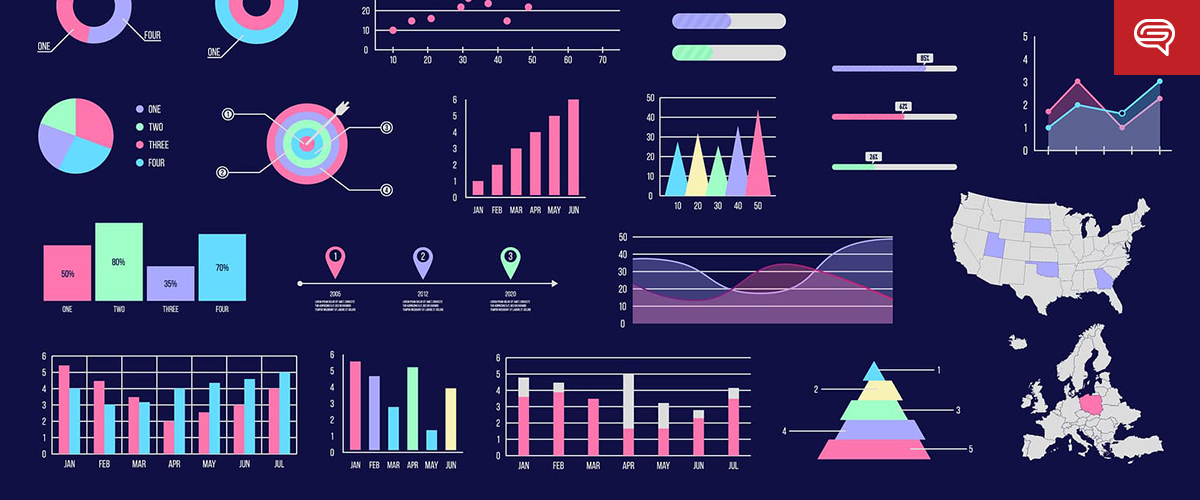
Data visualization turns quantifiable data into something more than graphs, tables and charts. It creates comparisons through images and makes sense of data beyond numbers.
More than turning numbers into images, data visualization connects them with three important context variables: Meaning, Cause and Dependency. These variables help audiences better understand what they’re seeing and connect them to the greater concept.
Why is Data Visualization Critical?
Humans are visual creatures! Hence, every business presentation involving data needs a slideshow.
Engaging your audience’s sense of sight, along with aural stimulation, is a twofold way to get your point across—especially if it involves data and figures.
Take a moment to think about math.
Most people can’t do a multi-step equation in their head. But, give them a piece of paper and a pencil and they’ll have no trouble working it out in short order.
The people viewing your business presentation may not have to solve any problems, but the concept is the same. Without visualization, it’s hard to come to a conclusion or contextualize data. Creating a visual makes it easier for the brain to digest information.
Take the following simple statement, for example:
“Customers were four times more likely to buy Product X than Product Y, and nine times more likely than Product Z.”
Hearing that statement might raise a few eyebrows, but it’s hard to visualize what that means in your head. Instead, attach those figures to pictures of the products or proportionate representations, and you’ve created context.
Suddenly, the data is about more than numbers—it’s about competition. It’s about market share. It’s about dominance.
Example: Visualizing the World’s Biggest Data Breaches
Here’s a great visualization of the world’s biggest data breaches:
As you can see, good data visualization connects figures to concepts in a way that provokes thought beyond the numbers.
Yes, simply saying “Anthem’s data breach affected 122% more people than Adobe but only 14% more than Target ,” provides important information that can be digested — however, proper visualization of the statement allows for the audience to pick up on trends and patterns more easily and quickly.
It gives meaning to the greater concept, reveals the cause behind the figures, and explains the dependency of the data, so people can make broader conclusions.
Data Visualization isn’t Always Easy

While data visualization is the key to getting your message across, creating it is easier said than done. It needs to walk the fine line of creativity, relevancy, and clarity, or people will miss the message entirely.
Keep this acronym in mind:
- Clearly distinguish the data
- Leverage powerful imagery
- Explain the “in”
- Allude to the bigger picture
- Remove unnecessary elements
Remember that this is meant to make data appealing. Someone should be able to see the data, contextualize it, and connect it to a larger concept.
But more than that, data visualization should tell a story.
Let’s say you’re describing Total Addressable Market (TAM), Serviceable Available Market (SAM) and Target Market (TM) in a pitch deck.
It’s one thing to say “our TAM is 80 million people, our SAM is 40 million people and our TM is 10 million people.” It may be true, but it’s uninspiring. It doesn’t tell the story of your product, brand or abilities. Instead, consider the power of data visualization:
Data visualization has levels, too.
In the above example, you might use your brand’s colors to delineate the different groups or arrange the icons in the shape of your logo. It’s subtle nuances like this that empower data visualization and drive the point home.
For most people at the helm of a business presentation, it’s hard to conceive these nuances when designing a slideshow.
Business professionals are intent on delivering the message—they’re not as engaged in how it’s delivered. Only someone with a background in graphic design or media analysis understands how important the little things are in data visualization.
And while almost everyone has access to PowerPoint, few people have the design chops and creative ability to execute exceptional data visualization.
PowerPoint is the Gold Standard for Data Visualization
Let’s make one thing clear: PowerPoint is the premier tool for data visualization.
We’ve all seen our fair share of bad PowerPoint presentations, but that’s not representative of how powerful this software truly is. In the right hands, PowerPoint is a game-changer for any business presentation.
PowerPoint offers numerous tools to make understanding facts and figures easier, particularly when it comes to data visualization. In-suite table and graph generation makes it easy to turn data sets into basic visuals—color-coded, labeled and in myriad styles.
Drag-and-drop, resize and stylistic tools also make it easy to insert prepared images into the presentation itself. Animation keeps audiences engaged! While we don’t recommend the star wipe for a formal presentation, dissolves, fades and curls are all great options.
For someone with a graphic design background, PowerPoint is a playground for making even the driest facts and figures interesting and exciting.
Data Demands a Visual Experience
It doesn’t matter how interesting or important your data is, it’s not going to have the effect you want it to without visualization to make it real.
For a business presentation to be successful, it takes emphasis on data visualization and the design elements that make important information pop off the page. If you’re going to give a business presentation with a visual element, make sure the visual is truly engaging. Dropping text into a PowerPoint isn’t enough. Adding colors and transitions might make it flashy, but they don’t inspire your audience.
To take your presentation to the next level and drive home a true understanding takes data visualization, done right.
Ready to take your presentation to the next level? Schedule a free presentation consultation now.