Slidegenius, Inc.

What Are Designers’ Go-To Fonts for PowerPoint Presentations?

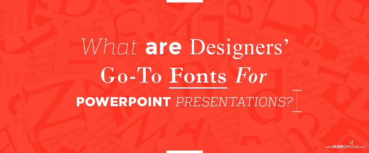
Your performance as a speaker, with the effective integration of powerful visuals, makes a good presentation. If you want to get the branding right, you should balance these two in every pitch.

If you’re going to use a PowerPoint presentation for your pitch, the content of your deck should reflect your overall message.

One way to emphasize the content is through using the right fonts. This aspect of visual design is one of the most important choices you have to make. Arranging the text strategically can help you send a powerful message.

Getting a customized PowerPoint presentation? Here are a few things you should know about font styles:

Serif vs Sans Serif

These are font styles that you should familiarize yourself with. You can use these for various parts of the presentation, differentiating one part from another, or putting emphasis to retain information.

If you see small elements extending from the letters, these are called “serifs” and fonts with these are commonly used in magazines, books, or anything related to print. Sans serif lacks the projecting elements jutting from the edges. You can see this style dominating most web-based experiences.

To give you a visual representation of the two styles, take Garamond and Arial for example. Garamond is characterized by the small lines at the ends of its characters while Arial has none of these.

While on the topic of various font styles, fonts are categorized in five different ways: Geometric, Humanist, Old Style, Transitional, Modern, and Slab Serif.

Font Alternatives

Times New Roman had been the default font for Word Documents for decades, only to be replaced by Calibri in Office 2007. If you would like to veer from the norm, here are some fonts you can use as alternatives:

  • Libertad
  • Carrig
  • Helvetica
  • Raleway
  • Open Sans
  • Alégre Sans
  • Roboto
  • Futura
  • Lato
  • Centabel Book

Before you choose your font, however, here are factors you need to consider:

Theme

The font you choose should go well with the theme of your presentation. It should match the message you’re trying to convey because if it doesn’t complement the look and feel of your deck, it will be noticeable.

Demographics

Know your audience—their age range, their interests. It’s important that you engage them through things they understand and like. For example, if you’re presenting to a group of young people, make sure that you’re using a typeface that can be easily understood.

Legibility

To make sure you hold the readers’ attention, make sure the text is readable. Save the fancy-looking fonts for headlines and more prominent usages.

Mood

This is what you get when you combine the aesthetics of the typeface to the readability of the text. The font you choose evokes emotion, but its readability can take communication to a whole new level.

There are plenty of fonts to choose from, which is why you should stick to just one. Two to three types should suffice—no point in combining two fonts that look the same. Improve your design by combining the ones that complement each other and let your presentation stand out.

Typography, Is It Really Important?

The font you use for your deck is part of presentation design. If your content is mostly text—facts and other relevant information, you should be mindful of which ones you use.

SlideGenius Blog Module One

Get hundreds of PowerPoint slides for free.

Sign up for your free account today.

Sign Up now

Good fonts might go unnoticed in an awe-inducing presentation. If you make a bad choice, there is nothing that could hide it—not the colors, not the images.

If you get your presentation customized by a PowerPoint expert, take note of how they make everything come together, even when there are two to three different fonts in the deck.

What is Typography?

To get technicalities out of the way: typography is a type of visual art. It refers to the creation and arrangement of written words. This encompasses all aspects of the text, from font to readability.

In presentation decks, typography is not only used to convey ideas, but to also set the mood and evoke emotion from the audience.

So, you might be asking why it matters—the answer is simple: it retains reader attention. As a writer, designer, and presenter, your audience’s attention is the best gift you can ever receive. Earning their trust and engaging them at the first slide are as valuable as maintaining this until the end.

Here are a few things to remember if you’re applying typography to your presentation:

  • Match the typeface to the brand’s message
  • Avoid clashing colors or backgrounds
  • This is meant to engage and not distract

Fonts and Information Retention

Designers always take these two functions into consideration. Look at it this way: while they would purchase a fancy display font for the header, using the same font for the article below it would be difficult to read through.

This all depends on the designer and how they’re going to incorporate intricate fonts into the presentation as these are helpful when it comes to retaining information—it doesn’t matter if it’s about art, history, or science. In fact, in a study published in Cognition, an academic journal, psychologists from Princeton and Indiana University conducted an experiment where they had 28 men and women read about three species of aliens.

Half of the participants that read in easy-to-read font (Arial, black, 16 pt) answered correctly 72.8% of the time while those who reviewed the material in hard-to-read font (Comic Sans MS or Bodoni MT, lighter shade, 12 pt) got it right 86.5%.

Apart from the layout, design, and content of your custom PowerPoint presentation, typography is one of the aspects that you wouldn’t want to miss out on. While everyone is attentive about the substance of your pitch, your audience will still look at how you present your words on the screen.

If you want to create a presentation, but don’t know where to start, you’ve come to right place. With SlideGenius, we help you get the word out by creating professionally designed decks. Feel free to browse our portfolio and see what we’ve done in the past!

SlideGenius Blog Module One

Download free PowerPoint templates now.

Get professionally designed PowerPoint slides weekly.

Sign Up Now

References:

Donahue, Elisabeth. “Font focus: Making ideas harder to read may make them easier to retain.” Princeton University. October 28, 2010. www.princeton.edu/news/2010/10/28/font-focus-making-ideas-harder-read-may-make-them-easier-retain

Carey, Benedict. “Come On, I Thought I Knew That!” The New York Times. April 18, 2011. www.nytimes.com/2011/04/19/health/19mind.html

Saving Typeface: Tips for PowerPoint Presentation Fonts

A good presentation comes in a package. This includes an effective speaker supported by powerful visuals. A PowerPoint that complements your performance is essential in leaving a lasting impact on people. There are many aspects of visual design, and among one of the most important is your choice of fonts.

While crowding text is highly discouraged, text isn’t necessarily banned from your slide deck. Arranging text strategically in your PowerPoint and choosing the right font style and size can drive home a powerful message.

But that’s often easier said than done. How do you use text to communicate to your audience? Which fonts prompt a response? We attempt to answer these questions with a few basic rules:

Limit the Fonts You Use

Familiarizing yourself with the pros and cons of both serif and sans serif fonts will save you time choosing between them. However, there are several font types, and deciding which one to use is still pretty tricky. Using three or more fonts is already a bit of a handful.

According to Engage Interactive developer, Jamie Wright, if you can’t justify your use of a third font, it would be good to keep it out of the picture. Too many fonts can be confusing for your audience. You want your audience to focus on your speech, not on a distracting font. If you want to draw your audience’s attention to the text on the slide, try combining font types.

For example, serif fonts are often used for the body of text, while sans serif fonts are used as headlines. Because sans serifs are easier to read, using them for a headline draws immediate attention. On the other hand, serifs guide the eyes with their design, making them better for longer blocks of texts. Knowing the strengths of different font types will let you use them to your advantage.

Consider Readability

Size matters. Unless you intend to have it invisible to the viewer, your text should be readable. Color also plays a huge role in presentation design. The color you choose evokes a psychological response on your audience. Audience members respond differently to different types of colors. But also make sure your words are visible by choosing a color that contrasts with its background.

Contrast is a key element of text readability. Low-contrast text and text with color similar to its slide are unreadable. People won’t be able to get the message of your presentation if they can’t see what’s on your slide. At the same time, don’t overdo it.

Don’t sabotage yourself with flashy, animated text. Keeping your text simple yet readable is enough to keep your audience’s attention.

The Font that Must Not Be Used

Aside from bullet points, another PowerPoint taboo is the use of Comic Sans. The Comic Sans font has gained a bad rap for a number of reasons. Among these is the font being overused in inappropriate situations. While there is nothing wrong with this font per se, you wouldn’t want to be associated with it.

The general disapproval of Comic Sans is enough to discredit any presentation that makes use of the infamous font. If you want to look for similar but less stigmatized options, there are alternatives to choose from. Ban Comic Sans, an organization dedicated to eradicating the notorious font, provides an entire list on their site.

But still use them wisely. Don’t go for unconventional fonts on a whim. Always think about the effect your font will have on your presentation.

Conclusion

When organized strategically, text can enhance presentation design. In order to maximize the element of text, consider the fonts you use. Don’t saturate a slide with several fonts unless you can justify it. Be aware of font size and color. Any text you put on a slide must always be clear and readable to your audience. Similarly, don’t go over the top with your design.

Unconventional fonts can be distracting. The main purpose of your font choice is to emphasize what you’re trying to say, not draw attention to itself.

If you want professional help in deciding how to organize your PowerPoint, contact our SlideGenius experts today and get a free quote!


References

“Fonts.” Ban Comic Sans. Accessed October 8, 2015. www.bancomicsans.com/main
Wright, Jamie. “How Many Fonts Is Too Many Fonts?” Engage Interactive. Accessed October 8, 2015. www.engageinteractive.co.uk/blog/how-many-fonts-is-too-many-fonts
Spector, Lincoln. “Six PowerPoint Nightmares (and How to Fix Them).” PCWorld. Accessed October 8, 2015. www.pcworld.com/article/237106/six_powerpoint_nightmares_and_how_to_fix_them_.html


Featured Image: “Stencil Font” by Cory Schmitz on flickr.com

-->