

These days, to stand out in the pharmaceutical or biotechnology industries, companies need to drive meaningful activity at every stage of the buyer’s journey—from creating awareness to validating their expertise to closing those highly-coveted prospects.
It’s not hard to understand why. After all, pharmaceutical and biotechnology firms operate within mammoth industries ($188 billion and $112 billion, respectively).
Standing out, therefore, is a must.
In addition to other marketing efforts, like harnessing content marketing, which drives both awareness and expertise, pharma and biotech companies need to make sure their marketing and sales presentations are doing everything they can to help educate and close prospects.
So what does this caliber of presentation look like?
In this article, we will take a look at what makes a good presentation in the bio and pharma space.
How We Did It
We sat down with our accomplished team of SlideGeniuses to discuss the sector in detail.
We had them answer the following questions for three of our customers (Johnson & Johnson, Astellas Pharma, and Pfizer) that operate in the vertical:
- What were the client’s goals for the presentation?
- Are there any recurring issues that presentations have in the biotech and pharma industries?
- How did the presentation design strategy help accomplish these goals?
Recurring Issues with Biotech & Pharma Presentations
1) Visuals Aren’t Enticing
The Pharmaceuticals sector has always had issues with having stale graphics and data within their presentations.
2) Poor Data Visualization
Data is generally very scientific and is hard to understand unless presented in a digestible way.
3) Inconsistent Branding
Typically, companies in the space don’t have a well-established brand or style. In large markets like biotech and pharmaceuticals, companies have a hard time standing out.
BRAND #1: JOHNSON & JOHNSON
Johnson & Johnson’s goals for the presentation:
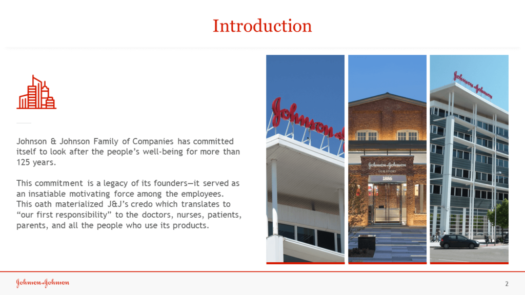
Their audience was made up of businessmen and women eager to learn what is on the horizon for the company. Johnson & Johnson created this deck to provide an overview of the company, what they stand for, what products they create, financials, and who are some of the minds within the company. They wanted the audience to understand the core of the business.
Original presentation’s main issue: visuals weren’t enticing enough.
The Final Product:
How did our design enhancements help accomplish Johnson & Johnson’s goals?
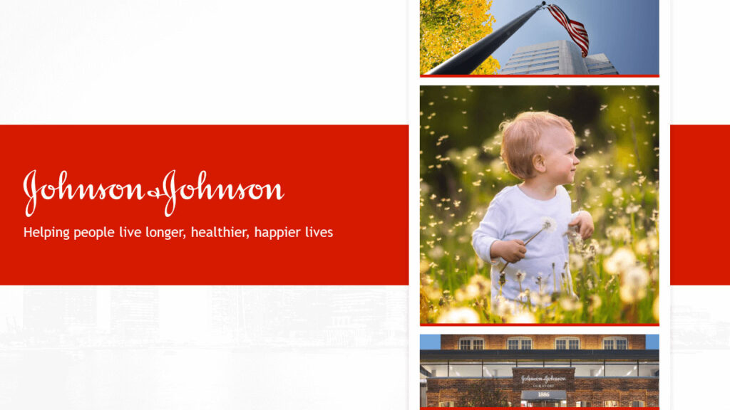
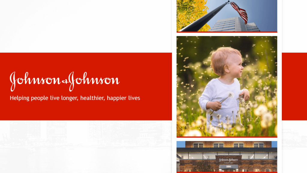
Johnson & Johnson wanted to inject their brand into their presentation to stray away from the typical, dull PowerPoints we see in that sector.
With that in mind, our goal was to keep their classic red and white colors and pair that with a modern yet minimalist design to engage with the audience in a meaningful way.
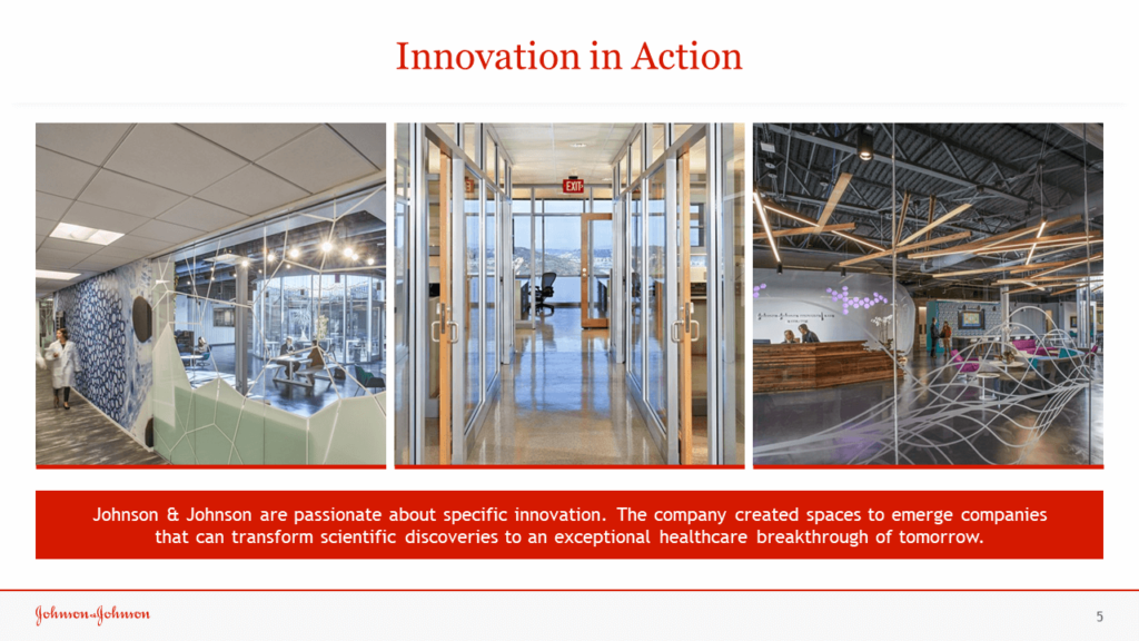
For their credo slide, we showcased pictures that tell a story of Johnson & Johnson’s mission.
It was important to showcase the many areas of the healthcare sector that the company touches and this slide helps the audience understand that by provoking an emotional response through imagery.
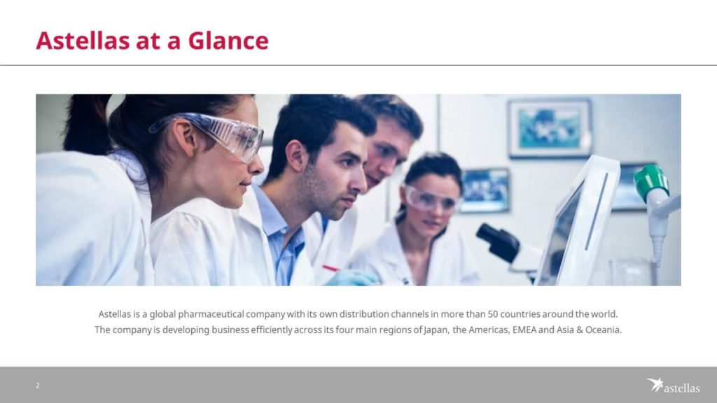
BRAND #2: ASTELLAS PHARMA
Astellas’ goals for the presentation:
Astellas was concerned that their message got lost with poor use of graphics and monotonous data. They had an important engagement with potential investors in their audience, so it was key to enhance their messaging through graphic design.
Original presentation’s main issue: Poor data visualization.
The Final Product:

How did our design enhancements help accomplish Astella’s goals?
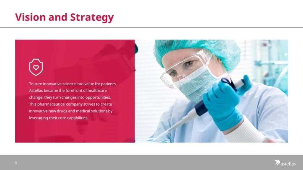
Our strategy for this project was to take Astellas’ strong brand colors and create a bold impactful presentation that will help drive their message home. Astellas wanted us to highlight their company, products, and sectors they service in a way the audience would understand.
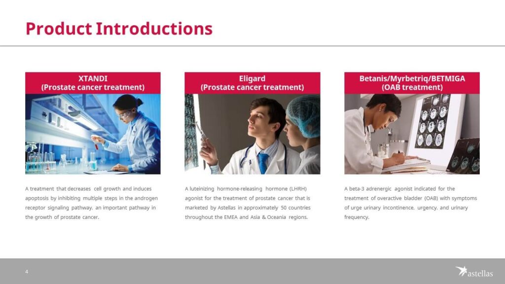
In the product introduction slide, we showcased a few of their products that were new to the market. The goal was to highlight these with meaningful imagery and short descriptions to educate the audience of Astellas’ current projects.
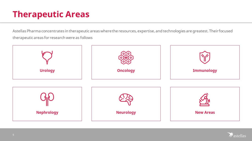
For the “therapeutics” slide, we used iconography to help showcase the different fields of expertise Astellas’ is concentrated in.
BRAND #3: Pfizer
Pfizer’s goals for the presentation:
Pfizer’s audience was comprised of scientists and researchers. They wanted the audience to have up-to-date information with new products, road maps, and financials.
Original presentation’s main issue: Inconsistent branding.
The Final Product:


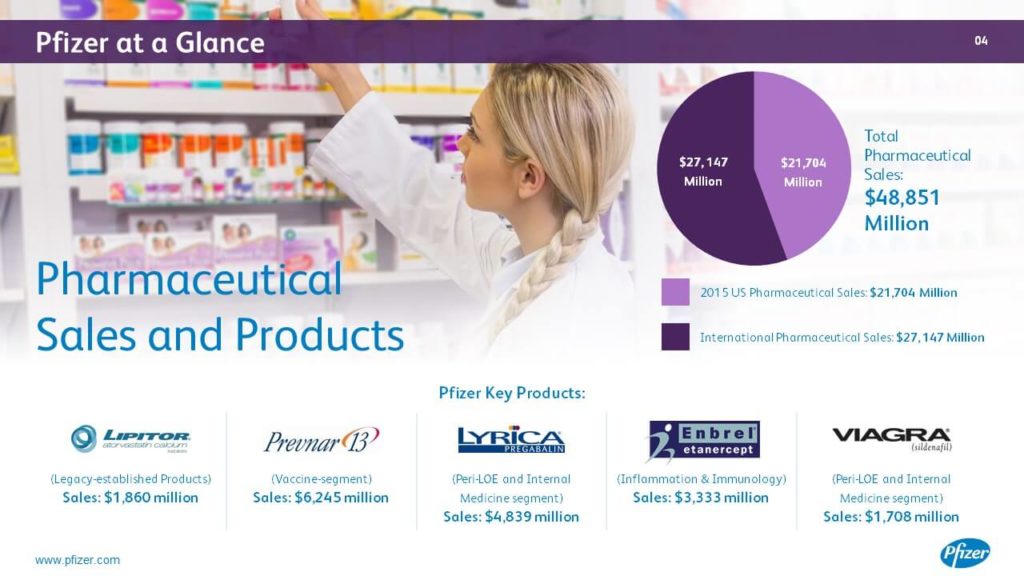

How did our design enhancements help accomplish Pfizer’s goals?
Going into this project, the client and SlideGenius agreed that visuals were needed to drive the narrative. Knowing that we incorporated stunning imagery, that drove home the message of each PowerPoint slide.
For example, for corporate responsibility, they wanted to showcase their involvement in healthcare with a strong visual that emphasized the message.
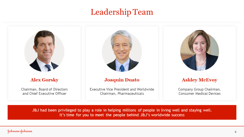
Under “leadership”, we highlighted top team members of the organization to showcase expertise in each sector. We wanted to show the audience the full breadth of their services within healthcare.
