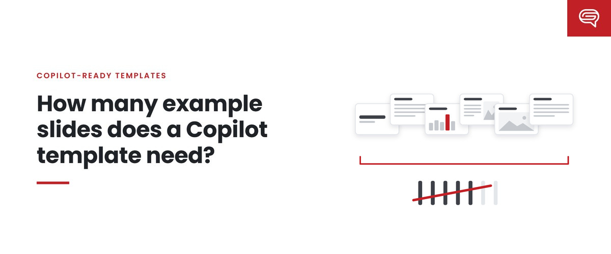
It is the first question almost every team asks once they learn that Copilot in PowerPoint learns from a template’s sample slides. How many do we need? Ten? Fifty? A hundred?
The honest answer is that nobody can give you a number that is right for every organization, including Microsoft. What we can give you is a way to work out the right set for yours — one that is grounded in how Copilot uses examples and in the slides your people actually make.
What Microsoft says
Microsoft’s guidance does not set a count. It says a template should include representative sample slides across the kinds of slides an organization uses, and it lists the slide intents that are usually needed:
- Generic: title, agenda, section header or divider, content (text, bullets, icons, images), data visualization (tables, charts, statistics, dashboards), timelines, process diagrams and flow charts, lists, quotes and statements, Q&A, summary or key takeaways, conclusion, thank-you.
- Specialized, where relevant: introductions, team slides, contacts, maps, calendars, case studies.
It also asks for three densities — light, medium and heavy — and for examples of how the brand uses color, typography, imagery and data.
And it says what happens when there aren’t enough: “Copilot falls back to the Slide Master — which may result in less optimal output.”
So the requirement is coverage, not a count. The set needs to cover the slide intents your organization uses, at the densities it uses them, in the visual language it uses.
Why “more” isn’t the answer
If coverage matters, it is tempting to conclude that more examples are always better. They aren’t, for three reasons.
Examples teach patterns, including accidental ones. Every example is a lesson. If you include twelve cover variations and two content slides, you have taught Copilot that your brand is mostly covers. Proportion matters.
Near-duplicates blur the lesson. Three slightly different comparison slides don’t teach “comparison” three times as well. They teach that the differences don’t matter — or leave Copilot choosing arbitrarily between them.
Every example is maintenance. Examples have to be updated when the brand changes, the template changes or Microsoft’s behavior changes. A set nobody can maintain drifts.
The goal is the smallest set that covers what your people make. Anything beyond that should have to earn its place.
A method for finding your set
This is the approach we use.
Step 1: Start from real decks, not a list of slide types
Collect a sample of recent presentations from across the organization — the everyday ones, not just the showpieces. Sort their slides by what each slide is for: introducing a topic, comparing options, showing a trend, explaining a process, making a recommendation, summarizing.
You will usually find that a surprisingly small number of intents covers most slides, plus a long tail of rare ones.
Step 2: Map intents to layouts
For each common intent, identify the layout that should serve it. If there isn’t one, that is a gap in the template — and no number of examples will fix a missing layout.
Step 3: Add densities where they’re real
For each common intent, ask whether your people make it at more than one density. A title slide usually has one density. A content slide very often has three: a single statement, a balanced text-and-image slide, and a dense slide of detail. Build examples only for densities that actually occur.
Step 4: Add the brand’s distinctive patterns
Then add examples for the things that make your decks look like yours rather than anyone’s: how you highlight a statistic, how you lay text over photography, how you structure a chart title, how a section divider looks. Microsoft specifically calls out highlighted statistics, key takeaways and image treatments.
Step 5: Cut
Remove anything that duplicates another example’s lesson, anything for an intent nobody uses, and anything that exists only because it looked good in the template launch deck.
Why we won’t quote a typical number
The number is an output of that method, not a target, and it varies with what an organization makes. One that produces mostly data-heavy analytical decks needs more data examples; one that produces mostly narrative decks needs more content variations; one with several distinct audiences may need density variants that another can skip. We are still measuring how set size affects output across different templates, and we would rather tell you that than invent a benchmark. Be suspicious of anyone who quotes a number before looking at your decks.
Quality matters more than count
A small set of excellent examples teaches more than a large set of mediocre ones. What makes an example good for a model:
- One clear purpose. Microsoft recommends slide types with a clear, recognizable purpose and complete end-to-end layouts demonstrating a single use case.
- Realistic content. Real-looking titles, real-length text, plausible data. “Lorem ipsum” teaches nothing about how much text belongs on a slide.
- Durable content. Nothing that would be false if copied: no market statistics, no dated figures, no customer names. Models can reproduce example content closely.
- Good judgment on display. The most important element is the most visible. The hierarchy is obvious. This is where design quality directly becomes output quality.
How to know you have enough
The only reliable test is behavior. Build a fixed set of realistic prompts, run them against the template, and look at where Copilot struggles. Slides that come out generic, or content forced into the wrong layout, point to an intent or density your examples don’t cover. Add an example, rerun the same prompts, and see if it helped.
When new examples stop changing the output, you are close. When they start making it worse — Copilot choosing between too many similar options — you have gone too far.
Key takeaways
- Microsoft sets no count; it asks for coverage of real slide intents at light, medium and heavy densities.
- Without enough examples, Copilot falls back to the Slide Master.
- More isn’t better: examples teach patterns, including accidental ones, and every example needs maintaining.
- Find your set from real decks: intents, then layouts, then densities, then distinctive patterns, then cut.
- Test with fixed prompts. The right number is the one where new examples stop improving the output.
Want your example set built from how your people actually present? Have your template scored.**
Related reading
- The Copilot-ready template checklist
- Where the savings in generated decks come from, and where they leak
- Your template is now the ceiling on every deck your company makes
Sources
- Microsoft Support, Keep your presentation on-brand with Copilot (July 2026)