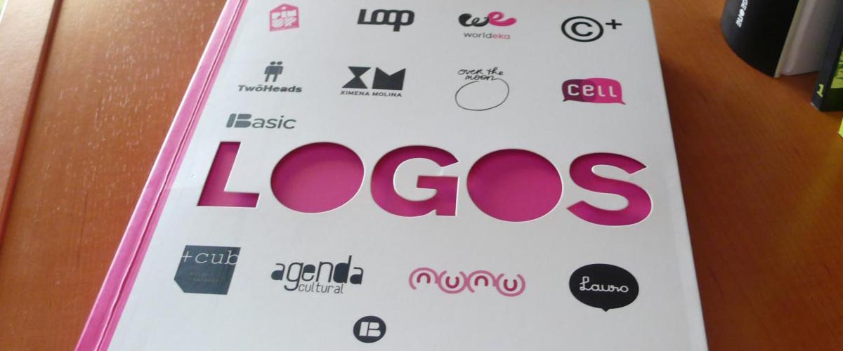
A company logo is crucial in representing your brand. An excellently made logo will increase your brand recognition and help to make your business easily identifiable, representing your brand professionally and encapsulating its image. For this reason, we’ve collected three points you need to remember in creating your brand’s logo:
1. Design Appropriate with Your Message
Your logo is a crucial customer touchpoint, and will form the initial impression people have about your brand before they even make a direct transaction. Choosing the right design means giving your logo your brand’s identity. For instance, are you aiming to be serious and formal? Or fun and approachable?
Tailor your logo to your message and mission without being too direct or obvious. You can include your company name in your logo, or just leave powerful icons that matter to your brand.
For example, Apple uses an apple as their brand logo. Attributed to graphic designer Rob Janoff, the Apple logo has undergone numerous changes through the years, but has remained consistent in one thing – the iconic apple. A feature on Janoff’s page shows his creative process in visualizing the company logo around the symbolic fruit it’s become known for.
Janoff’s original design, which was a rainbow-striped apple, meant to humanize the products, emphasize the product’s ability to show colored images, and make it more attractive to the eyes, especially to children. Similarly, use an appropriate design to achieve a distinct identity that sets you apart from the competition.
2. Simplicity is Key
Keep your design as simple as possible without being extremely clean and minimalistic all the time, since a design that’s too bare may also bore people. Having a very intricate logo tends to be confusing, and will be more difficult to reproduce on your products. By definition, a cluttered logo is one that has extraneous elements in its design.
Too many colors, characters, or embellishments that aren’t related to your company’s overall message are considered superfluous elements, and should be left out of your logo.
To get the right balance of character and minimalism, maximize your use of white space. White space, or negative space, is the absence of any objects or elements. You don’t have to saturate viewers with too much glamor to get your message across. Applying white space lets people’s eyes rest and focus on the most important parts of your logo. Leave the backdrop of your logo free of extra elements to help it stand out and grab attention effectively.
If you’re aiming for a powerful impact, an image that summarizes your business identity will suffice. For example, social media platform Twitter’s logo, credited to freelance designer Simon Oxley, features a blue bird. Its latest design is rounded, simple, and unembellished, but it manages to explain what Twitter stands for in a single image, which just goes to show that “show, not tell” applies to logo-making as well.
3. It Should Stick
Like a good tagline, your logo needs to be timeless and memorable. To attract and keep people’s attention, consider tapping into the psychology of shape and color. Different colors affect people in different ways, so knowing which ones to use can give your brand a leverage.
Some of the most common colors used, especially in the food industry, are red and yellow. These warm colors command attention because of their vibrancy. In the same way, shapes can stir certain ideas in your viewers. Those with soft edges, like circles or ovals, project positivity and unity. On the other hand, pointed shapes with more defined edges, like squares and triangles, portray stability and formality.
For a logo that doesn’t intend to use images, shape psychology can still come in handy with the fonts you use. Fonts with softer edges have the same effect as circular shapes, while sleeker, more angular fonts evoke similar reactions as sharp shapes.
Some logos also manipulate negative space to create a clever and striking design. The famous WWF logo designed by British conservationist and ornithologist, Sir Peter Scott, mixes white space and strokes of the color black to create an image of a panda. This play with space and color both effectively encapsulates the organization’s ideals, and serves as a visual treat.
In Conclusion: Logos Can Make or Break Your Brand
Logos need to be catchy and relevant to your business so people can easily associate them with your brand. Remember: find the right logo design by having it reflect your message, and use white space to draw attention to the main parts of your logo. Similarly, tap into shape and color psychology to be both noticeable and unforgettable.
Follow these simple design principles to help your logo stand out in the market.
References
Simon Oxley Idokungfoo for You Illustration. Accessed January 6, 2016. www.idokungfoo.com
“Sir Peter Scott.” WWF UK. Accessed January 6, 2016. www.wwf.org.uk/about_wwf/history/sir_peter_scott.cfm
“The Apple Logo Story.” Rob Janoff. Accessed December 11, 2015. www.robjanoff.com/the-apple-logo-story
“The Psychology of Logo Shapes: A Designer’s Guide.” Creative Bloq. Accessed December 11, 2015. www.creativebloq.com/logo-design/psychology-logo-shapes-8133918
“Twitter_logo_blue.png.” Twitter. Accessed December 11, 2015. https://g.twimg.com/Twitter_logo_blue.png
“WWF Logo – Design and History of WWF Logo.” Logo Design Blog. Accessed January 6, 2016. www.famouslogos.us/wwf-logo“WWF Logo.”
“WWF Logo.” Pixel Logo. Accessed December 11, 2015. www.pixellogo.com/sites/www.pixellogo.com/files/wp-content/uploads/2014/04/WWF-Logo.gif
Featured Image: “Basic Logos” by Armando Sotoca on flickr.com
www.flickr.com/photos/criterion/4693090982


