In 2014, scientists from MIT discovered the brain processes an image in as little as 13 milliseconds.
In short, it’s better to use an image when discussing complex concepts. Visuals are more relatable than text. The past few years have proven it. Reporting tools have significantly reduced the burden of reading material.
This is great. After all, most B2B executives are overbooked. Between meetings and all-day conference calls, there’s no time to review long reports.
But, as every transaction and every site visitor creates data, expressing the data correctly can be a “life and death” decision. After all, you don’t want to miss a key insight your competitor uses to their advantage.
With data visualization tools, key details are conveyed in a non-time-consuming manner. It is more efficient and accurate than other means of data representation.
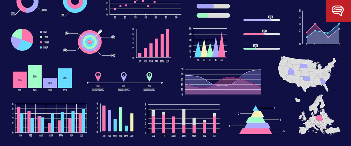
5 Business Graphs Every B2B Executive Needs to See
Company Dashboards
Company dashboards align teams to core business goals, tracking shared progress. This benefits morale and encourages teamwork.
Visuals are easier to follow when combined with animations, trend charts, and color-coded marks. Always remember to tie all relevant data to larger goals.
Account Revenue Reports
Start by identifying the best and worst performers by account. Use these when making informed decisions.
Focus on the how much people engage and usage rates. Update the ideal customer profile you want to focus on. Low-performers also present opportunities for improvement and growth.
Quarterly and Monthly Revenue Reports
Revenue reports provide a quick overview of the progress made towards goals.
Consider day-by-day breakdowns and revenue attributed to each department, product, and service. The reports can create greater insights into the trends that are guiding your business. They can also help you plan for the future, and understand the past.
B2B Sales and Service Leaderboards
A little friendly competition among sales and customer service teams reinforces good behavior. It motivates them to improve their approach.
Tracking these data points identifies the highest performers and specific qualities to impart to others, improving the team’s overall process. This also highlights training opportunities and best practices. Comparing your teams is less about who is better and more about the synergy of the entire group.
Capacity and Resource Planning
Capacity and resource modules provide internal stakeholders with visually accurate representations of their employees. They also lend insight into the material requirements of each project. These modules help take care of scheduling and track budget requirements.
Data visualization tools are ideal for unifying relevant information.
Make your data easy to understand and analyze. Use data visualization tools not only to make your presentations more pleasing to look at, but to ensure that everybody is on the same page.
If you need assistance, let us know. At SlideGenius, we’ve helped countless people in your position to represent data in the most effective and communicative fashion. Just reach out for a free quote. We’ll be happy to help.
Marketing is about analyzing and applying data to provide consumers with the products they want.
Advancements in technology and computer science have been providing marketers newfound access to incredible amounts of data to capitalize on. However, it emphasizes the need for marketers to effectively visualize their data to better express their messages.
For most people, raw data can be overwhelming and unappealing to look at. Not everyone is a data wiz, after all.
Visualized data amplifies key pieces of information and communicates clearer messages, saving both time and brainpower.
When there’s just too much data for any ordinary person to handle, visualizing it can make things easier to swallow. People need to understand what they are seeing for them to start acting on it. In this article, we will break down the best practices when visualizing your data.
Tell a Story
You must be thoughtful in your use of data. Look at each bit of information as if they were carefully placed pieces in the overall narrative of your presentation.
Having too much information risks muddying your desired message. This is a common issue that many marketers fall into.
Having a concrete narrative structure to your presentation helps audiences follow the flow of information. Visuals, especially when used to extrapolate large chunks of data, greatly improve the audience’s ability to internalize what is being conveyed in front of them.
Adjust for Your Audience
As you craft your presentation, consider to whom you’ll be talking. Potential consumers or C-level investment partners? Or maybe it’s just your internal marketing team? Whoever it may be, each of these groups have their own sets of expectations and level of understanding.
The average Joe has no immediate concern about current spending trends in the market. He wants to know how a product can significantly improve aspects of his daily life. The data you provide must match accordingly with the type of people you will be talking to.
Design for Comprehension
The beauty of graphic design is that it can make big data more digestible. However, there’s no “one size fits all” when it comes to effective visual design. Charts are a good example for presenting data, but it’s important to know about the various types and their best uses.
Bar – for comparing discrete examples
Line – for continuous data sets
Pie – for illustrating pieces of a whole
Here are some tips for making more effective designs:
Label everything featured on the chart. Audiences must know what all the pieces are before they can understand the whole. Someone who needs to clarify what data set is being talked about will always put a halt on your presentation.
Use colors to create cohesion in your design. Contrasting colors will make elements stand out, thus helping audiences pinpoint the specific information they’re looking for. Be wary of the associated meanings behind certain colors (e.g. red as a signifier for danger), depending on your intended message.
Create Greater Context
It’s good to assume that your presentation can (and will) be passed along to others without the benefit of accompanying verbal narrative. Having this in mind means that it rests heavily on the visuals to communicate as much information as possible in a manner that can be understood on its own. It’s important to create designs with enough context so the impact of your message can be felt with or without verbal support.
For example, let’s say you are charting marketing-qualified leads (MQL’s) over time. Plot that against other variables which may drive fluctuations in MQL’s, like website traffic, paid investment or frequency of events. This might help you determine whether overall web traffic is irrelevant, but paid investments are critical.
Don’t Mislead Your Audience
Be consistent with how you present data. Once you start using graphs that show zero as the baseline, then all graphs that follow should be uniform to that standard. Don’t change your scale unless it’s pertinent to the data set, and then call it out. While it can be tempting to make that 3% increase look like 50%, it can come off as deceitful.
If you (or your team) is pulling data from tools like Google Analytics or Hubspot, be sure you fully grasp the details of your data points (e.g. what’s included in the site conversion rate, how you’re categorizing a new user, what is the criteria for SQL versus MQL.) Having a better understanding of data will ultimately lead to better designs.
Our team of presentation designers, writers and animators collaborate diligently to ensure every presentation is a successful sales tool. Let us help you inject new life into your presentations and raise your business towards new heights. Contact us today!
Data visualization, to put it simply, is the presentation of data in a graphical format. This involves turning analytics and insights presented in a way other than textually, making difficult concepts much easier to comprehend.
The human brain processes information much easier when presented with large amounts of data translated into charts and graphs.
Using visuals is a quick and easy way to convey complex concepts in a manner that everyone can understand.
Data visualization, therefore, can:
Identify areas of improvement
Clarify which factors influence customer behavior
Help allocate products
Predict sales volumes
In many industries, sales in particular, seeing is believing. The ability to view information and apply solutions in real-time is important.
So, here are five essential dashboard data visualizations that sales teams can use to improve their performance and boost their sales advantage.
Geographical Heatmaps
Also known as “choropleth maps,” these refer to a color-coded matrix that represents value or risk. These are maps of countries or cities, highlighted or annotated to show numbers.
Preparing and analyzing heatmaps are incredibly easy. These could be up and running just by merely translating the necessary data. This type of data visualization is usually quicker to interpret than numbers at first glance because its colors usually range from green (good values) to red (bad values).
An example of sales teams using heatmaps would be when they’re determining their target demographic—a consensus of households that would be interested in their products.
Bubble Charts/Word Clouds
Bubbles charts are similar to heatmaps, only that the objects that represent values are, well, bubbles. You can use colors can to represent values for this type of data visualization.
Word clouds look like jumbled words that seem to have no correlation until given context. These are clusters of words in different sizes. The bigger and bolder they appear, the more often they are mentioned in a text—the more important they are.
In this text for example, you will see the word “data” 13 times. If it were to appear as a word cloud, it would appear to be the biggest word.
Waterfall Charts
To better understand finances, waterfall charts help translate financial data and project a clearer picture of how gains, losses, and balances are affecting bottomline.
To put it in the context of marketing, another example would be how leads and blog traffic in the last year could be affecting your business.
Radar Charts
Also referred to as “spider charts,” these best visualize multiple performance variables that are sub-components of other variables. When you’re uncertain about the units of measurement used, these provide a rough estimate.
An example would be gauging customer experience after purchasing a product. The different variables would include price, customer support quality, ease of the sales process, and user-friendliness of the service.
Bullet/Gauge Charts
Gauge charts, also referred to as dial or speedometer charts, represent one metric at a time. Their goal is simple: to show how close you are to achieving a certain goal.
Say you’re aiming for a certain number of leads for a project. Assume that number is 100 and you’re only at the 65 mark. It’s easier to visualize that using a gauge chart. Apart from that, you’d know how important this value is to the discussion since it is emphasized in graphical form.
Today, as data collection becomes more streamlined, information becomes abundant, meaning there’s so much to learn. The only problem is, not everyone can comprehend all this.
Data visualization is an effective strategy if you want to translate complex datasets into information that is more concise, straightforward, and understandable to those who are not familiar with the concept you are discussing.
It continues to help sales teams and analysts look at data more imaginatively. Ultimately, this is a useful skill to develop, effectively conveying and leveraging information in a visual format.
Make no mistake: when data is involved, a visual is essential. A well-designed presentation with ample data visualization is a surefire way to get your message across.
Plus, it’ll keep people engaged.
Nothing puts people to sleep faster than someone rattling off statistics or trying to explain quantitative change over time.
Having a contextual representation of the data helps presenters stimulate their audience, giving onlookers a reason to pay attention.
A quarterly boardroom presentation, the pitch for a merger or acquisition, an appeal to stakeholders, the next big company initiative—whatever the subject of your business presentation, it demands data visualization.
Without something to look at, your message may fall on deaf ears.
What is Data Visualization?
Data visualization turns quantifiable data into something more than graphs, tables and charts. It creates comparisons through images and makes sense of data beyond numbers.
More than turning numbers into images, data visualization connects them with three important context variables: Meaning, Cause and Dependency. These variables help audiences better understand what they’re seeing and connect them to the greater concept.
For those of you looking for a deeper dive into data visualization, check out our “Mastering Data Visualization” guide:
Why is Data Visualization Critical?
Humans are visual creatures! Hence, every business presentation involving data needs a slideshow.
Engaging your audience’s sense of sight, along with aural stimulation, is a twofold way to get your point across—especially if it involves data and figures.
Take a moment to think about math.
Most people can’t do a multi-step equation in their head. But, give them a piece of paper and a pencil and they’ll have no trouble working it out in short order.
The people viewing your business presentation may not have to solve any problems, but the concept is the same. Without visualization, it’s hard to come to a conclusion or contextualize data. Creating a visual makes it easier for the brain to digest information.
Take the following simple statement, for example:
“Customers were four times more likely to buy Product X than Product Y, and nine times more likely than Product Z.”
Hearing that statement might raise a few eyebrows, but it’s hard to visualize what that means in your head. Instead, attach those figures to pictures of the products or proportionate representations, and you’ve created context.
Suddenly, the data is about more than numbers—it’s about competition. It’s about market share. It’s about dominance.
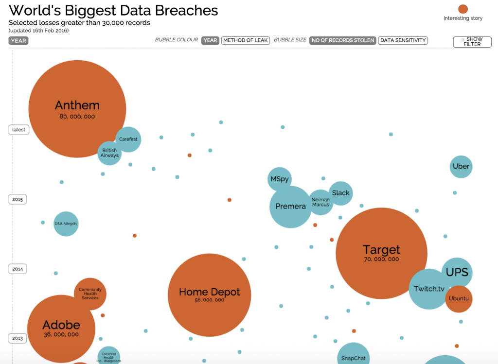
Example: Visualizing the World’s Biggest Data Breaches
Here’s a great visualization of the world’s biggest data breaches:
As you can see, good data visualization connects figures to concepts in a way that provokes thought beyond the numbers.
Yes, simply saying “Anthem’s data breach affected 122% more people than Adobe but only 14% more than Target ,” provides important information that can be digested — however, proper visualization of the statement allows for the audience to pick up on trends and patterns more easily and quickly.
It gives meaning to the greater concept, reveals the cause behind the figures, and explains the dependency of the data, so people can make broader conclusions.
Data Visualization isn’t Always Easy
While data visualization is the key to getting your message across, creating it is easier said than done. It needs to walk the fine line of creativity, relevancy, and clarity, or people will miss the message entirely.
Keep this acronym in mind:
Clearly distinguish the data
Leverage powerful imagery
Explain the “in”
Allude to the bigger picture
Remove unnecessary elements
Remember that this is meant to make data appealing. Someone should be able to see the data, contextualize it, and connect it to a larger concept.
But more than that, data visualization should tell a story.
Let’s say you’re describing Total Addressable Market (TAM), Serviceable Available Market (SAM) and Target Market (TM) in a pitch deck.
It’s one thing to say “our TAM is 80 million people, our SAM is 40 million people and our TM is 10 million people.” It may be true, but it’s uninspiring. It doesn’t tell the story of your product, brand or abilities. Instead, consider the power of data visualization:
Data visualization has levels, too.
In the above example, you might use your brand’s colors to delineate the different groups or arrange the icons in the shape of your logo. It’s subtle nuances like this that empower data visualization and drive the point home.
For most people at the helm of a business presentation, it’s hard to conceive these nuances when designing a slideshow.
Business professionals are intent on delivering the message—they’re not as engaged in how it’s delivered. Only someone with a background in graphic design or media analysis understands how important the little things are in data visualization.
And while almost everyone has access to PowerPoint, few people have the design chops and creative ability to execute exceptional data visualization.
PowerPoint is the Gold Standard for Data Visualization
Let’s make one thing clear: PowerPoint is the premier tool for data visualization.
We’ve all seen our fair share of bad PowerPoint presentations, but that’s not representative of how powerful this software truly is. In the right hands, PowerPoint is a game-changer for any business presentation.
PowerPoint offers numerous tools to make understanding facts and figures easier, particularly when it comes to data visualization. In-suite table and graph generation makes it easy to turn data sets into basic visuals—color-coded, labeled and in myriad styles.
Drag-and-drop, resize and stylistic tools also make it easy to insert prepared images into the presentation itself. Animation keeps audiences engaged! While we don’t recommend the star wipe for a formal presentation, dissolves, fades and curls are all great options.
For someone with a graphic design background, PowerPoint is a playground for making even the driest facts and figures interesting and exciting.
Data Demands a Visual Experience
It doesn’t matter how interesting or important your data is, it’s not going to have the effect you want it to without visualization to make it real.
For a business presentation to be successful, it takes emphasis on data visualization and the design elements that make important information pop off the page. If you’re going to give a business presentation with a visual element, make sure the visual is truly engaging. Dropping text into a PowerPoint isn’t enough. Adding colors and transitions might make it flashy, but they don’t inspire your audience.
To take your presentation to the next level and drive home a true understanding takes data visualization, done right.
65% of people identify as visual learners. That explains a demand to revolutionize traditional presentation methods to be more creative and visually stimulating. Among visual aids, infographics are beginning to gain momentum. Quickly, it’s becoming one of the most popular means of visualizing data in recent years.
Its clean and straightforward delivery of otherwise complex data adds to the infographic’s appeal. But just like any data presentation, infographics take time and effort to make. Knowing how to strategically clean and place material is important in pulling off a good infographic. Randomly throwing things together would confuse potential viewers and deter them from looking further at your material.
Here are three ways to making an effective infographic:
Info + Graphics
As its name suggests, infographics are a mixture of your actual information and a bit of graphics. The word “infographics” is, after all, a portmanteau of the words information and graphics. The key to a good one is a balance between data and visual impact. You have to translate your raw information to graphics without compromising one for the other.
Otherwise, you either fail to deliver your main point to your infographic viewer, or they get bored with what they see. To marry your info and graphics seamlessly, highlight key information and keep any supporting or minor details in smaller text. Maintaining a consistent theme is also helpful in providing structure to your graphics.
Don’t Oversimplify
Although an infographic aims to steer clear of being too complicated to digest, oversimplifying your data is just as bad. Avoid seeming one-sided in an attempt to cut the figures you have in your infographic. But don’t bombard people with statistics.
Leaving gaps between your facts defeats the purpose of presenting information. Organize your data efficiently for a better end product. In her article on data visualization, The Guardian’sRachel Banning-Lover, suggests that one way to reconcile this dilemma is to narrow down your focus to a specific issue. This segregates your data into main points and sub-points in relation to your chosen topic.
Once you have that in mind, you’ll know how to go about your visual arrangement better.
Lay out the Layout
Once you have your data ready, the next step is to decide how you’re going to incorporate your graphics. In an infographic, everything is meant to affect visual impact. Graphics aren’t the only part of your visual presentation.
It’s a matter of making text, image, and even space work together to attract viewers and relay information. You’re free to design and layout your elements however you like. But as a general guide, always consider whether people can easily read through your visuals. A pretty and comprehensive infographic will be wasted if it can’t be read.
Make use of whitespace to give your reader’s eyes a break. Whitespace, or the absence of text or objects in a layout, helps ease the eyes into reading. Encourage the viewer to read on, don’t intimidate them by saturating your infographic with text and images.
Conclusion
An infographic is a handy communication device. But don’t be fooled into making it an excuse for lazy data presentation. Making hard facts visually palatable is by no means an easy task. Pay equal attention to your data and your graphics.
Don’t let one overshadow the other in your overall layout. At the same time, make sure your infographic is not only aesthetically pleasing, but also readable. You’ll be able to get an audience’s attention and create a lasting impression.
Need help with your presentation needs? Contact our SlideGenius experts today and request a free quote!
References
Banning-Lover, Rachel. “How to make infographics: a beginner’s guide to data visualisation”. The Guardian. August 28, 2014. Accessed October 12, 2015. www.theguardian.com/global-development-professionals-network/2014/aug/28/interactive-infographics-development-data
“Go Visual: Use Infographics to Give Your Business Pitch Maximum Impact – Piktochart Infographics.” Piktochart Infographics. October 1, 2015. Accessed October 12, 2015. www.piktochart.com/blog/go-visual-use-infographics-to-give-your-business-pitch-maximum-impact
Dealing with data is a crucial part of any presentation. When the stakes are particularly high, presenting data is the best way to add weight and leverage to your ideas. If you want to make sure your presentation holds up, you need to provide evidence that will support your main arguments.
The only problem with data is when you have too much. As we’ve constantly established, simplicity is an important factor in presentation design. How can facts and figures be helpful if they only end up confusing your audience? When it comes to presenting data, you’ll need to cut back on complex graphs and lengthy explanations. The best way to present data is through concise visuals that are both striking and creative.
Before anything else, you need to think of data in your presentation as an iceberg. The part we see floating in water is said to make up only 10% of its entire mass. The rest of it is underwater, hidden from plain sight. Similarly, the data you include in your presentation should only be a small part of the information you have available.A lot of research and hard work goes into gathering data for a presentation, but you can’t expect to include everything in your slides.
Like an iceberg, don’t show your audience every bit of information you have. The data in your presentation should only be a small part of everything you’ve gathered during research and preparation. (Source)
In other words, the data you include in your presentation should be the ones that are most crucial to making your point. Before you start building your slides, review the information you have and figure out what each stands for in relation to your core message. The numbers that stand out the most are the most significant to your key arguments.
With that said, here are a few more tips to keep in mind when you’re presenting data:
Figure out the best way to visualize your data
After deciding which of the information you have is the most relevant to your presentation, the next thing you need to do is to turn your data into visuals. Review the different types of charts to find out which one works best for the numbers you have. Check out these resources to learn more about choosing the most suitable format for your data:
The charts in your presentation should make sense without too much explanation. Make sure you choose the correct format so that you can get the simplest and most streamlined illustration. Basically, line and bar charts are great for emphasizing trends. Meanwhile, a pie chart is perfect for illustrating how specific numbers correspond to a whole.
There are also times when it’s better to avoid using charts at all. Certain data is better presented through a simple illustration. If you’re not comparing several numbers, maybe a single but striking graphic is enough to prove your point.
Be creative with your visualization
Presenting data doesn’t have to be boring, so keep your visuals interesting. It’s not enough to turn your data into simple charts or illustrations. You also need to take note of a few PowerPoint design principles.
In our discussion on top PowerPoint design practices, we discussed how some factors—particularly the use of images, color, and space—can make a huge difference in the look of your slides. If you want your data to pop, make sure you learn how to use and manipulate these elements in your visualizations. Look through our portfolio for inspiration.
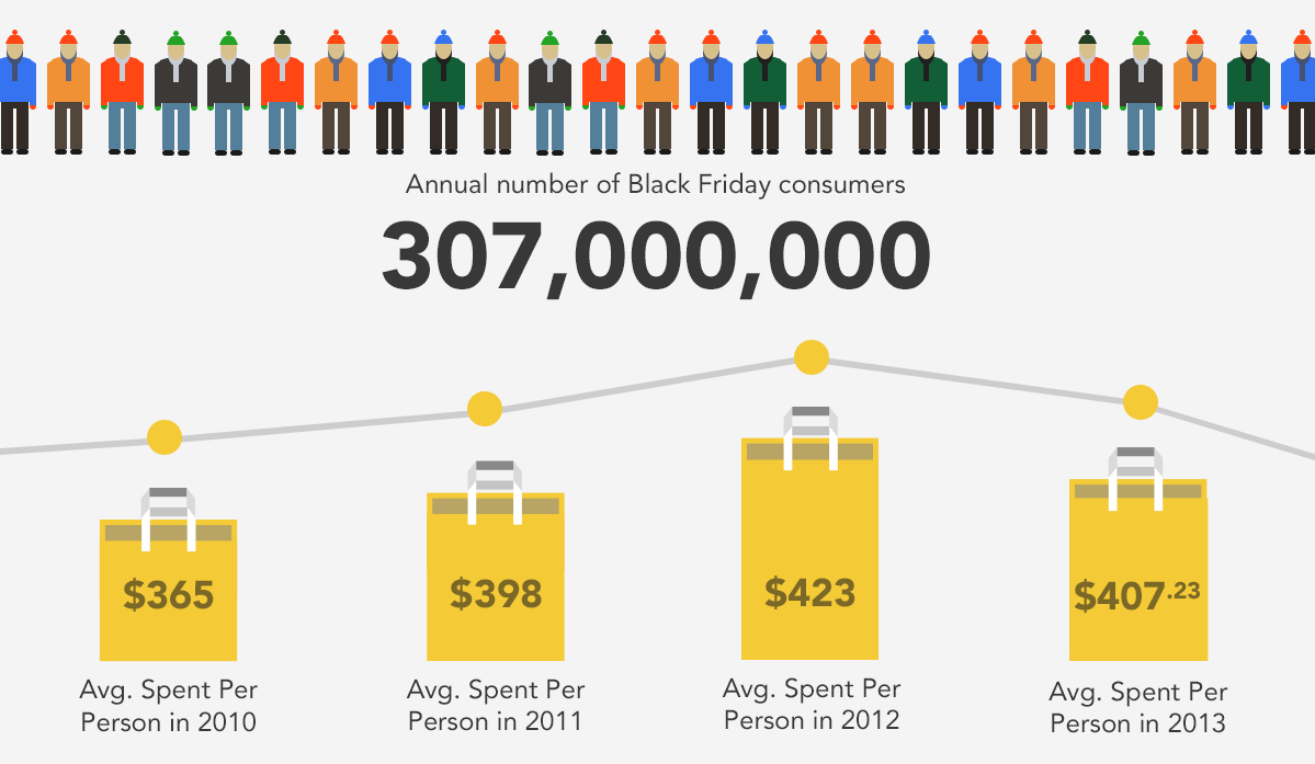
Data about Black Friday shoppers visualized in an infographic on Visual.ly
Highlight the insights
Aside from great design, it’s also important to highlight what your data is about. When it comes to presenting data, the audience isn’t particularly interested in seeing exact figures. What they want to see is the logic behind the numbers. Why are they important? What point are they trying to make?
To avoid confusing the audience, make sure your slides feature a short explanation of your data. Caption your charts or illustrations with a few short sentences that can briefly explain what your data represents. Here’s another example from the SlideGenius portfolio:
When you’re delivering your presentation, it will also help if you lead with the conclusion. To present everything clearly, you’ll need to show the bigger picture before going in to the finer points of your data.
All the numbers, figures, facts and stats that you gathered for your professional presentation are all useless…let me tell you why.
Let me explain through this: “If a tree falls in a forest and no one is around to hear it, does it make a sound?” My answer to that philosophical question would be “who cares?” If the tree is not in my sight, my space, causing me any problem, or bringing me any benefit, why am I interested?
Much like that tree, and its sound or soundless noise, is of no direct interest to me, neither is your data, at least not yet. At the moment, your data is like that tree, it is a vague and irrelevant issue to the typical audience member. They don’t see, hear, feel, or need the sound or the tree, so to them, it is useless. The only way your complicated bar charts, pie graphs, numbers or percentages (your tree, if you will) will make me care is if they are relevant to me. The first step to relevance is making your data understandable.
What is data visualization?
Data Visualization is the idea of visualizing data away from your computer and in so doing, making sense of your complex issues. Once your audience can make sense of your data, they can begin to see any personal relevance or interest in it. This is where data visualization comes in again.
Data visualization has the power to harness the relationships of meaning, cause and dependency. These three elements are what people use to judge personal relevance and interest on. If your audience understands the true meaning of what your showing, then sees what it can cause, or has caused to them personally, and finally understands that the next move is dependent on them, then you will have effectively made your data useful.
How to visualize your data
Extract the data from your current line graph, bar graph, pie chart, statistics or whatever medium you are displaying your data through. Then take a relevant photograph, or drawing, or design, and incorporate the data in it. For example:
The key point to understand with this is that the design is meant to support and complement the data. For example:
data on football fan attendance visualized by having fans hold up helmets to make a bar chart;
data on declining education budgets visualized as a bar chart traced in the dusty rear window of a preschool;
data on increasing dental costs can be visualized in a toothpaste line graph on a dollar bill
Additionally it is essential to focus on the central aspect of the visual. Whether it may be photography, hand drawn art, or a mix of the two, be sure it is good quality. Check the lighting, the picture quality, contrast, etc. Keep the photo free of extraneous elements; they will only confuse the audience. Take you base piece and add some descriptive text and a title in an image-editing program. Pretend it is your original chart or graph.
Science behind visualizations
These visualizations are effective interesting because as humans, we are not yet hardwired to understand and compute the things we see on screens and on paper. We are built to understand the real world, and we are very good at evaluating the things in it, and this lends an immediate grasp of the subject that rectangles on a screen sometimes can’t imitate.


