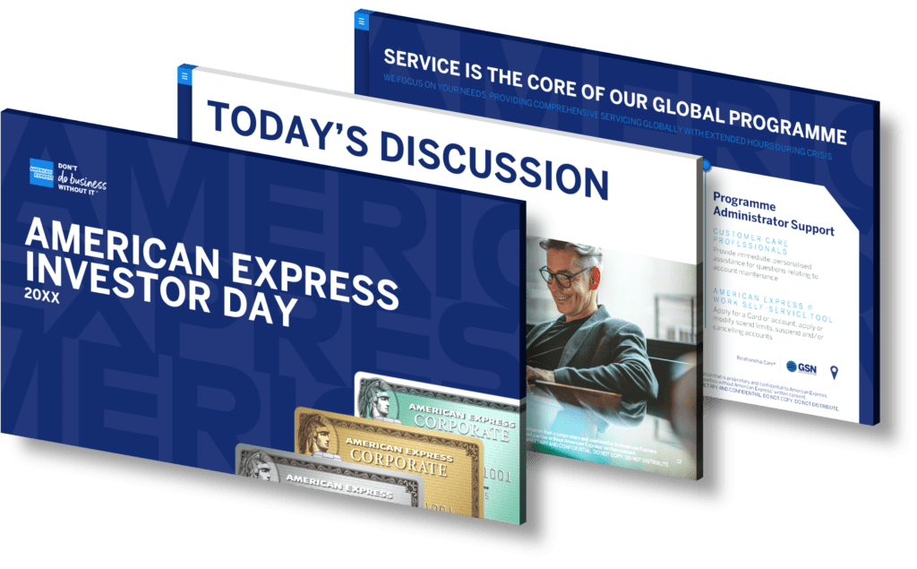
Businesses can leverage infographics as a powerful tool to communicate quarterly financial results effectively by simplifying complex data into visually engaging formats. Infographics allow companies to present key metrics such as revenue, profit margins, and expenditures in a way that is not only easy to understand but also captures the audience’s attention. By utilizing graphs, charts, and icons, businesses can highlight trends and comparisons clearly, making it easier for stakeholders to grasp performance insights at a glance. Furthermore, infographics can help streamline communication during presentations or reports by emphasizing critical points without overwhelming viewers with excessive information.
To maximize the impact of an infographic on quarterly financial results, businesses should consider the following strategies:
- Identify Key Metrics: Focus on essential figures that contribute significantly to understanding overall performance.
- Simplify Data Visualization: Use clear graphics like pie charts or bar graphs for straightforward comparisons between different periods or targets.
- Create Compelling Narratives: Tell a story through your data—highlight successes and areas for growth with supporting visuals.
- Ensure Brand Consistency: Align infographic design with corporate branding elements such as colors and fonts for cohesive communication.
This approach not only aids in conveying information more effectively but also enhances engagement among employees, investors, and other stakeholders who may have varying levels of financial literacy. When done right, infographics serve as an excellent medium for driving discussions around financial performance while fostering transparency within the organization.
View Our Presentation Portfolio


