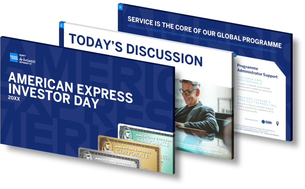
How can businesses effectively use infographics to present complex financial data like Bank of Cyprus Group’s quarterly results?
Businesses can leverage infographics to present complex financial data, such as Bank of Cyprus Group’s quarterly results, by employing a strategic approach that enhances clarity and engagement. First, it’s essential to distill the data into key performance indicators (KPIs) that matter most to stakeholders. This means selecting the most impactful metrics such as revenue growth, profit margins, and customer acquisition rates.
Next, utilize visual elements like charts and graphs to transform numerical data into easily digestible visuals. For instance, a line graph can effectively illustrate trends over multiple quarters while pie charts can break down revenue streams or expenditure categories at a glance.
Incorporating icons or illustrations related to financial themes can further enhance understanding; for example, using an upward arrow icon next to growth figures signifies positive performance instantly. Additionally, employ consistent color schemes that align with your brand identity for coherence across all visual materials.
The layout should guide viewers through the information logically — starting from high-level summaries before diving deeper into specifics allows audiences of varying expertise levels to follow along effortlessly. Lastly, consider adding brief explanatory notes or callouts highlighting significant changes or anomalies in the data for additional clarity.
By transforming complex financial results into engaging infographics with meaningful visuals and clear narratives, businesses not only facilitate better understanding but also increase retention of critical information among stakeholders.
View Our Presentation Portfolio

How can infographics enhance understanding of digital twin technology in asset management?
Infographics serve as powerful tools for communicating complex concepts, such as digital twin technology in asset management. By visually breaking down intricate ideas into digestible formats, infographics enhance comprehension and retention of information. They can depict the lifecycle of a digital twin, illustrating how it mirrors physical assets in real-time to optimize performance and maintenance strategies. Utilizing icons, charts, and graphs allows viewers to quickly grasp data relationships and trends without becoming overwhelmed by text-heavy content.
Moreover, infographics can highlight case studies or success stories within asset management that leverage digital twins effectively. By showcasing before-and-after scenarios or key performance indicators (KPIs), stakeholders can visualize the tangible benefits of adopting this technology. This visual storytelling not only aids in understanding but also fosters engagement among diverse audiences—from technical experts to executives—ensuring everyone is on the same page when discussing strategic initiatives.
Overall, employing infographics facilitates a clearer dialogue around digital twin technology’s role in enhancing asset management practices by simplifying complexity and driving informed decision-making.
View Our Presentation Portfolio

How can businesses effectively use infographics to simplify complex data in investor presentations?
Businesses can effectively utilize infographics in investor presentations by transforming complex data into visually appealing and easily digestible formats. Infographics serve as a powerful tool to illustrate key points, showcase trends, and highlight important statistics without overwhelming the audience with dense text or intricate details. Here are several strategies to consider:
- Visual Hierarchy: Use size, color, and layout strategically to emphasize the most critical information. This helps guide the audience’s attention to what matters most.
- Simplification of Data: Break down complicated data sets into single visuals that highlight key findings or comparisons. For instance, pie charts can effectively represent market share while bar graphs may be used for growth over time.
- Consistent Branding: Maintain brand colors and fonts throughout your infographic to reinforce brand identity while presenting data. This consistency builds trust with investors.
- Narrative Flow: Create a logical progression of information that tells a story from start to finish. A well-structured narrative will keep investors engaged and make it easier for them to follow along.
- Avoid Clutter: Ensure that each infographic is not overcrowded with information; simplicity is key. Aim for clarity by limiting the number of elements shown at once and using whitespace effectively.
The success of an investor presentation often hinges on how clearly you can communicate your message—infographics provide an excellent means of achieving this goal by enhancing comprehension through visual stimulation.
View Our Presentation Portfolio

How can infographics enhance engagement during investor presentations on business growth and strategy?
Infographics play a crucial role in enhancing engagement during investor presentations focused on business growth and strategy. By visually representing complex data and insights, infographics simplify information, making it easier for investors to grasp key concepts quickly. The use of charts, graphs, and icons can highlight critical trends, performance metrics, and strategic initiatives without overwhelming the audience with text-heavy slides.
Moreover, infographics capture attention through compelling design elements that break the monotony of traditional presentation formats. They can convey a narrative that guides investors through your business story—showcasing achievements while outlining future opportunities effectively.
Incorporating infographics also promotes retention; studies show that visuals improve comprehension and memory recall. When investors see well-crafted visual representations of data points related to market analysis or growth projections, they are more likely to remember the information presented. This leads to meaningful discussions post-presentation and fosters stronger connections between your team and potential investors.
Additionally, using infographics encourages interactivity during presentations. Presenters can ask questions based on infographic content or invite feedback on specific visuals, creating an engaging dialogue rather than a one-sided monologue.
View Our Presentation Portfolio

How can businesses leverage infographic design to effectively visualize and communicate emerging content marketing trends in 2024?
In 2024, businesses can strategically leverage infographic design to effectively visualize and communicate emerging content marketing trends by focusing on several key aspects. First, infographics allow for the distillation of complex information into digestible visuals that capture attention and facilitate understanding. By using eye-catching graphics, brands can highlight significant data points related to new trends, such as shifts in consumer behavior or technological advancements.
Moreover, incorporating storytelling elements within infographics can enhance engagement. Businesses should aim to create a narrative that guides viewers through the information presented, emphasizing how these trends affect their audience directly. Utilizing a mix of vibrant colors and consistent branding helps reinforce brand identity while making the content more memorable.
Additionally, interactive infographics are becoming increasingly popular as they encourage viewer interaction and participation. By including clickable elements or animations, businesses can make their content more engaging and informative while also collecting user data for further insights.
Finally, sharing these infographics on multiple platforms—such as social media channels and email newsletters—ensures broader distribution and reach. This multi-channel approach not only boosts visibility but also enhances SEO efforts by driving traffic back to the company’s website.
View Our Presentation Portfolio

How can businesses leverage infographics to effectively communicate quarterly financial results?
Businesses can leverage infographics as a powerful tool to communicate quarterly financial results effectively by simplifying complex data into visually engaging formats. Infographics allow companies to present key metrics such as revenue, profit margins, and expenditures in a way that is not only easy to understand but also captures the audience’s attention. By utilizing graphs, charts, and icons, businesses can highlight trends and comparisons clearly, making it easier for stakeholders to grasp performance insights at a glance. Furthermore, infographics can help streamline communication during presentations or reports by emphasizing critical points without overwhelming viewers with excessive information.
To maximize the impact of an infographic on quarterly financial results, businesses should consider the following strategies:
- Identify Key Metrics: Focus on essential figures that contribute significantly to understanding overall performance.
- Simplify Data Visualization: Use clear graphics like pie charts or bar graphs for straightforward comparisons between different periods or targets.
- Create Compelling Narratives: Tell a story through your data—highlight successes and areas for growth with supporting visuals.
- Ensure Brand Consistency: Align infographic design with corporate branding elements such as colors and fonts for cohesive communication.
This approach not only aids in conveying information more effectively but also enhances engagement among employees, investors, and other stakeholders who may have varying levels of financial literacy. When done right, infographics serve as an excellent medium for driving discussions around financial performance while fostering transparency within the organization.
View Our Presentation Portfolio

How can an infographic enhance understanding of no-cost home energy assessments and their benefits for businesses?
Infographics serve as a powerful tool for enhancing understanding, particularly in complex topics like no-cost home energy assessments and their associated benefits for businesses. By visually presenting data and information, infographics can break down intricate concepts into digestible pieces that are easier to understand. For instance, an infographic can illustrate the step-by-step process of obtaining a home energy assessment, highlighting key elements such as eligibility criteria and the potential outcomes.
Moreover, visual representations of statistics related to energy savings or environmental impact can further engage viewers by providing clear comparisons or charts that showcase the tangible benefits of these assessments. This not only helps businesses recognize how they can reduce costs through improved energy efficiency but also emphasizes their role in contributing to sustainability efforts.
By using icons, color coding, and concise text explanations within an infographic format, companies are more likely to capture attention quickly while ensuring critical information is retained effectively. This makes infographics not just informative but also compelling marketing assets that drive awareness around no-cost home energy assessments.
View Our Presentation Portfolio

How can infographics effectively showcase a company’s sustainability projects and carbon footprint reduction efforts?
Infographics are a powerful visual tool that can effectively communicate complex information in an easily digestible format, particularly when showcasing a company’s sustainability initiatives and carbon footprint reduction efforts. By combining compelling graphics with concise text, infographics allow businesses to highlight key data points, achievements, and strategies related to their environmental impact.
To begin with, it is essential to present clear statistics that demonstrate progress over time. For instance, incorporating graphs or charts that illustrate reductions in carbon emissions or increases in renewable energy usage can provide immediate visual evidence of a company’s commitment to sustainability. This makes the data more relatable and impactful for the audience.
Additionally, storytelling elements can be integrated into the infographic design. Narratives about specific projects such as tree planting campaigns or waste reduction programs not only engage viewers but also humanize corporate initiatives by sharing personal stories from employees or community members involved in these efforts.
The use of color schemes associated with eco-friendliness—such as greens and earth tones—can further reinforce the message of sustainability while attracting attention. Icons representing recycling symbols or nature elements help convey themes quickly without overwhelming text content.
Incorporating interactive features into digital infographics enhances engagement by allowing users to explore various aspects of sustainability projects at their own pace through clickable sections leading them deeper into specific data points when desired.
Overall, effective infographic design should balance aesthetics with informative content while ensuring clarity so audiences grasp both the significance and impact of your company’s environmental endeavors effortlessly.
View Our Presentation Portfolio

How can infographics effectively showcase the benefits of renewable feedstock in the food industry?
Infographics serve as a powerful tool for visually communicating complex information, making them particularly effective in showcasing the benefits of renewable feedstock in the food industry. By employing clear and engaging visuals, infographics can simplify intricate data surrounding renewable materials and their impacts on sustainability. This method not only captures attention but also enhances retention by breaking down statistics, trends, and comparisons into digestible graphical elements.
For instance, through charts or graphs illustrating carbon footprint reductions achieved by using renewable feedstock versus traditional sources, audiences can grasp significant environmental benefits at a glance. Additionally, infographics can highlight case studies or success stories from companies that have integrated these materials into their production processes; using icons or images to represent each step makes it relatable and easy to understand.
The use of color schemes that align with eco-friendly themes further reinforces the message while maintaining visual appeal. Combining compelling narratives with strong imagery helps convey urgency around adopting sustainable practices within the food industry—encouraging stakeholders to consider renewable options seriously.
View Our Presentation Portfolio

How can infographics effectively highlight the benefits of carbon fiber composites in various industries?
Infographics serve as a powerful tool for effectively communicating complex information in a visually engaging format, particularly when illustrating the benefits of carbon fiber composites across various industries. By utilizing graphics, charts, and concise text, infographics can simplify technical details about carbon fiber’s strength-to-weight ratio, durability, and resistance to corrosion—key advantages that appeal to sectors such as aerospace, automotive, sports equipment manufacturing, and construction.
For instance, an infographic can compare traditional materials with carbon fiber composites using visual elements like bar graphs or pie charts to showcase weight savings or performance enhancements. Additionally, incorporating icons representing different industries helps viewers quickly associate these benefits with real-world applications. The use of color coding can further enhance readability by distinguishing between various advantages such as cost-effectiveness in the long run or sustainability aspects due to lesser waste during production.
Moreover, storytelling through infographics allows you to present case studies demonstrating successful implementations in specific projects—such as lightweight components that led to fuel efficiency improvements in aircraft design. This narrative approach captivates audiences while providing practical insights into how carbon fiber composites are revolutionizing their respective fields.
View Our Presentation Portfolio
