Do you know the difference between making a tie-dye shirt and a corporate presentation? Most people don’t seem to.
You wouldn’t go out in a red suit with green polka dots that has purple sparkles, yellow buttons, and shiny silver stars (unless you’re a clown at a birthday party, in which case…no judgment), so why dress your investor presentation like that? Color is like a magical potion, it can change our mood in a matter of seconds, without us even realizing it. While it’s a powerful tool to wield in your PowerPoint presentations, it’s important to utilize color correctly, because using the wrong colors will often leave your presentation worse off than if you had just left it in black and white.
We’ll divide our advice into two categories: how to contrast colors in a presentation, and how to choose the background colors for it.
Color Contrast:
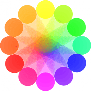
-Avoid putting colors that are opposite each other on the color wheel on top one another (background and text) in any slide. This is particularly true for green and red, but the heavy contrast can have a straining effect on the eyes, making your audience grow tired from viewing your presentation.

-15 to 25 percent of men have at least some mild color blindness, usually having trouble distinguishing between red and green, blue and black, or blue and purple. Avoid putting these colors too close to one another.
-Less is more: If you’ve established that you’re not making a tie-dye shirt, keep it simple and professional. Leave the creative endeavors to the professional presentation designers.
Color psychology:
Different colors carry specific connotations depending on the culture you find yourself in. For the sake of convenience, we’ll stick to western culture. The following colors can have a significant emotional impact when used as a background color:
Pink: Despite being a generally warm, pleasing color, it carries a connotation that denotes a lack or seriousness, and is generally regarded as unprofessional.
Red: This one’s tricky, and there is a bit of dispute over its practical use. It’s been shown to increase heart rate, which is often associated with agitation and restlessness, but it can also be associated with passion and desire. Use with caution, and avoid as a default background tone.
Blue: Typically regarded as a safe, calming color. However, because of this, it’s become so common in the business world that it’s now often regarded as unoriginal. Try blending different shades of blue and getting a little creative with it.
Green: Associated with financial success and interaction; usually a safe color for any business or presentation.
Black: Regarded as the most neutral of all colors, in regard to eliciting an emotional response. It also signifies finality, which can be useful in financial presentations.
While obtaining a rough understanding of color psychology will no doubt benefit you in your own PowerPoint presentations, it’s no match for the creative and graphic design expertise found with professional presentation designers.


