
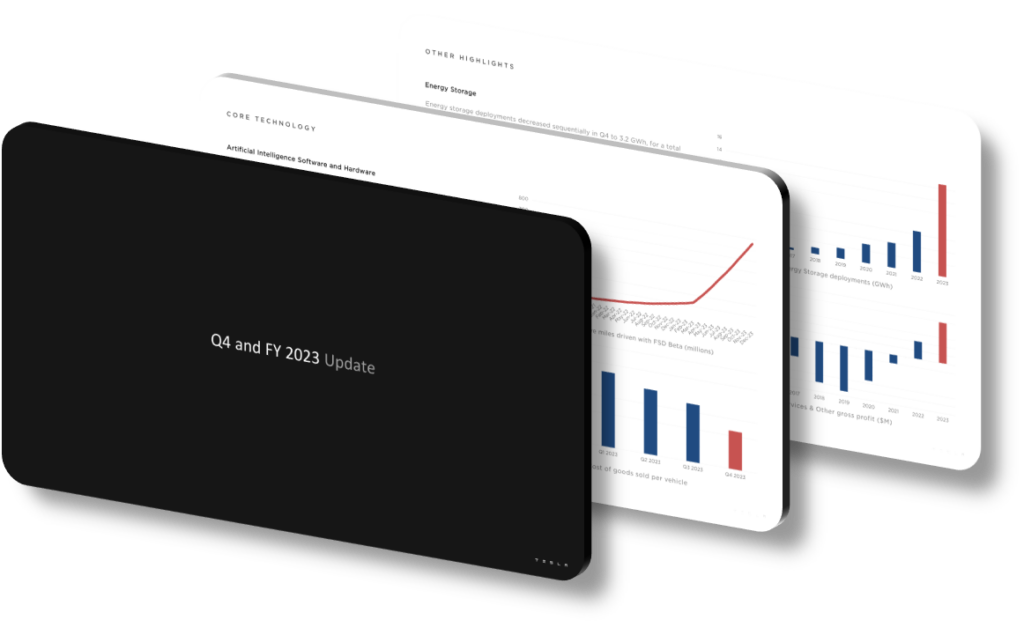
A well-structured Q4 FY 2023 earnings presentation effectively highlights key achievements by combining visual hierarchy, data-first storytelling, and deliberate layout choices that guide the audience’s eye toward the most important metrics. Rather than burying revenue milestones or unit delivery figures in dense text blocks, a strong presentation isolates those numbers with generous white space, bold typography, and high-contrast color accents. When investors and analysts can locate a record-breaking annual delivery figure or a margin improvement percentage within seconds of a slide appearing, the design is doing its strategic job — making success undeniable and memorable without requiring verbal explanation.
The core design principle at work is progressive disclosure, which means each slide surfaces only the information needed at that moment in the narrative arc. An opening slide might show a single headline metric — such as a 38% year-over-year revenue increase — while subsequent slides layer in context like regional breakdown, product-line contribution, and cost-per-unit improvements. This approach prevents cognitive overload and keeps the audience anchored to the story rather than scanning cluttered charts. A common mistake in quarterly earnings decks is cramming six KPIs onto one slide; strong Q4 presentations deliberately limit each frame to one or two claims, trusting the supporting data to do the convincing.
Color strategy plays an underappreciated role in achievement emphasis. Presentations that use a restrained two-to-three color palette — for example, a neutral dark background with a single vibrant accent color reserved exclusively for record-breaking figures — create an automatic visual signal. When viewers see that accent color, they learn quickly that it marks something historically significant. Contrast this with decks that use four or five colors inconsistently: the viewer loses the ability to distinguish emphasis from decoration, and every data point competes equally for attention. Effective Q4 FY 2023 designs also use consistent iconography — upward-trending arrows, checkmarks, or milestone badges — to reinforce narrative momentum without adding textual noise.
- Using a full-bleed dark background with a single electric-blue accent on record figures draws the eye immediately to milestones, preventing the audience from treating all data points equally.
- Placing the most important achievement — such as a highest-ever quarterly free cash flow figure — on the very first data slide sets an authoritative tone before deeper metrics are introduced.
- Limiting each slide to a maximum of two KPIs forces the presenter to prioritize ruthlessly, ensuring that secondary metrics do not dilute the impact of primary achievements like annual delivery totals.
- Using a large-format number treatment — for example, a 72-point bold typeface for a delivery milestone — surrounded by 40% white space signals importance more efficiently than any caption or label could.
- Segmenting the deck into clearly labeled chapters such as ‘Operational Highlights,’ ‘Financial Performance,’ and ‘Outlook’ gives the audience a mental map and allows investors to navigate quickly to their area of focus.
- Animating only the key achievement slides — while keeping supporting charts static — focuses viewer attention during live presentations and ensures the critical data moments land with appropriate dramatic weight.
- Providing a one-page summary slide at the end that consolidates five or six top achievements with their numeric values gives analysts a quotable snapshot that often ends up reproduced in financial media coverage.
The practical takeaway is that achievement-focused presentation design is less about decoration and more about information architecture. If you are building or evaluating a Q4 earnings deck, start by listing the five achievements you most want the audience to remember, and then audit every slide to confirm that the design is actively steering attention toward those five items rather than competing with them. This approach works best for investor-facing materials, board briefings, and analyst days. It is less appropriate for internal operational reviews, where completeness and granular detail matter more than headline impact — in those contexts, prioritizing visual drama over data density can actually obscure the nuanced picture decision-makers need.
Need a presentation that wins the room? SlideGenius designs custom, high-impact decks for brands like Red Bull, Amazon, and Adidas. Browse our presentation design portfolio, explore our PowerPoint design services, or contact us for a free quote.










