
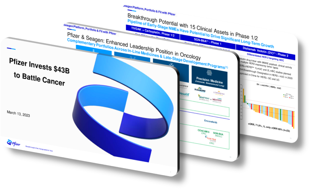
Pfizer’s presentation design for the Seagen acquisition enhances understanding by using a carefully layered visual hierarchy that guides the audience from high-level strategic rationale down to granular financial detail. Rather than overwhelming viewers with dense text slides, the design employs color-coded sections, consistent iconography, and structured data visualization to separate oncology pipeline value from financial synergy projections. This approach allows analysts, investors, and regulators to process complex information in digestible stages, reducing cognitive load while still conveying the full scope of a deal valued at approximately $43 billion. The deliberate pacing of information mirrors the logical sequence of due diligence itself.
Effective acquisition presentation design relies on the principle of progressive disclosure — starting with the ‘why’ before the ‘how’ and ‘how much.’ Pfizer’s slides reportedly open with a strategic narrative around antibody-drug conjugate (ADC) technology, establishing Seagen’s unique scientific position before introducing any numbers. This framing is crucial because it primes the audience to interpret financial figures through a strategic lens rather than treating the deal purely as a cost center. A common mistake in M&A presentations is front-loading financial tables before the audience has an emotional or intellectual reason to care about the target company, which leads to skepticism rather than alignment.
Visual consistency across slides creates a sense of trust and authority, which matters enormously in investor-facing communications. When fonts, color palettes, and chart styles remain uniform, the audience’s brain spends less energy decoding format and more energy absorbing content. In contrast, presentations that switch between bar charts, scatter plots, and plain text tables without a unifying visual grammar force the viewer to constantly reorient. Pfizer’s design reportedly uses a structured two-column layout on analytical slides, placing clinical milestone timelines on one side and commercial revenue ramp projections on the other, so comparisons can be made instantly rather than requiring the viewer to flip between slides.
Data visualization choices also play a significant role in clarifying complex biotech metrics. Pipeline waterfall charts, for example, allow a non-scientific investor to immediately grasp how many ADC candidates Seagen holds at each clinical stage (Phase 1, Phase 2, Phase 3) and estimate probability-adjusted value without reading footnotes. Similarly, bridge charts that show how Seagen’s oncology revenue stacks on top of Pfizer’s existing franchise make the accretion story visually self-evident, removing the need for verbal explanation during live presentations.
- Using color-coded therapeutic area tags (e.g., breast cancer in one color, bladder cancer in another) allows audiences to track specific pipeline assets across multiple slides without losing context.
- Placing a single ‘key message’ header above each chart — such as ‘ADC platform expands addressable market by an estimated $10B+’ — ensures the takeaway is never ambiguous, even for a skimming reader.
- Timeline slides that align clinical readout dates with projected revenue milestones help analysts model forward earnings without needing supplemental documents or verbal clarification from presenters.
- A dedicated ‘risk and mitigation’ slide using a two-column table structure signals intellectual honesty, which builds credibility with skeptical institutional investors who are looking for gaps in management’s logic.
- Consistent use of a muted background with high-contrast data elements ensures slides remain legible when projected in large conference rooms or compressed into PDF format for distribution.
- Executive summary slides that use three-to-five numbered icons rather than bullet points help senior decision-makers navigate back to specific sections during Q&A without paging through the full deck.
- Embedding a simplified competitive landscape matrix early in the deck contextualizes why Seagen’s ADC patents represent a defensible moat rather than a temporary technological advantage.
Ultimately, the reason this presentation design enhances understanding is that it treats communication as a product, not an afterthought. Every structural choice — from section sequencing to chart type selection — serves the goal of reducing friction between complex information and audience comprehension. This approach is most effective for sophisticated audiences like institutional investors and regulatory bodies who have limited time but high analytical expectations. It is less appropriate for general consumer communications or early-stage pitches where narrative storytelling and simplicity should take precedence over structured data density. If you are building a similar M&A presentation, start by mapping your audience’s specific knowledge gaps and design each slide to close exactly one gap at a time.
Need a presentation that wins the room? SlideGenius designs custom, high-impact decks for brands like Red Bull, Amazon, and Adidas. Browse our presentation design portfolio, explore our PowerPoint design services, or contact us for a free quote.










