
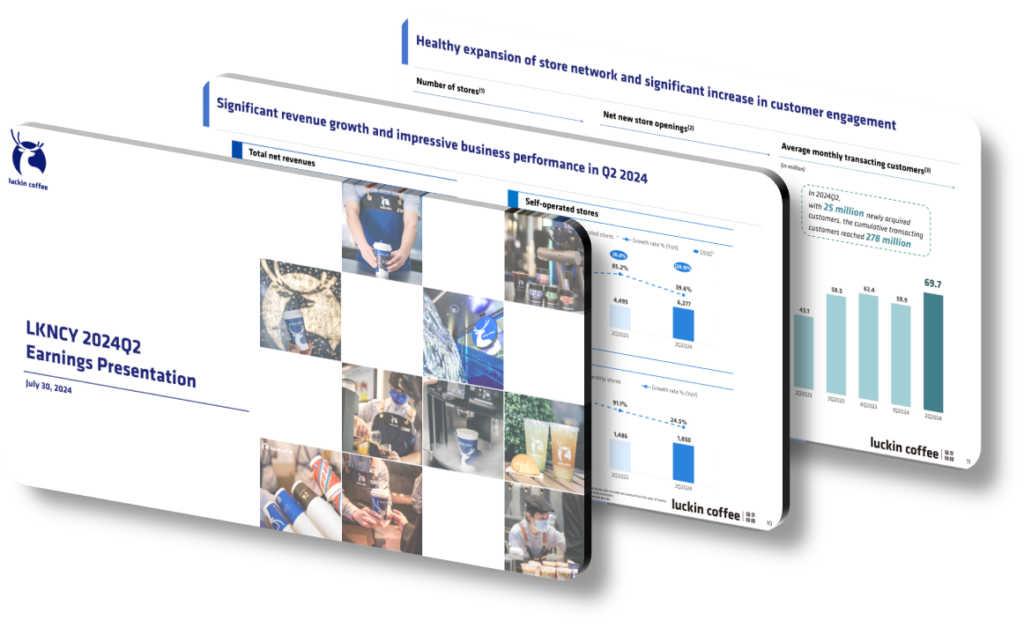
Luckin Coffee’s Q2 2024 investor presentation is deliberately structured to foreground strategic growth metrics because the company is actively rebuilding institutional investor confidence after its 2020 accounting scandal, while simultaneously competing in an increasingly crowded Chinese specialty coffee market. The design choices — prominent placement of store-count milestones, same-store sales recovery curves, and partnership expansion data — serve a dual purpose: they signal operational stability to skeptical analysts and demonstrate that the brand’s aggressive domestic expansion is sustainable and systematically planned rather than opportunistic. This framing is critical when a company needs to convert cautious observers into long-term shareholders.
Presentation design in investor contexts is never neutral. When a company chooses to open a slide deck with a geographic heat map of new store locations rather than a raw revenue table, it is making an argument about trajectory over snapshot. Luckin’s Q2 2024 materials lean heavily on visual storytelling that emphasizes compound growth — layered bar charts showing quarter-over-quarter net new stores, funnel graphics illustrating the conversion from casual customers to loyalty-app members, and callout boxes that anchor every financial figure to a forward-looking strategic initiative. This approach is common among companies that want analysts to evaluate them on a growth-adjusted basis rather than on current-period profitability alone, which is especially useful when operating margins are still recovering or being deliberately compressed by reinvestment.
A common mistake investors and observers make when reviewing such presentations is conflating design emphasis with underlying performance. Highlighting a metric in a large font or placing it on the cover slide does not mean that metric is the most important one — it means management believes it is the most persuasive one for the current audience. For example, if new partnership channels (such as workplace or transit-hub kiosks) contributed a relatively small share of total Q2 revenue but showed 120% year-over-year growth, leading with that figure creates a powerful narrative of diversification even if the absolute contribution remains modest. Skilled readers of investor materials learn to cross-reference the prominent design elements with footnoted data tables to get the complete picture.
- Store-count expansion graphics are positioned early in the deck to anchor the analyst’s mental model around scale and network effects before financial details are introduced.
- Color-coded regional growth maps use visual contrast to make density increases feel dramatic and tangible, even when underlying customer traffic per store is growing more slowly.
- Loyalty program membership figures are presented with cumulative totals rather than active monthly users, which naturally produces larger, more impressive numbers without misrepresenting the data.
- Same-store sales charts use a selected baseline quarter to maximize the visual slope of recovery, which is a legitimate but carefully chosen framing decision worth noting.
- Partnership and co-branding announcements are grouped into a dedicated ‘ecosystem’ section to suggest strategic breadth, even if individual partnerships are early-stage with limited revenue impact.
- Forward-looking guidance ranges are displayed with midpoints emphasized in large type, while the lower bounds — which represent realistic downside scenarios — appear in smaller, lighter text.
- Operational efficiency ratios, such as beverage preparation time and waste reduction percentages, are included to signal process maturity to investors who track unit economics as a proxy for scalability.
Understanding why a presentation is designed the way it is matters as much as understanding what it contains. For anyone conducting due diligence on Luckin Coffee or any fast-growing consumer brand, the practical next step is to build a parallel data set from raw financial filings — such as the Form 20-F or unedited earnings call transcripts — and compare the trends there against the trends highlighted in the designed presentation. When both sources tell the same story, confidence increases. When they diverge, that divergence is the most important signal in the room. This analysis approach is less useful for mature, low-growth companies where presentation design tends to be conventional and conservative by nature.
Need a presentation that wins the room? SlideGenius designs custom, high-impact decks for brands like Red Bull, Amazon, and Adidas. Browse our presentation design portfolio, explore our PowerPoint design services, or contact us for a free quote.










