
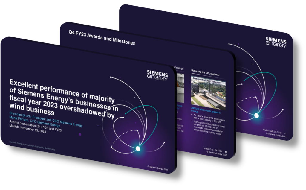
An AGS 2023-style annual general shareholders presentation is effective at highlighting key insights because it deliberately combines a restrained visual hierarchy with data-first storytelling. Rather than filling every slide with decorative elements, this design approach uses generous white space, consistent typographic scales, and a single dominant accent color to guide the viewer’s eye directly to the most critical numbers or conclusions. When each slide answers only one core question — revenue growth, margin expansion, strategic pivot — audiences retain more because there is no cognitive competition between the headline claim and supporting evidence. This singular focus is the cornerstone of what makes such presentations genuinely persuasive rather than merely informative.
The underlying principle is signal-to-noise discipline. Corporate reporting presentations often suffer from ‘dashboard overload,’ where twelve KPIs appear on a single slide and none of them registers clearly. By contrast, an effective AGS-style deck limits visible data points per slide to three or fewer, uses large-format numerals (often 48pt or above for the headline figure), and positions supporting context in a visually subordinate text block below. This hierarchy means a viewer scanning at two seconds per slide — which is realistic in a live setting — still captures the key insight before the presenter has spoken a word. Contrast ratios between figure and background should meet at minimum a 4.5:1 ratio (the WCAG AA standard) to ensure legibility across projection environments ranging from HD screens to aging conference-room projectors.
Another structural strength is the use of narrative arc across sections, not just within individual slides. An effective AGS presentation is typically divided into labeled ‘chapters’ — Market Context, Operational Performance, Capital Allocation, Outlook — each introduced by a transitional ‘billboard’ slide that states the section’s core takeaway as a declarative sentence rather than a topic label. For example, a section opener might read ‘Our cost-reduction program delivered €1.2 billion in savings ahead of schedule’ rather than simply ‘Cost Efficiency.’ This technique, sometimes called the ‘assertion-evidence’ framework popularized in engineering communication research, means every section transition reinforces a conclusion, compounding the audience’s understanding progressively rather than leaving synthesis until the final summary slide.
- Use a single accent color — such as a teal or amber drawn from the brand palette — exclusively for the one number or phrase that constitutes the key insight on each slide, so the eye lands there first automatically.
- Apply a consistent ‘headline as conclusion’ rule: every slide title should be a complete declarative sentence stating the insight, for example ‘Free cash flow reached a five-year high of €4.8 billion,’ not simply ‘Free Cash Flow.’
- Limit each data visualization to a single variable comparison where possible; a bar chart comparing two time periods is far more scannable than a clustered six-bar chart covering multiple segments simultaneously.
- Use progressive disclosure in animated builds — reveal each data series with a click so the audience focuses on one trend at a time rather than processing a fully populated chart all at once.
- Maintain a slide density of roughly one slide per 90 seconds of speaking time; for a 40-minute presentation this means approximately 26 slides, preventing both rushed delivery and tedious over-explanation.
- Introduce an ‘executive summary’ slide within the first three slides that lists the five headline conclusions, then link every subsequent section back to one of those five points to create an explicit structural thread throughout.
- Test slides at 50% zoom before finalizing — if a chart or headline is unreadable at thumbnail size, it will almost certainly be illegible on a wide-format screen viewed from the back row of a 200-seat auditorium.
The practical takeaway is that insight-driven presentation design is fundamentally an editorial process, not a design process — it starts with ruthless content curation before a single slide template is opened. A strong next step is to draft every slide title in sentence form first, on a plain document, and verify that reading only those titles tells a coherent story arc. This approach breaks down when the subject matter is genuinely exploratory or when the audience requires full data transparency for regulatory reasons, in which case an appendix-heavy supplementary deck serves better than forcing every detail into the main narrative flow.
Need a presentation that wins the room? SlideGenius designs custom, high-impact decks for brands like Red Bull, Amazon, and Adidas. Browse our presentation design portfolio, explore our PowerPoint design services, or contact us for a free quote.










