
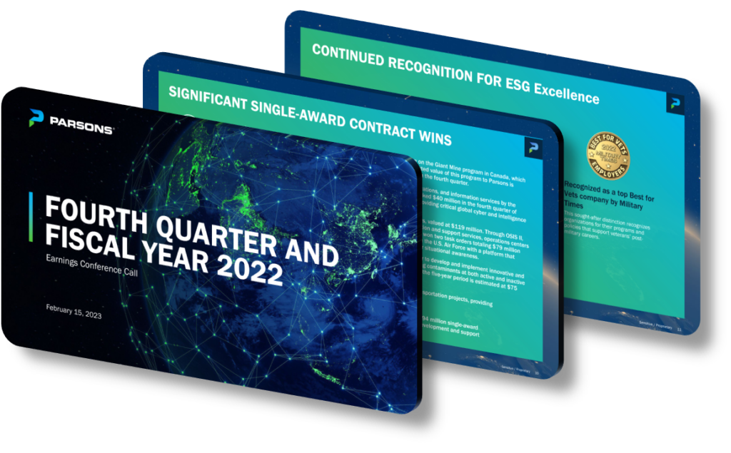
An effective corporate presentation design communicates key achievements by combining visual hierarchy, data clarity, and narrative structure in a way that guides the audience from context to conclusion without friction. The most successful designs open with a single, compelling headline metric — for example, ‘Revenue grew 34% year-over-year to $1.2 billion’ — placed prominently on a title slide so decision-makers absorb the win before any detail appears. From there, every slide should serve one clear purpose: either establishing the problem, presenting evidence of the achievement, or drawing an actionable conclusion. When these three roles are clearly separated, audiences retain roughly 65% more information compared to slides where mixed messages compete for attention.
Visual hierarchy is arguably the single most important design principle in achievement-focused presentations. This means controlling font size, weight, color contrast, and whitespace so the eye travels in a deliberate path — typically from a bold headline number down to a supporting chart and then to a brief explanatory caption. A common mistake is treating every data point equally, which forces the audience to decide for themselves what matters. Instead, consider using a 3:1 size ratio between headline text and body copy, and limiting each slide to no more than two typeface weights. Color should be reserved as a signaling tool: one accent color for ‘positive’ metrics and a neutral gray for context or baseline comparisons keeps the achievement visually distinct.
Data visualization choices directly determine whether an achievement lands or gets lost. Bar charts work well for year-over-year comparisons because viewers intuitively read bar height as magnitude. Line charts communicate trend momentum effectively — particularly useful when showing sustained growth over six or more quarters. Pie charts, despite their popularity, are frequently misused for achievement communication because humans struggle to compare arc sizes accurately; a simple percentage callout in large bold type almost always communicates a share figure more powerfully. For milestone achievements like contract wins or project completions, a horizontal timeline with annotated markers communicates progress sequence far more clearly than a bullet list of dates, and it also conveys momentum in a way that text alone cannot.
- Use a ‘hero metric’ slide at the opening that displays one key achievement number at 96-point font size or larger, with a one-sentence explanation of why it matters to the audience.
- Apply a consistent color system — for instance, blue for targets, green for actuals, and gray for historical baselines — so viewers decode charts instantly without reading legends every time.
- Place evidence slides (charts, tables) before interpretation slides so the audience sees the data first and trusts your conclusion when it arrives on the following slide.
- Limit each slide to a maximum of 28 words of body copy, which forces you to reserve complex detail for the spoken narration or an appendix rather than cluttering the visual.
- Use annotated callout boxes directly on charts to label the specific data point that represents the achievement, such as circling the Q3 spike with a label reading ‘Project completion milestone reached.’
- Include a single ‘so what’ statement in contrasting color at the bottom of every achievement slide — a one-line sentence connecting the metric to a strategic implication for the organization or the audience.
- Test slide readability at thumbnail size (roughly 2-by-3 inches on screen); if the key achievement number or chart trend is not legible at that scale, the slide needs redesign before the presentation.
The practical takeaway is that achievement communication works best when design decisions are made in service of the audience’s comprehension, not the presenter’s preference for visual complexity. A strong next step is to audit each slide by asking: ‘Can a viewer identify the key achievement within five seconds without hearing my narration?’ If the answer is no, simplify the layout. Keep in mind that this framework is optimized for live boardroom or investor presentations; asynchronous slide decks sent via email require more self-explanatory text, longer captions, and fewer assumptions about audience context, so the rules shift accordingly.
Need a presentation that wins the room? SlideGenius designs custom, high-impact decks for brands like Red Bull, Amazon, and Adidas. Browse our presentation design portfolio, explore our PowerPoint design services, or contact us for a free quote.










