
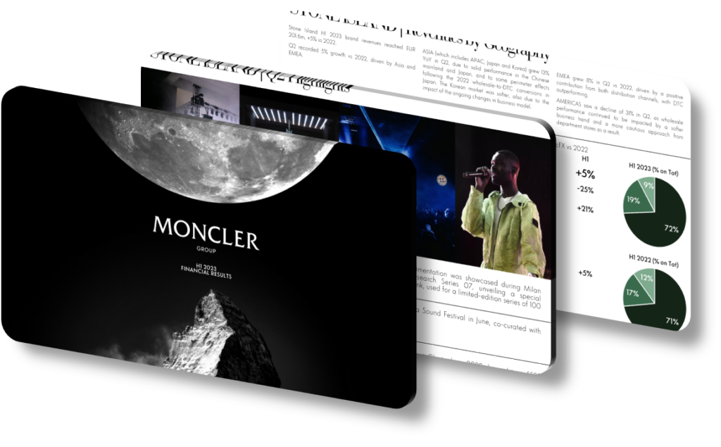
An effective H1 2023 financial presentation design communicates key milestones by combining visual hierarchy, data clarity, and narrative flow so that each slide moves the audience from raw numbers toward strategic insight. The most successful approaches anchor every section around a single dominant metric — revenue growth percentage, adjusted EBIT margin, or net revenue by region — and then layer supporting context beneath it. When a presentation opens with a headline like ‘Revenue +17% YoY at constant exchange rates,’ that specificity immediately signals credibility and sets the interpretive frame for everything that follows, allowing analysts and investors to calibrate their expectations before diving deeper.
The structural backbone of a strong half-year financial deck typically follows a three-part arc: performance recap, operational drivers, and forward-looking confidence signals. The performance recap section should use large-format numbers with minimal surrounding noise — white space is a deliberate design tool, not wasted real estate. Operational driver slides then explain the ‘why’ behind those numbers, using annotated bar charts or waterfall diagrams that visually decompose margin movement into its constituent parts. A common mistake is placing too many metrics on a single slide, which dilutes attention and forces the reader to rank importance themselves rather than receiving that editorial guidance from the designer. Each slide should answer exactly one question.
Color and typography carry significant strategic weight in financial presentation design. Using a restrained palette — typically two to three colors — allows accent colors to function as genuine signals rather than decoration. For example, using dark navy for baseline figures and a warm accent color exclusively for year-over-year growth callouts trains the eye to find the key takeaway instantly. Font sizing hierarchies matter equally: headline metrics at 48pt or above, supporting labels at 14-16pt, and footnotes no smaller than 10pt for accessibility. A slide where the most important number is the largest element on the page removes interpretive ambiguity entirely.
- Use a waterfall chart to decompose gross margin movement into pricing, volume, and mix effects, so audiences can immediately attribute performance shifts to specific business decisions rather than market forces alone.
- Place a geographic revenue breakdown using a simple horizontal bar chart with labeled percentage contributions, giving regional context without requiring the audience to calculate proportions mentally from a pie chart.
- Anchor the opening executive summary slide with three clearly ranked KPIs — such as net revenues, adjusted EBIT, and free cash flow — each accompanied by a single directional arrow and a concise YoY delta.
- Use consistent color coding across all slides so that, for example, the APAC region always appears in the same teal shade whether it appears in a revenue breakdown, a growth chart, or a footnote callout.
- Design a dedicated ‘bridge slide’ that connects H1 actuals to full-year guidance, using dotted-line projections and shaded confidence bands to distinguish confirmed data from forward estimates transparently.
- Apply a ‘one number per slide’ discipline for milestone announcements — for instance, a slide reading ‘€1.04B net revenues’ with a single supporting sentence delivers more impact than a table of six figures.
- Include a timeline graphic at the section-break slides that shows where H1 sits within the full strategic cycle, providing temporal orientation that helps stakeholders contextualize interim results against multi-year targets.
The practical takeaway is that financial presentation design is fundamentally an act of editorial curation: your job is to eliminate every element that doesn’t reinforce the central message of each slide. A strong next step is to audit each slide with a five-second test — if the key insight isn’t obvious within five seconds, simplify. This approach is most powerful when presenting to mixed audiences of analysts, media, and retail investors simultaneously. It is less appropriate for internal deep-dive reviews, where dense data tables and multi-variable charts serve the granular analytical needs of specialists who require raw data over curated narrative.
Need a presentation that wins the room? SlideGenius designs custom, high-impact decks for brands like Red Bull, Amazon, and Adidas. Browse our presentation design portfolio, explore our PowerPoint design services, or contact us for a free quote.










