
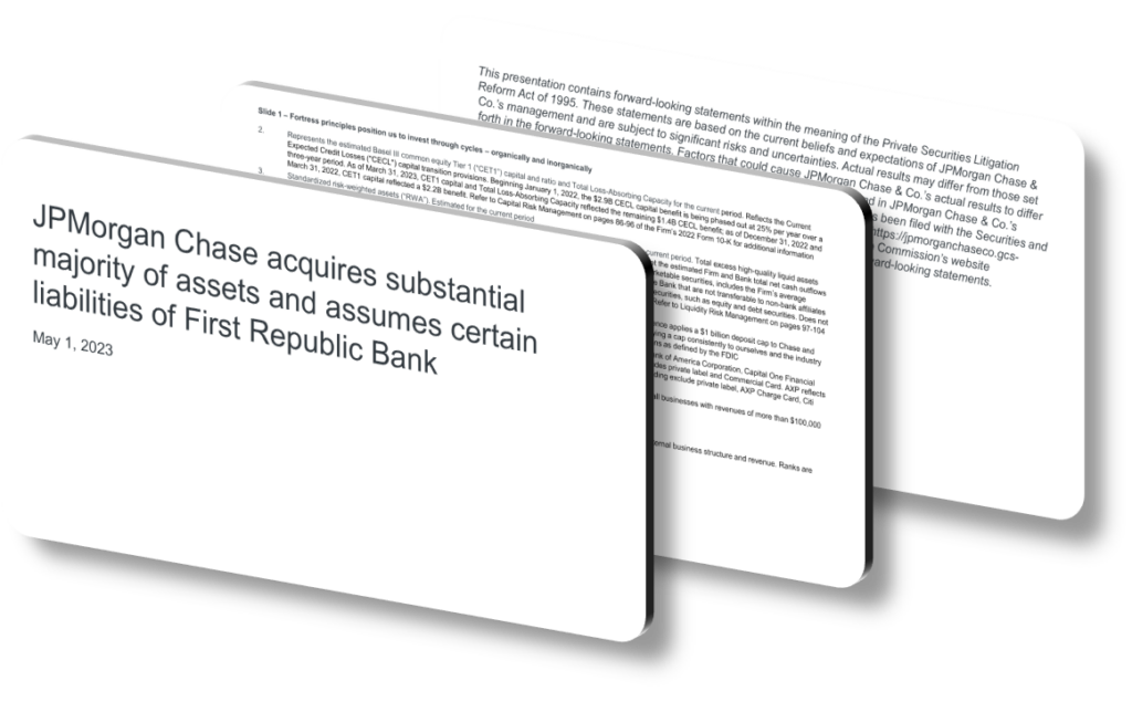
An effective acquisition presentation design works by ruthlessly prioritizing clarity over comprehensiveness — it guides the audience from uncertainty to confidence using a logical narrative arc, consistent visual hierarchy, and data that is selectively shown rather than exhaustively dumped. In the context of a major financial institution acquiring a distressed bank, the presentation must simultaneously reassure regulators, calm depositors, and signal strategic intent to investors. This requires a design philosophy where every slide answers one question, every chart reinforces one message, and the overall deck moves like a well-structured argument rather than a document appendix.
The structural backbone of an effective acquisition presentation is what communication designers call a ‘storyline architecture.’ Rather than organizing slides by department or data type, the most effective decks organize around the decision-maker’s anxiety sequence: first addressing stability and risk containment, then articulating the strategic rationale, then quantifying the financial impact. This sequencing is not accidental — it mirrors the cognitive journey of a skeptical audience. If financial benefits are presented before risk mitigation, audiences discount the upside figures because they are still mentally stuck on unresolved fear. Getting the sequence right is arguably more important than the quality of any individual slide.
Visual hierarchy is the second major lever. In high-stakes acquisition presentations, designers typically use a strict three-level typographic system: a headline that states the conclusion (not the topic), a supporting subhead or data callout that provides the key number or qualifier, and body text or chart labels that supply the evidence. This is the opposite of how most internal business documents are formatted, where headlines describe topics (‘Balance Sheet Overview’) rather than conclusions (‘Acquired deposits fully backstopped on Day 1’). Conclusion-first headlines allow a senior executive scanning at speed to reconstruct the full argument from headlines alone — a technique sometimes called the ‘elevator test’ for slide decks. Color usage also follows strict rules: a single accent color flags the single most important figure on each slide, avoiding the visual noise that dilutes attention.
- Using a consolidated ‘situation on one page’ slide as the opening frame gives regulators and executives an immediate anchor for interpreting all subsequent detail slides without confusion.
- Placing risk-mitigation data — such as capital buffer percentages and deposit insurance coverage thresholds — on the second slide signals that the presenting institution controls the risk narrative before skepticism builds.
- Employing a simple before-and-after balance sheet comparison, with clearly labeled pro-forma columns, eliminates guesswork about how the acquired entity affects the acquirer’s financial position.
- Using a timeline visualization with explicit milestone markers (Day 1, Week 2, 90-day integration) converts an abstract integration plan into a concrete, accountable sequence that builds credibility.
- Limiting each data chart to a single annotated callout rather than multiple data labels keeps the audience’s eye on the number that matters most, reducing cognitive load significantly.
- Including a one-slide regulatory and government coordination summary, showing named agencies and approval statuses, demonstrates institutional transparency and pre-empts questions about oversight.
- Ending with a quantified strategic benefit slide — ideally expressing synergies in both dollar figures and percentage-of-book terms — ties the entire presentation back to long-term shareholder and stakeholder value.
The practical takeaway is that effective acquisition presentation design is less about visual polish and more about information architecture and sequencing discipline. If you are designing a similar presentation, start by listing the five questions your audience will ask in the order they will ask them, then design one slide to answer each question before proceeding to supporting detail. This approach does not work as well for exploratory presentations or internal brainstorming sessions, where open-ended formats are more appropriate. But for high-stakes, time-pressured communications — where your audience is making billion-dollar decisions under uncertainty — a tightly engineered slide narrative is one of the most powerful tools available.
Need a presentation that wins the room? SlideGenius designs custom, high-impact decks for brands like Red Bull, Amazon, and Adidas. Browse our presentation design portfolio, explore our PowerPoint design services, or contact us for a free quote.










