
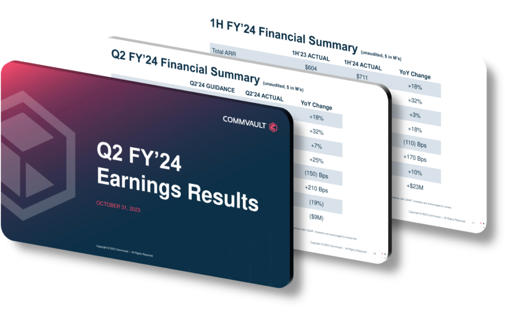
A presentation design stands out in communicating key data insights when it achieves a rare balance between visual clarity and analytical depth. The most effective designs don’t just decorate data — they create a structured narrative that guides the audience from raw numbers to actionable conclusions. This means choosing chart types that match the nature of the data (for example, using a slope chart instead of a clustered bar chart when showing change between two time points), establishing a consistent visual hierarchy so the audience always knows where to look first, and stripping away any decorative elements that compete with the signal itself. The goal is cognitive ease at every step.
One of the most common mistakes in data-driven presentations is the assumption that showing more data signals thoroughness. In reality, overloading a single slide with multiple KPIs, competing colors, and dense annotations creates what researchers call ‘extraneous cognitive load’ — the mental effort spent decoding the layout rather than understanding the insight. Strong design solves this by applying a strict one-insight-per-slide rule, where each visual asks and answers exactly one question. Supporting data lives in an appendix or a drill-down layer, not on the primary slide. This approach is especially critical in executive presentations where decisions must happen in real time and attention spans are compressed.
Typography and color grading deserve more strategic attention than they typically receive. A well-designed data slide uses no more than two typeface weights (for instance, a bold 28pt headline that states the insight explicitly, paired with a regular 14pt annotation layer for supporting detail). Color should encode meaning, not aesthetics — a sequential palette from light to dark for magnitude, a diverging palette for above/below-average performance, and a single accent color reserved exclusively for the ‘so what’ moment. Using red and green together without texture or shape differentiation also creates accessibility problems for roughly 8% of male viewers who experience red-green color blindness, which is a concrete, avoidable design failure.
- Apply the ‘headline as insight’ technique by writing slide titles as declarative sentences, such as ‘Customer retention dropped 12% in Q3 due to onboarding friction,’ rather than generic labels like ‘Retention Trends.’
- Use a consistent grid system across all slides — a 12-column layout at 1920×1080 resolution ensures chart elements, text blocks, and whitespace align predictably without manual adjustment each time.
- Introduce a ‘data-ink ratio’ audit before finalizing any chart by removing gridlines, redundant axis labels, and 3D effects that add visual mass without adding informational value.
- Layer your story using a progressive disclosure structure: start with the summary metric, then reveal the breakdown, then show the trend line, so each click adds one dimension rather than dumping all dimensions simultaneously.
- Color-code audience roles when presenting to mixed groups — highlight the metric most relevant to operations in one accent color and the metric relevant to finance in another, so each stakeholder immediately identifies their key number.
- Test slide legibility at 60% zoom, which approximates how a slide looks on a laptop screen in a remote meeting, and ensure no critical label or data point disappears at that scale.
- Calibrate annotation density by following the ‘3-second rule’: if a viewer cannot identify the core insight within three seconds of seeing the slide without any spoken explanation, the design requires simplification.
Ultimately, outstanding data presentation design is less about software features and more about disciplined decision-making at each design step. A practical next step is to audit your three most recent data slides by showing them to a colleague for exactly three seconds and asking what they remember — if the answer isn’t your intended insight, you’ve identified a redesign priority. Keep in mind this framework applies best to summary and decision-support presentations; exploratory data analysis sessions deliberately break these rules, because in that context, density and iteration are features, not flaws.
Need a presentation that wins the room? SlideGenius designs custom, high-impact decks for brands like Red Bull, Amazon, and Adidas. Browse our presentation design portfolio, explore our PowerPoint design services, or contact us for a free quote.










