
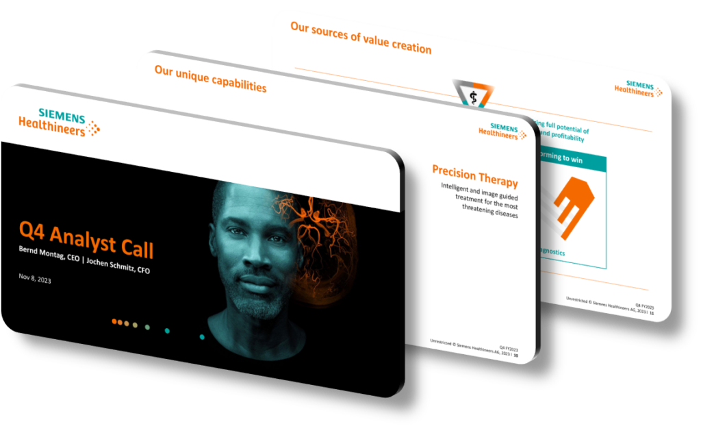
When a large medical technology company needs to communicate a full fiscal year’s worth of innovation to investors, analysts, and clinical partners, presentation design becomes a strategic discipline in its own right. Effective fiscal-year innovation presentations go well beyond slide aesthetics — they architect a narrative that connects product launches, regulatory approvals, and financial performance into a single coherent story. The strongest examples use a layered information hierarchy: a headline metric or milestone anchors each section, supported by clinical data visualizations, pipeline roadmap graphics, and segment-level breakdowns that allow different audience types to engage at their preferred depth of detail.
The core challenge in presenting a year’s innovations is preventing what designers call ‘innovation sprawl’ — a slide deck that lists dozens of product updates without helping the audience understand relative significance or strategic direction. Best-practice frameworks solve this by organizing innovations into named strategic pillars (for example, ‘Expanding Access,’ ‘AI-Driven Diagnostics,’ and ‘Workflow Automation’), then mapping each product or regulatory milestone onto those pillars. This approach lets viewers instantly see whether the company is executing on its stated strategy and where investment is concentrated. Color-coding by business segment — imaging, diagnostics, digital health — further reduces cognitive load and makes the deck navigable during live Q&A sessions.
Data visualization choices are critical when presenting healthcare innovations, because the underlying evidence is inherently complex. A fiscal year presentation might need to show clinical trial endpoints, installed-base growth curves, reimbursement coverage expansions, and regional revenue splits simultaneously. Effective decks use a consistent visual grammar: bar-over-line combination charts for volume-versus-growth comparisons, icon-based pipeline grids showing development stage (pre-clinical, FDA submission, cleared, commercialized), and geographic heat maps for market-access stories. Using a restrained palette — often two primary brand colors plus a single accent for highlights — prevents these dense charts from becoming visually overwhelming while still drawing attention to record-breaking numbers or breakthrough clearances.
- Anchor each business segment section with a single ‘hero innovation’ slide that names the product, its regulatory status, and one quantified clinical outcome to give analysts a memorable reference point.
- Use a visual pipeline grid with five columns representing development stages so stakeholders can quickly count how many innovations are approaching commercialization within the next 12 months.
- Apply a consistent icon set for innovation categories — such as a waveform icon for imaging, a molecule icon for in-vitro diagnostics — so the deck can be skimmed non-linearly during presentations to large audiences.
- Include a ‘year-in-review’ timeline slide formatted as a horizontal ribbon, placing regulatory clearances, partnership announcements, and product launches at their actual calendar quarter to show innovation cadence rather than just volume.
- Reserve a dedicated slide for AI and software innovations using a distinct background treatment, because digital health updates require a different investor mental model than hardware or reagent launches.
- Use side-by-side ‘before and after’ workflow diagrams to illustrate how a new technology reduces procedure steps or scan time, grounding abstract innovation claims in measurable operational impact.
- Close the innovation section with a forward-looking ‘upcoming milestones’ table listing expected FDA submissions or CE Mark reviews by quarter, giving the audience a concrete basis for evaluating future-year momentum.
Applying these principles delivers a presentation that communicates not just what was launched, but why it matters strategically and financially. A critical practical next step is aligning the design template with IR (investor relations) disclosure requirements early — font sizes, data sourcing footnotes, and forward-looking statement disclaimers must be built into the master layout before content is added, not retrofitted afterward. Note that this framework is less effective for early-stage companies with fewer than three distinct product lines, where a single-narrative format outperforms a segmented pillar structure.
Need a presentation that wins the room? SlideGenius designs custom, high-impact decks for brands like Red Bull, Amazon, and Adidas. Browse our presentation design portfolio, explore our PowerPoint design services, or contact us for a free quote.
Need this done for you? Discover SlideGenius’ presentation design services.










