
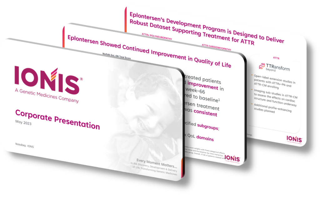
A well-crafted pharmaceutical presentation design highlights key genetic medicine innovations by combining precise scientific storytelling with visually layered data hierarchies that guide the audience from molecular mechanism to clinical outcome. The most effective designs open with a clear ‘mechanism of action’ visual — typically an annotated pathway diagram — that immediately anchors the audience in the biology before introducing efficacy data. This approach respects the sophistication of scientific audiences while making novel modalities like antisense oligonucleotides, RNA interference, or gene editing accessible to investor and regulatory reviewers who may not hold deep domain expertise in every platform being presented.
The structural challenge in genetic medicine presentations is scope: a single program may span target identification, preclinical pharmacology, biomarker strategy, patient stratification, and regulatory pathway considerations all within one slide deck. Effective design solves this by using a consistent visual grammar — color-coded by modality or therapeutic area, with iconographic shorthand for delivery mechanisms such as lipid nanoparticles versus GalNAc conjugates. When audiences see the same icon system repeated across slides, cognitive load drops and they can focus on the innovation delta rather than re-learning the visual language on each frame. A common mistake is overloading mechanism slides with full molecular structures that distract rather than inform; simplified schematic representations almost always communicate faster and more memorably.
Data visualization choices are where genetic medicine presentations most often differentiate themselves or fall flat. Presenting a reduction in disease-causing protein levels — say, an 80% knockdown of transthyretin in a ATTR amyloidosis trial — requires a chart type that emphasizes both magnitude and durability. A simple bar chart fails to show the time-course dimension that makes the result clinically meaningful; a line graph overlaid with individual patient trajectories communicates the same statistic with far greater persuasive weight. Similarly, biomarker waterfall plots and swimmer plots have become near-standard in oncology but are underused in rare genetic disease programs where individual patient responses are equally heterogeneous and equally compelling to show at the individual level.
- Use a modality legend established on slide two and repeated in a corner badge throughout, so audiences tracking multiple platforms — such as splice-switching versus exon skipping — never lose context during a long pipeline review.
- Anchor each program slide with a single bold statistic in 36-point type or larger, such as ‘63% reduction in seizure frequency,’ so the primary result is absorbed even by viewers scanning rather than reading.
- Incorporate patient journey timelines alongside clinical endpoints to humanize genetic medicine data and remind scientific audiences that behind every biomarker reading is a child or adult with a serious inherited condition.
- Apply color saturation as a signal of clinical maturity — lighter, cooler tones for preclinical assets and progressively richer, warmer tones for Phase 2 and Phase 3 programs — giving the pipeline slide an intuitive depth reading at a glance.
- Use annotated mechanism-of-action animations sparingly in live presentations, reserving moving graphics for the single most novel platform where motion genuinely illustrates a concept static art cannot, such as CRISPR base-editing specificity within a DNA strand.
- Design regulatory milestone slides as horizontal Gantt-style timelines rather than bulleted text lists, enabling investment and business development audiences to immediately map expected catalysts against a fiscal calendar.
- Reserve the final slide for a one-page platform thesis — a concise visual argument that all programs share a unifying scientific foundation — reinforcing the company’s differentiated position rather than ending on a routine risk-factor disclosure.
The practical takeaway is that genetic medicine presentation design succeeds when it functions simultaneously as a scientific document and a strategic narrative. Your immediate next step should be auditing your existing deck for visual grammar consistency: if your mechanism icons, color system, and data chart types are not standardized across every program, establish that system before optimizing individual slides. One important caveat — this high-density, layered approach is ideal for investor days and scientific conferences but should be substantially simplified for patient advocacy or general press briefings, where mechanism complexity should be traded for outcome-focused storytelling and plain-language benefit statements instead.
Need a presentation that wins the room? SlideGenius designs custom, high-impact decks for brands like Red Bull, Amazon, and Adidas. Browse our presentation design portfolio, explore our PowerPoint design services, or contact us for a free quote.










