
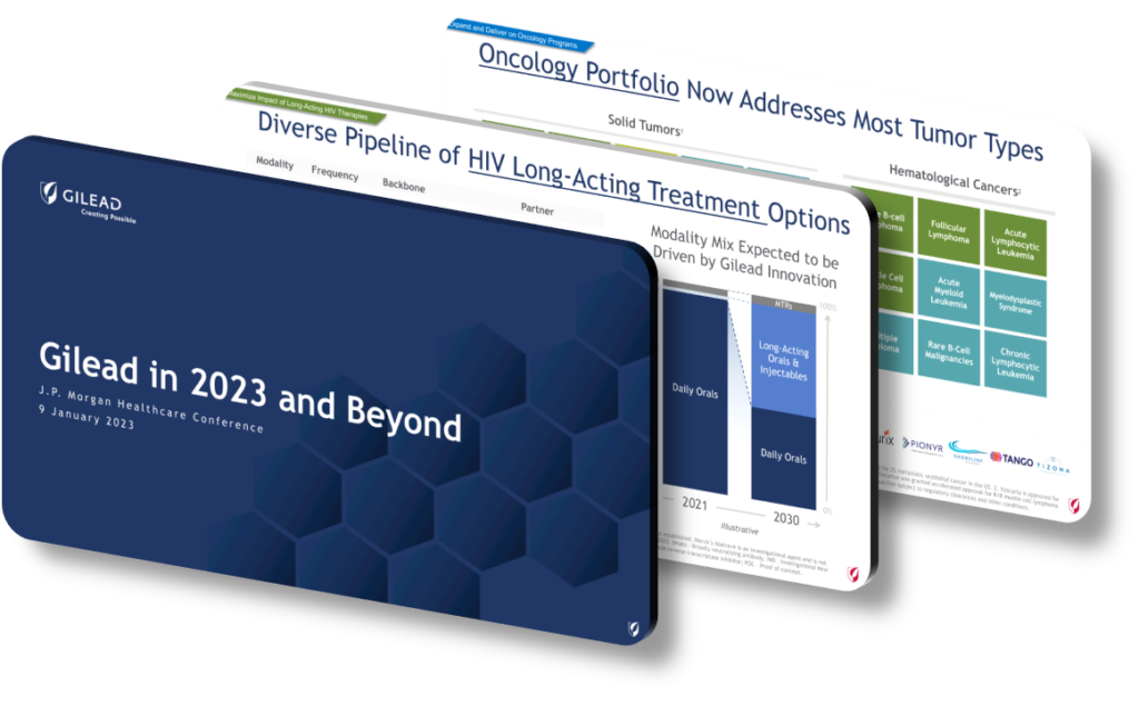
A biotech company’s presentation design at a high-stakes investor conference communicates strategic priorities through a deliberate combination of visual hierarchy, data sequencing, and narrative architecture — long before a single word is spoken aloud. The way slides are structured signals what leadership considers most important: pipeline candidates featured early with large, bold typography indicate near-term commercial focus, while deep genomic or platform-science slides near the end signal longer-horizon bets. At forums like the JPMorgan Healthcare Conference, where institutional investors rapidly cycle through dozens of back-to-back presentations, design choices function as a rapid-filtering mechanism that shapes analyst perception within the first sixty seconds of a session.
Color language and branding consistency play a more strategic role than many observers realize. Companies undergoing a major pivot — say, from small-molecule drugs to cell and gene therapy — often introduce a refreshed color palette or updated iconography at precisely the moment they want the market to perceive a transformation. A cool, clinical blue-and-white palette historically signals regulatory discipline and manufacturing precision, while warmer, more dynamic gradients suggest innovation-stage positioning. Typography choices matter as well: a shift from serif to geometric sans-serif fonts across a deck correlates with companies repositioning from legacy franchises toward next-generation platforms. These subtle design signals are not accidental — they are typically coordinated with investor relations teams, design agencies, and C-suite communications advisors months in advance of the conference date.
Data visualization architecture is perhaps the most content-rich design layer. How a company visualizes its clinical trial data — whether it leads with Kaplan-Meier survival curves, waterfall plots, or patient subgroup analyses — tells analysts which endpoints management believes will drive valuation. Pipeline prioritization grids that place a specific asset in the upper-right ‘high value, high confidence’ quadrant before competitors do the same communicate urgency. A presentation that devotes three consecutive slides to regulatory pathway clarity (for example, Breakthrough Therapy Designation status or FDA Fast Track eligibility) is telegraphing that commercialization, not just science, is the near-term priority. Conversely, companies that bury financial guidance in an appendix are signaling that the science narrative is meant to anchor the investment thesis rather than near-term earnings growth.
- Slide sequencing strategy matters enormously: leading with a single headline efficacy number in a 72-point font across a full-bleed slide forces the audience to anchor their entire perception on that specific clinical result before any context is introduced.
- Icon-based pipeline tables allow investors to scan development-stage breadth in under ten seconds, which is particularly powerful when a company wants to signal platform depth beyond its lead asset.
- Margin-of-safety framing, such as pairing a Phase 3 enrollment update with a specific patient-number milestone (e.g., ‘4,200 of 4,500 patients enrolled’), projects operational execution discipline that pure science slides cannot communicate on their own.
- Financial summary slides placed immediately after efficacy data — rather than at the end — indicate that management expects analysts to hold both the clinical and commercial theses simultaneously rather than treating them as separate stories.
- Consistent use of a three-color palette across all data charts (primary, secondary, comparator) reduces cognitive load, subtly positioning the company as operationally mature and investor-friendly rather than early-stage and exploratory.
- Speaker-note alignment between the slide design and the CEO’s spoken remarks creates a unified signal; divergence between the two (e.g., a cautious slide paired with aggressive oral commentary) introduces ambiguity that experienced analysts flag as a credibility concern.
- Appendix depth — specifically, the inclusion of competitive landscape analyses and payer coverage slides — signals that commercial readiness is already underway, not aspirational, which is a meaningful distinction for late-stage biotech positioning.
The practical takeaway is that presentation design at major investor conferences is a form of strategic communication that operates in parallel with the spoken narrative. If you are evaluating how any biotech company positions itself, study the slide order, the data prioritization, and the visual language before listening to management commentary — the design choices are often more candid about internal priorities than the prepared remarks. This framework applies most cleanly to large-cap and mid-cap companies with dedicated IR teams; early-stage companies at their first institutional conference may lack the design sophistication to make these signals legible, which itself is diagnostic information for investors assessing organizational maturity.
Need a presentation that wins the room? SlideGenius designs custom, high-impact decks for brands like Red Bull, Amazon, and Adidas. Browse our presentation design portfolio, explore our PowerPoint design services, or contact us for a free quote.










