
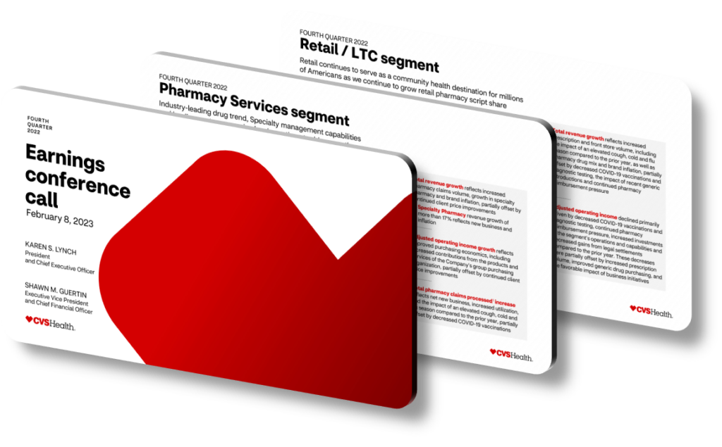
CVS Health’s 2023 strategic presentations use a layered visual hierarchy to surface key achievements, combining bold numerical callouts, color-coded performance tiers, and segmented layout grids that guide the viewer’s eye from headline metrics down to supporting detail. The design philosophy prioritizes clarity over decoration: large-format KPI cards isolate figures like membership growth in the Aetna segment or pharmacy script volumes, while muted background tones ensure those numbers command immediate attention. This approach reflects a broader trend among Fortune 20 health companies, where investor-facing materials must communicate complex, multi-segment performance without overwhelming non-specialist audiences.
A central technique in large-scale corporate presentation design is the use of strategic anchoring — placing the single most important number or claim in the top-left or center-top zone of a slide, since eye-tracking research consistently shows viewers scan that region first. For CVS Health’s 2023 materials, this means segment revenue milestones and adjusted operating income figures occupy prime visual real estate, while supporting context like year-over-year comparisons appears in smaller type below. This hierarchy is reinforced by typographic contrast: a 48-point headline figure paired with 12-point explanatory text creates a roughly 4:1 size ratio that signals importance without requiring the viewer to read every word to understand the message.
Color strategy also plays a critical role. Health-sector presentations frequently use a restrained palette of two or three brand-aligned colors — typically a primary blue or deep teal for achievement highlights, a neutral gray for contextual data, and a warm accent (amber or green) for positive variance indicators. This system prevents ‘color noise,’ a common mistake where presenters use five or more colors per slide, making it impossible for viewers to intuit what the color coding means. When a single accent color consistently signals ‘exceeded target,’ the audience learns to scan for that color as a performance shortcut, dramatically speeding up comprehension during fast-paced earnings presentations or investor days.
Segmented architecture is another key structural device. Rather than presenting enterprise-wide results as a monolithic block, high-performing corporate presentations divide performance into distinct business units — Health Care Benefits, Health Services, and Pharmacy & Consumer Wellness in CVS Health’s case — each given its own visual ‘lane’ with consistent iconography and layout. This segmentation lets analysts instantly locate the segment they track most closely, and it makes the narrative arc clearer: each segment’s slide follows an identical template of goal, result, and forward outlook, so the repetition itself becomes a comprehension aid.
- Use a maximum of three font weights per presentation deck to maintain visual discipline; mixing bold, regular, and light variants of a single typeface creates hierarchy without introducing chaos across 30 or more slides.
- Place percentage-change indicators (such as a 7.2% year-over-year revenue increase) directly adjacent to the absolute figure so viewers never have to mentally calculate context themselves, reducing cognitive load significantly.
- Apply a consistent ‘achievement badge’ icon — a checkmark or upward arrow in the accent color — next to any metric that met or exceeded the stated 2023 guidance target, creating a scannable success map across the deck.
- Use thin horizontal rules or subtle background shading to separate slide sections rather than hard borders, which can fragment the visual flow and make a dense data slide feel more like a spreadsheet than a strategic narrative.
- Include one ‘milestone moment’ slide per major segment — a single large image or illustrated timeline showing a key 2023 event, such as a major acquisition close or product launch milestone, to provide emotional anchoring amid dense financial data.
- Reserve animation or slide transitions exclusively for sequential data reveals, such as building a bar chart bar-by-bar, so motion always serves comprehension rather than acting as decoration that distracts from the underlying message.
- Ensure all data visualizations pass a ‘six-foot test’ — if the key takeaway is not readable from six feet away on a projected screen, the font size or chart label density needs revision before the presentation goes live.
The practical takeaway is that effective strategic presentation design is fundamentally a prioritization exercise: every visual decision should either amplify the most important achievement or remove friction from understanding it. A strong next step is to audit each slide against a single question — ‘What is the one thing a viewer should remember from this slide in 48 hours?’ — and ruthlessly remove anything that doesn’t serve that answer. This approach is less effective for highly technical deep-dives aimed at specialist analysts who need granular footnote data, where density is actually a feature rather than a flaw.
Need a presentation that wins the room? SlideGenius designs custom, high-impact decks for brands like Red Bull, Amazon, and Adidas. Browse our presentation design portfolio, explore our PowerPoint design services, or contact us for a free quote.










