
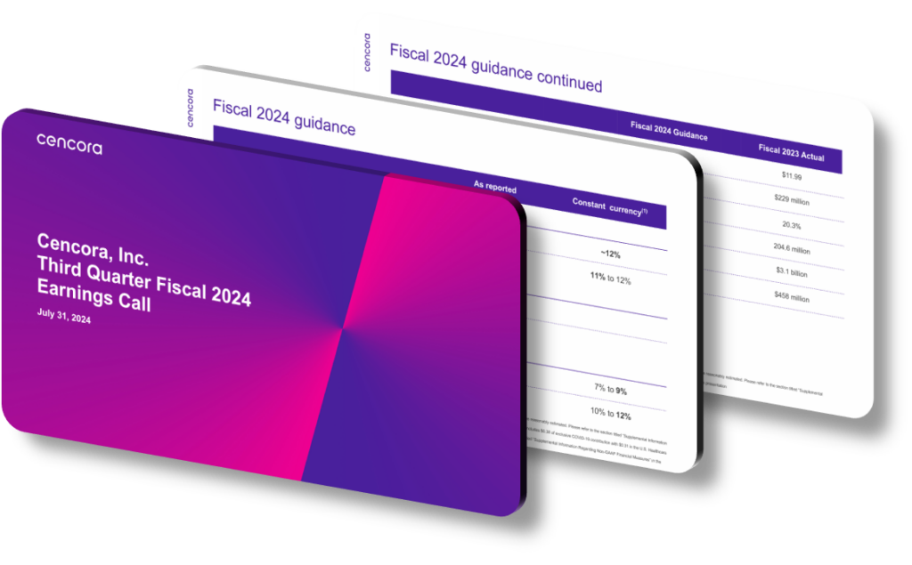
A well-crafted Q3 2024 earnings presentation design highlights strategic growth and ESG initiatives by using a deliberate visual architecture that guides investor attention through a logical narrative: operational momentum first, then forward-looking strategy, and finally ESG commitments as an integrated pillar rather than an afterthought. The most effective designs use color-coded section dividers, consistent iconography for sustainability metrics, and data visualization choices — such as stacked bar charts for segment revenue growth and progress-ring graphics for ESG goal completion — to make complex performance data immediately scannable for both retail investors and institutional analysts reviewing the deck on tight schedules.
Strategic growth sections in Q3 presentation decks typically lead with a ‘quarter-in-review’ summary slide that anchors the narrative before drilling into segment-level detail. The design challenge is separating organic growth drivers from acquisition-related revenue without burying the distinction in footnotes. Presentations that do this well use a two-column layout — one column for organic metrics, one for inorganic contributions — so analysts can model both scenarios without cross-referencing appendices. Typography choices also signal priority: bolding a specific percentage like a 7.3% year-over-year revenue increase in a featured call-out box draws the eye faster than embedding the same figure mid-paragraph in a wall of text.
ESG integration within earnings presentations has evolved significantly from the era of isolated ‘corporate responsibility’ appendix slides. In 2024, leading presentation frameworks embed ESG KPIs directly alongside financial metrics on the same slide, using small-multiple chart layouts to compare carbon intensity reductions, workforce diversity percentages, and supplier diversity spend against prior-year baselines. A common design mistake is treating ESG as decorative — adding a leaf icon next to a slide title without providing quantified targets or independent verification references. Slides that perform better with ESG-focused institutional investors include a clearly labeled framework mapping, such as alignment with GRI Standards or SASB industry-specific metrics, giving analysts a verifiable external reference point rather than proprietary definitions that cannot be benchmarked.
- Use a consistent color palette with one dedicated accent color reserved exclusively for ESG metrics so investors can instantly distinguish sustainability data from financial performance data across every slide in the deck.
- Open the strategic growth section with a visual roadmap slide that shows completed milestones in Q1–Q3 and greyed-out Q4 targets, giving forward-looking context without making unverifiable financial promises.
- Apply a ‘headline plus evidence’ layout on each growth slide — one declarative headline stating the outcome, such as ‘Specialty segment volume up 11% year-over-year,’ followed by three supporting data points beneath it.
- For ESG slides, include a side-by-side comparison of current-quarter actuals versus the annual 2024 target and the long-term 2030 commitment, presented in a three-column table that shows trajectory at a glance.
- Embed a ‘material topics’ heatmap slide early in the ESG section that rates issues by business impact and stakeholder concern on a two-axis grid, establishing why specific ESG priorities were chosen over others.
- Use thin horizontal rules and generous white space between data blocks to prevent information density from overwhelming slides that combine financial and non-financial metrics in a single view.
- Close the presentation with an integrated scorecard slide that lists five to seven key commitments — both financial guidance ranges and ESG progress indicators — so the final visual impression is holistic performance accountability.
The practical takeaway for anyone designing or evaluating a Q3 2024 earnings presentation is that design coherence directly affects credibility: when strategic growth data and ESG metrics share a unified visual language, the implicit message is that the organization manages both with equal rigor. A concrete next step is to audit your current deck by printing it in grayscale — if ESG slides lose all visual distinction from boilerplate financial slides, the design hierarchy needs reworking. Keep in mind this integrated approach is most valuable for companies with material ESG exposure or significant institutional investor bases; for very early-stage companies with minimal ESG footprint, a simpler separation of topics may avoid overpromising on metrics that lack robust underlying data.
Need a presentation that wins the room? SlideGenius designs custom, high-impact decks for brands like Red Bull, Amazon, and Adidas. Browse our presentation design portfolio, explore our PowerPoint design services, or contact us for a free quote.










