
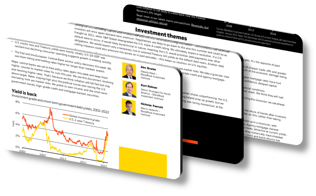
Effective presentation design highlights key investment strategies by combining visual hierarchy, selective data emphasis, and narrative structure to guide the audience toward the most critical insights. Rather than displaying every data point, strong financial presentations use contrast, whitespace, color coding, and typographic weight to draw the eye to core arguments — such as asset allocation rationale, risk-adjusted return projections, or macroeconomic positioning. The goal is to reduce cognitive load so decision-makers absorb the strategic logic quickly, rather than getting lost in spreadsheets or dense footnotes. When done well, design itself becomes an argument, not merely decoration.
A common mistake in investment presentations is treating design as an afterthought — adding color themes after the content is finalized, rather than letting structure drive the narrative from the start. The most effective approach maps each slide to a single strategic claim. For example, if a core strategy is overweighting infrastructure assets in an inflationary environment, that slide should lead with that claim in a large, bold headline, support it with one or two key data visualizations (such as a 10-year infrastructure return vs. CPI overlay), and eliminate any supporting tables that do not directly reinforce that specific point. Every visual element should either prove or contextualize the strategy — nothing more.
Color and typographic hierarchy play a specific functional role in investment strategy presentations. A disciplined color system — for instance, using a single accent color only for positive return figures or strategic recommendations — trains the audience to interpret color as meaning, not merely aesthetics. Typography weight distinctions (bold for conclusions, regular weight for supporting data) mirror the logical structure of the argument. Slide density is equally critical: research in presentation cognition suggests that slides with fewer than 40 words and one dominant visual element produce significantly higher recall than text-heavy equivalents, particularly in high-stakes investment committee or client-facing settings.
- Use a bold, single-sentence headline on each slide that states the investment conclusion directly, such as ‘Emerging market debt offers a 150bps yield premium with manageable duration risk in the current cycle,’ so the audience immediately grasps the strategic point.
- Apply a consistent two-color chart palette — one color for the strategy’s asset class and a neutral gray for benchmark comparators — so viewers instantly identify which line represents the recommended position across all visuals.
- Place the most critical risk disclosure or caveat in a clearly labeled sidebar box rather than burying it in footnotes, demonstrating analytical rigor while keeping the main narrative visually uncluttered.
- Use a ‘bridge slide’ between major sections that recaps the prior strategy point in a single bullet and previews the next, maintaining logical flow across multi-strategy decks that run longer than 15 slides.
- Incorporate a one-page ‘strategy at a glance’ summary table at the opening that lists each key strategy, its expected return range, time horizon, and primary risk factor, giving executives an executive-level anchor before deeper dives.
- Standardize axis scales across all charts within a single presentation so that a 5% move on one chart appears visually proportional to a 5% move on another, preventing inadvertent distortion of strategic comparisons.
- Use progressive disclosure in digital presentations — revealing each strategy point sequentially on a single slide — to control pacing and prevent the audience from reading ahead and missing the spoken rationale for each position.
The practical takeaway is to treat each slide as a standalone argument that could be extracted and shared independently without losing its strategic meaning. Begin your next revision by auditing each slide for a single, falsifiable claim in the headline, one primary visual, and a maximum of three supporting data points. This approach works best for institutional investor decks, investment committee reviews, and client strategy updates. It is less appropriate for regulatory filings or due diligence documents, where comprehensiveness and completeness are legally required over narrative clarity.
Need a presentation that wins the room? SlideGenius designs custom, high-impact decks for brands like Red Bull, Amazon, and Adidas. Browse our presentation design portfolio, explore our PowerPoint design services, or contact us for a free quote.










