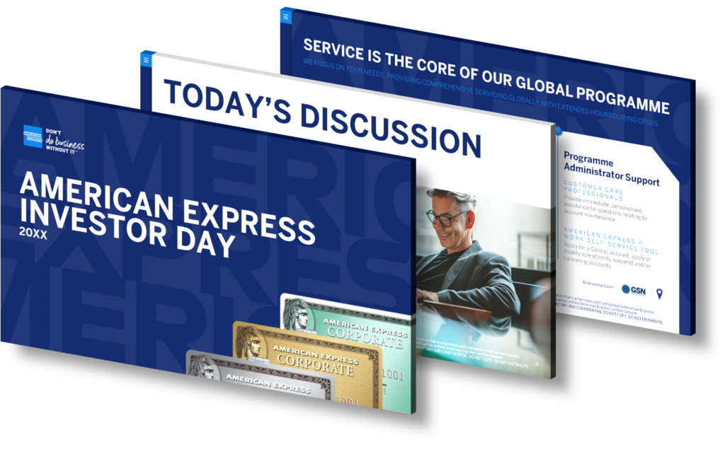
Designing an engaging infographic to present forward-looking statements and risks in business earnings reports requires a strategic approach that combines clarity, visual appeal, and effective storytelling. Start by identifying the key messages you want to convey regarding forecasts and potential risks. Use concise language to summarize complex information into digestible points that are easily understood at a glance.
Choose an appropriate color scheme that aligns with your brand while enhancing readability. For instance, use contrasting colors for different sections—such as green for positive outlooks and red for risks—to immediately signal the nature of the information being presented.
Incorporate visual elements like icons or illustrations to represent various categories of risk (market risk, operational risk, etc.) alongside statistical data such as charts or graphs that illustrate trends over time. This not only captures attention but also aids in comprehension by breaking down dense data into visual formats.
Utilize white space effectively; overcrowding your infographic can overwhelm viewers and dilute your message. Aim for a logical flow from one section to another—starting with forecasts, moving through potential challenges, and concluding with actionable insights or recommendations.
Lastly, ensure that any data presented is sourced accurately and cited appropriately within the infographic itself. This builds credibility with your audience while providing them with avenues for further exploration if desired. By combining these elements thoughtfully, you can create an impactful infographic that communicates critical business information clearly and engagingly.
View Our Presentation Portfolio
