The First Slide: What It Needs to Be and What It Has to Do

first slide

PowerPoint slide

presentation

If you want to maximize your slide presentation to establish better brand recall, start at the very beginning – the first slide. Naturally, it is the first thing that your audience will see even before you say a word. So design it in a way that stands out from the rest of your slides. It will help your logo and company name make an impression on your audience, and retain your brand in their memory long after your presentation ends.It will help your logo and company name make an impression on your audience, and retain your brand in their memory long after your presentation ends.

What your First Slide Needs to BE

As you prepare you presentation, it’s important that you develop a first slide that will generate interest in support of everything you are about to say. It should have a visual element that features key aspects of your organization that is consistent with the key concept of your presentation.It could be a photo or graphic image that stimulates people’s curiosity. As this is an excellent opportunity to draw attention to your business, make sure to make the most of it. When people come in the room and see your first slide, they should be compelled to want to be interested in you what you have to say.However, it doesn’t always have to be flashy to pique the audience’s interests while informing them of your brand. According to business guru Guy Kawasaki, in his famous 10-20-30 rule, your first slide should often be the Title Slide, which contains your company name, address, your name and position in the company, your email, and work cell number.Details like these may be straight to the point, but if you’re presenting to a crowd of busy VCs and investors, this is enough visual stimulus to let them in on your brand.

What your First Slide Needs to DO

With the right amount of texts and graphics, your first slide can communicate much more than what it appears to relate to the audience. Your audience should be able to digest the information you are sharing quickly and precisely. They should get an idea about your business even before you start to talk about what you have to offer.It is important that each slide in your presentation be well-designed and engaging. The first slide, however, is crucial in igniting the spark that will make people want to hear what you have to say and get to know more about your business. Design it right and it can help you set the stage for an awesome and successful presentation.

The Final Word

Ultimately, while the first slide isn’t the entire presentation itself, it’s still an introduction to the rest of your pitch. In the same way that you need to make a good first impression through your physical appearance and speech, you’ll need a deck to match.Start your pitch right with a winning opening slide. Impress people from the get-go. Don’t let any opportunity pass. 

Reference

The Only 10 Slides You Need in Your Pitch.” Guy Kawasaki. Accessed May 28, 2014.

Designing a ‘How It Works’ Slide That Works

how it works

Powerpoint

PowerPoint slide

presentation slides

slide design

Do you find it difficult to explain to someone how a product, service, or process works? If your business involves selling new products or you’re constantly introducing new service features, then you’ll need an easy way to explain things. This is where the “How It Works” slides come in.Explaining how certain things work is one of the most common uses of presentation slides. Done right, a “how it works” PowerPoint can be effective for product demos, process flow illustrations, or pitching a business idea. To help you get started out, here are some ways you can make this type of slide work:

Lay it out

PowerPoint has several types of slide layouts. The default type comes with two boxes: The text box at the top, which is for the title of the slide, and the middle box, which is a multipurpose placeholder for text, graphics, or any content types.For this purpose, however, you may choose the blank layout type and then simply insert the content that you need. Or better yet, as with the above slide, choose the Title Only template before putting all the other elements. To enhance the effect of your slide, feel free to choose from the Shapes and SmartArt Graphics.

Be consistent with colors

This one is pretty basic although there are still those who take it for granted. Buffer‘s Leonhard Widrich writes about how color schemes can affect our perception of a brand. The more recognizable colors have effectively been associated with specific brands, while those that were more difficult to point out didn’t have such a good color combination.Similarly, presentation slides should have similar color schemes as they can affect the overall impact of your message.Using varying combinations for different slides can confuse your audience. So for best results, make the color scheme of your How It Works slide consistent with the rest of your deck. This also applies to the slide itself. Looking at the above sample, you’ll notice that the color of the iVoteLIVE logo is consistent with that of the template. Apart from that, most of the imagery (i.e., photos and graphics) have similar shades of colors. This makes the slide pleasant to look at.

Take it easy with texts

This is another common concern and when it comes to How It Works slides, we can’t stress enough its importance. The purpose of slides is to describe visually something you can’t explain verbally. Why spend 15 minutes explaining a new feature, when a couple of images will take you just a few seconds, right?If you’re going to include some texts, make sure not to mix up the fonts and font sizes just for the heck of it. Otherwise, your slide will appear visually confusing. Take a look at the sample again. While the format of the texts describing the consumers is different from the texts indicating the features (iVoteLive computer interface, Live Program Broadcasts), they still work because each group has specific purpose.In short, they are not randomly mixed up.

The Takeaway: Engage with imagery

In general, images can make it easier for people to understand and remember ideas. So use relevant imagery instead of text in parts where you think a visual element would work better. When using images, though, be sure that they are of appropriate quality.For scanned images, the ideal resolution is between 150 dpi (when precise color reproduction is not required) and 300 dpi (if you need higher quality images).As much as possible, do not take images from the Internet as they usually of a very low quality and might pixelate when projected on a screen. 

Reference

Widrich, Leonhard. “Why Is Facebook Blue? The Science of Colors in Marketing.” The Huffington Post. January 16, 2014. Accessed May 20, 2014.

Adding PowerPoint Table to Your Slide

Draw table

Insert table

PowerPoint slide

PowerPoint table

Tables are a great way to organize and present data in an easy-to-read format. Whether you’re displaying financial figures, project timelines, or survey results, adding a table in PowerPoint can help make complex information more digestible for your audience. In this guide, we’ll walk you through the process of adding a table to your PowerPoint slide, customizing it, and ensuring it fits seamlessly into your presentation.

Step 1: Open Your PowerPoint Presentation

Begin by opening your PowerPoint presentation. Navigate to the slide where you want to add the table or create a new slide dedicated to displaying your table.

To Create a New Slide for Your Table:

  1. Click on the “Home” tab.
  2. Select “New Slide” and choose a layout that works best for the table. The Title and Content layout is ideal because it provides space for a title and a content area where you can easily insert the table.

Step 2: Insert a Table

Once you’ve selected the slide for your table, it’s time to insert the table:

  1. Click on the “Insert” Tab: In the ribbon at the top of the PowerPoint window, click on the Insert tab.
  2. Select “Table”: In the Tables group, click on the Table option. A grid will appear that allows you to choose the number of rows and columns you want.
  3. Choose Your Table Dimensions: Move your mouse over the grid and select the number of rows and columns by highlighting the appropriate squares (for example, 3 rows by 4 columns). You can also click “Insert Table” at the bottom of the grid and manually enter the number of rows and columns you need.

Once you’ve made your selection, PowerPoint will insert the table into your slide.

Step 3: Customize the Table

Now that you have your table on the slide, it’s time to customize it according to your needs. PowerPoint offers several formatting and design options for tables, allowing you to create a table that fits seamlessly with your presentation’s theme.

1. Entering Data:

  • Click inside any cell and start typing your data.
  • Press the Tab key to move to the next cell, or use the arrow keys for more precise navigation.

2. Resize the Table:

  • To adjust the size of the table, click and drag the sizing handles (small squares or circles) around the table.
  • You can also resize individual columns and rows by hovering over the border between cells until your cursor changes into a double-headed arrow, then dragging to adjust the width or height.

3. Design and Style the Table:

  • Table Design Options: After selecting the table, the Table Tools will appear at the top of the window, showing two tabs: Design and Layout.
  • Design Tab: This tab offers various pre-made table styles, shading options, and borders. Here’s what you can do:
    • Table Styles: PowerPoint provides several table style templates. Scroll through the options in the Table Styles gallery and click on one to apply it to your table.
    • Header Row: If you want to emphasize the first row of your table as a header, check the Header Row box under Table Style Options. This will automatically apply a distinct style to the top row.
    • Banded Rows or Columns: You can check the Banded Rows or Banded Columns options to alternate the shading of rows or columns, making your table easier to read.
    • Borders: You can also adjust border settings (style, color, weight) in the Borders group. This allows you to add or remove borders, or change their appearance, making your table more professional.

4. Adjust Table Layout:

  • Add or Remove Rows and Columns: In the Layout tab, you can add or remove rows and columns. Click on the Insert Above, Insert Below, Insert Left, or Insert Right buttons in the Rows & Columns group to add new rows or columns to your table.
  • Merge or Split Cells: If you need to merge two or more cells, select them, then click Merge Cells in the Layout tab. To split a cell into multiple columns or rows, click Split Cells.
  • Align Text: You can adjust the alignment of text within the table by selecting the text and using the alignment options in the Layout tab (e.g., center, left, right, top, or bottom alignment).

5. Adjusting Table Dimensions:

  • In the Cell Size group, you can manually adjust the height and width of your table’s rows and columns. This is useful if you need precise measurements for specific data.

Step 4: Enhance the Table with Graphics or Additional Features

Sometimes tables alone aren’t enough to convey your message clearly. You can enhance your table’s visual appeal and clarity by adding images or additional design elements.

Add Graphics or Icons:

  • Inserting Images: To make your table more visually engaging, you can add small images or icons. Click inside the cell where you want to insert the image, then go to the Insert tab and choose Pictures. This allows you to insert a picture from your computer or online sources.
  • Using Icons: PowerPoint 2013 also allows you to insert icons that can visually represent the data in your table. Go to the Insert tab and select Icons, then choose from a wide range of icons relevant to your content.

Add Chart for Comparison:

  • If you need to compare data, consider adding a chart next to or within the table. You can insert a chart by clicking on InsertChart and choosing a chart type that complements your table (e.g., bar, pie, or line charts).

Step 5: Review and Finalize Your Table

Before finishing your slide, take a few moments to review your table:

  • Check for Consistency: Ensure that the data is properly aligned, and the table looks consistent with the rest of your presentation design.
  • Proofread the Data: Double-check for any typos or incorrect information.
  • Adjust for Readability: Make sure your font size and colors are easy to read for your audience, especially when projected on a screen.

Final Thoughts

Adding a table to your PowerPoint presentation is a simple yet effective way to organize data and present information clearly. By following the steps outlined above, you can create tables that are not only functional but also visually appealing and aligned with the overall design of your slides. Whether you’re showcasing numerical data, timelines, or comparisons, well-designed tables will help your audience better understand and retain the information you’re presenting.

Creating a PowerPoint Timeline Using SmartArt

PowerPoint slide

shapes

SmartArt

Timeline slide

Last time, we created a basic timeline using shapes and tables. Today, we’re going to create another one but only this time, we’ll take advantage of the SmartArt feature in Microsoft PowerPoint 2010.SmartArt is useful for creating representations of a sequence of events in PowerPoint. This sequence of events can be a project milestone or an event timeline (which we’ll get back to in a bit).

The SmartArt Advantage

Basically, what SmartArt does is take the power and functionality of PowerPoint Shape on a different level.It allows you to mix and match shapes and text in order to create diagrams and other custom graphics. Using it strategically lets you create slides that both communicate your message and capture your audience’s attention.

Getting Started

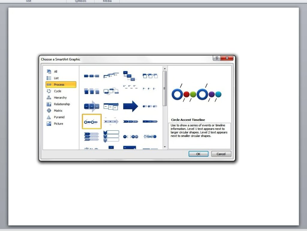
Now let’s create a basic timeline with the help of SmartArt. You can start by opening a blank PowerPoint slide. Point the cursor to the Insert tab and click on SmartArt. Then select Basic Timeline.This is under the Process folder or the Circle Accent Timeline. As you hit OK, you will have to enter the necessary elements. (“Level 1 text appears next to larger circular shapes. Level 2 text appears next to smaller circular shapes.”)PowerPoint timeline

Enhancing the Look

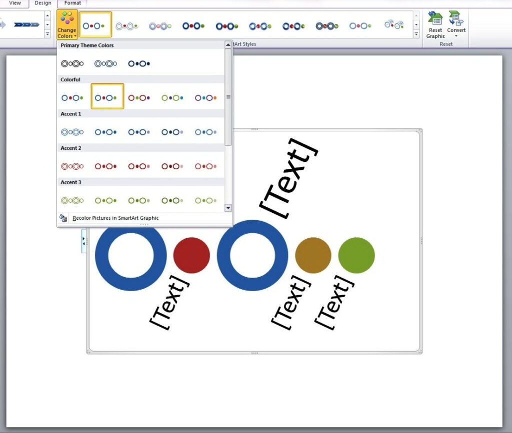
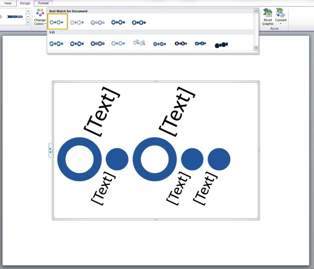
You may change the color of the graphic by clicking on the Design tag and picking the colors and effects that you want for your timeline.timeline2The different shape effects that you may choose include shadow, cartoon, 3D effect and more.template2Adding your content and doing a bit of tweaking completes the process. With some practice, you will soon be able to create a more complex PowerPoint timeline design.SmartArt is an excellent functionality in PowerPoint that provides you with a wide range of visual options. Keep in mind, though, that it is still up to you to determine the appropriate graphic that matches your content. Because at the end of the day, SmartArt is simply a PowerPoint tool at your disposal that you can wield to your advantage.

References

Learn More about SmartArt Graphics.” Office Support. Accessed May 14, 2014.”Basic PowerPoint Timeline Creation: Shapes and Tables.” SlideGenius, Inc. May 09, 2014. Accessed May 14, 2014.

About SlideGenius SlideGenius.com is your PPT presentation design guru for your business. Based in San Diego, California, SlideGenius has helped more than 500 international clients enhance their presentations, including those of J.P. Morgan, Harley-Davidson, Pfizer, Verizon, and Reebok. Call us at 1.858.217.5144 and let SlideGenius help you with your presentation today!