How can businesses enhance engagement with infographics in kidney care presentations?
Businesses can significantly enhance engagement with infographics in kidney care presentations by implementing several strategic approaches. First, it’s essential to identify the key messages that resonate with your audience—healthcare professionals, patients, or stakeholders—and present these messages through clear and concise visuals. Infographics should incorporate relevant statistics and data related to kidney health, treatment options, and patient outcomes to provide an informative backdrop that captivates attention.
Utilizing a combination of colors, fonts, and design elements not only makes the information visually appealing but also aids in comprehension. For instance, color coding different aspects of kidney care (like stages of disease or types of treatments) can help viewers quickly grasp complex information. Additionally, integrating icons and imagery relevant to kidney health can create a more relatable context for the audience.
Interactive infographics are another powerful tool; they encourage active participation from viewers by allowing them to explore different facets of information at their own pace. This interactivity keeps audiences engaged longer as they navigate through content tailored specifically for their interests or needs.
Lastly, storytelling is crucial when crafting presentations about kidney care. Weaving personal patient stories or case studies into infographics not only humanizes the data but also creates emotional connections that foster deeper engagement among audiences.
View Our Presentation Portfolio
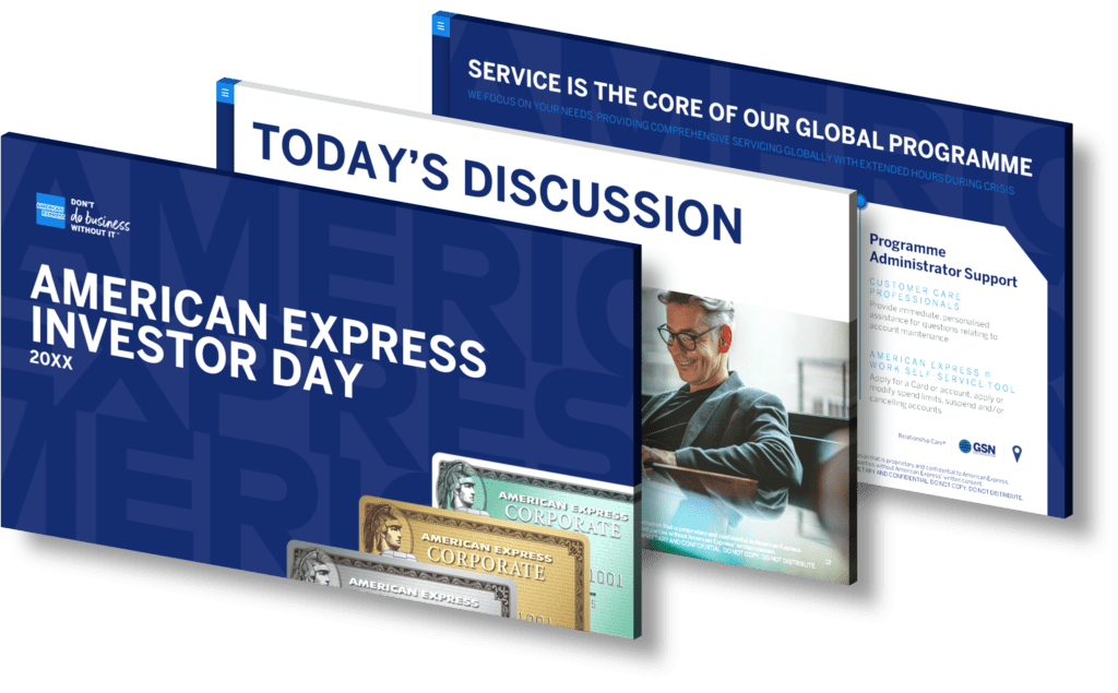
How can businesses enhance engagement through effective presentation design at analyst conferences?
Businesses can significantly enhance engagement through effective presentation design at analyst conferences by focusing on several key strategies. First, it’s essential to understand the audience and tailor the content to meet their interests and expectations. This involves using clear, concise language while avoiding jargon that may confuse attendees. Visual storytelling plays a crucial role; incorporating high-quality visuals such as infographics, charts, and images can help convey complex information more effectively than text alone.
Moreover, maintaining a consistent theme throughout the presentation fosters professionalism and aids in retention of information. Utilizing engaging slide layouts that incorporate ample white space ensures clarity and keeps the audience’s attention focused on critical points without overwhelming them with too much content at once.
Interactive elements, such as polls or Q&A sessions during the presentation, encourage participation from attendees and make them feel more involved in the discussion. Additionally, rehearsing delivery is vital; presenters should practice their timing and tone to ensure confidence when speaking live.
Lastly, consider providing handouts or digital resources after the presentation for deeper engagement post-conference. Following these strategies enables businesses not only to deliver impactful presentations but also to foster lasting relationships with analysts through meaningful interaction.
View Our Presentation Portfolio

How can infographics enhance engagement in Yammer communities?
Infographics serve as powerful tools for enhancing engagement in Yammer communities by effectively conveying complex information in a visually appealing and easily digestible format. When utilized within these collaborative platforms, infographics can simplify intricate data, making it more accessible and interesting to community members. This efficient communication fosters better understanding and retention of key messages, encouraging active participation. Moreover, the visual nature of infographics tends to grab attention quickly, increasing the likelihood that community members will stop scrolling and engage with the content presented. By integrating compelling visuals with relevant statistics or insights, organizations can stimulate conversations around important topics, drive user interaction through comments or shares, and ultimately strengthen the sense of community within Yammer groups. Additionally, well-designed infographics can serve as useful references for ongoing discussions or initiatives within teams.
View Our Presentation Portfolio

How can infographics enhance stakeholder engagement in presentations about strategic promises?
Infographics play a pivotal role in enhancing stakeholder engagement during presentations focused on strategic promises by transforming complex information into visually appealing and easily digestible formats. When stakeholders are presented with data through infographics, they can grasp key messages quickly and efficiently. This visual representation taps into the audience’s ability to process images faster than text, fostering better retention and understanding of critical concepts.
Moreover, infographics can effectively illustrate relationships between different elements of a strategic promise, such as timelines, milestones, or performance metrics. By using charts, graphs, and icons to convey this information, presenters can create a narrative that flows logically while maintaining the audience’s attention.
Additionally, incorporating infographics encourages interaction among stakeholders. As visuals stimulate discussion and questions regarding the data presented, they foster an environment conducive to collaborative dialogue about strategic objectives. This interactivity not only deepens engagement but also allows for real-time feedback from stakeholders who might have concerns or suggestions based on what they see.
Ultimately, leveraging well-designed infographics in presentations not only clarifies complex ideas but also enhances the overall experience for stakeholders by making meetings more engaging and informative. The right visuals can turn passive listeners into active participants in discussions surrounding your strategic promises.
View Our Presentation Portfolio

How can infographics enhance engagement during shareholder meeting presentations?
Infographics are powerful tools that can significantly enhance engagement during shareholder meeting presentations. By transforming complex data into visually appealing graphics, infographics help convey information more clearly and concisely. This visual approach captures the audience’s attention, making it easier for shareholders to grasp critical insights quickly.
Moreover, infographics can simplify intricate financial metrics and performance indicators by breaking them down into digestible visual elements such as charts, graphs, and icons. This not only aids in understanding but also allows for a quicker retention of information compared to traditional text-heavy slides.
Incorporating infographics fosters a more interactive experience; they encourage discussion and questions from attendees as they engage with the visuals presented. Additionally, well-designed infographics can evoke emotions or highlight key messages effectively, leading to increased investment confidence among shareholders.
Lastly, using branded infographics reinforces your organization’s identity while ensuring consistency across all presentation materials. When stakeholders see relevant data represented in an engaging format tailored to your brand’s aesthetics, it enhances credibility and trustworthiness.
View Our Presentation Portfolio

How can businesses enhance engagement through innovative infographic design in presentations?
Businesses can significantly enhance engagement through innovative infographic design in presentations by leveraging visual storytelling techniques that captivate their audience’s attention. Infographics simplify complex information, making it more digestible and memorable. To achieve this, organizations should focus on several key strategies:
- Data Visualization: Utilize charts, graphs, and pictograms to present data in a visually appealing manner. This not only aids comprehension but also helps to highlight key insights effectively.
- Consistent Branding: Incorporate brand colors, logos, and fonts throughout the infographic to ensure a cohesive look that reinforces brand identity.
- Simplicity and Clarity: Avoid clutter by keeping designs clean and straightforward. Use whitespace strategically to guide viewers’ eyes towards essential information.
- Narrative Flow: Design infographics that tell a story. Arrange elements logically so that the viewer can easily follow along from one point to another.
- User Interaction: For digital presentations, consider incorporating interactive elements such as clickable sections or animations which invite the audience to engage further with the content.
By integrating these techniques into their presentation design process, businesses can create impactful infographics that not only engage audiences but also facilitate better retention of information delivered during presentations.
View Our Presentation Portfolio

How can infographics enhance engagement in business presentations for annual meetings?
Incorporating infographics into business presentations, particularly for annual meetings, can significantly enhance engagement and retention among your audience. Infographics serve as powerful visual tools that simplify complex data and concepts, making them more accessible and easier to understand. By transforming intricate statistics or lengthy narratives into visually appealing graphics, you not only capture attention but also foster a deeper connection with the material being presented.
Research shows that visuals are processed 60,000 times faster than text in the human brain. This means that infographics can quickly convey key messages without overwhelming your audience with information overload. Additionally, they help break up monotonous text-heavy slides by adding color and design elements that maintain interest throughout the presentation.
Moreover, using infographics allows presenters to tell a compelling story through data visualization. This storytelling aspect can evoke emotions and encourage discussions among attendees—key factors in creating an engaging atmosphere during annual meetings where critical decisions are often made.
To maximize their effectiveness, ensure your infographics are designed with clarity in mind: use concise wording, relevant imagery, and a coherent layout to guide viewers through the information seamlessly. When strategically integrated into your presentation flow—such as summarizing quarterly performance or illustrating future projections—infographics become essential tools for enhancing comprehension and participation during business discussions.
View Our Presentation Portfolio

How can infographics enhance engagement during investor presentations on business growth and strategy?
Infographics play a crucial role in enhancing engagement during investor presentations focused on business growth and strategy. By visually representing complex data and insights, infographics simplify information, making it easier for investors to grasp key concepts quickly. The use of charts, graphs, and icons can highlight critical trends, performance metrics, and strategic initiatives without overwhelming the audience with text-heavy slides.
Moreover, infographics capture attention through compelling design elements that break the monotony of traditional presentation formats. They can convey a narrative that guides investors through your business story—showcasing achievements while outlining future opportunities effectively.
Incorporating infographics also promotes retention; studies show that visuals improve comprehension and memory recall. When investors see well-crafted visual representations of data points related to market analysis or growth projections, they are more likely to remember the information presented. This leads to meaningful discussions post-presentation and fosters stronger connections between your team and potential investors.
Additionally, using infographics encourages interactivity during presentations. Presenters can ask questions based on infographic content or invite feedback on specific visuals, creating an engaging dialogue rather than a one-sided monologue.
View Our Presentation Portfolio

How can infographics enhance engagement in healthcare education presentations?
Infographics serve as powerful tools in healthcare education presentations by transforming complex data into visually appealing formats that enhance understanding and retention. They can simplify intricate medical information, making it more accessible to diverse audiences, including patients, healthcare professionals, and students. By incorporating visuals such as charts, graphs, and icons alongside succinct text, infographics facilitate quicker comprehension of critical concepts and statistics. This visual representation can capture attention more effectively than traditional text-heavy slides or lectures.
Moreover, infographics encourage active engagement through interactive elements like clickable graphics or animations that invite viewers to explore the content further. This interactivity not only boosts audience involvement but also fosters a deeper connection with the material being presented. In a field where clarity is paramount for effective communication—especially regarding treatment options or health risks—infographics can significantly improve knowledge transfer and motivate behavior change among viewers.
In summary, leveraging infographics in healthcare education presentations enhances engagement by simplifying complex information into digestible visuals that promote interaction and comprehension.
View Our Presentation Portfolio

How can infographics enhance engagement in presentations for resource planning meetings?
Infographics are powerful tools that can significantly enhance engagement in presentations, particularly for resource planning meetings. By transforming complex data into visually appealing graphics, infographics simplify the information and make it more digestible for the audience. This visual representation captures attention and encourages interaction, as viewers are drawn to images rather than dense blocks of text.
Using infographics in resource planning presentations allows presenters to convey key messages quickly and effectively. They can highlight trends, comparisons, and projections using charts, graphs, and icons that resonate with the audience’s needs. This not only aids comprehension but also fosters collaborative discussions by providing clear visuals that every participant can relate to.
Moreover, incorporating infographics helps maintain a dynamic flow throughout the presentation. The use of color schemes and thematic designs keeps viewers engaged while reinforcing branding elements relevant to your organization or project goals. By breaking down complicated concepts into bite-sized visual formats, you invite participants to ask questions or share insights based on what they see—ultimately leading to richer conversations.
In summary, leveraging infographics in your resource planning meetings enhances engagement by making information accessible and inviting dialogue among stakeholders. They serve as an effective bridge between data-driven insights and actionable strategies.
View Our Presentation Portfolio

How can infographics boost engagement in presentations on climate change investing in Southeast Asia?
Infographics are powerful tools for enhancing engagement in presentations, particularly on complex topics such as climate change investing in Southeast Asia. By distilling intricate data into visually appealing graphics, infographics can capture the audience’s attention and facilitate better understanding of key messages. They serve several critical functions:
- Simplification of Complex Information: Infographics can break down complicated statistics and concepts related to climate change impacts, investment opportunities, and regional challenges into digestible visuals. This simplification helps audiences grasp essential information quickly.
- Visual Storytelling: By using a narrative structure supported by visuals, infographics can tell a compelling story about the importance of sustainable investing in Southeast Asia. This approach evokes emotional responses from the audience and makes the subject matter more relatable.
- Increased Retention Rates: Research shows that people retain information better when it is presented visually rather than textually. Infographics leverage this principle by combining images with concise text to enhance recall of crucial points during discussions on investment strategies or policy implications.
- Easier Data Comparison: Presenting data through charts and graphs allows for straightforward comparisons between different variables—such as carbon emissions versus investment returns—which is particularly relevant in discussions about climate risk and financial performance.
- Catering to Different Learning Styles: An effective presentation accommodates various learning preferences; infographics combine visual elements with text to appeal to both visual learners who benefit from imagery and analytical thinkers who appreciate data-driven content.
The integration of well-designed infographics not only boosts engagement but also fosters deeper conversations around vital issues like sustainability investments in Southeast Asia’s unique economic landscape. Implementing these elements strategically throughout your presentation will ensure you capture interest while conveying impactful insights effectively.
View Our Presentation Portfolio

How can slide design effectively engage Gen Z learners in a technology-driven educational environment?
To effectively engage Gen Z learners in a technology-driven educational environment, slide design must prioritize interactivity, visual appeal, and concise content. This generation is known for its digital fluency and preference for dynamic learning experiences. Here are several strategies to enhance engagement:
- Visual Storytelling: Utilize compelling visuals such as infographics, videos, and animations that resonate with the values of Gen Z. Incorporating relevant images can foster emotional connections with the material.
- Simplified Content: Keep text minimal on slides to avoid overwhelming viewers. Use bullet points or short phrases to convey key ideas clearly and concisely.
- Interactive Elements: Integrate quizzes or polls within presentations to encourage participation and make learning more engaging. Tools like Mentimeter or Kahoot can be seamlessly included into your slide decks.
- User-Centric Design: Make sure your slides are visually appealing by employing modern design principles—such as a cohesive color scheme and consistent font usage—that reflect current trends popular among younger audiences.
- Culturally Relevant Content: Tailor examples or case studies that relate directly to Gen Z’s interests, such as social issues or technological advancements; this will maintain their attention throughout the presentation.
The combination of these elements not only captures attention but also enhances retention of information among Gen Z learners in an increasingly tech-savvy education landscape.
View Our Presentation Portfolio
