‘Before/After’ Slides from Presentation Design Expert Garr Reynolds

Garr Reynolds

Presentation Zen

Renowned presentation expert, Garr Reynolds runs a blog called Presentation Zen where he shares tips and insights on presentation design. He advocates for the use of more minimalist visuals, challenging us to create presentations that are simple but impactful. He provides more details about this presentation design philosophy in his book.If you’re curious about learning more about his presentation design philosophy, see it in action with these Before and After slides.

Presentation Design Inspiration

Check out how the following slides have transitioned from PowerPoint Hell to Presentation Zen:These prove that PowerPoint slides don’t have to be long and detailed in order to embody the core of your message. Reynolds makes use of interesting images and minimal text without losing the key points of the slides.A few lessons you can pick up from these examples:

  • Add meaningful images that will ‘show’ without having to ‘tell’
  • Think of catchy, one-sentence headlines instead of using generic titles for your slides
  • Condense several bullet points into a brief but meaningful sentence

View the rest of the Before and After slides in Garr Reynolds’ SlideShare presentation. He has several other presentations that you can view. Browse through his profile to learn more about ‘zen’ presentation design.

Presentation Software Showdown: PowerPoint vs. Prezi

Powerpoint

powerpoint alternatives

PowerPoint vs Prezi

prezi

There are plenty of presentation software to choose from, but PowerPoint remains to be the top choice for most people. (Including you!) It’s been around since the 90s, and you’ve grown familiar with its classic and user-friendly interface. Still, you feel like trying something new for your next presentation, and you heard that Prezi is a great alternative.Like PowerPoint, Prezi is a presentation software that allows you to create and design slideshows. But instead of the all-too-familiar templates and linear slide layouts, it gives you nifty animations and non-linear slide transitions.You know that good presentation design can make a positive impact on audience participation. So, do you make the full transition to Prezi from PowerPoint? Before you decide, we’ve gone through some things you should know about these two presentation programs.

The Defending Presentation Software Champion: PowerPoint

PowerPoint vs PreziYou might have come across the term “Death by PowerPoint”. You might have even experienced it yourself when you had to sit through a PowerPoint presentation that seemed to last for hours. But as we’ve made clear previously, this isn’t the fault of the software program.If you learn the many tools and functions of PowerPoint, you’ll see why 500 million users patronize it. PowerPoint offers plenty of opportunity for you to be creative with your presentation design. You can customize templates, edit images, and use SmartArt graphics to easily present data.

The Presentation Software Underdog: Prezi

PowerPoint vs PreziWhen it comes to managing the content of your presentation, Prezi isn’t all that different from PowerPoint. You can easily add text, images, videos, and animations. What truly attracts users to this presentation software is the zooming animation.Instead of asking you to work on a progression of slides, Prezi gives you a big canvas where you can layout different ideas. When viewing the finished product, your audience seamlessly flows from the bigger picture into the specifics of your presentation. This zooming action adds an interesting visual dimension.Another upside to using Prezi is the fact that it’s a cloud-based program. You can make presentations as long as you have an internet connection.

The Verdict

Effective and engaging presentations are made by people, not the presentation software they choose to use. Whether you decide to use PowerPoint or Prezi depends on your content and who your audience is.When Does PowerPoint win?Make use of PowerPoint if you’re presenting a simple and linear story. It’s also useful if you’re going to add a lot of quantitative data in your presentations. Because of its more classic feel, it will work best for presentations in more formal settings, such as business meetings and academic lectures.When Does Prezi Win?Prezi is perfect for presentations that need to be visually engaging. Utilize its zooming animation to show how parts of your presentation correlate, and if you want to move freely from one part to another. Because its design is non-traditional, using Prezi is perfect for presentations in casual settings. However, you should also consider the fact that it makes use of animations that may cause motion sickness to some people.Whatever you decide to choose between these 2 presentation software, just keep in mind that effective presentation design is up to you.Featured Image: Angelo DeSantis via Flickr

Tech Talk: Mastering PowerPoint for Product Launch Presentations

software product announcements

technology powerpoint tips

Many companies have been opting to announce upcoming products at major events. This is especially prevalent in the technology and software industries.Earlier this month, Apple introduced everyone to iOS8 and OS X Yosemite at WWDC 2014. Similarly, several video game developers announced details of their forthcoming titles at E3 2014.A software product announcement is crucial to generating buzz around your pending release. It’s a type of presentation that’s similar to a product pitch. Previously, you pitched in board rooms to potential investors. Now, you’re introducing your big idea out to the public.Just like any other presentation, software product announcements need to be both engaging and informative.Do that by tapping into your audience’s visual sense with technology PowerPoint slides. Keep these pointers in mind when making a technology PowerPoint for the occasion:

1. Create a slide that hooks your audience

The beginning of your technology PowerPoint should have a slide that perfectly summarizes the product you’re presenting to the market.This slide should have a sound bite that reporters and potential users can easily relay. When Steve Jobs first introduced the iPhone in 2007, the sound bite was, “iPhone: Apple reinvents the phone”. Make the slide even more appealing by adding visuals of your software at work.

2. Tell a short but meaningful story

You’ve heard this tip before. It’s important for almost every type of presentation you can give. And it’s especially crucial for creating technology PowerPoint presentations meant to introduce new software to the masses.Skip long-winded explanations about the unique technological positioning of your product. Instead, get to the heart of it. What is your new software for? How is it important to people?But don’t get too carried away with the story-telling, as well. Make it meaningful, but short enough to be memorable.

3. Describe your product creatively

Of course, your product should feature heavily throughout the technology PowerPoint presentation.But more than just explaining the hypothetical nuts and bolts behind your software, you should describe your software in a way that’s relevant to your target market.

4. Choose color schemes that are consistent with your product

It’s important to choose color schemes that are consistent with your software.This way, your audience can easily become with your product, even if it’s just on an aesthetic level.Other basic presentation design rules you should follow include using easy-to-read fonts and high-contrasting colors for text and background.

5. Show-off with demos

This is the part of your technology PowerPoint that matters most. Back up all your previous slides by showing a video clip that demonstrates how your software works.The best way to explain your new product is by showing everyone how it works. Amp up the anticipation around your software by showing only a quick peek at the software.

If you still need help coming up with creative and professional designs for your presentation, don’t hesitate to contact us for a quick consultation. You can view some of our software and technology PowerPoint slides in our portfolio.

Reference

Vision.” Brain Rules. Accessed July 01, 2014. Feature Image from Wikimedia Commons

How to Work with a Professional PowerPoint Designer

powerpoint designer

presentation design

presentation designer

professional PowerPoint designer

Even with a working knowledge of PowerPoint, there will be times when you’d rather hire a presentation designer than work on it on your own. Either you’re too busy and don’t have the time or the event is too important for a DIY presentation. In any case, having a professionally designed PowerPoint gives you a number of advantages.For one, you can be sure that your slides are given a lot of tender, loving care. You know can’t go wrong once you step in front of your potential audience with your PowerPoint. Professional PowerPoint designers can certainly come up with attractive and mind-blowing designs. They don’t even need your help or input at all, right? Wrong.There’s more to working with presentation designers than telling them your preferred design and paying for their expertise. There are still some things expected of you to ensure that your presentation would look unique and not as though it was made using a cookie cutter template. To make the most of your collaboration (and your budget), here are some tips that you may want to follow when working with a designer:

Prepare your content

Unless you want your presentation to contain generic stock photos, you’ll need to provide your designer with appropriate materials to use. You also have to make sure that the text data is complete and ready.This way, the designer can work on your PowerPoint immediately and get it done according to your time frame.

Communicate properly

Your designer needs to understand your objectives for your presentation. If for some reason you’re going to be busy for the next couple of days, be sure to provide him or her with a description of what you want your slides to convey. This includes the general style, feel, and tone.If there are any specific colors and typeface that you want, then say so. Avoid giving general instructions such as “make it look awesome” or telling the designer to “surprise me.” Vague instructions can be interpreted in many different ways and really “surprise” you in the end.

Trust your designer’s instinct

When in doubt, put your trust on your designer. For sure, he or she has an extensive experience and the right skills to deliver great results.If you have some ideas that wouldn’t jive with the overall presentation design, let your designer work on a solution. After all, you’re working with an expert.

Conclusion

Working with a professional PowerPoint designer is not a one-way street. Both of you want the same thing: A well-designed PowerPoint presentation that will leave a great impression. So, as much as possible, be open to suggestions and if you’re presented with a concept, respond constructively.Keep in mind that successful projects are generally the result of a great collaboration between two people who respect each other’s skills and capabilities. 

Reference

Colors and Typography.” Virginia Tech. Accessed June 27, 2014.

Crafting Compelling Presentations: A Guide to Using the Assertion-Evidence Framework

assertion-evidence framework

It’s a bit of a mouthful. It also sounds like a complex scientific theory. But the Assertion-Evidence Framework isn’t as complicated as it sounds. You actually use it a lot when communicating in the workplace. It’s also an effective way to gauge if your PowerPoint presentation design is conveying the key messages you want your audience to receive.

What is the Assertion-Evidence Framework?

You might not realize it, but you use the assertion-evidence framework in plenty of everyday situations.For example, you’re in a meeting and you say something like, “the marketing campaign we launched for the new product is effective.” You make an assertion. When you follow that with, “the proof are in these documents that detail our positive ROI” – you are backing up your statement with evidence.Simply put, you’re using the assertion-evidence framework every time you make a statement supplemented by words or statements like “because”, “it can be proven by”, and “the reason is”.

How does the framework apply to PowerPoint presentation design?

This is how the assertion-evidence framework should guide your PowerPoint presentation design:Effective presentation design moves the audience into action. This action is a result of a series of small decisions they make throughout your presentation. These small decisions are made from assertions throughout your speech, which you should visualize in your PowerPoint slides. And as we’ve learned, all assertions in the assertion-evidence framework must be back up by data.Consider this PowerPoint slide from our portfolio:The assertion-evidence framework as applied in a PowerPoint slide by SlideGeniusAssertion: “NextImage Direct is Everywhere You Are”Evidence: A map of the U.S. with pins in every stateLike in this sample slide, assertions are usually made in the title of the slide. Evidence is laid out in the body through data, illustrations, or diagrams. While this is a rule you can bend, keep in mind to keep one assertion per slide. This way, all evidence in the slide answers to only one statement. It will also limit the amount of text, making room for visuals.Another thing to remember is that all assertions you make should be stated in clear sentences. Ask yourself if the assertion makes sense by itself. This will allow you to trim unnecessary data from your evidence, including only what answers your assertions. Featured Image: Paul Hudson via Flickr

Four Elements of a Successful Presentation

content

delivery

design

elements of a successful presentation

venue

What makes a successful presentation? When delivering a presentation, being a strong and confident speaker can help in engaging the audience.The quality of your slides – the content and overall design – is another matter. You also have to consider other elements such as the venue and its effect on your delivery.If it’s your first time to deliver a presentation, it’s okay to feel nervous. To help you overcome the jitters and ensure the success of your presentation, here are some tips that you may want to keep in mind:

Quality Content

Regardless of your topic, avoid making its scope too broad. Try to be specific by focusing on three or four important points. It would be great to tackle them in such a way that the first point flows logically to the next and so on.Make sure that your information is clear and logical. Present what your audience is expecting to learn and stick to your agenda. In case they want to know more about your topic, they will ask for sure. Just be prepared for their questions, though.

Engaging Slide Design

Use appropriate colors when designing your slides. Avoid too many color combinations to maintain a clean and professional look.The same goes for the text. Keep it to a minimum by aiming for one point for each slide. Be sure that the text is large enough to be read even by people at the back of the room.To enhance readability, the slide’s background color and the text should have great contrast. Resist the urge to use fancy fonts. Plain and simple font types would do for better readability.Don’t forget to use images. You can always use pictures or graphics to enhance your presentations, not to decorate the slides but to support your points. So make sure to use relevant and high-quality images.

Prepared Venue

When it comes to the venue, some variables can either enhance or reduce the impact of your presentation. If possible, visit the place in advance and check for the following:Is the presentation going to be held indoors?Will it be in a hall or a boardroom?Will it be darkened?Is the room carpeted? Or will the sound bounce off bare floors, instead?To further get the feel of the place and be more confident on the big day, you may want to rehearse your presentation in the actual venue.

Impressive Delivery

Your delivery can make or break your presentation. Make sure you have practiced your speech and the timing of your slides.If possible, practice in front of a colleague and ask them to give genuine feedback. Recording your presentation using the record function in PowerPoint is also a great idea.It can help you hear how you actually sound. If you notice anything off with your pitch or enunciation, make the necessary adjustments.

Captivating Comeback: Reigniting Your Audience’s Interest

audience

body language

nonverbal communication

presentation

Presenters wouldn’t want to bore the audience with a winding speech with innumerable slides to match. There are times, however, when you just have to face an indifferent audience.Teachers and lecturers especially encounter this type of problem most of the time. You may have prepared a 20-minute presentation, but if it feels like your target is indifferent to you from the start, then your preparation is all for naught.If you’ve been in such situation, it might not be your fault after all. The next time you encounter that type of audience, here are some things you can do:

Be Aware of Warning Signs

When you get caught up in your presentation, you might end up rambling. This can cause you to be oblivious to the fact that your audience is tuning out.In your next pitch, take note of the signs that people’s eyes are wandering off. They could be fidgeting or shifting in their seats. Some may even be squirming.Those who are truly bored may be checking their watches and surreptitiously looking for the exit signs. To save your presentation, you need to be aware of such signals so you can react accordingly.

Connect Using the Right Body Language

According to body language expert Carol Kinsey Goman, when audience attention falters, non-verbal communication can play a significant part in keeping them engaged.A strong eye contact, for example, can help jolt an audience member into paying attention. You may also use your voice to project and maintain control. In your spare time, try to learn how to vary the pitch and loudness of your voice.Additionally, make sure to maintain the right stance. This will help you convey confidence and authority.

Break your Pattern

If you’ve been droning on for a few minutes, think about pausing for about 10 seconds. Doing so will surely get everyone to pay attention.They’ll be surprised that you stopped. This will create anticipation on what you are going to say next.

Practice your Opener

Your slides won’t do everything for you. You can’t just show them to your audience while you go on reading from your notes.You may not notice it but how well you prepare can affect how you hold your audience’s attention. Speech coach Sims Wyeth suggests that one of the most important parts you should master is delivering a great opener.When you’re successful with your opener, you will be able to create a framework that prepares your audience for what they are about to hear.

Conclusion

Even the best presenters have difficulty commanding audience attention 100% of the time. It’s inevitable that people’s attention spans will stray from you.However, there are ways to reel them back in. Surprise them by breaking your speech pattern, or starting off on the right foot. Impress them with a good pitch, and guarantee all eyes trained on you for the rest of your speech.

References

Goman, Carol Kinsey. “10 Simple and Powerful Body Language Tips for 2013.” Forbes. Accessed June 12, 2014.Wyeth, Sims. “10 Ways Great Speakers Capture People’s Attention.” Inc.com. March 05, 2014. Accessed June 12, 2014.

Making Your Slides Less Text-Heavy

bullet points

Powerpoint

presentation

slides

The main purpose of a PowerPoint presentation is to help a presenter tackle a topic in as few words as possible, without losing the core message.Unfortunately, not all presenters know how to limit the amount of text on their slides. To avoid making your presentation appear too text-heavy, you may want to try the following suggestions:

Use Multiple Slides

The bullet point has been an alternative for many presenters who don’t want to flood their slides with walls of text. However, this solution sometimes proves to be counterintuitive, since many presenters make the mistake of fitting as many bullet points as they can – on a single slide.Just like paragraphs, this practice makes a slide look confusing. To avoid this, do away with bullets and give each point their own slide. Doing so will let you increase the font size as well as improve your slides’ layout.

Think Visually

Instead of describing things with words, consider using images to represent your points. Don’t worry about your audience not getting the reference at first glance. It’s up to you as the presenter to fill them in on the missing pieces, just make sure the connection is evident after you’ve given the explanation. If it’s still not obvious after that, you may want to reconsider your choice of words.This works for you since their attention will come back to you after viewing the slides. If you put text on your slide, their focus will stay on the slide – they’d just read everything instead of paying attention to you.

Keep it Short

While images are a great shorthand for your points, not all slides can contain only one image. Some slides may still require a few words to be effective. If you really need to add text, make sure to keep it to a minimum. Highlighting your main points can help organize your slides. Choose contrasting colors to enhance readability. If you’re going to use a bright background, for example, then choose a darker shade for your text.A good rule of thumb would be: If you can express something in one image, then do it. If you can’t, use as little text as possible. The audience is there to hear your talk, not to read the slides with you (or even ahead of you).

Conclusion

The presenter’s bane has always been walls of text that bore the audience and ineffectively relate key points. You can put an end to this information overload on your slides with a few simple steps.Instead of going for plenty of bullet points that defeat the point of breaking down text, try using multiple slides to get your point across. You can get even more creative and put images instead of text. But if you really can’t help using words in your slides, make sure to always keep them as short as possible.Your deck should complement your pitch, but in order to do that, it first needs to take be visually appealing, not off-putting. 

Reference

Contrast RebellionAccessed June 3, 2014.

How to Give Your PowerPoint Presentation a Good Start

opening

presentation

Every PowerPoint presentation relies on a great opening in order to establish a common ground between the presenter and the audience.Apart from setting the tone for the rest of the presentation, the opening allows you to create interest as well. Delivering an engaging opening is also a way for you to assert your qualification/credibility as a speaker. So, after a second or two of clearing your throat, what’s next?To help you out, here are some good opening ideas that you may want to try:

1. Ask a question

This is one of the most popular ways to start a PowerPoint presentation. Asking your audience a question allows you to set the framework for the entire talk.It instantly captures attention and builds interest. Use this technique as if you’re starting a direct conversation with an individual. In fact, you could even engage some members of the audience in a real yet short conversation relevant to your presentation.

2. Share a personal anecdote

According to Buffer CEO, Leo Wildrich, stories can be powerful. When you share a story with your audience, you are letting them relate to you on a personal level. This is because, like metaphors, stories appeal the right side of the brain and lowers people’s skepticism against sales and advertising pitches.Stories allow you to appeal to their emotion from the get-go. As long as it is significant to your presentation, your personal anecdote can help you establish rapport with your audience.

3. Use humor

Opening with a light-hearted joke is a nice way to break the ice. Humor eases lingering tension, and establishes a more personal connection with the audience. Be very careful with this technique, though.A humorous approach will only work if the joke is relevant to your message, suitable for your audience, and well, actually funny. Avoid sensitive or offensive jokes that might put you in a bad light. If you’re unsure of the punchline, it might be best not to say it at all.

The Takeaway: Get to the point

Sometimes, you don’t have to begin with a “formal” opening at all. Depending on the situation, you may do away with the usual warm-ups and get straight to the point.This usually works if you are pressed for time and you are in a meeting with CEOs, venture capitalists, or anyone who makes big business decisions. If this is the case, you may want to present your main points in the first few slides.How you start your presentation comes down to your style and preference. It’s up to you to choose the way with which you are at ease.

References

How to Use the Persuasive Power of Metaphors.” Enchanting Marketing. 2013. Accessed June 2, 2014.Widrich, Leo. “The Science of Storytelling: Why Telling a Story Is the Most Powerful Way to Activate Our Brains.” Lifehacker. Accessed June 2, 2014.

Using PowerPoint as a Learning Tool

learning tool

lecture

presentation

training

Nowadays, many lecturers, trainers, and educators use PowerPoint as a learning tool. However, critics of the software have pointed out the way it disrupts the learning process rather than helps people understand complex concepts.The famously quoted Gen. Stanley A. McChrystal, for instance, declared in 2010 his stance on PowerPoint — the way it oversimplifies things yet confuses the audience with elaborate diagrams does more harm than good, in the general’s eyes.But when done right, a presentation can make a lecture less boring while helping the presenter explain things more clearly.Designing a PowerPoint presentation as training or learning aid may seem simple enough. But still, there are things that you should keep in mind to make the most of this tool:

1. Leave out the unnecessary elements

Your audience will easily understand what you are saying if your presentation is coherent. This means anything that isn’t relevant should not be included.Check your slides for graphics, animation, or sound effects that are not directly related to the material on your slide. Too much of these will only cause cognitive overload and undermine your purpose.

2. Use texts wisely

Presentations work best when visual elements are used. Words can still have their place on your slide, though.For example, graphs are more comprehensible if they are accompanied by labels. Captions next to images can also help clear any potential confusion.

3. Add cues to guide your audience

Following your presentation is much easier if you will use a cue whenever you make a transition. This is a slide that acts as an outline of your presentation, telling the audience where you are in the topic.You may use graphics or photos to highlight your cues. With this technique, your audience will be able easily organize information in their minds and retain more of them effectively.

4. Tell a story

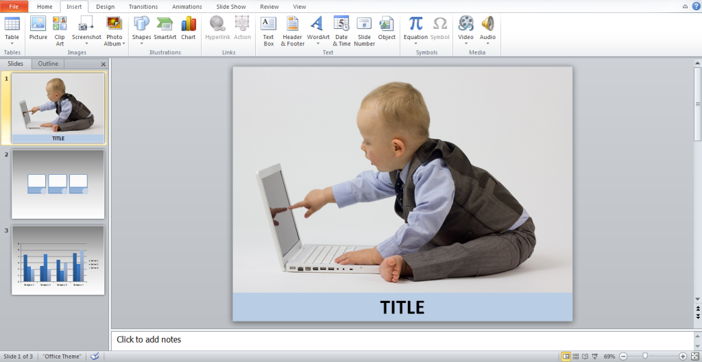
Slide decks are primarily composed of pictures with one or two sentences, allow your audience to have a few seconds to read and look at each slide. Then, proceed to tell a relevant story that supports your point.They are more likely to remember your message when you present your points this way. When they need to review your topic, all they have to do is recall your story.

Final Words

One final reminder: Use the “no show” or blank screen button. This rarely used button can help you veer everyone’s attention away from the PowerPoint and towards you.By using the blank screen function, you can discuss a matter in greater detail or facilitate a short exercise without having anyone distracted by a slide in the background. More importantly, it underscores the idea that a PowerPoint presentation is a tool for lecturers, not a crutch.More importantly, it underscores the idea that a PowerPoint presentation is a tool for lecturers, not a crutch.

Reference

Bumiller, Elisabeth. “We Have Met the Enemy and He Is PowerPoint.” The New York Times. April 26, 2010. Accessed June 1, 2014.