Preparation is a critical step in any type of campaign, including hosting webinars. To produce a successful one, you need to lay out all the steps leading to the actual event. It might be tempting to jump straight to the promotion stage, especially if you have a winning topic and a celebrated speaker, but no excuse can justify skipping the planning part. Without a solid plan in place, you may run the risk of delivering a lackluster presentation that will only prove to be a waste of time, effort, and money.Planning a webinar may seem like a daunting task, but it’s necessary if you want a worthwhile output. Part of the process is creating a checklist that will solidify your strategy. You don’t have to worry about the technicality of it all. With the abundance of tools you have at your disposal, you can plan an online seminar even with limited technological expertise. And besides, every bit of effort you make will be worth the rewards you’ll reap in the end.
Can a Webinar Help Reach Your Business Goals?
You’d think the answer to that question is an unwavering yes, but it actually depends on the goals you aim to achieve. While it’s true that webinars are an effective marketing tool, they only work in certain contexts. So, before planning one, make sure it will leave a positive impact on your business.What exactly are webinars for? For one, they’re a good training and outreach tool. You can use them to share your expertise to your target audience. Webinars are also effective for getting the word out to your customers when rolling out a new product. When done right, it can help you move customers further down the sales funnel and reposition yourself as an industry thought leader.
Resources:
Berdeal-Skelly, Michelle. “6 Tips to Planning a Successful Webinar.” Find and Convert. October 14, 2014. www.findandconvert.com/2014/10/6-tips-to-planning-a-successful-webinarGilbert-Knight, Ariel. “10 Steps for Planning a Successful Webinar.” TechSoup. September 2, 2016. www.techsoup.org/support/articles-and-how-tos/10-steps-for-planning-a-successful-webinarSibley, Amanda. “10 Things That Take a Webinar From Good to Great.” HubSpot. January 3, 2014. blog.hubspot.com/marketing/webinar-planning-list#sm.0000w6nx4vstbcwkqnc12umt2kzcx“15 Tips for a Successful Webinar.” MegaMeeting. n.d. www.megameeting.com/15_Successful_Webinar_Tips_Part1.html
Looking for creative presentations that can leverage your business? Enjoy free PowerPoint templates from SlideStore! Sign up today.
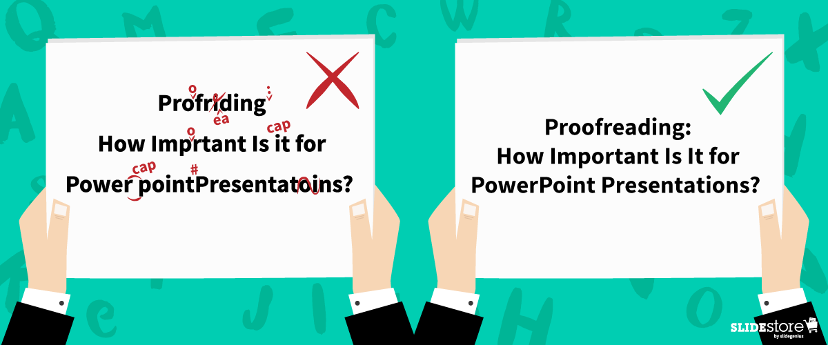
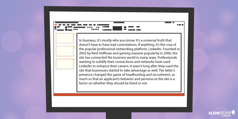
When reading, isn’t it bothersome to see a typographical error that distracts you from peacefully enjoying the piece? There’s the nagging feeling that “teh” should be “the,” that “your” should be “you’re,” or that “should of” is completely wrong. If tenses are all over the place or the subject-verb agreement isn’t correct, then that impression of the mistake gives way to disappointment and silent rage. Typos are distracting, to say the least.
To curb typographical errors, the responsibility of proofreading content falls squarely upon your shoulders. Be it a blog post, a book waiting to be published, or even a social media update, any piece of content should be proofread before publishing and publicizing, lest you be subject to the anger-inciting asterisk.
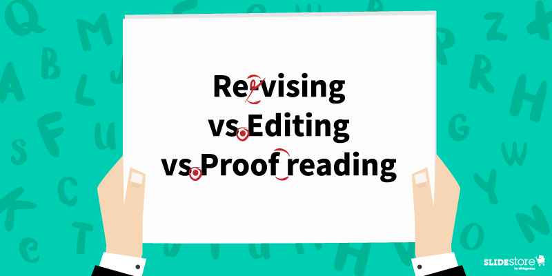
“But wait,” you may probably say. “What’s the difference between proofreading and editing? And there’s revision, too.” It’s time to contrast.
Revising vs. Editing vs. Proofreading
Revising entails the “re-visioning” of the whole piece; you gauge and, if ever, change how you approach your topic. Some of the main questions you need to consider when revising are, “Did the last draft fail to answer important questions, and does the recent one succeed?” and “Is the argument clear and understandable?”
Editing is done so that the whole piece is coherent and unified. You check the flow from one sentence to another and the logic from one paragraph to the next to discern whether the transitions are clear and smooth. If not, then rearrange paragraphs, rewrite sentences, and make the according edits.
Proofreading, the lightest of the three, is where you look for misspelled words, misused punctuation marks, and improper verb tenses and subject-verb agreements to fix them. This is the last step you should do before posting your content.
You must also check your PowerPoint presentation to ensure it doesn’t have any errors (and if it does, edit). Other than showing that you took the time to perfect your slide, it also implies the following notions:
Clarity
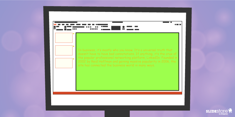
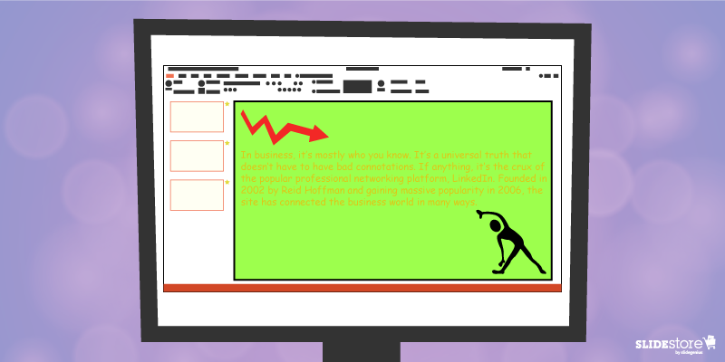
Apart from the fact that typographical errors and grammatical mistakes are distracting (diverting your reader’s attention to the typo itself), they take focus away from the message of your presentation in PowerPoint. There are more possible misinterpretations of a line missing a word, a missing letter crucial to the intended definition of the word (think “pubic” instead of “public”), or inconsistent tenses.
While it may be said that the human mind internally corrects the mistake, it’s still an unnecessary mental activity for the reader. Instead of focusing on and absorbing your piece, they’re looking out for mistakes just to satisfy the feeling that what they’re reading is clean and error-free—if they even decide to keep reading your piece.
Instead of muddling and muffling your piece’s flow of information because of errors, make sure your copy is clean and polished. Take the time to think about how your audience reads your article. When you see a typo, correct it right away.
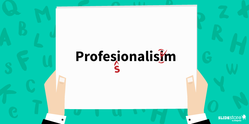
Professionalism
Often, if you read content rife with grammatical and typographical errors, your judgment on it is, “This must have been done by an amateur.” Contrast that with well-proofread copies, and the stigma of unprofessionalism is gone.
Careless mistakes are always a show of unprofessionalism. It can imply that you weren’t fully prepared with your slides or that you crammed your PowerPoint presentation. It can mean that you never bothered to check for mistakes after your first draft or that you didn’t organize everything effectively and efficiently.
This is why there is a practice in any printed publication to correct any factual or typographical errors that made it past layers of editing, albeit in the next edition. Unfortunately, this doesn’t hold as true for digital copies even though editing them is easier to do. Make sure you don’t fall into the same trap.
Consistency
Which do you go for: “toward” or “towards”? “Color” or “colour”? If you’re not careful, you might end up using two kinds of English in a single piece.
Having a consistent voice and tone is a must, if not for regional differences then for establishing yourself as a proficient English speaker and communicator. If you use American English, then keep it that way throughout your piece; if you’re going for British, then make your spelling and idiom use consistent. It may sound traditionalist, but there are critics of this kind of inconsistency. Plus, it helps define your target market without alienating the other party.
All in all, keep your content error-free. It’s a secret to crafting great copies. Even in school, you were trained to submit perfect essays and reports since having typos usually meant markdowns. It’s the same when it comes to business, only with far-reaching consequences. When you’re in front of a crowd whose decision could shape your life and/or career, you wouldn’t want to risk making the kind of mistake.
Writers live by a general rule, and it’s a good exercise of their English and organizational skills. “Write in white heat; revise/edit in cold blood.” Any word work you do falls under this rule. There are no exceptions. Not even your slides. The task of proofreading falls upon you, the content creator, and definitely not a PowerPoint presentation designer.
Resources:
Scocco, Daniel. “The Impotence of Proofreading.” Daily Writing Tips. n.d. www.dailywritingtips.com/the-impotence-of-proofreading
Wasielewski, Jarek. “The Importance of Proofreading Your Webinar.” Webinar Tips Blog. September 25, 2015. blog.clickmeeting.com/the-importance-of-proofreading-your-webinar
Wright, Catharine. “Revision, Editing and Proofreading: What’s the Difference?” Peer Writing Tutors & FYS Mentors. February 14, 2011. sites.middlebury.edu/peer_writing_tutors/2011/02/14/revision-editing-and-proofreading-what%E2%80%99s-the-difference
Wroblewski, M.T. “The Importance of Proofreading in the Workforce.” Chron. n.d. smallbusiness.chron.com/importance-proofreading-workforce-36110.html
Zimmer, John. “Five Typographical Errors to Avoid on Your Slides.” Manner of Speaking. November 6, 2010. www.mannerofspeaking.org/2010/11/06/five-typographical-errors-to-avoid-on-your-slides
“How Proofreading Services Can Make Your Next Presentation a Success.” Re:word. n.d. www.reword.ca/how-proofreading-services-can-make-your-next-presentation-a-success
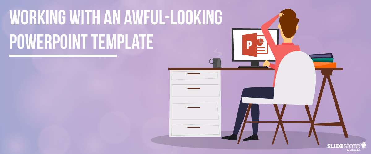
Corporate PowerPoint templates are notorious for their impracticality and ineffectiveness. This is because they’re usually created by people with limited knowledge or experience in design. If you are guilty of this sin, then you should hire a slide design professional who can amp up your template’s look and feel. The aesthetics of your presentation can reflect the amount of dedication you put in it, so make sure you create a template that is engaging and attractive.The general goals of a presentation are to communicate a message, make a point, and sell an idea. A bad template can undermine these goals and inhibit you from delivering an effective presentation. Here are some of the most common components of an awful-looking presentation template, alongside some tips on how to rectify them.
6 Elements of a Bad PowerPoint Template and How to Fix Them
What do bad presentation templates have in common? They all lack a unifying idea that marries content and design. Awful-looking presentations are ambiguous, and from this major flaw springs others. Although the following elements seem inconsequential, they can still leave a great impact on your template’s final look, usability, and effectiveness.
1. Inadequate features
A good presentation template should be flexible enough to meet the company’s needs. Otherwise, it will be of no use. Include the fundamental features in your template, but don’t stop there. Make sure you include not only an opening and ending slide but also transition slides, master slides, and other standard slides that can enhance your message. Apart from this, you should also provide a guidebook that will instruct and direct the presenters as to the proper uses of the template. Provide demonstration videos and actual presentation samples if necessary.
2. Lack of visual elements
One of the worst things you can do to a presentation template is to deprive it of an emotional element. Templates that are riddled with unnecessary bullets and large walls of text do nothing but insult the audience’s time and attention. Don’t encourage presenters to bombard their presentations with lengthy passages. Set presentation guidelines that limit ideas to one per slide. To add an emotional trigger, encourage the use of visual tools like graphics and videos. Let the presenters bring their ideas to life through emotive and photographic elements.
3. Weak color palette with poor contrast
Many things can go wrong with your chosen palette. For instance, you might choose a color theme that may not reflect your brand. The colors may not be appropriate to the image you want to project and the message you want to communicate. Another thing that may go awry is the color contrasting of the fonts and backgrounds. As you know, weak contrast results to poor readability, which will render your text invisible, and thus, worthless. To avoid this problem, always calculate the effect of a certain font color on the background. Finally, be careful about the inclusion of weak and/or daring colors in your theme. Weak colors can weaken your design, and daring colors can disorient your audience.
4. Unreadable typography
Typography is one of the most important elements of a presentation since it can set the stage for the content. There are two important aspects of typography: size and style. You need to get these two right to achieve an effective presentation. Make sure the standard font size you set is not lower than 44 points. This size is large enough to command attention but not too large that it looks ludicrous. You also need to consider the font style. Traditional serif fonts look formal and professional while sans serif fonts are more modern and clean-looking. Use what’s appropriate for your presentation.When you use custom fonts, make sure they’re installed in external computers. The thing about custom fonts is that they can mess up the layout of your slides if the computer you’re using doesn’t support them. Embed the true type fonts into the presentation to avoid this fiasco.
5. Cheesy effects
Perhaps the biggest PowerPoint nightmares are the cheesy effects, which include transitions, sound effects, and animations. It’s understandable if you want to spice up your template, but find better ways to do that other than adding inappropriate effects to your presentation. However, if you feel like you need to use the said effects because they offer a functional purpose, make sure to use them sparingly. Instead of the default sound effects from the PowerPoint library, embed background music from external resources. As for animations and transitions, make sure they add value to your content. Use only what’s absolutely crucial for the presentation.
6. Use of clipart and stock photos
Visual elements are generally good, but there are certain design taboos that you should avoid. We’re talking about clipart and clichéd stock photos. No matter how hard you try, you won’t find a reason compelling enough to justify the use of clipart in your deck. Nothing screams “lame” louder than mediocre symbols in a modern corporate presentation. The same thing goes for stock images. There are many staged and cringeworthy photos that will only lessen the value of your template if you’re careless enough to use them. If you’re going to use photos, go for genuine-looking ones that can trigger emotional reactions from the audience.If you address these bad design habits that plague many PowerPoint presentations today, you will save your company major headaches. Fix these problems and watch as your presentation templates reach a different level of beauty, usability, and effectiveness.
Resources:
Chibana, Nayomi. “Color Theory for Presentations: How to Choose the Perfect Colors for Your Designs.” Visme. December 28, 2015. blog.visme.co/how-to-choose-a-color-schemeGodin, Seth. “Really Bad PowerPoint.” Type Pad. January 29, 2007. sethgodin.typepad.com/seths_blog/2007/01/really_bad_powe.htmlHristov, Boris. “Reality Check: Is Your Company’s PowerPoint Template Bad?” Medium. January 19, 2016. medium.com/@borishristov/reality-check-is-your-company-powerpoint-template-bad-bf6ff82780ef#.4kkk8wijbMancini, Sunday. “4 Common PowerPoint Template Mistakes.” Ethos 3. May 26, 2016. www.ethos3.com/2016/05/4-common-powerpoint-template-mistakesPanzironi, Michelle. “7 PowerPoint Mistakes That Make You Look Old.” Forbes. January 16, 2016. www.forbes.com/sites/propointgraphics/2016/01/16/7-powerpoint-mistakes-that-make-you-look-hella-old/#41da1a5234e7“10 Tips for Designing Presentations That Don’t Suck: Part 1.” Work Front. February 2, 2017. resources.workfront.com/project-management-blog/10-tips-for-designing-presentations-that-dont-suck-part-1“10 Ways to Spot a Lame Corporate PowerPoint Template.” PowerPoint Ninja. n.d. www.powerpointninja.com/templates/10-ways-to-spot-a-lame-corporate-powerpoint-template“Choosing the Right Fonts for Your PowerPoint Presentation.” Documents with Precision. March 10, 2016. www.documentswithprecision.com/choosing-right-fonts-powerpoint-presentation
Creating strong PowerPoint slides requires attention to clarity, design, and engagement. Here are the fundamental elements of a well-designed PowerPoint slide:
1. Concise and Focused Content
Why it matters: A strong slide should deliver one key message or idea. Overloading slides with too much information distracts the audience and makes it harder for them to retain important points.
How to apply: Limit your slide to 3-5 bullet points or key ideas. Use short, direct sentences or phrases, and avoid long paragraphs. Each slide should support a single concept, allowing the audience to focus on the message without becoming overwhelmed.
2. Clear and Readable Text
Why it matters: If your audience cannot easily read the content on your slides, they’ll lose interest quickly. Legibility is essential for effective communication.
How to apply: Use large, sans-serif fonts like Arial or Calibri, with a minimum font size of 24 points for body text and 36 points for headings. Stick to consistent fonts and colors across all slides. Ensure there is sufficient contrast between the text and background, making it easy to read even from the back of the room.
3. Visual Balance and Design
Why it matters: An aesthetically pleasing slide keeps the audience’s attention and ensures your content is well-organized. Too much clutter can distract from the message.
How to apply: Utilize white space to give your slides a clean, organized look. Limit images and design elements to only those that enhance your message. Align your text, images, and visuals neatly to create visual balance on each slide. A consistent layout across all slides contributes to a professional appearance.
4. Engaging Visuals
Why it matters: Images, icons, and charts can convey ideas more powerfully than text alone, helping to increase understanding and retention.
How to apply: Incorporate relevant visuals like photos, icons, or infographics that support your message. Use charts and graphs to present data visually, but make sure they are simple and easy to understand. Avoid generic or irrelevant images that don’t add value to the presentation.
5. Consistent Branding
Why it matters: Consistent branding helps reinforce your message and creates a professional, cohesive presentation. It ensures that your slides reflect your company or personal brand.
How to apply: Use your brand’s colors, fonts, and logo consistently throughout the presentation. Stick to a color palette that complements your brand and is easy on the eyes. Make sure your slides align with your brand’s style guidelines for consistency.
6. Minimal Transitions and Animations
Why it matters: While transitions and animations can add engagement, overusing them can be distracting and make your presentation feel unprofessional.
How to apply: Use simple transitions and animations, like fade-ins or appear, sparingly and only to highlight key points. Avoid flashy effects like bouncing text or excessive movement, which can distract from your core message.
7. Actionable Call to Action (CTA)
Why it matters: A clear call to action helps direct the audience to the next steps, especially in business or sales presentations. It turns passive listeners into engaged participants.
How to apply: Place the CTA in a prominent spot on the final slide, using bold text or a contrasting color. Use specific, actionable language like “Sign up today” or “Contact us for more information” to drive engagement.
By focusing on these core elements, you can create effective, engaging, and professional PowerPoint slides that communicate your message clearly and resonate with your audience.
Ever since the birth of Microsoft PowerPoint, presentations have taken a turn for the better: user-friendly interface, easy-to-use buttons, and simple settings to name a few, rendering the whole task of creating presentations simpler and less time-consuming. Best of all is how the software gives you extras and bonuses to liven up to your slides with a few clicks and adjustments.Like the other elements of a visual aid, and especially with PowerPoint, animations can mean the difference between bland slides and zesty ones. Proper use of transitions can arrest attention and provide suspense. Effects can highlight and emphasize points. Motion paths in action can guide viewers’ eyes to where they should be looking next. There are many upsides to using animations.However, as with any upside, there are bound to be repercussions—two sides of the same coin, if you will. In this case, there are cons to using animation, ones that have a lasting impact even after your talk.Animations make or break your PowerPoint. They can be the wowing element or the disappointment that makes your audience members shake their heads. Before you pepper your slides with too many special effects, ask yourself the three following questions:
Important or Whimsical
Do you have a point to emphasize or a concept you wish to illustrate beyond just showing an image? Or do you want your text to sparkle or your object zoom in and out? Perhaps you want a “breaking glass” effect every time you go to the next slide?If you answered affirmatively on the first question, then you know how to use animation to your advantage. Using it when and because it’s necessary is the first step to acknowledging the fact that it’s more than just for dramatic flair. When employed correctly, it makes certain points stand out among the rest of your content.If you’re of the last two questions, though, then it’s time to rethink how you approach animation. Any excess for no reason is detrimental not just to your slide but also to your whole presentation. You risk looking amateurish when you try to retain your audience’s attention with special effects instead of wowing them with your message, content, and/or design.
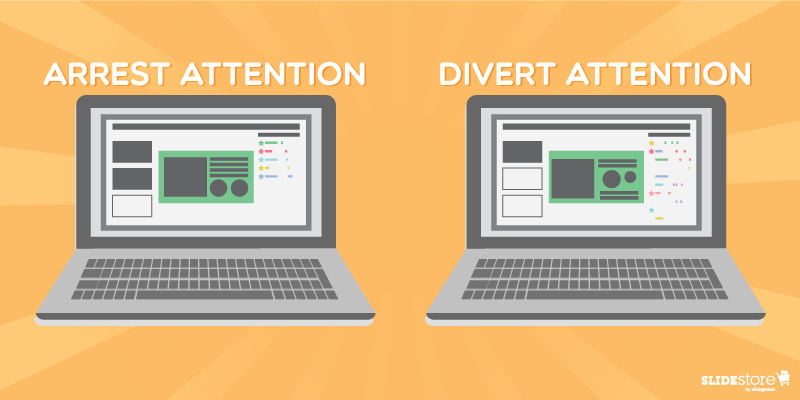
Arrest or Divert Attention
New PowerPoint users tend to be excessive on the animations. But just because they think it’s great doesn’t mean their audiences will do too. The worst-case scenario is that you turn off your viewers with the sheer number of animations and stop listening.This point is very much aligned with the one above, only this one tends to encompass a more focused area: does it draw and retain attention on the objects that need to be emphasized? If yes, then the animation served its function. If it doesn’t, then consider changing the animation settings or, as is often recommended, simply avoid it.In relation to animations on your presentations, the speaker, to whom the audience should pay attention, bears the greater weight when the special effects work or not. Your presentation is not a crutch, so if it draws away the audience’s attention from you, then your talk is compromised. The message is not effectively communicated. They’re reading—or reeling or wondering why you used that transition or fade effect—when they should be listening. In that short period, their attention drifted; their focus changed. The best way to avoid that is simplifying the prevailing thought of your animation use.
Enhancement or Distraction
Overall, the main question you want to answer before putting animations on your slides is, “Will my animations enhance the audience’s experience or distract them from the main point?” If every element you have becomes a waiting game for you and your audience, then your slides, if not your whole visual aid, take away from the whole experience—and possibly diminish it. They can’t concentrate on your message, and they may feel they just wasted their time.On the other hand, if you used animations smartly and properly, carefully planning what effects to put on major points and objects and properly executing the appropriate animation, then your audience will more likely remember your talk because it’s memorable. It informed them and sparked their genuine interest.All in all, PowerPoint animations are powerful tools; like any other, depending on the speaker (or the presentation design agency), it can be used in a good way or a bad way. If the animations work well in conjunction with the other elements of your slides—the perfect harmonization of your content, design, effects, and skills as a speaker—then you’ve got on your hands a powerful visual aid. You educate people more efficiently and more effectively. And that’s one of the best goals a public speaker could have.
Resources:
Cournoyer, Brendan. “PowerPoint Animation Tips: Dos and Don’ts for Business Presentations.” Brainshark. March 7, 2012. www.brainshark.com/ideas-blog/2012/March/powerpoint-animation-tips-for-business-presentationsNewbold, Curtis. “Top 12 Most Annoying PowerPoint Presentation Mistakes.” The Visual Communication Guy. September 24, 2013. www.thevisualcommunicationguy.com/2013/09/24/top-12-most-annoying-powerpoint-presentation-mistakesNoar, Adam. “10 Essential PowerPoint Hacks for More Exciting Presentations.” PresentationPanda.com. July 4, 2016. www.presentationpanda.com/blog/essential-powerpoint-hacksRussell, Wendy. “PowerPoint Presentations – the Good, the Bad and the Ugly.” ThoughtCo. February 18, 2016. www.thoughtco.com/powerpoint-presentations-good-and-bad-2767094Sartain, JD. “PowerPoint Animation Tips: Don’t Be That Person Whose Slides Are Deathly Boring.” PCWorld. February 10, 2015. www.pcworld.com/article/2859249/powerpoint-animation-tips-dont-be-that-person-whose-slides-are-deathly-boring.htmlVanderlee, Carly. “The Seven Deadly Sins of PowerPoint.” Bridgeable. August 20, 2014. www.bridgeable.com/the-seven-deadly-sins-of-powerpoint“Animation–Help or Entertainment?” Training Zone. August 23, 2001. www.trainingzone.co.uk/develop/talent/animation-help-or-entertainment
PowerPoint is an effective communication tool when rebranding a business, as it allows for clear visual storytelling, presenting complex ideas in a simplified, engaging way. During a rebrand, key stakeholders, employees, and clients need to understand the new brand identity, its values, and its visual elements. Here’s how PowerPoint can play a vital role in this process:
1. Visualizing the Brand Identity
Why it matters: PowerPoint presentations enable businesses to visually demonstrate the new brand’s logo, color schemes, fonts, and design elements. Visuals are crucial in communicating the changes in a brand’s identity effectively.
How to use it: Create slides that show before-and-after comparisons of logos, packaging, or marketing materials. Use the slides to showcase how these new visual elements align with the company’s refreshed identity and mission. This visual comparison helps the audience understand the shift in tone and aesthetic.
2. Articulating the Brand Story
Why it matters: Rebranding involves more than just a visual change—it also means conveying a new or refined brand story. PowerPoint can help narrate the evolution of the brand, from where it began to what it stands for today.
How to use it: Use PowerPoint’s narrative flow to tell the brand’s journey in stages, from the old brand identity to the newly redefined one. Add key messages that explain the brand’s vision, mission, and goals, using storytelling to engage stakeholders emotionally.
3. Highlighting Market Research and Insights
Why it matters: A successful rebrand is often driven by market insights and customer feedback. PowerPoint can be used to showcase the research behind the rebranding decisions, offering a transparent view of the data that influenced the change.
How to use it: Present graphs, charts, and infographics to explain customer sentiment, competitor analysis, and market positioning. This builds trust among employees, clients, or partners by showing that the rebranding is grounded in concrete data.
4. Educating Employees and Stakeholders
Why it matters: Internal stakeholders need to understand how to implement the rebrand consistently. PowerPoint presentations are an efficient tool for conducting training sessions on how to apply the new branding across various platforms.
How to use it: Create training decks that provide guidelines on using the new brand elements, including templates for emails, internal documents, and social media posts. Use slides to offer practical examples of what to do—and what not to do—when applying the new brand.
5. Communicating Brand Strategy and Future Goals
Why it matters: PowerPoint can help communicate the strategic direction of the rebrand, highlighting how it aligns with the company’s long-term goals. It offers a structured way to convey key milestones and next steps.
How to use it: Use the presentation to map out future marketing campaigns, product launches, or partnerships that align with the new brand. Showcase the brand’s evolving role in the market, using timelines and roadmaps to outline future initiatives.
6. Creating Investor and Client Buy-in
Why it matters: PowerPoint presentations can be used to pitch the rebrand to investors or clients, providing a professional and polished way to showcase the potential benefits of the new brand.
How to use it: Create a deck that highlights the rationale behind the rebrand, its anticipated impact on business growth, and how it will improve customer engagement. Use statistics and market projections to show the value of the rebrand to investors or partners.
7. Driving Consistency Across Multiple Channels
Why it matters: For a rebrand to be successful, consistency across all channels is crucial. PowerPoint can serve as a brand guideline document that is shared with all departments.
How to use it: Develop a comprehensive PowerPoint that acts as a style guide for the new brand. Include detailed instructions on how to apply the branding across print, digital, and social media platforms. This ensures uniformity in the way the brand is presented externally.
By using PowerPoint as a communication tool during a rebrand, businesses can ensure that they visually communicate their new identity, explain the rationale behind the changes, and educate key stakeholders on how to apply the brand consistently across channels. This combination of visual storytelling and structured messaging is crucial for ensuring that the rebrand is well-received and effectively implemented.
Here are five tips to help you finish your PowerPoint deck on time:
1. Use a Pre-Designed Template
Why it works: Using a professional, pre-designed template saves you time on design decisions, such as layout, colors, and fonts. Templates give you a structured framework to quickly fill in content.
How to apply: Choose a template that fits your content and branding. Platforms like SlideGenius or SlideStore offer ready-made designs for different presentation needs, from corporate decks to pitch presentations.
2. Prioritize Key Content First
Why it works: Focusing on the most important content first ensures you cover your core message, even if you’re running short on time. Filling in additional details or polishing the design can be done afterward.
How to apply: Create an outline of your main points and design those slides first. Once the essentials are in place, go back to add supporting details, visuals, or transitions.
3. Set a Timer for Each Task
Why it works: Allocating specific time slots to tasks helps keep you focused and prevents you from spending too much time on one slide or element.
How to apply: Use a timer or productivity app to give yourself strict time limits for different tasks (e.g., 15 minutes for each slide). Stick to your schedule to avoid getting bogged down in unnecessary edits.
4. Limit Design Edits
Why it works: Spending too much time on slide design can slow down your progress. Focus on functionality and readability instead of obsessing over perfect aesthetics.
How to apply: Choose one font, stick to a simple color palette, and avoid overcomplicating your slides with excessive animations or transitions. Save design tweaks for the end if time permits.
5. Delegate or Automate Repetitive Tasks
Why it works: If you’re short on time, delegate tasks like data entry, formatting, or creating graphics to a team member or use automation tools. This frees up time for you to focus on critical elements like crafting your message.
How to apply: Use features like PowerPoint’s Design Ideas or SmartArt to quickly create layouts and visual elements. If working in a team, consider real-time collaboration through Microsoft OneDrive or Google Slides to divide tasks.
By implementing these strategies, you’ll be able to streamline your workflow and complete your PowerPoint deck efficiently while ensuring quality.
Corporations and organizations often use a style guide to ensure that all their visual materials maintain a consistent and cohesive look.Because it’s impossible to keep track of every PowerPoint deck created in such an environment, a style guide guarantees that every presentation will correspond to your organization’s brand identity.[sg-blog-modules module=one]Before starting on your style guide, familiarize yourself with PowerPoint’s Slide Master function to create and customize templates first. This makes it easier to accomplish once you begin distributing it throughout the organization.Here are areas you need to focus on:
Leverage branding
Every design rule or suggestion that you put down should contribute to your branding efforts. As we’ve discussed in the past, an easy way to integrate branding into PowerPoint design is through the clever use of colors.Set down some rules on the color scheme that everyone should use for presentations. Keep your brand’s logo and overall aesthetic in mind, making sure your rules for the color scheme goes well with both. Let your colors stand out so that the audience can see that your slides are part of a larger, unified whole.Another way to leverage branding is by using visual metaphors that correspond to your brand identity. Include suggestions for images and illustrations people should use in their PowerPoint designs.
Establish rules following best PowerPoint practices
Aside from branding, a PowerPoint style guide also helps you maintain the quality of all the slide decks presented in your organization’s name.As such, it’s important that you establish key rules that follow the best PowerPoint practices. Be strict about the use of bullet points and the amount of text included in a single slide. Establish pointers on how data should be presented. There are different ways to do it, but all in all, you should make sure that charts and graphs don’t get too overwhelming by inputting only the content that matters to your pitch.Something else you can consider is making suggestions that can help manage the length of your company’s presentations.In this PowerPoint style guide from the American Marketing Association, there’s a suggestion that a PowerPoint deck should match its length in number of slides. For example, 10-minute presentations should have no more than 10 slides.
Add reminders for presentation delivery
It might seem unnecessary, but you can also include a few reminders on how presentations should be delivered.While a PowerPoint style guide may be focused on design, its overall objective should touch on improving presentations delivered throughout your organization. Also remind others to be more careful with the way they present their slides. After all, the point of creating PowerPoint slides is to enhance the message people are delivering with their presentations.At the end of the day, what matters is what audiences are left with. If the delivery is improved, you can expect outcomes to improve as well.–A PowerPoint style guide is a way you can make sure presentations are organized and consistent with the company’s overall message. Have a clear vision on how you want these presentations to look like, and what kind of impact you want them to leave on audiences.These are the things you need to have defined and clarified in your PowerPoint style guide:
Use of logo
Color scheme
Font type and size
Use of bullet points
Use of images, icons, and illustrations
Presenting data in charts and graphs
Editing and cutting back on slides
Pointers on presenting slides to make the most of the visual aids
Keep these in mind and start establishing some rules and pointers to maximize your use of effective visuals.[sg-blog-modules module=two]
There are many advantages to reaching out and connecting with your audience online. Consider integrating online content marketing as part of your strategy for optimal audience engagement.What better way to pique your target audience’s interests than providing them with content that’s both useful and relevant to their interests?[sg-blog-modules module=one]That said, online presentations can significantly improve your brand’s visibility online.As you know, a presentation is both a visual and informative medium. Take note of the ways you can cut back lengthy PowerPoint presentations and turn them to more SEO-friendly slides. In the process, don’t forget to check if the end product lines up with your objectives.Ask yourself these questions to make sure your online presentations are working for you:
How relevant are your online presentations?
According to NN Group co-founder Jakob Nielsen, majority of online users spend only about 10 to 20 seconds browsing through a web page to find what they’re looking for. If the page doesn’t have that information, they’ll skip over to the next link.Don’t let the same thing happen to your online presentations. If the audience skips past the thumbnail of your online presentation, they might never scroll back to have a second look.Make sure you’re relevant to what they might be searching for.Create a presentation offering to give them tips or advice, but don’t make it too generic.Business consultant, Mark Evans, stresses the importance of fitting the needs and interests of your target audience by learning as much as you can about them.From that knowledge, create a headline and title slide that will surely catch people’s attention.
Can your content sustain interest?
Now that you’ve caught your audience’s attention, the next step is figuring out how to engage and keep them interested.Keep them on your page by highlighting your core message and key takeaways.Don’t present your online pitch in a roundabout way. Define your presentation’s premise from the get go and put your main points forward.This lets your target audience tell that your ideas are in line with what they’re looking for.They’ll keep clicking to see what’s on the next slide.
Do you have a clear Call-to-Action?
After making a compelling argument, leave your audience with one last powerful statement. Before they move on to find something else to read, don’t forget to make your pitch.That’s what a Call-to-Action is for. Should they contact you for inquiries? Should they follow you on social media?End with a clear-cut statement that lets the audience know what you want them to do next.–We can’t emphasize enough how much online presentations can help your brand in the long run. Engage your target audience and gain the leads you need by keeping these 3 things in mind. If you want help with designing an online presentation audiences will never forget, contact us to schedule a conversation with our PowerPoint experts.[sg-blog-modules module=two]
The most effective PowerPoint slides are often simple and concise. As branding experts TRAY Creative put it: cluttered slides will only put your audience to sleep.Effective decks help the presenter discuss a topic with memorable and arresting visuals. In other words, a PowerPoint presentation isn’t there to act as your script or teleprompter.[sg-blog-modules module=one]If your presentations are always burdened by text-heavy PowerPoint slides, it’s time to dial back and strip your deck bare.Try the following suggestions to make sure you don’t have walls of text blocking the audience’s interest in your discussion:
Strip your content down to its essentials
Cutting back on text-heavy PowerPoint slides rely on your ability to edit your own content.Before you start making your PowerPoint deck, review the draft you’ve prepared and see how you can simplify your points even more. Your goal is to strip down your content to the bare minimum.You don’t have to waste space on your slides to elaborate particulars. Your slides are there to highlight the main points and takeaways.Everything else that needs to be discussed or described is for the presenter to do on his own.
Use multiple slides to split up bullet points
Bullet points are often maligned in PowerPoint design because of constant misuse. A lot of presenters insist on presenting text through a bullet point list, even if the text requires a lengthy paragraph description.Bullet points are meant to simplify content and list down key information. If you’re going to use it to cram several paragraphs on a single slide, you’re not utilizing bullet points properly.Split up your content across multiple PowerPoint slides. Even if you end up with 10 more slides than you originally planned, your deck won’t look poorly designed.Spreading out your PowerPoint to tackle one point at time will help you make sure your slides aren’t dragged down by too much text.
Represent content visually
I’m sure you’re familiar with the saying, “a picture is worth a thousand words.” Remember to keep it in mind when making PowerPoint slides, because it’s extremely crucial to presentation design.Sometimes, it can be hard to cut back on content because there are things that require several sentences to describe.Luckily, PowerPoint is a visual tool. Instead of using up slide space on lengthy descriptions, you can represent certain parts of your content through pictures or graphics instead.Turn a discussion on a particular process into a flowchart. Find pictures that represent your brand values. Think visually and use images to relay what might need several sentences to say.–In general, try to keep your PowerPoint slides visual. Use text to enhance the meaning of particular images or graphs, and do it by using the simplest sentences or phrases. Remember, a PowerPoint deck is a visual aid. It shouldn’t overwhelm your audience with too much information. As the presenter, it’s your job to take the stage and discuss your presentation accordingly.[sg-blog-modules module=two]