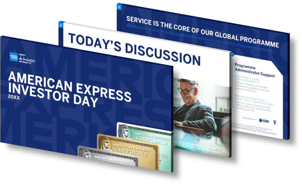
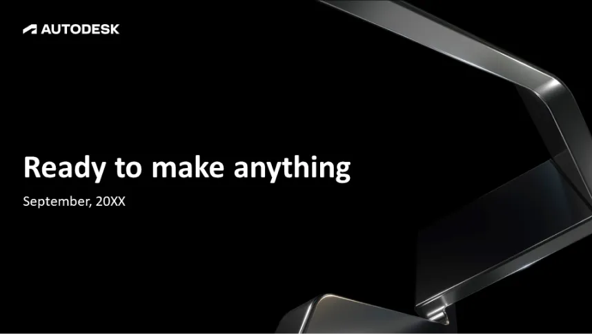
Effective infographic design plays a pivotal role in enhancing the communication of complex ERP (Enterprise Resource Planning) solution features during business presentations. By transforming intricate data into visually engaging formats, infographics simplify information and make it more digestible for your audience. When dealing with multifaceted topics like ERP systems, which often involve technical jargon and detailed processes, utilizing infographics allows presenters to illustrate key components such as modules, workflows, and integration capabilities through visuals rather than dense text.
This approach not only captures attention but also aids retention; studies indicate that people retain information better when it’s presented visually. Infographics can include charts, diagrams, icons, and other graphic elements that break down the complexity of ERP solutions into simpler concepts. For instance:
- Flowcharts: These can depict how data flows within an ERP system or show interactions among various modules.
- Comparison Charts: Highlight different features or benefits of various ERP offerings succinctly.
- Pictograms: Use imagery to represent statistics related to efficiency gains or cost savings from implementing an ERP solution.
Moreover, well-designed infographics foster engagement by encouraging audience interaction—viewers are likely to ask questions based on visual cues presented rather than being overwhelmed by textual descriptions alone. In summary, incorporating effective infographic design not only clarifies complex features but also enhances overall communication effectiveness in business presentations related to ERP solutions.
View Our Presentation Portfolio
